HR teams track many moving parts at once: headcount, salary, employee status, performance, engagement, attrition, recruitment sources, training hours, departments, designations, locations, gender, and monthly workforce movement. When these items sit in separate files, HR reporting becomes slow and inconsistent.
The HR Analytics Dashboard in Excel solves that reporting gap with a ready-to-use workbook. Users can replace the sample employee data, click Refresh All, and review multiple HR dashboard pages with KPI cards, pivot charts, slicers, and structured analysis tabs.
Click here to view the HR Analytics Dashboard in Excel.
Key Features of HR Analytics Dashboard in Excel
- 5 KPI cards for Total Employees, Total Salary, Active Employees, Avg. Performance Rating, and Avg. Engagement Score.
- 5 analysis pages for Overview, Department, Attrition, Recruitment, and Training review.
- Interactive slicers for quick filtering across available HR fields.
- Pivot-based charts for employee count, salary, attrition, recruitment source, training hours, performance, and engagement.
- Data Sheet tab where users add HR records in the same format.
- Support Sheet tab containing pivot tables that power the dashboard dynamically.
Dashboard Pages Explanation
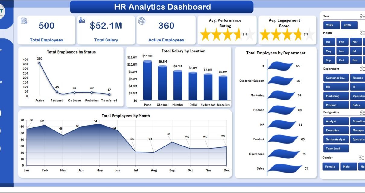
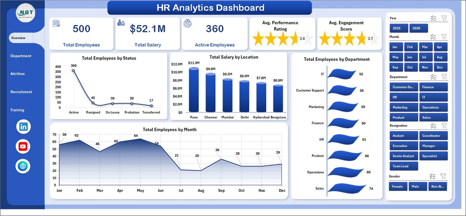
1. Overview Page
The Overview Page gives leadership a high-level HR snapshot. At the top, cards show Total Employees, Total Salary, Active Employees, Avg. Performance Rating, and Avg. Engagement Score.
Total Employees by Status: This chart shows the split of employees by active, resigned, or other workforce statuses. It helps HR teams quickly understand current workforce composition.
Total Salary by Location: This chart compares salary distribution across locations. It is useful for payroll review, location budgeting, and regional cost analysis.
Total Employees by Department: This visual shows which departments have the highest headcount. It supports workforce planning and department-level hiring discussions.
Total Employees by Month: This chart tracks monthly employee movement. It helps leaders identify hiring growth, exits, and staffing changes across time.
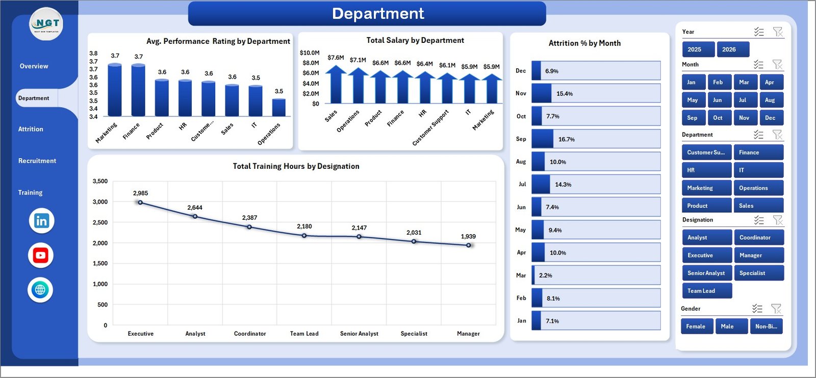
2. Department
The Department page focuses on team-level performance, payroll, attrition, and training effort.
Avg. Performance Rating by Department: This chart compares average performance rating across departments. It helps managers identify strong teams and teams that may need coaching.
Total Salary by Department: This chart shows payroll cost by department. It supports budget review and salary distribution analysis.
Attrition % by Month: This visual shows monthly attrition movement. It helps HR spot periods where retention pressure increased.
Total Training Hours by Designation: This chart shows training effort by role or designation. It helps L&D teams understand whether learning investment is reaching the right employee groups.
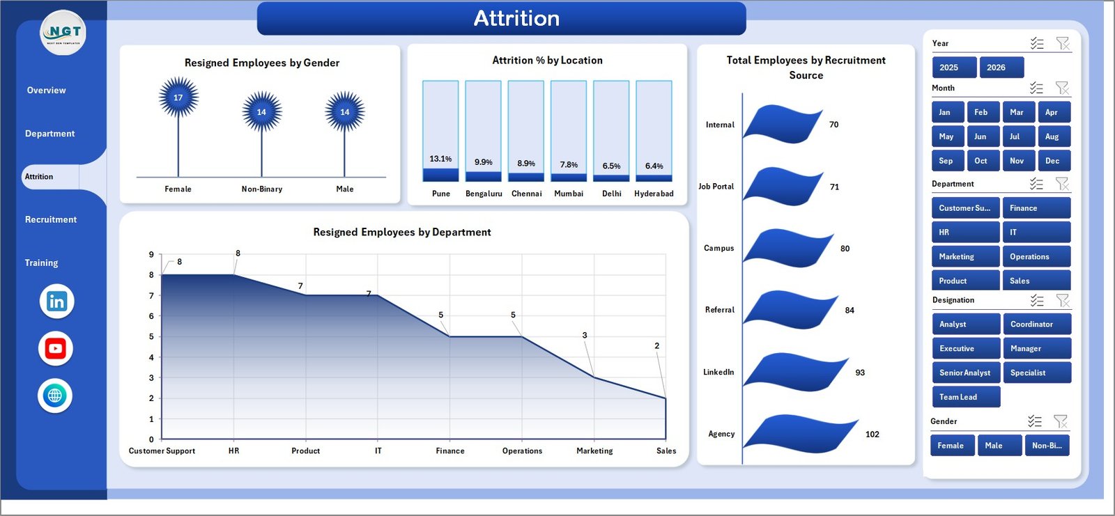
3. Attrition
The Attrition page is designed for turnover and retention analysis.
Resigned Employees by Gender: This chart helps teams review resignation patterns by gender. It can support deeper inclusion, retention, and workforce equity discussions.
Attrition % by Location: This chart compares attrition percentage across locations. It helps identify offices or regions where follow-up may be needed.
Total Employees by Recruitment Source: This visual shows the recruitment source mix behind the workforce. It helps recruiters understand which channels are contributing the most employees.
Resigned Employees by Department: This chart highlights departments with more resignations. It is useful for retention review and manager discussions.
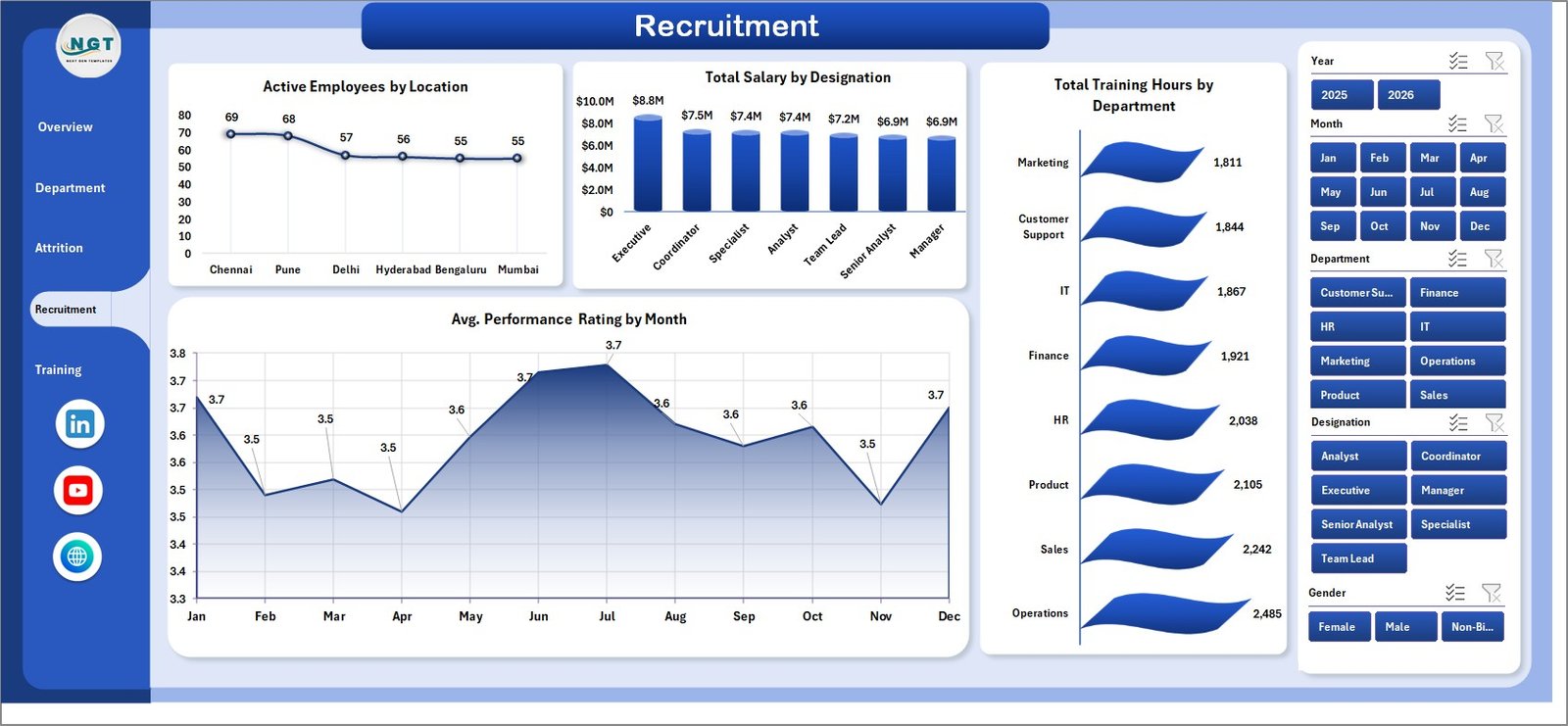
4. Recruitment
The Recruitment page connects current employees, salaries, training effort, and monthly performance trends.
Active Employees by Location: This chart shows current active headcount by location. It helps management understand where the active workforce is concentrated.
Total Salary by Designation: This chart compares payroll by designation. It helps review salary cost by role group.
Total Training Hours by Department: This visual shows training hours by department. It helps HR and L&D compare training effort across teams.
Avg. Performance Rating by Month: This chart tracks performance movement by month. It helps teams see whether performance is improving, flat, or declining across the reporting period.
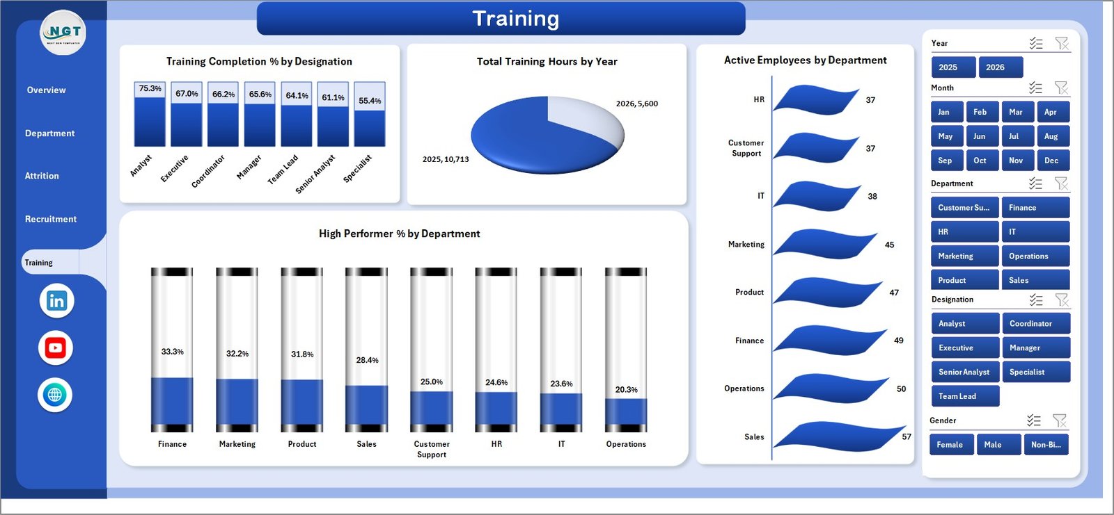
5. Training
The Training page is useful for L&D teams and HR managers who want training and performance insights in one view.
Training Completion % by Designation: This chart compares completion percentage by role. It helps identify designations where training completion may need follow-up.
Total Training Hours by Year: This chart shows training volume over years. It helps teams understand learning effort at a broader time level.
Active Employees by Department: This visual gives current employee context by department. It helps compare training activity against workforce size.
High Performer % by Department: This chart shows the share of high performers by department. It supports talent review, succession planning, and manager discussions.
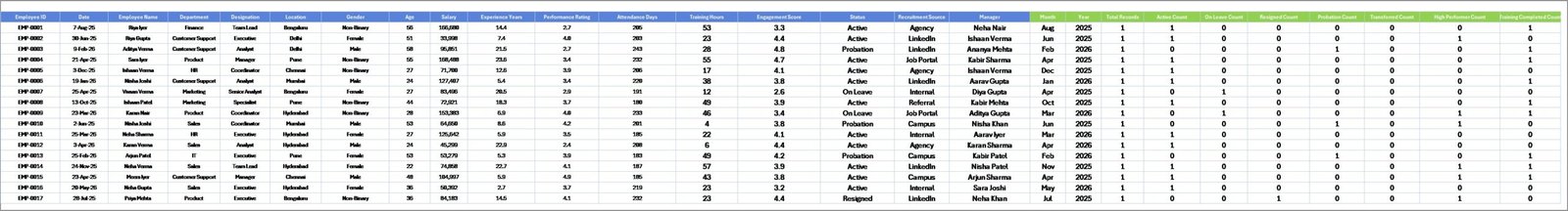
6. Data Sheet Tab
The Data sheet is the input layer. Add your HR data in the same format as the sample records. Consistent department, location, designation, status, recruitment source, month, and employee fields are important because the dashboard uses pivot tables and slicers.
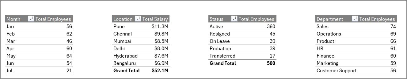
7. Support Sheet Tab
The Support sheet contains multiple pivot tables used to create the entire dashboard dynamically. After updating the Data sheet, go to the Data tab in the Excel Ribbon and click Refresh All. All pivots and charts refresh together. You can keep this sheet hidden during normal use.
HR Analytics Dashboard in Excel vs. Google Sheets vs. Paid HR SaaS – Feature Comparison
| Feature | HR Analytics Dashboard in Excel | Google Sheets alternative | Paid HR SaaS |
|---|---|---|---|
| Cost | $17.99 one-time | Low cost, usually self-built | Monthly or annual subscription |
| Platform | Microsoft Excel | Browser-based spreadsheet | Vendor-hosted HR platform |
| Setup time | Replace data and refresh | Build formulas, charts, and slicers manually | Implementation and onboarding |
| Real-time team collaboration | Possible through OneDrive or SharePoint | Strong | Usually included |
| Mobile access | Limited for dashboard editing | Good for viewing | Usually included |
| Customizable fields | Fully editable workbook | Editable with permissions | Often limited by vendor schema |
| Year-1 cost at 5 users | $17.99 plus Excel already used | Low if self-managed | Can reach hundreds or thousands |
| HR analytics pages | Built in across multiple dashboard tabs | Custom setup required | Depends on module and plan |
Who Should Use This Template
This dashboard is useful for HR managers, HR analysts, people operations teams, recruitment managers, L&D teams, HR consultants, CHRO office teams, and business owners who need a practical Excel reporting layer for workforce analytics.
It is not a full HRIS, payroll processing system, applicant tracking system, employee self-service portal, or live compliance workflow. It works best when your team already has structured HR data and wants a clean dashboard for recurring review.
Real-World Use Cases
Priya, HR Manager: She reviews active employees, salary by location, department headcount, and monthly attrition before each management meeting.
Daniel, HR Consultant: He copies the workbook for each client and uses Department and Attrition pages to prepare retention and workforce planning recommendations.
Anita, L&D Lead: She uses the Training page to compare completion percentage, training hours, and high performer percentage by department and designation.
Advantages of HR Analytics Dashboard in Excel
- Faster monthly HR reporting: The workbook gives prebuilt cards, charts, slicers, and dashboard pages.
- Familiar platform: Most HR teams already know Excel, so the learning curve is lower than a new SaaS tool.
- Editable model: Users can adjust fields, pivots, charts, colors, labels, and worksheets.
- Clear data workflow: Update the Data sheet, click Refresh All, and review the dashboard pages.
Opportunities for Improvement
This is an Excel reporting template, not a live HR application. It does not collect job applications, process payroll, manage employee logins, or automate approvals. Teams can improve the workbook further by adding extra fields, custom slicers, Power Query cleanup, or organization-specific KPI definitions.
Best Practices
- Keep department, location, designation, status, gender, and recruitment source names consistent.
- Refresh the dashboard after every major data update.
- Keep the Support sheet protected or hidden for everyday users.
- Back up the workbook before changing pivot tables or dashboard layouts.
- Use slicers during HR review meetings instead of creating many duplicate reports.
For official guidance on Excel tables, charts, and workbook usage, see Microsoft Excel support.
Explore Relevant Templates
- HR Analytics Dashboard in Excel – the template covered in this article.
- HR & Workforce Analytics Bundle – a bundle of HR templates across Excel, Google Sheets, and Power BI.
- HR Review Analytics Dashboard in Google Sheets – cloud-based review analytics.
- Temp Staffing Dashboard in Excel – staffing and workforce reporting.
- Browse Excel dashboard templates.
Frequently Asked Questions
What does the HR Analytics Dashboard in Excel track?
It tracks employees, salary, active headcount, performance rating, engagement score, employee status, department, month, location, attrition, recruitment source, training hours, designation, gender, and high performer percentage.
Can I replace the sample data?
Yes. Replace or add records in the Data sheet, keep the same format, then click Refresh All so the pivot tables, charts, slicers, and cards update.
Does this workbook require macros?
No macro workflow is required for normal dashboard use. The dashboard uses Excel data, pivot tables, pivot charts, slicers, and refresh logic.
Can I customize the dashboard?
Yes. You can edit fields, formulas, pivots, charts, slicers, colors, labels, and worksheet layouts inside Excel.
Is this a full HR software system?
No. It is a reporting dashboard template. It does not replace payroll software, HRIS workflows, applicant tracking, or employee self-service tools.
Is this a one-time purchase?
Yes. The dashboard is sold as a one-time downloadable Excel template from NextGenTemplates.
About the Author
Built by PK – Microsoft Certified Professional with 15+ years of Excel, Google Sheets, and Power BI experience. Founder of NextGenTemplates, reaching 300K+ subscribers across YouTube channels. Every template is hand-built and tested before release.
Conclusion
The HR Analytics Dashboard in Excel gives HR teams a practical way to review employees, salary, active headcount, attrition, recruitment source, performance, engagement, and training data without building a dashboard from scratch.
Use it when you need a clear Excel workbook for management reviews, monthly HR reporting, retention analysis, department comparison, and training review. Visit YouTube.com/@PKAnExcelExpert for step-by-step Excel tutorials.


