IoT Services Dashboard in Excel is a ready-to-use reporting workbook for IoT service providers, managed device support teams, telecom operations groups, and client success managers who need clear visibility across revenue, service cost, ticket volume, monitored devices, uptime, downtime, response time, resolution performance, and customer satisfaction. The workbook includes 7 worksheet tabs, 5 dashboard pages, 4 headline KPI cards, multiple slicers, a Data Sheet, and a Support Sheet. Instead of rebuilding service reports manually, users can update the Data Sheet, refresh the pivots, and review IoT performance in minutes.
Excel remains a practical analytics layer for many operations teams because it is widely available, familiar, and easy to customize. Microsoft also explains slicers as a visual way to filter table and PivotTable data, which matches the filtering workflow used in this dashboard. Reference: Microsoft Support on using slicers to filter data.
Click here to purchase IoT Services Dashboard in Excel
Key Features of IoT Services Dashboard in Excel
- 7 worksheet tabs: Overview, Service Mix, Device Ops, Client Health, Support SLA, Data Sheet, and Support Sheet.
- 4 headline KPI cards: Total Subscription Revenue, Total Tickets Opened, Total Devices Monitored, and Avg. Satisfaction.
- Service mix reporting: Analyze plan tier, service type, network type, service status, and monthly ticket activity.
- Device operations analysis: Track downtime hours, uptime percentage, resolution percentage, and monitored devices by region.
- Client health review: Compare satisfaction, revenue, service cost, resolution percentage, and uptime by client or region.
- Support SLA view: Review response time by priority, tickets by status, and total tickets resolved by technician.
- Refreshable Excel structure: Add data in the Data Sheet, click Refresh All, and update the dashboard pages.
Dashboard Pages Explanation
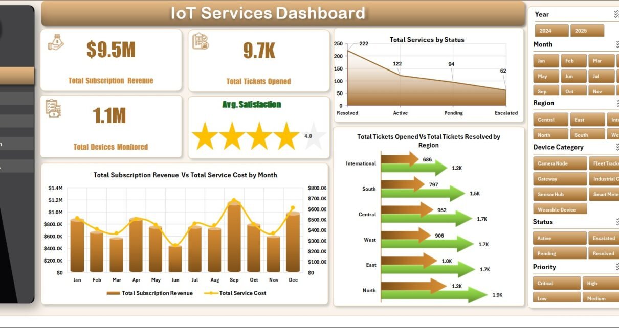
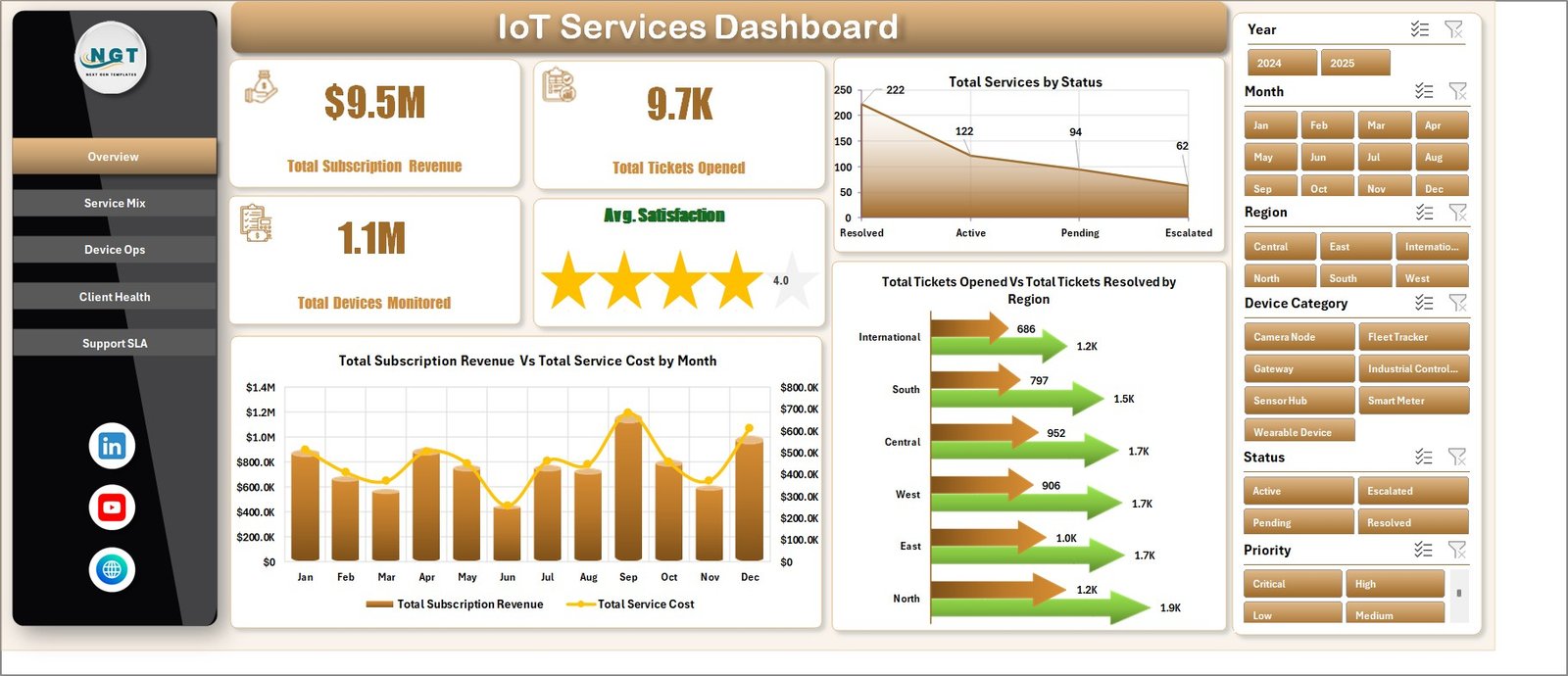
1. Overview Page
The Overview Page gives managers a high-level snapshot of IoT service performance. At the top, the KPI cards show Total Subscription Revenue, Total Tickets Opened, Total Devices Monitored, and Avg. Satisfaction. These cards help leadership read commercial performance, support demand, device coverage, and customer sentiment in one place.
Total Services by Status: This chart shows how services are distributed by status. It helps teams understand whether the portfolio is weighted toward active, pending, closed, paused, or problem service records.
Total Subscription Revenue and Total Service Cost by Month: This chart compares monthly revenue with service cost. It helps managers see whether service delivery cost is rising faster than recurring subscription income.
Total Tickets Opened and Total Tickets Resolved by Region: This view compares incoming ticket demand and resolved ticket activity across regions. It helps support leaders identify where workload is high and whether resolution capacity is keeping pace.
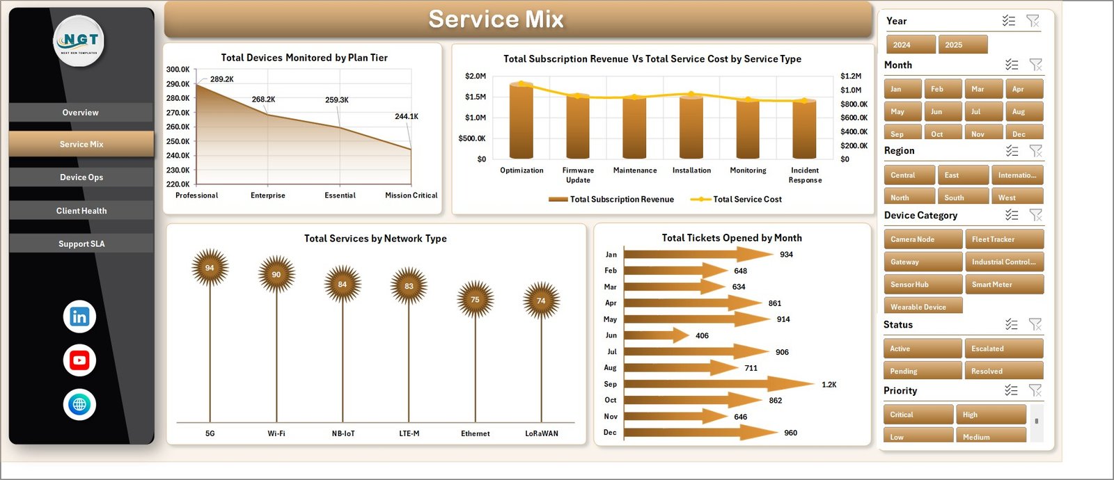
2. Service Mix
The Service Mix sheet focuses on how the IoT service portfolio is distributed by plan, service type, network type, and month. It is useful for commercial planning, service packaging, and portfolio review.
Total Devices Monitored by Plan Tier: This chart shows device volume by plan tier. It helps teams understand which plans carry the largest monitoring responsibility.
Total Subscription Revenue and Total Service Cost by Service Type: This chart places income and delivery cost side by side for each service type. It helps identify profitable and cost-heavy service lines.
Total Services by Network Type: This visual shows how services are distributed across network types. It helps technical teams understand the network mix behind support and monitoring demand.
Total Tickets Opened by Month: This monthly view shows support demand over time. It helps teams see seasonal support patterns or periods where ticket volume increased.
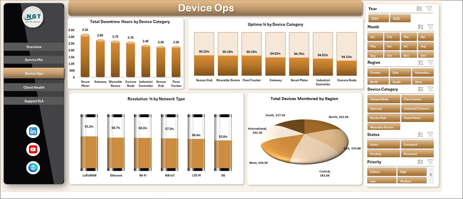
3. Device Ops
The Device Ops tab is built for operational reliability review. It helps users compare downtime, uptime, resolution percentage, and device coverage across device categories, network types, and regions.
Total Downtime Hours by Device Category: This chart highlights which device categories create the most lost service time. It is useful for maintenance planning, device quality review, and escalation discussions.
Uptime % by Device Category: This view compares reliability by device group. It helps teams identify categories that perform consistently and categories that need investigation.
Resolution % by Network Type: This chart compares issue resolution rates by network type. It helps identify whether some networks create more difficult support cases than others.
Total Devices Monitored by Region: This visual shows monitoring coverage by geography. It supports regional capacity planning and service coverage review.
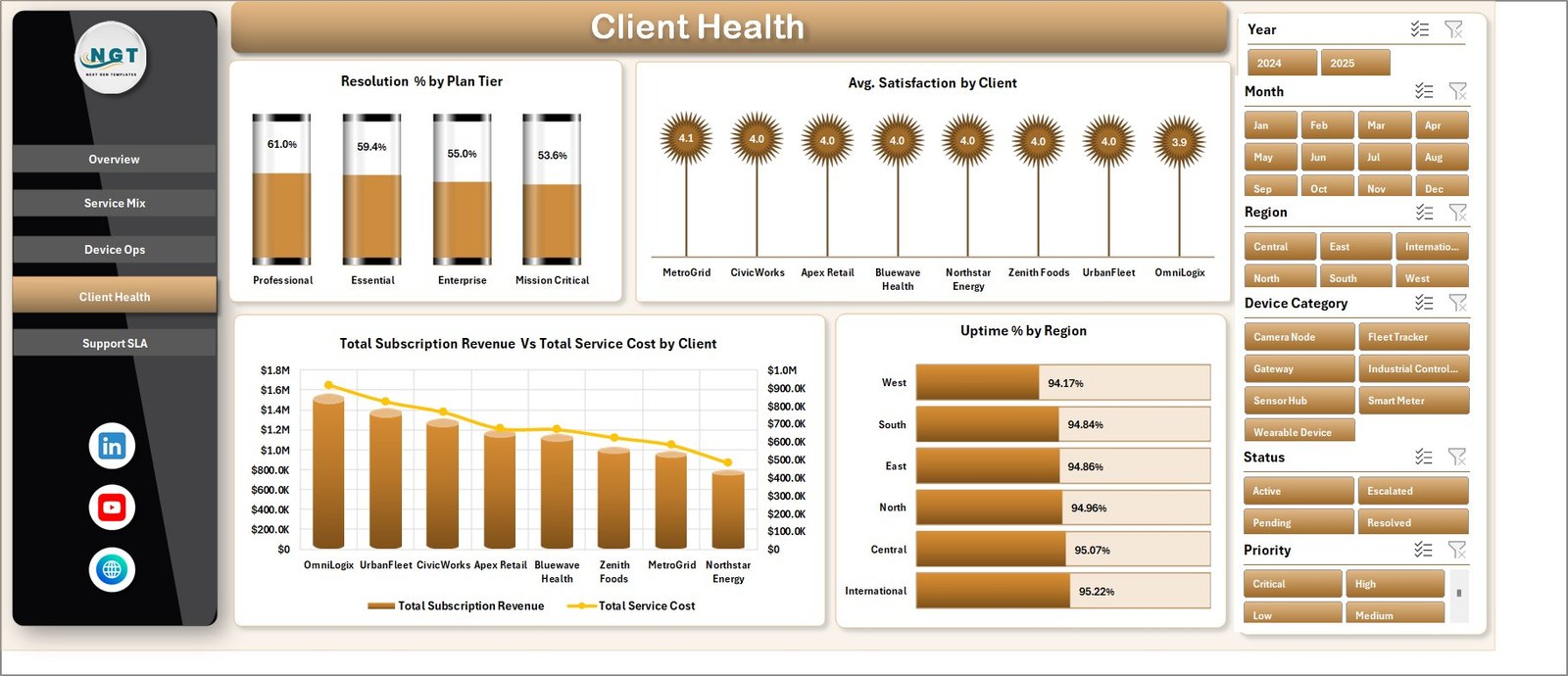
4. Client Health
The Client Health tab connects account value with service quality. It helps client success teams review which clients are profitable, which clients show lower satisfaction, and where uptime or resolution performance may affect renewals.
Resolution % by Plan Tier: This chart compares resolution performance across plan tiers. It helps teams check whether premium plans are receiving stronger service outcomes.
Avg. Satisfaction by Client: This visual ranks clients by satisfaction score. It helps account managers identify happy clients and clients who need proactive follow-up.
Total Subscription Revenue and Total Service Cost by Client: This chart compares client revenue with delivery cost. It supports renewal planning, profitability review, and cost control.
Uptime % by Region: This view compares service reliability by region. It helps operations teams spot regional reliability patterns that may affect customer experience.
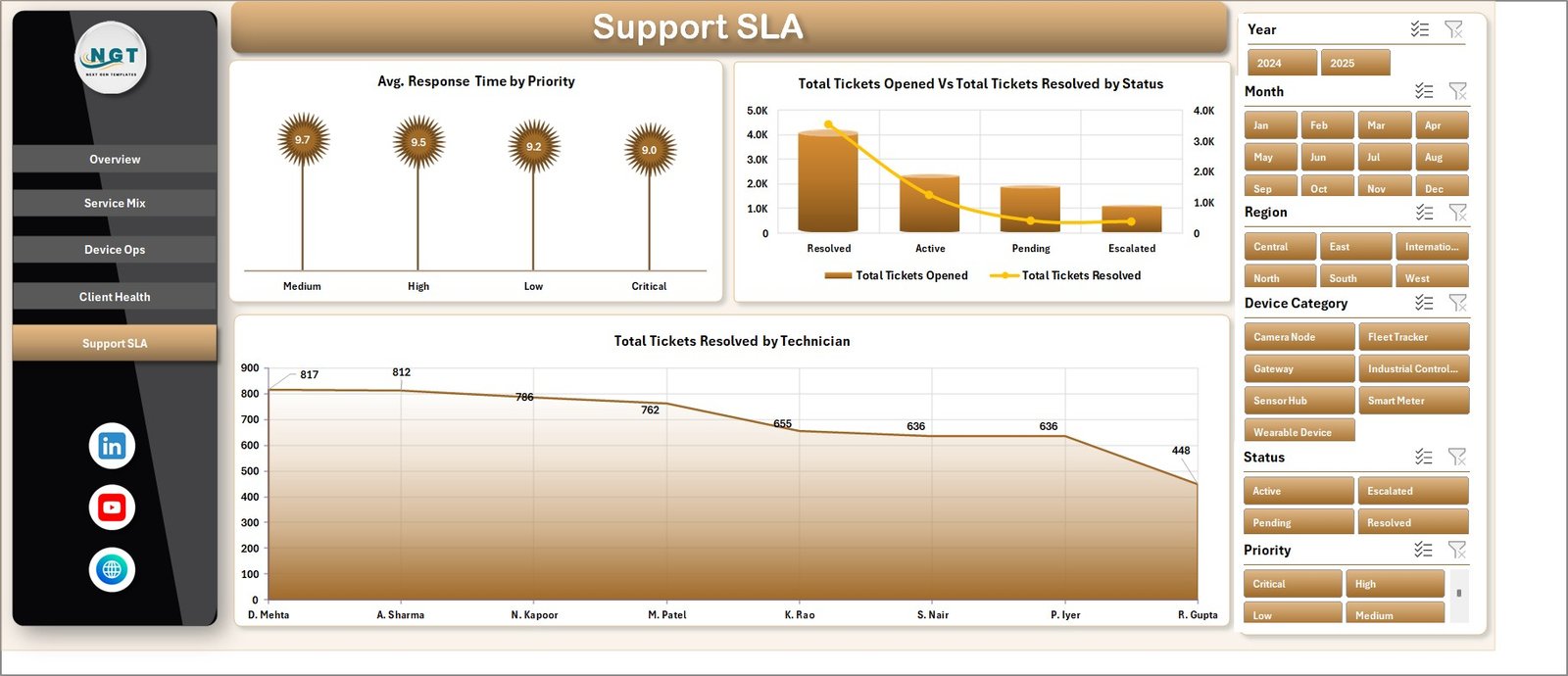
5. Support SLA
The Support SLA tab is designed for support managers who need visibility into response time, ticket status, and technician workload. It gives a practical view of whether the support team is keeping pace with service expectations.
Avg. Response Time by Priority: This chart compares response time across priority levels. It helps teams check whether urgent tickets receive faster attention than lower-priority tickets.
Total Tickets Opened and Total Tickets Resolved by Status: This chart compares open and resolved ticket activity by status. It helps support leaders review backlog, closure movement, and ticket lifecycle health.
Total Tickets Resolved by Technician: This visual compares resolution output by technician. It supports workload balancing and performance review.
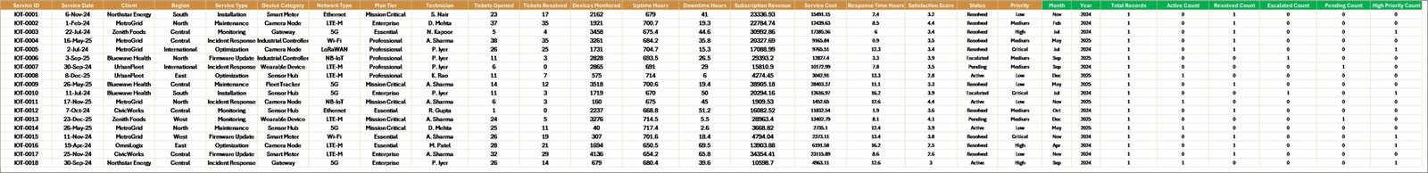
6. Data Sheet Tab
The Data Sheet is the input layer for the workbook. Users add IoT service records in the same format as the sample data. Keeping client, region, service type, network type, device category, technician, priority, status, revenue, cost, uptime, downtime, and ticket fields consistent is important because the dashboard uses pivot tables and slicers.
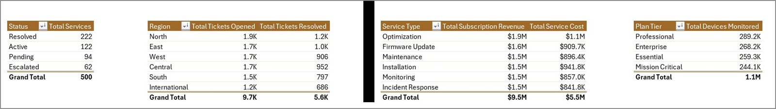
7. Support Sheet
The Support Sheet contains multiple pivot tables used to create the dashboard dynamically. After updating the Data Sheet, go to the Data tab in the Excel Ribbon and click Refresh All. The pivots and charts refresh together, and the Support Sheet can stay hidden during normal dashboard use.
IoT Services Dashboard in Excel vs. Google Sheets vs. Paid CRM/SaaS – Feature Comparison
| Feature | IoT Services Dashboard in Excel | Google Sheets alternative | Paid IoT service SaaS |
|---|---|---|---|
| Cost | $17.99 one-time | Template cost or manual build | Monthly or annual subscription |
| Platform | Microsoft Excel | Google Sheets in browser | Vendor cloud platform |
| Setup time | Replace data and refresh | Copy file and adapt formulas | Implementation and configuration |
| Real-time team collaboration | Possible with OneDrive or SharePoint | Native sharing | Usually included |
| Mobile access | Excel mobile or web for light review | Google Sheets mobile app | Vendor mobile app |
| Customizable fields | Editable workbook, charts, and pivots | Editable with permissions | Often limited by vendor settings |
| Share with link | Possible through Microsoft 365 | Native share links | Usually role-controlled |
| Year-1 cost at 5 users | $17.99 plus Excel licensing if needed | Low software cost plus setup time | Often hundreds or thousands |
| IoT service analytics | Built for revenue, cost, tickets, devices, uptime, downtime, client health, and SLA review | Must be configured | Depends on vendor module and plan |
Who Should Use This Template
This template is a good fit for IoT service providers, managed service providers, smart building teams, connected device support teams, telecom support groups, operations analysts, client success managers, and Excel users who need a practical reporting layer for device service performance.
It is not a replacement for a live device-monitoring platform, sensor gateway, ticketing system, CRM, billing system, or automated SLA engine. Use it as a reporting workbook after exporting or preparing your IoT service data.
Real-World Use Cases
Arjun, IoT operations manager: opens the Overview and Device Ops tabs before weekly operations meetings to review uptime, downtime, monitored devices, and regional coverage.
Maya, support lead: uses the Support SLA page to compare response time by priority, ticket resolution by status, and tickets resolved by technician before team reviews.
Daniel, client success manager: reviews Client Health to compare satisfaction, revenue, service cost, resolution percentage, and uptime before renewal conversations.
Advantages of IoT Services Dashboard in Excel
- It gives IoT service teams a ready reporting structure instead of a blank workbook.
- It combines financial, operational, client, and SLA performance in one file.
- It uses familiar Excel features like sheets, charts, pivots, and slicers.
- It can be edited by experienced Excel users without waiting for a software vendor.
- It works well for weekly service reviews, client health meetings, and monthly management reports.
Opportunities for Improvement
The dashboard is refresh-based, so it does not replace live telemetry, automated ticket routing, device alerts, or real-time SLA monitoring. Larger teams may want to connect Excel to a governed data source, add Power Query transformations, or publish a controlled copy through Microsoft 365. Microsoft explains how PivotTables summarize worksheet data in its documentation: Overview of PivotTables and PivotCharts.
Best Practices
- Keep service type, network type, client, region, device category, technician, status, and priority names consistent.
- Validate revenue, service cost, ticket counts, uptime, downtime, satisfaction, and response-time fields before refreshing.
- Refresh the workbook after each data update using Data, then Refresh All.
- Keep one clean backup of the original workbook before changing pivot tables or chart fields.
- Hide the Support Sheet when sharing the dashboard with users who only need analysis pages.
Explore Relevant Templates
You can download this product here: IoT Services Dashboard in Excel. You may also like Digital Twin Services Dashboard in Excel, Digital Twin Services Dashboard in Power BI, and IT Asset Management Dashboard in Power BI.
Frequently Asked Questions
What does the IoT Services Dashboard in Excel track?
It tracks subscription revenue, service cost, tickets opened, tickets resolved, devices monitored, uptime, downtime, response time, resolution percentage, satisfaction, clients, regions, technicians, plan tiers, service types, network types, and priorities.
How many worksheet tabs are included?
The workbook includes 7 tabs: Overview, Service Mix, Device Ops, Client Health, Support SLA, Data Sheet, and Support Sheet.
Do I need macros to use this dashboard?
No. The dashboard uses standard Excel sheets, pivot tables, charts, and slicers.
Can I use my own IoT service data?
Yes. Replace the sample rows in the Data Sheet with your own records while keeping the same column structure.
Can the Support Sheet be hidden?
Yes. The Support Sheet can remain hidden because it mainly stores the pivot tables that power the dashboard.
Is this a live IoT monitoring platform?
No. It is an Excel reporting dashboard, not a live sensor monitoring platform, ticketing system, or automated SLA tool.
About the Author
Built by PK – Microsoft Certified Professional with 15+ years of Excel, Google Sheets, and Power BI experience. Founder of NextGenTemplates, reaching 300K+ subscribers across YouTube channels. Every template is hand-built and tested before release.
Conclusion
The IoT Services Dashboard in Excel gives operations, support, finance, and client success teams a simple way to review IoT service performance from one workbook. Instead of managing disconnected reports, users can update the Data Sheet, refresh the workbook, and use slicers to review service mix, device operations, client health, and SLA performance.
Visit our YouTube channel for step-by-step tutorials: Youtube.com/@PK-AnExcelExpert.