Loyalty Programs Management Dashboard in Power BI is a ready-to-use PBIX report for teams that need to track loyalty cost, member engagement, points earned, active members, purchase value, redemption, satisfaction, and retention risk from one visual report. Loyalty programs often create large datasets across tiers, channels, campaigns, customer segments, regions, points, rewards, and monthly purchases. Without a dashboard, teams can miss expensive campaigns, weak engagement, low redemption, and at-risk member groups.
This Power BI dashboard gives you 5 report pages, 5 high-level cards, interactive slicers, and 16 focused charts so you can move from a high-level loyalty view into member, reward, engagement, and retention analysis quickly. You can open the PBIX file in Power BI Desktop, replace the sample data or connect your own source, and customize the report for your business.
For Power BI setup and publishing guidance, you can also refer to the official Microsoft Power BI documentation.
Loyalty Programs Management Dashboard in Power BI
Key Features of Loyalty Programs Management Dashboard in Power BI
- 5 Power BI pages: Overview, Members, Rewards, Engagement, and Retention.
- 5 KPI cards: Total Reward Cost, Engaged Members, Total Members, Active Members, and Total Points Earned.
- Interactive slicers: Apply filters and review selected loyalty program performance quickly.
- Reward cost analysis: Track reward expense by tier, campaign, and month.
- Member analysis: Compare purchase amount, redeemed members, and points earned across tiers, segments, and channels.
- Engagement reporting: Review engagement rate by program and enrollment source.
- Retention monitoring: Track at-risk members, satisfaction, and member trends by month.
- Editable PBIX file: Change visuals, fields, measures, page names, slicers, and colors in Power BI Desktop.
Dashboard Pages Explanation
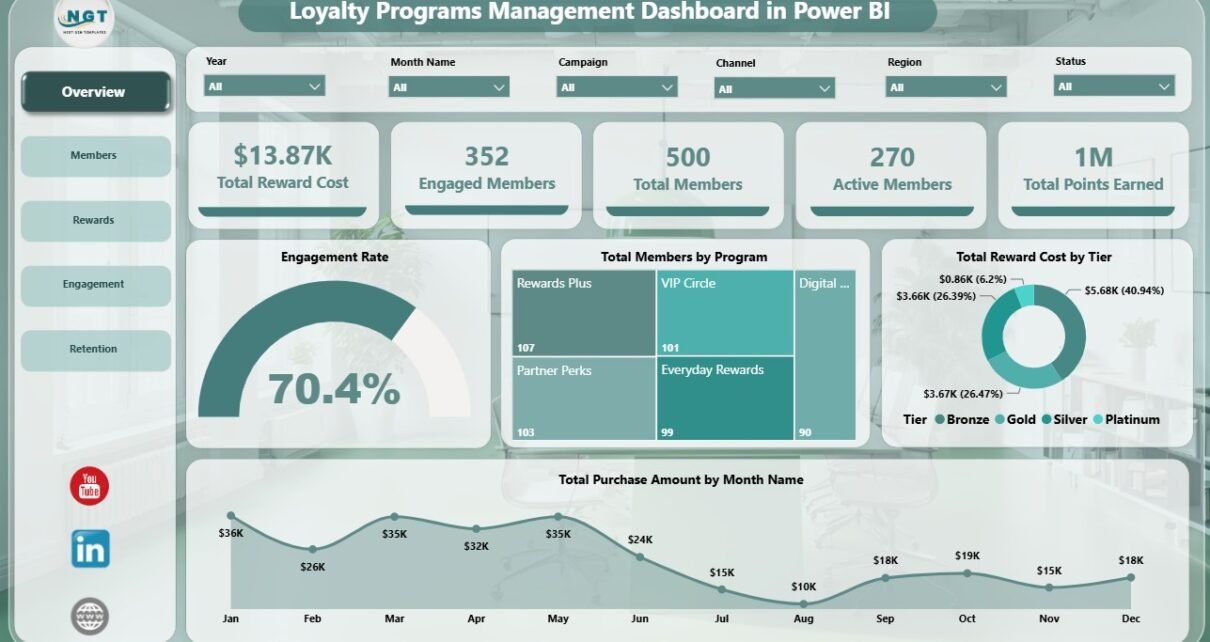
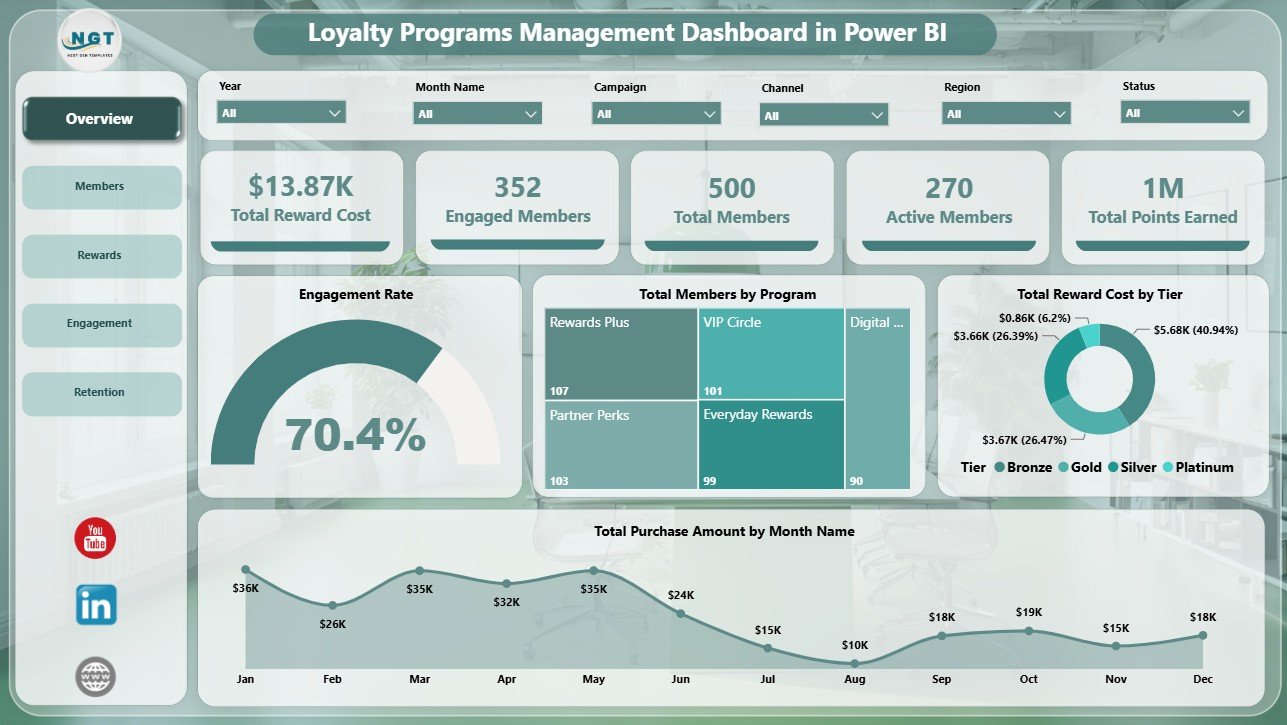
1 – Overview Page
The Overview page is designed for the first management review. At the top, KPI cards show Total Reward Cost, Engaged Members, Total Members, Active Members, and Total Points Earned. These cards help leaders understand the scale, participation, and cost of the loyalty program before reviewing detailed charts.
Engagement Rate by Selected Filters: This chart changes with slicer selections and shows the engagement rate for the filtered member group. It is useful when you want to compare loyalty performance by program, tier, channel, segment, or region.
Total Members by Program: This chart compares how many members belong to each loyalty program. It helps identify programs that have strong adoption and programs that may need better enrollment campaigns.
Total Reward Cost by Tier: This visual shows reward cost by membership tier. It helps managers understand whether premium tiers are using a balanced share of incentives or creating excessive cost pressure.
Total Purchase Amount by Month Name: This monthly trend shows loyalty-linked purchase value. It helps teams compare seasonal performance, campaign periods, and month-to-month movement.
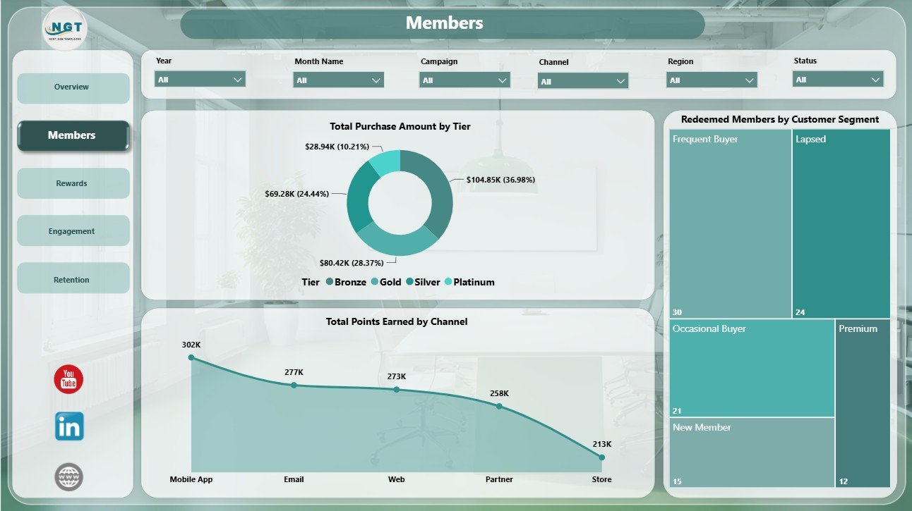
2 – Members
The Members page focuses on the customer base and the value generated by each member group.
Total Purchase Amount by Tier: This chart compares purchase amount across tiers. It helps you see whether top tiers are driving higher value or whether lower tiers need nurturing.
Redeemed Members by Customer Segment: This chart shows which customer segments are actively redeeming rewards. It helps teams understand whether offers are attracting the right segments.
Total Points Earned by Channel: This visual compares points earned across channels. It helps identify where members are most active and which channels create the highest loyalty participation.
Members
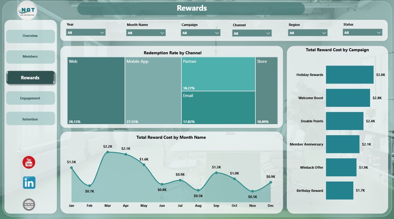
3 – Rewards
The Rewards page explains redemption activity and incentive cost. It is useful for marketers and finance teams that need to understand whether rewards are creating useful engagement.
Redemption Rate by Channel: This chart compares redemption rate across channels. It helps identify where customers are most likely to use rewards and where redemption may need support.
Total Reward Cost by Campaign: This visual compares reward cost across campaigns. It helps you review campaign budget impact and identify high-cost offers.
Total Reward Cost by Month Name: This trend tracks reward cost by month. It helps teams spot seasonal spikes, campaign-driven cost increases, and periods that need closer budget review.
Rewards
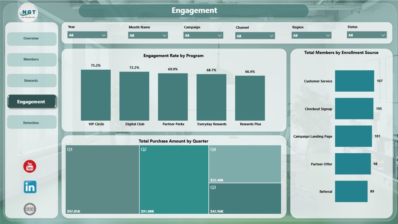
4 – Engagement
The Engagement page helps teams understand how customers join and how actively they participate after enrollment.
Engagement Rate by Program: This chart compares engagement by loyalty program. It helps identify programs with strong member interaction and programs that may need better offers, communication, or positioning.
Total Members by Enrollment Source: This chart shows where members came from. It helps teams compare acquisition sources such as online, store, referral, campaign, or partner enrollment.
Total Purchase Amount by Quarter: This chart summarizes purchase value by quarter. It helps leadership review loyalty performance across planning cycles.
Engagement
5 – Retention
The Retention page supports churn prevention, customer experience review, and segment-level retention planning.
Total Members by Month Name: This chart tracks member count by month. It helps identify growth, slowdowns, and sudden changes in member volume.
At Risk Members by Customer Segment: This chart shows which segments contain the most at-risk members. It helps teams prepare targeted win-back campaigns and retention offers.
Average Satisfaction by Region: This visual compares satisfaction across regions. It helps managers find locations or markets where loyalty experience may need improvement.
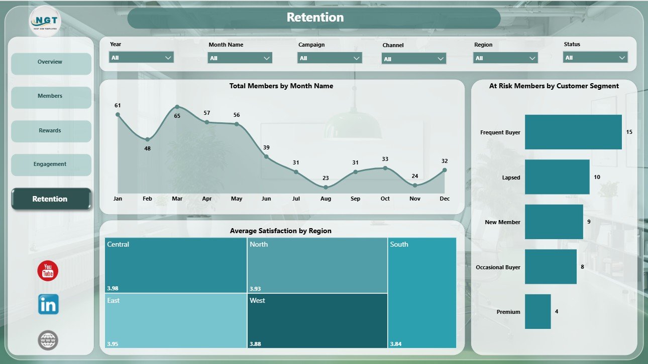
Retention
Loyalty Programs Management Dashboard in Power BI vs. Tableau vs. Paid CRM/SaaS – Feature Comparison
| Feature | This Power BI dashboard | Tableau or Qlik alternative | Paid CRM/SaaS |
|---|---|---|---|
| Cost | $17.99 one-time | License plus dashboard build time | Monthly or annual subscription |
| Platform | Power BI Desktop / Power BI Service | Tableau, Qlik, or another BI platform | Vendor-hosted loyalty or CRM suite |
| Setup time | Open PBIX, replace or connect data, refresh | Build or adapt reports | Implementation and onboarding |
| Real-time team collaboration | Available through Power BI Service when published | Available with cloud plans | Usually included |
| Mobile access | Power BI mobile after publishing | Plan dependent | Usually included |
| Customizable fields | Editable model, measures, visuals, pages, and slicers | Editable with BI skills | Depends on vendor permissions |
| Share with link | Available through Power BI Service | Available with cloud publishing | Login controlled |
| Year-1 cost at 5 users | $17.99 plus any Microsoft licensing | License and build cost dependent | Often hundreds or thousands |
| Loyalty-specific analysis | Built for reward cost, members, engagement, retention, satisfaction, and campaigns | Must be built | Depends on module and plan |
Who Should Use This Template
This template is ideal for loyalty program managers, CRM analysts, retail marketing teams, e-commerce operators, customer success leaders, business analysts, and consultants who need repeatable Power BI reporting for loyalty programs.
It is especially useful when your team already exports loyalty data from a CRM, POS, e-commerce platform, spreadsheet, or database and wants to analyze that data visually in Power BI.
Real-World Use Cases
Anika, loyalty marketing manager: reviews reward cost, engaged members, redemption rate, and purchase trend before monthly campaign meetings.
Rahul, CRM analyst: uses the Members and Retention pages to identify at-risk customer segments and prepare win-back recommendations.
Maria, retail operations leader: compares engagement by program, enrollment source, satisfaction by region, and purchase amount by quarter before planning the next loyalty budget.
Advantages of Loyalty Programs Management Dashboard in Power BI
- It gives leadership a quick view of cost, members, activity, and points earned.
- It separates loyalty reporting into practical pages instead of one crowded dashboard.
- It supports slicer-based exploration across program, tier, channel, segment, region, campaign, and period.
- It is editable, so Power BI users can adapt the model and visuals to their own data.
- It uses a one-time template purchase instead of adding another reporting subscription.
Opportunities for Improvement
This template is a reporting dashboard, so it does not run reward campaigns, send emails, issue coupons, or update live member accounts by itself. To get the best results, users should connect clean loyalty data with consistent fields for programs, tiers, channels, points, purchases, rewards, segments, regions, and dates.
Advanced teams may also add custom DAX measures, live data connections, RLS security, scheduled refresh, or additional pages for cohort analysis, customer lifetime value, and churn prediction.
Best Practices
- Keep member IDs, campaign names, tier names, and channel names consistent.
- Refresh the report after replacing or connecting source data.
- Validate reward cost and points earned against your source system before presenting.
- Use slicers during review meetings to focus on one program, tier, or segment at a time.
- Publish to Power BI Service only after checking access permissions and data privacy rules.
Explore Relevant Templates
You can download the Loyalty Programs Management Dashboard in Power BI from NextGenTemplates. You can also explore more Power BI dashboard templates and related retail/customer templates such as the General Store POS Web App.
Frequently Asked Questions
What is included in this Power BI dashboard?
It includes 5 Power BI pages: Overview, Members, Rewards, Engagement, and Retention, with KPI cards, slicers, and loyalty analysis charts.
What software do I need?
You need Power BI Desktop to open and edit the PBIX file. Power BI Desktop is available from Microsoft.
Can I use my own loyalty data?
Yes. You can replace the sample dataset or connect the report to your own loyalty data source, then refresh the visuals.
Does it replace CRM software?
No. It is a reporting dashboard, not a CRM, customer database, campaign automation tool, or rewards engine.
Can I customize the visuals?
Yes. You can edit visuals, colors, measures, fields, slicers, and report pages inside Power BI Desktop.
Can this be used for management reporting?
Yes. The Overview, Rewards, Engagement, and Retention pages are designed for regular loyalty performance reviews.
About the Author
Built by PK – Microsoft Certified Professional with 15+ years of Excel, Google Sheets, and Power BI experience. Founder of NextGenTemplates, reaching 300K+ subscribers across YouTube channels. Every template is hand-built and tested before release.
Conclusion
The Loyalty Programs Management Dashboard in Power BI gives teams a practical way to monitor loyalty rewards, members, points, purchase value, engagement, and retention without creating every page from scratch. It is best for teams that already have loyalty data and want a flexible PBIX report for monthly review, campaign analysis, and customer retention planning.
For more tutorials, visit PK An Excel Expert on YouTube.