The Micro-Mobility Platforms Dashboard in Excel helps shared scooter, bike-share, e-bike, and urban mobility teams turn trip, rider, fleet, market, and cost records into clear performance reporting. The workbook includes 7 sheet tabs, 4 executive KPI cards, 21 chart views, multiple slicers, a structured Data Sheet, and a Support Sheet built around pivot tables. For teams comparing one $17.99 Excel template against recurring software or a custom dashboard build, it gives a practical reporting layer that can be updated with exported data and refreshed from the Excel Data ribbon.
Micro-mobility operators often need to answer urgent questions quickly: which city is profitable, which vehicle type has better margin, which platform source drives operating cost, and whether trips are growing faster than expenses. This dashboard brings those views into one editable workbook.
Download the Micro-Mobility Platforms Dashboard in Excel
Key Features of Micro-Mobility Platforms Dashboard in Excel
- 7 worksheet tabs: Overview, Market, Fleet, Riders, Trend, Data Sheet, and Support Sheet.
- 4 high-level cards: Total Revenue, Contribution Profit Value, Total Trips, and Total Operating Cost.
- 21 chart views: Analyze profit margin, revenue, trips, operating cost, incidents, rider rating, city, platform, zone, plan type, vehicle type, and monthly trends.
- Multiple slicers: Filter dashboard pages quickly by available fields so users can move from total performance to focused segments.
- Refreshable pivot structure: Update the Data Sheet, then use Refresh All in Excel to update pivots and charts.
- Editable Excel design: Users can adjust labels, chart formatting, slicers, pivot fields, and source records if they are comfortable with Excel.
Dashboard Pages Explanation
1 – Overview Page
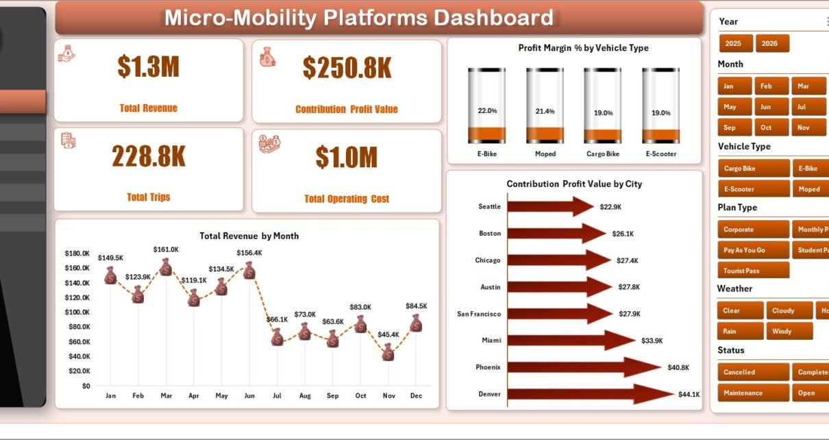
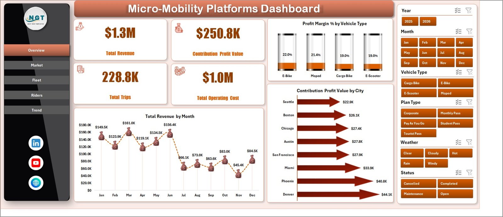
The Overview Page is the high-level dashboard sheet. At the top, it shows Total Revenue, Contribution Profit Value, Total Trips, and Total Operating Cost so leaders can review commercial health before drilling into city, fleet, rider, or trend pages.
Profit Margin % by Vehicle Type: This chart compares margin across vehicle types such as scooters, bikes, e-bikes, or other fleet categories. It helps managers understand which asset groups are creating healthier unit economics.
Contribution Profit Value by City: This chart ranks cities by contribution profit. It helps identify profitable markets, weak cities, and locations that may need pricing, rebalancing, or cost review.
Total Revenue by Month: This monthly trend shows how revenue changes over time. It is useful for spotting seasonality, campaign effects, market maturity, or demand dips.
2 – Market
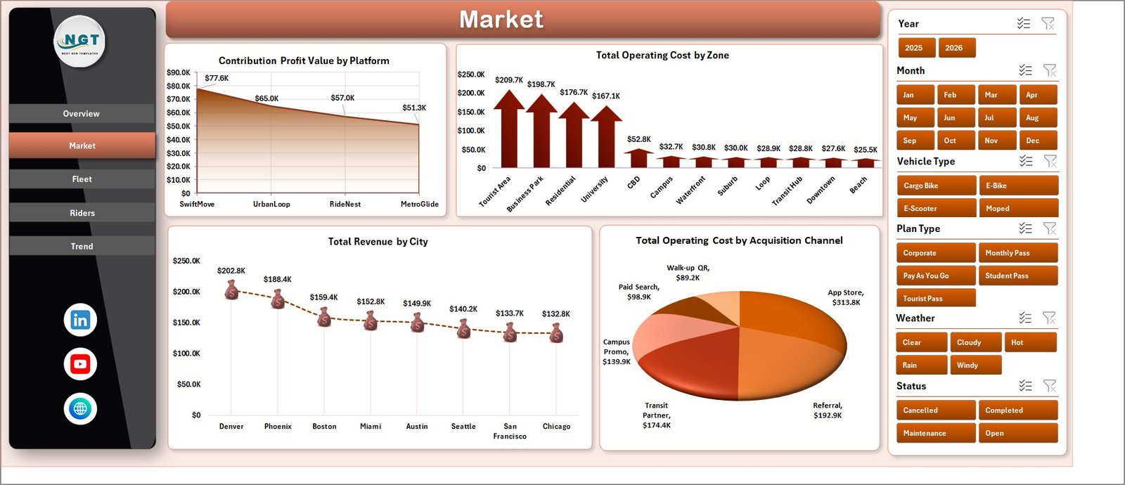
The Market sheet focuses on platform, zone, city, and acquisition channel analysis. It gives operations, finance, and growth teams a market-facing view of where value is created and where operating cost is concentrated.
Contribution Profit Value by Platform: This chart compares profit contribution by platform source. It helps teams see which service channel, partner, or app source performs best after cost.
Total Operating Cost by Zone: This chart shows cost by operating zone. It helps identify areas where maintenance, charging, parking, staffing, or rebalancing may be pushing costs higher.
Total Revenue by City: This chart compares revenue across cities. It helps market managers separate high-volume cities from weaker markets that need attention.
Total Operating Cost by Acquisition Channel: This chart connects acquisition channels to operating cost. It helps growth teams evaluate whether rider acquisition sources are linked with profitable operations.
3 – Fleet
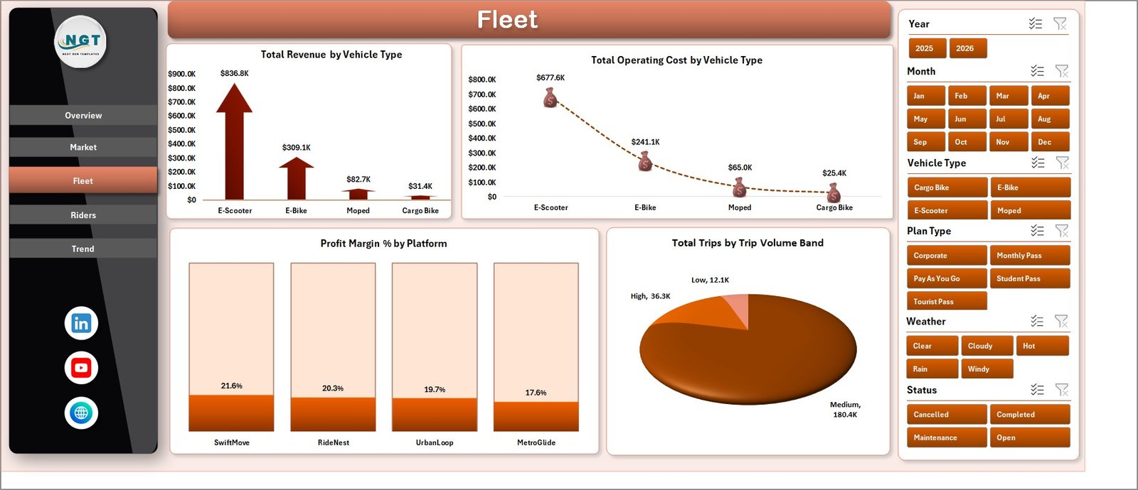
The Fleet sheet reviews fleet mix, platform margin, operating cost, and trip volume bands. It is useful for fleet managers deciding which vehicle types deserve more deployment, maintenance focus, or replacement planning.
Total Revenue by Vehicle Type: This chart compares revenue generated by vehicle category. It helps teams see whether scooters, bikes, e-bikes, or other modes are driving the strongest sales.
Total Operating Cost by Vehicle Type: This chart shows which vehicle types create higher operating cost. It supports decisions around repair cycles, charging strategy, and fleet allocation.
Profit Margin % by Platform: This chart compares margin by platform. It helps identify where fees, incentives, or channel behavior may be reducing profitability.
Total Trips by Trip Volume Band: This chart groups trips into volume bands. It makes demand intensity easier to understand during weekly or monthly operations reviews.
4 – Riders
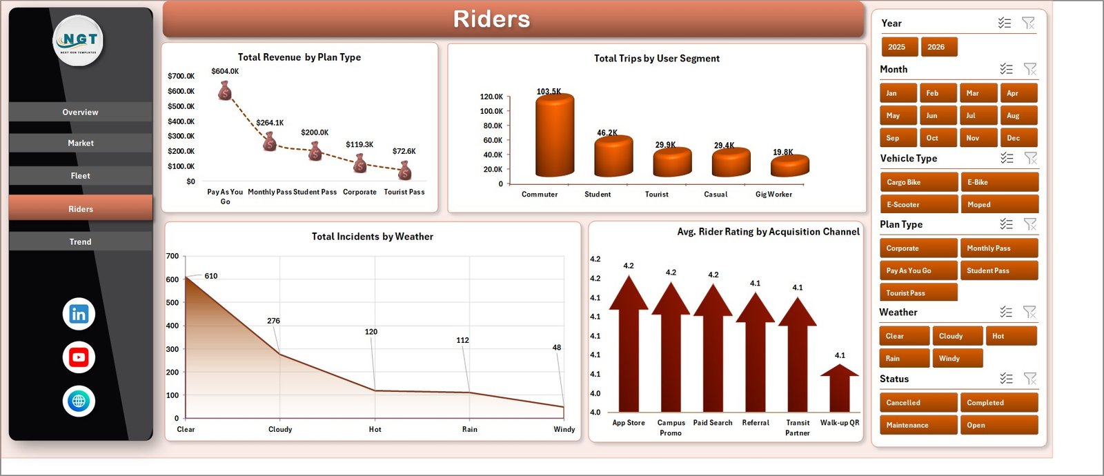
The Riders sheet analyzes revenue by plan type, trip behavior by user segment, incident count by weather, and rider rating by acquisition channel. It connects commercial performance with rider experience and safety context.
Total Revenue by Plan Type: This chart compares plan-based revenue. It helps teams see whether subscriptions, passes, or pay-as-you-go activity contribute more to revenue.
Total Trips by User Segment: This chart shows trip volume by user segment. It helps distinguish commuter, casual, tourist, student, or other rider behavior if those segments are present in the data.
Total Incidents by Weather: This chart connects incident count with weather conditions. It helps operations teams review safety risk during rain, heat, cold, or poor visibility.
Avg. Rider Rating by Acquisition Channel: This chart compares rider satisfaction by acquisition source. It helps growth teams understand whether some channels bring users with better or worse service experience.
5 – Trend
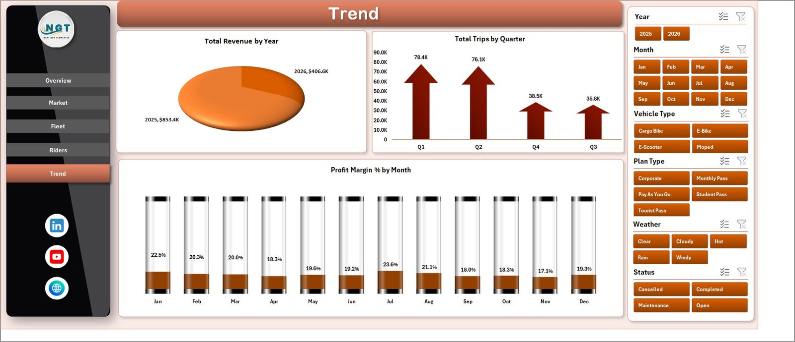
The Trend sheet is built for time-based review. It shows annual revenue, quarterly trips, and monthly profit margin so managers can separate short-term noise from longer-term movement.
Total Revenue by Year: This chart shows year-level revenue movement. It helps leadership understand whether the business is expanding, flat, or contracting over time.
Total Trips by Quarter: This chart tracks quarterly trip demand. It helps teams review seasonal ridership and compare operating periods.
Profit Margin % by Month: This chart tracks monthly margin. It helps identify months where cost, incentives, or demand patterns affected profitability.
6 – Data Sheet Tab
The Data Sheet is where users add or replace source records. Keep the same column order and format so the KPI cards, pivots, slicers, and charts continue working correctly after refresh.

7 – Support Sheet
The Support Sheet contains the pivot tables used to create the dashboard dynamically. After updating the Data Sheet, go to the Excel Data ribbon and click Refresh All. All pivot tables and charts refresh together. You can keep this sheet hidden before sharing the workbook with end users.

Micro-Mobility Platforms Dashboard in Excel vs. Google Sheets vs. Paid Fleet SaaS – Feature Comparison
| Feature | This Excel dashboard | Google Sheets alternative | Paid fleet SaaS |
|---|---|---|---|
| Cost | One-time template purchase | Low software cost plus setup time | Recurring subscription |
| Platform | Microsoft Excel | Browser-based spreadsheet | Vendor cloud platform |
| Setup time | Replace data and refresh pivots | Import data and test formulas | Implementation, training, and onboarding |
| Real-time team collaboration | Available through OneDrive or SharePoint | Native collaboration | Usually included |
| Mobile access | Excel mobile or web for light review | Google Sheets mobile app | Vendor app or browser |
| Customizable fields | Editable sheets, pivots, charts, labels, and slicers | Editable with formula control | Limited by vendor permissions |
| Share with link | Possible through Microsoft 365 sharing | Native link sharing | Role-based sharing |
| Year-1 cost at 5 users | Template price plus Microsoft licensing if needed | Workspace cost plus setup time | Often hundreds or thousands |
| Micro-mobility reporting | Revenue, profit, trips, cost, platform, rider, fleet, and trends | Must be built or adapted | Depends on modules purchased |
Who Should Use This Template
This template is useful for micro-mobility operators, scooter rental businesses, bike-share companies, e-bike services, city operations managers, fleet supervisors, finance analysts, growth teams, consultants, and founders who need a structured Excel dashboard for exported operating data.
It is best when your source records are already available in a spreadsheet or export file. It is not a GPS system, live telematics platform, payment gateway, rider app, dispatch system, or maintenance ticketing tool.
Real-World Use Cases
Anika, city operations manager: uses the Market sheet to compare operating cost by zone and revenue by city before adjusting vehicle rebalancing coverage.
Marcus, finance lead: uses the Fleet sheet to compare profit margin by vehicle type and platform before monthly budget reviews.
Priya, growth analyst: reviews revenue by plan type, rider rating by acquisition channel, and trips by user segment to understand whether growth quality is improving.
Advantages of Micro-Mobility Platforms Dashboard in Excel
- Fast setup: Replace sample records, refresh pivots, and start reviewing dashboard pages.
- No recurring dashboard subscription: It is a downloadable Excel workbook.
- Editable analysis structure: Excel users can adjust pivots, fields, slicers, chart formatting, and labels.
- Focused shared mobility metrics: The workbook is built around revenue, contribution profit, trip volume, operating cost, riders, cities, platforms, zones, and vehicle types.
- Useful for recurring reporting: The page structure supports weekly operations reviews and monthly performance reports.
Opportunities for Improvement
The dashboard depends on clean input data. If city, platform, vehicle type, zone, or acquisition channel names are inconsistent, the pivots may split similar records into separate categories. A controlled data-entry process or standardized export will improve reporting quality.
The workbook also does not connect live to scooters, locks, riders, chargers, or payment systems. It works best as an analysis layer after operational data has been exported from your source systems.
Best Practices
- Keep Data Sheet column headers unchanged unless you also update the supporting pivots.
- Use consistent names for city, zone, platform, vehicle type, plan type, and acquisition channel.
- Refresh the workbook after every major data update.
- Review profit and cost together, not revenue alone.
- Hide the Support Sheet before sharing the workbook with non-technical users.
- When collaborating through Microsoft 365, follow Microsoft guidance for safe Excel co-authoring: collaborate on Excel workbooks.
Explore Relevant Templates
You can download the product draft here: Micro-Mobility Platforms Dashboard in Excel.
Related templates include EV Fleet Dashboard in Google Sheets, Last-mile Delivery Dashboard in Power BI, and Logistics Management System Web App.
Frequently Asked Questions
What is included in the Micro-Mobility Platforms Dashboard in Excel?
The workbook includes Overview, Market, Fleet, Riders, Trend, Data Sheet, and Support Sheet tabs with KPI cards, slicers, charts, source data, and pivot support tables.
Can I use my own micro-mobility data?
Yes. Replace the sample records in the Data Sheet with your own data in the same format, then click Refresh All.
Does the dashboard require macros?
No. The dashboard is based on Excel tables, pivot tables, charts, and slicers.
Can I customize the dashboard pages?
Yes. You can edit page names, labels, chart styles, pivot fields, slicers, and source columns if you are comfortable with Excel.
Is this a replacement for fleet management software?
No. It is a reporting dashboard, not a telematics, dispatch, lock-control, payment, or work-order system.
Which version of Excel should I use?
Use a modern desktop version of Microsoft Excel for best pivot refresh and slicer performance.
About the Author
Built by PK – Microsoft Certified Professional with 15+ years of Excel, Google Sheets, and Power BI experience. Founder of NextGenTemplates, reaching 300K+ subscribers across YouTube channels. Every template is hand-built and tested before release.
Conclusion
Micro-mobility performance can change quickly across cities, vehicle types, rider groups, and acquisition channels. The Micro-Mobility Platforms Dashboard in Excel gives operators a practical way to convert structured records into clear reporting pages for revenue, trips, contribution profit, operating cost, incidents, rider ratings, and trend analysis. Update the Data Sheet, refresh the workbook, and use the dashboard to make city, fleet, market, and rider decisions with less manual reporting effort.
For more Excel tutorials and dashboard examples, visit PK An Excel Expert on YouTube.