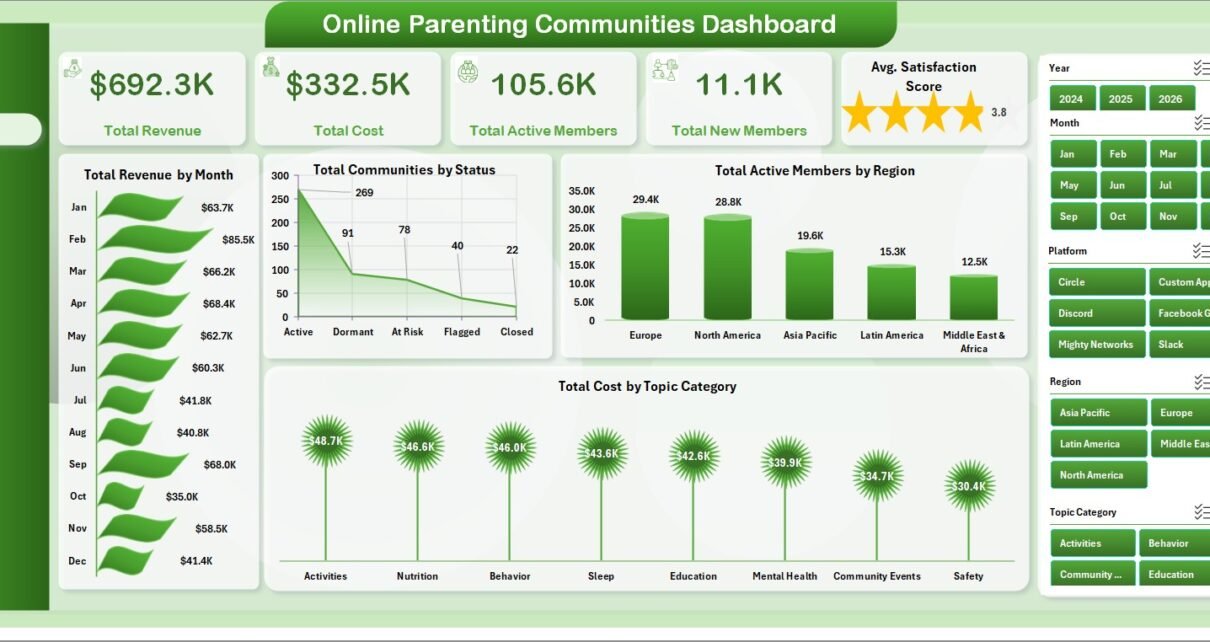
Online Parenting Communities Dashboard in Excel is built for teams that manage online parenting groups, membership communities, family-support programs, and parent education platforms. Community teams often track revenue, costs, member growth, engagement, satisfaction, risk, retention, and moderation in separate exports. This Excel dashboard brings those measures into one workbook with 7 worksheet tabs, 5 KPI cards, multiple slicers, 20 chart views, a structured Data Sheet, and a Support Sheet powered by pivot tables.
The goal is simple: replace manual monthly reporting with a repeatable Excel workflow. Add your data in the same format, click Refresh All, and use slicers to review parenting community performance by region, country, platform, membership tier, topic category, moderator, risk level, parent segment, child age group, and acquisition channel.
Key Features of Online Parenting Communities Dashboard in Excel
- 7 worksheet tabs: Overview, Engagement, Membership, Moderation, Regional, Data Sheet, and Support Sheet.
- 5 headline cards: Total Revenue, Total Cost, Total Active Members, Total New Members, and Avg. Satisfaction Score.
- 20 chart views: Track revenue, cost, posts, active members, communities, contribution, retention, and satisfaction.
- Interactive slicers: Filter dashboard views quickly without rebuilding formulas.
- Editable data structure: Replace sample records in the Data Sheet and keep the same column format.
- Pivot-powered support layer: Refresh all pivots and charts from Excel’s Data tab.
- No subscription: Use the workbook as a one-time Excel reporting template.
Dashboard Pages Explanation
1. Overview Page
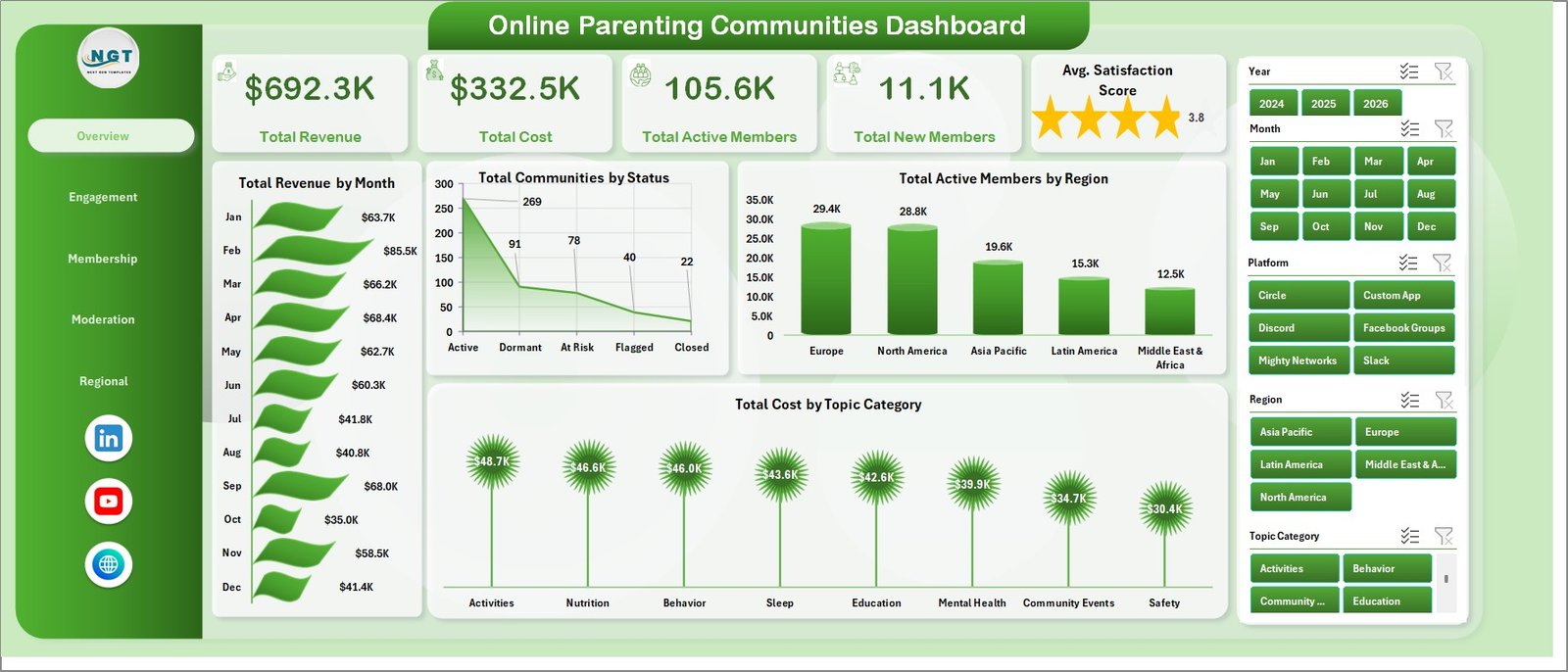
The Overview page is the executive summary for the workbook. It shows Total Revenue, Total Cost, Total Active Members, Total New Members, and Avg. Satisfaction Score at the top so managers can review the health of the community portfolio quickly.
Total Revenue by Month: This chart shows monthly revenue movement for the parenting community program. Use it to spot growth, seasonality, campaign lift, or months where membership revenue slowed.
Total Communities by Status: This chart groups communities by status, such as active, inactive, pending, or at-risk. It helps leaders see whether the overall community base is healthy or needs operational follow-up.
Total Active Members by Region: This chart compares active member counts across regions. It helps identify where parent engagement is strongest and where local outreach, content, or moderation support may be needed.
Total Cost by Topic Category: This chart shows cost by parenting topic category. It helps teams understand which topics require more resources, moderator time, content investment, or platform spend.
2. Engagement
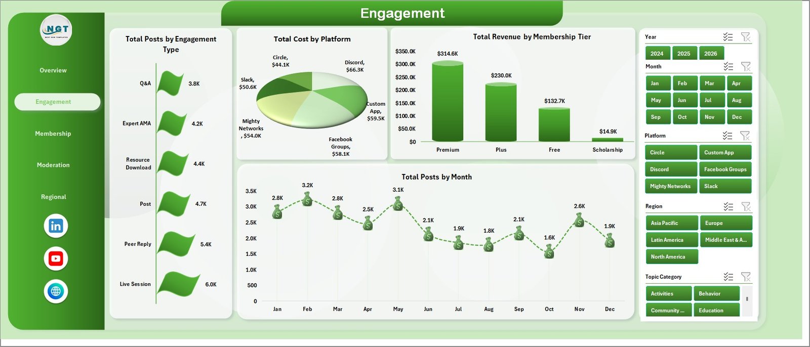
The Engagement sheet focuses on member activity and platform performance. It is useful for community managers who need to understand posting behavior, platform costs, membership-tier value, and monthly participation trends.
Total Posts by Engagement Type: This chart compares post volume by engagement type. It helps reveal whether members are asking questions, sharing experiences, replying to others, or participating in guided discussions.
Total Cost by Platform: This chart shows cost by platform. It helps teams compare where hosting, tools, ads, or community operations are using the most budget.
Total Revenue by Membership Tier: This chart compares revenue generated by each membership tier. It is useful for pricing reviews, upgrade planning, and understanding whether premium tiers are carrying enough value.
Total Posts by Month: This trend tracks monthly posting activity. It helps identify engagement spikes, quiet months, and the effect of campaigns, events, or seasonal parenting topics.
3. Membership
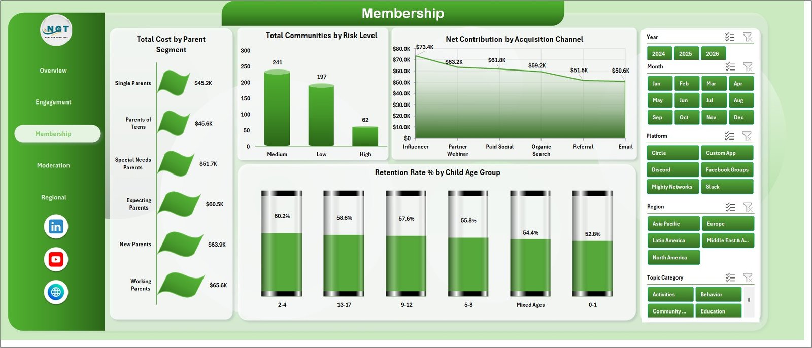
The Membership sheet explains member mix, retention, acquisition quality, and risk. It is especially useful for membership leads who want to compare parent segments, child age groups, acquisition sources, and community risk levels.
Total Cost by Parent Segment: This chart compares cost across parent segments. It helps identify which segments require more support, content, onboarding, or moderation effort.
Total Communities by Risk Level: This chart groups communities by risk level. It helps managers monitor which communities may need attention before member experience or retention declines.
Net Contribution by Acquisition Channel: This chart compares contribution by source channel. It helps reveal which acquisition channels bring members who create stronger revenue after cost.
Retention Rate % by Child Age Group: This chart compares retention by child age group. It helps identify life-stage segments where parents remain engaged or where extra support may be needed.
4. Moderation
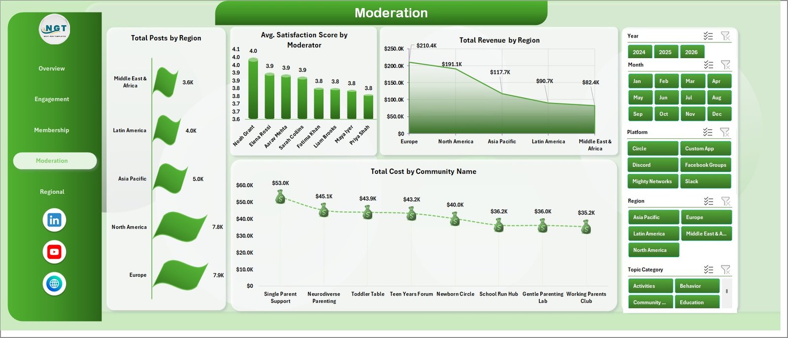
The Moderation sheet helps teams connect member activity, satisfaction, cost, and revenue to moderation decisions. It is helpful for reviewing moderator performance, regional posting load, and community-level cost pressure.
Total Posts by Region: This chart compares post volume by region. It helps moderation teams understand where member activity is highest and where coverage may need to be adjusted.
Avg. Satisfaction Score by Moderator: This chart compares satisfaction score by moderator. It supports coaching, staffing, and quality review conversations without relying only on anecdotal feedback.
Total Revenue by Region: This chart shows revenue by region. It helps compare commercial performance with engagement and moderation workload in the same dashboard area.
Total Cost by Community Name: This chart identifies which communities carry the highest cost. It helps managers investigate whether cost is linked to scale, topic complexity, moderation intensity, or platform needs.
5. Regional
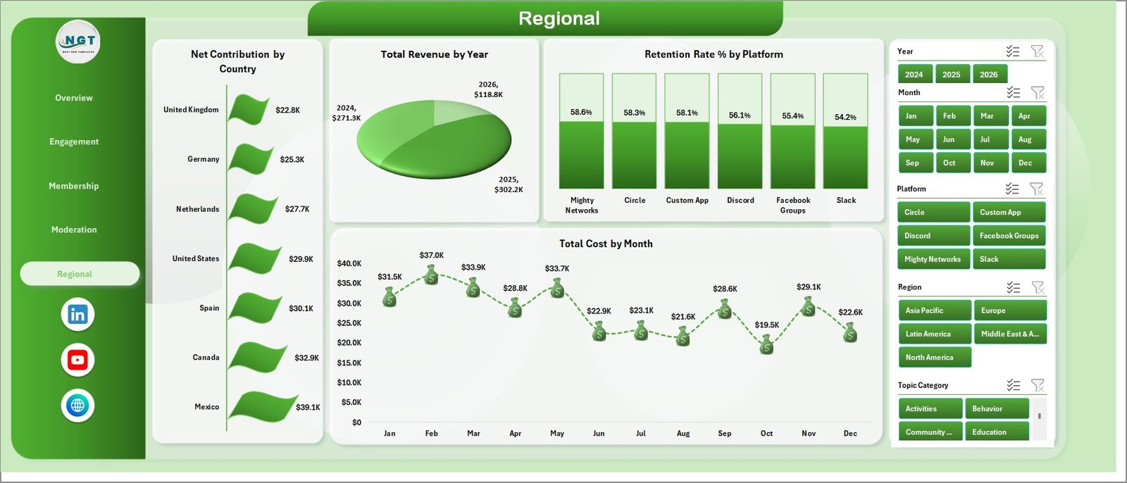
The Regional sheet focuses on country, year, platform, and month-level performance. It is useful for leaders who need to compare contribution, retention, revenue, and cost across geographies and time periods.
Net Contribution by Country: This chart compares net contribution by country. It helps identify markets where the parenting community model is financially strongest after costs.
Total Revenue by Year: This chart shows revenue across years. It helps leadership review long-term growth and compare annual performance without manually building a trend report.
Retention Rate % by Platform: This chart compares retention across platforms. It helps teams understand whether certain platforms support stronger member loyalty than others.
Total Cost by Month: This chart shows monthly cost movement. It helps budget owners spot cost spikes, seasonal spending, or months that require deeper review.
6. Data Sheet Tab
The Data Sheet is the input layer of the workbook. Add your parenting community records in the same format as the sample data so the pivots, slicers, cards, and charts continue to update correctly.

7. Support Sheet
The Support Sheet contains the pivot tables that power the dashboard. After updating the Data Sheet, go to the Data tab in the Excel Ribbon and click Refresh All. Microsoft also notes that PivotTables can be refreshed from the Data tab when the source data changes: Microsoft Learn answer on refreshing PivotTables. You can keep the Support Sheet hidden during normal use.

Online Parenting Communities Dashboard in Excel vs. Google Sheets vs. Paid Community SaaS – Feature Comparison
| Feature | This Excel Dashboard | Google Sheets Alternative | Paid Community SaaS |
|---|---|---|---|
| Cost | One-time template purchase | Low cost, but may need manual build | Monthly or annual subscription |
| Platform | Microsoft Excel | Browser-based spreadsheet | Vendor cloud platform |
| Setup time | Replace data and refresh | Build or adapt formulas and charts | Implementation and onboarding |
| Real-time team collaboration | Available through OneDrive or SharePoint | Built in | Usually included |
| Mobile access | Possible through Excel mobile or cloud storage | Built in | Usually included |
| Customizable fields | Editable workbook structure | Editable sheet structure | Depends on vendor settings |
| Share with link | Use OneDrive or SharePoint | Built in | Login controlled |
| Year-1 cost at 5 users | Template cost plus existing Excel licensing | Usually low | Often much higher |
| Parenting-specific reporting | Built around parenting communities | Requires custom setup | Depends on platform exports |
Who Should Use This Template
This dashboard is a good fit for parenting community managers, family support organizations, online education programs, membership teams, community moderation leads, parent coaching businesses, content teams, and analysts who already use Excel for reporting. It is best when your data can be exported or maintained in a structured table.
It is not a replacement for a live community app, messaging system, payment processor, automated moderation platform, or CRM. If your team needs real-time member management, use a dedicated platform and use this workbook for periodic reporting.
Real-World Use Cases
Weekly community review: A community manager filters the Overview and Engagement pages to review active members, new members, posts, revenue, and satisfaction before a weekly team meeting.
Membership planning: A membership lead uses the Membership page to compare parent segments, child age groups, acquisition channels, and retention rate before planning campaigns.
Moderation planning: A moderation lead reviews posts by region, satisfaction by moderator, and cost by community to decide where staffing or training support is needed.
Advantages of Online Parenting Communities Dashboard in Excel
- It keeps financial, engagement, membership, moderation, and regional views in one workbook.
- It uses familiar Excel features, so most teams can update it without a new platform rollout.
- It supports quick filtering through slicers for faster review meetings.
- It separates the editable Data Sheet from the Support Sheet that powers the dashboard.
- It gives teams a repeatable structure for monthly or weekly parenting community reporting.
Opportunities for Improvement
The dashboard depends on clean data, consistent headers, and a refresh workflow. It does not connect directly to every community platform, and it does not replace a live analytics API. Teams with very large datasets may eventually want Power BI, a database, or a direct reporting pipeline. For Excel-based reporting, however, this workbook gives a practical starting point that can be customized over time.
Best Practices
- Keep the same column headers in the Data Sheet.
- Validate date, revenue, cost, member count, and satisfaction fields before refreshing.
- Use consistent names for platforms, regions, topic categories, and membership tiers.
- Refresh all pivot tables after every data update.
- Hide the Support Sheet after setup to keep the workbook clean for end users.
- Save a backup copy before making major structural changes.
Explore Relevant Templates
- Online Parenting Communities Dashboard in Excel
- Online Fitness Communities Dashboard in Excel
- Online Certification Providers Dashboard in Excel
- Childcare Services Dashboard in Excel
- Browse Excel Dashboard Templates
Frequently Asked Questions
What is included in the Online Parenting Communities Dashboard in Excel?
The workbook includes Overview, Engagement, Membership, Moderation, Regional, Data Sheet, and Support Sheet tabs, plus KPI cards, slicers, charts, and pivot tables.
Can I use my own data?
Yes. Replace the sample records in the Data Sheet while keeping the same format, then refresh the workbook.
Do I need macros?
No. The workflow uses Excel tables, pivot tables, slicers, charts, and Refresh All.
Can the Support Sheet be hidden?
Yes. The Support Sheet contains pivot tables and can remain hidden after setup.
Can this work for multiple parenting communities?
Yes. The dashboard is designed to compare multiple communities by status, region, country, platform, topic, moderator, membership tier, and other dimensions.
Can I customize the charts?
Yes. Because it is an Excel workbook, you can edit chart types, labels, colors, formulas, pivots, slicers, and sheet names.
About the Author
Built by PK – Microsoft Certified Professional with 15+ years of Excel, Google Sheets, and Power BI experience. Founder of NextGenTemplates, reaching 300K+ subscribers across YouTube channels. Every template is hand-built and tested before release.
Conclusion
The Online Parenting Communities Dashboard in Excel gives parenting community teams a clear way to review revenue, cost, active members, new members, satisfaction, engagement, membership, moderation, and regional trends from one workbook. Update the Data Sheet, refresh the pivots, and use the dashboard pages to make faster, more consistent decisions.
For more Excel tutorials and dashboard ideas, visit PK: An Excel Expert on YouTube.