Most theatre reporting packs are a stack of numbers with no verdict attached. Box office was 486,556 – good or bad? Occupancy was 60.5% – is that where it should be? The Theater Management KPI Dashboard in Power BI exists to answer that question before anyone has to ask it. It is a KPI scorecard: pick a month, and every metric arrives already judged against target, colour-coded red, amber or green, with the month-on-month direction and a 12-month sparkline sitting on the same row.
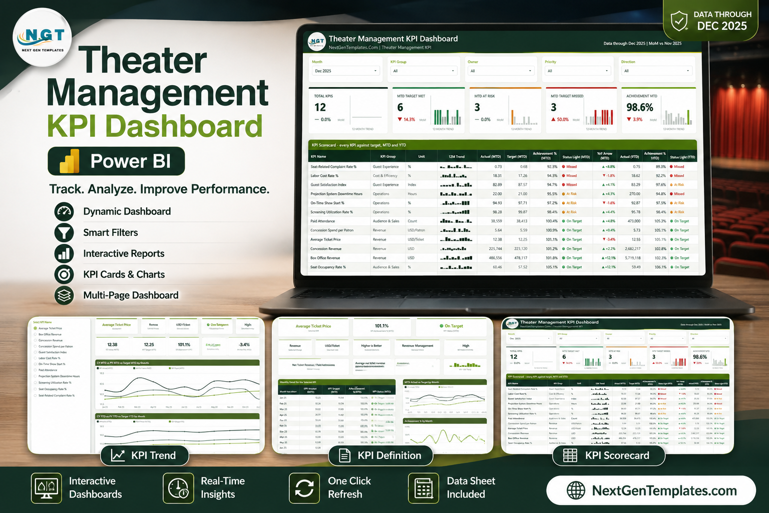
This walkthrough covers what is on each of the four pages, how the scorecard logic works, and how to swap the sample data for your own venue’s numbers.
Scorecard, Not Analytical Dashboard
It is worth being precise about what this template is, because near-identically named products exist in both families.
An analytical dashboard is built for exploration. You slice revenue by film, by screen, by showtime, by day part, and you go looking for the reason behind a number. It is the right tool between meetings.
A KPI scorecard is built for accountability. It has a fixed list of metrics, each with an owner, a target and a tolerance band, and its whole job is to tell you every month which ones landed and which ones did not. It is the right tool in the meeting.
This template is the second kind. If your monthly management pack is the pain point, start here. If you need to interrogate transaction-level data, an analytical Power BI dashboard is the companion, not the substitute.
Page 1: The KPI Scorecard
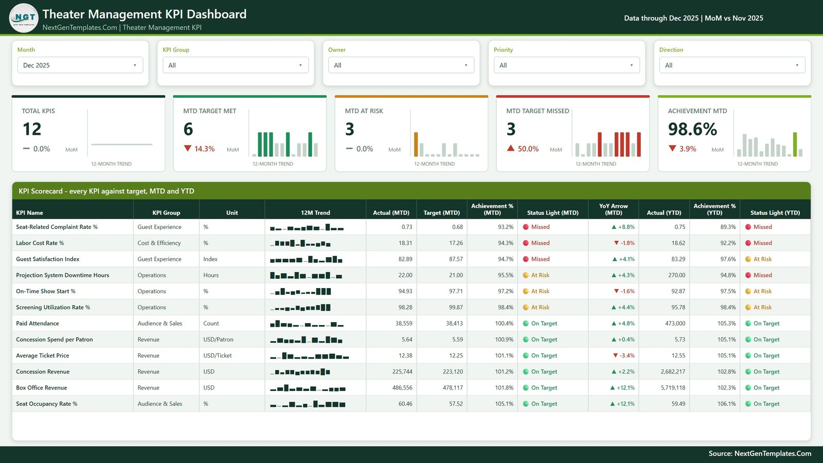
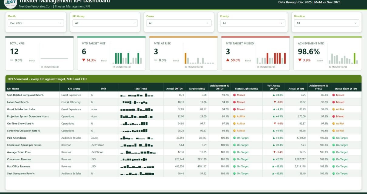
Five slicers run across the top – Month, KPI Group, Owner, Priority and Direction. The Month slicer is the one that does the heavy lifting: change it and the whole page recalculates for that reporting period, with the header confirming the comparison in use (the sample file reads “Data through Dec 2025 | MoM vs Nov 2025”).
Beneath the slicers sit five summary tiles, each with a MoM delta and its own 12-month trend micro-chart:
- Total KPIs – how many metrics are in scope after the slicers are applied
- MTD Target Met – the green count
- MTD At Risk – the amber count
- MTD Target Missed – the red count
- Achievement MTD – the blended achievement percentage for the month
In the sample data that reads 12 KPIs, 6 met, 3 at risk, 3 missed, and 98.6% blended achievement – which is exactly the shape of a real month. Nothing is uniformly green, and the tiles tell you at a glance that a quarter of the scorecard needs attention.
The scorecard table itself
The table below the tiles is the product. Every KPI gets a row, and every row carries:
- KPI Name, KPI Group and Unit
- A 12M Trend sparkline that stays on the full year regardless of which month is selected
- Actual (MTD), Target (MTD) and Achievement % (MTD)
- Status Light (MTD) – On Target, At Risk or Missed
- A YoY Arrow (MTD) with the percentage change
- Actual (YTD), Achievement % (YTD) and Status Light (YTD)
Having MTD and YTD status side by side matters more than it sounds. Projection System Downtime Hours in the sample month is amber on MTD but red on YTD – a metric that is recovering from a bad year. Guest Satisfaction Index is the reverse: red this month, amber for the year. Those two rows need different conversations, and a single-status scorecard would flatten them into the same one.
The 12 KPIs
The sample build ships with twelve theatre KPIs across five groups:
| KPI | KPI Group | Unit |
|---|---|---|
| Box Office Revenue | Revenue | USD |
| Concession Revenue | Revenue | USD |
| Average Ticket Price | Revenue | USD/Ticket |
| Concession Spend per Patron | Revenue | USD/Patron |
| Paid Attendance | Audience & Sales | Count |
| Seat Occupancy Rate % | Audience & Sales | % |
| Screening Utilization Rate % | Operations | % |
| On-Time Show Start % | Operations | % |
| Projection System Downtime Hours | Operations | Hours |
| Guest Satisfaction Index | Guest Experience | Index |
| Seat-Related Complaint Rate % | Guest Experience | % |
| Labor Cost Rate % | Cost & Efficiency | % |
That list is data, not code. Add a row to the KPI sheet and it appears on the scorecard.
Page 2: KPI Trend
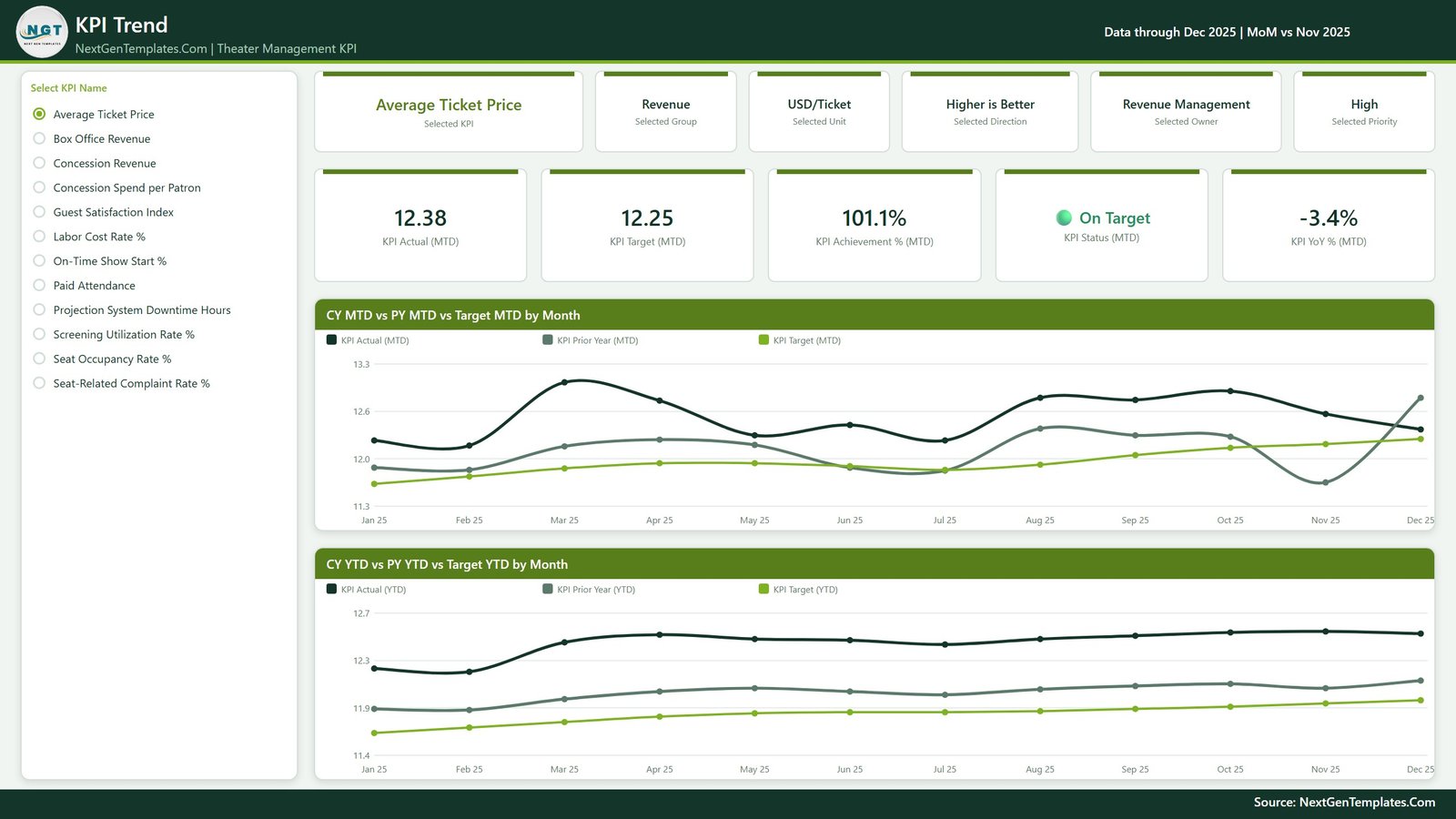
The scorecard tells you which KPI to look at. This page is where you look at it.
A radio-button list of every KPI runs down the left. Pick one – Average Ticket Price, say – and the entire page becomes that metric. A strip of header cards confirms the context: Selected KPI, Selected Group (Revenue), Selected Unit (USD/Ticket), Selected Direction (Higher is Better), Selected Owner (Revenue Management) and Selected Priority (High). That owner field is doing real work in a management meeting; the scorecard names the responsible team without anyone having to remember.
A second row of cards gives the numbers for the selected month: KPI Actual (MTD), KPI Target (MTD), KPI Achievement % (MTD), KPI Status (MTD) and KPI YoY % (MTD).
Then two line charts carry the history:
- CY MTD vs PY MTD vs Target MTD by Month – three series across twelve months, so you can see the actual line, last year’s line and the target line together
- CY YTD vs PY YTD vs Target YTD by Month – the same comparison on a cumulative basis, which smooths out the month-to-month noise
The pairing is deliberate. A KPI can look erratic on MTD and perfectly steady on YTD, and knowing which of those you are dealing with changes whether you act.
Page 3: KPI Definition
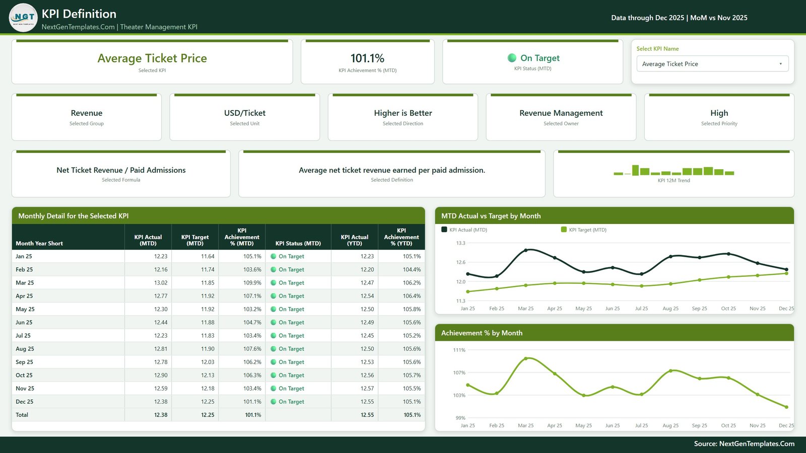
This is the page that ends the argument about how a number is calculated.
The same KPI selector appears here as a dropdown, and it is synced with the list on the Trend page – pick a KPI on either page and both follow. There is no drillthrough anywhere in this build, which is a deliberate simplification: nobody has to be taught to right-click a visual to find the detail.
The page shows the selected KPI’s:
- Formula in plain language – Average Ticket Price is Net Ticket Revenue / Paid Admissions
- Definition – a one-line description of what the metric actually measures
- Group, Unit, Direction, Owner and Priority
- A 12-month trend micro-chart
Below that sits a Monthly Detail table – one row per month with KPI Actual (MTD), KPI Target (MTD), Achievement % (MTD), Status (MTD), Actual (YTD) and Achievement % (YTD), plus a total row. Two charts sit alongside it: MTD Actual vs Target by Month and Achievement % by Month.
If someone challenges a red light in a meeting, this page settles it in one click.
How the Traffic Lights Actually Work
The scorecard logic is the part worth understanding before you load your own data, because it is what separates a real scorecard from a table with conditional formatting bolted on.
Each KPI carries a direction flag and a pair of tolerance bands. For a higher-is-better metric such as Paid Attendance, achievement is actual over target, and coming in above target scores above 100%. For a lower-is-better metric such as Labor Cost Rate % or Projection System Downtime Hours, the maths inverts: coming in below target is the win, and the achievement percentage rises accordingly.
The tolerance bands then decide the colour. A KPI comfortably past its threshold is green (On Target), one inside the tolerance zone is amber (At Risk), and one outside it is red (Missed). Because the bands are per KPI, you can hold On-Time Show Start % to a tighter standard than Concession Spend per Patron without writing any new logic – you just set different bands on the two rows.
This is why the sample data shows Screening Utilization Rate % at 98.4% achievement sitting amber while Paid Attendance at 100.4% sits green. Both are close to target; only one is inside its acceptable band.
Loading Your Own Data
The template reads from a three-sheet Data.xlsx that ships alongside the .pbix file:
- Open the .pbix in Power BI Desktop – the free version is enough for everything here.
- Open Data.xlsx. One sheet defines the KPIs (name, group, owner, unit, direction, priority, formula, definition and tolerance bands), one holds monthly actuals and one holds monthly targets.
- Replace the sample rows with your own. Keep the column headers exactly as they are – the query maps on header name.
- Home > Refresh in Power BI Desktop. The scorecard, both KPI pages and every trend chart update together.
- Recolour if you want to. A single custom theme file drives every visual, so rebranding to your venue’s palette is one change, not forty.
- Publish to the Power BI Service if you want to share it, or just circulate the .pbix.
Adding a thirteenth KPI is the same routine: one new row in the KPI sheet, its actuals and targets in the other two, refresh. Nothing is hard-coded to twelve.
Practical Notes
- Native visuals only. No custom visuals to get approved, nothing to install.
- Nothing is locked. Every measure, visual and colour is editable.
- Your data stays local. Power BI Desktop reads the Excel file on your machine; nothing is uploaded anywhere.
- Give each owner their own view by setting the Owner slicer – a department head sees only the KPIs they answer for.
- The 12M sparkline ignores the Month slicer on purpose, so the trend context never collapses to a single point.
Where to Get It
The Theater Management KPI Dashboard in Power BI is available on NextGenTemplates as an instant download – the .pbix, the three-sheet Data.xlsx pre-filled with twelve months of sample data, and the theme file.
Get the Theater Management KPI Dashboard in Power BI
The same scorecard exists on two other platforms if Power BI is not where your team works: the Excel version and the Google Sheets version. For a broader cultural-venue view, the Arts & Culture KPI Dashboard in Power BI and the Museum Operations KPI Dashboard in Power BI follow the same pattern.
Frequently Asked Questions
Does this use drillthrough?
No. The KPI selector is a synced slicer shared by the KPI Trend and KPI Definition pages. Click a KPI name on either page and the other follows.
Can I change the KPI list?
Yes. The KPIs live in Data.xlsx with their groups, owners, units, direction and tolerance bands. Add, remove or rename rows and refresh.
Do lower-is-better KPIs work correctly?
Yes. Each KPI carries a direction flag, so metrics like Labor Cost Rate % and Projection System Downtime Hours score above 100% achievement when the actual lands below target.
Do I need a Power BI Pro licence?
Not to use the file – Power BI Desktop is free. A Pro or PPU licence is only needed to publish and share through the Power BI Service.
How is this different from an analytical theatre dashboard?
A scorecard measures a fixed KPI list against target with owners and traffic lights. An analytical dashboard slices transaction data to explain why a number moved. Most venues use both.
Final Word
Building this from scratch is a week of DAX: the MTD and YTD measures, the prior-year comparisons, the direction-aware achievement maths, the tolerance bands, the synced KPI pages. The template has all of it already working against sample data, so the only real work left is dropping in your own months. Change the Month slicer, read the red rows, and run the meeting.