Most engineering teams already have the numbers. They are just in five different places: deployment counts in the CI tool, incidents in the on-call platform, story points in the tracker, and the cloud bill in a portal nobody outside finance opens. The DevOps Teams Dashboard in Excel is a five-page workbook that puts all four in one file, driven by pivot tables and slicers, so a monthly delivery review takes one screenshot instead of four exports.
It ships with 500 sample deployment records covering January 2025 to January 2026, 28 data columns, 25 pivot tables, 20 charts and four slicers – Month, Team, Service and Environment – repeated on every page so one click filters the whole report. There are no macros, no add-ins and no connections to anything. You paste your own deployment log over the sample rows, press Refresh All, and the workbook does the rest.
What the five pages actually show
Each page answers a different question, and every chart on it is fed by a pivot over the same table, so the slicers keep them all in sync.
Overview – the state of delivery in one screen
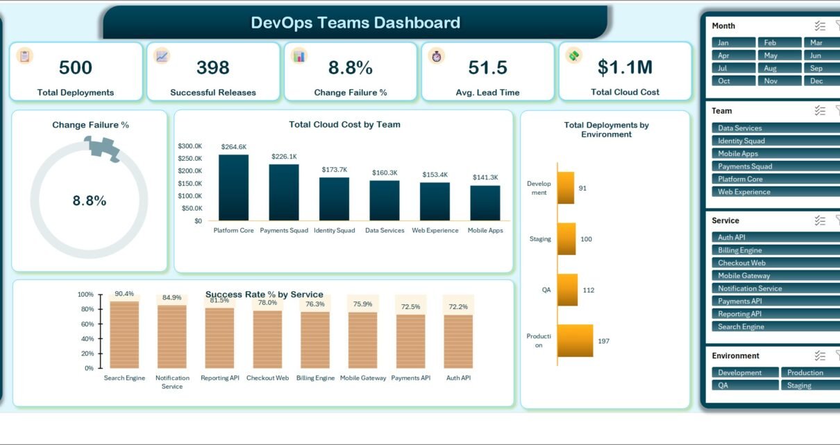
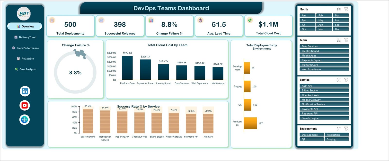
Five KPI cards sit across the top: Total Deployments, Successful Releases, Change Failure %, Avg. Lead Time and Total Cloud Cost. On the sample year those read 500, 398, 8.8%, 51.5 hours and $1.1M. Below them, a Change Failure % gauge repeats the 8.8% as a dial, Total Cloud Cost by Team ranks the six squads from Platform Core at $264.6K down to Mobile Apps at $141.3K, Total Deployments by Environment splits the 500 releases into Production 197, QA 112, Staging 100 and Development 91, and Success Rate % by Service runs from Search Engine at 90.4% down to Auth API at 72.2%.
That last chart is usually the one that starts a conversation. An eighteen-point spread between your best and worst service is not a rounding error, and it is visible before anyone opens a second tab.
Delivery Trend – is throughput improving or just busier?
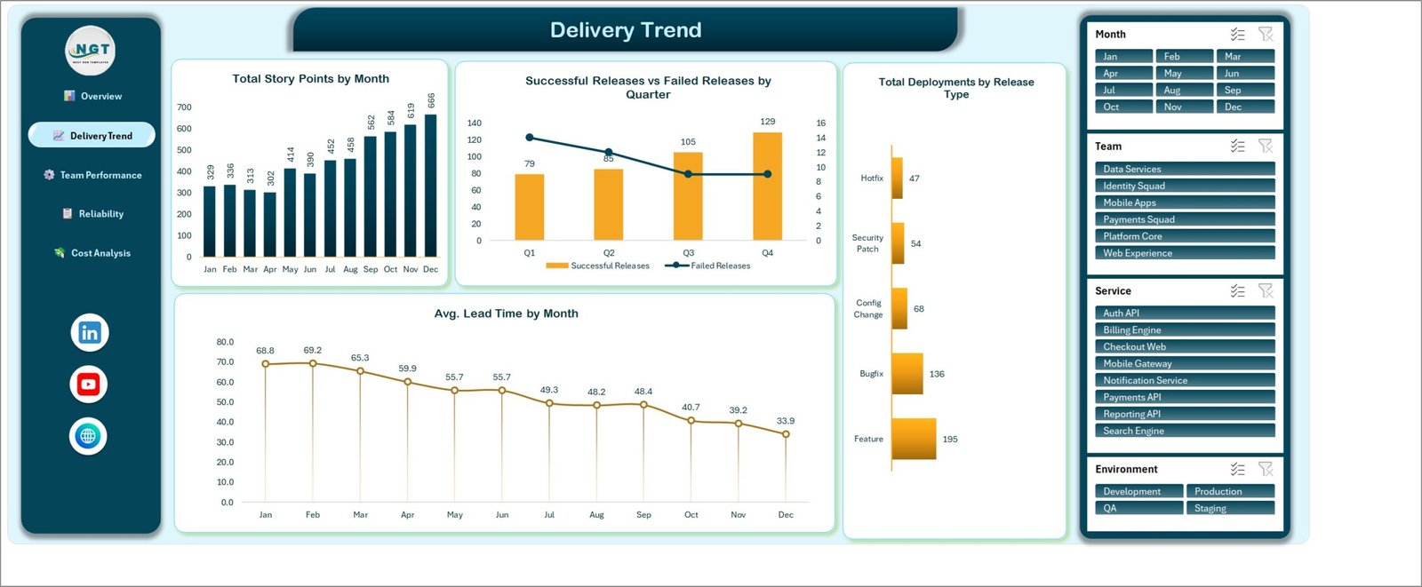
Total Story Points by Month climbs from 329 in January to 666 in December on the sample data. Successful Releases vs Failed Releases by Quarter puts a bar series against a line so a rising release count with a falling failure line reads instantly – 79, 85, 105 and 129 successful releases across the four quarters. Total Deployments by Release Type breaks the year into Feature 195, Bugfix 136, Config Change 68, Security Patch 54 and Hotfix 47.
The chart that earns its place is Avg. Lead Time by Month, which falls from 68.8 hours in January to 33.9 in December. Throughput going up while lead time comes down is the pattern you want to be able to prove, and this is the page that proves it.
Team Performance – who is shipping, and how cleanly
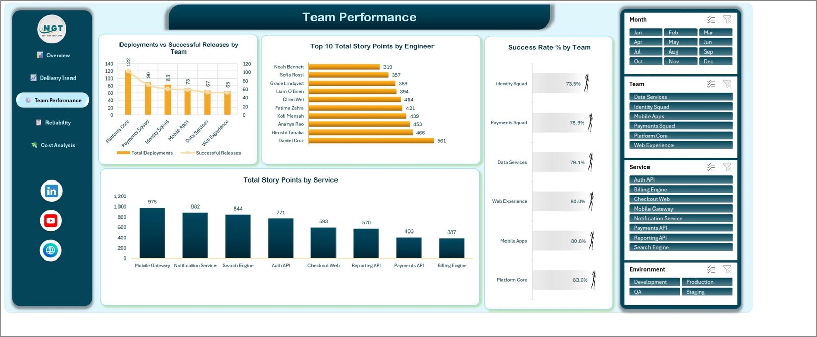
Deployments vs Successful Releases by Team pairs a column with a line for each of the six squads, from Platform Core’s 122 deployments down to Web Experience’s 65. Success Rate % by Team ranks them the other way – Platform Core 83.6%, Mobile Apps 80.8%, Web Experience 80.0%, Data Services 79.1%, Payments Squad 78.9%, Identity Squad 73.5% – which is where volume and quality stop agreeing with each other. Top 10 Total Story Points by Engineer picks the busiest ten of the fourteen engineers in the data, and Total Story Points by Service shows where the effort actually went: Mobile Gateway 975, Notification Service 882, Search Engine 844, down to Billing Engine at 387.
Reliability – incidents, restore time and where change fails
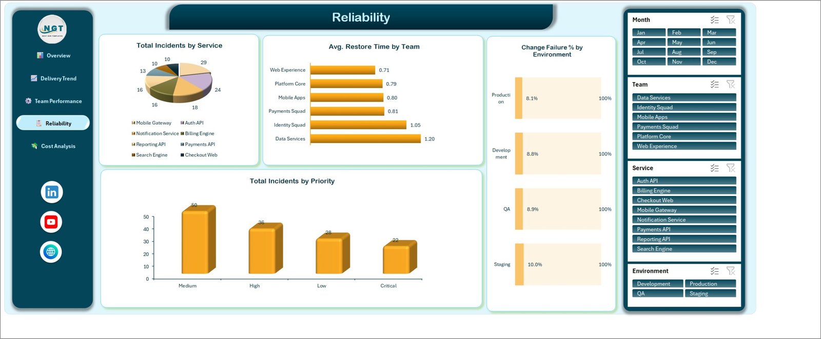
Total Incidents by Service splits 136 incidents across the eight services as a pie, with Mobile Gateway carrying the largest slice at 29. Avg. Restore Time by Team runs from Web Experience at 0.71 hours to Data Services at 1.20 – a 70% difference between the fastest and slowest squad on the same estate. Change Failure % by Environment is the quiet one: Production 8.1%, Development 8.8%, QA 8.9%, Staging 10.0%. When your staging environment fails changes more often than production does, the gate is the problem, not the code. Total Incidents by Priority closes the page with Medium 50, High 36, Low 28 and Critical 22.
Cost Analysis – what delivery is costing you
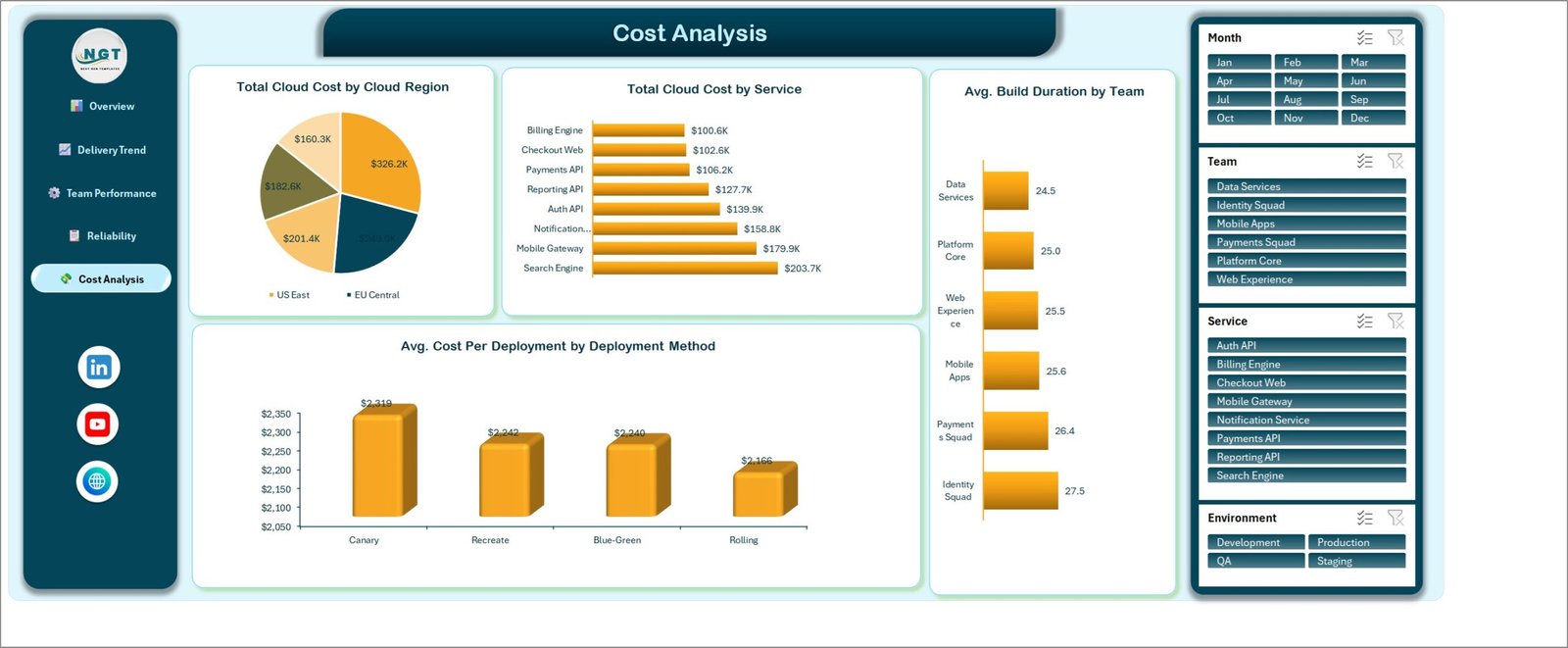
This is the page most DevOps reporting leaves out. Total Cloud Cost by Cloud Region splits the $1.1M across five regions, Total Cloud Cost by Service ranks Search Engine at $203.7K down to Billing Engine at $100.6K, Avg. Build Duration by Team runs a tight 24.5 to 27.5 minutes, and Avg. Cost Per Deployment by Deployment Method compares Canary at $2,319, Recreate at $2,242, Blue-Green at $2,240 and Rolling at $2,166.
Roughly $150 per deployment separates the most and least expensive release strategy. Over 500 deployments that is real money, and it is a decision an engineering lead can actually make.
The data sheet, and what you have to fill in
The Data sheet holds an Excel table called TblData in rows 4 to 503, 28 columns wide. Most of them are what you would expect: Deployment ID, Date, Team, Service, Environment, Release Type, Cloud Region, Deployment Method, Engineer, Priority, Status, Build Duration Mins, Deploy Duration Mins, Lead Time Hours, Restore Time Hours, Incidents, Code Commits, Story Points and Cloud Cost.
Three columns need attention when you paste your own data. Month, Year and Quarter are plain text that must match each row’s Date – the trend charts group on them, not on the date itself. And the six counter columns at the end – Total Records, Successful Deploys, Failed Deploys, Rolled Back Deploys, Production Deploys and Hotfix Releases – are 1/0 flags that feed the KPI cards and the Change Failure % gauge. Leave them blank and the cards read zero even though the charts look fine, which is the one way to be quietly wrong with this file.
The Status column carries Success, Failed, Cancelled, Rolled Back and In Progress. Everything else – team names, service names, environments, regions – is data, not a hard-coded list, so a team that calls its squads something else can simply type its own values and refresh.
How to put your own data in
- Unzip the download and open DevOps Teams Dashboard in Excel.xlsx. No macro prompt appears – the file has none.
- Read the five pages against the sample year first so you know what each chart is meant to answer.
- On the Data sheet, replace rows 4 to 503 with your own deployments, one row per deployment. Keep the 28 headers in row 3, or rename them and update the chart titles to match.
- Fill Month, Year and Quarter to match each Date, and set the six counter columns to 1 or 0.
- Press Ctrl+Alt+F5 (Data > Refresh All). There is no auto-refresh, so this step is not optional.
- Use the Month, Team, Service and Environment slicers on any page to narrow the whole report, and clear them with the filter icon in each slicer header.
Pasting more than 500 rows is fine – the source is a table, so it grows on its own and the pivots follow after a refresh.
What this workbook is not
It is worth being blunt about the limits, because they are the difference between a happy buyer and a refund.
It does not connect to anything. No GitHub, GitLab, Azure DevOps, Jenkins, Datadog, PagerDuty or cloud billing API. Numbers arrive by export and paste. That is the trade: nothing syncs, but the file opens on any laptop, works offline, and no data leaves your network.
It is not an incident management tool – it counts incidents and restore times you record, it does not page anyone. And it does not apply DORA’s Elite/High/Medium/Low banding or benchmark you against an industry sample. It reports deployment counts, change failure rate, lead time and restore time from your own rows; the labels, if you want them, are yours to apply.
One more distinction worth making, because the names are close. The DevOps Teams KPI Dashboard in Excel is a different template – a month-picker scorecard with MTD/YTD columns and traffic-light targets. This one is the analytical dashboard: five pages of pivot-driven charts with slicers, built for exploring the data rather than scoring it. Some teams run both. They are not the same file.
Who gets the most out of it
Engineering managers reporting deployment frequency and change failure rate monthly. Platform and SRE leads who need restore time and incident counts split by team. Delivery managers running several squads against shared services. Consultancies reporting DevOps health to a client without provisioning them a seat in a SaaS tool. And anyone who has been asked why the cloud bill went up and wants the answer on the same page as the delivery numbers.
If you already keep a deployment log in a spreadsheet, this is the reporting layer that log has been missing.
Get the template
The download is a single ZIP containing the .xlsx and an Excel Dashboard user manual PDF. It works in Excel 2016 and later and Microsoft 365, on Windows and Mac – slicers need the desktop app, so Excel for the web will display the pages but filter behaviour is limited.
Download the DevOps Teams Dashboard in Excel – instant download, lifetime access, free updates to the file.
If you want the same reporting in a different shape, DevOps KPI Dashboard in Excel takes the targets-and-traffic-lights route, API Development Dashboard in Excel goes endpoint by endpoint, Cloud Computing KPI Dashboard in Excel covers the infrastructure side, and DevOps Teams KPI Dashboard in Power BI is the Power BI equivalent.