In today’s business world, charts and graphs have become an essential part of data analysis. They help to present complex data in a clear and concise manner, allowing us to quickly analyze and draw conclusions from the information presented. In this article, we will learn how to create a weekly sales chart in Excel. This chart will display employee-wise weekly sales and Mon to Fri sales trend of each employee in small columns. By the end of this article, you will have the knowledge to create an informative employee-wise weekly sales chart that will help you to better understand your business’s sales data.
Click to buy Weekly Sales Chart in Excel
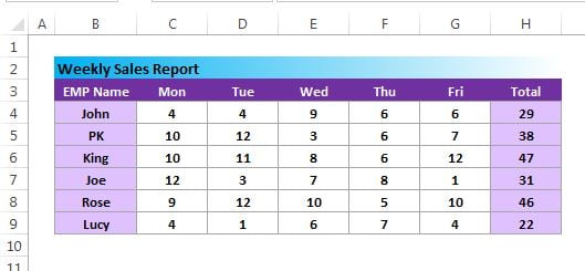
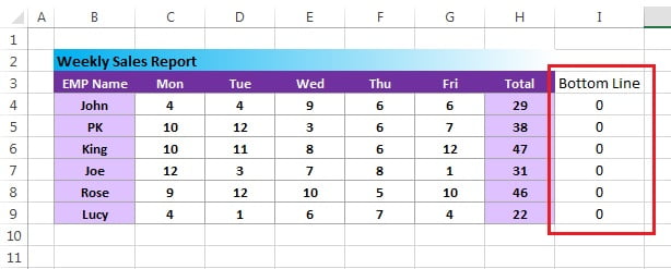
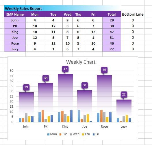
Data Set for Weekly Sales Chart in Excel
To create the weekly sales chart in Excel, we will first need a data set. Below is the data set that we will use for this example:
Steps to create Weekly Seles Chart in Excel-
Inserting the Chart
- Add a support column “Bottom Line” as keep values as Zero
Click to buy Weekly Sales Chart in Excel
- Select the Range “B3:I9”
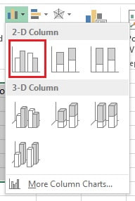
- Go to Insert >>Charts>>Column Chart>>Insert a 2D clustered column chart
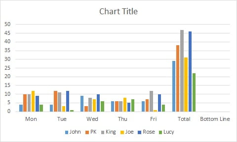
- After inserting the chart will look like below image
Formatting the Chart
- Right click on the chart and click on Select Data.
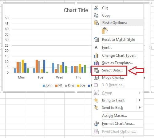
- Select Data Source window will be opened.
- Click on Switch Row/Column
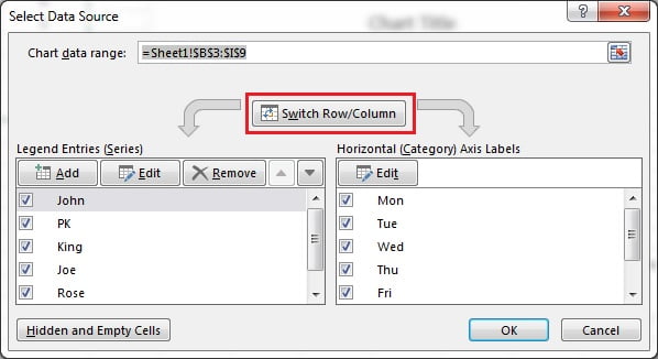
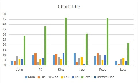
- After clicking on Switch Row/Column button our chart will look like below image.
- Right click on Total column and click on Change Series Chart Type.
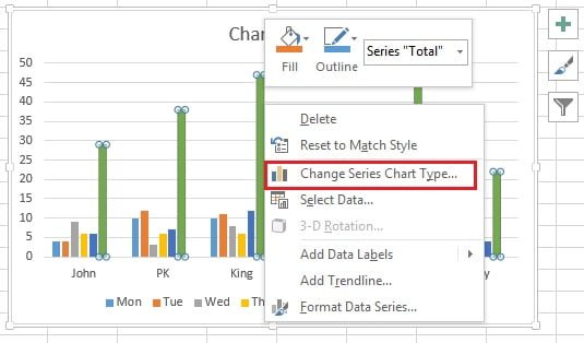
- Change Chart type window will be displayed.
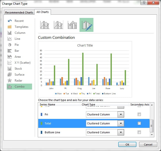
- Select the Line chart for Total Series.
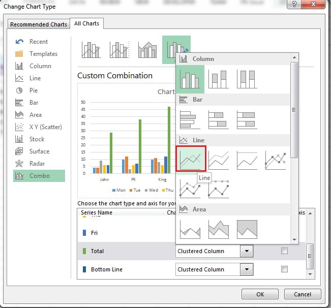
- Take the same chart type (Line Chart) to Bottom Line Series also.
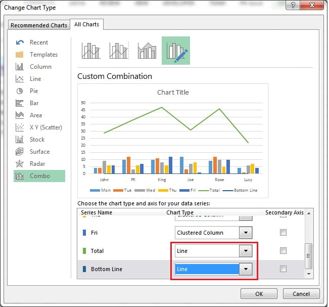
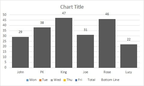
- After changing the chart type our chart will look like below image.
Adding Up/Down Bars
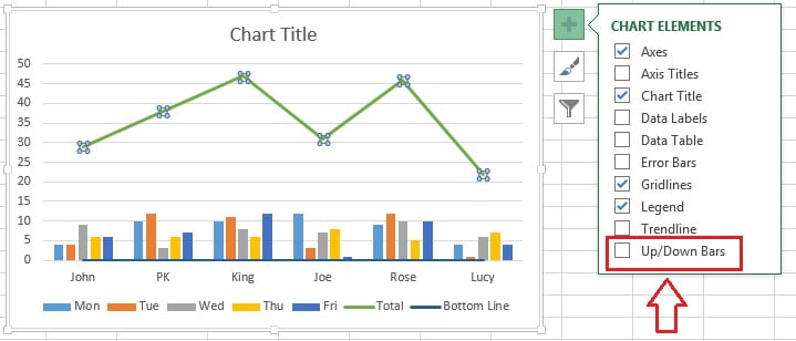
- Select the Total line chart (Green Line)
- Click on the Chart Elements button (Plus button of chart)
- Check the Up/Down Bars
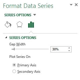
- Right click on the line and click on Format Data Series.
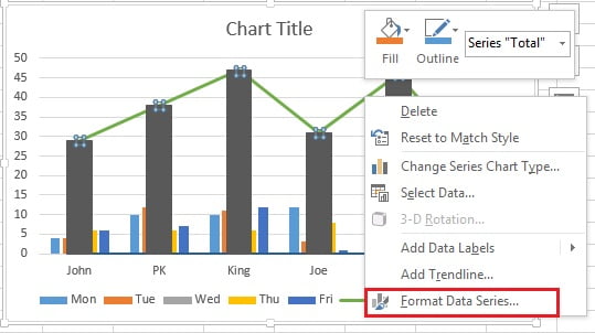
- Change the Gap Width around 30% (make sure small columns should go behind the down bars)
- Right click on the line and click on Add Data Labels.
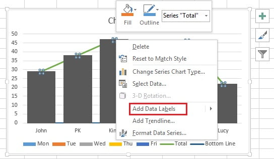
- Data labels will be added.
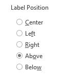
- Right click on data label and click on Format Data Labels.
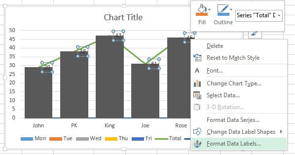
- Select Above in Label Position.
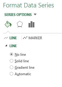
- Go to the Fill and Line option and select No line.
- Our chart will look like below given image after choosing the No line for Total Series.
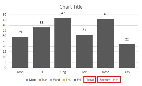
- Delete the Total and Bottom Line in Legends by double clicking and pressing Delete button in your keyboard.
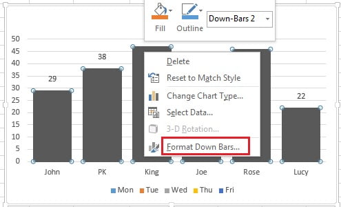
- Right click on Down Bar (Black Bar) and click on Format Down Bars.
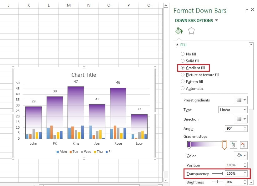
Fill colors
- Fill the Gradient Fill in the Down Bars with two Stops.
- Select the Type as Linear and put the Angle as 90°.
- Keep the color for the First Stop as Purple.
- Choose Second Stop color white with 100% Transparency.
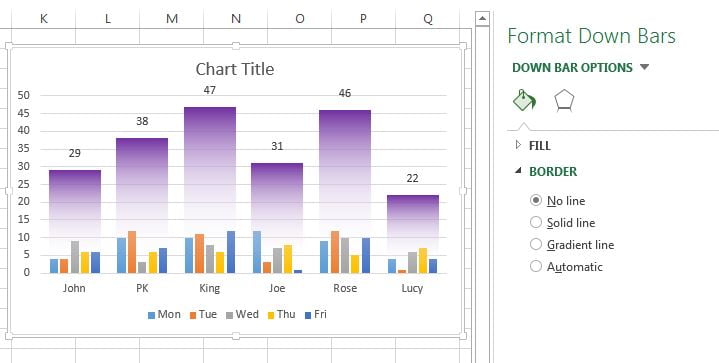
- Choose Border for down bars as No line.
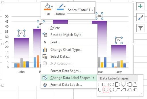
Now we can change the data label shapes-
- Right click on data label and choose a shape from Change Data Label Shape.
- Now change the data label background color as purple.
- Change the data label Font color as white.
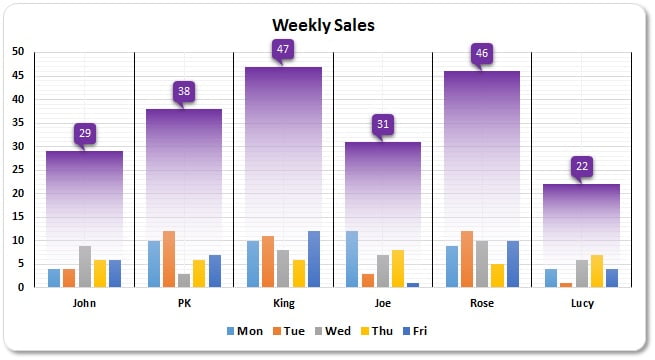
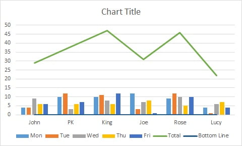
Our weekly Sales chart is ready it will look line below image.
Click to buy Weekly Sales Chart in Excel
Visit our YouTube channel to learn step-by-step video tutorials
Watch the video tutorial for Weekly Sales Chart
Click to buy Weekly Sales Chart in Excel