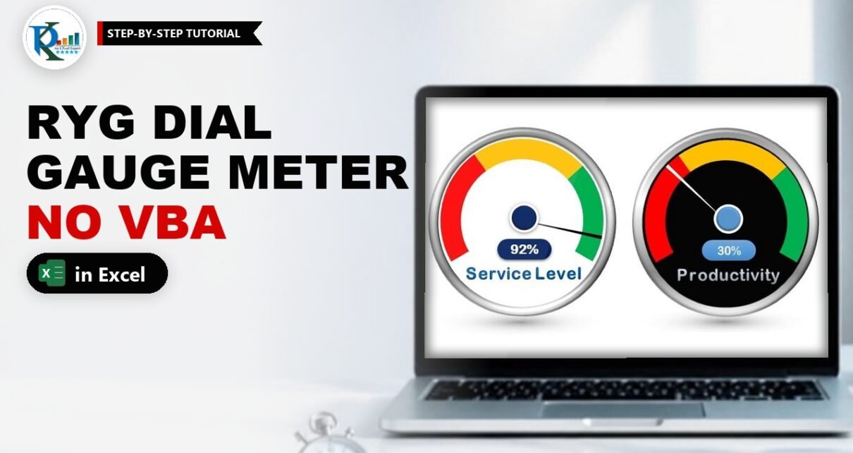
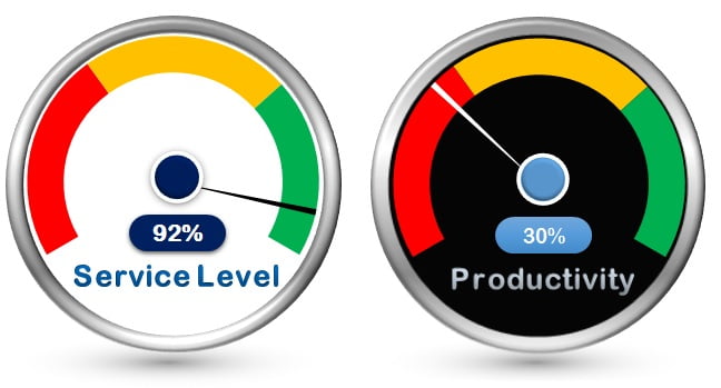
An RYG dial gauge meter in Excel shows a KPI the way a car dashboard shows speed: a needle points into a red, yellow or green zone, so anyone can read the status in one second. This one is built with a doughnut chart, a pie chart and a few shapes, with no VBA or macros. The zones come from cells, so you can set your own Red, Yellow and Green limits for Service Level, Quality Score, Productivity or any other percentage KPI, and the needle and label move as soon as the value changes.
Watch the Video Tutorial
In the video PK builds the gauge from scratch: the coloured doughnut, the pie-chart needle on the secondary axis, the linked value label, the metallic bezel and the floor shadow, and then turns a copy into the black version.
What You Will Build
- A coloured dial: Red for 0-35%, Yellow for 35-70% and Green for 70-100%, drawn as a doughnut chart.
- A moving needle: a thin pie slice that points at the actual KPI value.
- A live value label linked to the KPI cell.
- A metallic bezel and a floor shadow made from formatted oval shapes.
- A second, black theme made from a copy of the first gauge.
How the Gauge Data Is Laid Out
The gauge needs two small tables on the sheet:
- The dial table (B3:D6) – Red, Yellow, Green and Blank in column B, the readable ranges (0% to 35%, 35% to 70%, 70% to 100%) in column C, and the size of each zone in column D:
35%,35%,30%and50%. - The needle table (F1:I1) – the label
SL%in F1, the actual value in G1 (65% in the video), the needle width1%in H1 and the remaining part of the circle in I1.
Column D holds the width of each zone, not its upper limit. Red runs from 0 to 35, so it is 35 wide; Yellow runs from 35 to 70, so it is also 35 wide; Green runs from 70 to 100, so it is 30 wide. Change these numbers and the colours move, which is why the gauge is data-driven even for the RYG zones.
Part 1 – Build the RYG Dial
Step 1: Understand the 150% circle
A doughnut chart always draws a full circle. A gauge, though, only needs the top part. The trick is to make the whole circle worth 150%: the three colours add up to 100% and a Blank slice of 50% fills the rest. The coloured part then covers 100/150 of the circle, which is 240 degrees, and the blank 120 degrees sits at the bottom where it will be invisible.
Step 2: Insert the doughnut
Select B3:B6, hold Ctrl and select D3:D6, then go to Insert › Pie or Doughnut Chart › Doughnut. Resize the chart and delete the chart title.
Step 3: Rotate it with Angle of first slice
Right-click the ring, choose Format Data Series and set Angle of first slice to 240°. Now Red starts at the lower left, the colours sweep over the top and the Blank slice sits underneath. In the video the doughnut hole size is 75%, which gives a nice thin dial.
Step 4: Colour the zones
Click the ring once, then click one slice again to select only that point. Give it Fill › Solid fill: red for the first slice, yellow for the second and green for the third. Select the Blank slice and set it to No fill. Delete the legend. The coloured arc is ready.
Part 2 – Add the Needle with a Pie Chart
Step 5: Build the needle data
In G1 type the actual KPI value (for example 65%), in H1 type 1% for the needle thickness, and in I1 calculate the rest of the circle. PK uses 150% minus the sum of G1 and H1, so a formula such as this one does the job:
I1 =150%-SUM(G1:H1)With 65% and 1% this returns 84%. The three cells always add up to 150%, the same total as the dial, so both charts use the same scale.
Step 6: Add the series and turn it into a pie
Right-click the chart and choose Select Data › Add. Use F1 as the series name and G1:I1 as the series values. The series formula in the video reads =SERIES(Sheet3!$F$1,,Sheet3!$G$1:$I$1,2). Then right-click the new ring, choose Change Series Chart Type and set the SL% series to Pie.
Step 7: Hide everything except the needle
Select the large value slice and set it to No fill, then do the same for the remaining slice. Select the thin 1% slice and give it a solid black fill. If the 1% slice is too thin to click, change H1 to 10% for a moment, format it, then set it back to 1%.
Step 8: Line the needle up with the dial
Select the pie and set its Angle of first slice to 240°, the same as the doughnut. Remove the outline of both the doughnut and the pie (Outline › No Outline). Finally, in Format Data Series for the pie, choose Plot Series On › Secondary Axis. The pie now sits on top of the doughnut and the needle points into the dial.
How the needle works
- Both charts start at 240° and both total 150%, so 1% of value means the same angle on the dial and on the pie.
- The first pie slice (G1) is invisible and pushes the needle forward by exactly the KPI value. At 65% the needle lands in the yellow zone, between 35% and 70%.
- H1 is the needle itself: a 1% slice drawn in black.
- I1 fills whatever is left, so when G1 goes up, I1 goes down and the needle moves without anything else changing.
Part 3 – Finish the RYG Dial Gauge Meter in Excel
Step 9: Clean up the chart
Hide the helper values if you like, untick Gridlines on the View tab, and set the chart area to Shape Fill › No Fill and Shape Outline › No Outline.
Step 10: Add the centre hub
Insert an Oval from Basic Shapes, hold Shift while you drag so it stays a perfect circle, and place it on the needle’s pivot. Remove its outline and apply Shape Effects › Preset › Preset 1 for a raised, glossy look.
Step 11: Add the linked value label
Insert a Rounded Rectangle under the hub and drag its yellow handle to the right until the ends are fully round. Apply a preset effect without the shadow. Then, with the shape selected, click in the formula bar, type =G1 and press Enter. The label now shows 65%. Make the font bigger and bold.
Test it: change G1 to 95% and the needle swings into green; change it to 25% and it drops into red, with the label following every time.
Step 12: Add the metallic bezel
Insert a large Oval (again with Shift) over the whole gauge. Set Fill to No fill and the Line width to 12 pt, then use Shape Effects › Bevel › Circle. For the metal shine, set the line to Gradient line with four stops spaced roughly evenly: dark grey, light grey, dark grey, light grey.
Step 13: Add the floor shadow
Draw a flat oval just below the gauge. Remove its line and give it a Gradient fill with only two stops, grey and white, and set the gradient Type to Path. Adjust the transparency of the stops until the shadow fades softly into the sheet.
Step 14: Group everything
Click one of the shapes, press Ctrl+A to select all the shapes and the chart, right-click and choose Group. Now the gauge moves and resizes as one object.
Part 4 – Create the Black Theme
Copy the grouped gauge and paste it next to the first one. Fill the inner circle behind the dial with black and send it to the back, then change the needle colour to white so it stands out. Point the copy at a second KPI, such as Productivity, by building its own needle table. The bezel, hub and label stay the same.
Common Errors and Fixes
The needle points to the wrong place
Check three things: both series have Angle of first slice at 240°, the needle values in G1:I1 add up to 150%, and the dial values in D3:D6 also add up to 150%.
The needle is hidden behind the dial
The pie must be on the Secondary Axis. Without it, Excel draws the pie as another ring of the doughnut.
The label shows a number like 0.65
The shape copies the cell’s format. Format G1 as a percentage and the label shows 65%.
Tips
- Change your targets in column D only, and keep the Blank value at 50% so the total stays at 150%.
- Use
=MIN(MAX(actual,0),100%)in G1 if your KPI can go above 100% or below zero, so the needle never leaves the dial (an addition to the original build). - A thinner needle (0.5%) looks sharper on large gauges; a thicker one (2%) reads better on small dashboard tiles.
- Microsoft’s guide to doughnut charts explains hole size and slice rotation.
Want It Ready-Made?
The finished workbook with both themes is available as the RYG Dial Gauge Meter in MS Excel template on NextGenTemplates.com. If you want gauges inside complete reports, browse the Excel KPI dashboard templates. To learn charts, infographics and dashboards step by step, join the video course Excel Pivot Tables & Dashboards: Basic to Advanced.
Related Tutorials
- Speedometer Chart in Excel: Build a Gauge Chart Step by Step
- 3D Gauge Chart in Excel
- Ultimate Speedometer in Excel
- Doughnut Chart in Excel
- Pie Chart in Excel
Frequently Asked Questions
How do I make a gauge chart in Excel without VBA?
Combine a doughnut chart for the coloured dial with a pie chart for the needle. Both total 150 percent, both start at an angle of 240 degrees and the pie sits on the secondary axis. No macros are needed.
Why does the doughnut total 150 percent?
The three zones add up to 100 percent and a hidden 50 percent slice fills the bottom of the circle. That makes the visible dial exactly 240 degrees, a classic gauge shape.
How do I change the red, yellow and green limits?
Edit the zone widths in column D. For example, Red 0 to 50 and Yellow 50 to 80 become 50 percent and 30 percent, with Green taking the last 20 percent. Keep the Blank slice at 50 percent.
How do I show the KPI value in the middle of the gauge?
Insert a rounded rectangle, select it, type =G1 in the formula bar and press Enter. The shape then shows the live value of the KPI cell.
Can I download the RYG dial gauge file?
The finished two-theme workbook is a paid template on NextGenTemplates.com. Everything you need to build it yourself is explained step by step in this tutorial and the video.
About the Author
PK is a Microsoft Excel expert and trainer and the founder of PK: An Excel Expert and NextGenTemplates.com. He has been teaching Excel, Power Query and Power BI since 2016 on his YouTube channel.
Conclusion
An RYG dial gauge meter in Excel is just two charts and a few shapes working together: a 150% doughnut for the coloured dial, a 150% pie for the needle, a linked label and some shape effects for the finish. Set your own zone limits in column D, point G1 at your KPI and your gauge is ready for any report or dashboard.