Part of the free Module 8: Basic Charts · Lesson 1 of 12 · Full Excel course
Updated on 5 September 2026 · Works in Excel 365, 2021, 2019 and 2016 unless noted.
A column chart in Excel compares values across categories with vertical bars, one column per category, so the tallest column is always the largest value. It is the first chart most people build and the right choice for sales by employee, monthly totals or counts by region. You insert it from Insert > Charts > Insert Column or Bar Chart > Clustered Column, then add data labels, colours and a title.
What a column chart shows
Each column’s height is proportional to its value and the category names sit along the horizontal axis. Because the eye compares heights very accurately, a column chart makes small differences between categories visible at a glance. It works best with up to ten or twelve categories whose names are short. If the labels are long, use a bar chart instead; if you want to show change over many time periods, use a line chart.
Excel offers three column layouts in 2-D and 3-D. Clustered Column places one column per value side by side. Stacked Column piles the series on top of each other to show a total. 100% Stacked Column scales every column to the same height so you compare shares. This lesson builds the clustered version, which is the default and the one you will use most.
Sample data for the lesson
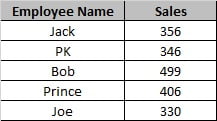
The example uses a small employee-wise sales table. Type it into a blank sheet with the headers in row 1 so your cell references match the steps below.
| Employee Name | Sales |
|---|---|
| Jack | 356 |
| PK | 346 |
| Bob | 499 |
| Prince | 406 |
| Joe | 330 |
How to create a clustered column chart step by step
- Select the data range including the headers, A1:B6. Including the header row lets Excel name the series and the chart title automatically.
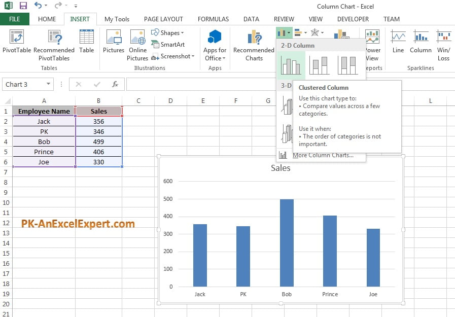
- Go to Insert > Charts > Insert Column or Bar Chart > 2-D Column > Clustered Column. Excel places the chart on the sheet with a default title and style. The shortcut Alt + F1 inserts the default chart type instantly.
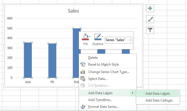
- Right-click any column and choose Add Data Labels. The value now prints above each column, which usually lets you delete the gridlines later.
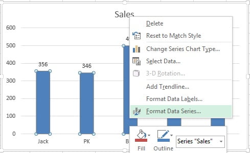
- Right-click a column again and choose Format Data Series. The Format pane opens on the right; you can also open it by selecting the series and pressing Ctrl + 1.
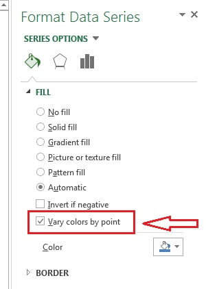
- In the pane click the Fill & Line icon (the paint bucket), expand Fill and tick Vary colors by point. Each employee’s column now gets its own colour from the theme palette.
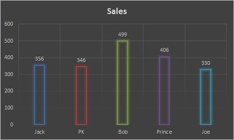
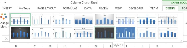
- Click the chart and open the Chart Design tab (labelled Design under Chart Tools in Excel 2016 and 2019). Pick a preset from the Chart Styles gallery; the example uses Style 13, which gives a dark background and outlined columns. Then click the chart title and type a descriptive name such as Sales.
Formatting a column chart
The default chart is readable, but a few targeted changes turn it into a report-ready visual. Every setting below lives in the Format pane, which opens when you double-click a chart element or press Ctrl + 1 with the element selected. The chart elements lesson covers each element in more depth.
| What to change | Where | Recommended setting |
|---|---|---|
| Chart title | Click the title and type, or link it to a cell by typing = and clicking the cell in the formula bar | Short and specific, for example Sales by Employee, 2026 |
| Column width | Format Data Series > Series Options > Gap Width | 50% to 80% for fuller columns (default is 219%) |
| Data labels | Chart Elements (+) > Data Labels > Outside End | On for a single series; add a number format if values are large |
| Value axis | Format Axis > Axis Options > Bounds | Minimum fixed at 0; set a round Maximum such as 600 |
| Gridlines | Chart Elements (+) > Gridlines | Remove when data labels are on |
| Legend | Chart Elements (+) > Legend | Remove for a single series; keep for two or more |
| Colours | Format Data Series > Fill, or Chart Design > Change Colors | One colour for one series; Vary colors by point only for a few named categories |
| Style | Chart Design > Chart Styles | Any preset; check that labels stay readable on dark backgrounds |
Column chart variants compared
| Variant | Gallery button | Best for | Avoid when |
|---|---|---|---|
| Clustered Column | 2-D Column > Clustered Column | Comparing individual values across categories or a few series | You need the total of the series |
| Stacked Column | 2-D Column > Stacked Column | Total per category plus its breakdown | Comparing the middle segments precisely |
| 100% Stacked Column | 2-D Column > 100% Stacked Column | Share of each series per category | The actual amounts matter |
| 3-D Clustered Column | 3-D Column > 3-D Clustered Column | Presentation slides | Accurate reading is required; perspective distorts height |
When to use and when not to use a column chart
Use a column chart to compare one measure across a handful of categories (sales by employee, tickets by team, units by product), to show a short time series of up to about twelve periods such as monthly revenue for one year, or to rank items after sorting the source data so the columns fall from tallest to shortest.
Do not use a column chart when category names are long (switch to a bar chart), when you have dozens of time points (use a line chart), when you want to show parts of a whole (use a stacked column, pie or doughnut chart) or when you need to plot two measures on different scales (use a combo chart with a secondary axis).
Worked example: sales by employee
Using the sample data, select A1:B6 and insert a clustered column chart. Excel plots five columns, with Bob at 499 clearly tallest and Joe at 330 shortest. Add data labels, set the Gap Width to 60% and fix the axis maximum at 600. Because there is one series, delete the legend and the gridlines. The result reads the values directly from the labels: Bob 499, Prince 406, Jack 356, PK 346 and Joe 330. If you sort the table by Sales in descending order first, the columns appear in that order and the ranking is obvious without reading a single number.
Download the practice file
Download the Column Chart Excel file to practise the steps with the same data, or click the chart below.
Tips and common mistakes
- Start the value axis at zero. A truncated axis exaggerates small differences and misleads the reader.
- Include the header row. Without it Excel labels the series Series1 and puts 1, 2, 3 on the axis.
- Names treated as a series? If the first column is numeric (years, for example) Excel plots it as data. Format it as text or use Select Data > Horizontal (Category) Axis Labels > Edit.
- Use an Excel Table as the source. Press Ctrl + T first and the chart grows automatically when you add rows; see the dynamic chart range lesson.
- One colour per series. Vary colors by point suits five named employees; it confuses when the categories are months.
- Prefer 2-D over 3-D. Perspective makes the tops of columns hard to compare against the axis.
- Do not over-label. Data labels and gridlines and axis numbers together are clutter; keep one or two.
Errors and how to fix them
| Problem | Cause | Fix |
|---|---|---|
| Chart is empty after insertion | Selection contained only text or was a single cell inside a range with blank neighbours | Select the full range including numbers, then insert again |
| Categories and series are swapped | Excel guessed the layout from the shape of the range | Chart Design > Data > Switch Row/Column |
| Axis shows 1, 2, 3 instead of names | Header row not selected or names are in a numeric format | Reselect with headers or edit the axis labels in Select Data |
| Columns too thin | Default Gap Width of 219% | Format Data Series > Gap Width 50 to 80% |
| Chart does not update with new rows | Source is a plain range | Convert to a Table (Ctrl + T) or extend the range in Select Data |
Practice exercise
- Build the clustered column chart from the sample data and add data labels outside the end of each column.
- Set the Gap Width to 60% and fix the vertical axis between 0 and 600.
- Sort the table by Sales, largest first, and confirm the chart reorders itself.
- Add a second column, Target, with 400 for each employee and re-insert the chart as a clustered column with two series. Keep the legend this time.
- Change the chart type to Stacked Column and note what the top of each column now represents.
Key takeaways
- A column chart compares values across categories with vertical bars; height equals value.
- Insert it from Insert > Charts > Insert Column or Bar Chart > Clustered Column after selecting the data with headers.
- Add data labels, reduce the Gap Width and start the axis at zero for an honest, readable chart.
- Use Vary colors by point only for a few named categories; otherwise keep one colour per series.
- Switch to a bar chart for long labels, a line chart for long time series and a stacked column for totals.
Related lessons
- Basic Charts course hub
- Stacked column chart
- Bar chart
- Chart elements: titles, axes, gridlines, legend and data labels
- How to choose the right chart type
- Excel Dashboard course
- Microsoft Support: Create a chart from start to finish
Frequently asked questions
What is the difference between a column chart and a bar chart in Excel?
A column chart uses vertical bars with categories along the bottom; a bar chart uses horizontal bars with categories down the left. They are the same chart rotated. Bar charts are better when category names are long or there are many categories, because the labels stay horizontal and readable.
How do I change the colour of one column only?
Click the series once to select every column, then click the single column again to select just that data point. Now choose a fill colour from Format > Shape Fill or from the Fill section of the Format pane. Only the selected column changes; the rest keep the series colour.
How do I sort the columns from largest to smallest?
Sort the source table by the value column in descending order using Data > Sort. A chart follows the order of its source rows, so the columns rearrange immediately. For a chart built from a PivotTable, sort the PivotTable field instead.
How do I make a column chart with two series?
Put the second measure in the next column, for example Target next to Sales, select all three columns including headers and insert a clustered column chart. Excel draws two columns per category in different colours and adds a legend. Use Switch Row/Column if the grouping is the wrong way round.
Why does my column chart show Series1 instead of the header name?
The header row was not part of the selection, or the header cell contains a number, which Excel treats as data. Reselect the range with the header included, or open Chart Design > Select Data, edit the series and point Series name at the header cell.
Want the finished version? Ready-made Excel dashboards, charts and KPI templates are available at NextGenTemplates.com.