In today’s digital age, businesses rely heavily on data to drive marketing success. Among the most effective marketing strategies, email marketing remains a powerful tool for reaching, engaging, and converting audiences. However, tracking the effectiveness of your email campaigns can be challenging without the right tools. That’s where the Email Marketing KPI Dashboard in Power BI comes into play.
This ready-to-use dashboard helps marketing professionals visualize performance metrics, monitor campaign progress, and make informed decisions — all within a single, interactive Power BI workspace.
What Is an Email Marketing KPI Dashboard in Power BI?
Click to Purchases Email Marketing KPI Dashboard in Power BI
An Email Marketing KPI Dashboard in Power BI is a comprehensive analytical solution designed to monitor, measure, and visualize the success of email marketing campaigns.
It captures data from Excel or other sources, allowing marketers to analyze KPIs such as:
-
Open rate
-
Click-through rate (CTR)
-
Conversion rate
-
Bounce rate
-
Unsubscribe rate
-
Campaign ROI
By consolidating these insights, Power BI transforms static data into interactive visuals that make it easy to identify trends, measure performance, and track marketing goals in real time.
Why Email Marketing Analytics Matter
Email marketing campaigns generate huge volumes of data — from opens and clicks to conversions and unsubscribes. Without analytics, it’s impossible to know which campaigns perform well and which need improvement.
With a Power BI dashboard, businesses can:
-
Track performance at a glance using visual indicators.
-
Identify high-performing campaigns through automated KPI comparisons.
-
Optimize email strategies by analyzing historical and current data.
-
Improve ROI by focusing on metrics that drive conversions.
Data-driven insights turn guesswork into precision, ensuring every email campaign contributes to business growth.
Structure of the Email Marketing KPI Dashboard in Power BI
This dashboard is built in Power BI Desktop and connects seamlessly with an Excel data source. It consists of three key pages, each designed for a specific purpose.
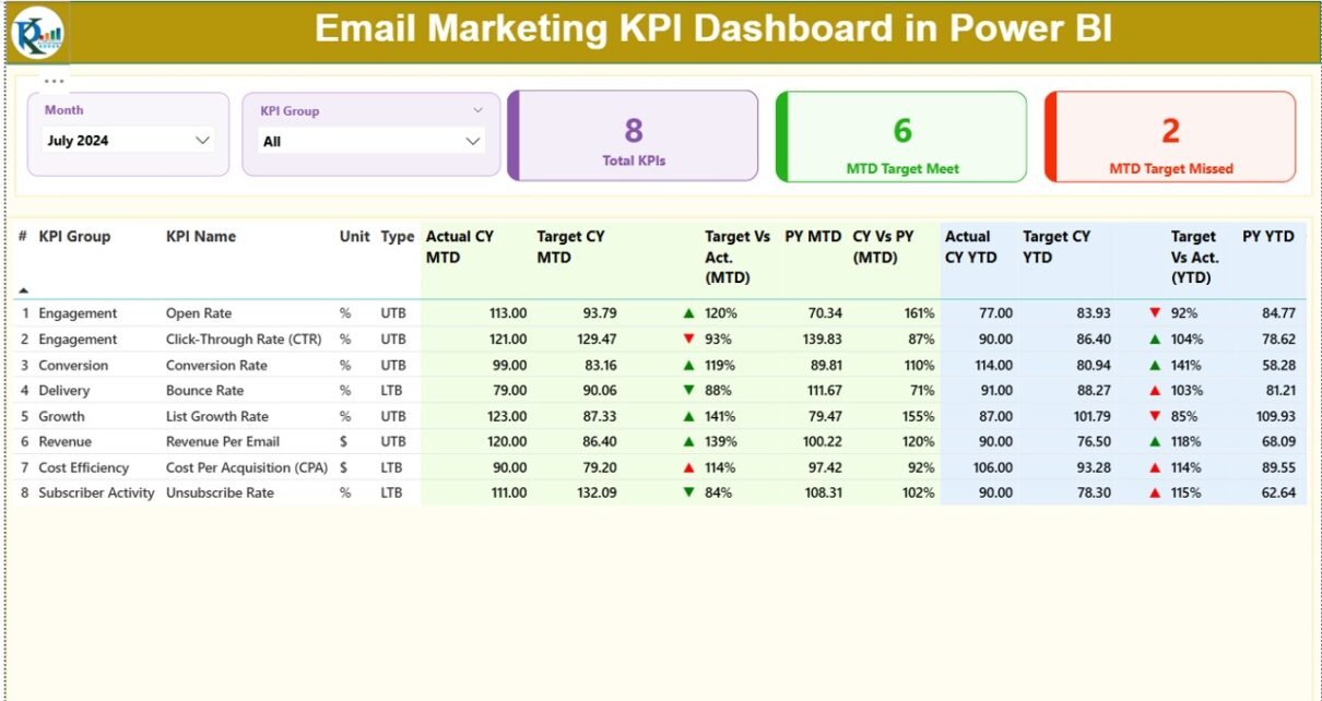
1️⃣ Summary Page — The Performance Overview
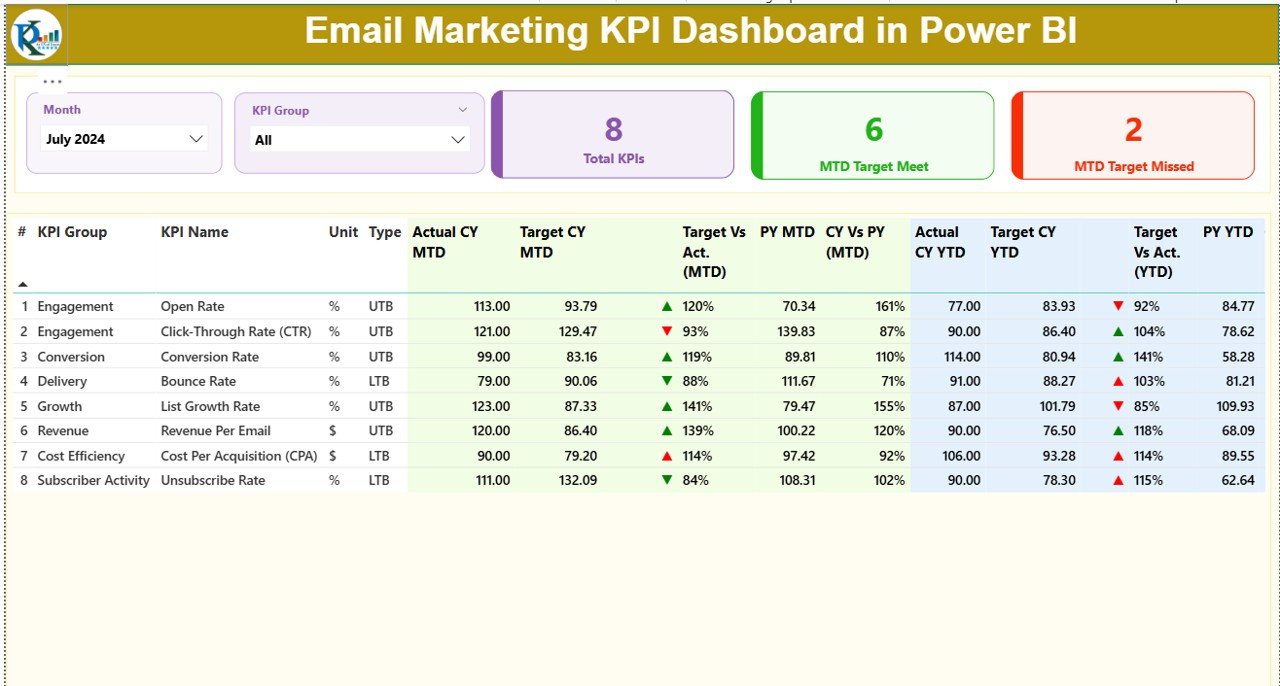
The Summary Page acts as the command center of the dashboard.
Key features include:
-
Month and KPI Group slicers: Easily filter data by specific months or KPI categories.
Performance Cards:
- Total KPIs Count
- MTD (Month-to-Date) Target Met Count
- MTD Target Missed Count
-
Detailed KPI Table: Displays comprehensive insights such as:
- KPI Number and KPI Name
- KPI Group (like Campaign Performance, Audience Engagement, Deliverability, etc.)
- Unit of measurement (%, count, or monetary value)
- Type: UTB (Upper the Better) or LTB (Lower the Better)
-
Target vs Actual (MTD) =
(Actual / Target) × 100 -
CY vs PY (MTD) =
(Current Year MTD / Previous Year MTD) × 100 -
Target vs Actual (YTD) =
(Actual / Target) × 100 -
CY vs PY (YTD) =
(Current Year YTD / Previous Year YTD) × 100
This page provides a snapshot of campaign health, comparing performance across current, target, and previous-year benchmarks.
2️⃣ KPI Trend Page — Visualizing Performance Over Time
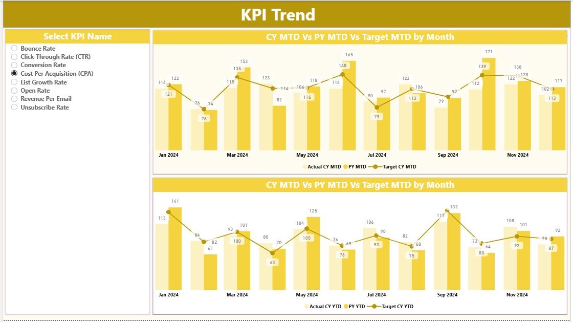
The KPI Trend Page gives marketers a visual understanding of how each KPI performs over time.
Key components:
-
Slicer for KPI Selection: Users can choose a specific KPI (e.g., CTR or Open Rate).
-
Combo Charts: Dual visuals comparing Actual, Target, and Previous Year data for both MTD and YTD performance.
With trend visualization, marketers can easily identify:
-
Periods of high engagement
-
Seasonal fluctuations in performance
-
Campaign strategies that resulted in higher ROI
This page supports data-driven storytelling, helping decision-makers understand trends and patterns that shape marketing outcomes.
3️⃣ KPI Definition Page — Understanding Each Metric
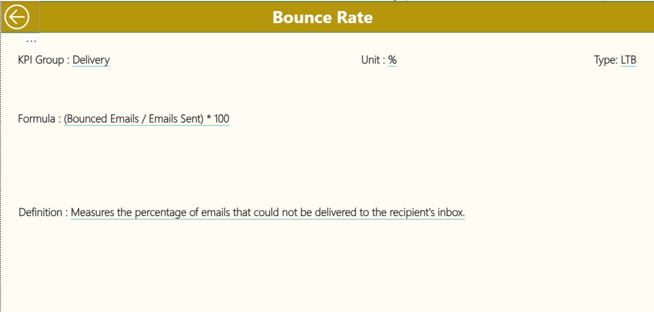
This drill-through page (hidden by default) allows users to explore KPI details in depth. From the Summary Page, clicking on a KPI navigates to its definition, formula, and characteristics.
Displayed information includes:
-
KPI Number
-
KPI Group
-
KPI Name
-
Unit
-
Formula
-
Definition
-
Type (UTB/LTB)
A Back Button on the top-left corner brings users back to the Summary Page seamlessly.
This structure makes the dashboard both informative and interactive, empowering users to explore every layer of their data.
Excel Data Source — The Backbone of the Dashboard
The Excel file serves as the central data repository, containing three structured worksheets:
1️⃣ Input_Actual Sheet
Stores actual performance data for each KPI, with columns for:
-
KPI Name
-
Month (use the first date of each month)
-
MTD and YTD values
2️⃣ Input_Target Sheet
Contains target values for each KPI, aligned with the same structure as the actual data.
3️⃣ KPI_Definition Sheet
Documents:
-
KPI Number
-
KPI Group
-
KPI Name
-
Unit
-
Formula
-
Definition
-
Type (LTB/UTB)
This Excel structure ensures easy updates, consistent data entry, and accurate dashboard refreshes.
Advantages of the Email Marketing KPI Dashboard in Power BI
Click to Purchases Email Marketing KPI Dashboard in Power BI
1. Unified Data View
Power BI combines all KPIs from multiple campaigns, giving marketers a single, holistic view of performance.
2. Real-Time Insights
Instantly analyze current month performance versus targets and previous year metrics.
3. Improved Decision-Making
Visual indicators and trend charts help identify strengths and weaknesses across campaigns.
4. Enhanced Accountability
Each team member can track their metrics and adjust strategies to meet targets.
5. Customizable and Scalable
Easily modify KPIs, data sources, or visuals to suit specific business requirements.
6. Time-Saving Automation
Automated updates from Excel save time and reduce manual reporting efforts.
7. Data-Driven Strategy Optimization
Understanding KPIs helps businesses focus on improving open rates, click rates, and ROI.
How to Use the Dashboard Effectively
-
Update Data Regularly:
Refresh the Excel file every campaign cycle with the latest actual and target data. -
Review Summary Insights:
Start from the Summary Page to identify areas where performance diverges from targets. -
Analyze Trends:
Use the KPI Trend Page to detect consistent underperformance or highlight seasonal success. -
Drill-Through for Clarity:
Dive into the KPI Definition Page for deeper context and understanding of metrics. -
Take Action:
Convert insights into improvements — like refining subject lines or optimizing send times.
Visualizations and Insights You Can Create
Power BI allows flexible and dynamic visuals for marketing performance. Examples include:
-
Donut Charts for Target vs Actual achievement
-
Line Charts for Monthly CTR trends
-
Stacked Bar Charts for comparing multiple campaigns
-
KPI Cards showing conversion or bounce rate changes
-
Heatmaps showing regional engagement rates
-
Trend Arrows and Conditional Formatting to indicate performance direction
With these visuals, marketers gain a complete story — from top-level trends to granular insights.
Best Practices for Using the Email Marketing KPI Dashboard
1. Define Clear KPI Goals
Each campaign must have measurable objectives (e.g., increase CTR by 5% or reduce bounce rate below 1%).
2. Keep Data Clean
Remove duplicates, invalid emails, and outdated records for accurate reporting.
3. Refresh Data Frequently
Regular updates maintain real-time accuracy and trust in insights.
4. Customize Dashboard Layout
Highlight the KPIs that matter most to your business — whether engagement, conversions, or ROI.
5. Integrate with Other Data Sources
Combine data from CRM tools or Google Analytics for a 360° marketing view.
6. Focus on Actionable Insights
Don’t just track data — use it to improve subject lines, segmentation, and personalization.
7. Automate Reports
Schedule Power BI refreshes and email snapshots to share weekly summaries with stakeholders.
8. Benchmark Against Past Performance
Comparing CY vs PY trends helps identify improvement areas.
9. Train Teams on Dashboard Usage
Ensure marketing teams understand how to interpret visuals and metrics effectively.
10. Use Alerts and Thresholds
Set up KPI alerts to notify when performance deviates beyond acceptable limits.
Opportunities for Improvement
Even a well-designed dashboard can evolve. Consider:
-
Adding real-time API connections to marketing platforms like Mailchimp or HubSpot.
-
Implementing segmentation filters (by region, campaign type, or audience group).
-
Incorporating predictive analytics to forecast future performance.
-
Enhancing visual storytelling with Power BI bookmarks and buttons.
These improvements can turn your Email Marketing Dashboard into a true intelligence powerhouse.
Conclusion
The Email Marketing KPI Dashboard in Power BI is more than just a reporting tool — it’s a performance management system that empowers businesses to make smarter, faster, and data-driven marketing decisions.
By combining Excel’s simplicity with Power BI’s analytical power, marketers can track all campaign metrics in one place, measure progress toward goals, and continuously optimize their strategies.
If your goal is to improve open rates, drive more conversions, and maximize email ROI, implementing this dashboard is the smartest next step.
Frequently Asked Questions (FAQs)
Click to Purchases Email Marketing KPI Dashboard in Power BI
1. What is the purpose of an Email Marketing KPI Dashboard?
It tracks all essential performance indicators like open rate, CTR, and ROI, helping marketers measure campaign success and improve results.
2. Why use Power BI for email marketing analytics?
Power BI provides dynamic visuals, interactive filtering, and real-time data updates that make analysis faster and more insightful than traditional spreadsheets.
3. Can I customize KPIs in the dashboard?
Yes, you can easily add, remove, or modify KPIs based on your organization’s goals or campaign structure.
4. How often should I update the Excel data source?
It’s best to update it after each campaign or at least monthly to maintain accurate insights.
5. What are the most important KPIs for email marketing?
The most crucial metrics include open rate, CTR, bounce rate, unsubscribe rate, conversion rate, and ROI.
6. Can I connect this dashboard to Mailchimp or HubSpot?
Yes, by enabling API connections or using Power BI connectors, you can fetch live data from these platforms.
7. Is Power BI suitable for small businesses?
Absolutely! Power BI is cost-effective, scalable, and easy to use, making it ideal for startups and large enterprises alike.
8. How can I share the dashboard with my team?
You can publish it to Power BI Service and share access via workspace permissions or email reports.
9. What’s the difference between MTD and YTD in the dashboard?
MTD (Month-to-Date) shows performance for the current month, while YTD (Year-to-Date) aggregates performance for the entire year.
10. What’s next after creating the dashboard?
Continuously analyze results, test new email strategies, and use insights to boost engagement and conversions.
Visit our YouTube channel to learn step-by-step video tutorials