This ready-to-use dashboard gives leaders complete visibility into transformation projects. Moreover, it converts raw data into clear, interactive insights. As a result, decision-makers can track performance, control budgets, and improve customer experience without wasting time.
In this detailed guide, you will learn:
-
What a Digital Transformation Dashboard in Excel is
-
Why organizations need it
-
A complete explanation of all 5 dashboard pages
-
Key metrics to track
-
Advantages of Digital Transformation Dashboard in Excel
-
Best practices for using it
-
Frequently Asked Questions
Let’s explore everything step by step.
Click to Purchases Digital Transformation Dashboard in Excel
What Is a Digital Transformation Dashboard in Excel?
A Digital Transformation Dashboard in Excel is an interactive reporting tool that helps organizations monitor digital initiatives, budgets, risks, and performance metrics in one centralized system.
Instead of checking different files, leaders can:
-
Track project budgets
-
Monitor department performance
-
Analyze customer experience scores
-
Evaluate cybersecurity risk levels
-
Measure completion percentages
Excel makes this process simple. You can use pivot tables, slicers, and pivot charts to create dynamic visual reports. Furthermore, users can filter data by department, region, project category, or month instantly.
Therefore, the dashboard provides clarity, structure, and control over transformation initiatives.
Why Do Organizations Need a Digital Transformation Dashboard?
Digital transformation involves:
-
Technology upgrades
-
Process automation
-
Cybersecurity improvements
-
Customer experience enhancement
-
Department-level innovation
However, transformation projects often fail due to poor tracking and unclear reporting. Leaders cannot see real-time cost variance or risk exposure. Consequently, they delay decisions.
A Digital Transformation Dashboard in Excel solves these problems because it:
-
Centralizes all data
-
Highlights budget variances
-
Tracks completion rates
-
Identifies high-risk areas
-
Improves accountability
Moreover, Excel offers flexibility. Organizations can customize the dashboard according to their KPIs.
Key Features of Digital Transformation Dashboard in Excel
This ready-to-use Excel dashboard includes powerful features designed for business users.
1️⃣ Page Navigator (Left-Side Navigation)
The Page Navigator appears on the left side of the dashboard. It allows users to switch between analytical pages easily. As a result, users save time and avoid confusion.
Complete Explanation of All 5 Dashboard Pages
Now let us understand each page in detail.
1️⃣ Overview Page – The Command Center
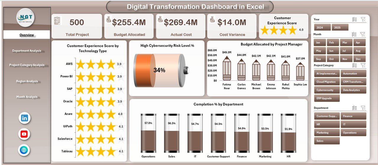
The Overview Page acts as the main control panel. It includes:
-
Right-side slicer for filtering
-
4 KPI Cards
-
4 interactive charts
KPI Cards Display:
-
Total Budget Allocation
-
Total Actual Cost
-
Overall Completion %
-
High Cybersecurity Risk Level %
Charts on Overview Page:
-
Customer Experience Score by Technology Type
This chart shows how different technologies impact customer satisfaction. Therefore, leaders can prioritize high-performing solutions. -
High Cybersecurity Risk Level %
This chart highlights security exposure. Consequently, teams can take preventive action. -
Budget Allocation by Project Manager
This visual displays budget distribution among managers. As a result, management ensures balanced investment. -
Completion % by Department
This chart reveals which departments meet their transformation goals.
Overall, the Overview page gives a high-level summary. It helps leaders act quickly and confidently.
Click to Purchases Digital Transformation Dashboard in Excel
2️⃣ Department Analysis – Performance at Department Level
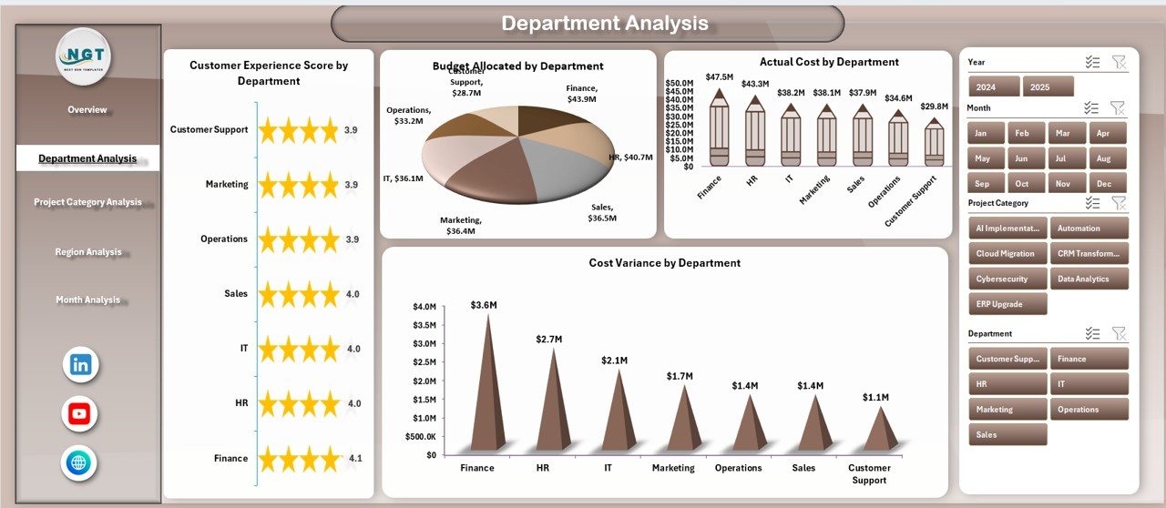
The Department Analysis page focuses on department-wise performance.
Right-Side Slicer:
Users can filter by project category, region, or month.
Charts Included:
-
Customer Experience Score by Department
This chart identifies departments that improve customer interactions. -
Budget Allocation by Department
Leaders can review budget distribution. -
Actual Cost by Department
This visual shows spending trends. -
Cost Variance by Department
It highlights overspending or savings.
Therefore, department heads can take corrective actions quickly.
3️⃣ Project Category Analysis – Strategic View by Project Type
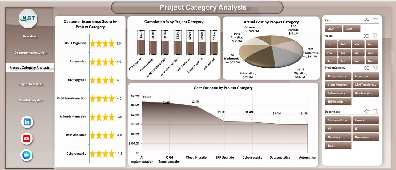
Different transformation projects require different investments. This page provides category-based insights.
Charts Included:
-
Customer Experience Score by Project Category
-
Completion % by Project Category
-
Actual Cost by Project Category
-
Cost Variance by Project Category
As a result, leadership can:
-
Compare innovation projects
-
Identify high-performing categories
-
Control cost overruns
Moreover, teams can align projects with strategic goals.
4️⃣ Region Analysis – Geographic Performance Monitoring
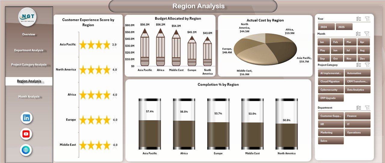
Digital transformation impacts different regions differently. Therefore, regional tracking becomes essential.
Charts Included:
-
Customer Experience Score by Region
-
Completion % by Region
-
Actual Cost by Region
-
Cost Variance by Region
Consequently, management can:
-
Identify lagging regions
-
Allocate more resources
-
Improve operational efficiency
This page supports global and multi-location organizations.
Click to Purchases Digital Transformation Dashboard in Excel
5️⃣ Month Analysis – Time-Based Financial Tracking
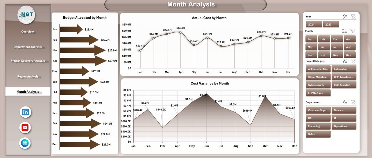
The Month Analysis page focuses on time-based trends.
Charts Included:
-
Budget Allocation by Month
-
Actual Cost by Month
-
Cost Variance by Month
This page helps organizations:
-
Track monthly spending patterns
-
Identify cost spikes
-
Monitor project timelines
Therefore, finance teams gain better control over transformation budgets.
Support Sheet – The Backend Structure
The Support Sheet manages:
-
KPI definitions
-
Calculation formulas
-
Lookup tables
This sheet ensures accurate reporting.
Data Sheet – The Core Data Entry Page
The Data Sheet captures all transformation-related data such as:
-
Department Name
-
Project Category
-
Region
-
Project Manager
-
Technology Type
-
Budget Allocation
-
Actual Cost
-
Completion %
-
Cybersecurity Risk Level
-
Customer Experience Score
-
Month
Users enter data here. Then pivot tables process the information automatically.
What KPIs Should You Track in a Digital Transformation Dashboard?
You should track the following KPIs:
-
Budget Allocation
-
Actual Cost
-
Cost Variance
-
Completion Percentage
-
Customer Experience Score
-
Cybersecurity Risk Level %
-
Technology Adoption Rate
-
Project Delivery Timeliness
Tracking these metrics ensures transparency and accountability.
Advantages of Digital Transformation Dashboard in Excel
A Digital Transformation Dashboard in Excel offers several advantages.
1️⃣ Improves Decision-Making
Because the dashboard shows real-time data, leaders make faster decisions.
2️⃣ Enhances Budget Control
You can monitor cost variance instantly. Therefore, finance teams avoid overspending.
3️⃣ Increases Transparency
Departments see their performance clearly. As a result, accountability improves.
4️⃣ Reduces Manual Work
Instead of preparing reports manually, Excel automates calculations.
5️⃣ Improves Risk Management
Cybersecurity risk charts help teams act before issues grow.
6️⃣ Customizable and Scalable
You can modify KPIs according to business needs.
How to Create a Digital Transformation Dashboard in Excel?
If you want to build it from scratch, follow these steps:
-
Prepare structured data in Excel table format.
-
Define KPIs and calculation logic.
-
Create pivot tables for analysis.
-
Insert pivot charts for visualization.
-
Add slicers for filtering.
-
Design a navigation panel.
-
Test formulas and links.
Finally, format the dashboard for clarity and user experience.
Best Practices for the Digital Transformation Dashboard in Excel
To get maximum value, follow these best practices.
Keep Data Clean and Structured
Use consistent naming conventions.
Update Data Regularly
Enter monthly updates to maintain accuracy.
Use Clear KPI Definitions
Define each KPI clearly in the support sheet.
Avoid Overloading with Charts
Keep visuals simple and focused.
Use Slicers Smartly
Place slicers in visible positions for easy filtering.
Protect Backend Sheets
Lock formulas to prevent accidental changes.
Common Challenges in Digital Transformation Tracking
Organizations often face:
-
Budget overruns
-
Delayed project completion
-
High cybersecurity risks
-
Low customer adoption
-
Poor inter-department coordination
However, a structured dashboard helps overcome these challenges.
How Does This Dashboard Improve Strategic Planning?
Because it combines financial, operational, and risk metrics, it supports strategic planning.
Leaders can:
-
Align projects with corporate goals
-
Allocate resources effectively
-
Identify high-performing teams
-
Reduce transformation risk
Therefore, it acts as a strategic planning tool.
Who Can Benefit from Digital Transformation Dashboard in Excel?
Click to Purchases Digital Transformation Dashboard in Excel
-
CIOs
-
Digital Transformation Managers
-
Project Managers
-
Finance Teams
-
Department Heads
-
Strategy Consultants
Moreover, startups and enterprises can use it equally.
Conclusion
Digital transformation requires clear tracking, structured reporting, and accurate analysis. Without visibility, organizations lose control over budgets, timelines, and risk management.
However, a Digital Transformation Dashboard in Excel provides complete clarity. It centralizes data, simplifies reporting, and improves decision-making. Furthermore, it enhances transparency and strengthens accountability.
Therefore, if your organization wants better control over digital initiatives, this dashboard becomes an essential tool.
It does not just show numbers. Instead, it drives transformation success.
Frequently Asked Questions with Answers
What is a Digital Transformation Dashboard in Excel?
It is an interactive Excel-based reporting tool that tracks digital projects, budgets, completion rates, and risks.
Can I customize the KPIs?
Yes, you can modify KPI definitions according to business needs.
Do I need advanced Excel skills?
No. If you understand pivot tables and slicers, you can use it easily.
How often should I update the data?
You should update data monthly or weekly, depending on project frequency.
Can small businesses use this dashboard?
Yes. Small businesses can use it to track technology investments and project performance.
Does it support multi-region analysis?
Yes. The Region Analysis page tracks performance by location.
How does it help in budget control?
It calculates cost variance automatically and highlights overspending.
Is Excel enough for digital transformation tracking?
Yes. For many organizations, Excel provides flexibility and cost-effective reporting.
Visit our YouTube channel to learn step-by-step video tutorials