Running a dropshipping business without a unified analytics view is the fastest way to burn ad spend on losing channels. The Dropshipping Dashboard in Excel tracks 5 core KPIs (Total Revenue, Net Profit, Orders, Ad Spend, AOV) across 5 interactive analysis pages and 17+ pre-built charts — covering channels, products, suppliers, and customer geography in a single .xlsx file. Setup takes under 10 minutes.
For most operators running 2-3 sales channels and 3+ suppliers, this is the gap between guessing and knowing. Triple Whale and Polar charge $129-499 per month for similar visibility; this Excel-based dropshipping tracker delivers the same KPI structure for $17.99 one-time, with the bonus that your data stays on your laptop instead of in someone else’s cloud.
Key Features of the Dropshipping Dashboard in Excel
This dashboard is built around how dropshippers actually work — not how a generic sales tool thinks they should. Every page answers a real operational question, and every chart traces back to a single Data sheet you replace with your own export.
📊 5-page interactive structure. Overview, Channel Performance, Product Analysis, Supplier & Fulfillment, and Customer & Geography — each page filters together through shared slicers. Click a date range or supplier on any page and every chart across all five pages refreshes simultaneously through the pre-built pivot engine on the Support sheet.
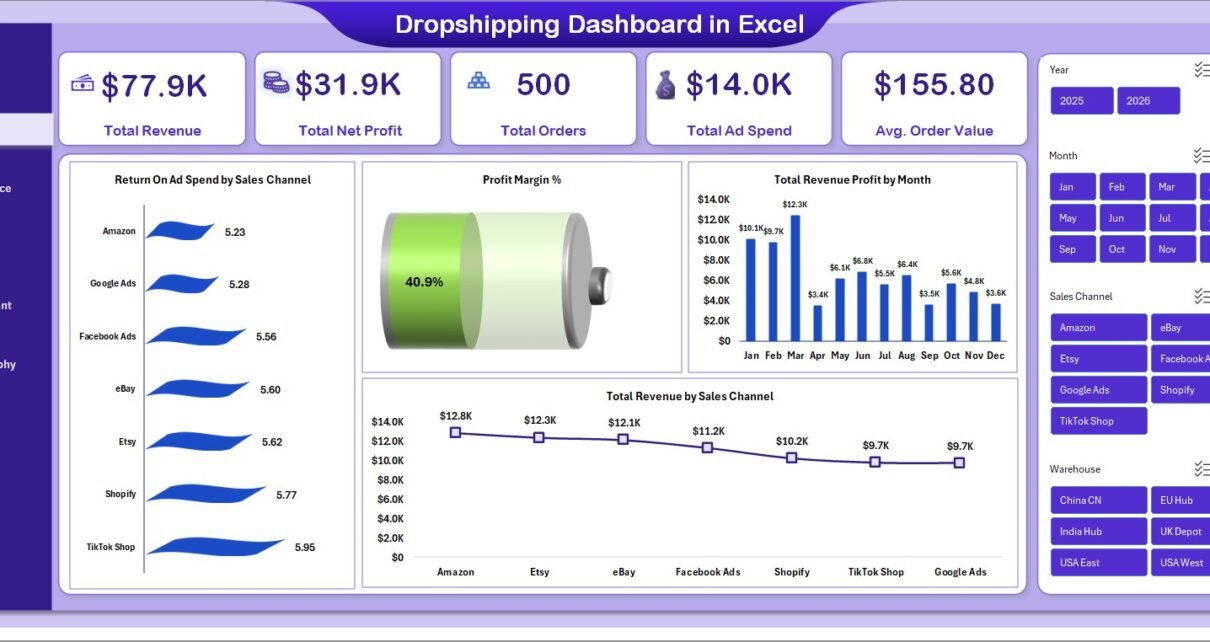
💰 5 executive KPI cards on the Overview page: Total Revenue, Total Net Profit, Total Orders, Total Ad Spend, and Average Order Value. These are calculated dynamically from the Data sheet using SUMIFS-driven formulas, so they update the moment you replace sample rows.
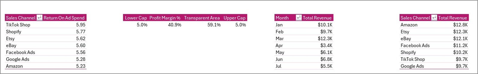
📈 17+ pre-built charts covering Return On Ad Spend by Sales Channel, Profit Margin %, Total Revenue Profit by Month, Total Revenue by Sales Channel, Total Revenue by Device, Total Revenue Vs Total Net Profit by Category, Avg. Rating by Category, Total Revenue Vs Total Supplier Cost by Supplier, Return % by Warehouse, Delivery % by Supplier, Total Revenue by Customer Country, and Total Revenue by Payment Method.
🎛️ Multi-slicer filtering. Filter by Sales Channel (Shopify, Amazon, eBay, Etsy, TikTok Shop), Date Range, Country, Supplier, Category, or Device. The slicers cascade across the entire dashboard, not just the active page.
🔄 One-click refresh architecture. Update the Data sheet, click Data > Refresh All, and every pivot, chart, and KPI updates simultaneously. No formulas to drag, no ranges to extend.
Dashboard Pages Explanation
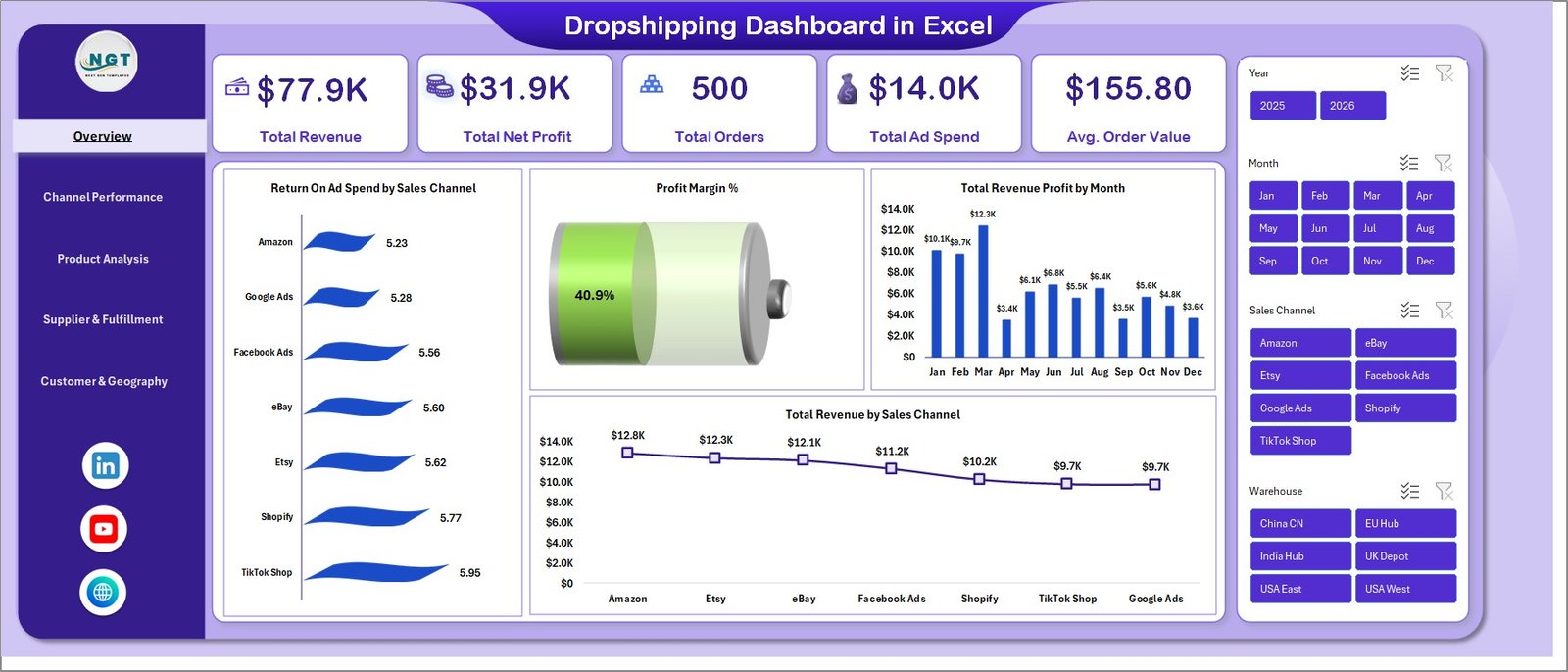
Page 1 — Overview
The Overview is the executive snapshot — the page you open Monday morning to see whether the previous week was good, average, or bleeding money. Five KPI cards across the top show Total Revenue, Total Net Profit, Total Orders, Total Ad Spend, and Average Order Value. Below that, four charts surface the highest-leverage views: Return On Ad Spend by Sales Channel (which channel is actually paying back), Profit Margin % (overall and trend), Total Revenue Profit by Month (seasonality), and Total Revenue by Sales Channel (volume mix).
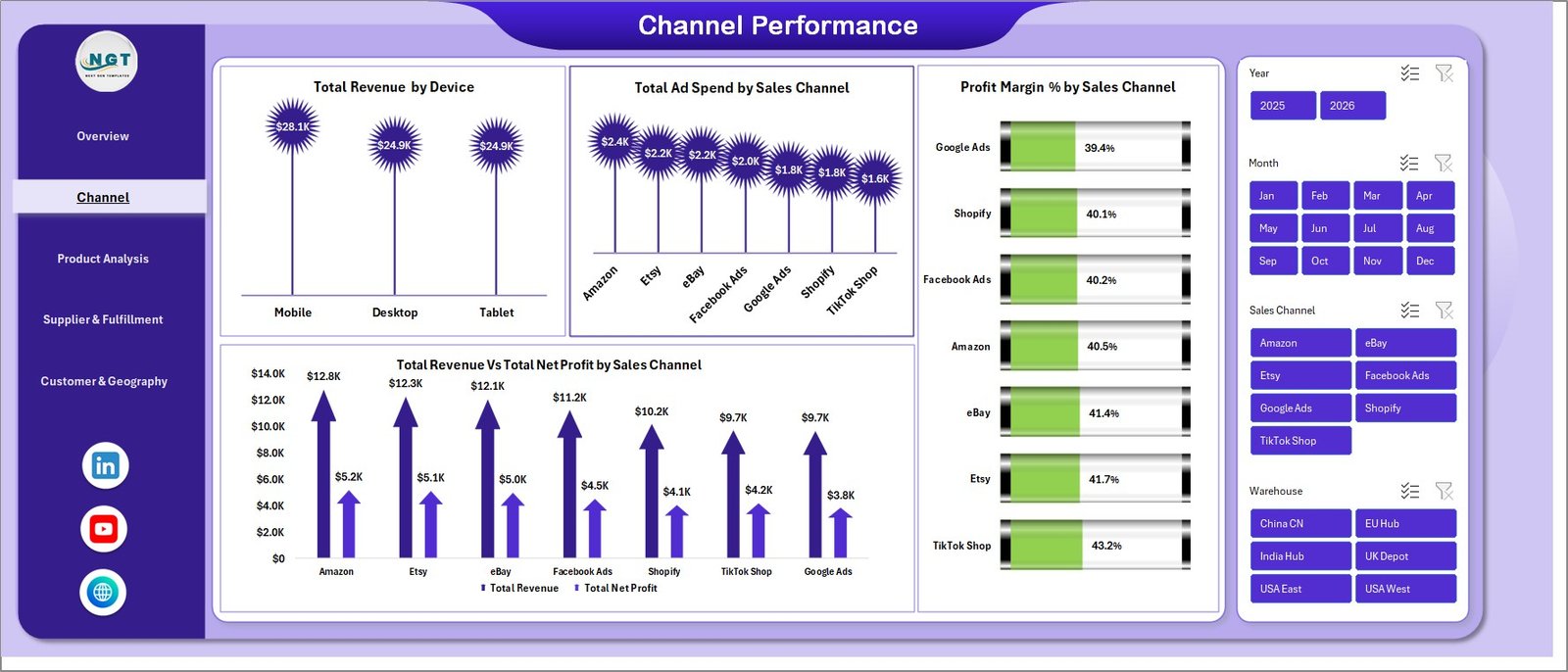
Page 2 — Channel Performance
This page answers “which channel is actually profitable, not just busy?” The four charts — Total Revenue by Device, Total Ad Spend by Sales Channel, Profit Margin % by Sales Channel, and Total Revenue Vs Total Net Profit by Sales Channel — expose the gap between top-line revenue and bottom-line margin. A channel can drive 30% of revenue and contribute 5% of profit; this page makes that obvious.
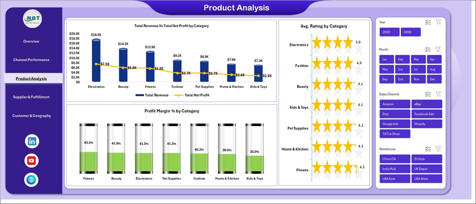
Page 3 — Product Analysis
Three charts tell you which product categories deserve more ad budget and which are dead weight: Total Revenue Vs Total Net Profit by Category, Avg. Rating by Category, and Profit Margin % by Category. The rating overlay matters — a category with high revenue but a 3.2-star average is a refund time bomb worth pruning before it burns reviews on your store.
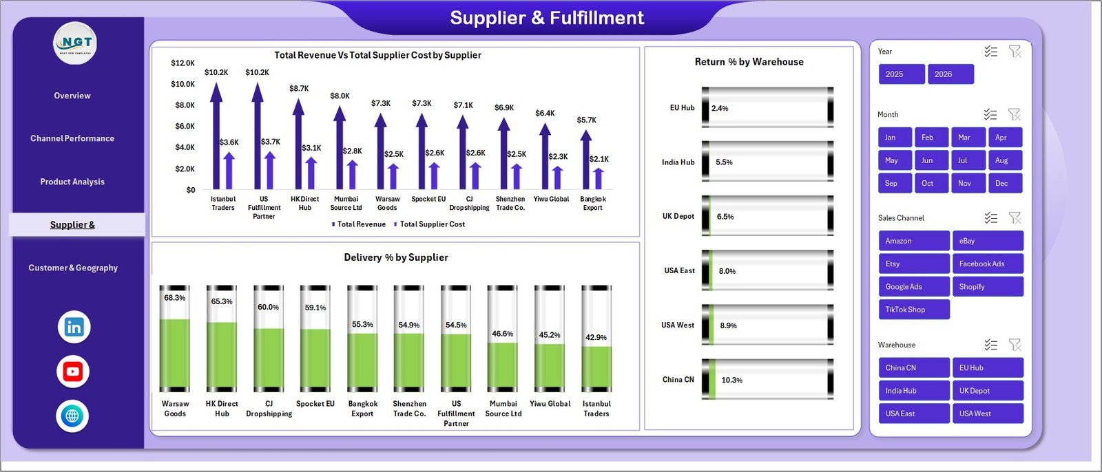
Page 4 — Supplier & Fulfillment
The single most under-tracked area for most dropshippers. Total Revenue Vs Total Supplier Cost by Supplier reveals which suppliers are squeezing margin. Return % by Warehouse exposes fulfillment weak points. Delivery % by Supplier identifies the supplier whose late shipments are costing you customer loyalty. For anyone running 3+ suppliers, this page typically pays for the dashboard 100x over within 30 days.
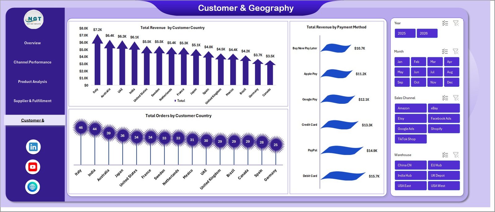
Page 5 — Customer & Geography
Three charts: Total Revenue by Customer Country, Total Revenue by Payment Method, and Total Orders by Customer Country. This page tells you where to scale ad spend geographically and which payment options correlate with the highest conversion. Stores on Shopify and WooCommerce typically discover one or two countries that punch far above their order volume in average order value — those are your scaling targets.
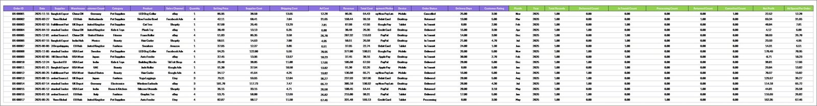
Sheet 6 — Data Sheet
The single source of truth. Replace the sample rows with your own order-level export from Shopify, WooCommerce, Amazon Seller Central, or any other channel — keep the column headers exactly as-is, and the dashboard updates after one Data > Refresh All click. Microsoft Learn’s pivot refresh guide covers the underlying mechanic if you want to dig deeper.
Sheet 7 — Support Sheet
The hidden engine. All pivot tables that drive the dashboard live here. Right-click the tab and Hide it before sharing the file with stakeholders — they don’t need to see the plumbing.
Dropshipping Dashboard in Excel vs. Google Sheets vs. Triple Whale / Polar — Feature Comparison
| Feature | Dropshipping Dashboard in Excel | Google Sheets equivalent | Triple Whale / Polar |
|---|---|---|---|
| Cost | $17.99 one-time | $9-15 one-time | $129-499 / month |
| Platform | Microsoft Excel (offline) | Google Sheets (browser) | Cloud SaaS |
| Setup time | Under 10 minutes | Under 15 minutes | 2-5 days |
| ROAS by channel | ✅ Pre-built | ✅ Pre-built | ✅ Auto-pulled |
| Supplier cost & margin tracking | ✅ Pre-built | Manual setup | ❌ Not native |
| Works offline / private data | ✅ | ❌ | ❌ |
| Year-1 cost at 5 users | $17.99 | $9-15 | $1,548 – $5,988 |
| Customizable formulas | ✅ Full Excel access | ✅ Apps Script | Limited (UI only) |
For dropshippers who want channel ROAS, supplier margin, and customer geography in one file without paying $1,500+ per year for a SaaS analytics suite, the Dropshipping Dashboard in Excel sits in the sweet spot.
Who Should Use This Template
Perfect for:
- Solo dropshippers and small teams ($10K–$500K monthly revenue) on Shopify, WooCommerce, or multi-marketplace setups
- Operators running 2+ sales channels who need a unified ROAS view
- Stores using 3+ dropshipping suppliers who need supplier-level margin visibility
- Ecommerce consultants and agencies delivering monthly reports to dropshipping clients
Not a fit if:
- You need real-time API sync with Shopify and Meta Ads (use Triple Whale or Polar)
- Your team works exclusively in Google Sheets
- You’re an enterprise needing SOC 2-compliant cloud BI
Real-World Use Cases
Marcus runs a 4-person Shopify dropshipping team selling pet accessories on Shopify, Amazon, and TikTok Shop. Every Monday morning he opens the Dropshipping Dashboard to review the previous week’s ROAS by channel. Last quarter the dashboard surfaced a 0.8x ROAS on TikTok Shop while Shopify direct was running at 3.2x — he killed the TikTok Shop spend the same day, and replaced his $199/month Triple Whale subscription with this $17.99 file.
Priya is a Mumbai-based ecommerce consultant managing 7 dropshipping clients. She drops each client’s monthly export into a copy of this template and sends a 5-page PDF report with branded styling. Setup takes 8 minutes per client. Before this dashboard, she was spending 3 hours per client building reports from scratch in Google Sheets — a 95% time saving she now passes on as faster turnaround.
Jamie operates a solo print-on-demand store with 12 suppliers across Aliexpress, Printful, and Spocket. The Supplier & Fulfillment page surfaced that one supplier was running a 14% return rate vs. 3% for the rest. Jamie swapped suppliers within a week and recovered roughly $4,200/month in margin. The dashboard paid for itself 200x over.
Advantages of the Dropshipping Dashboard in Excel
✅ Direct cost savings. One-time $17.99 vs $129-499/month subscription analytics tools. At 5 users, the year-one savings range from $1,500 to nearly $6,000.
✅ Data privacy by default. Your order data, supplier costs, and customer information never leave your laptop. No cloud sync, no telemetry, no risk of a vendor data breach exposing your customer list.
✅ Fully customizable. Every chart, formula, slicer, and pivot table is unlocked. Add a logo, change the theme, swap KPI definitions, add new chart types — it’s just Excel, with no licensing restrictions on what you can change.
✅ Excel-native. No new tool to learn. If you can use SUMIFS and pivot tables, you can extend this dashboard. Compare with our Shopify Store Dashboard or Ecommerce Conversion Rate KPI Dashboard for related Excel dashboards on the same architecture.
Opportunities for Improvement
Honest limitations — because every tool has them:
⚠️ Manual data import. This dashboard does not auto-sync with Shopify or marketplace APIs. You’ll need to export a CSV from each source and paste it into the Data sheet. For most stores under $500K monthly revenue this is a 5-minute weekly task; for higher-volume stores, an API-connected SaaS like Triple Whale may be worth the spend.
⚠️ Single-user file. If you need 4 team members editing the dashboard simultaneously in real time, the Excel file isn’t ideal — a Google Sheets equivalent or cloud BI works better. SharePoint or OneDrive co-authoring works for asynchronous collaboration.
⚠️ No mobile-native view. Excel mobile renders the dashboard but not optimally. For executives who want to glance at numbers from a phone all day, a dedicated mobile dashboard tool is a better fit.
Best Practices
📌 Refresh weekly, not daily. Daily refreshes inflate the noise-to-signal ratio. Weekly refreshes (every Monday) match how most operators make budget decisions.
📌 Hide the Support sheet before sharing the file. Stakeholders shouldn’t see the pivot plumbing.
📌 Add a column for net advertising profit (Revenue − Ad Spend − COGS) if you want a single number that captures channel efficiency. Drop a SUMIFS-based KPI card on the Overview page.
📌 Save as .xlsx, not .xls. Slicers don’t survive the older format.
📌 Use the workbook theme to apply your brand colors in one click rather than editing each chart individually.
Explore Relevant Templates
- Shopify Store Dashboard in Excel — the broader Shopify-focused version
- Etsy Seller Analytics Dashboard in Excel — single-channel Etsy focus
- Abandoned Cart Recovery KPI Dashboard — pair with this to plug revenue leaks
- Ecommerce Conversion Rate KPI Dashboard — funnel-focused KPI view
- Best Excel Dashboard Templates — our curated dashboard roundup
Frequently Asked Questions
What KPIs does the Dropshipping Dashboard in Excel track?
The Dropshipping Dashboard tracks 5 core KPIs (Total Revenue, Total Net Profit, Total Orders, Total Ad Spend, Average Order Value) plus 17+ chart-level metrics including ROAS by channel, profit margin % by category, supplier cost vs revenue, return rate by warehouse, delivery % by supplier, and revenue by customer country.
How long does setup take?
Setup takes under 10 minutes. Open the Dropshipping Dashboard in Excel, paste your order-level data into the Data sheet keeping the column headers as-is, and click Data > Refresh All. Every chart, KPI card, and slicer updates automatically through the pre-built pivot engine on the Support sheet.
How does this compare to Triple Whale or Polar?
The Dropshipping Dashboard in Excel is a $17.99 one-time purchase versus Triple Whale’s $129-499 monthly subscription. The trade-off is that this template requires manual CSV import, while Triple Whale auto-syncs via API. For stores under $500K monthly revenue, the Excel option saves $1,500-$6,000 per year and keeps your data private.
Which sales channels does the Dropshipping Dashboard support?
The Dropshipping Dashboard supports any sales channel you have data for — the sample dataset uses Shopify, Amazon, eBay, Etsy, and TikTok Shop, but you can rename or add channels in the Data sheet. The slicer auto-populates from your data, so adding a new channel takes zero formula edits.
Can I customize the colors and add my logo?
Yes. The Dropshipping Dashboard in Excel uses standard Excel chart formatting, so you can edit colors via the workbook theme, replace fonts, and insert your logo on any page. The pivot tables and slicers are unlocked, so layout is fully editable.
Does it work on Mac and on older Excel versions?
The Dropshipping Dashboard runs on Excel 2016 and later for Windows and Mac, and on Microsoft 365. Slicers and pivot tables are supported in all of these. It is not compatible with Excel 2013 or earlier.
Is the data private?
Yes. The Dropshipping Dashboard in Excel is a local file — your order data, supplier costs, and customer information stay on your computer. No cloud sync, no telemetry, no third-party access — a key advantage over SaaS analytics tools.
About the Author
Built by PK — Microsoft Certified Professional with 15+ years of Excel, Google Sheets, and Power BI experience. Founder of NextGenTemplates, reaching 300K+ subscribers across YouTube channels (@PK-AnExcelExpert, @NextGenTemplates, @NeoTechNavigators). Every template is hand-built and tested before release.
Conclusion
If you’re running a dropshipping operation on Shopify, WooCommerce, or any multi-channel marketplace setup, the gap between knowing your numbers and guessing them is usually 15-30% of your margin. The Dropshipping Dashboard in Excel closes that gap in 10 minutes, with no subscription, no learning curve, and no data leaving your laptop.
📈 Click here to Purchase the Dropshipping Dashboard in Excel
✅ Instant download · One-time payment · No subscription · Lifetime access
🎥 Visit our YouTube channel for step-by-step video tutorials
👉 Youtube.com/@PK-AnExcelExpert
📅 Last updated: May 2026