Tracking the performance of corporate events used to mean stitching together budget spreadsheets, attendance lists, and venue invoices into one unwieldy file every quarter. The Event Management Report in Excel replaces that workflow with 4 connected worksheets, 5 KPI cards, 5 pre-built charts, and a filterable per-event information table — all driven by one Data sheet you populate once.
This article walks through every sheet of the Event Management Report in Excel template, explains how each chart is built, and shows when to use a Report-style template instead of a Dashboard. By the end you will know exactly how to drop your own event log into the file and produce a board-ready report in under 10 minutes — on Windows or Mac.
Key Features of Event Management Report in Excel
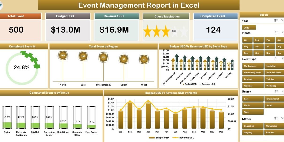
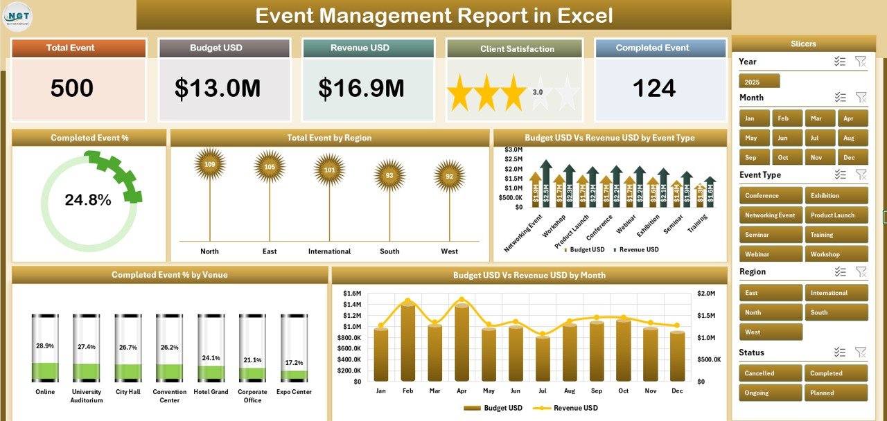
The Event Management Report in Excel ships as a single .xlsx file with 4 worksheets that work together as one connected report. Five KPI cards on the Summary page recalculate every time a slicer is clicked, and the Report page table filters in lockstep with the Summary visuals.
📊 Two-Page Reporting Structure. A visual Summary page for executives and a tabular Report page for operations teams. The split is deliberate — most stakeholders only need one of the two views, and the file lets you print either independently as a one-pager or a multi-page appendix.
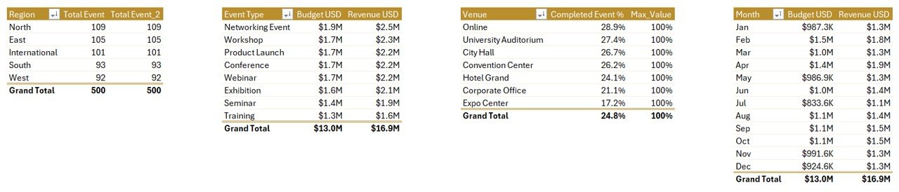
📈 5 Pre-Built Analytical Charts on the Summary. Completed Event %, Total Event by Region, Budget Vs Revenue by Event Type, Completed Event % by Venue, and Budget Vs Revenue by Month. Together they answer the four questions every events sponsor asks about completion, geography, profitability, and seasonality.
🎛️ Slicer-Driven Filtering on Both Pages. The Summary slicer panel sits on the right edge; the Report slicer panel sits on the left. Click any value in any slicer and the entire page recalculates instantly — no formulas to edit, no chart ranges to fix, no pivot refreshes to remember.
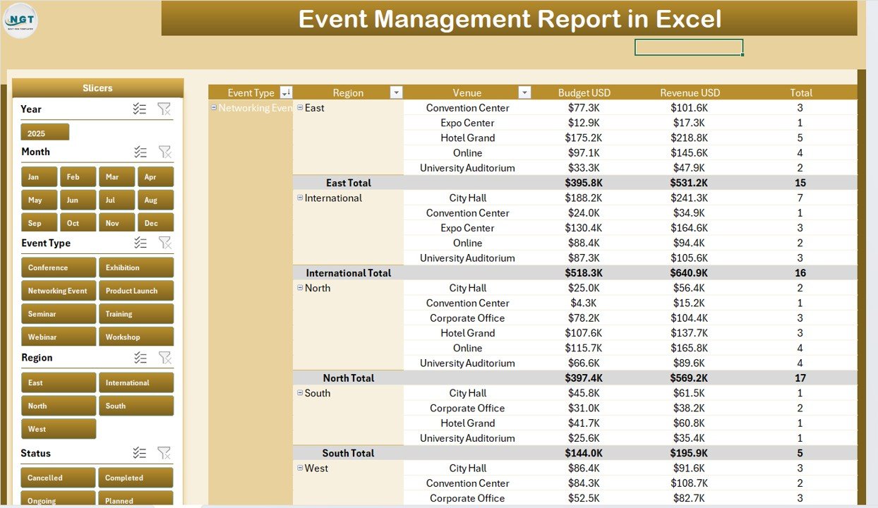
📋 Filterable Information Table on the Report Page. A clean tabular view that lists every event with Event Name, Type, Region, Venue, Month, Status, Budget, and Revenue. Filter the slicer on the left and the table compresses to a printable subset for board packs, audits, or vendor reviews.
🔄 Replace and Refresh Workflow. Drop your event log into the Data sheet, click Data → Refresh All on the Excel ribbon, and every chart, KPI card, and table row across both pages rebuilds. Microsoft documents this pivot-refresh pattern in detail in Microsoft 365 Support.
💻 Native .xlsx — Mac and Windows Compatible. No macros, no add-ins, no external connections. Works offline, opens in Excel for Mac, Excel for Windows, and Excel on the web. Compatible with Excel 2016 and later.
Sheets Explanation — Inside the Event Management Report in Excel
The Event Management Report in Excel contains 4 worksheets. Each plays a distinct role in the reporting flow, from raw data input to the polished executive view.
Sheet 1 — Summary. Opens with five KPI cards stretched across the top of the page and a right-aligned slicer panel for one-click filtering. Below the cards sit the five analytical visuals: Completed Event % (a single ring or gauge that tracks the share of events that closed successfully), Total Event by Region (a regional volume view), Budget Vs Revenue by Event Type (paired bars per event type to expose profitability), Completed Event % by Venue (which venues actually deliver), and Budget Vs Revenue by Month (the monthly seasonality curve).
Sheet 2 — Report. A filterable information table paired with a left-side slicer panel. The table lists every event row with its core fields — Event Name, Type, Region, Venue, Month, Status, Budget, and Revenue — and updates the moment a slicer is clicked. The Report sheet is built for printing, archiving, and per-event review. Use it for printable per-event reports, audit packs, vendor reviews, or as a clean export to send stakeholders who only want the numbers, not the charts.
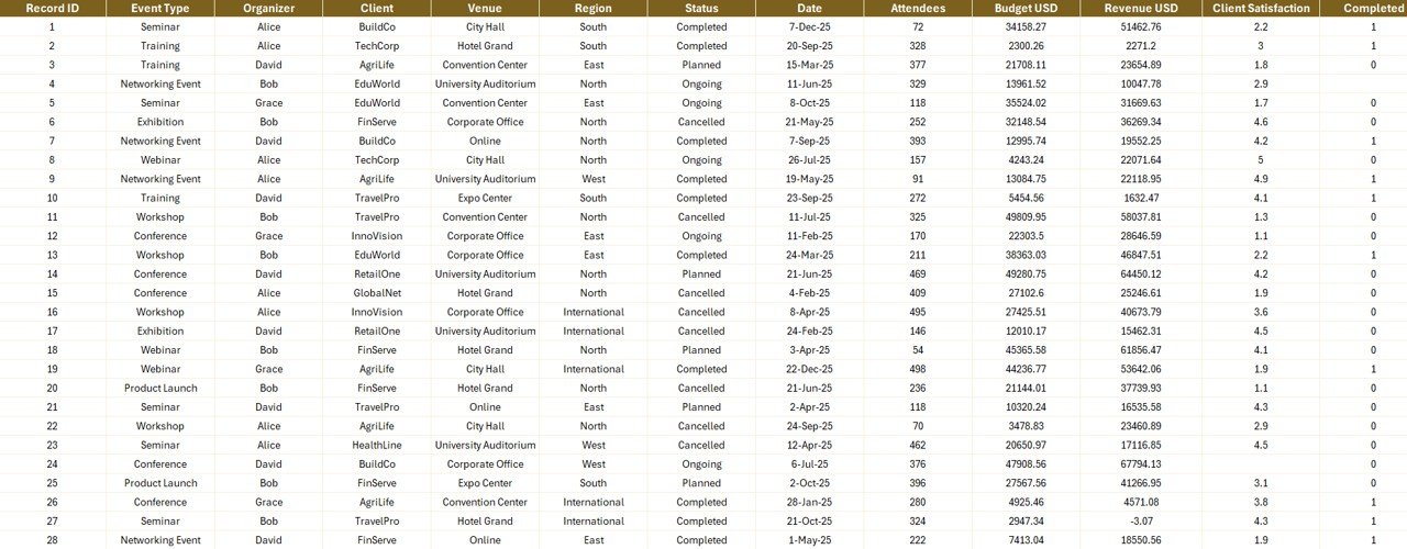
Sheet 3 — Data. The single source of truth. Drop your own event records into this sheet, keeping the column headers identical to the sample. Each row represents one event with fields for Event Name, Type, Region, Venue, Month, Status, Budget, Revenue, and any custom columns you add. The Data sheet accepts as many rows as Excel can hold, so you can keep historical events alongside new ones and use the Status slicer to separate active from archived rows.
Sheet 4 — Support. Holds the pivot tables that power every chart on the Summary page and the slicer-linked information table on the Report page. Click Data → Refresh All after updating the Data sheet and every pivot recalculates, which in turn refreshes every chart and the information table. The Support sheet is meant to be hidden in production — right-click the tab and choose Hide before sharing the file with stakeholders. Microsoft explains the underlying pivot model behind this design in their PivotTable documentation.
Event Management Report in Excel vs. Power BI Event Dashboard vs. Cvent / Bizzabo — Feature Comparison
| Feature | Event Management Report in Excel | Power BI Event Dashboard | Cvent / Bizzabo / Eventbrite Pro |
|---|---|---|---|
| Cost | $7.99 one-time ✅ | $17.99 one-time | $500 – $5,000+ per year |
| Platform | Microsoft Excel (Win + Mac) ✅ | Power BI Desktop (Windows only) | Web SaaS, vendor-hosted |
| Setup time | Under 10 minutes ✅ | Under 10 minutes | 2–6 weeks onboarding |
| Slicer filtering on every page | Yes — both pages ✅ | Yes | Yes |
| Editable formulas and pivots | Fully editable ✅ | DAX (steeper learning curve) | Vendor-locked metrics |
| Works fully offline | Yes — local .xlsx ✅ | Yes — local .pbix | No — internet required |
| Mac compatibility | Yes — native ✅ | No (Windows only) | Yes (browser only) |
| Year-1 cost at 5 users | $7.99 total ✅ | $17.99 total | $2,500 – $25,000+ |
| Live attendee check-in | No | No | Yes |
For event teams that want a print-ready report without a Cvent invoice or a Power BI license, the Event Management Report in Excel sits in the sweet spot.
Who Should Use This Template
Perfect for:
- Event managers running 10–200 events a year who need a clean, PDF-ready report for executives
- Corporate events teams tracking budget vs revenue per event type and per month
- Marketing and brand teams reporting completion rates and venue performance to leadership
- Agencies that need to hand clients a per-event information table with a filterable view
- Mac users locked out of Power BI Desktop who still want slicer-driven event analytics
Not a fit if:
- You need live attendee check-in, badge printing, or onsite ticket scanning — use Cvent or Bizzabo
- Your organization requires SOC 2, HIPAA, or enterprise SSO around event reporting tools
- You only run 1–2 hobby events a year — the setup overhead is not worth it
- You need real-time multi-user collaboration on the same file — Excel desktop is single-author at heart
Real-World Use Cases
Priya runs corporate events at a 120-person B2B SaaS company. She uses the Event Management Report in Excel to deliver her quarterly board update. She filters the Summary page by quarter using the right-side slicer panel and exports both the chart view and the Report page information table into a 3-page PDF for the board pack. Before the template, Priya rebuilt the same report from raw exports every quarter — a process that consistently took two full afternoons and a follow-up email to fix formatting issues.
David is a regional events director at a hospitality group managing 40 venues. He uses the Completed Event % by Venue chart and the Total Event by Region chart to identify which venues consistently underperform and which regions carry the program. The Report page information table goes straight to his procurement team for venue contract renewals — they appreciate having a clean per-venue history in tabular form rather than a chart screenshot.
Maya runs a 6-person events agency serving non-profits. Each client gets their own copy of the Event Management Report in Excel template with their event log dropped into the Data sheet. She prints the Summary as a one-pager and the Report as a tabular appendix, replacing her previous $180 per month subscription that she only ever used for reporting. With 14 clients, that switch alone saved her $30,000+ a year in unused SaaS spend.
Advantages of Event Management Report in Excel
💰 One-time $7.99 vs. $500–$5,000+ per year for SaaS. The cost difference is not marginal — at 5 users for 3 years, the Event Management Report in Excel saves between $7,500 and $74,994 compared to mid-market event SaaS. For agencies running multiple client reports, the savings multiply per client.
⚡ Setup time measured in minutes, not weeks. SaaS event platforms typically need 2–6 weeks of onboarding, data migration, and user training. The Event Management Report in Excel is functional in under 10 minutes — open the file, paste your event log, refresh.
🔓 Full edit access to every formula, pivot, and chart. Need a new chart? Add it. Need a new KPI? Drop it on the Summary. Need to remove a column from the Report table? Delete it. SaaS tools lock you to whatever metrics the vendor decided matter.
🛡️ Data ownership stays local. The .xlsx file sits on your disk. No telemetry, no vendor cloud, no third-party data processors. For non-profits and consultancies handling sensitive donor or client event data, this matters more every year.
Opportunities for Improvement
The Event Management Report in Excel is intentionally a reporting tool — not an operational one. It will not replace ticketing platforms, attendee check-in apps, or live registration forms. If you need any of those, pair the template with an operational tool and feed the operational data into the Data sheet weekly or monthly.
Real-time collaboration is also limited to whatever Excel itself supports. If multiple team members need to edit the file simultaneously, store it on OneDrive or SharePoint and use Excel for the web — co-authoring works, but it is slower than a native SaaS multi-user experience.
Finally, the template uses pivot tables, not Power Query. If your event data lives in a SQL database, a CRM API, or a Google Sheets feed, you will need to copy-paste or export to CSV before pasting into the Data sheet. Power Query users can wire up an automated refresh themselves in five minutes — the file accepts custom queries pointed at the Data sheet without breaking the rest of the report.
Best Practices
Keep the column headers in the Data sheet exactly as the sample provides them. The pivot tables on the Support sheet reference these headers by name — rename a column and the pivot will silently break, leaving you with a chart that points to nothing.
Add new columns to the right of the existing ones, never in the middle. New right-side columns are ignored by existing pivots, so they cannot break anything. Inserting columns in the middle shifts the pivot ranges and forces you to refresh every pivot manually.
Use the Status field consistently — Completed, Cancelled, Pending. The Completed Event % calculation depends on a clean Status field. Mixed values like “Done”, “Closed”, “Wrapped” will show up as separate slicer entries and skew the percentage.
Hide the Support sheet before sharing the file with executives or clients. The pivot tables look messy compared to the polished Summary and Report sheets. Right-click the Support tab and choose Hide — the report keeps working perfectly with the sheet hidden.
Save a “template” copy of the file before adding any data. That way, when you onboard a new client or start a new fiscal year, you can drop in fresh data without inheriting last year’s slicer selections or chart filter states.
Explore Relevant Templates
💎 Available in other formats: if Excel is not your preferred platform, the same event analytics also exist as a Event Management Analysis Dashboard in Excel, an Event Management Analysis Dashboard in Power BI, and an Event Management Analysis Dashboard in HTML.
🔹 Healthcare Services Report in Excel — same Report-style format applied to clinic and hospital operations.
🔹 Public Relations (PR) Report in Excel — Report-format template for PR and communications teams.
🔹 Wedding Budget Dashboard in Google Sheets — event-adjacent budget tracking for weddings and private events.
🔹 Browse all Excel Report Templates or explore the broader Microsoft Excel Templates catalog.
Frequently Asked Questions
What KPIs does the Event Management Report in Excel track?
The Event Management Report in Excel surfaces five KPI cards on the Summary page plus five charts: Completed Event %, Total Event by Region, Budget Vs Revenue by Event Type, Completed Event % by Venue, and Budget Vs Revenue by Month. The Report page adds a filterable information table for line-by-line review.
How does the Event Management Report in Excel compare to Cvent or Bizzabo?
Cvent and Bizzabo cost $500–$5,000+ per year and focus on live event operations like ticketing, check-in, and badging. The Event Management Report in Excel is a one-time $7.99 purchase focused entirely on post-event reporting — completion rates, budget vs revenue, regional and venue analysis. Use it alongside an operational tool, not in place of one.
How long does setup take?
Setup takes under 10 minutes. Open the .xlsx file in Excel, drop your event log into the Data sheet using the same column headers, and click Data → Refresh All. Every chart on the Summary page and every row of the Report page information table updates automatically. No formula edits required.
Does the Event Management Report in Excel work on Mac?
Yes. The Event Management Report in Excel is a native .xlsx file with no macros and no add-ins, so it opens cleanly in Excel for Mac, Excel for Windows, and Excel on the web. All slicers, pivot tables, and charts behave identically across all three platforms.
Can I add my own KPIs and charts?
Yes. The Support sheet contains the pivot tables that drive every visual — add new pivots, new fields, or new measure columns and Excel will let you create new charts pointed at them. The Data sheet accepts as many extra columns as you need without breaking existing visuals.
How is a Report different from a Dashboard?
A dashboard prioritizes visual KPIs at a glance. The Event Management Report in Excel includes that Summary view but adds a dedicated Report page with a filterable information table — built for printing, archiving, and per-event review. Reports answer “what happened to each event”; dashboards answer “how is the program doing overall”.
Are there macros or external connections?
No. The Event Management Report in Excel uses only native Excel features — pivot tables, charts, slicers, and the standard Data → Refresh All command. No VBA, no Power Query, no external data connections. The file works offline forever.
About the Author
Built by PK — Microsoft Certified Professional with 15+ years of Excel, Google Sheets, and Power BI experience. Founder of NextGenTemplates, reaching 300K+ subscribers across YouTube channels (@PK-AnExcelExpert, @NextGenTemplates, @NeoTechNavigators). Every template is hand-built and tested before release.
Conclusion
The Event Management Report in Excel turns a quarterly two-afternoon spreadsheet rebuild into a 10-minute paste-and-refresh job. With 5 KPI cards, 5 pre-built charts, slicer filtering on both pages, and a printable information table, the template covers what 95% of corporate events teams actually need from their reporting tool — without the $5,000-a-year invoice that comes with full event-management SaaS.
👉 Click here to Purchase the Event Management Report in Excel
✅ Instant download · One-time payment · No subscription · Lifetime access
🎥 Visit our YouTube channel for step-by-step Excel tutorials: YouTube.com/@PK-AnExcelExpert
📅 Last updated: April 2026