Fan community platforms often track members, subscriptions, acquisition channels, moderation results, content categories, satisfaction, and revenue across separate exports. The Fan Communities Platforms Dashboard in Excel gives teams a ready reporting workbook with 7 worksheet tabs, 5 KPI cards, 20+ chart views, slicers, a Data Sheet, and a Support Sheet for pivot-based dashboard refreshes.
This template is designed for creator economy teams, fan platform managers, community operators, membership analysts, media businesses, and moderation leads who need a clean Excel dashboard for Total Revenue Value, Net Platform Income, Total Active Members, Total New Members, Avg. Satisfaction Score, platform cost, subscription revenue, revenue quality, and engagement analysis.
Click here to purchase Fan Communities Platforms Dashboard in Excel
Key Features of Fan Communities Platforms Dashboard in Excel
- 7 Excel sheet tabs: Overview, Platform Mix, Community Growth, Engagement, Revenue Quality, Data Sheet, and Support Sheet.
- 5 executive KPI cards: Total Revenue Value, Net Platform Income, Total Active Members, Total New Members, and Avg. Satisfaction Score.
- Multiple slicers: Filter dashboard pages quickly and review community performance without rebuilding reports.
- Pivot-driven charts: The Support Sheet stores pivot tables that feed the full dashboard.
- Refresh All workflow: Update the Data Sheet, click Refresh All in Excel, and the dashboard updates.
- Editable Excel file: Change chart titles, colors, fields, formulas, layouts, and slicers as your reporting needs evolve.
For users who want to learn more about pivot tables and refreshing Excel reports, Microsoft provides official guidance in Microsoft Support for refreshing PivotTable data.
Dashboard Pages Explanation
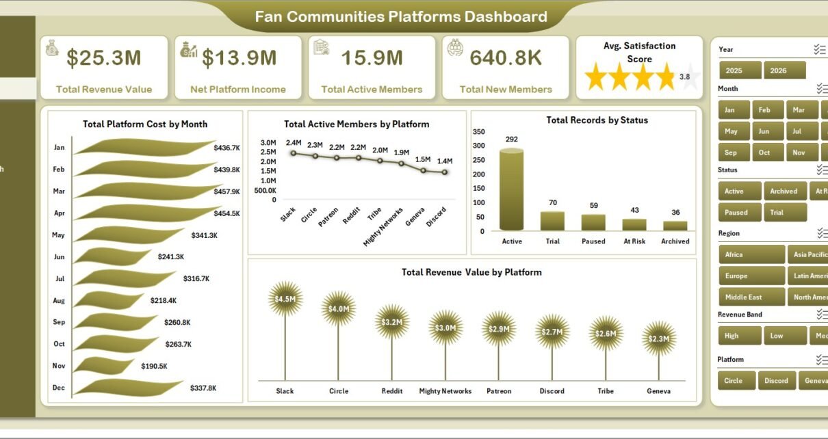
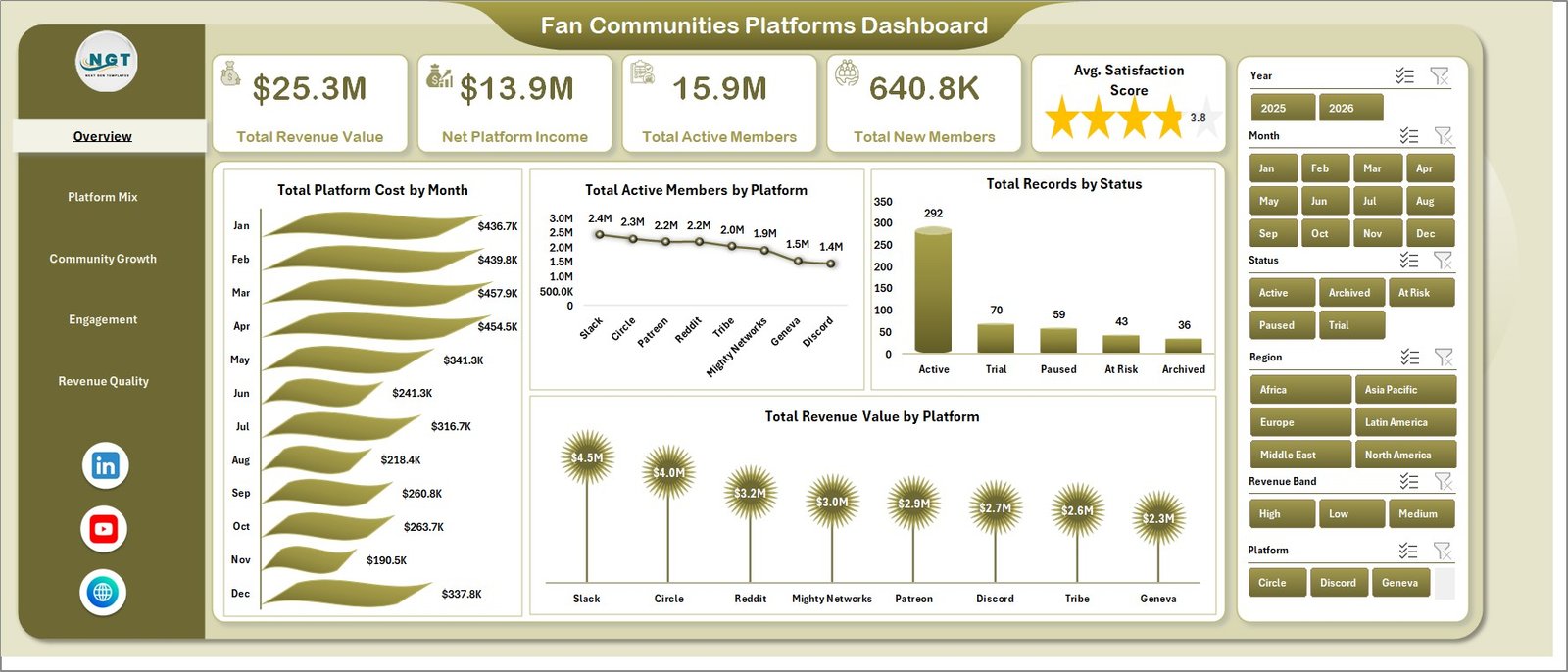
1. Overview Page
The Overview Page is the main executive dashboard. At the top, it includes KPI cards for Total Revenue Value, Net Platform Income, Total Active Members, Total New Members, and Avg. Satisfaction Score. These cards give leadership a quick view of community scale, commercial performance, member growth, and satisfaction.
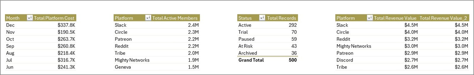
Total Platform Cost by Month: This chart shows monthly platform cost movement. It helps finance and community teams identify cost spikes, seasonal changes, and months where platform spending needs review.
Total Active Members by Platform: This visual compares active member volume across platforms. It helps managers understand where the most engaged audience is concentrated.
Total Records by Status: This chart summarizes records by status, such as active, inactive, pending, paused, or closed. It is useful for operational cleanup and membership status monitoring.
Total Revenue Value by Platform: This chart compares revenue contribution by platform. It helps teams understand which fan platforms are producing the strongest commercial value.
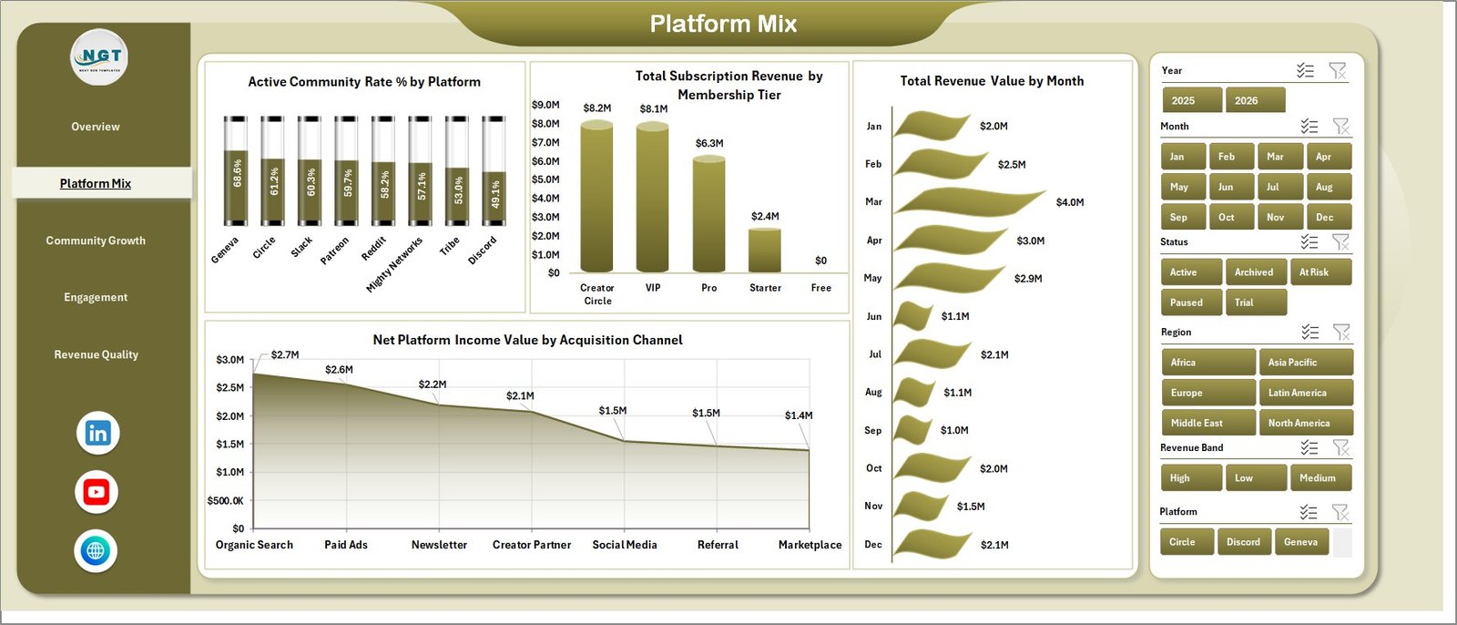
2. Platform Mix
The Platform Mix page focuses on platform activity, membership tier revenue, monthly revenue, and acquisition channel performance. Active Community Rate % by Platform shows which platforms have stronger active community share. Total Subscription Revenue by Membership Tier shows which paid tiers contribute the most subscription revenue.
Total Revenue Value by Month gives a time-based revenue trend. Net Platform Income Value by Acquisition Channel helps teams compare the income quality of different acquisition sources.
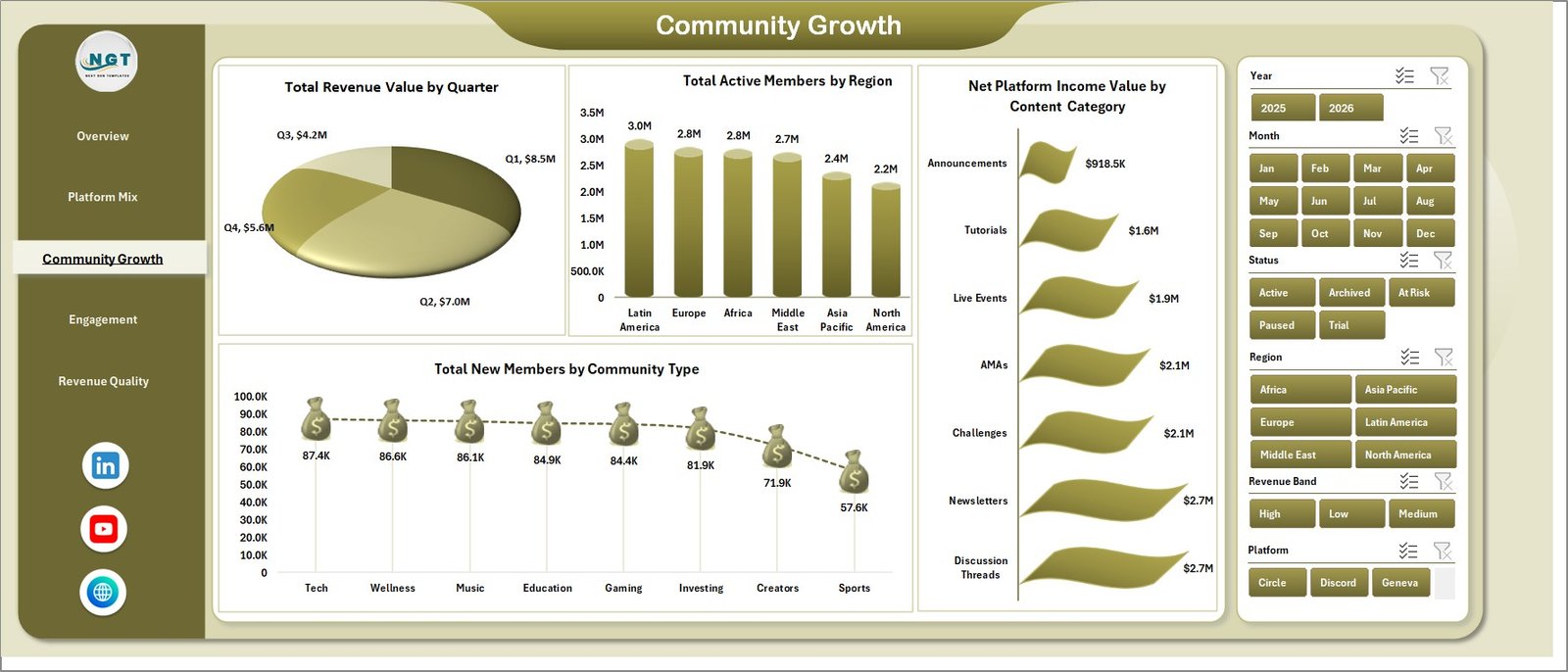
3. Community Growth
The Community Growth page reviews quarterly revenue, active members by region, net income by content category, and new members by community type. Total Revenue Value by Quarter helps teams compare performance across quarters and identify growth cycles.
Total Active Members by Region shows where the audience base is strongest. Net Platform Income Value by Content Category identifies which categories create the best income, while Total New Members by Community Type highlights community formats that attract fresh members.
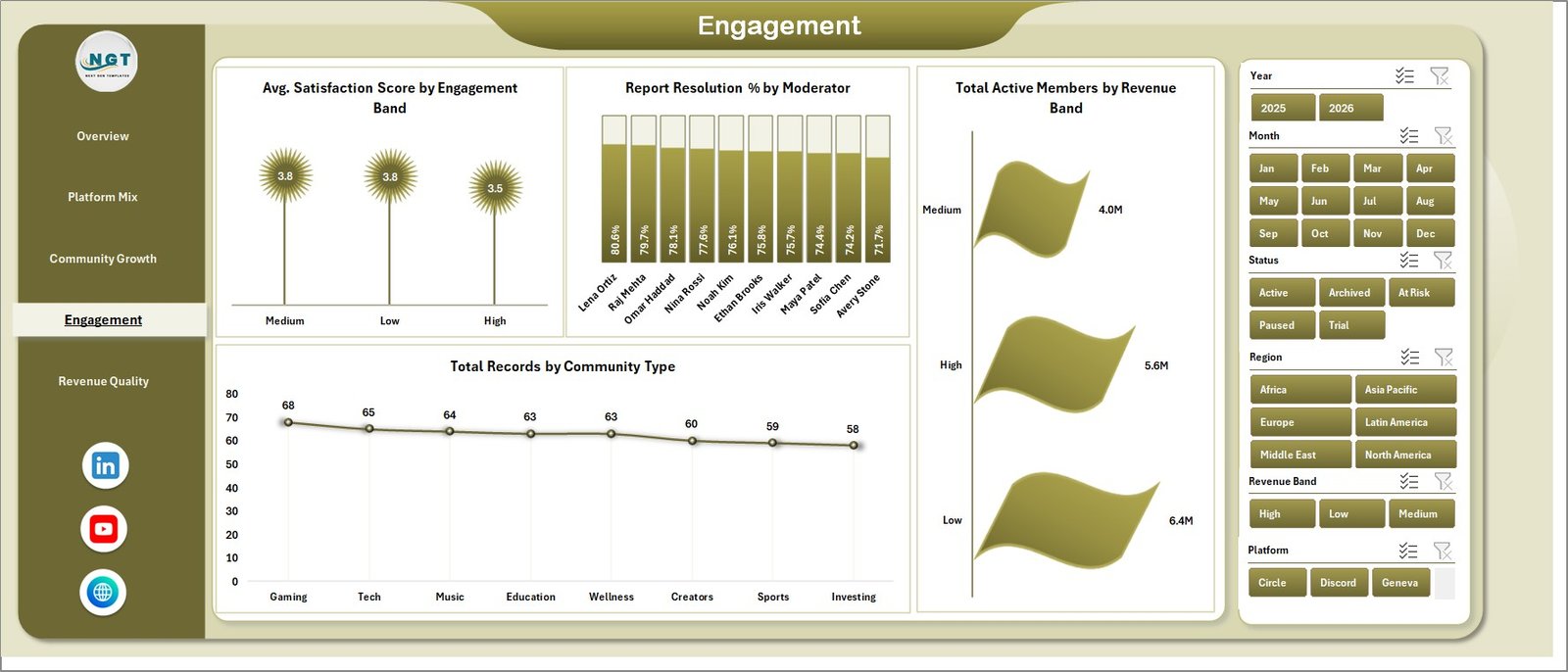
4. Engagement
The Engagement page connects satisfaction, moderation performance, revenue bands, and community type distribution. Avg. Satisfaction Score by Engagement Band helps compare member satisfaction across engagement segments.
Report Resolution % by Moderator shows how effectively moderators resolve reported issues. Total Active Members by Revenue Band connects audience activity with revenue value, while Total Records by Community Type explains the structure of the community portfolio.
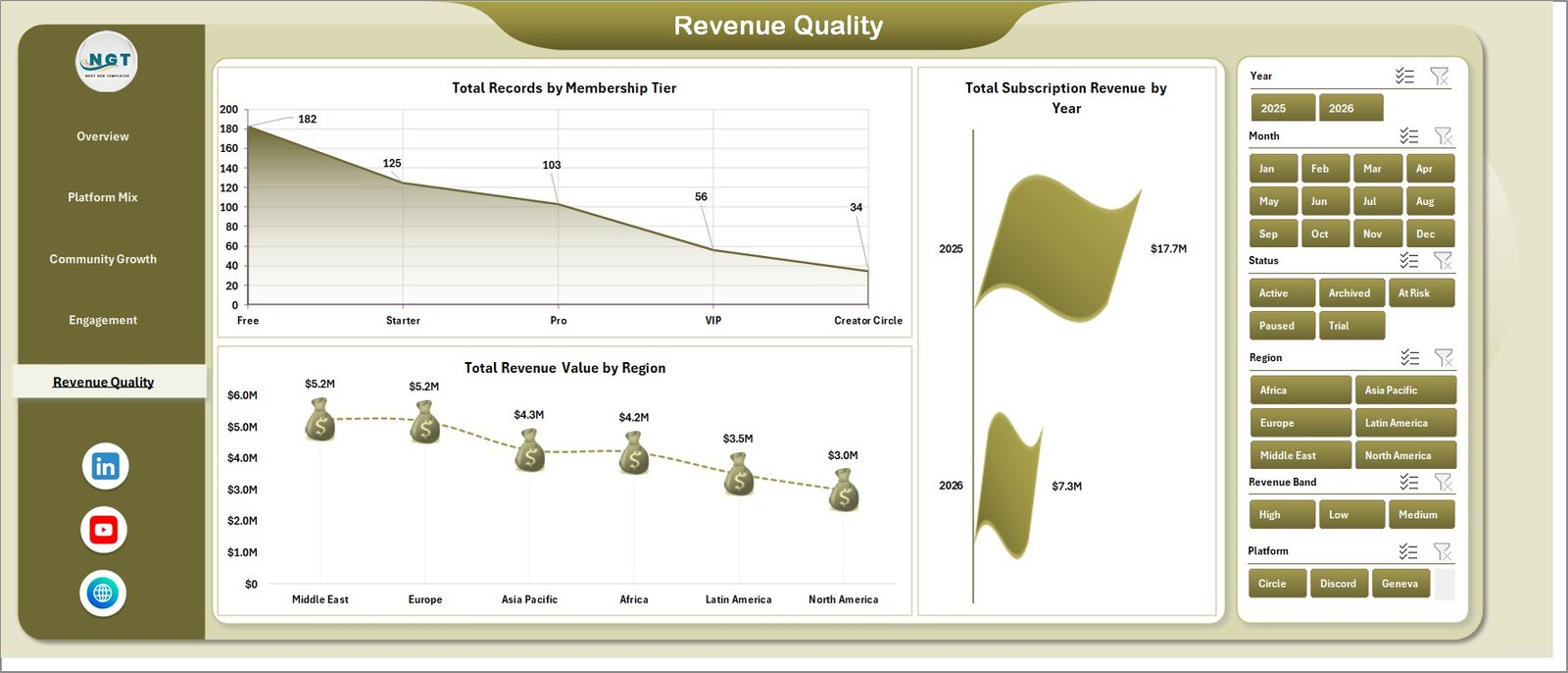
5. Revenue Quality
The Revenue Quality page gives a closer view of membership tier distribution, yearly subscription revenue, and regional revenue value. Total Records by Membership Tier helps teams understand the plan mix inside the dataset.
Total Subscription Revenue by Year shows long-term subscription movement. Total Revenue Value by Region helps compare commercial performance across markets and identify stronger regions.
6. Data Sheet Tab
The Data Sheet tab is where users enter or paste records in the same format as the sample data. Keeping the column structure consistent allows the workbook’s pivots, charts, slicers, and KPI cards to refresh correctly.

7. Support Sheet Tab
The Support Sheet contains multiple pivot tables used to create the entire dashboard dynamically. After updating the Data Sheet, go to the Data tab in the Excel Ribbon and click Refresh All. The pivot tables and charts refresh together. You can keep this sheet hidden for normal dashboard use.
Fan Communities Platforms Dashboard in Excel vs. Google Sheets vs. Paid CRM/SaaS – Feature Comparison
| Feature | This Excel Dashboard | Google Sheets Alternative | Paid Community SaaS |
|---|---|---|---|
| Cost | $17.99 one-time | Low-cost sheet template or manual build | Monthly or annual subscription |
| Platform | Microsoft Excel | Browser-based spreadsheet | Vendor cloud platform |
| Setup time | Replace data and refresh | Copy sheet and paste data | Onboarding and configuration |
| Real-time collaboration | Limited unless stored in Microsoft 365 | Built in | Usually included |
| Customizable fields | Fully editable workbook | Editable sheet | Limited by vendor settings |
| Share with link | Available through OneDrive or SharePoint setup | Built in | Login controlled |
| Year-1 cost at 5 users | $17.99 plus Excel licensing you already use | Usually low | Often hundreds or thousands |
| Fan community analytics | Built across 5 dashboard pages | Requires equivalent template | Depends on plan and export access |
Who Should Use This Template
This dashboard is useful for fan community platform operators, creator teams, paid membership managers, community managers, media companies, moderation leads, and analysts who need recurring reporting without a full BI project. It is especially helpful when the team already receives exports from community, membership, subscription, or content platforms.
It is not designed to replace a live membership platform, payment processor, CRM, moderation system, or customer support tool. It works best as an Excel reporting layer for structured data exports.
Real-World Use Cases
Community operations manager: Reviews active members, new members, satisfaction score, and status distribution before monthly community performance meetings.
Creator economy analyst: Uses Platform Mix and Community Growth to compare revenue by platform, membership tier, quarter, region, acquisition channel, and content category.
Moderation lead: Uses the Engagement page to compare report resolution by moderator and satisfaction score by engagement band.
Advantages of Fan Communities Platforms Dashboard in Excel
- It saves time compared with building a fan community dashboard from scratch.
- It keeps revenue, members, engagement, satisfaction, and moderation views in one workbook.
- It supports slicer-based exploration during meetings.
- It uses familiar Excel features like pivots, charts, and Refresh All.
- It can be customized as platform reporting needs change.
Opportunities for Improvement
Larger teams can extend the workbook by adding automated Power Query imports, member retention measures, churn rate, cohort analysis, creator-level detail, paid plan migration tracking, support response aging, or scheduled refresh through a Microsoft 365 workflow. Teams with more mature data pipelines may also connect the workbook to exported CSVs or structured database extracts.
Best Practices
- Keep platform, region, content category, membership tier, status, moderator, and community type names consistent.
- Validate KPI cards after every refresh.
- Keep a backup copy before changing the Support Sheet pivots.
- Use slicers during review meetings instead of creating many separate report files.
- Refresh the dashboard after every Data Sheet update.
Explore Relevant Templates
You can download the product from Fan Communities Platforms Dashboard in Excel. You may also want to compare it with Digital Comic Startups Dashboard in Excel, Digital Comic Startups Dashboard in Power BI, and Music School Dashboard in Google Sheets. Browse more Excel Dashboard Templates on NextGenTemplates.
Frequently Asked Questions
What KPI cards are included?
The Overview page includes Total Revenue Value, Net Platform Income, Total Active Members, Total New Members, and Avg. Satisfaction Score.
How many worksheet tabs are included?
The workbook includes 7 worksheet tabs: Overview, Platform Mix, Community Growth, Engagement, Revenue Quality, Data Sheet, and Support Sheet.
Can I use my own fan community data?
Yes. Replace the sample records on the Data Sheet tab, keep the same format, and click Refresh All in Excel.
Do I need advanced Excel skills?
No advanced Excel skills are required for normal use. You only need to update the Data Sheet and refresh the workbook. Advanced users can customize pivots, charts, and slicers.
Can I hide the Support Sheet?
Yes. The Support Sheet contains pivot tables used by the dashboard and can be hidden after setup.
Does this replace a community platform?
No. It is a reporting dashboard, not a live member portal, payment platform, moderation workflow, or CRM.
About the Author
Built by PK – Microsoft Certified Professional with 15+ years of Excel, Google Sheets, and Power BI experience. Founder of NextGenTemplates, reaching 300K+ subscribers across YouTube channels. Every template is hand-built and tested before release.
Conclusion
The Fan Communities Platforms Dashboard in Excel is a practical reporting template for teams that want a clearer view of community revenue, active members, new members, satisfaction, moderation performance, platform costs, content categories, membership tiers, and regional performance. It gives fan community teams a ready Excel structure while keeping the workbook editable for future reporting needs.
Visit YouTube.com/@PKAnExcelExpert for more Excel and dashboard tutorials.