Fleet-as-a-Service (FaaS) has transformed how organizations manage transportation, mobility, and logistics. Instead of owning and maintaining large fleets, companies now focus on service-oriented fleet usage, performance, and profitability. However, without a structured monitoring system, fleet costs, revenues, and operational efficiency often remain unclear. That is exactly where a Fleet-as-a-Service Dashboard in Excel becomes a powerful solution.
A Fleet-as-a-Service Dashboard in Excel converts raw fleet data into clear, actionable insights. Moreover, it enables fleet managers, operations teams, and leadership to monitor costs, contracts, service packages, and trends from one interactive Excel dashboard. Since the dashboard works entirely in Excel, it remains easy to use, flexible, and accessible across teams.
In this detailed article, you will explore everything about the Fleet-as-a-Service Dashboard in Excel. You will understand how it works, why it matters, what each analytical page shows, and how best practices help maximize fleet profitability and efficiency. Additionally, this article explains how organizations can use this dashboard to make data-driven fleet decisions with confidence.
Click to Purchases Fleet-as-a-Service Dashboard in Excel
What Is a Fleet-as-a-Service Dashboard in Excel?
A Fleet-as-a-Service Dashboard in Excel is a ready-to-use analytical and monitoring tool designed to track financial, operational, and contract-based fleet KPIs in one place.
Instead of reviewing multiple spreadsheets for trip costs, fuel expenses, revenue, and contracts, this dashboard consolidates all important metrics into one structured and visual model. As a result, users instantly understand fleet performance at a glance.
The dashboard leverages Excel formulas, Pivot Tables, slicers, and charts to deliver interactive analytics without relying on complex BI tools.
Why Is a Fleet-as-a-Service Dashboard Important?
Fleet-as-a-Service operations involve multiple moving parts such as contracts, service packages, fuel types, regions, and vehicles. Without proper analytics, cost leakages and performance gaps remain hidden.
Here is why this dashboard is essential:
-
It centralizes fleet cost and revenue data
-
It improves visibility across contracts and service packages
-
It highlights profit and loss instantly
-
It enables trend-based decision-making
-
It reduces manual reporting effort
As a result, organizations gain better control over fleet operations and profitability.
Click to Purchases Fleet-as-a-Service Dashboard in Excel
How Does the Fleet-as-a-Service Dashboard in Excel Work?
The dashboard follows a simple and practical workflow:
-
Fleet data gets stored in structured Excel tables
-
Pivot Tables aggregate performance metrics
-
Slicers dynamically filter dashboards
-
Charts and cards update automatically
Therefore, teams spend less time preparing reports and more time analyzing performance.
What Are the Key Features of the Fleet-as-a-Service Dashboard in Excel?
The dashboard includes five well-designed analytical pages supported by structured backend sheets.
Page Navigator: How Do You Move Across Pages Easily?
A Page Navigator appears on the left side of the dashboard.
Why Is the Page Navigator Useful?
-
It enables one-click navigation between pages
-
It improves user experience
-
It eliminates confusion between multiple sheets
As a result, users explore analytics faster and more efficiently.
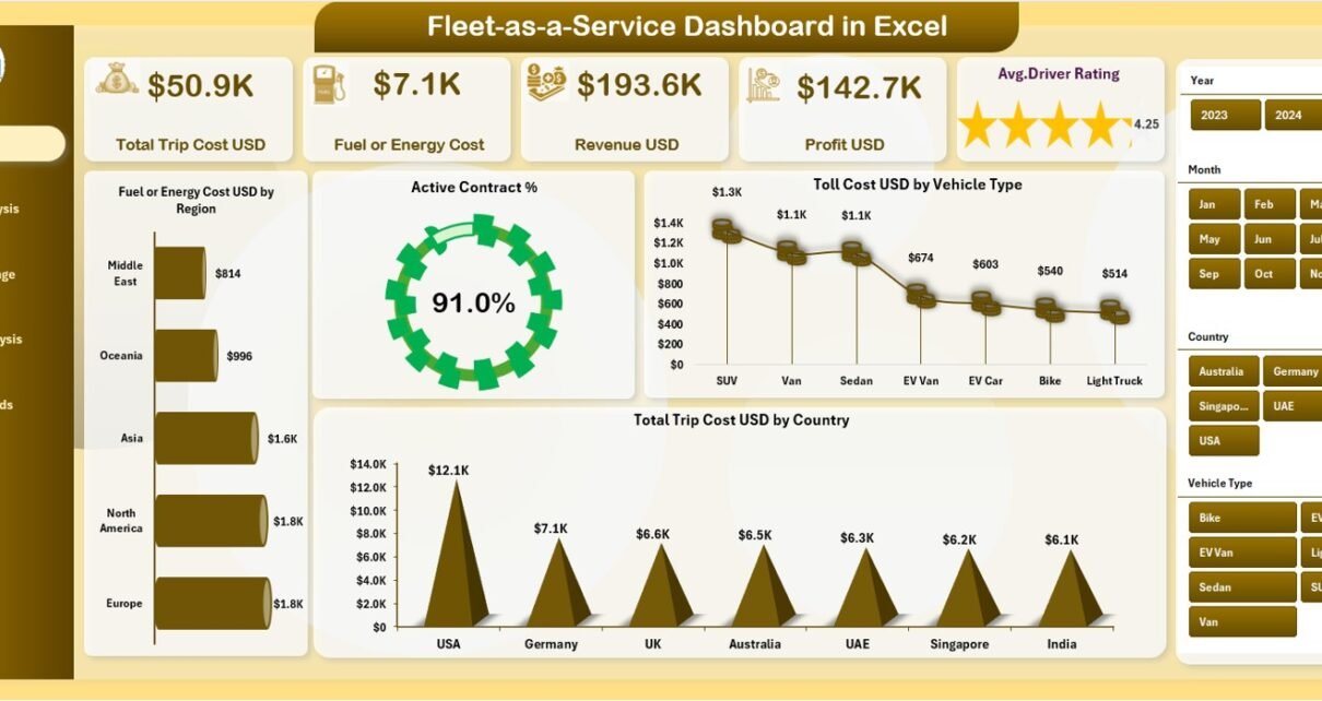
1.Overview Page: What High-Level Insights Does It Provide?
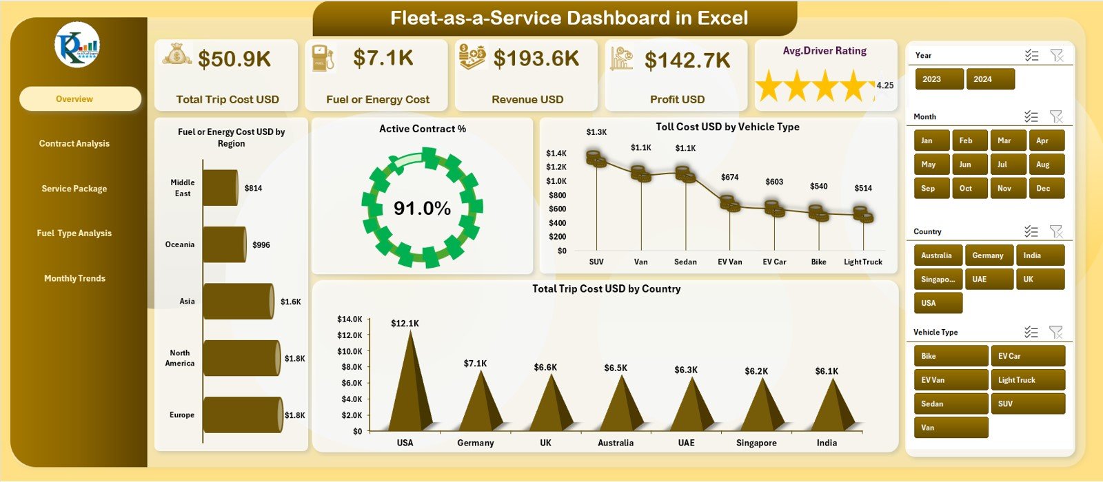
The Overview Page acts as the main landing page of the dashboard. It summarizes overall fleet performance in a simple and visual format.
KPI Cards on the Overview Page
The dashboard displays five KPI cards that provide instant insights:
-
Total Trip Cost USD
-
Fuel or Energy Cost USD
-
Revenue USD
-
Profit USD
-
Average Driver Rating
These cards help users quickly assess financial health and service quality.
Charts on the Overview Page
The Overview Page includes four powerful charts:
-
Fuel or Energy Cost USD by Region
-
Active Contract %
-
Toll Cost USD by Vehicle Type
-
Total Trip Cost USD by Country
Together, these visuals highlight cost drivers, contract health, and geographical performance.
Slicer on the Overview Page
A right-side slicer (silencer) allows users to filter data dynamically. As users change slicer selections, all cards and charts update automatically.
2.Contract Analysis Page: How Can You Evaluate Contract Performance?
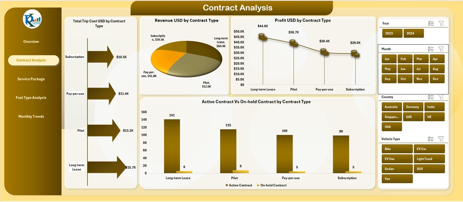
The Contract Analysis Page focuses on performance by contract type.
Charts on the Contract Analysis Page
This page contains four critical charts:
-
Total Trip Cost USD by Contract Type
-
Revenue USD by Contract Type
-
Profit USD by Contract Type
-
Active Contracts vs On-Hold Contracts by Contract Type
These visuals help fleet managers understand which contract types drive revenue and which ones consume costs.
Why Is Contract Analysis Important?
-
It improves contract profitability evaluation
-
It identifies underperforming contract categories
-
It supports smarter contract renewal decisions
As a result, organizations optimize their contract strategies.
Click to Purchases Fleet-as-a-Service Dashboard in Excel
3.Service Package Analysis Page: How Do Service Packages Impact Profitability?
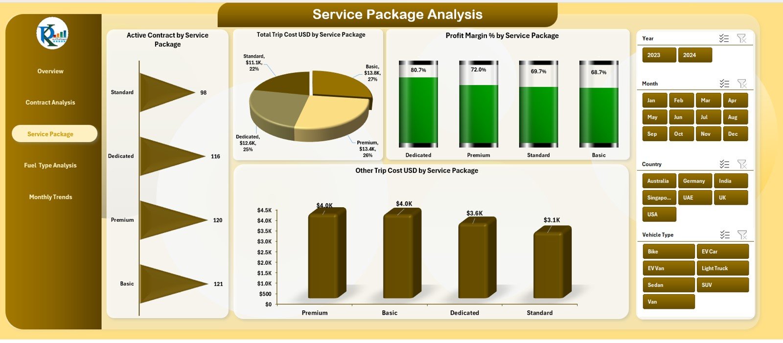
The Service Package Analysis Page evaluates performance by service offering.
Charts on the Service Package Analysis Page
This page displays four analytical charts:
-
Active Contracts by Service Package
-
Total Trip Cost USD by Service Package
-
Profit Margin % by Service Package
-
Other Trip Cost USD by Service Package
These visuals reveal which service packages deliver higher margins and better cost efficiency.
Why Is Service Package Analysis Critical?
-
It highlights profitable service packages
-
It exposes cost-heavy offerings
-
It guides pricing and packaging decisions
Therefore, organizations align services with profitability goals.
4. Fuel Type Analysis Page: How Does Fuel Type Affect Performance?
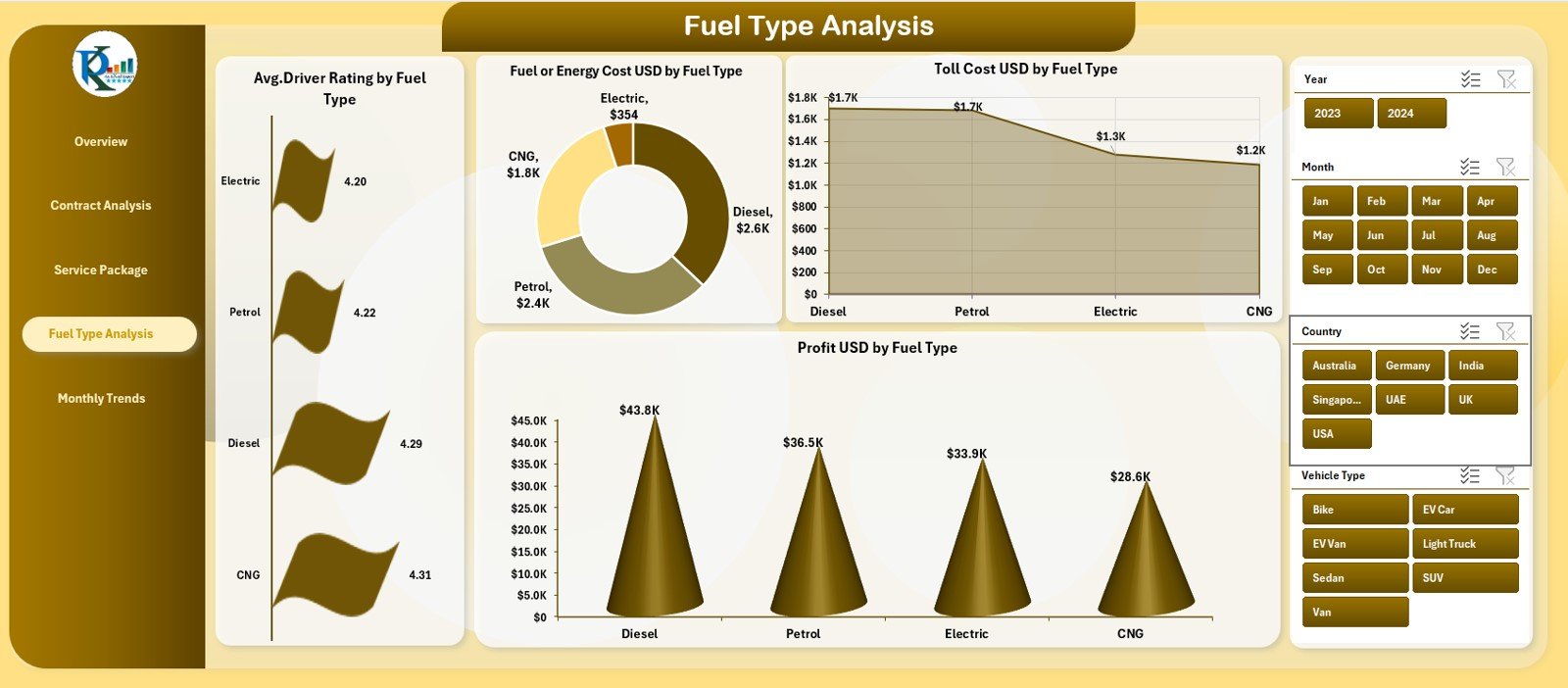
The Fuel Analysis Page focuses on fleet performance by fuel or energy type.
Charts on the Fuel Analysis Page
This page includes four informative charts:
-
Average Driver Rating by Fuel Type
-
Fuel or Energy Cost USD by Fuel Type
-
Toll Cost USD by Fuel Type
-
Profit USD by Fuel Type
These insights help organizations evaluate both cost and service quality across traditional and alternative fuels.
Why Is Fuel Analysis Valuable?
-
It supports energy cost optimization
-
It aids fuel strategy planning
-
It links driver performance with fuel choice
As a result, teams make data-driven sustainability decisions.
5. Monthly Trends Page: How Do You Track Performance Over Time?
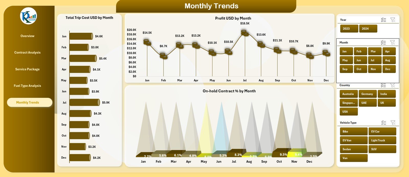
The Monthly Trends Page focuses on performance movement over time.
Charts on the Monthly Trends Page
The page includes three trend charts:
-
Total Trip Cost USD by Month
-
Profit USD by Month
-
On-Hold Contract % by Month
These trends help organizations understand seasonality, growth patterns, and operational instability.
Why Are Monthly Trends Important?
-
They reveal cost spikes and dips
-
They highlight profit consistency
-
They support forecasting and planning
Therefore, leadership gains a long-term performance view.
Support and Backend Sheets: What Powers the Dashboard?
Behind the dashboard, support and data sheets ensure smooth functionality.
Data Sheet: Why Is Structured Data Important?
The Data Sheet stores raw fleet records such as:
-
Trips
-
Costs
-
Revenue
-
Contracts
-
Vehicles
-
Fuel types
-
Regions and countries
Since the dashboard relies on this structured data, accuracy here ensures accurate insights.
Advantages of Fleet-as-a-Service Dashboard in Excel
Using this dashboard delivers clear business and operational benefits.
✅ Centralized fleet performance monitoring
✅ Clear visibility of costs, revenue, and profit
✅ Contract and service package insights
✅ Fuel-wise and region-wise analysis
✅ Trend-based decision-making
✅ Easy adoption with Excel
Because of these advantages, teams manage fleets with confidence and clarity.
Click to Purchases Fleet-as-a-Service Dashboard in Excel
Best Practices for the Fleet-as-a-Service Dashboard in Excel
Following best practices ensures consistent and reliable insights.
-
Define clear cost and revenue categories
-
Maintain consistent data formats
-
Update data regularly
-
Review slicer logic periodically
-
Monitor profitability across all dimensions
-
Keep dashboard visuals simple and aligned
When teams follow these practices, dashboard value increases significantly.
Common Mistakes to Avoid While Using the Dashboard
Avoiding these mistakes protects dashboard accuracy.
-
Avoid inconsistent region or country names
-
Do not mix currencies in one field
-
Avoid missing monthly data
-
Do not overload charts with too many metrics
-
Avoid manual changes to Pivot Tables
By avoiding these issues, users preserve dashboard integrity.
Who Should Use the Fleet-as-a-Service Dashboard?
This dashboard fits multiple business roles.
-
Fleet Managers
-
Operations Managers
-
Mobility Service Providers
-
Finance and Profitability Teams
-
Strategy and Leadership Teams
Since the dashboard works in Excel, both technical and non-technical users adopt it easily.
Conclusion
A Fleet-as-a-Service Dashboard in Excel transforms scattered fleet data into a centralized performance monitoring system. It improves transparency, enhances cost control, and supports data-driven decision-making.
By analyzing trip costs, fuel expenses, revenue, profit, contracts, and trends in one place, organizations gain complete fleet visibility. As a result, they improve efficiency, profitability, and service quality.
For any organization operating under a Fleet-as-a-Service model, this dashboard becomes an essential analytical tool.
Click to Purchases Fleet-as-a-Service Dashboard in Excel
Frequently Asked Questions (FAQs)
What is the primary purpose of a Fleet-as-a-Service Dashboard in Excel?
It helps track fleet costs, revenue, profit, contracts, and trends in one Excel-based dashboard.
Can this dashboard handle large fleet datasets?
Yes. Excel Pivot Tables manage large datasets effectively when data remains structured.
Can I customize KPIs and charts?
Yes. Users can customize KPIs, charts, and slicers based on business needs.
Does the dashboard track monthly trends automatically?
Yes. Monthly trend charts update automatically based on input data.
Is this dashboard suitable for EV and mixed fuel fleets?
Yes. The Fuel Analysis page supports different fuel and energy types.
Does using this dashboard require advanced Excel skills?
No. Basic Excel knowledge is sufficient for use and maintenance.
Click to Purchases Fleet-as-a-Service Dashboard in Excel
Visit our YouTube channel to learn step-by-step video tutorials