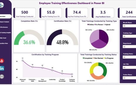
Monitoring employee training effectiveness is crucial for organizations to ensure skill development, knowledge retention, and organizational growth. The Employee Training
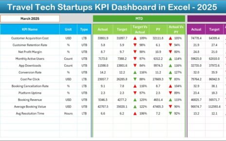
Travel tech startups operate in a fast-moving and highly competitive environment. While innovation drives success, data-driven decision-making sustains growth. However,
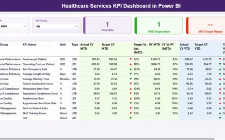
Healthcare organizations work in an environment where each day brings new challenges. Patient needs change fast, operations shift often, and