Home>Blogs>Charts and Visualization>Forecast Vs Actual Chart with Safe Zone Range in Excel>Forecast Vs Actual Chart -2
Forecast Vs Actual Chart -2
31
Jul 2019
2228Comments Off on Forecast Vs Actual Chart -2
PK
Meet PK, the founder of PK-AnExcelExpert.com! With over 15 years of experience in Data Visualization, Excel Automation, and dashboard creation. PK is a Microsoft Certified Professional who has a passion for all things in Excel. PK loves to explore new and innovative ways to use Excel and is always eager to share his knowledge with others. With an eye for detail and a commitment to excellence, PK has become a go-to expert in the world of Excel. Whether you're looking to create stunning visualizations or streamline your workflow with automation, PK has the skills and expertise to help you succeed. Join the many satisfied clients who have benefited from PK's services and see how he can take your Excel skills to the next level!
https://www.pk-anexcelexpert.com
Related Articles
Customer Support Dashboard in Excel
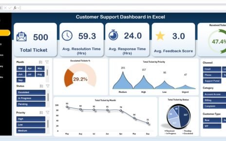
Efficient customer support is critical for maintaining satisfaction, loyalty, and business growth. The Customer Support Dashboard in Excel is a
Small Business KPI Dashboard in Excel
In today’s competitive business environment, tracking and analyzing your Key Performance Indicators (KPIs) is essential for success. A Small Business
Hearing Aid Services KPI Dashboard in Power BI
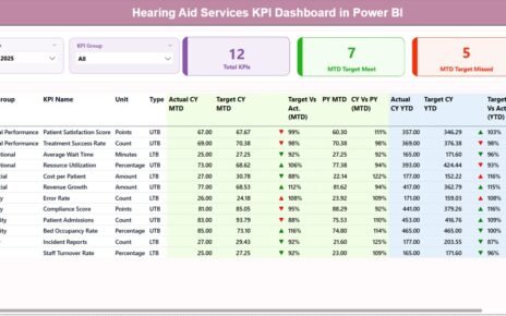
In today’s fast-evolving healthcare industry, hearing aid service providers must track performance with precision. Audiology clinics manage patient consultations, hearing


