Are you curious about how to break down a date into its individual components like day, month, and year in
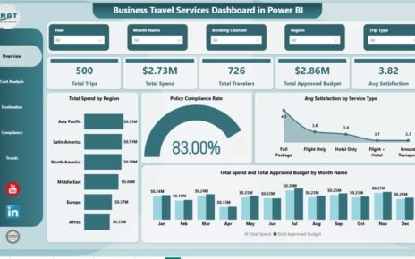
Corporate travel is one of the top three controllable expense categories for mid-size organizations — yet most teams still
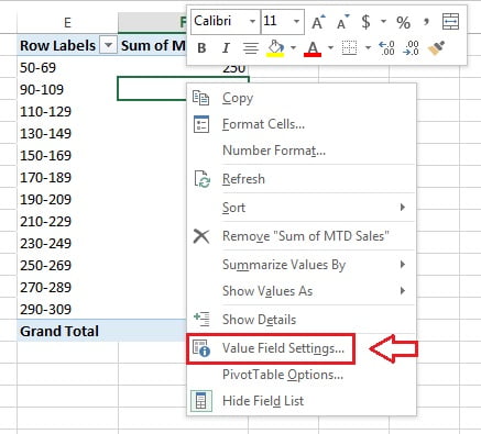
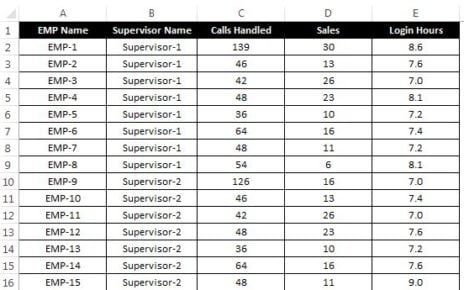
In this article you will learn how we can split our data into multiple workbooks. Every workbook will be saved