Fundraising success depends on clarity, timing, and measurable performance. However, many organizations still struggle with scattered spreadsheets, delayed reports, and unclear performance indicators. As a result, decision-making becomes reactive instead of proactive. That is exactly where a Fundraising Campaign KPI Dashboard in Power BI makes a powerful difference.
This detailed guide explains everything you need to know about a Fundraising Campaign KPI Dashboard in Power BI—from its purpose and structure to its advantages, best practices, and real-world usage. Moreover, the article uses simple language, smooth transitions, and practical examples so that anyone can understand and implement it easily.
Click to Purchases Fundraising Campaign KPI Dashboard in Power BI
What Is a Fundraising Campaign KPI Dashboard in Power BI?
A Fundraising Campaign KPI Dashboard in Power BI is an interactive and visual reporting solution designed to track, measure, and analyze fundraising performance using key performance indicators (KPIs).
Instead of reviewing multiple spreadsheets or static reports, this dashboard brings all critical fundraising metrics into one centralized view. Consequently, fundraising managers, nonprofit leaders, and campaign teams can monitor progress in real time and take corrective actions immediately.
Most importantly, this dashboard uses Power BI for visualization and Excel as the data source, which keeps the system flexible, scalable, and easy to maintain.
Why Do Fundraising Campaigns Need KPI Dashboards?
Fundraising campaigns involve multiple moving parts—donor engagement, targets, timelines, and historical comparisons. Without a structured KPI dashboard, teams often miss early warning signs.
Here is why a Fundraising Campaign KPI Dashboard in Power BI becomes essential:
-
It provides real-time visibility into campaign performance
-
It highlights target achievement and gaps instantly
-
It enables data-driven decision-making
-
It eliminates manual reporting and errors
-
It improves transparency and accountability
As a result, organizations can focus more on donor engagement and less on data preparation.
How Does the Fundraising Campaign KPI Dashboard in Power BI Work?
The dashboard follows a simple yet powerful architecture. Power BI handles visualization and analysis, while Excel manages the data input. Because of this separation, users can update data easily without touching the dashboard design.
Data Flow Overview
-
Users update fundraising data in Excel
-
Power BI refreshes the dataset
-
Visuals and KPIs update automatically
-
Decision-makers review insights in real time
This approach ensures accuracy, consistency, and speed.
Key Features of Fundraising Campaign KPI Dashboard in Power BI
This ready-to-use dashboard includes three well-structured pages, each designed for a specific analytical purpose.
Click to Purchases Fundraising Campaign KPI Dashboard in Power BI
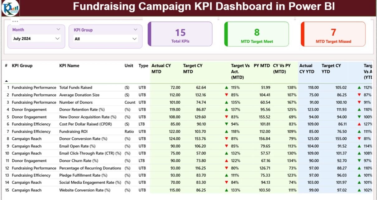
1) Summary Page – How Does It Help Monitor Overall Performance?
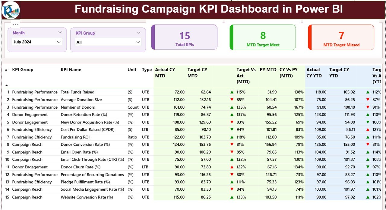
The Summary Page serves as the main landing page of the dashboard. It provides a consolidated view of all fundraising KPIs at a glance.
Top-Level Slicers
At the top of the page, you will find two slicers:
-
Month Slicer – Filters the dashboard by selected month
-
KPI Group Slicer – Filters KPIs by category
These slicers allow users to focus on specific time periods or KPI groups instantly.
KPI Cards on the Summary Page
Just below the slicers, the dashboard displays three key KPI cards:
-
Total KPIs Count – Shows the total number of fundraising KPIs
-
MTD Target Met Count – Displays how many KPIs met their Month-to-Date targets
-
MTD Target Missed Count – Highlights KPIs that failed to meet targets
These cards immediately indicate overall campaign health.
Detailed KPI Table Explained
Below the KPI cards, the dashboard presents a detailed KPI table with comprehensive metrics.
Columns Included in the Table
-
KPI Number
Displays the sequence number of the KPI -
KPI Group
Categorizes KPIs such as Donations, Engagement, Campaign Efficiency, or Outreach -
KPI Name
Shows the specific KPI name -
Unit
Indicates the measurement unit (Amount, Count, Percentage, etc.) -
Type (LTB / UTB)
Defines whether Lower is Better (LTB) or Upper is Better (UTB)
Month-to-Date (MTD) Performance Metrics
-
Actual CY MTD – Current Year actual MTD value
-
Target CY MTD – Current Year target MTD value
-
MTD Icon – ▲ or ▼ icons with green or red color to show performance status
-
Target vs Actual (MTD) – Actual ÷ Target percentage
-
PY MTD – Previous Year MTD value
-
CY vs PY (MTD) – Current Year vs Previous Year comparison
These metrics help teams track short-term fundraising momentum.
Year-to-Date (YTD) Performance Metrics
-
Actual CY YTD – Current Year actual YTD value
-
Target CY YTD – Current Year target YTD value
-
YTD Icon – Visual performance indicator
-
Target vs Actual (YTD) – Actual ÷ Target percentage
-
PY YTD – Previous Year YTD value
-
CY vs PY (YTD) – Year-over-year performance comparison
With these insights, teams can assess long-term fundraising progress.
2) KPI Trend Page – How Can You Analyze Fundraising Trends?
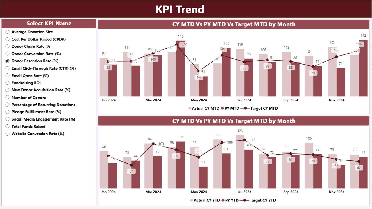
The KPI Trend Page focuses on visual trend analysis. Instead of static numbers, this page helps users understand patterns and performance movements.
Key Visuals on the Trend Page
The page includes two combo charts:
-
MTD Trend Chart
Shows Actual Current Year, Previous Year, and Target values -
YTD Trend Chart
Displays cumulative performance against targets and historical data
These charts make trend analysis intuitive and actionable.
KPI Selection Slicer
On the left side, the dashboard includes a KPI Name slicer. Users can select any KPI to analyze its performance over time.
As a result, stakeholders can quickly identify growth trends, declines, or inconsistencies.
3) KPI Definition Page – Why Is It Important?
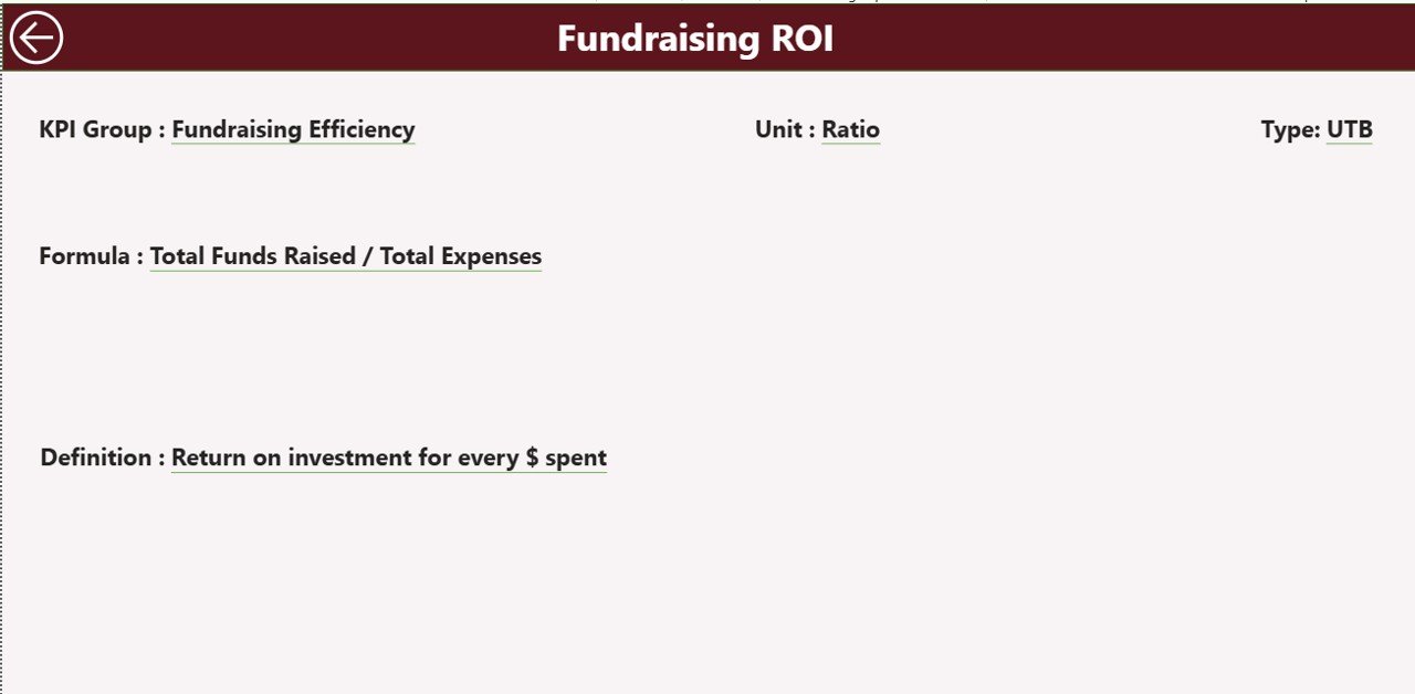
The KPI Definition Page acts as a drill-through page and remains hidden by default. Users can access it directly from the Summary Page.
What Does This Page Show?
-
KPI Formula
-
KPI Definition
-
KPI Type (LTB or UTB)
-
Measurement Unit
This page ensures clarity and consistency across teams. Moreover, it eliminates confusion during reviews or audits.
Navigation Feature
A Back Button at the top-left corner allows users to return to the Summary Page instantly.
Excel Data Source Structure – How Is Data Managed?
The dashboard uses an Excel file as its data source, which includes three structured worksheets.
Click to Purchases Fundraising Campaign KPI Dashboard in Power BI
1) Input_Actual Sheet – How Do You Enter Actual Data?
In this sheet, users enter actual fundraising results.
Required Columns
-
KPI Name
-
Month (use the first date of the month)
-
MTD Actual Value
-
YTD Actual Value
This structured approach ensures smooth data refresh in Power BI.
2) Input_Target Sheet – How Do You Define Targets?
This sheet captures target values for fundraising KPIs.
Required Columns
-
KPI Name
-
Month (first date of the month)
-
MTD Target Value
-
YTD Target Value
By separating targets from actuals, the dashboard ensures accurate comparisons.
3) KPI Definition Sheet – How Do You Maintain KPI Standards?
This sheet stores master KPI information.
Required Columns
-
KPI Number
-
KPI Group
-
KPI Name
-
Unit
-
Formula
-
Definition
-
Type (LTB or UTB)
This structure guarantees consistent KPI interpretation across the organization.
Advantages of Fundraising Campaign KPI Dashboard in Power BI
A Fundraising Campaign KPI Dashboard in Power BI offers multiple strategic and operational benefits.
Key Advantages
-
Centralized Performance Tracking
View all fundraising KPIs in one place -
Real-Time Insights
Monitor progress instantly after data refresh -
Improved Accountability
Track responsibility and performance clearly -
Historical Comparison
Analyze trends using previous year data -
Visual Performance Indicators
Identify issues quickly using icons and charts -
Reduced Manual Effort
Eliminate repetitive reporting tasks
As a result, fundraising teams work smarter and faster.
Who Can Benefit from This Dashboard?
This dashboard suits a wide range of users:
-
Nonprofit Organizations
-
Charity Foundations
-
Fundraising Managers
-
Campaign Coordinators
-
Board Members and Donors
-
Finance and Strategy Teams
Because of its flexible design, both small and large organizations can use it effectively.
Best Practices for the Fundraising Campaign KPI Dashboard in Power BI
To maximize value, teams should follow these best practices.
1) Define Clear and Measurable KPIs
Always choose KPIs that align with fundraising goals. Avoid vague or unmeasurable indicators.
2) Update Data Regularly
Maintain a fixed schedule for updating Excel input sheets. Regular updates ensure accurate insights.
3) Use Consistent Time Periods
Always use the first date of the month to maintain consistency across MTD and YTD calculations.
4) Validate Data Before Refresh
Check for missing values or incorrect entries before refreshing Power BI.
5) Train Users on KPI Definitions
Ensure all stakeholders understand KPI formulas and meanings using the KPI Definition page.
6) Review Trends, Not Just Numbers
Focus on patterns and trends instead of isolated values.
Common Challenges and How This Dashboard Solves Them
Challenge: Scattered Data Sources
Solution: Centralized Excel-based input
Challenge: Delayed Reporting
Solution: Automated Power BI refresh
Challenge: Lack of Transparency
Solution: Clear KPI definitions and visuals
Challenge: Manual Errors
Solution: Structured data entry
How Does This Dashboard Support Better Decision-Making?
This dashboard transforms raw fundraising data into actionable insights. Because leaders can see performance gaps instantly, they can adjust strategies, allocate resources effectively, and improve donor engagement.
Moreover, historical comparisons help teams understand what worked before and replicate success.
Conclusion
A Fundraising Campaign KPI Dashboard in Power BI acts as a powerful decision-support tool for modern fundraising organizations. By combining structured Excel data with interactive Power BI visuals, it delivers clarity, control, and confidence.
Instead of reacting to problems late, teams can monitor progress proactively, improve accountability, and maximize fundraising outcomes. Ultimately, this dashboard turns fundraising data into strategic advantage.
Frequently Asked Questions (FAQs)
1) What is a Fundraising Campaign KPI Dashboard in Power BI?
It is an interactive Power BI dashboard that tracks fundraising KPIs using Excel-based data inputs.
2) Can non-technical users use this dashboard?
Yes, users only need to update Excel sheets. Power BI handles visualization automatically.
3) How often should data be updated?
You should update data monthly or more frequently, depending on campaign needs.
4) What types of KPIs can this dashboard track?
It can track donation amounts, donor counts, campaign efficiency, engagement rates, and more.
5) Can this dashboard compare current and previous year performance?
Yes, it includes MTD and YTD comparisons with previous year data.
6) Is this dashboard customizable?
Yes, you can add KPIs, modify visuals, and adjust slicers based on your requirements.
7) Why use Power BI instead of Excel dashboards?
Power BI offers better visualization, interactivity, and scalability compared to static Excel dashboards.
Visit our YouTube channel to learn step-by-step video tutorials