NFT Art Marketplaces Dashboard in Excel is a ready-to-use analytics template for NFT art marketplace owners, creator managers, Web3 analysts, and digital art teams that need clearer reporting without a monthly software bill. NFT marketplaces often need to monitor sales, listings, sold listings, views, creator royalties, gas fees, bids, auction status, marketplace fees, buyer regions, art categories, and blockchain mix at the same time. When these metrics sit in separate exports or manual reports, decision-making becomes slow and inconsistent.
This Excel dashboard solves that by giving you 7 structured sheet tabs, 5 high-level KPI cards, 19 chart views, slicers for fast filtering, a clean Data Sheet, and a Support Sheet with refreshable pivot tables. After replacing the sample data, you can go to the Excel Data ribbon and click Refresh All to update the pivots, charts, and KPI cards.
Click here to purchase NFT Art Marketplaces Dashboard in Excel
Key Features of NFT Art Marketplaces Dashboard in Excel
- 7 dashboard sheet tabs: Overview, Sales, Creator, Chain Mix, Auction View, Data Sheet, and Support Sheet.
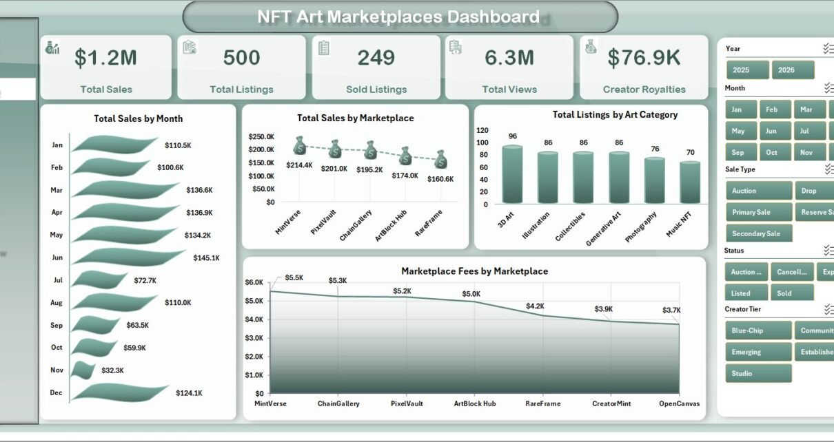
- 5 KPI cards: Total Sales, Total Listings, Sold Listings, Total Views, and Creator Royalties.
- 19 analytical charts: Review marketplace performance, monthly trends, blockchain distribution, creator tiers, auctions, bids, royalties, and fees.
- Slicer-based filtering: Filter the dashboard quickly by available marketplace, creator, blockchain, region, art category, sale type, status, and time fields.
- Editable Data Sheet: Add your own NFT marketplace records in the same format as the sample data.
- Refreshable Support Sheet: Pivot tables power the whole dashboard dynamically and can be hidden after setup.
Dashboard Pages Explanation
1. Overview Page
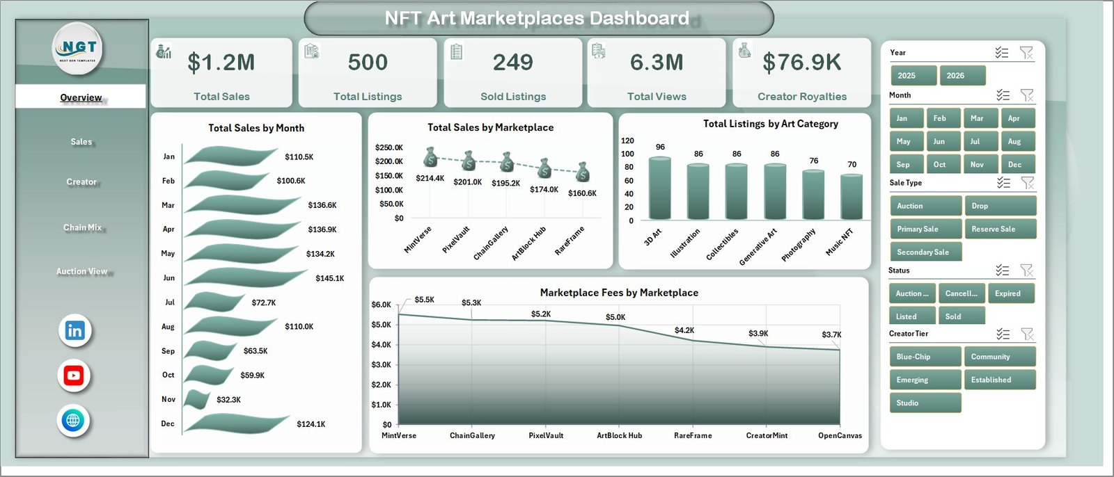
The Overview page is the main executive dashboard. At the top, it shows Total Sales, Total Listings, Sold Listings, Total Views, and Creator Royalties, giving a quick snapshot of marketplace health.
The Total Sales by Month chart shows how sales move over time and helps identify seasonal activity or campaign impact. Total Sales by Marketplace compares platform contribution so teams can see which marketplace is driving the most revenue.
Total Listings by Art Category highlights inventory distribution across art styles or categories. Marketplace Fees by Marketplace helps teams compare fee burden and understand where revenue leakage may be higher.
2. Sales Page
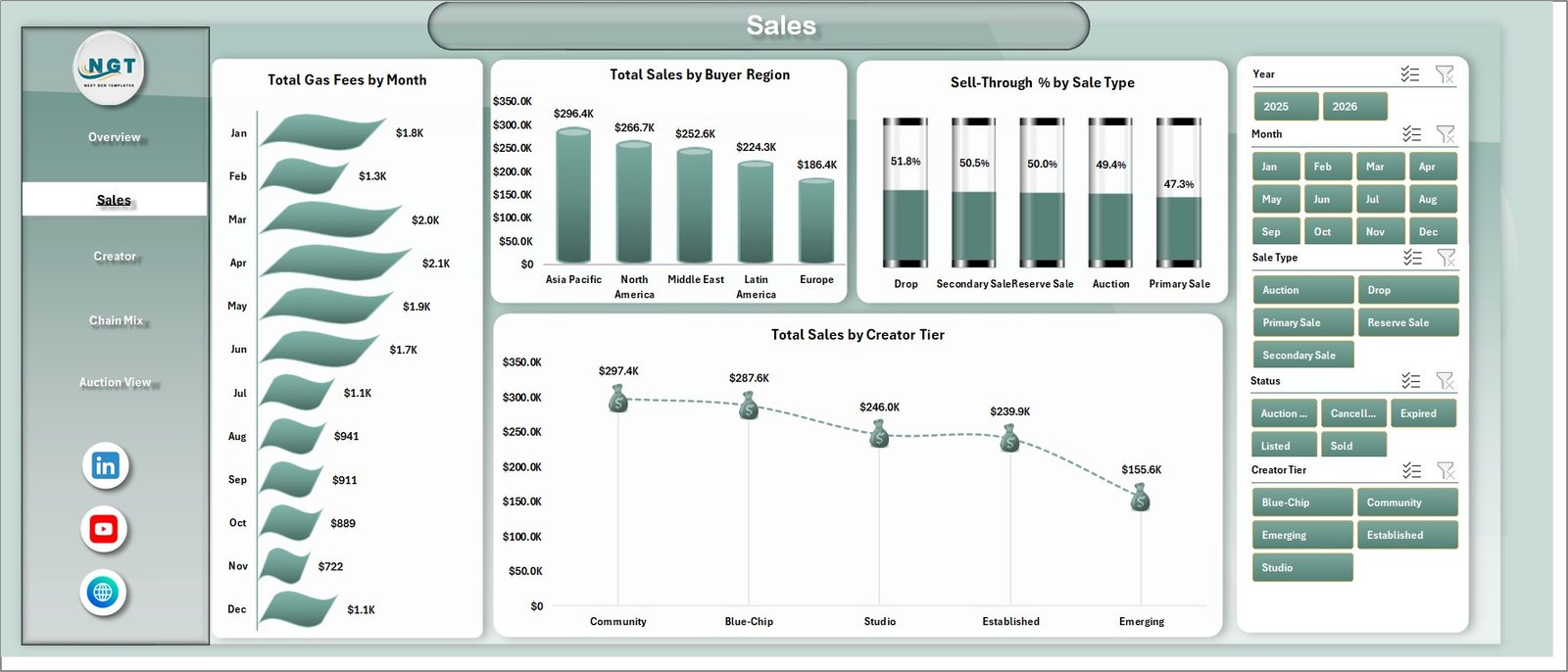
The Sales tab focuses on revenue behavior, transaction costs, buyer geography, and creator tier contribution. Total Gas Fees by Month helps users see when blockchain transaction costs rise or fall.
Total Sales by Buyer Region reveals which locations contribute the most sales. Sell-Through % by Sale Type compares auction and fixed-price performance, while Total Sales by Creator Tier shows which creator groups generate stronger revenue.
3. Creator Page
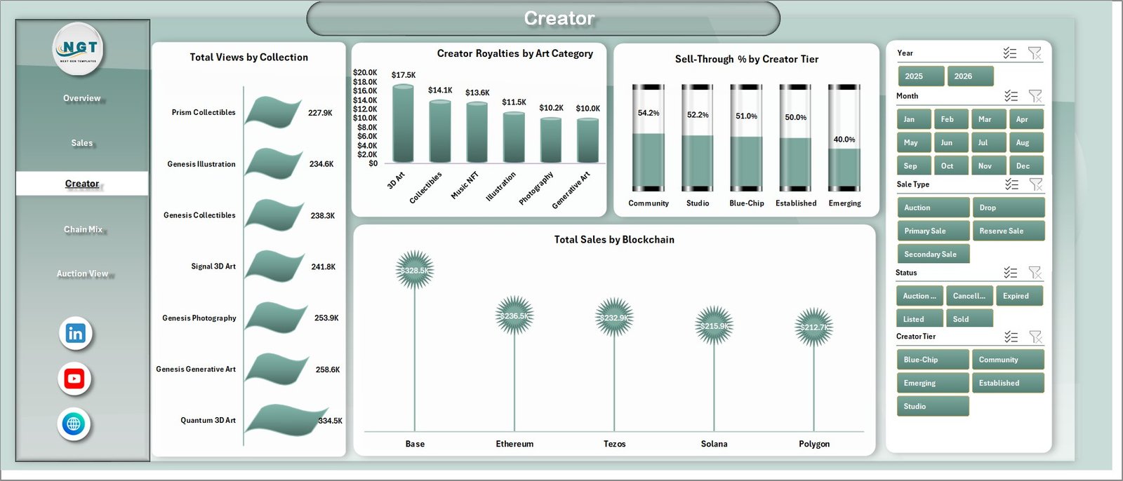
The Creator page is designed for collection and artist performance analysis. Total Views by Collection helps identify which collections attract the most attention from buyers or collectors.
Creator Royalties by Art Category shows where royalty value is being generated. Sell-Through % by Creator Tier compares creator segments, and Total Sales by Blockchain shows which networks are contributing sales volume.
4. Chain Mix Page
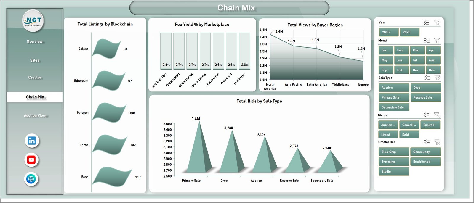
The Chain Mix tab helps users compare blockchain and marketplace economics. Total Listings by Blockchain shows where assets are listed, while Fee Yield % by Marketplace compares fee efficiency across platforms.
Total Views by Buyer Region highlights audience engagement by geography. Total Bids by Sale Type reveals whether buyers are more active in auctions, direct sales, or other sale models.
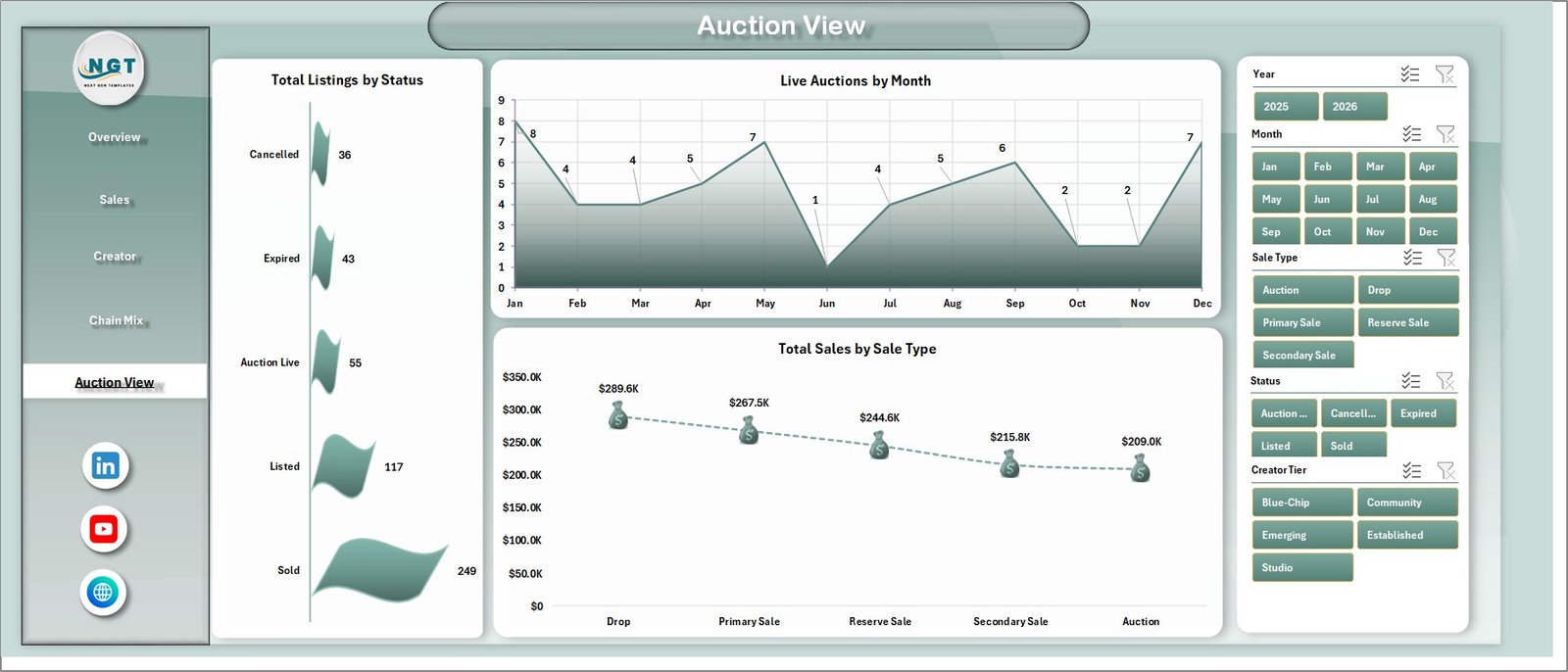
5. Auction View Page
The Auction View page focuses on listing and sale activity. Total Listings by Status helps teams see active, sold, expired, pending, or other listing stages depending on the source data.
Live Auctions by Month shows auction volume over time. Total Sales by Sale Type compares how much revenue comes from auction-based sales versus other sale methods.
6. Data Sheet Tab
The Data Sheet is the source table for the dashboard. Users should add marketplace records in the same format as the sample data so the pivots and charts continue to work correctly.

7. Support Sheet Tab
The Support Sheet contains multiple pivot tables used to build the dashboard. After updating the Data Sheet, users can click Refresh All from the Excel Data tab. The pivots and charts will refresh, and the sheet can be kept hidden during normal reporting.

NFT Art Marketplaces Dashboard in Excel vs. Google Sheets vs. Paid CRM/SaaS – Feature Comparison
| Feature | This Excel Dashboard | Google Sheets Alternative | Paid SaaS Alternative |
|---|---|---|---|
| Cost | $17.99 one-time | Template or workspace cost | Monthly subscription |
| Platform | Microsoft Excel | Browser spreadsheet | Vendor cloud system |
| Setup time | Under 10 minutes | Under 15 minutes | Days to weeks |
| Real-time collaboration | Available with OneDrive or SharePoint | Native sharing | Usually included |
| Mobile access | Excel app | Sheets app | Usually included |
| Customizable fields | Fully editable | Fully editable | Often limited by plan |
| Share with link | Via OneDrive or SharePoint | Native link sharing | Account-based access |
| Year-1 cost at 5 users | $17.99 plus Excel licensing if needed | Template plus workspace cost | Often $600 to $6,000+ |
| NFT marketplace metrics | Built in | Requires setup | Depends on vendor |
Who Should Use This Template
This template is useful for NFT marketplace founders, digital art marketplace operators, Web3 analysts, creator success teams, NFT collection managers, investor reporting teams, and consultants working with digital asset platforms. It is especially helpful when teams already export marketplace data and want a flexible reporting model in Excel.
It is not the right fit for teams that need live wallet monitoring, automated blockchain indexing, API-based marketplace sync, or smart contract-level analysis. Those workflows require specialized Web3 data infrastructure.
Real-World Use Cases
Maya, an NFT marketplace operator, updates the Data Sheet weekly and reviews Total Sales, Sold Listings, Marketplace Fees, and Live Auctions before growth meetings.
Dev, a creator relations manager, uses the Creator page to compare collection views, royalty value, sell-through %, and creator tier performance.
Arun, a Web3 analyst, refreshes the pivots after adding monthly marketplace exports and uses the Chain Mix tab to explain blockchain and region-level trends.
Advantages of NFT Art Marketplaces Dashboard in Excel
- It keeps marketplace sales, listing, fee, and creator metrics in one workbook.
- It uses familiar Excel workflows instead of forcing a new analytics platform.
- It supports quick filtering through slicers and pivot-based dashboards.
- It gives both high-level KPI cards and detailed page-level analysis.
- It can be edited, expanded, and customized by the user.
Opportunities for Improvement
The dashboard is designed for structured Excel reporting, not automatic blockchain syncing. Advanced users may extend it with Power Query, API exports, or additional calculated fields. Teams with very large transaction volumes may also consider pairing this workbook with a database or BI tool.
Best Practices
- Keep the Data Sheet column structure consistent.
- Refresh all pivot tables after every data update.
- Validate marketplace fee and gas fee fields before reporting.
- Use consistent names for marketplaces, blockchains, buyer regions, and creator tiers.
- Keep the Support Sheet hidden to avoid accidental pivot changes.
Microsoft also provides guidance on using PivotTables and PivotCharts in Excel; you can review their official PivotTable documentation here: Microsoft Support – Overview of PivotTables and PivotCharts.
Explore Relevant Templates
- NFT Art Marketplaces Dashboard in Excel
- NFT Marketplaces KPI Dashboard in Excel
- AI Art Studios Dashboard in Power BI
- Excel Dashboard templates on NextGenTemplates
Frequently Asked Questions
What is the NFT Art Marketplaces Dashboard in Excel?
It is a ready-to-use Excel dashboard for tracking NFT marketplace sales, listings, sold listings, views, royalties, gas fees, bids, marketplace fees, blockchain mix, and auctions.
How many sheets are included?
The workbook includes 7 sheet tabs: Overview, Sales, Creator, Chain Mix, Auction View, Data Sheet, and Support Sheet.
Can I update the dashboard with my own data?
Yes. Replace the sample records in the Data Sheet using the same format, then click Refresh All from the Excel Data ribbon.
What are the main KPI cards?
The top KPI cards are Total Sales, Total Listings, Sold Listings, Total Views, and Creator Royalties.
Does the dashboard work automatically after data changes?
The dashboard updates after you refresh the pivot tables. Go to Data in the Excel ribbon and click Refresh All.
Can I keep the Support Sheet hidden?
Yes. The Support Sheet is used for pivot tables and can be hidden after setup to keep the workbook clean for end users.
About the Author
Built by PK – Microsoft Certified Professional with 15+ years of Excel, Google Sheets, and Power BI experience. Founder of NextGenTemplates, reaching 300K+ subscribers across YouTube channels. Every template is hand-built and tested before release.
Conclusion
The NFT Art Marketplaces Dashboard in Excel gives NFT teams a practical way to organize marketplace analytics in a familiar workbook. With KPI cards, slicers, page-level analysis, a clean Data Sheet, and refreshable pivots, it helps users move from scattered exports to structured insight. For teams that want editable NFT marketplace reporting without a subscription, this Excel template is a strong starting point.
Visit our YouTube channel for step-by-step Excel, dashboard, and template tutorials: YouTube.com/@PKAnExcelExpert