Managing nuclear energy operations requires precision, discipline, and continuous monitoring. Every decision impacts safety, regulatory compliance, plant efficiency, and financial stability. Therefore, organizations must track performance indicators in a structured and transparent way. However, many teams still depend on scattered spreadsheets and manual reports. As a result, leaders struggle to identify issues quickly.
To solve this challenge, the Nuclear Energy Operations KPI Dashboard in Power BI provides a centralized, interactive, and data-driven reporting system. It helps plant managers, operations teams, and executives monitor key performance indicators (KPIs) in real time. Moreover, it simplifies complex nuclear performance data into clear visuals and actionable insights.
In this detailed guide, you will learn everything about the Nuclear Energy Operations KPI Dashboard in Power BI, including its structure, features, benefits, best practices, and frequently asked questions.
Click to buy Nuclear Energy Operations KPI Dashboard in Power BI
What Is a Nuclear Energy Operations KPI Dashboard in Power BI?
A Nuclear Energy Operations KPI Dashboard in Power BI is an interactive business intelligence solution designed to monitor safety, operational, and performance metrics in nuclear power plants.
Instead of reviewing multiple files and disconnected reports, teams can:
- Monitor monthly performance
- Compare actual vs target values
- Analyze year-over-year performance
- Track MTD (Month-To-Date) and YTD (Year-To-Date) metrics
- Drill into KPI formulas and definitions
Consequently, decision-makers gain full visibility into plant performance and take corrective action faster.
Why Do Nuclear Energy Operations Need a KPI Dashboard?
Nuclear power plants operate under strict regulations and safety standards. Therefore, leaders must track performance daily. However, without structured reporting, teams may overlook early warning signs.
Structure of the Nuclear Energy Operations KPI Dashboard in Power BI
This ready-to-use dashboard contains three powerful pages inside the Power BI Desktop file. Each page serves a specific purpose.
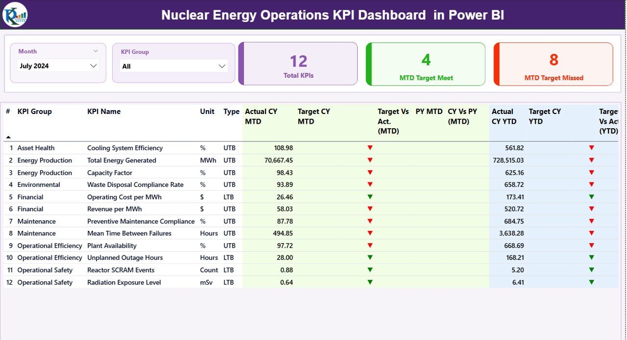
Summary Page – The Main Control Center
The Summary Page acts as the primary reporting screen. It provides a complete overview of all KPIs for a selected month.
What Do You See on the Top Section?
At the top, you find:
- Month Slicer – Select any month to update the entire dashboard instantly.
- KPI Group Slicer – Filter KPIs by category.
- Three KPI Cards:
- Total KPIs Count
- MTD Target Meet Count
- MTD Target Missed Count
- Therefore, managers immediately understand overall performance status.
What Information Does the Detailed KPI Table Show?
Below the summary cards, the dashboard displays a structured KPI table with the following fields:
- KPI Number – Sequence number of each KPI
- KPI Group – Category of the KPI
- KPI Name – Specific performance metric
- Unit – Measurement unit
- Type – LTB (Lower the Better) or UTB (Upper the Better)
How Does MTD Performance Tracking Work?
The dashboard tracks Month-To-Date performance using:
- Actual CY MTD – Current Year actual value
- Target CY MTD – Current Year target value
- MTD Icon – ▲ (Green) or ▼ (Red) indicator
- Target Vs Act. (MTD) – Formula: Actual ÷ Target
- PY MTD – Previous Year MTD value
- CY Vs PY (MTD) – Formula: Current MTD ÷ Previous Year MTD
As a result, teams quickly understand whether they meet targets and how performance compares with last year.
How Does YTD Performance Tracking Work?
Similarly, the dashboard tracks Year-To-Date metrics:
- Actual CY YTD
- Target CY YTD
- YTD Icon
- Target Vs Act. (YTD)
- PY YTD
- CY Vs PY (YTD)
Therefore, leadership evaluates long-term performance trends, not just monthly results.
Click to buy Nuclear Energy Operations KPI Dashboard in Power BI
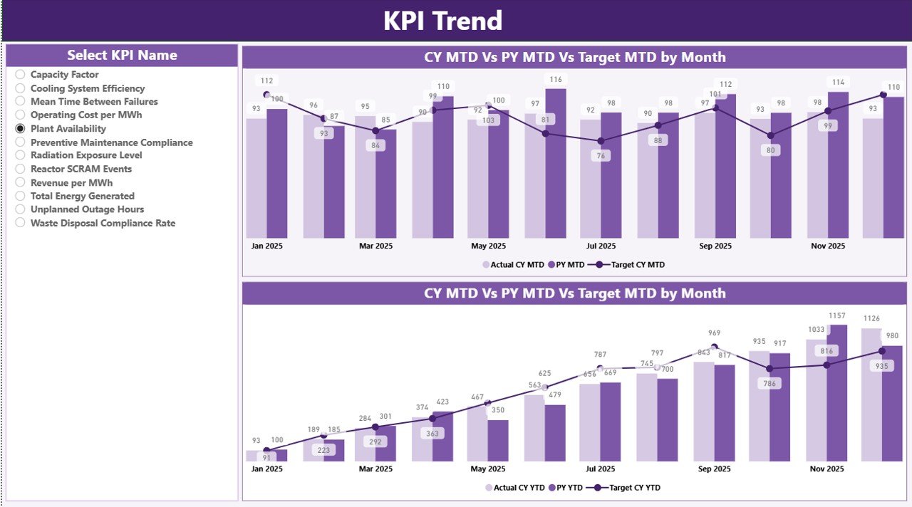
KPI Trend Page – Visual Performance Analysis
The KPI Trend Page allows deeper analysis. Here, users select a KPI from the slicer on the left side.
What Does This Page Show?
It displays two combo charts:
- MTD Trend Chart
- YTD Trend Chart
Each chart compares:
- Current Year Actual
- Previous Year Actual
- Target Values
Consequently, managers observe seasonal trends, performance consistency, and improvement areas.
Moreover, visual charts help communicate results clearly during review meetings.
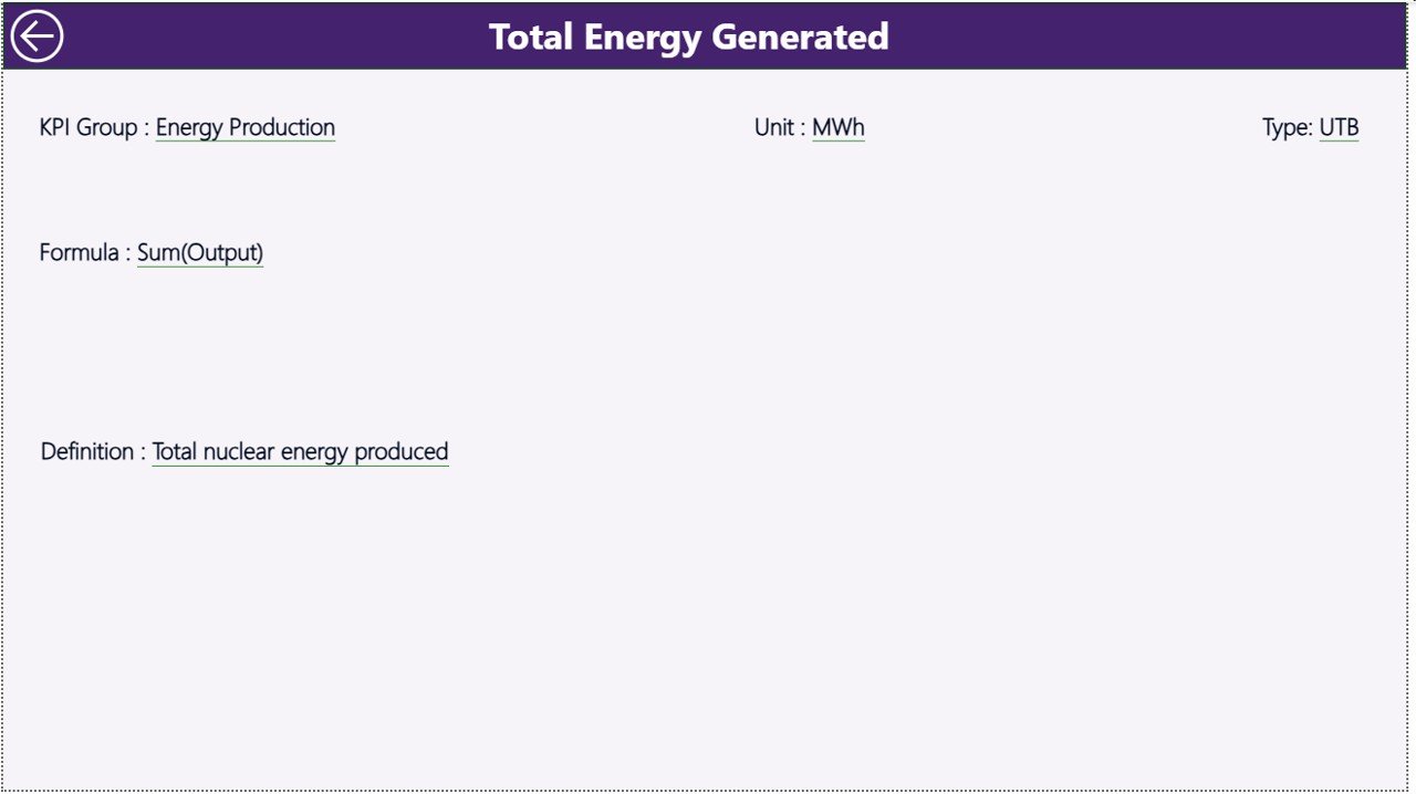
KPI Definition Page – Drill-Through Transparency
Click to buy Nuclear Energy Operations KPI Dashboard in Power BI
The KPI Definition Page remains hidden by default. However, users can drill through from the Summary Page.
What Does This Page Include?
- KPI Number
- KPI Group
- KPI Name
- Unit
- Formula
- Definition
- Type (LTB or UTB)
Therefore, this page ensures transparency. Every stakeholder understands how each KPI is calculated.
To return, simply click the back button on the top left corner.
Click to buy Nuclear Energy Operations KPI Dashboard in Power BI
Excel Data Source Structure
The dashboard uses an Excel file as its data source. This setup keeps data management simple and flexible.
The Excel file contains three worksheets:
Input_Actual Sheet
In this sheet, you enter:
- KPI Name
- Month (First date of the month)
- MTD value
- YTD value
This sheet captures actual performance numbers.
Input_Target Sheet
Here, you enter:
- KPI Name
- Month
- Target MTD
- Target YTD
Therefore, the dashboard automatically compares performance against defined goals.
KPI Definition Sheet
This sheet includes:
- KPI Number
- KPI Group
- KPI Name
- Unit
- Formula
- Definition
- Type (LTB or UTB)
As a result, the dashboard remains structured and consistent.
Advantages of Nuclear Energy Operations KPI Dashboard in Power BI
Organizations gain multiple benefits from this dashboard.
Improved Performance Visibility
Leaders see all KPIs in one place. Therefore, they identify issues faster.
Real-Time Target Monitoring
The dashboard instantly highlights target achievement status with visual icons.
Better Decision Making
Since managers analyze accurate data, they make informed decisions.
Year-Over-Year Comparison
The system compares current performance with previous year metrics. Consequently, teams track progress effectively.
Structured KPI Governance
The KPI Definition page ensures clarity and accountability.
Reduced Manual Work
Power BI automates calculations. Therefore, teams save time and reduce errors.
How Does This Dashboard Improve Nuclear Plant Operations?
Nuclear facilities must prioritize safety, reliability, and compliance. Therefore, structured KPI monitoring strengthens operational control.
- Enhances Safety Monitoring
When safety KPIs fall below target, the dashboard highlights them immediately.
- Improves Operational Efficiency
Managers monitor downtime, generation output, and maintenance KPIs.
- Supports Regulatory Compliance
Accurate documentation and historical data simplify compliance audits.
- Strengthens Financial Control
By tracking cost-related KPIs, organizations manage budgets effectively.
Best Practices for the Nuclear Energy Operations KPI Dashboard in Power BI
To maximize value, follow these best practices:
Keep KPI Definitions Clear
Always define each KPI with a short and simple formula.
Update Data Monthly Without Delay
Enter actual and target data consistently.
Review Target Thresholds Periodically
Adjust targets based on realistic benchmarks.
Use Drill-Through Analysis
Encourage managers to analyze KPI details, not just summary numbers.
Train Team Members
Ensure stakeholders understand LTB and UTB classifications.
Maintain Clean Excel Data
Avoid blank cells and incorrect date formats.
What Types of KPIs Can You Track?
You can track multiple categories, such as:
- Safety KPIs
- Operational Efficiency KPIs
- Maintenance KPIs
- Regulatory Compliance KPIs
- Financial Performance KPIs
Therefore, the dashboard adapts to various nuclear operational requirements.
Why Choose Power BI for Nuclear KPI Reporting?
Power BI offers powerful visualization and automation features.
- Interactive slicers
- Drill-through capability
- Automated calculations
- Dynamic charts
- Secure data handling
Moreover, Power BI integrates seamlessly with Excel, making data management simple.
How to Implement This Dashboard Successfully?
Follow these steps:
- Define your KPI list clearly.
- Structure the Excel data file.
- Enter actual and target data monthly.
- Refresh the Power BI dashboard.
- Conduct monthly review meetings.
As a result, your organization builds a strong data-driven culture.
Conclusion
The Nuclear Energy Operations KPI Dashboard in Power BI transforms complex nuclear plant data into clear and actionable insights. It centralizes KPI tracking, automates calculations, and highlights performance gaps instantly.
Moreover, it improves transparency through structured KPI definitions and drill-through analysis. Therefore, plant managers gain confidence in their decision-making process.
If your organization wants better control, improved compliance, and stronger operational visibility, this dashboard provides a powerful solution.
Frequently Asked Questions (FAQs)
What is the purpose of a Nuclear Energy Operations KPI Dashboard in Power BI?
It helps nuclear facilities monitor operational, safety, and financial KPIs in a centralized and interactive system.
How often should we update the dashboard?
You should update the dashboard monthly by entering actual and target values in the Excel source file.
What does LTB and UTB mean?
LTB stands for “Lower the Better.”
UTB stands for “Upper the Better.”
Can we customize KPIs?
Yes. You can modify KPI definitions, add new KPIs, or change targets according to plant requirements.
Does this dashboard support year-over-year comparison?
Yes. It automatically compares current year performance with previous year metrics.
Is technical knowledge required to use this dashboard?
Basic Power BI knowledge helps. However, since the dashboard remains ready-to-use, most users can operate it easily.
Visit our YouTube channel to learn step-by-step video tutorials
Watch the step-by-step video tutorial:
Click to buy Nuclear Energy Operations KPI Dashboard in Power BI