Managing pension funds involves responsibility, accuracy, and long-term vision. Every decision directly impacts retirees, employees, and financial stability. Therefore, pension fund managers must track performance carefully and act quickly when numbers drift away from targets. This is exactly where a Pension Funds KPI Dashboard in Power BI becomes a powerful solution.
In this detailed guide, you will learn what a Pension Funds KPI Dashboard in Power BI is, why it matters, how it works, what pages it includes, and how it uses Excel as a data source. Moreover, you will also explore its advantages, best practices, and frequently asked questions so you can confidently implement it in your organization.
Click to buy Pension Funds KPI Dashboard in Power BI
What Is a Pension Funds KPI Dashboard in Power BI?
A Pension Funds KPI Dashboard in Power BI is an interactive, ready-to-use analytical dashboard designed to monitor, track, and evaluate the performance of pension fund operations. It converts raw Excel data into meaningful KPIs, comparisons, and trends.
Instead of working with static reports and manual calculations, this dashboard provides a single screen where decision-makers can:
- Monitor Monthly-to-Date (MTD) and Year-to-Date (YTD) results
- Compare actual performance against targets
- Analyze current year vs previous year performance
- Identify underperforming KPIs instantly
Because the dashboard uses Power BI for visualization and Excel for data input, it strikes a perfect balance between simplicity and analytical power.
Why Do Pension Funds Need a KPI Dashboard?
Pension funds manage large volumes of financial data across multiple KPIs. Without a structured system, organizations often face delayed reporting, inconsistent numbers, and reactive decision-making. However, a KPI dashboard solves these challenges effectively.
Key reasons pension funds need a KPI dashboard:
- Because manual reports take time and increase error risk
- Because leadership needs real-time insights
- Because compliance, accuracy, and transparency matter
- Because performance tracking must align with long-term goals
As a result, a Power BI-based KPI dashboard becomes essential rather than optional.
How Does the Pension Funds KPI Dashboard in Power BI Work?
The working process remains simple and efficient. You do not need advanced Power BI or coding knowledge.
Here is how it works step by step:
- You enter actual and target KPI values into structured Excel sheets
- You refresh the Power BI file
- All dashboards, KPIs, and trends update automatically
This seamless integration allows analysts, managers, and executives to focus on decision-making instead of data preparation.
What Pages Are Available in the Pension Funds KPI Dashboard in Power BI?
This dashboard includes three well-structured pages, each designed for a specific analytical purpose.
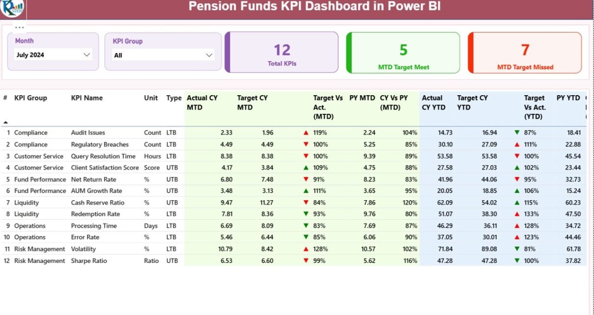
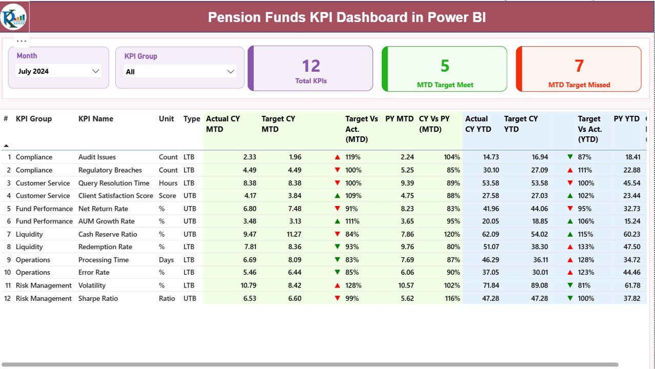
the Summary Page
The Summary Page acts as the main performance cockpit of the dashboard. It provides an at-a-glance overview of all KPIs.
Top-Level Slicers
At the top of the page, you will find interactive slicers that allow deeper analysis:
- Month Slicer – Select the reporting month
- KPI Group Slicer – Filter KPIs by category or group
These slicers automatically update every visual on the page.
KPI Cards on the Summary Page
The Summary Page displays three powerful KPI cards:
- Total KPIs Count – Shows how many KPIs are being tracked
- MTD Target Met Count – Shows how many KPIs achieved the target
- MTD Target Missed Count – Shows KPIs that did not meet targets
Because these cards update dynamically, leadership can quickly assess overall performance.
Detailed KPI Table Explained
Below the cards, the dashboard displays a comprehensive KPI table with rich metrics for detailed analysis.
Columns Included in the Table
- KPI Number – Unique sequence number of each KPI
- KPI Group – Category or functional grouping
- KPI Name – Name of the performance indicator
- Unit – Measurement unit (%, USD, count, ratio, etc.)
- Type – LTB (Lower the Better) or UTB (Upper the Better)
MTD Metrics on the Summary Page
The Monthly-to-Date metrics allow managers to track short-term performance.
- Actual CY MTD – Current year actual MTD value
- Target CY MTD – Target value for current MTD
- MTD Icon –
- ▲ Green arrow when actual meets or exceeds target
- ▼ Red arrow when actual misses target
- Target vs Actual (MTD) – Percentage calculated as:
- Actual MTD / Target MTD
- PY MTD – Previous year MTD value
- CY vs PY (MTD) – Percentage comparison:
- Current MTD / Previous Year MTD
- These metrics help identify immediate deviations and trends.
YTD Metrics on the Summary Page
Year-to-Date metrics support long-term evaluation and strategic planning.
- Actual CY YTD – Current year cumulative value
- Target CY YTD – Target cumulative value
- YTD Icon – Visual status indicator
- Target vs Actual (YTD) – Actual YTD / Target YTD
- PY YTD – Previous year YTD value
- CY vs PY (YTD) – Current YTD / Previous Year YTD
By combining MTD and YTD views, decision-makers gain a complete performance picture.
Click to buy Pension Funds KPI Dashboard in Power BI
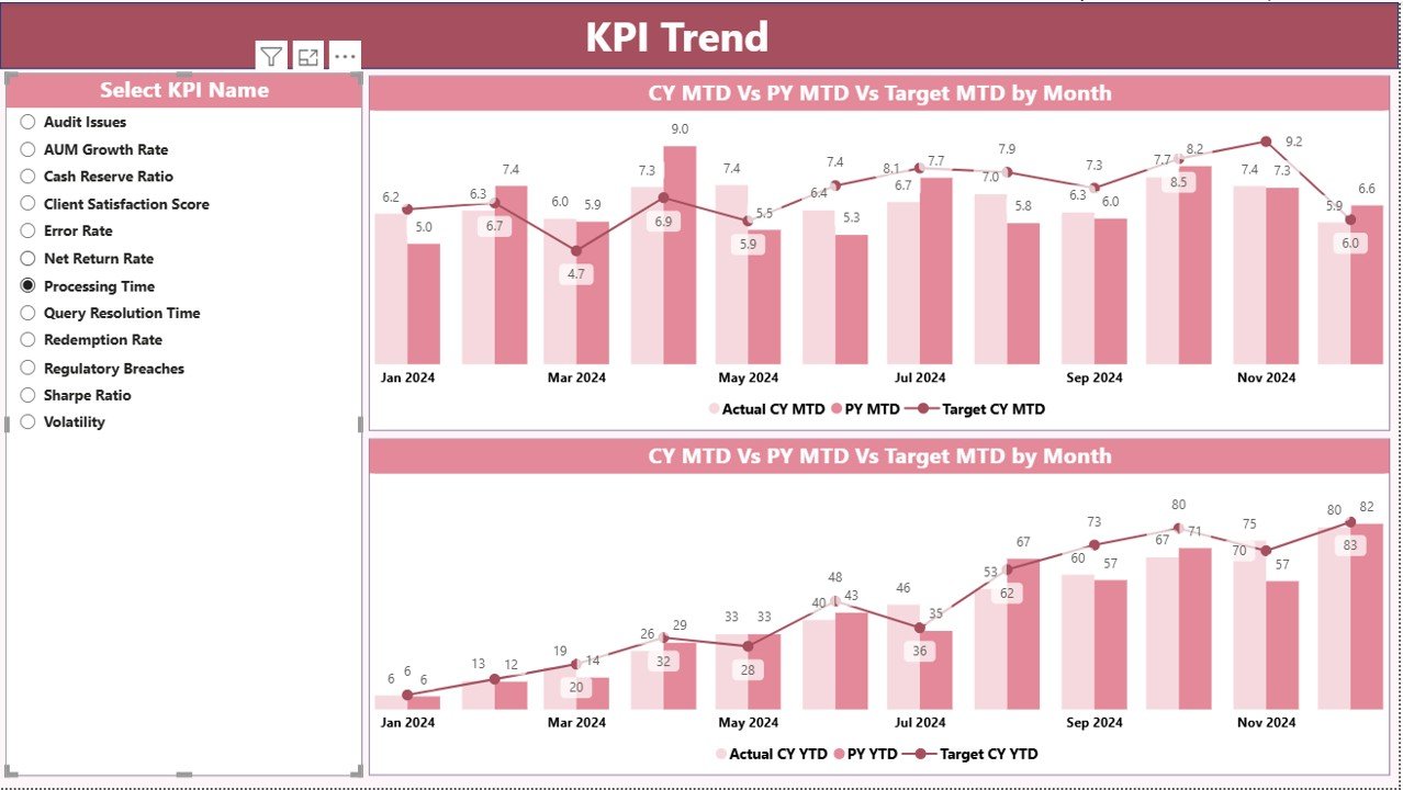
the KPI Trend Page
The KPI Trend Page focuses on performance movement over time.
Key Features of the KPI Trend Page
- Two combo charts for MTD and YTD trends
- Comparison of:
- Current Year Actual
- Previous Year Actual
- Target Values
- A KPI Name slicer on the left for quick selection
- Because this page focuses on trends, users can quickly answer questions like:
- Is performance improving month by month?
- Do targets align with historical performance?
- Which KPIs show consistent volatility?
As a result, this page supports both tactical and strategic analysis.
Click to buy Pension Funds KPI Dashboard in Power BI
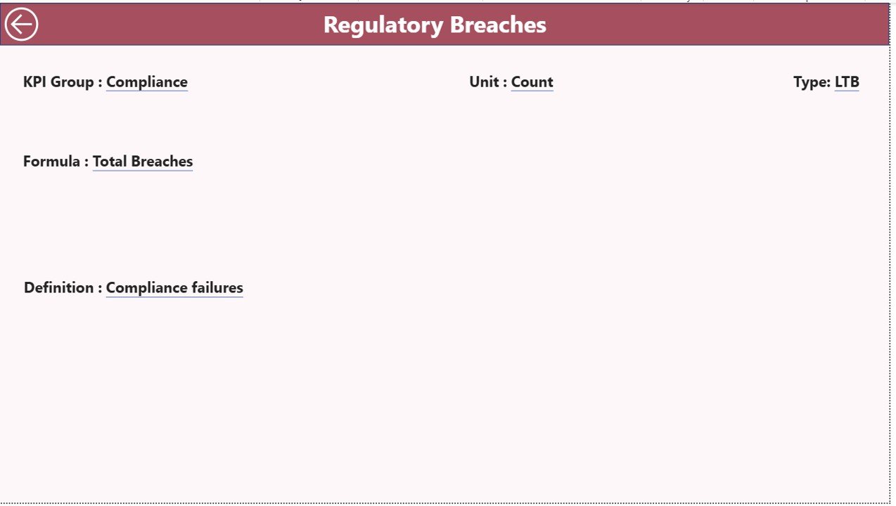
KPI Definition Page
The KPI Definition Page acts as a reference and governance layer.
Key Characteristics
- Designed as a drill-through page
- Hidden from direct navigation
- Accessible by right-clicking a KPI from the Summary Page
Information Available
- KPI Formula
- KPI Definition
- KPI Group
- KPI Type (LTB or UTB)
This feature improves transparency and ensures everyone interprets KPIs consistently.
How Do You Navigate Back to the Main Page?
Navigation remains intuitive and user-friendly. A Back button appears on the top-left corner of the KPI Definition page. With one click, users return to the Summary Page.
Click to buy Pension Funds KPI Dashboard in Power BI
What Data Source Does the Pension Funds KPI Dashboard Use?
This dashboard uses Excel as its data source, which makes data entry simple and familiar.
What Excel Sheets Are Required?
You must maintain three Excel worksheets to power the dashboard.
Input_Actual Sheet
This sheet captures actual KPI performance.
Columns to fill:
- KPI Name
- Month (use the first date of the month)
- MTD Value
- YTD Value
Input_Target Sheet
This sheet stores KPI targets.
Columns to fill:
- KPI Name
- Month (use the first date of the month)
- MTD Target
- YTD Target
KPI Definition Sheet
This sheet acts as metadata for KPIs.
Columns included:
- KPI Number
- KPI Group
- KPI Name
- Unit
- Formula
- Definition
- Type (LTB or UTB)
Once you update these sheets, you just refresh Power BI to see updated insights.
Click to buy Pension Funds KPI Dashboard in Power BI
Advantages of the Pension Funds KPI Dashboard in Power BI
Using this dashboard delivers both operational and strategic benefits.
Key Advantages
- Centralized Performance Tracking – All KPIs appear in one place
- Improved Decision-Making – Real-time insights enable faster actions
- Clear Target Monitoring – Visual indicators highlight gaps instantly
- MTD and YTD Comparisons – Short-term and long-term visibility
- Previous Year Benchmarking – Easy performance comparison
- Excel-Based Data Entry – No complex system changes required
- Professional Power BI Visuals – Executive-friendly design
- Scalability – Easily add new KPIs or periods
As a result, pension fund teams gain control, clarity, and confidence.
Best Practices for the Pension Funds KPI Dashboard in Power BI
To maximize value, follow these best practices consistently.
Data Management Best Practices
- Always use the first date of the month for time consistency
- Maintain uniform KPI names across all sheets
- Validate numbers before refreshing the dashboard
- Avoid blank or inconsistent KPI definitions
Dashboard Usage Best Practices
- Review the dashboard monthly and quarterly
- Focus first on target missed KPIs
- Use trend charts to identify recurring issues
- Share insights with stakeholders regularly
Governance Best Practices
- Keep KPI formulas documented and approved
- Limit editing access to definition sheets
- Maintain version control for Excel files
- Align KPIs with regulatory and compliance needs
Who Should Use This Pension Funds KPI Dashboard?
This dashboard suits a wide range of professionals:
- Pension Fund Managers
- Investment Analysts
- Finance Controllers
- Compliance Teams
- Senior Leadership
- Audit and Risk Committees
Because it adapts easily, both small and large pension funds can benefit.
Conclusion
A Pension Funds KPI Dashboard in Power BI transforms how pension organizations monitor, analyze, and improve performance. Instead of drowning in spreadsheets and delayed reports, teams gain a clear, visual, and structured system for managing KPIs.
Because the dashboard combines Excel data entry with Power BI analytics, it remains easy to use while delivering powerful insights. Moreover, the built-in comparisons, trend analysis, and KPI definitions ensure transparency and accountability at every level.
If you want better control, accuracy, and strategic visibility over pension fund performance, this dashboard becomes an essential tool.
Frequently Asked Questions (FAQs)
- What is the main purpose of a Pension Funds KPI Dashboard in Power BI?
The main purpose is to track pension fund KPIs, compare actuals with targets, analyze trends, and support better decision-making using interactive visuals.
- Do I need advanced Power BI skills to use this dashboard?
No. You only need to update Excel data and refresh the Power BI file. The dashboard logic already exists.
- Why does the dashboard include both MTD and YTD metrics?
MTD metrics track short-term performance, while YTD metrics support long-term evaluation and strategic planning.
- Can I add more KPIs to the dashboard?
Yes. You can add new KPIs by updating the KPI Definition, Input_Actual, and Input_Target sheets.
- What does LTB and UTB mean?
- LTB (Lower the Better) – Lower values indicate better performance
- UTB (Upper the Better) – Higher values indicate better performance
- How frequently should I update the Excel data?
You should update the data monthly. However, you can also refresh it more frequently if required.
- Is this dashboard suitable for executive reporting?
Yes. The clean visuals, KPI cards, and target indicators make it ideal for executive reviews and board presentations.
- Can this dashboard support compliance and audits?
Yes. Clear KPI definitions, historical comparisons, and structured data support transparency and audit readiness.
Visit our YouTube channel to learn step-by-step video tutorials
Watch the step-by-step video tutorial:
Click to buy Pension Funds KPI Dashboard in Power BI