Businesses need fast and clear insights to grow their revenue. Sales change every month, new products enter the market, customer behaviour shifts often, and marketing teams run many campaigns. Because of these changes, business leaders look for real-time clarity on performance. A Revenue Growth KPI Dashboard in Power BI solves this need. It creates a single place where users can see revenue, trends, KPIs, and targets without working on complex reports.
In this long and complete guide, you will learn everything about a Revenue Growth KPI Dashboard in Power BI. I will explain the dashboard structure, page-by-page details, working method, advantages, best practices, and FAQs. You will understand how this dashboard turns raw data into powerful insights that help teams grow faster.
Click to Purchases Revenue Growth KPI Dashboard in Power BI
What Is a Revenue Growth KPI Dashboard in Power BI?
A Revenue Growth KPI Dashboard in Power BI is a ready-to-use analytical tool that tracks all important KPIs related to revenue. It reads the data from a simple Excel file and shows it in a clean, visual, and interactive Power BI report. Users can check actual numbers, targets, variances, Month-to-Date (MTD) and Year-to-Date (YTD) performance, and previous year comparisons.
Because the dashboard runs in Power BI, users enjoy:
-
Attractive visuals
-
Auto-calculated KPIs
-
Drill-through capabilities
-
Slicers and filters
-
Clean navigations
-
Real-time refresh
The goal of this dashboard is simple: help decision makers understand revenue growth clearly and take fast actions to improve performance.
Why Do You Need a Revenue Growth KPI Dashboard in Power BI?
Revenue grows only when teams work with clear numbers. An unorganized Excel sheet makes it hard to understand trends. Managers cannot track monthly achievement, targets, and gaps. Because of this, decision making becomes slow and reactive.
On the other hand, a Power BI dashboard:
-
Displays KPIs visually
-
Tracks MTD and YTD progress
-
Compares numbers with previous year
-
Highlights KPIs that miss the target
-
Helps users identify opportunities for improvement
-
Shows detailed trends with simple navigation
This dashboard brings all revenue information into a single place so leadership teams can focus on results instead of manual calculations.
Structure of the Revenue Growth KPI Dashboard in Power BI
This dashboard contains three well-structured pages inside the Power BI file:
-
Summary Page (Main Dashboard)
-
KPI Trend Page
-
KPI Definition Page (Drill-Through Page)
Each page has its own purpose, and together they create a complete Revenue Growth Monitoring System.
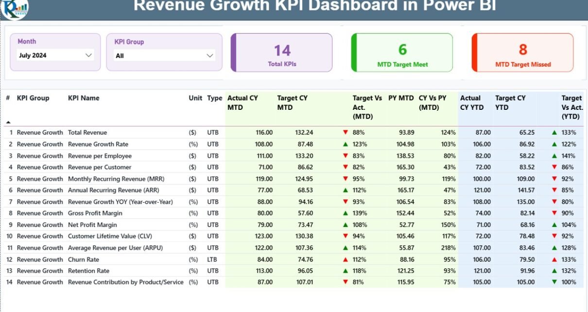
1. Summary Page – The Main Performance View
The Summary Page works as the central place where users can see all KPIs together. This page includes:
Top Section – Smart Slicers
The dashboard includes two slicers:
-
Month Slicer: Choose any month to check performance.
-
KPI Group Slicer: Select specific KPI categories like Sales, Marketing, Operations, Finance, etc.
These slicers update the entire dashboard instantly.
KPI Cards
The top part includes three KPI cards:
-
Total KPIs Count
-
MTD Target Met Count
-
MTD Target Missed Count
These cards help the user understand overall health of the business in one quick glance.
Detailed KPI Table
The table below shows the full KPI dataset. Each KPI includes:
✔ KPI Number
The sequence number assigned to every KPI.
✔ KPI Group
Shows the category such as Revenue, Profitability, Sales Efficiency, Marketing, etc.
✔ KPI Name
Displays the exact KPI name like Monthly Sales Growth, Customer Revenue, Region-wise Sales, etc.
✔ Unit
Shows the measurement unit (%, $, Nos., etc).
✔ Type (UTB or LTB)
This indicates whether the KPI follows:
-
UTB – Upper the Better
-
LTB – Lower the Better
✔ Actual CY MTD
Current Year Month-to-Date actual number.
✔ Target CY MTD
Target value of Current Year MTD.
✔ MTD Icon (▲ / ▼)
-
Green ▲ icon shows KPIs meeting the target.
-
Red ▼ icon shows KPIs missing the target.
✔ Target vs Actual (MTD)
Shows Actual / Target percentage.
✔ PY MTD
Month-to-Date value for the same month of the Previous Year.
✔ CY vs PY (MTD)
Shows Current MTD / Previous Year MTD percentage comparison.
✔ Actual CY YTD
Current Year Year-to-Date actual number.
✔ Target CY YTD
Current Year YTD target number.
✔ YTD Icon (▲ / ▼)
Green or red icons indicate whether the YTD values meet the target.
✔ Target vs Actual (YTD)
Shows Actual / Target percentage for YTD values.
✔ PY YTD
Previous Year YTD value.
✔ CY vs PY (YTD)
Comparison between Current YTD and Previous YTD.
Because of this detailed table, users can understand every KPI’s real performance quickly.
Click to Purchases Revenue Growth KPI Dashboard in Power BI
2. KPI Trend Page – Visual Trend Analysis
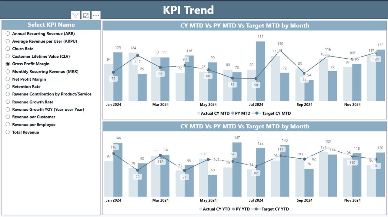
The KPI Trend page helps users dive deeper into trends. The left side contains a slicer:
-
KPI Name Slicer: Select any KPI to analyze its historical trend.
Once the user selects a KPI, the page displays:
Two Combo Charts
These charts show:
-
Current Year Actuals
-
Previous Year Actuals
-
Target Values
The charts are available for:
✔ MTD Trends
✔ YTD Trends
These visuals make it easy to understand:
-
Whether the KPI is improving
-
Whether the KPI is stable
-
Whether the KPI is declining
-
Whether the KPI meets the expectations
Users can track month-by-month performance and see how revenue grows through the year.
3. KPI Definition Page – Drill-Through Insights
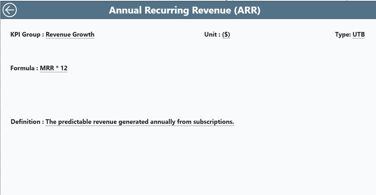
This is a hidden drill-through page. Users can right-click on any KPI in the Summary Page and move to a deeper explanation.
The KPI definition section includes:
-
KPI Number
-
KPI Group
-
KPI Name
-
Unit
-
Formula
-
KPI Definition
-
Type (LTB / UTB)
This page helps new users understand KPI meaning, logic, and calculation. To return to the main page, users can click the Back button shown on the top left.
Excel Data Structure Used in This Dashboard
This dashboard reads the data from a structured Excel file. The file contains three worksheets:
✔ 1. Input_Actual Sheet
This sheet stores:
-
KPI Name
-
Month (use first day of the month)
-
MTD Actual
-
YTD Actual
✔ 2. Input_Target Sheet
This sheet stores:
-
KPI Name
-
Month (first day of the month)
-
MTD Target
-
YTD Target
✔ 3. KPI Definition Sheet
This sheet stores:
-
KPI Number
-
KPI Group
-
KPI Name
-
Unit
-
Formula
-
Definition
-
KPI Type (LTB / UTB)
When users update this Excel file, Power BI refreshes automatically and updates all visuals.
Advantages of a Revenue Growth KPI Dashboard in Power BI
A Revenue Growth KPI Dashboard gives many benefits. These advantages help companies grow continuously and confidently.
1. Real-Time Visibility on Revenue
The dashboard updates instantly. Users can see the latest numbers and track growth without delay.
2. Clear Comparison Between Actuals and Targets
The dashboard shows both MTD and YTD comparisons. Users understand if they are on track or falling behind.
3. Quick Understanding Through Icons
The green and red icons help users see the status instantly.
4. Accurate Previous Year Comparison
Teams can compare their current performance with last year and understand growth patterns.
5. Trend Analysis Made Easy
The KPI Trend page helps users see long-term patterns. Managers can track seasonality, product cycles, or demand cycles.
6. Easy for All Departments
Finance, Sales, Marketing, Operations, and Leadership teams can all track KPIs from the same dashboard.
7. Zero Manual Calculations
Power BI auto-calculates everything. Users do not waste time on formulas.
8. User-Friendly Navigation
The drill-through and slicers create a smooth experience for all users.
Best Practices for Using the Revenue Growth KPI Dashboard
Click to Purchases Revenue Growth KPI Dashboard in Power BI
To use the dashboard effectively, follow these best practices:
1. Keep Data Clean and Updated
Always enter correct MTD and YTD numbers in the Excel sheet.
2. Use Consistent KPI Names
The Actual and Target sheets must use the same KPI Name spelling.
3. Review Trends Every Month
Track the KPI Trend page regularly to understand long-term growth.
4. Monitor MTD & YTD Separately
MTD shows short-term performance while YTD shows long-term results.
5. Review KPI Definitions
Use the drill-through page often to understand KPI logic and measure accuracy.
6. Compare with Previous Year
Always check CY vs PY to see real growth.
7. Share the Dashboard with Stakeholders
Collaboration helps teams make better decisions.
8. Refresh the Dataset Daily
If possible, refresh the dashboard daily to stay updated.
Conclusion
A Revenue Growth KPI Dashboard in Power BI gives companies a clear, complete, and real-time view of their revenue performance. It helps teams understand trends, compare actuals with targets, monitor KPIs, and take timely actions. Since the dashboard uses simple Excel data and powerful Power BI visuals, users do not need complex tools or advanced knowledge.
The Summary Page highlights KPI health, the Trend Page shows long-term patterns, and the KPI Definition Page ensures clarity and transparency. Together, these pages create a complete revenue intelligence system that supports confident decisions and faster business growth.
Frequently Asked Questions (FAQs)
1. What is a Revenue Growth KPI Dashboard?
It is a Power BI report that tracks all revenue-related KPIs using actuals, targets, MTD, YTD, and previous year comparisons.
2. Who can use this dashboard?
Sales teams, finance teams, marketing teams, operations teams, and leadership teams can use it to monitor revenue performance.
3. Does this dashboard need coding?
No. You only need to fill data in the Excel file. Power BI handles everything else.
4. How often should I update the dashboard?
You should update it monthly or weekly based on your business needs.
5. Can I add more KPIs?
Yes. You can add more KPIs to the Excel file and refresh the Power BI dataset.
6. What is the best way to use MTD and YTD values?
Use MTD to track short-term performance and YTD to track long-term financial health.
7. Can I compare current revenue with the previous year?
Yes. The dashboard includes PY MTD and PY YTD numbers for clear comparison.
8. What if my KPI is missing targets?
The red icons and variance percentages will highlight the gap so you can take corrective actions quickly.
Visit our YouTube channel to learn step-by-step video tutorials