Smart cities continue to reshape how governments plan, build, and manage urban ecosystems. Cities now depend on data to improve infrastructure, enhance citizen services, optimize resources, and ensure sustainable growth. However, without structured performance tracking, even the most ambitious smart city initiatives struggle to deliver measurable outcomes. Therefore, city planners, municipal authorities, and smart city program teams need a centralized system to monitor progress clearly and consistently.
That is exactly where the Smart Cities Development KPI Dashboard in Power BI becomes a powerful solution.
This in-depth, SEO-friendly guide explains everything you need to know about a Smart Cities Development KPI Dashboard in Power BI. You will learn what it is, why it matters, how it works, its page-wise structure, data flow, advantages, best practices, and frequently asked questions. Moreover, this article expands your provided information using practical explanations and real-world relevance, so you can confidently use or implement this dashboard in smart city projects.
Click to buy Smart Cities Development KPI Dashboard in Power BI
What Is a Smart Cities Development KPI Dashboard in Power BI?
A Smart Cities Development KPI Dashboard in Power BI is an interactive performance monitoring system designed to track, analyze, and visualize key indicators related to urban development initiatives.
Instead of managing scattered Excel files, static reports, and delayed updates, this dashboard consolidates all smart city KPIs into one structured Power BI report. As a result, decision-makers gain instant visibility into both short-term progress and long-term trends.
This dashboard supports:
- Month-to-Date (MTD) performance analysis
- Year-to-Date (YTD) performance tracking
- Target vs Actual monitoring
- Current Year vs Previous Year comparisons
- KPI-level drill-through for definitions and formulas
Because Power BI handles interactivity, slicers, and visuals efficiently, city teams can explore data dynamically and take faster, data-backed actions.
Why Do Smart Cities Need KPI Dashboards?
Smart city projects involve multiple departments, large budgets, and long timelines. Therefore, transparency and accountability become essential. However, manual reporting slows progress and hides issues.
A Smart Cities Development KPI Dashboard solves these challenges by:
- Centralizing all KPIs in one view
- Highlighting performance gaps early
- Supporting data-driven planning
- Improving coordination across departments
- Strengthening governance and reporting
Moreover, when stakeholders see clear visuals instead of raw numbers, discussions become more focused and decisions become faster.
How Does a Smart Cities Development KPI Dashboard in Power BI Work?
This dashboard uses Excel as the data source and Power BI Desktop as the visualization layer. Because of this setup, the solution remains simple, flexible, and easy to maintain.
Here is how the workflow operates:
- You update actual and target data in Excel sheets
- Power BI connects to the Excel file
- Measures calculate MTD, YTD, and comparisons
- Visuals update automatically
- Users filter data using slicers and drill-through
As a result, you avoid complex databases while still achieving enterprise-level reporting.
What Are the Key Features of the Smart Cities Development KPI Dashboard in Power BI?
The Smart Cities Development KPI Dashboard includes three structured pages inside a single Power BI Desktop file. Each page serves a clear purpose and supports different levels of analysis.
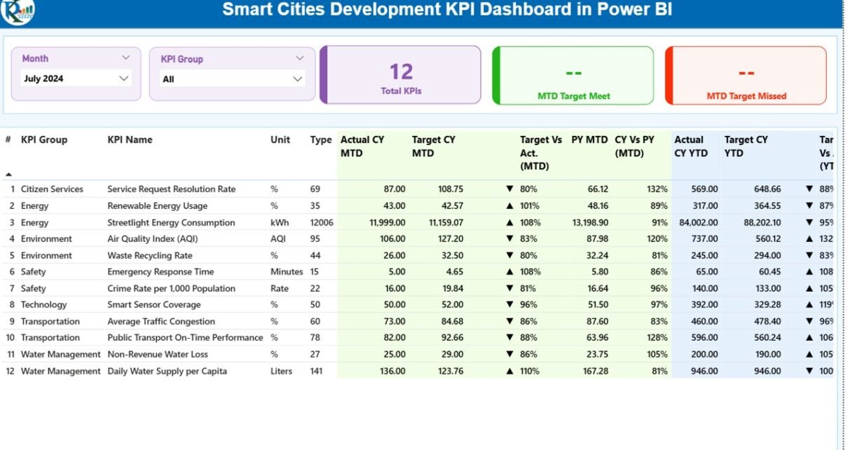
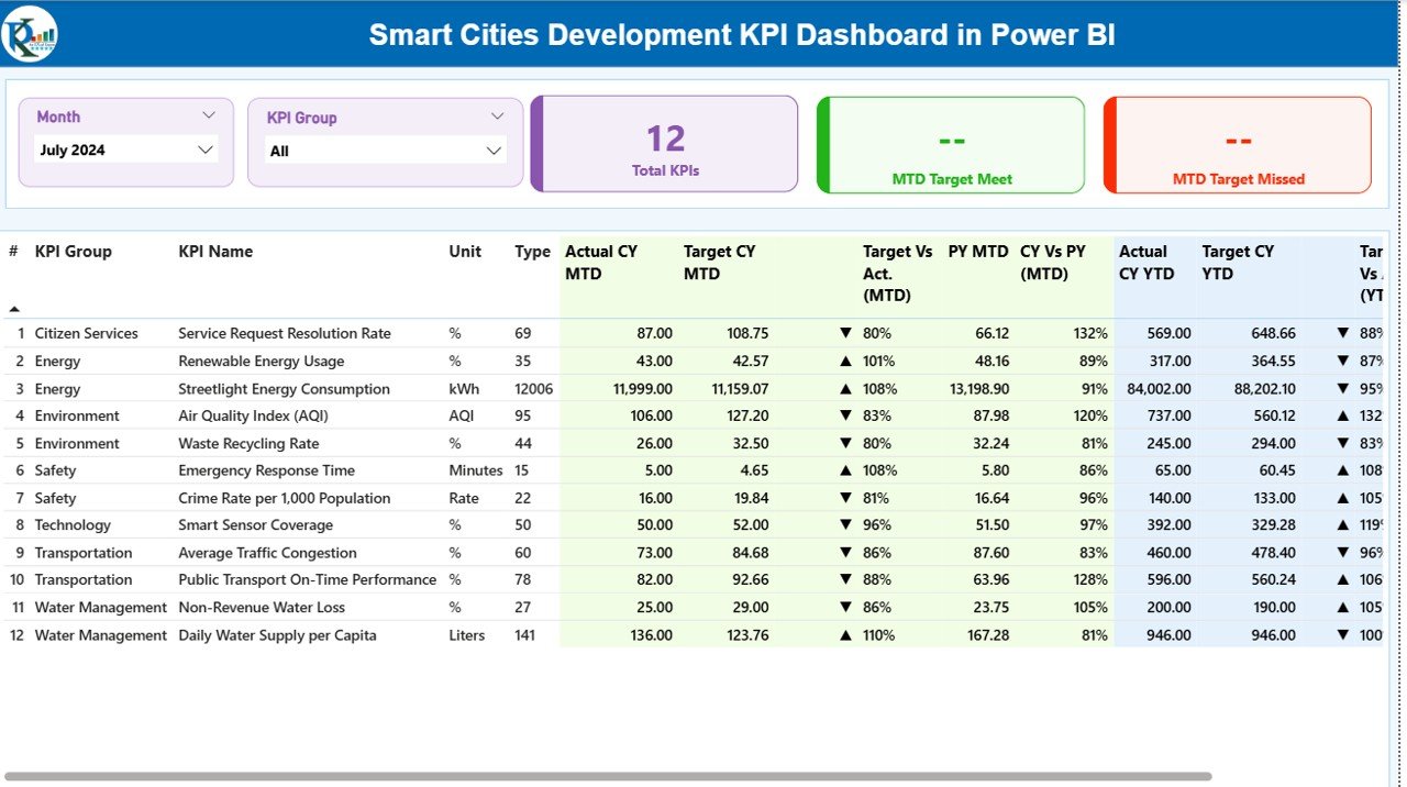
Summary Page
The Summary Page acts as the central control room of the dashboard. It provides a consolidated overview of all smart city KPIs at a glance.
Key Elements of the Summary Page
Top Slicers
- Month slicer
- KPI Group slicer
These slicers allow users to focus on specific time periods and KPI categories instantly.
KPI Cards
At the top of the page, you see three critical cards:
- Total KPIs Count
- MTD Target Met Count
- MTD Target Missed Count
These cards quickly communicate overall performance health.
Detailed KPI Table on the Summary Page
Below the cards, the dashboard displays a detailed KPI table with the following columns:
- KPI Number – Sequence number of the KPI
- KPI Group – Category or domain of the KPI
- KPI Name – Name of the performance indicator
- Unit – Measurement unit (%, count, hours, etc.)
- Type – LTB (Lower the Better) or UTB (Upper the Better)
MTD Performance Metrics
The Summary Page includes detailed Month-to-Date metrics:
- Actual CY MTD – Current year actual MTD value
- Target CY MTD – Current year target MTD value
- MTD Icon – ▲ or ▼ with green/red indicators
- Target vs Actual (MTD) – Actual ÷ Target
- PY MTD – Previous year MTD value
- CY vs PY (MTD) – CY MTD ÷ PY MTD
Because these metrics appear together, users instantly understand performance status and growth trends.
YTD Performance Metrics
The dashboard also displays Year-to-Date metrics:
- Actual CY YTD – Current year actual YTD value
- Target CY YTD – Current year target YTD value
- YTD Icon – ▲ or ▼ with color indicators
- Target vs Actual (YTD) – Actual ÷ Target
- PY YTD – Previous year YTD value
- CY vs PY (YTD) – CY YTD ÷ PY YTD
This structure ensures balanced monitoring of short-term execution and long-term progress.
Click to buy Smart Cities Development KPI Dashboard in Power BI
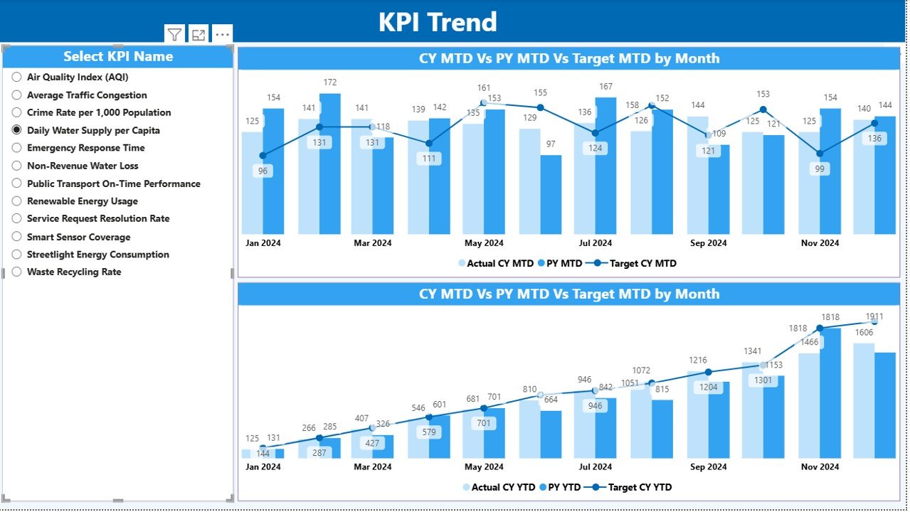
KPI Trend Page
The KPI Trend Page focuses on trend analysis and historical comparison.
Features of the KPI Trend Page
- Two combo charts
- Current Year Actual values
- Previous Year Actual values
- Target values for MTD and YTD
- KPI Name slicer on the left
Because users can select a single KPI, the charts update instantly. Therefore, analysts can study seasonal patterns, growth consistency, and target alignment over time.
Moreover, combo charts improve clarity by combining bars and lines in one view.
Click to buy Smart Cities Development KPI Dashboard in Power BI
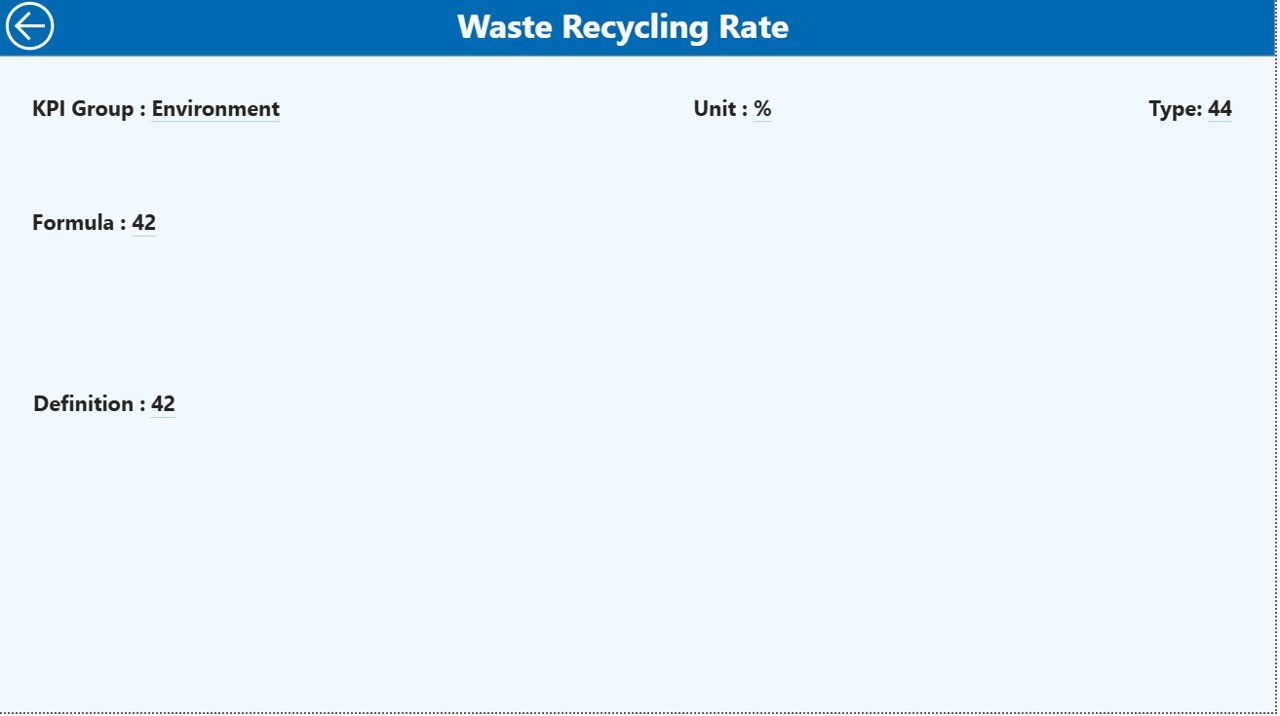
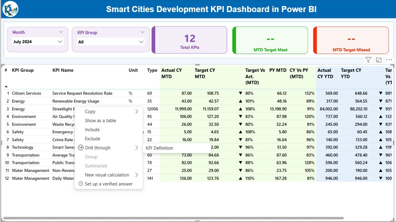
KPI Definition
The KPI Definition Page acts as a drill-through reference page.
Purpose of the KPI Definition Page
- Displays KPI formula
- Explains KPI definition
- Shows unit and type (LTB or UTB)
This page remains hidden by default. However, users can drill through from the Summary Page to access it.
Because of this design, the dashboard maintains cleanliness while still offering deep context when required.
A Back Button on the top-left corner allows users to return to the main page easily.
Click to buy Smart Cities Development KPI Dashboard in Power BI
How Does the Excel Data Source Work for This Dashboard?
The Smart Cities Development KPI Dashboard uses an Excel file as its data source. This design keeps data entry simple and avoids technical complexity.
Input_Actual Sheet
In this sheet, users enter actual performance values:
- KPI Name
- Month (first date of the month)
- MTD number
- YTD number
Because the structure stays consistent, Power BI reads and refreshes data smoothly.
Input_Target Sheet
This sheet captures planned or benchmark values:
- KPI Name
- Month (first date of the month)
- Target MTD number
- Target YTD number
By separating actual and target data, the dashboard ensures clean comparisons.
Click to buy Smart Cities Development KPI Dashboard in Power BI
KPI Definition Sheet
This sheet stores master KPI information:
- KPI Number
- KPI Group
- KPI Name
- Unit
- Formula
- Definition
- Type (LTB or UTB)
Because definitions remain centralized, governance and consistency improve across departments.
What KPIs Can You Track in a Smart Cities Development Dashboard?
Smart city initiatives cover multiple domains. Therefore, this dashboard supports a wide range of KPIs, such as:
- Infrastructure development progress
- Smart mobility adoption rates
- Energy efficiency metrics
- Water and waste management indicators
- Digital service usage
- Citizen satisfaction scores
- Budget utilization rates
Because the dashboard uses a flexible KPI definition sheet, you can customize KPIs easily.
Advantages of Smart Cities Development KPI Dashboard in Power BI
Using a Smart Cities Development KPI Dashboard in Power BI delivers measurable benefits across governance, operations, and strategy.
Key Advantages
- Centralized Monitoring – Track all smart city KPIs in one place
- Real-Time Insights – Refresh data quickly for updated visuals
- MTD and YTD Visibility – Balance short-term and long-term analysis
- Target Accountability – Identify missed targets instantly
- Historical Comparison – Measure improvement against previous years
- User-Friendly Design – Navigate easily with slicers and drill-through
- Scalable Framework – Add new KPIs without redesigning the dashboard
Because of these advantages, city leaders gain confidence in decision-making.
Best Practices for the Smart Cities Development KPI Dashboard in Power BI
To maximize value, you should follow proven best practices.
Best Practices to Follow
- Define KPIs clearly before implementation
- Use consistent units and formulas
- Update Excel data on a fixed schedule
- Review target values periodically
- Limit KPIs to actionable metrics
- Train users on slicers and drill-through
- Validate data before refresh
- Maintain version control for Excel files
When teams follow these practices, dashboard reliability and trust improve significantly.
How Does This Dashboard Support Smart City Governance?
Governance requires transparency, accountability, and measurable outcomes. This dashboard supports governance by:
- Providing auditable KPI definitions
- Showing clear target achievement status
- Supporting review meetings with visuals
- Enabling performance-based decision-making
Therefore, policymakers and administrators stay aligned with development goals.
Who Can Use the Smart Cities Development KPI Dashboard?
This dashboard suits multiple stakeholders:
- Urban planners
- Municipal authorities
- Smart city mission teams
- Infrastructure project managers
- Policy analysts
- Government consultants
Because the design stays intuitive, even non-technical users can explore insights confidently.
Conclusion: Why Smart Cities Need KPI Dashboards in Power BI
Smart cities succeed when data guides decisions. However, raw data alone never creates impact. Instead, structured visualization, clear KPIs, and consistent tracking drive results.
The Smart Cities Development KPI Dashboard in Power BI transforms complex urban performance data into a clean, interactive, and decision-ready system. It centralizes KPIs, highlights progress, reveals gaps, and supports accountability. Moreover, its Excel-based input design ensures ease of use and flexibility.
When city teams adopt this dashboard, they move from reactive reporting to proactive governance. As a result, smart city initiatives achieve clarity, efficiency, and sustainable growth.
Frequently Asked Questions About Smart Cities Development KPI Dashboard in Power BI
What is the main purpose of a Smart Cities KPI Dashboard?
The main purpose is to track, analyze, and visualize smart city performance using structured KPIs, targets, and comparisons.
Can I customize KPIs in the Smart Cities Development Dashboard?
Yes, you can easily customize KPIs using the KPI Definition Excel sheet without changing the Power BI design.
Does this dashboard support both MTD and YTD analysis?
Yes, the dashboard supports both Month-to-Date and Year-to-Date analysis with target and previous year comparisons.
Do I need advanced Power BI skills to use this dashboard?
No, the dashboard uses slicers, tables, and charts that remain easy to use for both technical and non-technical users.
How often should I update the Excel data?
You should update the Excel data monthly or as per your reporting cycle to ensure accurate insights.
Can this dashboard support multiple smart city departments?
Yes, KPI Group filtering allows you to analyze performance across different departments and domains.
Why is Power BI suitable for smart city dashboards?
Power BI offers interactivity, scalability, and visual clarity, which makes it ideal for complex smart city
Visit our YouTube channel to learn step-by-step video tutorials
Watch the step-by-step video tutorial:
Click to buy Smart Cities Development KPI Dashboard in Power BI