In today’s data-driven agriculture and environmental services industry, soil testing service providers must track performance with precision. Accuracy, turnaround time, client satisfaction, and operational efficiency directly impact credibility and revenue. Therefore, relying on scattered Excel files or manual reports no longer works. This is exactly where a Soil Testing Services KPI Dashboard in Excel becomes a powerful solution.
A Soil Testing Services KPI Dashboard in Excel helps laboratories, agronomy consultants, and testing agencies monitor critical KPIs in one centralized system. Moreover, it converts raw numbers into meaningful insights using visuals, comparisons, and trends. As a result, decision-makers can act faster and improve service quality consistently.
In this comprehensive article, you will learn what a Soil Testing Services KPI Dashboard in Excel is, how it works, its structure, advantages, best practices, and frequently asked questions. Additionally, you will understand how each worksheet contributes to better reporting and smarter decisions.
What Is a Soil Testing Services KPI Dashboard in Excel?
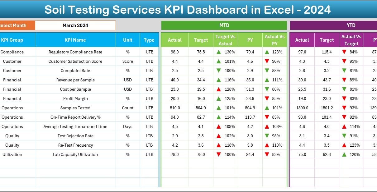
A Soil Testing Services KPI Dashboard in Excel is a ready-to-use performance monitoring tool designed to track, analyze, and visualize key performance indicators related to soil testing operations. Instead of reviewing multiple reports, users can view MTD, YTD, target, and previous year performance on a single interactive dashboard.
Moreover, this dashboard supports both Lower the Better (LTB) and Upper the Better (UTB) KPIs. Therefore, it ensures correct performance interpretation across different metrics such as error rates, turnaround time, test volumes, and revenue-related indicators.
Because Excel powers this dashboard, teams can use it without complex BI tools. At the same time, the structure remains scalable and business-ready.
Why Do Soil Testing Services Need a KPI Dashboard?
Soil testing services operate in a highly sensitive environment where accuracy, timeliness, and consistency matter the most. Therefore, management teams must monitor performance continuously.
A KPI Dashboard helps because:
-
It centralizes all KPIs in one place
-
It compares actual results with targets
-
It highlights deviations using visual indicators
-
It supports month-wise and year-wise analysis
As a result, service providers can reduce errors, improve turnaround time, and increase customer trust.
How Does a Soil Testing Services KPI Dashboard in Excel Work?
The working model of this dashboard remains simple yet effective.
-
Data Entry
First, users enter actual, target, and previous year data in dedicated input sheets. -
KPI Logic & Definitions
Next, KPI formulas, units, and types are defined in the KPI Definition sheet. -
Automated Dashboard Update
Finally, users select a month, and the dashboard updates automatically.
Because of this structure, the dashboard stays easy to maintain and reliable.
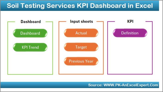
What Worksheets Are Included in the Soil Testing Services KPI Dashboard in Excel?
This dashboard contains 7 well-structured worksheets, each designed for a specific purpose.
1. Home Sheet: How Does It Improve Navigation?
The Home Sheet acts as an index page for the entire dashboard.
Key Benefits of the Home Sheet
-
Provides 6 navigation buttons
-
Allows one-click movement to any worksheet
-
Improves usability for non-technical users
As a result, users save time and avoid confusion while navigating the file.
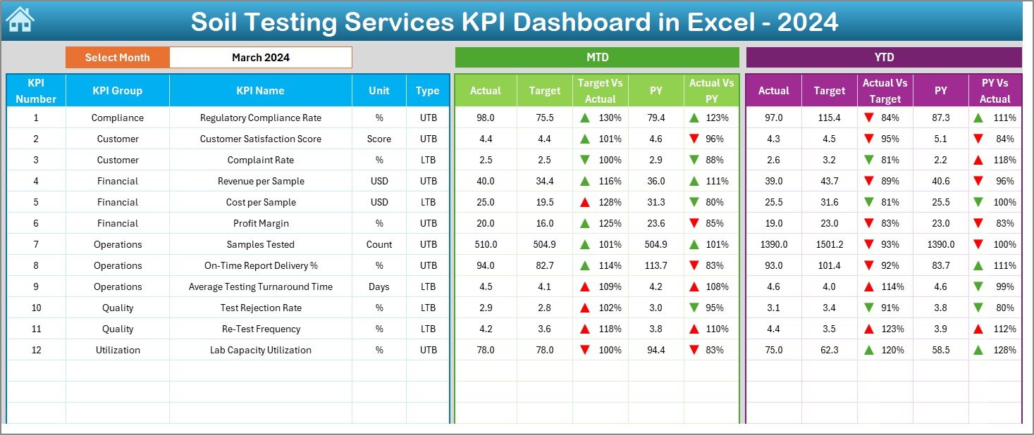
2. Dashboard Sheet: How Do You Monitor Overall KPI Performance?
The Dashboard Sheet serves as the core of the KPI system.
How Does Month Selection Work?
On cell D3, users select the month from a drop-down. Immediately, the entire dashboard updates for the selected period. Therefore, users can analyze performance month by month without manual adjustments.
What KPIs Are Displayed on the Dashboard?
The dashboard displays both MTD and YTD performance metrics, including:
-
Actual values
-
Target values
-
Previous year values
-
Target vs Actual comparison
-
Current year vs previous year comparison
How Does MTD Analysis Help?
For Month-to-Date (MTD), the dashboard shows:
-
MTD Actual
-
MTD Target
-
Previous Year MTD
-
Target vs Actual %
-
PY vs Actual %
Additionally, up and down arrows with conditional formatting indicate performance status. Therefore, users instantly understand whether a KPI performs well or needs attention.
Why Is YTD Analysis Important?
For Year-to-Date (YTD), the dashboard displays:
-
YTD Actual
-
YTD Target
-
Previous Year YTD
-
Target vs Actual %
-
PY vs Actual %
Because YTD numbers show cumulative performance, management teams can track long-term progress effectively.
3. KPI Trend Sheet: How Can You Analyze Performance Trends?
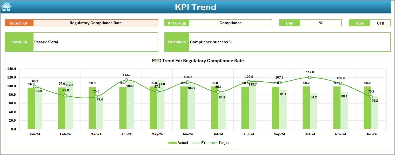
The KPI Trend Sheet focuses on trend-based analysis.
How Do You Select a KPI?
Users select a KPI from the drop-down available in cell C3. Once selected, all KPI-specific details and charts update automatically.
What KPI Details Are Displayed?
This sheet displays:
-
KPI Group
-
KPI Unit
-
KPI Type (LTB or UTB)
-
KPI Formula
-
KPI Definition
Therefore, users understand the KPI context before analyzing trends.
What Charts Are Shown?
The sheet displays MTD and YTD trend charts for:
-
Actual values
-
Target values
-
Previous year values
As a result, users can:
-
Identify seasonal patterns
-
Compare targets vs actuals over time
-
Detect performance improvements or declines early
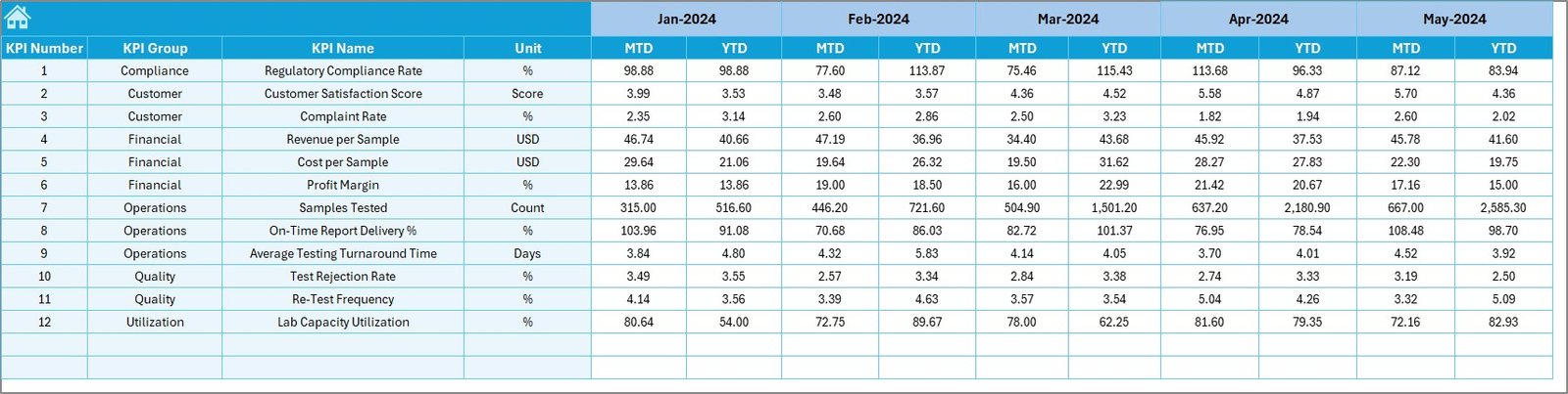
4. Actual Numbers Input Sheet: How Do You Enter Current Data?
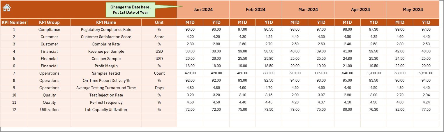
The Actual Numbers Input Sheet captures current-year performance data.
How Does Month Control Work?
On cell E1, users enter the first month of the year. After that, they can change months easily while entering data.
What Data Is Entered Here?
Users enter:
-
KPI Name
-
Month
-
MTD Actual values
-
YTD Actual values
Because of this structured approach, data entry remains clean and consistent.
5. Target Sheet: How Are Performance Goals Defined?
The Target Sheet stores target values for each KPI.
What Values Are Entered?
Users enter:
-
KPI Name
-
Month
-
MTD Target values
-
YTD Target values
Therefore, the dashboard can calculate Target vs Actual comparisons automatically.
6. Previous Year Number Sheet: Why Is Historical Data Important?
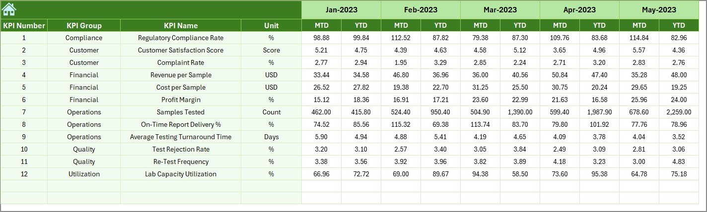
The Previous Year Number Sheet captures last year’s data.
Why Does This Sheet Matter?
Because year-over-year comparison helps teams:
-
Measure growth or decline
-
Understand long-term trends
-
Set realistic future targets
Users enter previous year values in the same structure as current year data. As a result, comparisons remain accurate.
7. KPI Definition Sheet: How Does It Ensure Consistency?
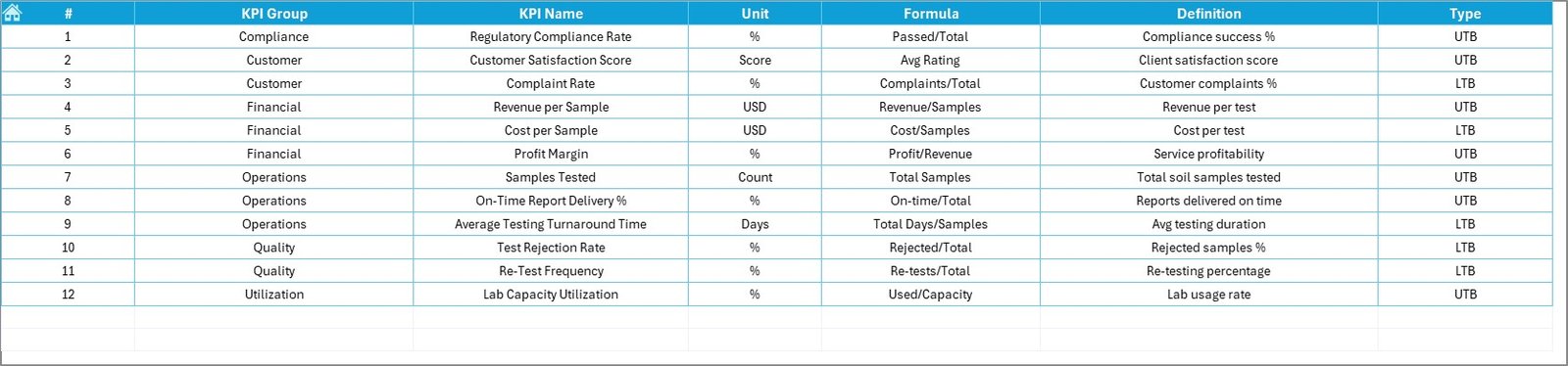
The KPI Definition Sheet acts as the foundation of the dashboard.
What Information Is Stored Here?
-
KPI Name
-
KPI Group
-
Unit
-
Formula
-
KPI Definition
Because all KPIs are clearly defined, teams avoid misinterpretation and reporting errors.
Advantages of Soil Testing Services KPI Dashboard in Excel
Using a Soil Testing Services KPI Dashboard in Excel offers multiple benefits.
1. Centralized Performance Tracking
All KPIs remain available in one dashboard instead of multiple files.
2. Improved Decision-Making
Visual indicators help teams act faster and smarter.
3. Better Accuracy Control
LTB and UTB logic ensures correct KPI evaluation.
4. Time Savings
Automated calculations reduce manual reporting effort.
5. Easy Adoption
Excel-based design allows quick adoption without training.
Best Practices for the Soil Testing Services KPI Dashboard in Excel
To get maximum value, follow these best practices.
Define KPIs Clearly
Always document formulas and definitions in the KPI Definition sheet.
Keep Data Consistent
Use the same KPI names across all sheets.
Update Data Regularly
Monthly updates keep insights accurate and actionable.
Use Logical KPI Groups
Group KPIs such as Operations, Quality, Turnaround Time, and Revenue.
Avoid KPI Overload
Track only KPIs that drive decisions and improvements.
How Does This Dashboard Support Business Growth?
A Soil Testing Services KPI Dashboard in Excel supports growth by:
-
Improving turnaround time tracking
-
Reducing quality issues
-
Enhancing operational transparency
-
Supporting compliance and reporting
-
Building trust with clients and stakeholders
Because data becomes visible and actionable, teams perform better consistently.
Conclusion: Why Should You Use a Soil Testing Services KPI Dashboard in Excel?
A Soil Testing Services KPI Dashboard in Excel transforms raw laboratory data into clear insights. It enables service providers to track MTD and YTD performance, compare targets with actuals, and analyze trends efficiently.
Moreover, its structured worksheet design, conditional formatting, and trend analysis make it a practical, scalable, and business-ready solution. In a competitive and accuracy-driven industry, this dashboard becomes an essential performance management tool.
Frequently Asked Questions (FAQs)
What is a Soil Testing Services KPI Dashboard in Excel?
It is an Excel-based tool that tracks and analyzes key performance indicators for soil testing operations.
Can non-technical users use this dashboard?
Yes, the dashboard uses simple navigation, drop-downs, and visuals.
What does MTD and YTD mean?
MTD means Month-to-Date, and YTD means Year-to-Date performance.
What is LTB and UTB in KPIs?
LTB means Lower the Better, while UTB means Upper the Better.
How often should data be updated?
Monthly updates work best for accurate performance tracking.
Can new KPIs be added later?
Yes, users can add KPIs by updating the KPI Definition and input sheets.
Does this dashboard support trend analysis?
Yes, it includes MTD and YTD trend charts for each KPI.
Is Excel enough for large datasets?
For most soil testing services, Excel works well. However, larger organizations may later integrate BI tools.
Can this dashboard be customized?
Yes, users can customize KPIs, targets, and formats easily.
Who benefits most from this dashboard?
Soil testing labs, agronomy consultants, quality managers, and operations heads benefit the most.
Visit our YouTube channel to learn step-by-step video tutorials