In the modern healthcare landscape, data plays a crucial role in managing insurance operations efficiently. Whether you’re analyzing claim trends, member satisfaction, or premium performance, understanding the story behind your data is essential. That’s exactly where the Health Insurance KPI Dashboard in Power BI becomes a game-changing tool.
This ready-to-use Power BI dashboard gives you a complete overview of health insurance performance by combining multiple data points into one interactive visual platform. Built to simplify analysis, it helps insurance companies, brokers, and administrators monitor every important Key Performance Indicator (KPI) with ease.
Click to Purchases Health Insurance KPI Dashboard in Power BI
What Is a Health Insurance KPI Dashboard in Power BI?
A Health Insurance KPI Dashboard is an interactive reporting solution designed to measure the efficiency and financial health of insurance operations. It pulls data from Excel or other databases and visualizes KPIs such as claim settlement ratio, policy renewals, premium growth, and cost per claim.
By using Power BI’s dynamic visuals, users can track monthly trends, compare current vs previous year results, and identify patterns that impact profitability and customer satisfaction.
This dashboard empowers business analysts, actuaries, and decision-makers to move away from manual spreadsheets and make data-driven decisions with clarity.
Click to Purchases Health Insurance KPI Dashboard in Power BI
Key Features of the Health Insurance KPI Dashboard
This Power BI solution comes with three structured pages and an Excel data source for easy data management.
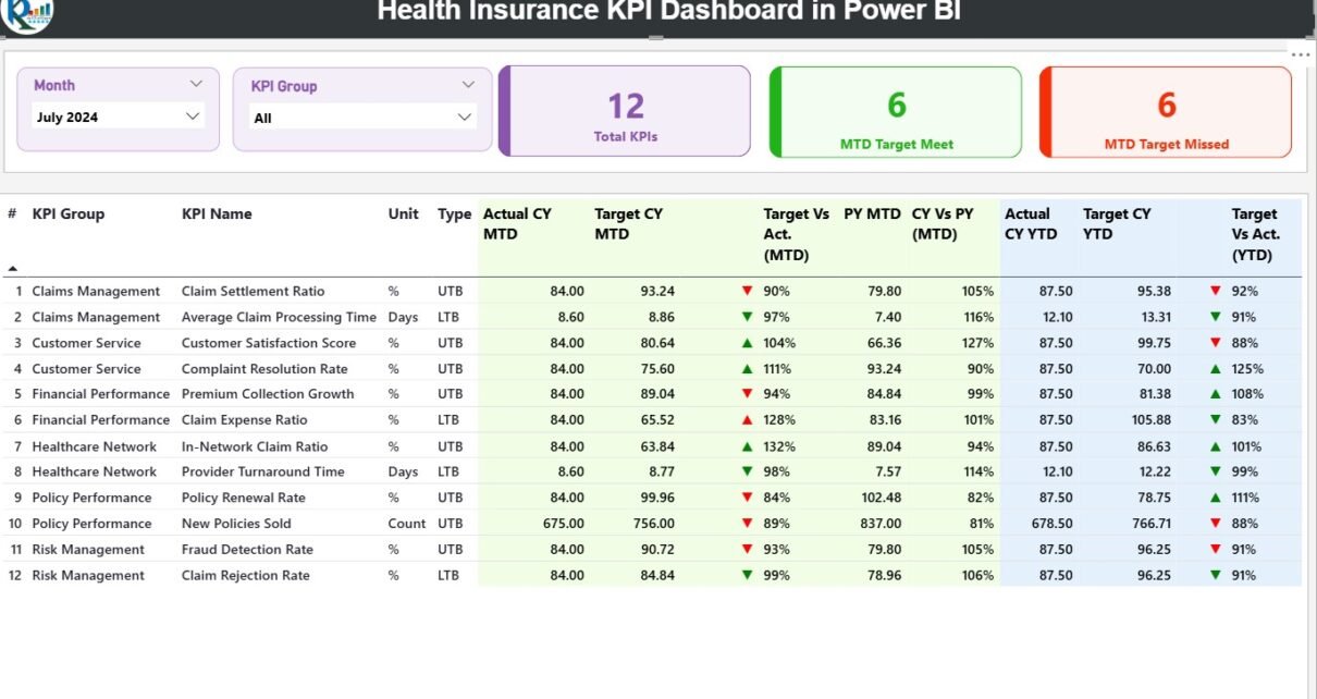
1️⃣ Summary Page – The Main Dashboard
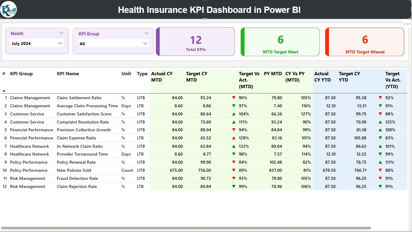
The Summary Page serves as the central hub of the report. It provides a quick snapshot of all KPIs and their performance for both Month-to-Date (MTD) and Year-to-Date (YTD) periods.
At the top, you’ll find Month and KPI Group slicers, allowing you to filter the entire dashboard instantly.
Key Elements of the Summary Page:
-
KPI Cards:
Three cards display Total KPIs Count, MTD Target Met Count, and MTD Target Missed Count. These cards give you a high-level understanding of overall performance. -
Detailed KPI Table:
Below the cards, a data table showcases every metric in detail:-
KPI Number: Sequence number of the KPI.
-
KPI Group: Category (e.g., Claims, Premiums, Operations).
-
KPI Name: Name of the metric being tracked.
-
Unit: Unit of measurement (%, number, amount).
-
Type: Defines whether the KPI is UTB (Upper the Better) or LTB (Lower the Better).
-
Actual CY MTD / Target CY MTD: Current Month-to-Date actual vs target values.
-
MTD Icon: Green ▲ or Red ▼ icons show whether the KPI met or missed its target.
-
Target vs Actual (MTD): Displays performance percentage using the formula (Actual ÷ Target).
-
PY MTD and CY vs PY (MTD): Compares the same month from the previous year with the current period.
-
Actual CY YTD / Target CY YTD: Year-to-Date progress of each KPI.
-
YTD Icon: Visual indication of whether the KPI is on track.
-
CY vs PY (YTD): Displays performance improvement compared to the previous year’s cumulative values.
-
This design ensures that managers can instantly see which KPIs are improving and which require corrective actions.
Click to Purchases Health Insurance KPI Dashboard in Power BI
2️⃣ KPI Trend Page – Tracking Growth Over Time
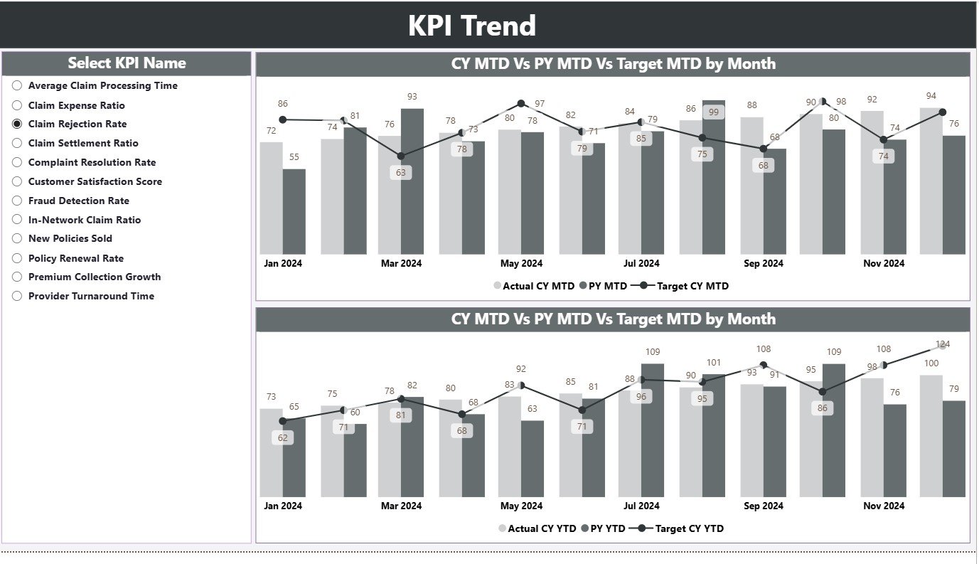
The KPI Trend Page focuses on visual trend analysis.
It includes two combo charts that display Actual, Target, and Previous Year data for both MTD and YTD. This structure makes it easy to identify whether performance is improving or declining over time.
A KPI Name slicer on the left allows you to select a specific KPI to analyze. Once you select it, the charts automatically update to show its detailed trend for better storytelling.
This page is ideal for senior management or BI analysts who need to evaluate year-on-year patterns, seasonal fluctuations, and strategy effectiveness.
3️⃣ KPI Definition Page – The Drill-Through Section
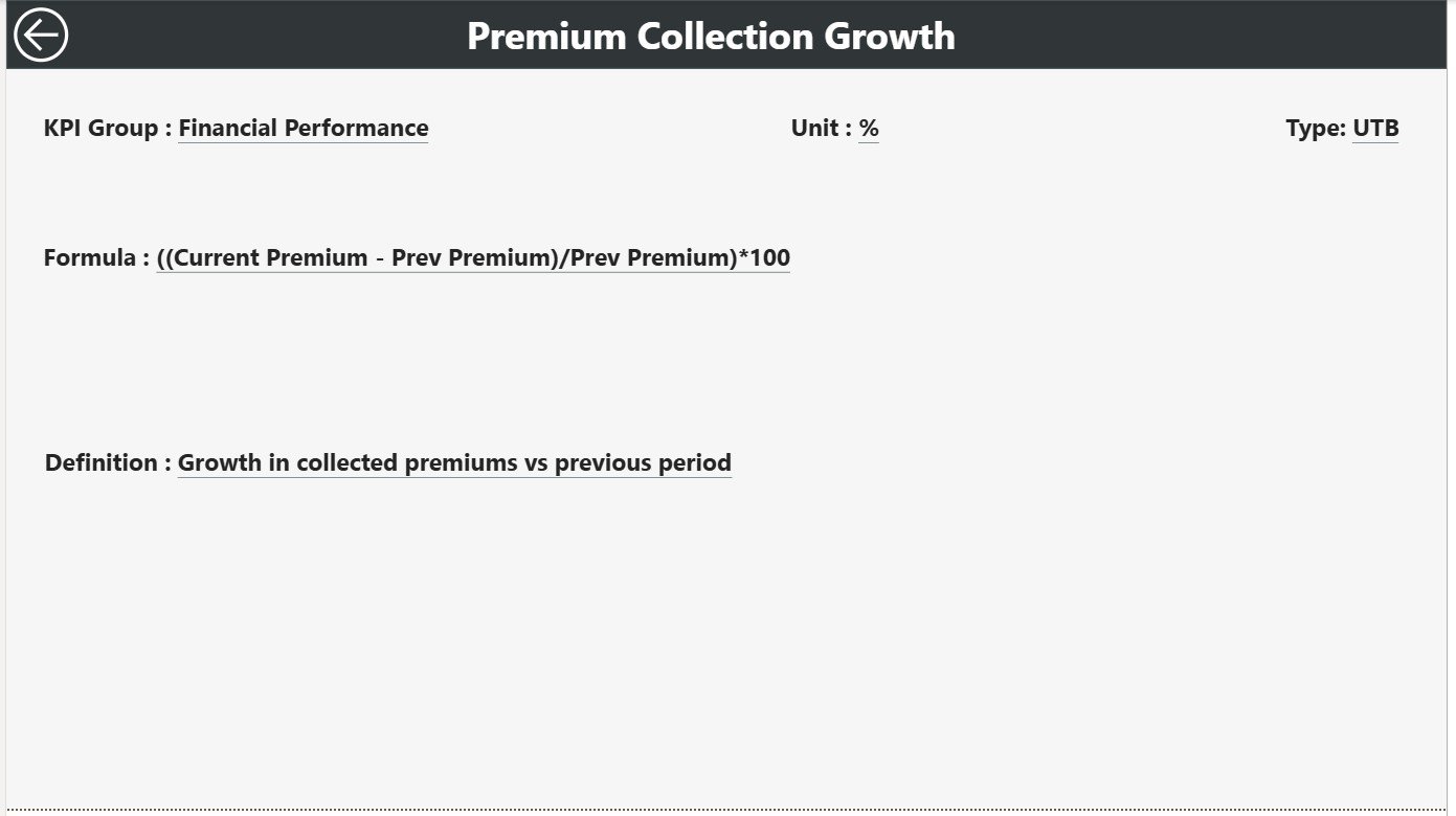
This is a hidden page designed for deeper exploration.
From the Summary Page, users can drill through to this KPI Definition Page to see additional details about a specific KPI — such as its formula, definition, and calculation logic.
It acts as a documentation page inside the dashboard, ensuring every metric remains clearly defined for all users.
A “Back” button placed at the top-left corner allows users to return to the main dashboard easily.
Excel Data Source for the Dashboard
The Health Insurance KPI Dashboard in Power BI uses a structured Excel file as its data source.
This file includes three main worksheets:
1️⃣ Input_Actual Sheet Tab
-
Used to record the actual performance numbers for each KPI.
-
Columns include: KPI Name, Month (first date of each month), MTD values, and YTD numbers.
2️⃣ Input_Target Sheet Tab
-
Stores all the target values for the same KPIs.
-
Data is entered by month, with MTD and YTD targets clearly defined.
3️⃣ KPI Definition Sheet Tab
-
Lists the KPI Number, Group, Unit, Formula, Definition, and Type (LTB/UTB).
-
This sheet ensures consistency between Excel data and Power BI visuals.
This Excel connection allows users to update numbers monthly without modifying the Power BI design — keeping the dashboard dynamic yet easy to maintain.
Common KPIs Tracked in the Health Insurance Dashboard
The following KPIs are typically included in this dashboard, though users can customize them based on business needs:
-
Claim Settlement Ratio (%)
-
Average Claim Processing Time (Days)
-
Premium Collected (USD)
-
Policy Renewal Rate (%)
-
Claims Incurred Ratio (%)
-
Customer Satisfaction Score (CSAT)
-
Loss Ratio (%)
-
Number of Policies Sold
-
Average Premium per Policy (USD)
-
Total Active Members
-
Claim Rejection Percentage (%)
-
Agent Productivity (Policies per Agent)
-
Expense Ratio (%)
These KPIs collectively measure operational efficiency, customer engagement, and overall financial health of the insurance business.
Click to Purchases Health Insurance KPI Dashboard in Power BI
Why Use Power BI for Health Insurance Analytics?
Power BI provides a perfect balance between visualization flexibility and real-time analytics. Here’s why it stands out for the insurance industry:
-
💡 Interactive Analysis: Slice, filter, and drill down into specific KPIs easily.
-
🚀 Dynamic Refresh: Automatically updates when Excel data changes.
-
🎯 Smart Visuals: Highlights KPI status using conditional icons and colors.
-
📊 Cross-Device Access: Works seamlessly across desktops, tablets, and mobile devices.
-
🧩 Customizable: Add your company logo, theme colors, or KPI groups without extra coding.
When combined with structured Excel input, Power BI becomes a low-cost, high-impact tool for health insurers.
Click to Purchases Health Insurance KPI Dashboard in Power BI
Advantages of the Health Insurance KPI Dashboard
The dashboard offers several measurable benefits for both operations and management teams.
1️⃣ Simplifies Performance Monitoring
Instead of working with dozens of Excel sheets, all data is centralized into one visual report. This structure saves time and eliminates confusion.
2️⃣ Promotes Data-Driven Decision-Making
With live comparisons of MTD and YTD results, managers can make evidence-based decisions instantly.
3️⃣ Improves Efficiency and Accuracy
Automated visuals and formulas minimize manual errors. Every update in Excel instantly reflects in Power BI visuals, ensuring data integrity.
4️⃣ Encourages Accountability
Each KPI is assigned a target, making performance transparent across departments like Claims, Underwriting, and Operations.
5️⃣ Supports Continuous Improvement
By tracking Current vs Previous Year performance, the dashboard helps identify improvement areas over time.
Best Practices for Using the Health Insurance KPI Dashboard
To maximize the value of your dashboard, follow these simple but powerful best practices:
1. Keep KPI Definitions Clear
Ensure every KPI has a documented formula and definition. This prevents confusion when multiple users interpret the data.
2. Refresh Data Regularly
Update the Excel data monthly or weekly depending on your business frequency. Fresh data keeps insights relevant.
3. Use Color Codes Consistently
Maintain standard traffic-light logic:
-
Green = On Target
-
Yellow = Moderate
-
Red = Below Target
Consistency helps users grasp performance instantly.
4. Focus on Actionable Metrics
Avoid overloading the dashboard with too many KPIs. Track only those that directly influence business performance.
5. Compare Trends Over Time
Use the KPI Trend Page regularly. Identifying upward or downward trends helps anticipate issues before they become major challenges.
6. Automate the Data Connection
Link the Power BI file directly to your Excel data source. This eliminates manual imports and ensures real-time updates.
7. Share Insights Securely
Publish the Power BI report to your organization’s workspace or Power BI Service. Manage permissions to control who can view or edit.
Click to Purchases Health Insurance KPI Dashboard in Power BI
Use Cases for the Health Insurance KPI Dashboard
This dashboard caters to a variety of real-world scenarios:
-
Insurance Companies: Monitor claim ratios, premium growth, and loss trends.
-
TPAs (Third-Party Administrators): Track claim turnaround time and rejection percentages.
-
Brokers & Agents: Evaluate performance through policy conversion and renewal rates.
-
Corporate HR Teams: Analyze employee health insurance utilization.
-
Healthcare Providers: Assess partnership performance with insurance carriers.
No matter your role, the dashboard delivers clarity, speed, and actionable insights.
How to Use the Dashboard Effectively
Follow this quick step-by-step process to make the most of your Power BI solution:
-
Open the Power BI File: Launch the
.pbixfile in Power BI Desktop. -
Connect Excel Data Source: Ensure the file path of your Excel source is valid.
-
Refresh Data: Click “Refresh” to update visuals with the latest numbers.
-
Navigate Using Slicers: Use the Month and KPI Group filters on the Summary Page.
-
Drill Through to KPI Definition: Click any KPI to view its formula and logic.
-
Export Insights: Download or share visual reports with stakeholders.
Within minutes, you’ll gain a 360-degree understanding of how your health insurance operations are performing.
The Impact of Data Visualization in Health Insurance
Power BI transforms complex insurance data into digestible visuals. Instead of reading through endless tables, decision-makers can quickly see:
-
Which KPIs exceed expectations.
-
Which areas need immediate attention.
-
How performance changes month to month.
This clarity accelerates business growth and strengthens risk management. Data visualization doesn’t just improve understanding — it builds confidence in decision-making.
Conclusion
The Health Insurance KPI Dashboard in Power BI isn’t just a reporting tool — it’s a complete performance management system. By consolidating Excel data into an intelligent visual dashboard, it empowers organizations to track, compare, and improve their key performance indicators with precision.
From claim settlement efficiency to premium growth and customer satisfaction, this dashboard puts every insight at your fingertips.
If you want to simplify reporting, improve data accuracy, and enhance operational transparency, this Power BI solution is the perfect fit for your organization.
Frequently Asked Questions (FAQs)
1. What is the Health Insurance KPI Dashboard in Power BI?
It’s an interactive Power BI report that visualizes key insurance performance indicators, helping users analyze MTD, YTD, and yearly trends easily.
2. How is the data connected to the dashboard?
The dashboard uses an Excel file as its data source. You can update KPI values in Excel, and Power BI will automatically refresh the visuals.
3. Can I customize the KPIs?
Yes. You can add or remove KPIs based on your organization’s requirements. Just update the Excel definition sheet and refresh Power BI.
4. What are the main benefits of this dashboard?
It saves time, reduces manual reporting errors, and delivers instant insights using visuals and trends.
5. Is it suitable for both insurers and brokers?
Absolutely. The dashboard works for insurance companies, brokers, TPAs, and even corporate HR teams managing group insurance.
6. Do I need advanced Power BI knowledge?
No. The dashboard is pre-built and intuitive. Basic Power BI knowledge is enough to use it effectively.
7. Can I share this dashboard online?
Yes. You can publish it on Power BI Service and share it securely with stakeholders using role-based permissions.
8. How often should I update the data?
For best results, refresh it monthly or quarterly depending on your reporting cycle.
Click to Purchases Health Insurance KPI Dashboard in Power BI
Visit our YouTube channel to learn step-by-step video tutorials