Home healthcare services grow every year because more patients choose comfort, safety, and personalized care at home. As the number of cases increases, the need for timely reporting also grows. Teams handle patient visits, care delivery, staff scheduling, treatment quality, and compliance rules. When they track these metrics manually, confusion increases, and delays appear quickly. This is why a Home Healthcare KPI Dashboard in Power BI helps healthcare managers stay informed and make faster decisions.
In this detailed guide, you will learn what this dashboard is, how it works, what its pages include, why teams depend on it, and how you can use it effectively in your workflow. This article also discusses the advantages, best practices, and frequently asked questions that support better understanding.
Click to buy Home Healthcare KPI Dashboard in Power BI
What Is a Home Healthcare KPI Dashboard in Power BI?
A Home Healthcare KPI Dashboard in Power BI is a ready-to-use performance reporting solution for home healthcare organizations. It brings all important KPIs into one clean, interactive, and user-friendly interface. You can track every key metric such as patient volume, service quality, home visit performance, staff workload, MTD achievements, YTD progress, and past year comparisons.
Since the dashboard uses Power BI visuals and slicers, teams can move from one page to another without any difficulty. You can filter by month, KPI group, or KPI name in seconds. Because data comes from a simple Excel file, you can update numbers without technical skills. This makes the dashboard ideal for nurses, coordinators, administrators, and care managers who want a complete view of operational performance.
Why Do Home Healthcare Teams Need a Power BI KPI Dashboard?
Home healthcare operations run on many moving parts. Patient needs change daily, and service plans depend on staff availability. Without clear visibility, teams struggle to take quick action.
A Power BI KPI dashboard solves these problems. It gives real-time insights, reduces manual work, and improves decision-making. You can track progress at a monthly or yearly level. You can also check whether teams meet their targets and how the current year performs compared to the previous year.
Because healthcare management requires accuracy, this type of dashboard offers a dependable structure that brings everything together.
How Does the Home Healthcare KPI Dashboard Work?
The dashboard uses a simple Excel file as its data source. The Excel file includes three worksheets:
- Input_Actual Sheet
You enter:
- KPI Name
- Month (use the first date of the month)
- MTD numbers
- YTD numbers
- Input_Target Sheet
You enter:
- KPI Name
- Month
- MTD targets
- YTD targets
- KPI Definition Sheet
You enter:
- KPI Number
- KPI Group
- KPI Name
- Unit
- Formula
- Definition
- KPI Type (UTB or LTB)
Power BI reads these sheets and updates the report automatically.

Click to buy Home Healthcare KPI Dashboard in Power BI
What Are the Key Features of the Home Healthcare KPI Dashboard in Power BI?
This dashboard includes three pages:
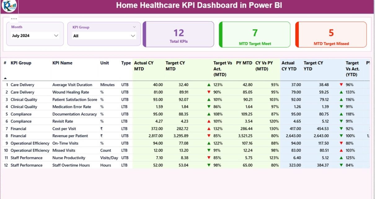
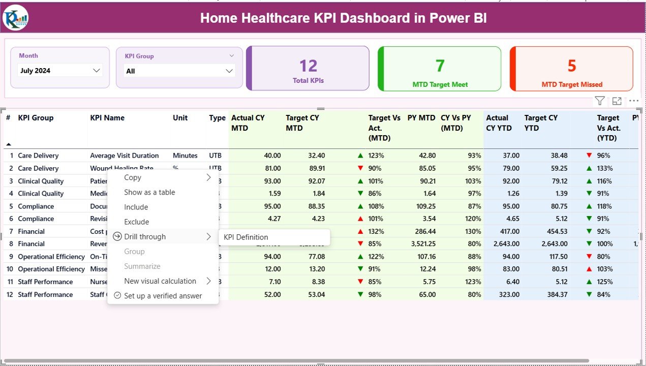
Summary Page – What Insights Does It Provide?
The Summary Page is the main report page. It shows:
Interactive Slicers
Month slicer
KPI Group slicer
These slicers help you filter the dashboard in seconds.
Visual Cards
The page displays three important cards:
Total KPIs Count
MTD Target Met Count
MTD Target Missed Count
These cards help you understand whether the team performs well.
Detailed KPI Table
This table includes all performance values:
KPI Number
KPI Group
KPI Name
Unit
- Type (UTB or LTB)
- Actual CY MTD
- Target CY MTD
- MTD Icon (▲ or ▼ with green/red color)
- Target vs Actual (MTD)
- PY MTD
- CY vs PY MTD
- Actual CY YTD
- Target CY YTD
- YTD Icon (▲ or ▼ with color)
- Target vs Actual (YTD)
- PY YTD
- CY vs PY YTD
These metrics allow quick comparison between MTD, YTD, and previous year results.
Click to buy Home Healthcare KPI Dashboard in Power BI
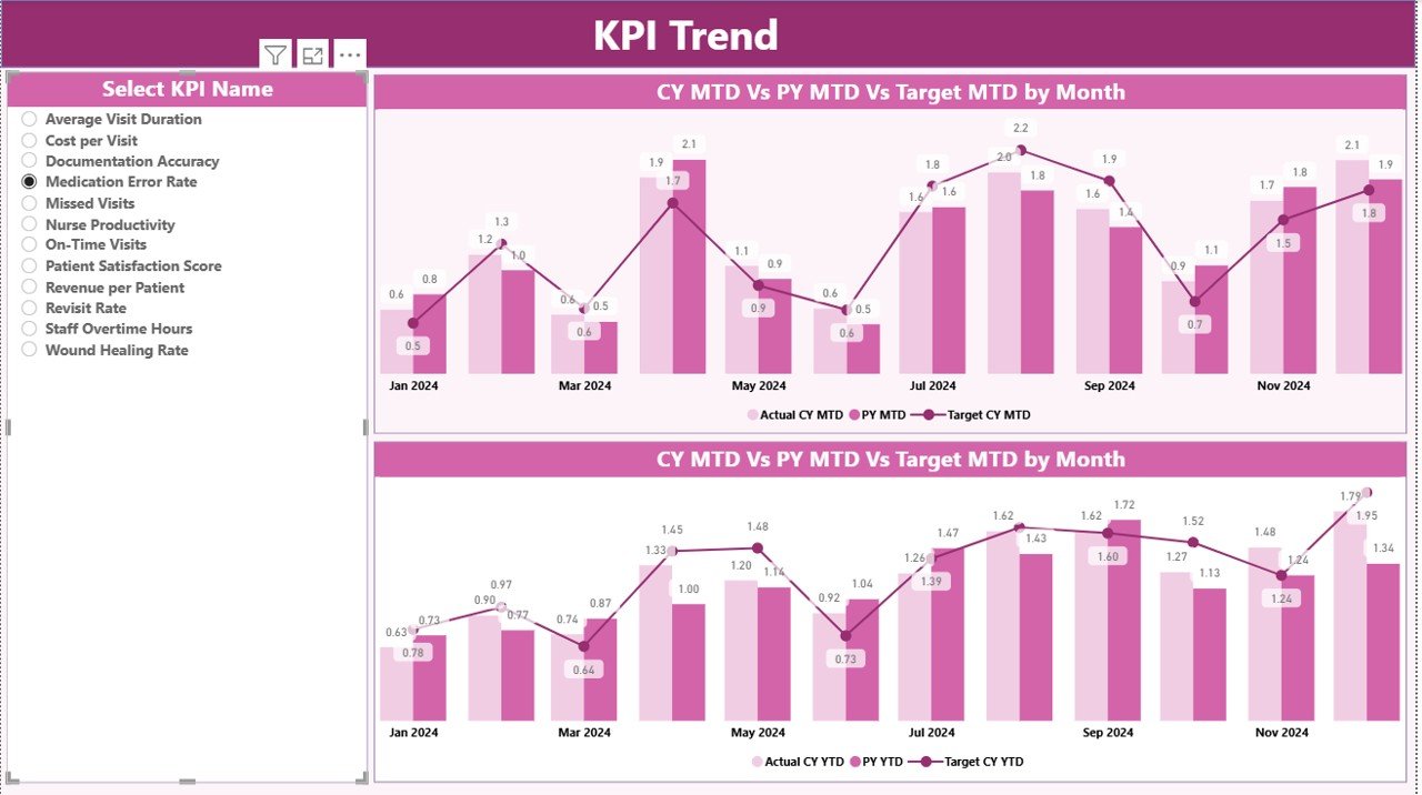
KPI Trend Page – Why Is It Useful?
The KPI Trend Page shows two combo charts:
Chart 1: MTD Trends
It displays:
- Current Year MTD Actual
- Current Year MTD Target
- Previous Year MTD Actual
Chart 2: YTD Trends
It displays:
- Current Year YTD Actual
- Current Year YTD Target
- Previous Year YTD Actual
This page also has a slicer to select the KPI name.
You can see performance movements over time and identify improvement areas quickly.
Click to buy Home Healthcare KPI Dashboard in Power BI
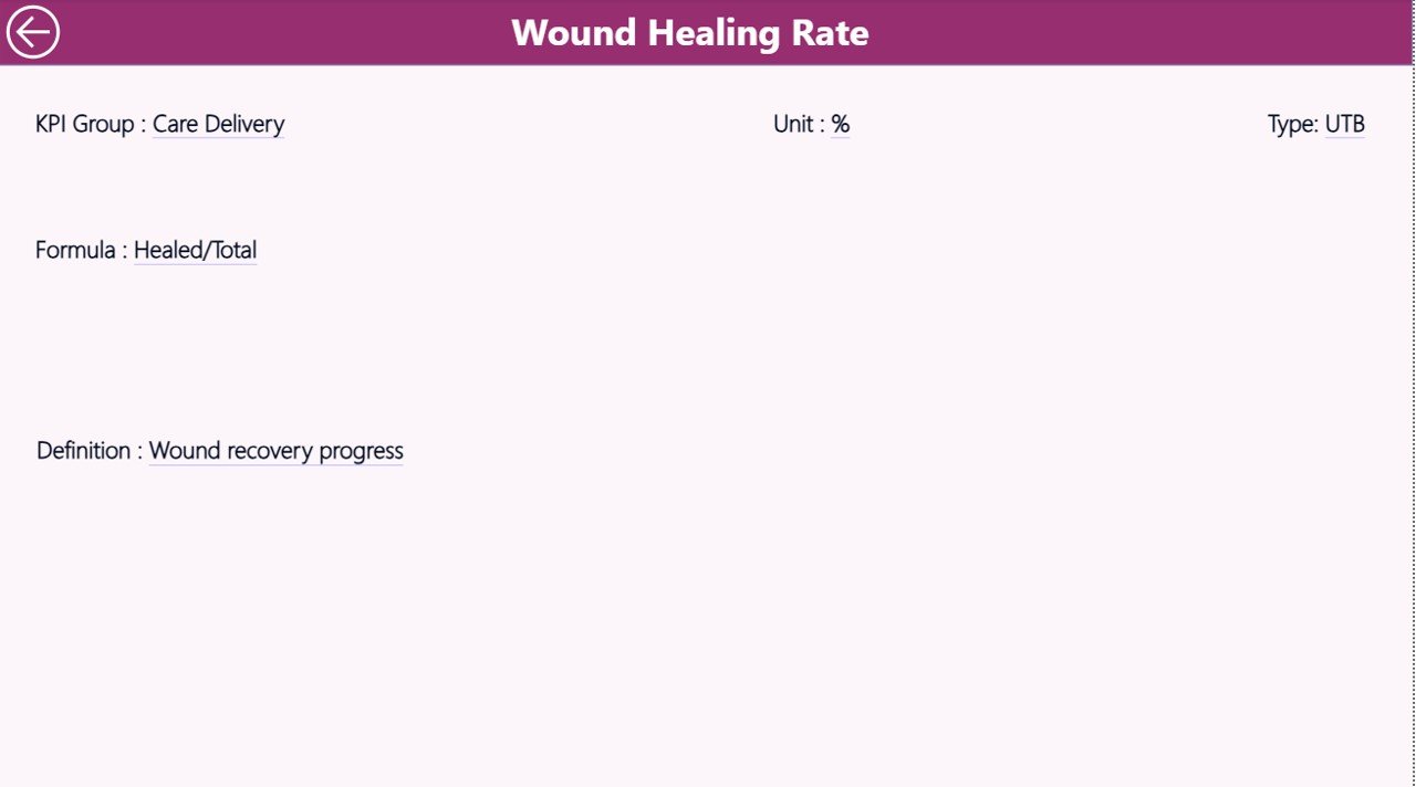
KPI Definition Page – When Should You Use It?
This is a drill-through page. It stays hidden from the main navigation.
When you want to see the formula or definition of a KPI:
- Right-click the KPI on the Summary Page
- Select Drill Through → KPI Definition
You will see details such as:
- Formula
- KPI Definition
- Unit
- Type
You can return to the main page using the Back button located on the top-left corner.
Click to buy Home Healthcare KPI Dashboard in Power BI
Why Is Data Entry So Simple in This Dashboard?
Because the dashboard connects to Excel, you only need to fill three sheets.
You don’t need coding.
You don’t need DAX skills.
You don’t need complex formulas.
Just update numbers every month, and Power BI refreshes instantly.
This simplicity makes the dashboard useful for hospitals, home care agencies, and healthcare startups.
What KPIs Can You Track in a Home Healthcare Dashboard?
You can track many KPIs depending on your organization. Some examples include:
- Patient Visits Completed
- Visit Completion Rate
- Average Visit Duration
- Medication Compliance Rate
- Patient Satisfaction Score
- Readmission Rate
- Emergency Visit Count
- Care Plan Adherence
- Travel Time Efficiency
- Staff Utilization Rate
- Total Patients Served
- Missed Visit Count
- Nurse-to-Patient Ratio
These KPIs show how well your home healthcare service performs.
Advantages of Using a Home Healthcare KPI Dashboard in Power BI
- You Get Real-Time Visibility
This dashboard shows live performance numbers. It helps you respond quickly.
- You Improve Service Quality
You can track patient visits, satisfaction, and treatment outcomes in a clear way.
- You Make Better Decisions
You see MTD, YTD, and previous year comparisons.
This makes decision-making simple and accurate.
- You Save Time
You avoid manual data collection.
The dashboard updates instantly.
- You Reduce Errors
Standard KPI definitions bring clarity.
Your numbers remain consistent and reliable.
- You Focus on What Matters
Dashboards help you notice trends and problem areas faster.
How Does Power BI Make Home Healthcare Reporting Easier?
Power BI simplifies reporting in many ways:
- It refreshes data automatically.
- It offers slicers to filter results.
- It displays icons to show KPI status.
- It uses charts to show trends.
- It keeps all KPI definitions in one place.
Because reporting becomes smooth, teams spend more time improving patient care and less time working with spreadsheets.
Best Practices for Using the Home Healthcare KPI Dashboard
To get maximum value from the dashboard, follow these best practices:
- Update Actual and Target Data Every Month
Fresh data gives accurate reports.
- Use Consistent KPI Names
This keeps Excel tables clean and error-free.
- Set Clear KPI Targets
Targets help your team understand performance expectations.
- Review KPI Definitions Often
KPI meaning must remain clear for every department.
- Use Drill-Through Features
Drill-through pages help you study KPI formulas in detail.
- Compare with Previous Year Numbers
This helps you see long-term improvements.
- Analyze Trend Charts Monthly
Trend charts show whether your performance grows or drops.
- Share the Dashboard with Your Team
Team visibility improves teamwork and coordination.
- Keep Data Clean
Avoid blank rows, duplicate names, and incorrect dates.
- Refresh Power BI Frequently
This ensures updated insights each time you open the report.
Conclusion
A Home Healthcare KPI Dashboard in Power BI is a powerful tool that brings clarity, speed, and accuracy to healthcare performance reporting. Because home healthcare teams manage many tasks, they need a reliable dashboard that shows progress every month and every year. This dashboard helps teams track KPIs, compare results, identify issues, and improve service quality.
With easy Excel-based data entry and ready-made visuals, this dashboard saves time and effort. When you use it regularly, you strengthen your operations and deliver better outcomes to patients.
Frequently Asked Questions (FAQs)
- What is a Home Healthcare KPI Dashboard?
It is a Power BI dashboard that tracks important performance indicators such as patient visits, service quality, staff performance, and compliance metrics.
- Who can use this dashboard?
Home healthcare agencies, hospitals, clinics, nursing teams, administrators, and healthcare coordinators can use it.
- Do I need technical skills to use this dashboard?
No. You only need to enter data in Excel sheets.
- Can I update KPIs every month?
Yes. Just add new MTD and YTD data for each KPI.
- Does this dashboard support drill-through?
Yes. You can drill through from the Summary Page to the KPI Definition Page.
- Can I customize KPIs?
Yes. You can add, change, or remove KPIs from the Excel sheets.
- What type of charts does the dashboard include?
It includes combo charts for MTD and YTD trends.
- Does the dashboard support previous year comparisons?
Yes. It compares current year numbers with previous year values.
- How many sheets does the Excel file include?
It includes three sheets: Input_Actual, Input_Target, and KPI Definition.
- Can I use this dashboard for multiple branches?
Yes. You can add KPI Group filters to track different branches or teams.
Visit our YouTube channel to learn step-by-step video tutorials
Click to buy Home Healthcare KPI Dashboard in Power BI