Subscription box revenue is volatile. One quarter your “Quarterly Glow” plan crushes monthly margins, the next month a single bad fulfilment week wipes out three weeks of growth. If you run a subscription box business, you already know that without a clear monthly view of revenue, profit, plan mix, and region performance, decisions get made on gut feel — and gut feel is expensive.
The Subscription Box Dashboard in Excel exists to fix exactly that problem. It is a ready-to-use Excel workbook with 5 interactive pages, 5 headline KPIs, and 16+ charts that turn raw subscription order data into a one-glance performance read every Monday morning.
👉 Click here to Purchase Subscription Box Dashboard in Excel
In this guide you will learn what the Subscription Box Dashboard in Excel includes, how every page works, who it is built for, how it compares to Subbly and Cratejoy analytics, and the best practices that get the most value out of it. By the end you will know whether this template fits your subscription business — and exactly how to use it if it does.
What Is the Subscription Box Dashboard in Excel?
The Subscription Box Dashboard in Excel is a multi-page Excel reporting workbook built specifically for subscription box operators. It pulls from a single Data sheet you populate with order rows, then drives a hidden Support sheet of pivot tables that feed every chart and KPI card on the visible pages.
The dashboard tracks 5 headline KPIs — Total Revenue, Net Profit, Total Orders, Avg. Order Value, and Avg. Satisfaction — across 5 dedicated analysis pages. Every page carries multiple slicers so you can filter the entire view by subscription plan, box category, region, channel, or month with one click.
It is intended as a Subbly or Cratejoy alternative for businesses that want subscription analytics without a recurring SaaS bill. According to Microsoft’s PivotTable documentation, pivot-driven workbooks like this one update by simply clicking Data → Refresh All — no formulas to rewrite when new rows arrive.
Key Features of Subscription Box Dashboard in Excel
The dashboard has been built around four design rules: be readable in 30 seconds, be filterable in one click, be refreshable in three steps, and require zero macros. Below is what that produces.
🔹 5 KPI cards on the Overview page showing Total Revenue, Net Profit, Total Orders, Avg. Order Value, and Avg. Satisfaction.
🔹 16+ pre-built charts covering revenue, profit, orders, and satisfaction sliced by plan, category, region, channel, customer type, and renewal status.
🔹 Multiple slicers on every page filtering the entire dashboard with one click.
🔹 Editable Data sheet with pre-formatted column headers — paste your subscription order export, hit Refresh All, the dashboard updates.
🔹 Hidden Support sheet that houses every pivot table powering the charts, keeping the visible pages clean.
🔹 No macros, no add-ins — works on Microsoft Excel for Windows, Mac, and Excel for the web.
Dashboard Pages Explanation
The workbook contains 7 tabs in total — 5 visible analysis pages, the Data sheet, and the Support sheet. Here is how each one works.
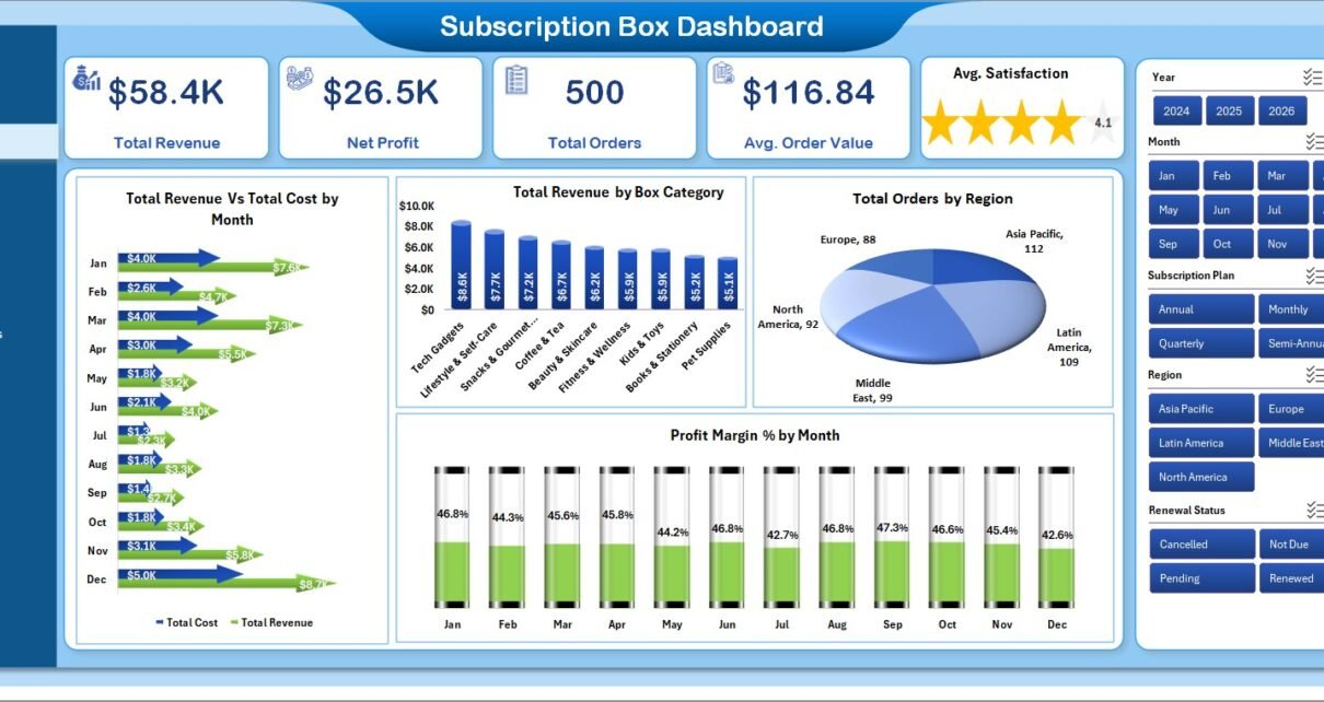
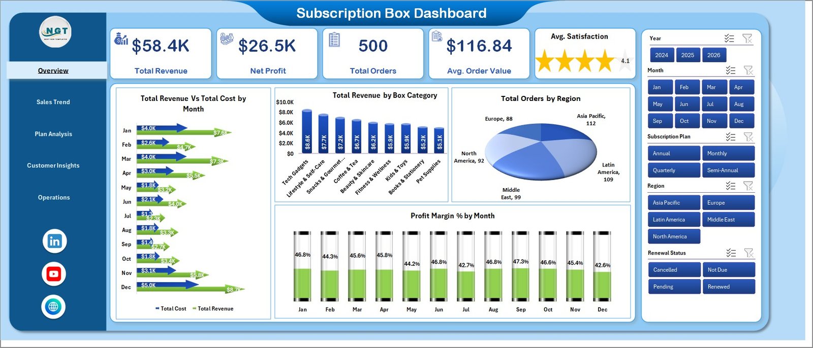
1. Overview Page
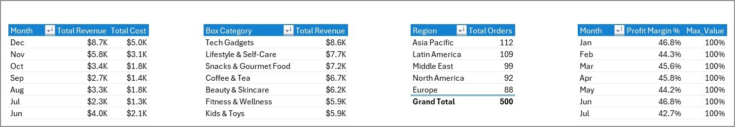
The Overview page is the highest-level read on the business. The top of the sheet hosts the 5 KPI cards (Total Revenue, Net Profit, Total Orders, Avg. Order Value, Avg. Satisfaction). Below the cards, four charts visualize the headline analysis — Total Revenue Vs Total Cost by Month, Total Revenue by Box Category, Total Orders by Region, and Profit Margin % by Month. Slicers on the page filter every card and chart simultaneously.
👉 Click here to Purchase Subscription Box Dashboard in Excel
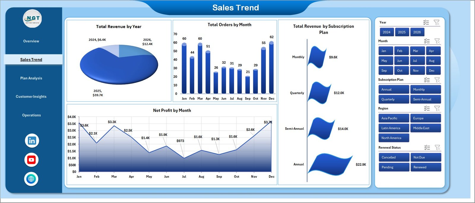
2. Sales Trend
The Sales Trend page is where you spot growth and seasonality. It displays Total Revenue by Year for long-term direction, Total Orders by Month for seasonality patterns, Total Revenue by Subscription Plan for plan-level trend lines, and Net Profit by Month for profit cyclicality.
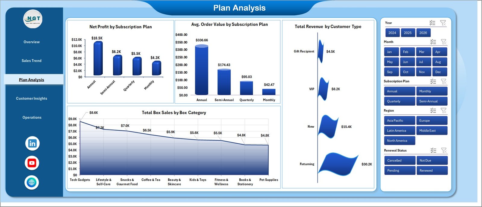
3. Plan Analysis
The Plan Analysis page tells you which subscription plans deserve more marketing investment. It shows Net Profit by Subscription Plan, Avg. Order Value by Subscription Plan, Total Revenue by Customer Type (new vs returning), and Total Box Sales by Box Category. Use this page when you are deciding which plans to promote, retire, or reprice.
👉 Click here to Purchase Subscription Box Dashboard in Excel
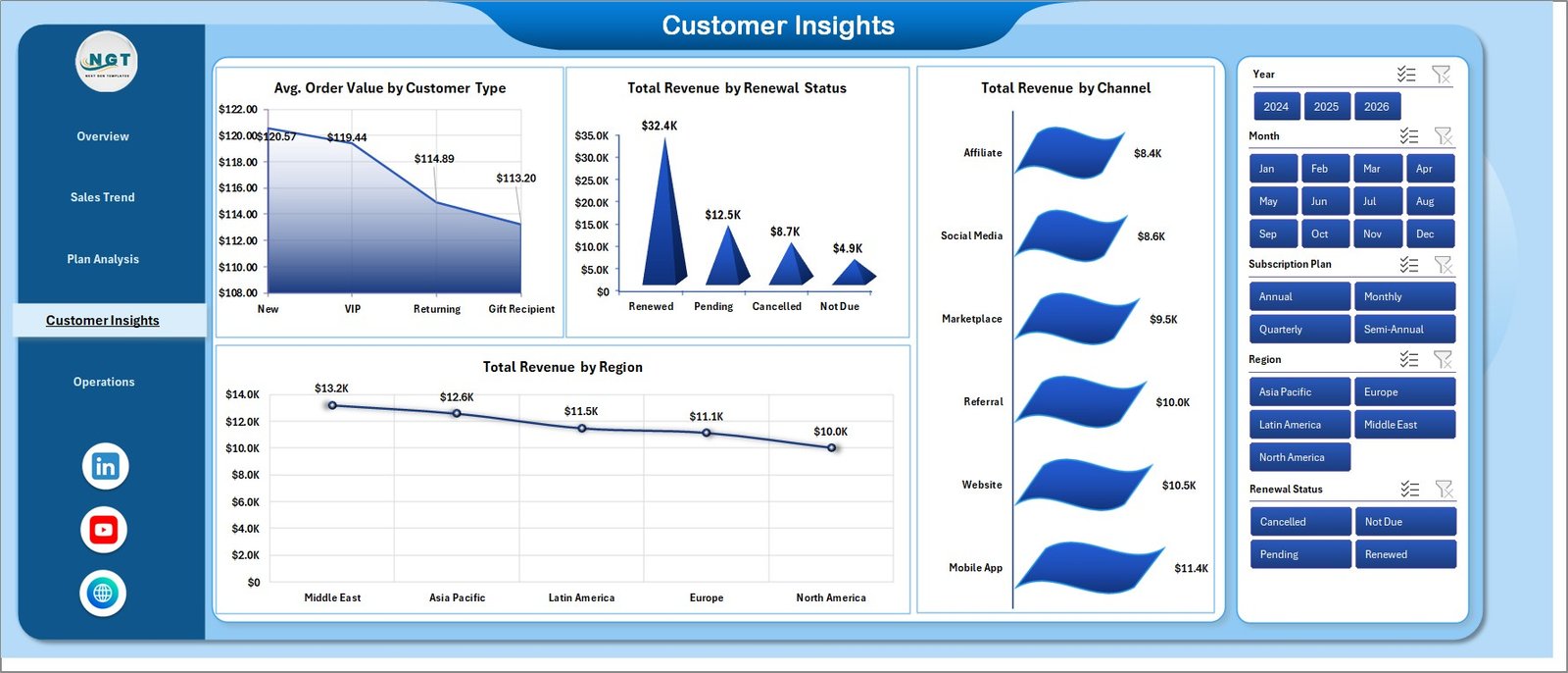
4. Customer Insights
The Customer Insights page is the retention and acquisition view. It surfaces Avg. Order Value by Customer Type, Total Revenue by Renewal Status (active, paused, cancelled), Total Revenue by Channel, and Total Revenue by Region. This is where you learn how much revenue is sitting in paused subscriptions and which channels are pulling the most weight.
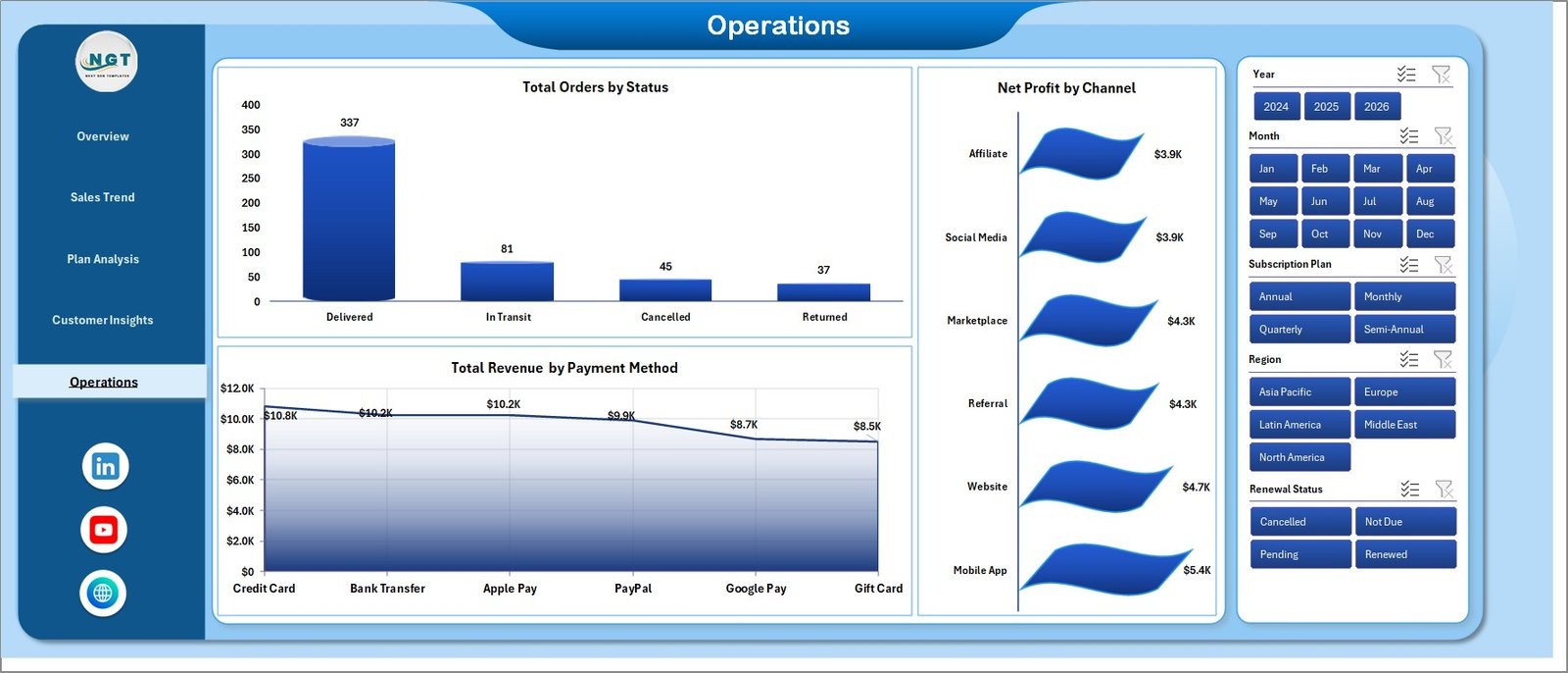
5. Operations
The Operations page is built for fulfilment and finance stand-ups. It shows Total Orders by Status (shipped, processing, returned), Net Profit by Channel, and Total Revenue by Payment Method. Use this page to surface bottlenecks and payment-mix shifts.
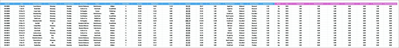
6. Data Sheet tab
The Data sheet is where you paste your subscription order data in the same column format. Pre-populated headers cover order ID, date, plan, box category, region, channel, payment method, customer type, renewal status, order status, revenue, cost, and satisfaction score. Add rows below the headers — that is the only edit needed before refreshing the dashboard.
7. Support Sheet tab
The Support sheet houses every pivot table that drives the charts. After you update the Data sheet, click Data → Refresh All in the Excel ribbon — every pivot rebuilds and every chart on every page updates. You can keep this sheet hidden during day-to-day use; it does not need to be visible to function.
👉 Click here to Purchase Subscription Box Dashboard in Excel
Subscription Box Dashboard in Excel vs. Google Sheets vs. Subbly / Cratejoy — Feature Comparison
| Feature | Subscription Box Dashboard in Excel | Google Sheets equivalent | Subbly / Cratejoy Analytics |
|---|---|---|---|
| Cost | $17.99 one-time | $8-12 one-time | $39-159 / month + transaction fees |
| Platform | Excel Windows / Mac / Web | Browser only | Hosted SaaS only |
| Setup time | Under 10 minutes | Under 10 minutes | 2-5 days for full migration |
| Works offline | ✅ Yes | ❌ No | ❌ No |
| Customizable | ✅ Fully editable | ✅ Editable | ❌ Locked templates |
| Year-1 cost at 3 users | $17.99 total | ~$10 total | $1,400-5,700+ per year |
| Data ownership | ✅ Local file | Cloud | Vendor-locked |
| Vendor lock-in risk | ✅ None | Low | High |
For subscription box operators that want clear plan, region, and channel reporting without paying $40-160 per month for hosted analytics, the Subscription Box Dashboard in Excel sits in the sweet spot.
Who Should Use This Template
Perfect for:
- Subscription box founders running 50-5,000 active subscribers who need plan-mix and renewal visibility.
- E-commerce operations managers tracking multiple box themes and watching profit by category.
- FP&A and finance leads at DTC brands who want a one-page board view in Excel they already trust.
- Retention marketing teams running winback campaigns by region and channel.
Not a fit if:
- You run an enterprise subscription business with 100,000+ subscribers needing real-time warehouse-backed dashboards.
- You need automatic data sync from Stripe, Recharge, or Bold without any manual export step.
- You need warehouse pick-and-pack workflow automation rather than reporting.
Real-World Use Cases
Maya runs a beauty subscription box with 1,200 active subscribers. Every Monday she pastes the previous week’s Stripe export into the Data sheet, hits Refresh All, and the Plan Analysis page tells her whether the new “Quarterly Glow” plan is outperforming the monthly default. She replaced a $99/month Subbly analytics tier with this dashboard and reinvests the saved $1,188 a year into Meta ads.
Daniel is FP&A lead at a snack box DTC brand. He uses the Overview and Sales Trend pages in his monthly board pack to show Total Revenue Vs Total Cost by Month and Profit Margin % by Month. The template replaced a custom Power Query model that broke whenever the data schema changed; this one is just rows in a sheet plus Refresh All.
Priya leads retention marketing for a book subscription company. She lives in the Customer Insights page — Total Revenue by Renewal Status tells her how much revenue is sitting in “paused” subscribers, and Total Revenue by Channel tells her where to focus winback emails next.
Advantages of Subscription Box Dashboard in Excel
🔹 One-time cost vs recurring SaaS — pay $17.99 once instead of $39-159 every month for the rest of your business’s life.
🔹 No data lock-in — the workbook is a local file you own, so you can hand it to a new analyst, fork it, or migrate without an export wizard.
🔹 Refresh in 5 seconds — Data → Refresh All rebuilds every chart on every page; no formula edits, no rebroken pivot links.
🔹 Filter by anything in one click — slicers on every page mean a CFO can produce a region-specific revenue view in three seconds during a board meeting.
🔹 Native Excel only — no macros, no VBA, no add-ins, so security software and Mac users have nothing to fight with.
🔹 Built on a hidden Support sheet so the visible pages stay clean and presentation-ready.
Opportunities for Improvement
This template is a reporting dashboard, not a full subscription operations stack. Some genuine limitations to know before buying:
🔹 No automated data sync — you paste data manually from your billing platform export. If you need Stripe or Recharge to push data in real time, this is not the tool.
🔹 No customer-level drill-down — the dashboard works at aggregate level (plan, region, channel). It does not produce a per-customer renewal forecast.
🔹 No churn cohort analysis — cohort retention curves are not built into this version. The Plan Analysis page covers profitability, not cohort behaviour.
🔹 Excel 2016 or later required — older Excel versions may not render slicers correctly.
If those gaps matter to you, pair this with the Subscription and SaaS Renewal Calendar in Excel for renewal-date tracking, or upgrade to a Power BI version of the dashboard for live data connection.
Best Practices
🔹 Run a weekly refresh ritual — same day, same time, every week. Consistency matters more than frequency.
🔹 Keep the Data sheet column headers untouched — pivot tables read these names. Renaming a header is the #1 reason dashboards “stop working”.
🔹 Use the slicers, not raw data — train every team member to filter by plan or region rather than scrolling through the Data sheet.
🔹 Save monthly snapshot copies — at the end of every month, save a dated copy of the workbook. This builds a free historical archive.
🔹 Hide the Support sheet in production use — it should be visible only when you are extending the pivot tables.
🔹 Bring the Overview page into your board pack — it is designed to be screenshotted and pasted directly into a slide.
Explore Relevant Templates
- Baby Products Retail Dashboard in Excel — sister retail dashboard with similar slicer + pivot architecture.
- Abandoned Cart Recovery KPI Dashboard in Excel — pair this with the subscription dashboard to track recovery on top of acquisition.
- Dropshipping Dashboard in Excel — for operators running both a subscription box and a dropshipping arm.
- Etsy Seller Analytics Dashboard in Excel — if your subscription box also sells one-off bundles on Etsy.
- SaaS Onboarding Dashboard in Excel — adjacent template for SaaS-style subscription onboarding metrics.
- Browse the full Excel Dashboard Templates library.
Frequently Asked Questions
What KPIs does the Subscription Box Dashboard in Excel track?
The Subscription Box Dashboard in Excel tracks 5 headline KPIs — Total Revenue, Net Profit, Total Orders, Avg. Order Value, and Avg. Satisfaction — across 5 dedicated pages, plus 16+ supporting charts covering revenue and profit sliced by plan, region, channel, box category, renewal status, payment method, and order status.
How does this compare to Subbly or Cratejoy analytics?
Subbly and Cratejoy charge $39-159 per month for hosted analytics, billed forever. The Subscription Box Dashboard in Excel is a $17.99 one-time purchase you own outright with no per-user fee or subscription. The trade-off is you paste data manually rather than syncing in real time.
How long does setup take?
Setup takes under 10 minutes for most users. Download the file, paste your subscription order export into the Data sheet keeping the column headers intact, then click Data → Refresh All. Every chart and KPI on all five pages updates automatically the first time you refresh.
Can I customize the charts and KPIs?
Yes. Every chart, slicer, and KPI cell is fully editable in the Subscription Box Dashboard in Excel. You can add new KPIs by extending the pivot tables on the Support sheet, change colors to match your brand, or remove pages you do not use.
Does the dashboard work on Mac and Excel for the web?
Yes. The Subscription Box Dashboard in Excel works on Microsoft Excel for Windows, Mac, and Excel for the web. There are no macros, no add-ins, and no internet connection required after download — pivot tables and slicers are native Excel features.
Do I need to enable macros to use this template?
No. The Subscription Box Dashboard in Excel uses only native Excel features — pivot tables, slicers, charts, and standard formulas. There are no macros or VBA scripts, so there is nothing to enable and nothing for security software to block.
Can I add new subscription plans or box categories?
Yes. Just type the new plan name or category into the Data sheet rows. After you click Data → Refresh All, the new value appears automatically in every slicer, chart, and KPI on the dashboard — no formula or pivot edits required.
About the Author
Built by PK — Microsoft Certified Professional with 15+ years of Excel, Google Sheets, and Power BI experience. Founder of NextGenTemplates, reaching 300K+ subscribers across YouTube channels. Every template is hand-built and tested before release.
Conclusion
The Subscription Box Dashboard in Excel turns subscription order data into a one-page performance read across 5 dedicated analysis pages. Five KPI cards, sixteen charts, and slicers on every page mean a subscription box founder, operations manager, or finance lead can answer “how are we doing this month?” in 30 seconds — not 30 minutes.
If you are paying $40-160 per month for Subbly or Cratejoy analytics, this $17.99 one-time template covers the same revenue, plan, region, and channel reporting questions for the price of one month of SaaS.
👉 Click here to Purchase Subscription Box Dashboard in Excel
✅ Instant download · One-time payment · No subscription · Lifetime access
Visit our YouTube channel for step-by-step video tutorials.
📅 Last updated: May 2026