Corporate learning has evolved rapidly over the last decade. Today, organizations no longer rely only on traditional classroom training or scattered learning reports. Instead, they invest heavily in corporate universities to upskill employees, improve leadership capabilities, and align learning with business strategy. However, managing training programs, costs, assessments, and participation without a structured analytical system often leads to confusion and poor decision-making.
That is exactly where a Corporate Universities Dashboard in Excel becomes a powerful solution.
In this in-depth, SEO-friendly article, you will learn what a Corporate Universities Dashboard in Excel is, why organizations need it, how it works, its page-wise dashboard structure, key features, advantages, best practices, and frequently asked questions. The language remains clear, practical, and easy to understand throughout the article.
Click to Purchases Corporate Universities Dashboard in Excel
What Is a Corporate Universities Dashboard in Excel?
A Corporate Universities Dashboard in Excel is a ready-to-use analytical tool that helps organizations track, monitor, and analyze learning and development activities conducted through their corporate university programs.
Instead of managing multiple spreadsheets, emails, and manual reports, this dashboard consolidates all training-related data into interactive KPI cards, charts, and slicers within a single Excel file. As a result, HR leaders, L&D managers, trainers, and senior management gain instant visibility into program performance, costs, assessments, completion rates, and learner satisfaction.
Moreover, because the dashboard is built in Excel, it remains flexible, cost-effective, and easy to customize for different organizational needs.
Why Do Organizations Need a Corporate Universities Dashboard in Excel?
Managing a corporate university involves handling multiple variables at once. Therefore, organizations need a centralized analytics solution. A Corporate Universities Dashboard in Excel fulfills this need effectively.
Here are the key reasons why organizations need it:
-
Training data often remains scattered across departments
-
Manual reporting consumes time and increases error risk
-
Leadership needs clear visibility into training ROI
-
Learning effectiveness must align with business goals
-
Budget control requires accurate cost analysis
Because of these challenges, an Excel-based dashboard offers a practical and scalable solution that works without additional software investments.
How Does a Corporate Universities Dashboard in Excel Work?
The dashboard works by transforming raw training data into meaningful insights through structured sheets, formulas, pivot tables, and charts.
Data Collection Process
First, users enter or import data into a Data Sheet. This sheet typically contains information such as:
-
Corporate University name
-
Department
-
Program type
-
Region
-
Trainer type
-
Delivery mode
-
Program cost
-
Assessment scores
-
Completion status
-
Participant satisfaction
-
Program schedule month
Because the data follows a structured format, Excel processes it easily.
Analysis and Visualization
Next, the dashboard uses:
-
Pivot tables for aggregation
-
KPI cards for quick metrics
-
Charts for trends and comparisons
-
Slicers for dynamic filtering
As a result, users can filter insights by department, program type, region, month, or corporate university in seconds.
Key Features of the Corporate Universities Dashboard in Excel
This Corporate Universities Dashboard in Excel comes with thoughtfully designed features that improve usability and decision-making.
Page Navigator for Easy Navigation
A Page Navigator placed on the left side allows users to move quickly between different analytical pages. Therefore, users never waste time searching for insights.
Right-Side Slicers for Dynamic Filtering
Each analytical page includes right-side slicers. These slicers allow users to filter data instantly by key dimensions such as department, program type, region, or month.
Five Structured Dashboard Pages
The dashboard includes five analytical pages, each designed for a specific analysis purpose.
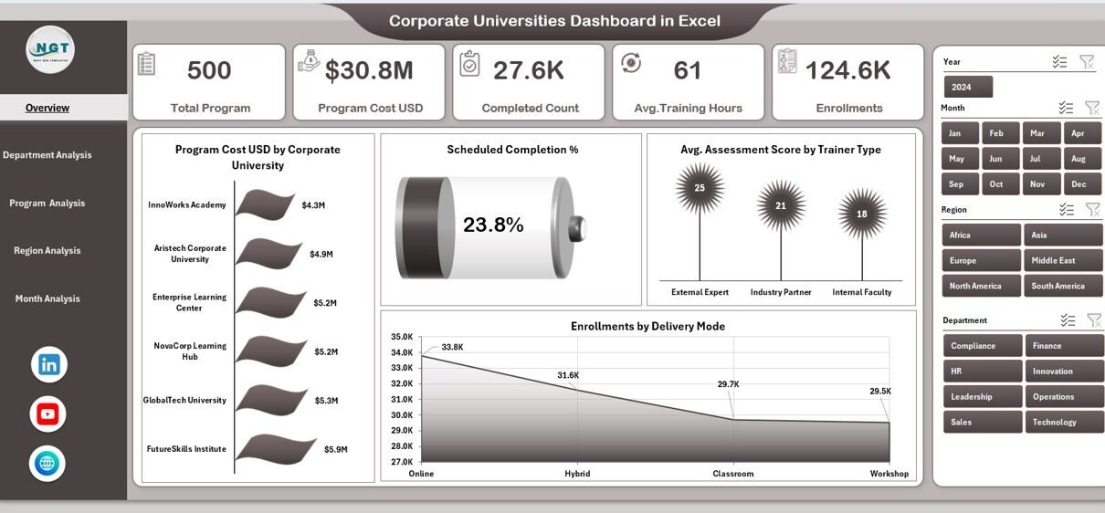
Overview Page: What Does the Overview Page Show?
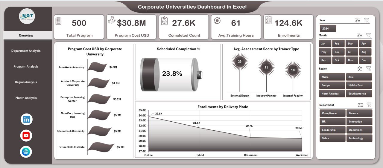
The Overview Page acts as the command center of the Corporate Universities Dashboard in Excel.
KPI Cards on the Overview Page
The page includes five KPI cards, which provide instant high-level insights into corporate learning performance.
Click to Purchases Corporate Universities Dashboard in Excel
These cards typically highlight critical learning metrics at a glance.
Charts on the Overview Page
The Overview Page includes four powerful charts:
-
Program Cost USD by Corporate University
This chart compares training investment across different corporate universities. -
Scheduled Completion %
This visual shows how well programs meet planned schedules. -
Average Assessment Score by Trainer Type
This chart helps evaluate trainer effectiveness. -
Enrollments by Delivery Mode
This analysis compares classroom, virtual, and hybrid learning modes.
Because all charts update dynamically with slicers, decision-makers gain instant clarity.
Department Analysis Page: How Does Department-Level Performance Look?
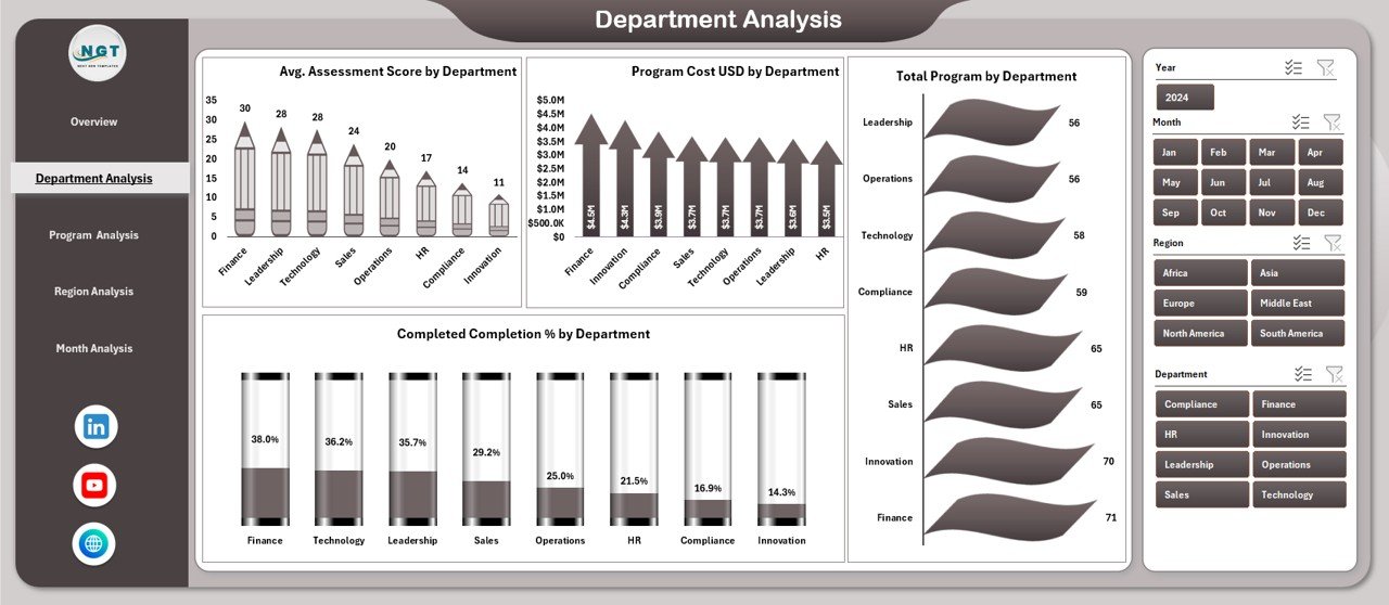
The Department Analysis Page focuses on training performance across departments.
Key Charts in Department Analysis
This page includes four detailed charts:
-
Average Assessment Score by Department
This chart identifies departments with strong or weak learning outcomes. -
Program Cost USD by Department
This visual highlights departmental training spend. -
Total Programs by Department
This chart shows training volume distribution. -
Completed Completion % by Department
This analysis tracks program completion efficiency.
As a result, HR leaders can identify departments that require additional support or optimization.
Program Analysis Page: Which Program Types Perform Best?
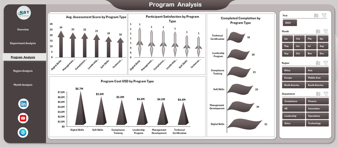
The Program Analysis Page evaluates training effectiveness by program type.
Charts Included in Program Analysis
This page contains four insightful charts:
-
Average Assessment Score by Program Type
This chart compares learning outcomes across leadership, technical, and soft skill programs. -
Program Cost USD by Program Type
This visual helps track cost distribution. -
Participant Satisfaction by Program Type
This chart highlights learner feedback. -
Completed Completion by Program Type
This metric evaluates completion efficiency.
Therefore, organizations can refine program portfolios based on performance and satisfaction.
Region Analysis Page: How Do Regions Compare in Learning Performance?
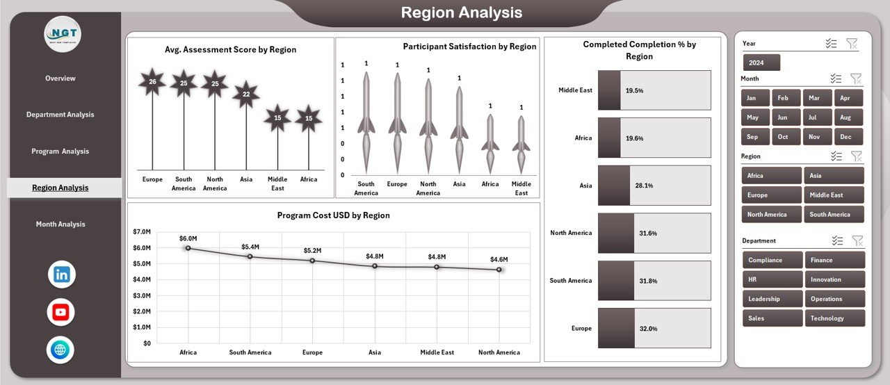
The Region Analysis Page provides a geographical view of training effectiveness.
Click to Purchases Corporate Universities Dashboard in Excel
Key Regional Charts
This page includes four charts:
-
Average Assessment Score by Region
-
Program Cost USD by Region
-
Participant Satisfaction by Region
-
Completed Completion by Region
Because regional differences often impact learning delivery, this analysis helps align regional strategies with global learning goals.
Month Analysis Page: How Does Performance Change Over Time?
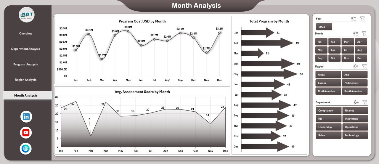
The Month Analysis Page focuses on time-based trends.
Charts on Month Analysis Page
This page includes three charts:
-
Average Assessment Score by Month
-
Total Programs by Month
-
Program Cost USD by Month
With this view, organizations can identify seasonal trends, peak training periods, and cost fluctuations.
What Supporting Sheets Power the Dashboard?
Behind the scenes, the dashboard relies on structured support sheets.
Data Sheet
The Data Sheet acts as the backbone of the dashboard. It stores all raw learning data in a structured format. Because of this structure, pivot tables and charts update automatically.
Support Sheet
The Support Sheet handles calculations, mappings, and helper tables. As a result, the dashboard remains clean and user-friendly.
Advantages of Corporate Universities Dashboard in Excel
Using a Corporate Universities Dashboard in Excel offers several advantages.
Centralized Learning Analytics
-
Consolidates all training data in one place
-
Eliminates scattered reports
-
Improves data consistency
Better Decision-Making
-
Provides real-time insights
-
Highlights strengths and gaps
-
Supports data-driven strategy
Cost Control and Budget Optimization
-
Tracks program costs accurately
-
Identifies high-cost, low-impact programs
-
Improves ROI analysis
Improved Learning Effectiveness
Click to Purchases Corporate Universities Dashboard in Excel
-
Measures assessment scores
-
Tracks completion rates
-
Monitors participant satisfaction
Easy Customization
-
Modify KPIs easily
-
Add new charts or filters
-
Adapt to organizational changes
No Additional Software Cost
-
Runs entirely on Excel
-
Requires no BI tools
-
Suitable for all organization sizes
Who Can Benefit from a Corporate Universities Dashboard in Excel?
This dashboard suits multiple stakeholders.
-
HR and L&D Managers
-
Corporate University Administrators
-
Department Heads
-
Training Coordinators
-
Senior Leadership Teams
-
HR Analytics Professionals
Because it serves both operational and strategic needs, it adds value across the organization.
Best Practices for the Corporate Universities Dashboard in Excel
Following best practices ensures maximum value from the dashboard.
Maintain Clean and Consistent Data
Always use standardized naming conventions for departments, regions, and programs. As a result, analysis remains accurate.
Update Data Regularly
Frequent updates ensure insights remain relevant. Therefore, schedule monthly or weekly data refreshes.
Use Slicers Strategically
Avoid cluttering the dashboard with too many slicers. Instead, focus on key filters that drive decisions.
Review KPIs Periodically
Business priorities change over time. Therefore, review KPIs quarterly to ensure alignment.
Train Users on Dashboard Usage
Provide short training sessions for HR teams. As a result, adoption improves and insights increase.
Protect Core Formulas
Lock calculation cells to prevent accidental changes. This practice maintains dashboard integrity.
How Does This Dashboard Support Strategic Learning Decisions?
A Corporate Universities Dashboard in Excel does more than reporting. It supports long-term strategy.
-
Aligns training with organizational goals
-
Highlights future skill gaps
-
Supports leadership development planning
-
Improves workforce capability forecasting
Because learning strategy drives business growth, this dashboard becomes a strategic asset.
Conclusion: Why Should You Use a Corporate Universities Dashboard in Excel?
A Corporate Universities Dashboard in Excel transforms learning data into actionable intelligence. Instead of relying on manual reports and assumptions, organizations gain clarity, control, and confidence in their learning investments.
With structured pages, interactive slicers, and meaningful charts, this dashboard simplifies training analysis while supporting strategic decision-making. Moreover, because it runs in Excel, it remains accessible, flexible, and cost-effective.
If your organization wants to improve learning effectiveness, optimize training budgets, and strengthen corporate university performance, this dashboard serves as a reliable solution.
Frequently Asked Questions (FAQs)
What is the main purpose of a Corporate Universities Dashboard in Excel?
The main purpose is to track, analyze, and improve corporate learning performance using structured KPIs and visual insights.
Can small organizations use this dashboard?
Yes, small and mid-sized organizations can use it effectively because Excel requires no additional investment.
Does this dashboard require advanced Excel skills?
No, basic Excel knowledge is enough to use and update the dashboard.
Can I customize KPIs and charts?
Yes, the dashboard allows easy customization based on organizational needs.
How often should data be updated?
Monthly updates work well for most organizations, although weekly updates provide deeper insights.
Is this dashboard suitable for multiple regions?
Yes, the Region Analysis Page supports multi-region learning analysis.
Does it support both online and offline training programs?
Yes, the dashboard tracks different delivery modes, including classroom, virtual, and hybrid training.
Visit our YouTube channel to learn step-by-step video tutorials