Meeting rooms play a critical role in modern organizations. Teams brainstorm ideas, conduct reviews, onboard employees, and meet clients in these spaces. However, without proper tracking and analysis, meeting rooms often remain underutilized or overbooked. As a result, organizations face scheduling conflicts, wasted resources, and poor employee experience.
That is exactly where a Meeting Room Utilization Dashboard in Power BI becomes essential.
Instead of relying on manual logs, emails, or basic booking tools, organizations can use a Power BI dashboard to track meeting room usage in real time. Moreover, this dashboard transforms raw booking data into clear, visual, and actionable insights. Because of this, facility managers, HR teams, and leadership can make smarter decisions about space planning and workplace efficiency.
In this detailed guide, you will learn what a Meeting Room Utilization Dashboard in Power BI is, how it works, why it matters, and how each dashboard page supports data-driven decision-making. Additionally, you will explore its advantages, best practices, and frequently asked questions. By the end, you will clearly understand how this dashboard helps organizations optimize meeting room usage effectively.
What Is a Meeting Room Utilization Dashboard in Power BI?
A Meeting Room Utilization Dashboard in Power BI is an interactive analytics solution designed to monitor, analyze, and optimize how meeting rooms are used across an organization.
Instead of checking scattered calendars or static reports, this dashboard consolidates all meeting room booking data into a single Power BI file. As a result, stakeholders gain instant visibility into room usage, booking patterns, attendance trends, and utilization efficiency.
Moreover, Power BI connects seamlessly with Excel or database sources. Therefore, users can update data easily and refresh the dashboard instantly. Because of this flexibility, even non-technical users can maintain the dashboard without complex steps.
Why Do Organizations Need a Meeting Room Utilization Dashboard?
Many organizations struggle with meeting room management. While some rooms stay unused, others remain fully booked all day. However, without analytics, these problems stay hidden.
A Meeting Room Utilization Dashboard in Power BI solves this challenge by providing clear insights such as:
- Which rooms remain overused or underused
- How often meetings get completed or canceled
- Which departments consume the most meeting room time
- How meeting duration and attendance vary across teams
- Which locations require more or fewer meeting rooms
Because of this visibility, organizations can improve space planning, reduce costs, and enhance employee productivity.
How Does a Meeting Room Utilization Dashboard in Power BI Work?
The dashboard works by capturing meeting room booking data from Excel or other sources. This data typically includes booking date, room name, department, meeting type, organizer, attendance, duration, and booking status.
After loading the data into Power BI, the dashboard applies visual elements such as cards, charts, and slicers. Consequently, users can filter data by department, room, location, or time period. As a result, decision-makers gain instant insights without manual analysis.
Key Features of the Meeting Room Utilization Dashboard in Power BI
This dashboard includes five powerful analysis pages, each designed to answer specific business questions. Let us explore each page in detail.
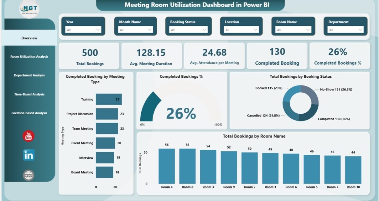
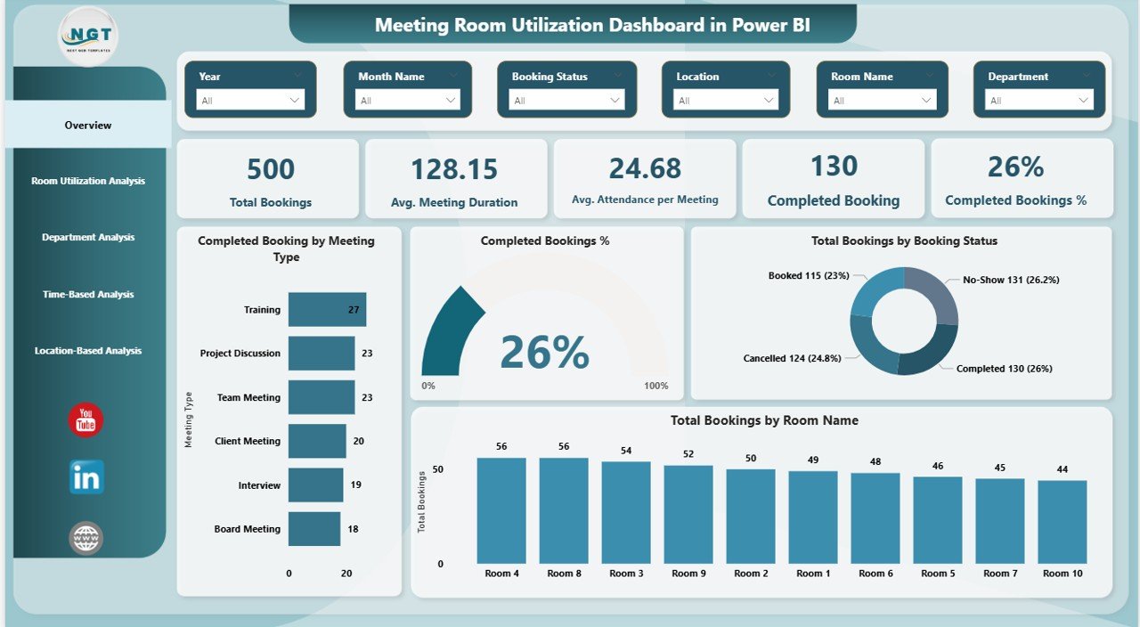
Overview Page Show
The Overview Page acts as the central summary of the dashboard. Because this page provides high-level insights, leadership teams often start their analysis here.
Key Metrics Displayed on the Overview Page
The overview page includes five KPI cards, which instantly show performance:
- Total Bookings – Shows the total number of meetings scheduled
- Average Meeting Duration – Highlights how long meetings typically last
- Average Attendance per Meeting – Indicates engagement levels
- Completed Bookings – Displays how many meetings actually happened
- Completed Booking % – Shows the success rate of scheduled meetings
Visual Insights on the Overview Page
In addition to KPI cards, the overview page includes multiple charts:
- Completed Bookings by Meeting Type
- Completed Booking % Trend
- Total Bookings by Booking Status
- Total Bookings by Room Name
Moreover, slicers allow users to filter data easily. As a result, users can analyze performance by specific time periods, rooms, or departments.
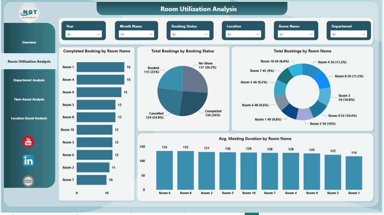
Room Utilization Analysis
The Room Utilization Analysis Page focuses on how individual rooms perform. Because meeting rooms represent a major facility cost, this analysis becomes extremely valuable.
Key Charts in Room Utilization Analysis
This page includes four focused visuals:
- Completed Bookings by Room Name
- Total Bookings by Booking Status
- Total Bookings by Room Type
- Average Meeting Duration by Room Name
Why Room Utilization Analysis Matters
Through this analysis, facility teams can:
- Identify rooms that remain underused
- Detect rooms that face frequent overbooking
- Adjust room sizes or layouts based on usage
- Improve booking policies
As a result, organizations can optimize space utilization and reduce unnecessary expansion costs.
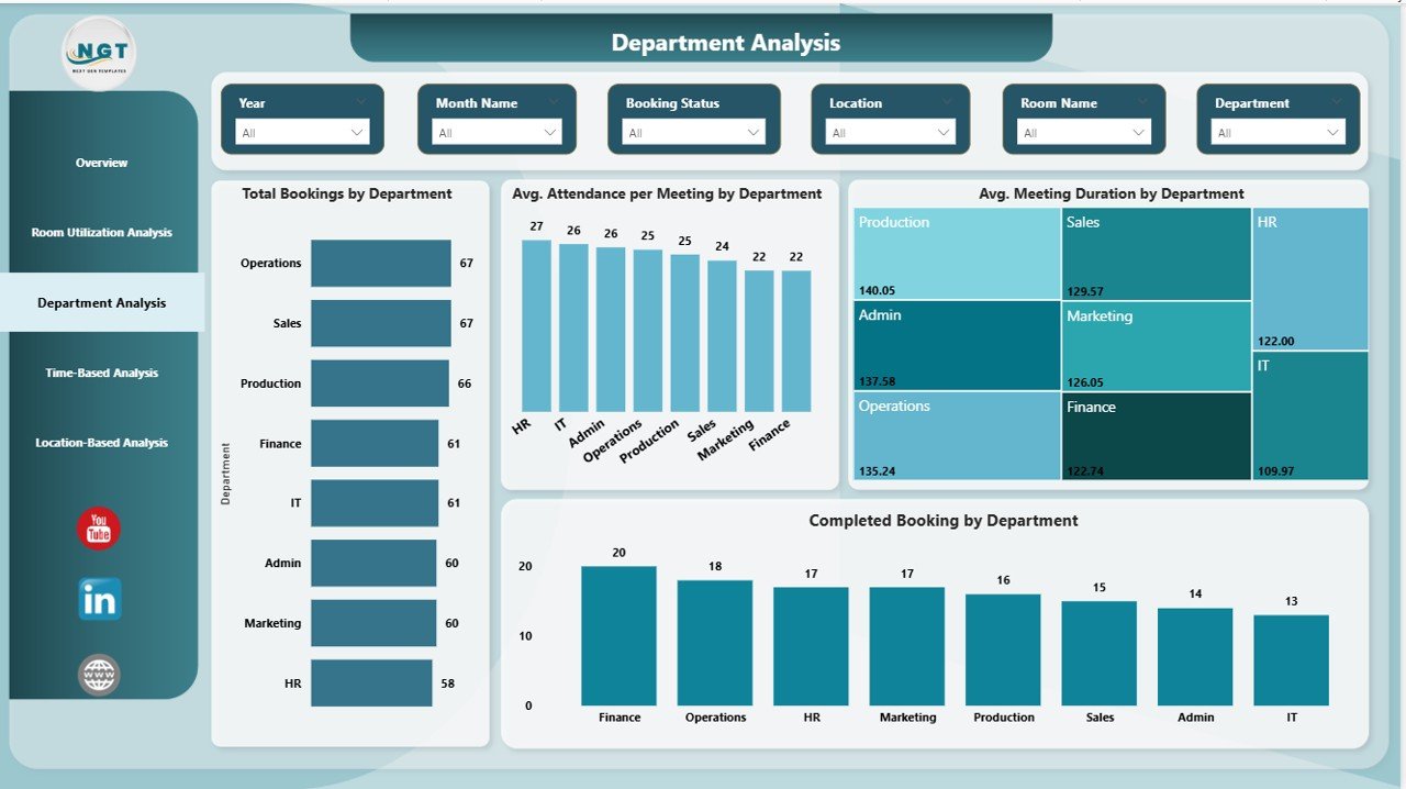
Department Analysis
The Department Analysis Page helps organizations understand how different teams use meeting rooms. Because departments often follow different meeting patterns, this page delivers powerful insights.
Key Charts in Department Analysis
This page includes four analytical visuals:
- Total Bookings by Department
- Average Attendance per Meeting by Department
- Average Meeting Duration by Department
- Completed Bookings by Department
Benefits of Department Analysis
With this data, organizations can:
- Identify departments that conduct excessive meetings
- Detect teams with low meeting attendance
- Improve meeting effectiveness across departments
- Align meeting practices with productivity goals
As a result, leaders can promote healthier meeting cultures across the organization.
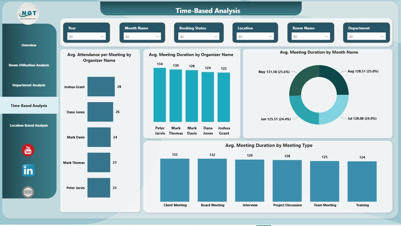
Time-Based Analysis Provide
The Time-Based Analysis Page focuses on when meetings happen and how organizers behave. Because timing patterns influence productivity, this analysis adds significant value.
Key Charts in Time-Based Analysis
This page includes four time-focused visuals:
- Average Attendance per Meeting by Organizer
- Average Meeting Duration by Organizer Name
- Average Meeting Duration by Month Name
- Average Meeting Duration by Meeting Type
Why Time-Based Analysis Is Important
Through this page, organizations can:
- Identify organizers who schedule lengthy meetings
- Track seasonal meeting trends
- Optimize meeting schedules by month or type
- Encourage better meeting planning habits
Consequently, teams can reduce meeting fatigue and improve efficiency.
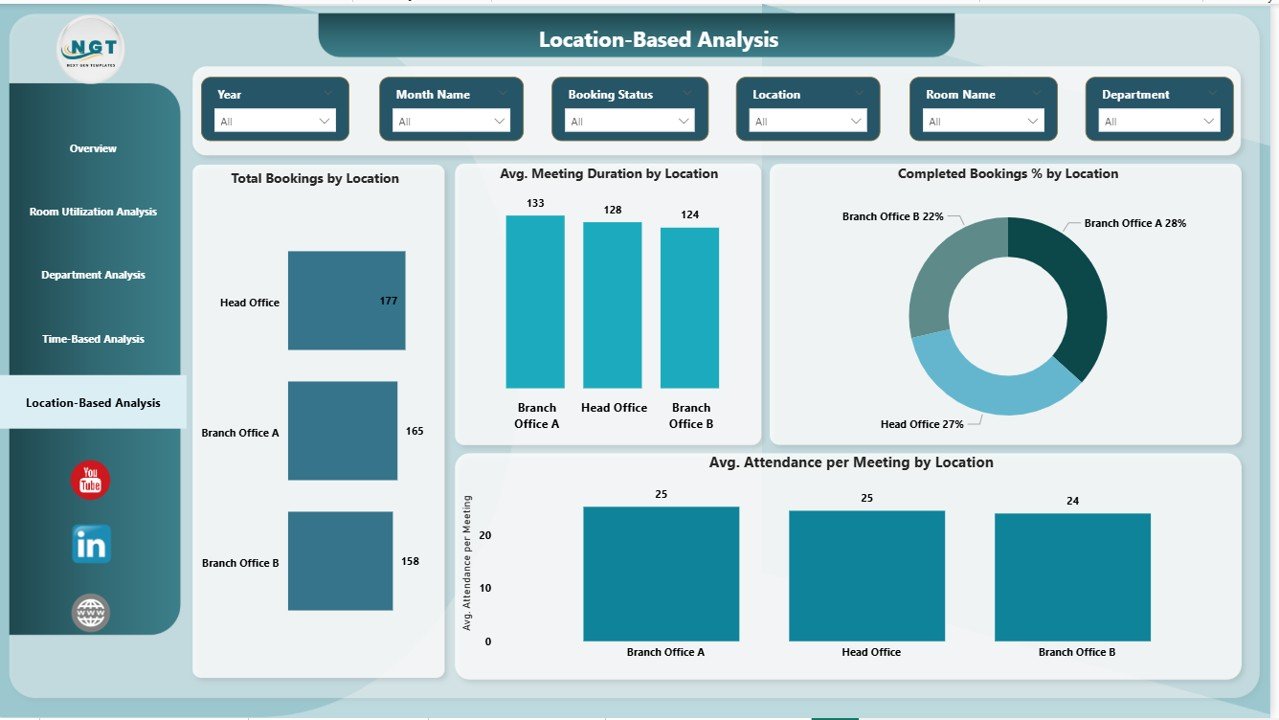
Location-Based Analysis
The Location-Based Analysis Page provides insights across office locations. Because many organizations operate across multiple sites, this page becomes essential.
Key Charts in Location-Based Analysis
This page includes four location-specific visuals:
- Total Bookings by Location
- Average Meeting Duration by Location
- Completed Bookings % by Location
- Average Attendance per Meeting by Location
Value of Location-Based Analysis
With this analysis, organizations can:
- Compare meeting room usage across offices
- Identify locations with space shortages
- Improve facility planning at regional levels
- Support hybrid and remote work strategies
As a result, leadership can make smarter global workspace decisions.
Advantages of a Meeting Room Utilization Dashboard in Power BI
A Meeting Room Utilization Dashboard in Power BI delivers measurable benefits across departments.
Key Advantages
- Improves meeting room utilization efficiency
- Reduces facility and real estate costs
- Enhances employee productivity
- Supports data-driven space planning
- Identifies booking conflicts and cancellations
- Encourages better meeting discipline
Moreover, because Power BI updates in real time, organizations always work with current data.
Who Can Use a Meeting Room Utilization Dashboard?
This dashboard serves multiple stakeholders:
- Facility Managers – Optimize room usage
- HR Teams – Improve workplace experience
- Office Administrators – Manage bookings efficiently
- Leadership Teams – Make strategic space decisions
- IT Teams – Integrate booking systems with analytics
Because of its intuitive design, users do not need advanced technical skills.
Best Practices for the Meeting Room Utilization Dashboard in Power BI
To get the most value from the dashboard, organizations should follow proven best practices.
Data Management Best Practices
- Maintain clean and consistent booking data
- Standardize room names and departments
- Track cancellations and no-shows accurately
Dashboard Design Best Practices
- Use clear slicers for filtering
- Keep visuals simple and readable
- Highlight key KPIs at the top
Usage Best Practices
- Review the dashboard monthly
- Share insights with department heads
- Use data to revise meeting policies
By following these practices, organizations can maximize dashboard impact.
How Does This Dashboard Support Better Decision-Making?
Because the dashboard consolidates all meeting room data into one place, decision-makers gain clarity instantly. Moreover, visual insights reduce guesswork and manual reporting.
As a result, organizations can:
- Decide whether to add or remove meeting rooms
- Improve meeting effectiveness policies
- Support flexible and hybrid work models
- Reduce wasted time and space
Therefore, the dashboard becomes a strategic planning tool, not just a reporting solution.
Conclusion: Why Every Organization Needs a Meeting Room Utilization Dashboard in Power BI
Meeting rooms represent valuable organizational assets. However, without analytics, organizations struggle to manage them effectively. That is why a Meeting Room Utilization Dashboard in Power BI becomes a must-have solution.
This dashboard transforms raw booking data into actionable insights across overview, room, department, time, and location dimensions. Moreover, it supports smarter decisions, better space utilization, and improved productivity.
In today’s data-driven workplace, organizations that track and optimize meeting room usage gain a clear competitive advantage.
Frequently Asked Questions (FAQs)
What is a Meeting Room Utilization Dashboard in Power BI used for?
Organizations use this dashboard to analyze meeting room bookings, usage patterns, attendance trends, and space efficiency. As a result, teams can optimize workspace utilization.
Can this dashboard work with Excel data?
Yes. The dashboard connects easily with Excel files. Users can update Excel data and refresh Power BI to see updated insights instantly.
Who benefits most from this dashboard?
Facility managers, HR teams, office administrators, and leadership teams benefit the most because they manage space, productivity, and employee experience.
Does this dashboard support multiple locations?
Yes. The Location-Based Analysis page helps organizations analyze meeting room usage across multiple offices and regions.
Is Power BI expertise required to use this dashboard?
No. The dashboard uses intuitive visuals and slicers. Therefore, business users can explore insights without technical expertise.
How often should organizations review this dashboard?
Organizations should review it monthly or quarterly to identify trends, improve policies, and optimize meeting room usage continuously.
Visit our YouTube channel to learn step-by-step video tutorials
Watch the step-by-step video tutorial: