Broadcasting businesses operate in a fast-moving and highly competitive environment. Every day, broadcasters manage channels, programs, advertisers, time slots, regions, and revenue streams. However, when teams rely on static reports or scattered spreadsheets, visibility drops quickly. As a result, decisions become reactive instead of strategic.
That is exactly where a Broadcasting Dashboard in Power BI becomes a powerful solution.
A Broadcasting Dashboard in Power BI transforms raw broadcast data into clear, interactive, and actionable insights. It helps broadcasters track advertisement revenue, monitor aired broadcasts, analyze channel and program performance, and improve overall operational efficiency. More importantly, it enables leadership teams to make faster and smarter decisions using real-time data.
In this detailed guide, you will learn what a Broadcasting Dashboard in Power BI is, why broadcasting companies need it, how it works, its dashboard pages, key features, advantages, best practices, and frequently asked questions. By the end of this article, you will clearly understand how this dashboard supports data-driven broadcasting decisions.
Click to Purchases Broadcasting Dashboard in Power BI
What Is a Broadcasting Dashboard in Power BI?
A Broadcasting Dashboard in Power BI is an interactive reporting and analytics solution designed to track and visualize key broadcasting performance metrics in one centralized place.
Instead of reviewing multiple disconnected reports, broadcasters use one Power BI dashboard to monitor:
-
Advertisement revenue performance
-
Aired broadcast percentage
-
Channel-wise broadcast performance
-
Program type effectiveness
-
Advertiser category contribution
-
Monthly broadcast and revenue trends
Because Power BI supports interactive slicers, dynamic visuals, and real-time updates, this dashboard delivers both flexibility and accuracy. As a result, broadcasters gain instant visibility into what is working and what needs improvement.
Why Do Broadcasting Companies Need a Power BI Dashboard?
Broadcasting organizations handle massive volumes of data daily. However, raw data alone does not create value. Therefore, businesses must convert data into insights quickly.
Here is why broadcasting companies strongly need a Power BI dashboard:
-
Manual reporting consumes time, while Power BI automates insights
-
Revenue leaks remain hidden without proper visualization
-
Channel and program decisions require data, not assumptions
-
Advertiser performance needs constant tracking
-
Leadership teams demand real-time visibility
As a result, a Broadcasting Dashboard in Power BI becomes essential for growth, control, and profitability.
How Does a Broadcasting Dashboard in Power BI Work?
A Broadcasting Dashboard in Power BI works by connecting broadcast data from one or multiple sources and transforming it into structured visuals.
Here is how it typically functions:
-
Data Collection
The dashboard pulls data from Excel files, databases, or cloud systems containing broadcast, advertiser, and revenue details. -
Data Modeling
Power BI organizes the data into relationships such as channels, programs, time slots, regions, and advertisers. -
Interactive Slicers
Users filter data by month, region, channel name, program type, or advertiser category. -
Dynamic Visuals
Charts, cards, and tables update instantly based on selections. -
Insight-Driven Decisions
Management uses insights to optimize schedules, pricing, and content strategies.
Because everything updates automatically, teams always work with the latest information.
Click to Purchases Broadcasting Dashboard in Power BI
Key Features of the Broadcasting Dashboard in Power BI
The Broadcasting Dashboard in Power BI includes five powerful analytical pages, each designed to answer specific business questions.
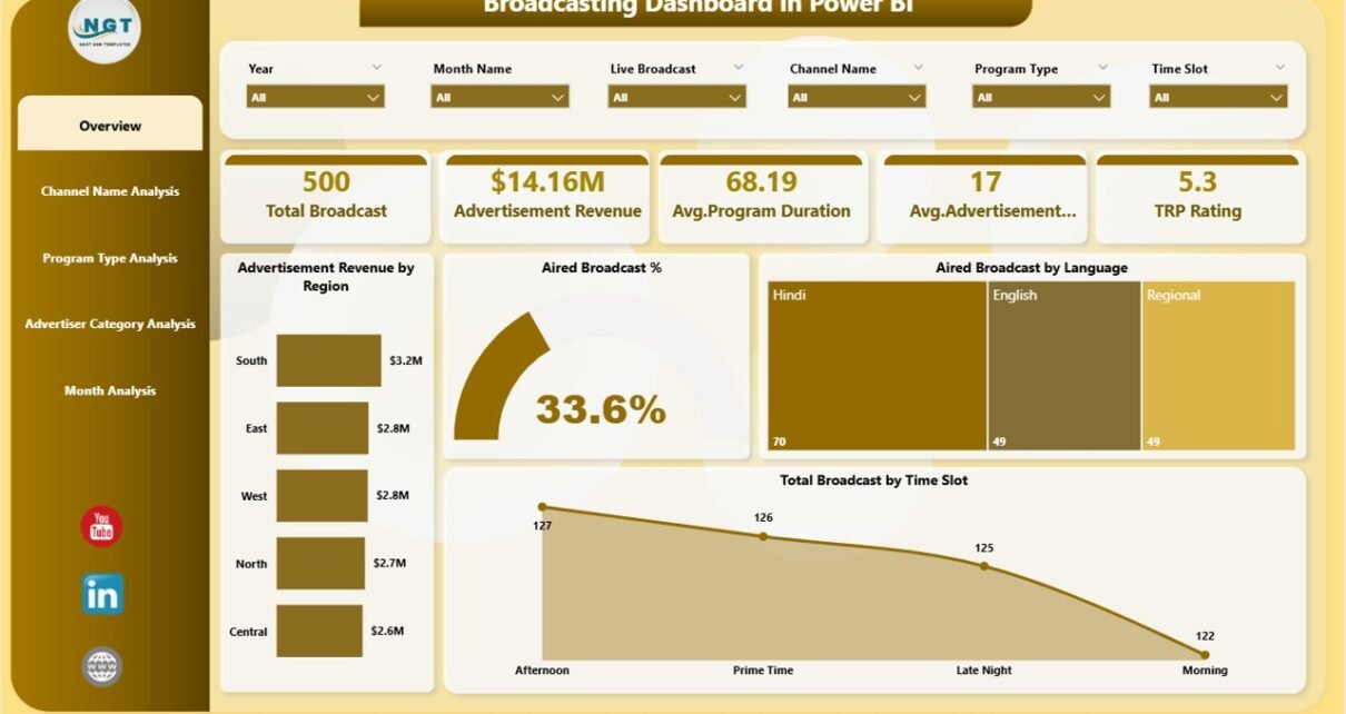
Overview Page: How Is Overall Broadcast Performance Performing?
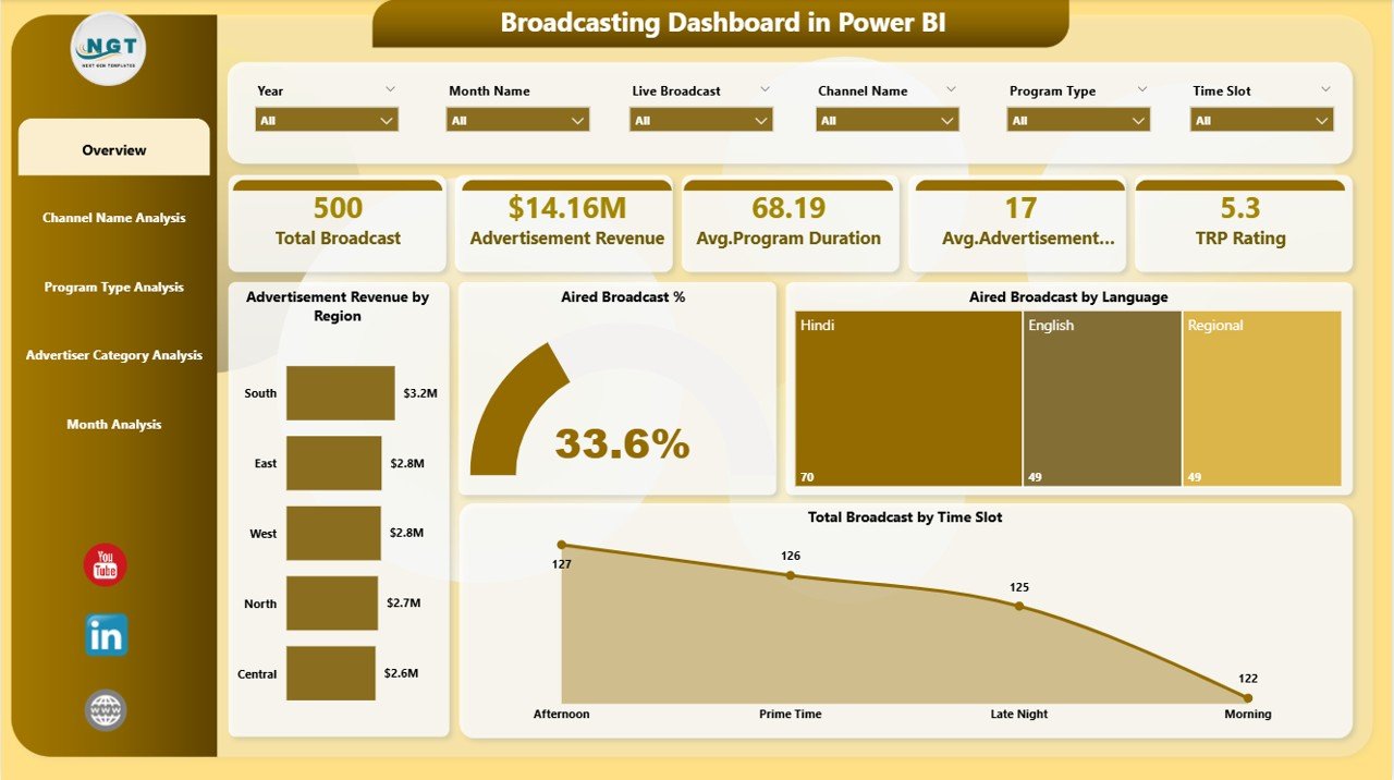
The Overview Page acts as the main control center of the dashboard. It provides a quick snapshot of overall broadcast performance.
Key Elements on the Overview Page
-
Interactive slicers for filtering data easily
-
Five KPI cards showing high-level metrics
-
Visual charts highlighting revenue and broadcast distribution
Metrics and Charts Included
-
Advertisement Revenue by Region
This chart shows how revenue distributes across different regions. As a result, teams quickly identify high-performing and low-performing regions. -
Aired Broadcast %
This metric highlights the percentage of scheduled broadcasts that actually aired. Therefore, teams can track operational efficiency. -
Aired Broadcast by Language
This visual shows language-wise broadcast distribution, helping broadcasters understand audience preferences. -
Total Broadcast by Time Slot
This chart reveals which time slots generate maximum broadcasts, enabling better scheduling decisions.
Because this page provides a high-level view, leadership teams often start their analysis here.
Channel Name Analysis Page: Which Channels Drive the Most Revenue?
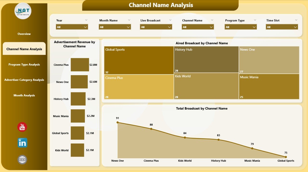
The Channel Name Analysis Page focuses on channel-level performance. It helps broadcasters compare channels based on revenue and broadcast activity.
Key Insights from This Page
-
Identify top-performing channels
-
Detect underperforming channels
-
Optimize channel-wise ad strategies
Charts Included
-
Advertisement Revenue by Channel Name
This chart highlights revenue contribution by each channel. -
Aired Broadcast % by Channel Name
This visual shows how efficiently each channel airs scheduled broadcasts. -
Total Broadcast by Channel Name
This chart displays broadcast volume by channel.
As a result, broadcasters can easily allocate resources and advertising inventory more effectively.
Click to Purchases Broadcasting Dashboard in Power BI
Program Type Analysis Page: Which Program Types Perform Best?
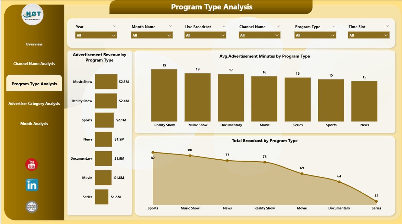
The Program Type Analysis Page helps broadcasters understand which program categories deliver the best results.
Why This Analysis Matters
Program types directly influence audience engagement and advertiser interest. Therefore, understanding performance at this level becomes critical.
Charts Included
-
Advertisement Revenue by Program Type
This chart reveals which program categories attract higher advertising revenue. -
Average Advertisement Minutes by Program Type
This metric helps evaluate ad load effectiveness across programs. -
Total Broadcast by Program Type
This chart shows broadcast volume for each program type.
With these insights, broadcasters can refine content strategies and maximize revenue opportunities.
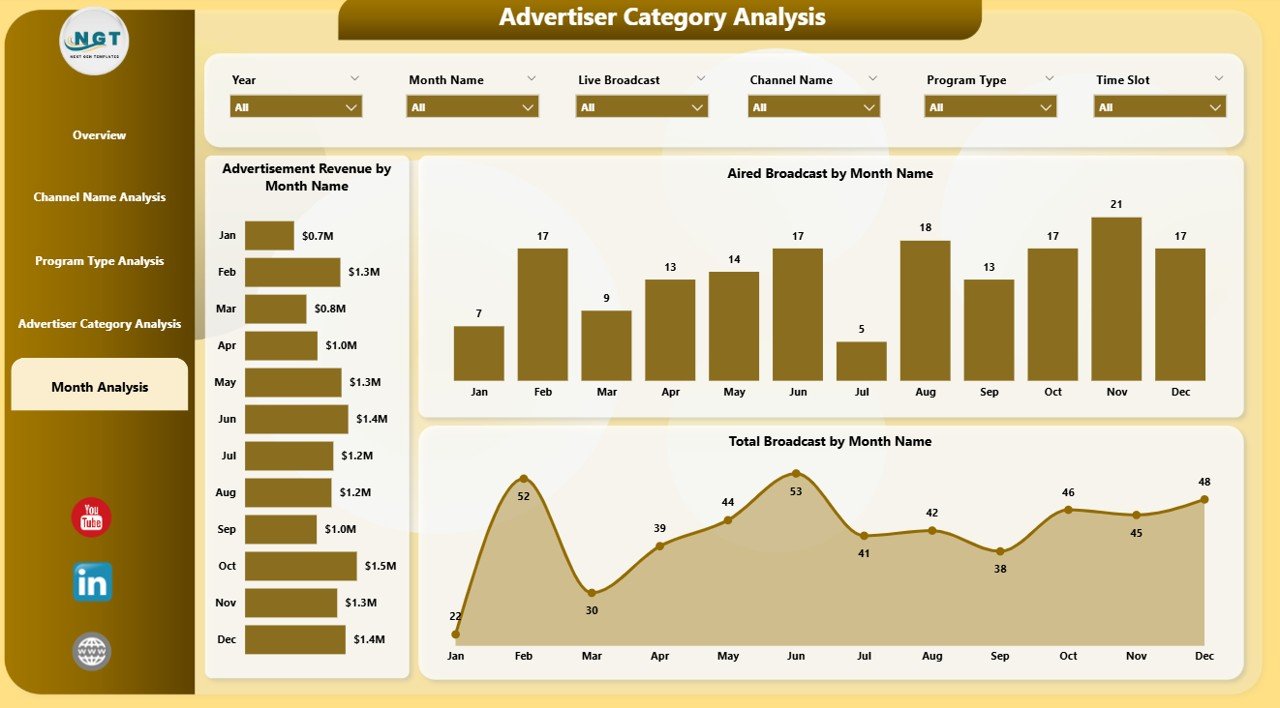
Advertiser Category Analysis Page: Which Advertisers Contribute the Most?
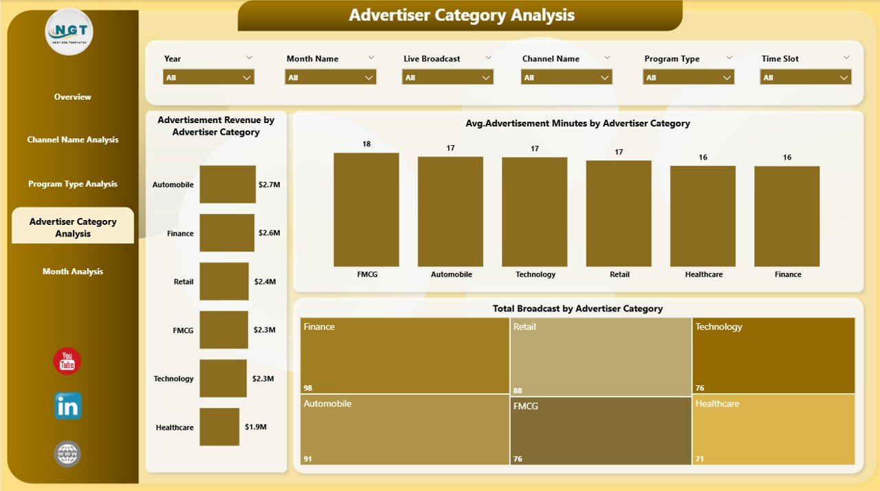
The Advertiser Category Analysis Page focuses on advertiser segmentation. It shows how different advertiser categories impact revenue and broadcast volume.
Key Benefits of This Page
-
Understand advertiser behavior
-
Identify high-value advertiser segments
-
Improve advertiser targeting strategies
Charts Included
-
Advertisement Revenue by Advertiser Category
This chart highlights revenue contribution by advertiser categories. -
Average Advertisement Minutes by Advertiser Category
This visual shows ad duration patterns across categories. -
Total Broadcast by Advertiser Category
This chart displays broadcast volume by advertiser category.
As a result, sales teams can tailor advertising packages more effectively.
Month Analysis Page: How Does Performance Change Over Time?
The Month Analysis Page focuses on trend analysis. It helps broadcasters track performance over time.
Why Monthly Analysis Matters
Trend analysis helps identify seasonality, growth patterns, and performance fluctuations.
Charts Included
-
Advertisement Revenue by Month
This chart tracks revenue trends over time. -
Aired Broadcast by Month
This visual shows monthly broadcast activity. -
Total Broadcast by Month
This chart highlights volume changes month by month.
Because trends drive strategic planning, this page supports long-term decision-making.
Advantages of Broadcasting Dashboard in Power BI
A Broadcasting Dashboard in Power BI delivers significant advantages to broadcasting organizations.
Key Advantages
-
Centralized reporting in one interactive dashboard
-
Faster decision-making with real-time insights
-
Improved revenue tracking across regions and channels
-
Better scheduling decisions using time-slot analysis
-
Enhanced advertiser management through category insights
-
Reduced manual reporting effort
-
Scalable and customizable for future needs
Therefore, broadcasters gain both operational control and strategic clarity.
Best Practices for the Broadcasting Dashboard in Power BI
Click to Purchases Broadcasting Dashboard in Power BI
To get maximum value from a Broadcasting Dashboard in Power BI, teams should follow proven best practices.
Best Practices You Should Follow
-
Always maintain clean and structured data sources
-
Use clear KPI definitions for consistency
-
Limit visuals to decision-driven metrics only
-
Use slicers wisely to avoid clutter
-
Review dashboard performance monthly and quarterly
-
Train users to interpret insights correctly
-
Continuously refine visuals based on business needs
By following these practices, broadcasters ensure long-term dashboard success.
Who Should Use a Broadcasting Dashboard in Power BI?
This dashboard suits a wide range of professionals, including:
-
Broadcasting company owners
-
Channel managers
-
Advertising sales teams
-
Media planners
-
Operations managers
-
Finance and revenue teams
Because it serves multiple roles, the dashboard becomes a shared decision-making platform.
Conclusion: Why a Broadcasting Dashboard in Power BI Is a Must-Have Tool
A Broadcasting Dashboard in Power BI empowers broadcasters to move from manual reporting to intelligent analytics. It delivers real-time visibility into revenue, broadcast efficiency, channels, programs, advertisers, and trends.
Instead of guessing performance, teams act on data. Instead of reacting late, leaders plan ahead. As a result, broadcasting organizations improve efficiency, profitability, and strategic confidence.
If your broadcasting business wants better control, smarter insights, and faster decisions, then a Broadcasting Dashboard in Power BI is no longer optional—it is essential.
Frequently Asked Questions (FAQs)
What is the main purpose of a Broadcasting Dashboard in Power BI?
The main purpose is to track broadcast performance, advertisement revenue, and operational efficiency in one interactive dashboard.
Can this dashboard handle large volumes of broadcast data?
Yes, Power BI handles large datasets efficiently while maintaining fast performance.
Does the dashboard support real-time updates?
Yes, the dashboard updates automatically when data sources refresh.
Can users filter data by channel or month?
Yes, interactive slicers allow filtering by channel, program type, region, advertiser category, and month.
Is the Broadcasting Dashboard customizable?
Yes, users can customize visuals, KPIs, and pages based on business requirements.
Who benefits the most from this dashboard?
Broadcasters, advertising sales teams, channel managers, and leadership teams benefit the most.
Visit our YouTube channel to learn step-by-step video tutorials