Pipeline infrastructure projects involve complex planning, continuous monitoring, strict safety regulations, and large financial investments. Therefore, organizations must track performance metrics accurately to ensure operational efficiency and project success. However, many companies still rely on manual spreadsheets, scattered reports, and delayed analytics. As a result, managers often struggle to evaluate pipeline performance, identify operational risks, and monitor key performance indicators effectively.
Therefore, businesses increasingly adopt data-driven dashboards to monitor pipeline infrastructure operations. One of the most effective solutions is the Pipeline Infrastructure KPI Dashboard in Power BI.
This powerful dashboard allows infrastructure teams, project managers, engineers, and executives to track operational KPIs, analyze project performance, and monitor progress through interactive visualizations.
In this detailed guide, you will learn:
- What a Pipeline Infrastructure KPI Dashboard in Power BI is
- Why pipeline infrastructure projects require KPI monitoring
- Key features of the dashboard
- How the Power BI dashboard works
- Advantages of using a KPI dashboard
- Best practices for implementation
- Frequently asked questions about pipeline KPI dashboards
Click to buy Pipeline Infrastructure KPI Dashboard in Power BI
What Is a Pipeline Infrastructure KPI Dashboard in Power BI?
A Pipeline Infrastructure KPI Dashboard in Power BI is an interactive data visualization tool designed to monitor the performance, progress, and efficiency of pipeline infrastructure operations.
Instead of analyzing multiple reports manually, this dashboard consolidates all pipeline performance data into one centralized system.
The dashboard uses Microsoft Power BI for visualization and Excel as the data source. Consequently, organizations can easily input operational data in Excel and instantly analyze the results through interactive charts, KPI indicators, and trend reports.
Because Power BI supports real-time analytics and dynamic visualizations, managers can quickly identify operational issues and make better decisions.
Why Do Pipeline Infrastructure Projects Need KPI Monitoring?
Pipeline infrastructure projects involve multiple operational factors such as construction progress, safety compliance, maintenance activities, and cost management. Therefore, organizations must continuously monitor performance indicators.
However, without proper analytics tools, teams often encounter several challenges.
Common Challenges Without KPI Dashboards
- Scattered operational data across multiple spreadsheets
- Delayed reporting and manual analysis
- Difficulty identifying underperforming KPIs
- Lack of centralized monitoring system
- Poor decision-making due to incomplete data
- Inefficient performance tracking
Therefore, organizations use KPI dashboards to improve transparency and operational efficiency.
When teams implement a Pipeline Infrastructure KPI Dashboard in Power BI, they gain clear visibility into performance metrics, trends, and operational outcomes.
Key Features of the Pipeline Infrastructure KPI Dashboard in Power BI
The Pipeline Infrastructure KPI Dashboard in Power BI includes multiple analytical components that help users monitor performance efficiently.
This dashboard contains three major pages designed to provide complete KPI insights.
- Summary Page
- KPI Trend Page
- KPI Definition Page
Let’s explore each page in detail.
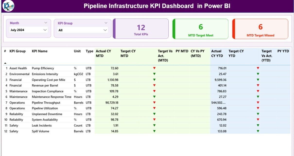
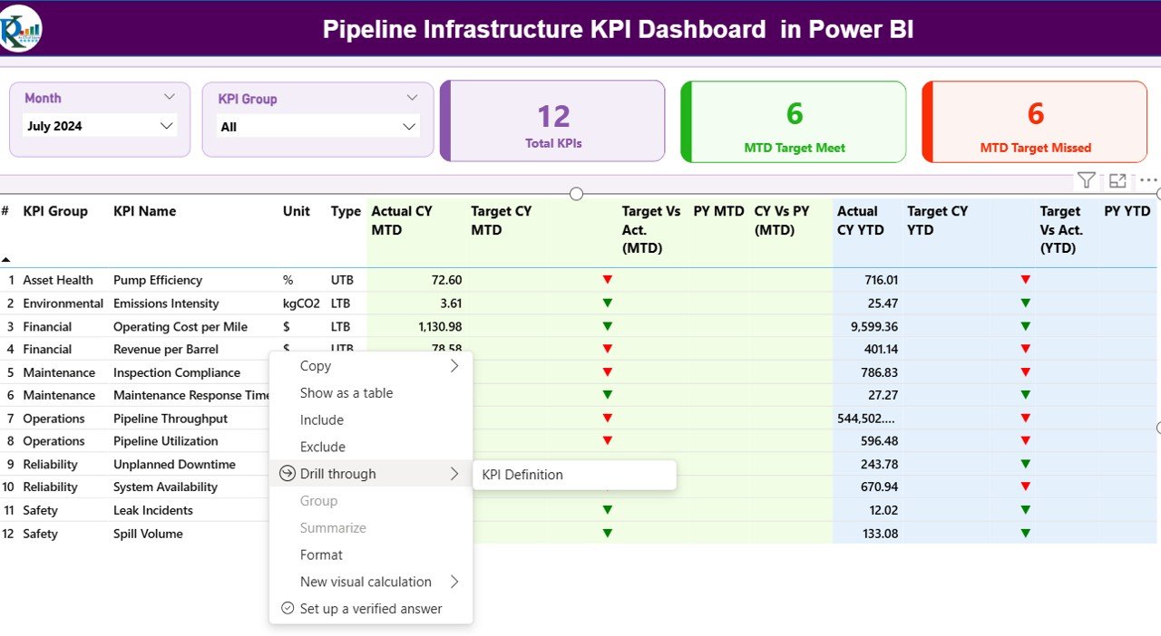
Summary Page – The Main Dashboard Interface
The Summary Page acts as the central analytics interface of the dashboard. It displays important KPI metrics and operational insights in one view.
Because managers require quick information, this page highlights critical KPI performance indicators.
Key Elements of the Summary Page
Month and KPI Group Slicer
At the top of the dashboard, users can select:
- Month
- KPI Group
These slicers allow managers to filter the entire dashboard instantly. Therefore, decision-makers can analyze performance for specific time periods or KPI categories.
KPI Performance Cards
The dashboard includes three important KPI cards:
- Total KPIs Count – Displays the total number of KPIs monitored in the dashboard.
- MTD Target Meet Count – Shows the number of KPIs that achieved their targets in the current month.
- MTD Target Missed Count – Indicates the number of KPIs that failed to meet targets.
These cards provide quick insights into overall pipeline performance.
Detailed KPI Table
Below the KPI cards, the dashboard displays a comprehensive KPI table containing multiple performance indicators.
This table includes the following columns:
KPI Number
This column displays the sequence number assigned to each KPI.
KPI Group
This column categorizes KPIs into different operational groups such as:
- Safety
- Operations
- Maintenance
- Construction
- Cost Management
KPI Name
This column displays the name of the KPI being monitored.
Unit
This column shows the unit of measurement used for the KPI. Examples include:
- Percentage
- Hours
- Units
- Currency
KPI Type (LTB or UTB)
The dashboard categorizes KPIs into two types:
- LTB – Lower the Better
- UTB – Upper the Better
This classification helps evaluate KPI performance accurately.
Actual CY MTD
This column displays the Actual Month-To-Date value for the current year.
Target CY MTD
This column displays the target value for the current month.
MTD Status Icon
The dashboard shows visual indicators to represent KPI performance.
- ▲ Green arrow indicates the KPI met or exceeded the target.
- ▼ Red arrow indicates the KPI failed to meet the target.
These visual indicators allow users to quickly identify performance status.
Target vs Actual (MTD)
This column calculates the percentage difference between actual and target values.
Formula used:
Actual Value ÷ Target Value
Previous Year MTD (PY MTD)
This column displays the KPI value for the same month in the previous year.
CY vs PY (MTD)
This metric compares current performance with last year’s performance.
Formula used:
Current Year MTD ÷ Previous Year MTD
Year-to-Date KPI Monitoring
In addition to monthly monitoring, the dashboard also tracks Year-To-Date (YTD) performance.
The following fields appear in the dashboard:
Actual CY YTD
Displays the cumulative KPI value for the current year.
Target CY YTD
Displays the target KPI value for the current year.
YTD Status Icon
Visual arrows indicate whether the KPI achieved its annual target.
Target vs Actual (YTD)
This column calculates YTD performance against the target.
Formula:
Actual YTD ÷ Target YTD
Previous Year YTD
Displays the KPI value from the same period in the previous year.
CY vs PY (YTD)
Compares current year performance with previous year performance.
Formula:
Current YTD ÷ Previous Year YTD

Click to buy Pipeline Infrastructure KPI Dashboard in Power BI
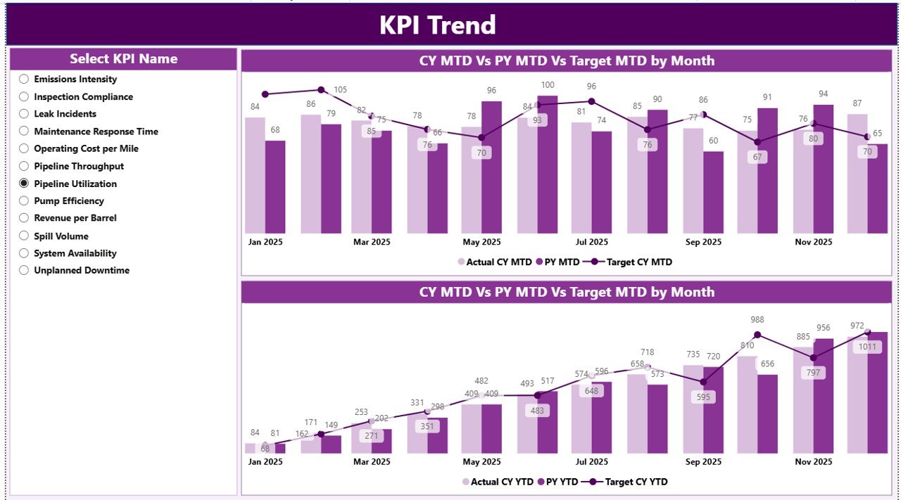
KPI Trend Page – Performance Analysis Over Time
While the Summary Page provides snapshot insights, the KPI Trend Page focuses on historical performance analysis.
This page helps users understand how KPIs evolve over time.
Key Features of the KPI Trend Page
The page contains two combo charts.
These charts display:
- Current Year Actual Values
- Previous Year Actual Values
- Target Values
Charts analyze both:
- MTD performance
- YTD performance
KPI Selection Slicer
On the left side of the page, users can select a specific KPI.
Once selected, the charts automatically update to show the trend of the selected KPI.
Therefore, managers can easily analyze:
- Performance growth
- Performance decline
- Seasonal patterns
- Operational improvements
Click to buy Pipeline Infrastructure KPI Dashboard in Power BI
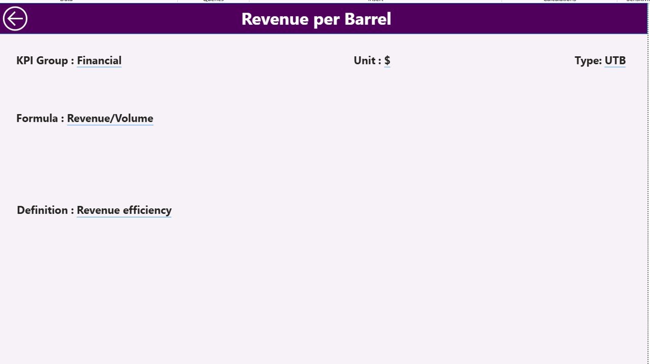
KPI Definition Page – Detailed KPI Explanation
The KPI Definition Page provides detailed information about each KPI.
This page works as a drill-through page, which means users can open it directly from the Summary Page.
When users drill into a KPI, they can see additional details such as:
- KPI Formula
- KPI Definition
- KPI Unit
- KPI Group
- KPI Type
This information helps users understand the calculation and purpose of each KPI.
Because this page focuses on detailed information, the dashboard keeps it hidden by default.
Users can return to the main dashboard using the Back Button located on the top left corner.
Click to buy Pipeline Infrastructure KPI Dashboard in Power BI
Excel Data Source Used in the Dashboard
The Pipeline Infrastructure KPI Dashboard uses Excel as the data source.
Users only need to update the Excel file, and Power BI automatically refreshes the dashboard.
The Excel file contains three worksheets.
Input_Actual Worksheet
This worksheet stores the actual KPI performance values.
Users need to enter the following fields:
- KPI Name
- Month (First date of the month)
- MTD value
- YTD value
Once entered, the dashboard automatically updates.
Click to buy Pipeline Infrastructure KPI Dashboard in Power BI
Input_Target Worksheet
This worksheet contains target values for each KPI.
Users must fill the following data:
- KPI Name
- Month
- Target MTD value
- Target YTD value
These values allow the dashboard to calculate performance comparisons.
KPI Definition Worksheet
This worksheet defines all KPIs used in the dashboard.
It includes the following columns:
- KPI Number
- KPI Group
- KPI Name
- Unit
- Formula
- Definition
- Type (LTB or UTB)
This sheet acts as the master KPI reference table.
Advantages of Pipeline Infrastructure KPI Dashboard in Power BI
Organizations gain multiple operational benefits when they implement a KPI dashboard.
- Centralized Data Monitoring
The dashboard consolidates pipeline performance data into one centralized interface.
Therefore, managers no longer need to review multiple reports.
- Real-Time Decision Making
Because Power BI updates data dynamically, managers can monitor pipeline performance instantly.
Consequently, teams can take quick corrective actions.
- Improved Operational Efficiency
The dashboard highlights underperforming KPIs immediately.
As a result, organizations can improve operational processes faster.
- Better Data Visualization
Power BI provides interactive charts, KPI indicators, and visual analytics.
Therefore, complex operational data becomes easy to understand.
- Performance Benchmarking
The dashboard compares:
- Current year performance
- Previous year performance
- Target values
This comparison helps organizations evaluate operational progress.
- Increased Transparency
All stakeholders can monitor pipeline performance through a single dashboard.
Therefore, teams maintain better transparency across departments.
Best Practices for the Pipeline Infrastructure KPI Dashboard
Organizations should follow certain best practices to maximize the value of KPI dashboards.
Define Clear KPIs
Choose performance indicators that directly reflect pipeline operations, safety, and efficiency.
Maintain Accurate Data
Always ensure that Excel data inputs remain accurate and updated.
Incorrect data leads to misleading analytics.
Standardize KPI Definitions
Ensure that every KPI has a clear formula and definition.
Therefore, teams avoid confusion while interpreting results.
Use Visual Indicators Effectively
Use arrows, colors, and status indicators to highlight performance status.
Visual cues make dashboards easier to interpret.
Monitor KPIs Regularly
Review dashboard insights frequently to identify operational trends and risks.
Train Team Members
Ensure that team members understand how to use the dashboard.
Training improves data-driven decision making.
Conclusion
Pipeline infrastructure projects demand precise monitoring, strong performance tracking, and timely decision making. However, manual reporting methods often create delays and inefficiencies.
The Pipeline Infrastructure KPI Dashboard in Power BI solves these challenges by providing a centralized analytics solution. It allows organizations to track operational performance, compare actual results with targets, and analyze KPI trends in real time.
With its interactive visualizations, KPI monitoring tools, and Excel integration, this dashboard enables managers to gain valuable insights and improve operational efficiency.
Therefore, organizations that adopt KPI dashboards gain stronger control over pipeline infrastructure performance.
Frequently Asked Questions (FAQs)
What is a Pipeline Infrastructure KPI Dashboard?
A Pipeline Infrastructure KPI Dashboard is a performance monitoring tool that tracks operational metrics related to pipeline construction, maintenance, safety, and project efficiency.
Why should companies use Power BI for KPI dashboards?
Power BI provides powerful visualization tools, interactive charts, and real-time analytics. Therefore, it helps organizations monitor KPIs effectively.
What data source does the dashboard use?
The dashboard uses Microsoft Excel as the data source. Users simply update Excel sheets, and Power BI refreshes the dashboard automatically.
What are MTD and YTD in KPI dashboards?
- MTD (Month-To-Date) represents performance for the current month.
- YTD (Year-To-Date) represents cumulative performance for the entire year.
What does LTB and UTB mean in KPIs?
- LTB (Lower the Better) means lower values indicate better performance.
- UTB (Upper the Better) means higher values indicate better performance.
Who can use a Pipeline Infrastructure KPI Dashboard?
This dashboard is useful for:
- Pipeline project managers
- Infrastructure engineers
- Operations teams
- Data analysts
- Executive leadership teams
Visit our YouTube channel to learn step-by-step video tutorials
Watch the step-by-step video tutorial:
Click to buy Pipeline Infrastructure KPI Dashboard in Power BI