Running an HVAC service business means juggling dozens of data points every week — service calls, technician dispatches, parts cost, response times, customer ratings, and regional profit. When all of that lives in scattered spreadsheets or a field service CRM export you never really look at, you end up managing the business on feel rather than data. The HVAC Service Dashboard in Power BI fixes that in one .pbix file — 5 report pages, 5 KPIs, 15+ visuals, DAX-powered, and ready for free Power BI Desktop.
In this post I’ll walk through every page of the dashboard, what each chart means for an HVAC service operator, and how to plug in your own service data. If you want the ready-to-use file, grab the HVAC Service Dashboard in Power BI on NextGenTemplates for a one-time $17.99.
Key Features of the HVAC Service Dashboard in Power BI
- 5 dedicated report pages — Overview, Service Analysis, Technician Performance, Regional Insights, and Revenue Breakdown, each answering a specific HVAC operations question.
- 5 executive KPI cards on the Overview page — Total Revenue, Total Service Jobs, Total Parts Cost, Total Labor Cost, and Completion Rate — visible at a glance.
- DAX-powered data model — every visual is driven by editable DAX measures, so swapping source data refreshes every chart in one click.
- Technician scorecard built-in — Avg Customer Rating, Completion Rate, and Warranty Jobs per Technician, monthly review-ready.
- Regional profitability view — Net Profit by Region plus Total Revenue vs Parts Cost by Customer Type.
- Cross-page slicers — filter by Region, Technician, Service Type, Equipment Type, Priority, or Customer Type.
- Offline usage — runs fully in free Power BI Desktop, no Power BI Pro licence required.
For the data connection and DAX fundamentals used in this dashboard, see the Microsoft Power BI fundamentals documentation.
Dashboard Pages Explanation
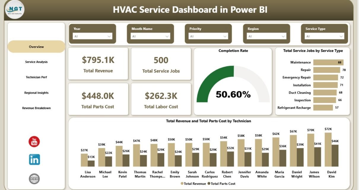
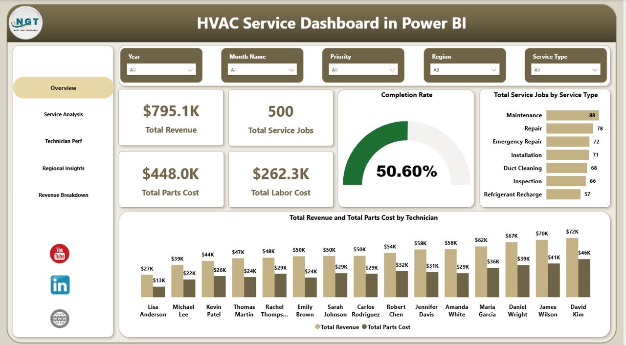
Page 1 — Overview
The Overview page is the daily command centre for HVAC service managers and owners. Five KPI cards at the top show Total Revenue, Total Service Jobs, Total Parts Cost, Total Labor Cost, and Completion Rate at a glance. Below the cards, two charts provide operational context: Total Service Jobs by Service Type ranks installation, repair, maintenance, inspection, and emergency calls by volume so you immediately see which service lines are driving workload, and Total Revenue and Total Parts Cost by Technician side-by-side reveals which technicians are driving top-line revenue versus consuming parts budget — the gap between those two bars is effectively the margin each technician delivers. Slicers at the top let you filter the entire page by Region, Service Type, or Priority.
Overview Page — HVAC Service Dashboard in Power BI
Page 2 — Service Analysis
The Service Analysis page is built for operations managers who want to understand labor efficiency and service mix. Total Labor Cost by Service Type identifies which service categories consume the most hours so you can re-price maintenance contracts that are leaking margin. Total Service Jobs by Equipment Type splits demand across AC units, furnaces, heat pumps, boilers, and ventilation systems to guide technician training and parts stocking decisions. Avg Service Duration by Priority compares how long low, medium, high, and emergency calls actually take — critical for SLA commitments and realistic dispatch scheduling windows.
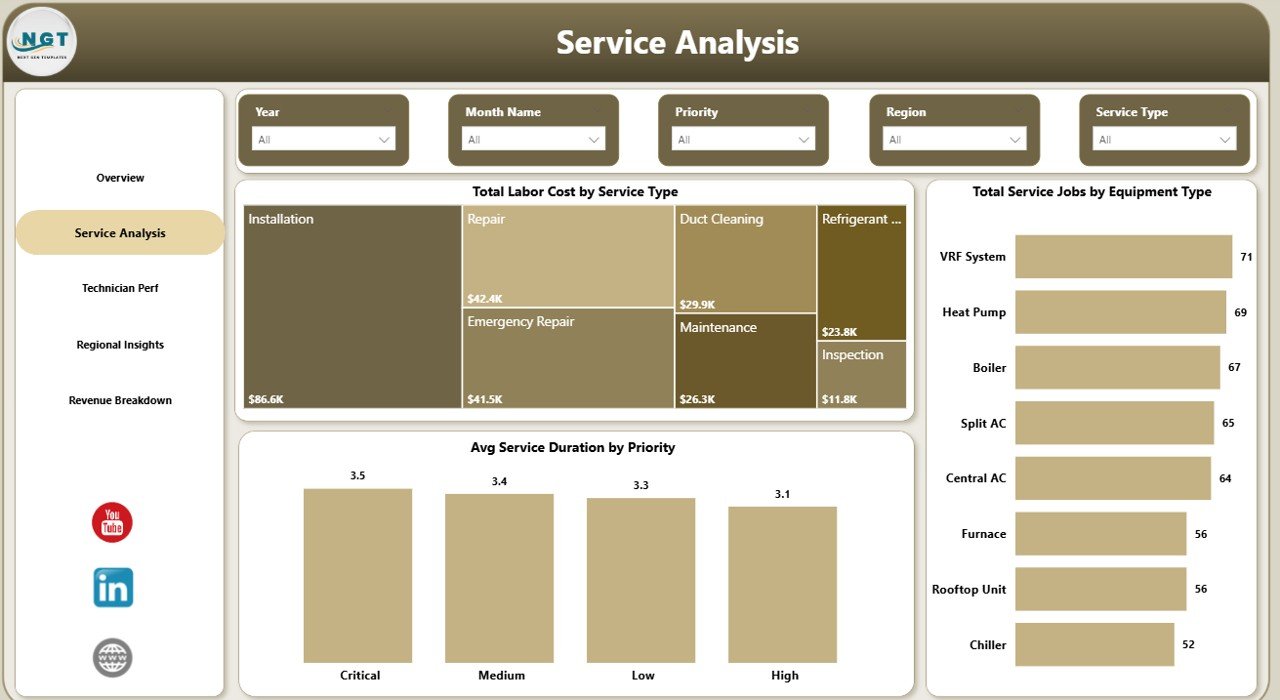
Service Analysis Page
Page 3 — Technician Performance
The Technician Performance page is the monthly review screen every service supervisor will bookmark. Avg Customer Rating by Technician surfaces the service-quality side of the story — a technician with a high completion rate but a 3.5-star average rating is a coaching opportunity, not a termination. Completion Rate by Technician ranks productivity head-to-head so favouritism cannot hide from the numbers. Total Service Jobs and Warranty Jobs by Technician flags technicians with high warranty-callback ratios, which is the single strongest leading indicator of install quality problems in the field.
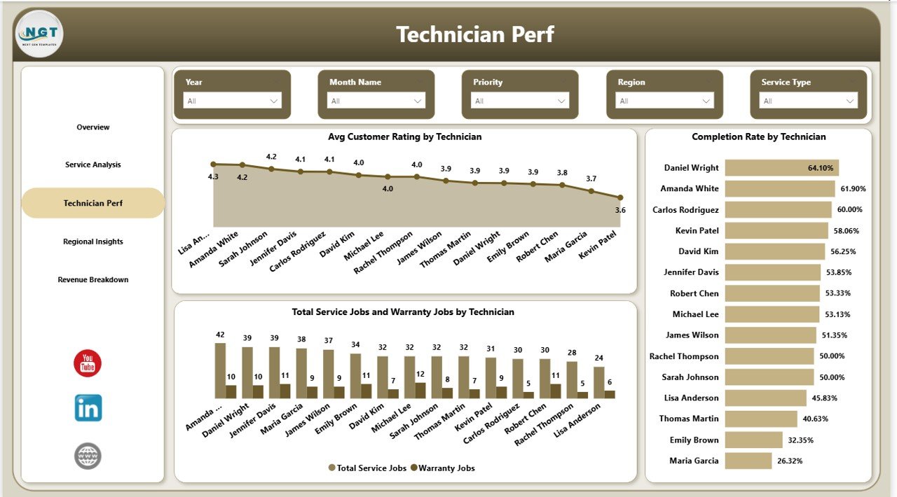
Technician Perf Page — Monthly Review Screen
Page 4 — Regional Insights
The Regional Insights page translates operational data into geographic profit for owners and sales leaders. Net Profit by Region ranks every service territory by bottom-line contribution — a region with high revenue but razor-thin net profit is usually hiding a parts-markup or travel-time problem that the Overview page alone will never surface. Total Service Jobs and Warranty Jobs by Region exposes which areas are generating the most repeat callbacks. Total Revenue and Total Parts Cost by Customer Type compares residential, commercial, and industrial contribution so you can decide where to invest sales effort next quarter.
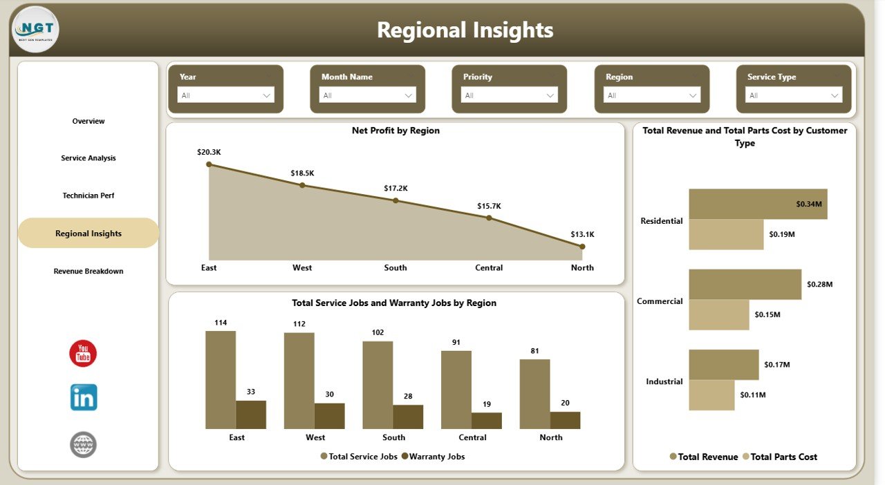
Regional Insights Page — Net Profit by Region
Page 5 — Revenue Breakdown
The Revenue Breakdown page is the finance-oriented view for CFOs and owners. Total Revenue by Equipment Type ranks revenue contribution across AC units, furnaces, heat pumps, boilers, and ventilation systems so you can double down on the most profitable equipment lines. Total Revenue by Warranty Covered shows how much of your top line is in-warranty (lower margin) versus billable (higher margin) — a critical input for pricing the next maintenance contract. Total Revenue by Service Status confirms how much invoiced revenue is already collected versus still pending, making monthly cash flow reviews a 30-second glance instead of a half-day reconciliation.
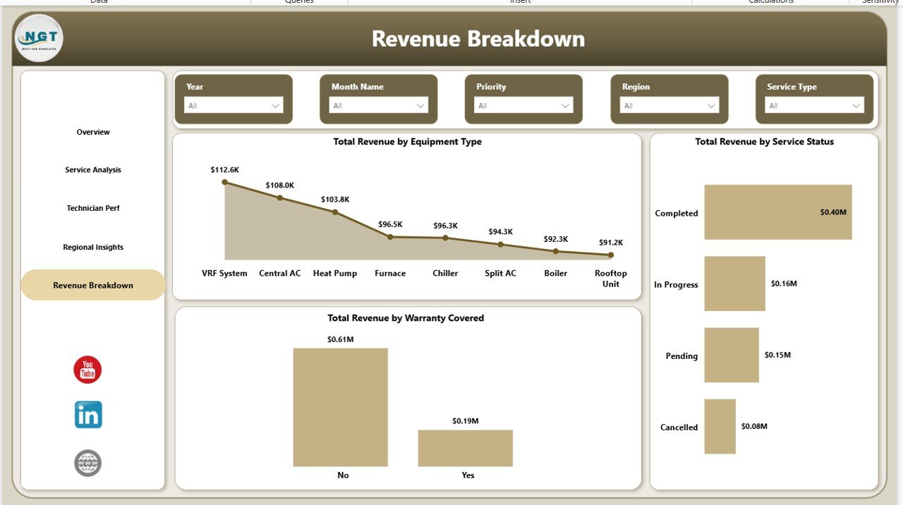
Revenue Breakdown Page — Equipment Type, Warranty Coverage, Service Status
HVAC Service Dashboard in Power BI vs. Excel Dashboard vs. ServiceTitan / Housecall Pro — Feature Comparison
| Feature | HVAC Service Dashboard in Power BI | Excel Dashboard equivalent | ServiceTitan / Housecall Pro |
|---|---|---|---|
| Cost | $17.99 one-time ✅ | $17.99–$24.99 one-time | $80–$300 / technician / month |
| Platform | Free Power BI Desktop ✅ | Microsoft Excel (licence required) | Proprietary SaaS |
| Setup time | Under 10 minutes ✅ | ~15 minutes | 2–6 weeks onboarding |
| DAX measures exposed | ✅ Fully editable | ❌ Pivot-driven only | ❌ Black-box vendor metrics |
| Works with any CRM export | ✅ CSV / Excel / SQL | ✅ CSV / Excel | ❌ Vendor data lock-in |
| Unlimited users | ✅ One licence, whole team | ✅ One licence, whole team | ❌ Per-technician pricing |
| Year-1 cost at 5 technicians | $17.99 ✅ | $17.99–$24.99 | $4,800–$18,000+ |
| Offline usage | ✅ Fully offline | ✅ Fully offline | ❌ Cloud-only |
For HVAC shops that want production-grade analytics without committing to $4,800+ per year in SaaS fees, the HVAC Service Dashboard in Power BI sits in the sweet spot.
Who Should Use This Template
Perfect for:
- HVAC service companies with 3–50 field technicians managing installs, repairs, and maintenance contracts
- Commercial HVAC contractors tracking warranty jobs, parts cost, and regional net profit
- Field service managers already using Power BI who want a pre-built analytics layer
- Facility maintenance teams replacing manual Excel exports with live technician scorecards
Not a fit if:
- You need tenant-facing scheduling, online booking, or digital invoicing — this is analytics, not a CRM
- You are an enterprise service firm requiring SOC 2, SSO, and ERP-level integrations
- Your source data lives only inside proprietary CRMs with no export capability
Real-World Use Cases
Marcus runs a 28-technician HVAC company across three metro areas. Every Monday he opens the HVAC Service Dashboard in Power BI, checks the Overview page for completion rate, flips to Technician Perf to see who had warranty callbacks over the weekend, and uses the Regional Insights page to decide where to route his sales closers. The weekly review takes 20 minutes, replacing the three-hour spreadsheet ritual his previous dispatcher built — and saving him the $420/technician/month ServiceTitan subscription his business partner wanted to sign last quarter.
Priya is an operations analyst at a commercial HVAC contractor. She loads the monthly service log into the dashboard, uses the Revenue Breakdown page to compare Total Revenue by Equipment Type across two quarters, and spots that heat-pump installs are quietly becoming 40% of revenue. That insight becomes the core of the sales team’s Q3 pivot toward heat-pump rebate programs — all from a one-time $17.99 purchase.
Daniel manages facilities for a 12-building commercial property portfolio. He uses the Service Analysis page to track Avg Service Duration by Priority so building owners can see emergency response is actually hitting the 4-hour SLA. The Regional Insights page lets him benchmark Net Profit by Region across his internal service team and two outside contractors, giving him a data-backed case for bringing more work in-house.
Advantages of the HVAC Service Dashboard in Power BI
- $17.99 one-time vs $80–$300/technician/month SaaS — you save $4,800–$18,000+ in year 1 on a 5-technician shop.
- Under 10-minute setup — no consultants, no onboarding training, no 6-week implementation plan.
- Full data ownership — the .pbix file lives on your computer, not a vendor’s cloud.
- Unlimited users — one licence, entire team access through Power BI Desktop.
- Fully customisable — open DAX measures, open visuals, open slicers. Change anything.
- Integrates with whatever you already use — connect to Excel, CSV, SQL, or your dispatch tool’s export.
Opportunities for Improvement
This dashboard is purpose-built for analytics, not field operations. It does not handle tenant communication, online booking, mobile technician dispatch, or invoicing — if you need those workflows, you still need a transactional field service CRM, and this template sits above that system as the analytics layer. Teams with very large operations (100+ technicians or 10,000+ monthly jobs) may also want to move the data model to Power BI Service with a gateway for scheduled refresh, which requires a Power BI Pro licence at $10/user/month. And if your source data export is inconsistent across months, you will need to standardise it once before the dashboard delivers clean numbers.
Best Practices
- Standardise your source data monthly — same columns, same data types, same technician IDs. Inconsistency breaks the data model silently.
- Use the Region and Technician slicers as your primary review lens — drill into one territory or technician at a time for cleaner operational conversations.
- Export the Overview page to PDF monthly as your owner or investor report — the layout is already presentation-ready.
- Watch the Avg Response Time by Priority chart — a rising emergency response time is the earliest warning of dispatch capacity problems.
- Review Warranty Jobs by Technician quarterly — technicians with high warranty ratios need coaching before they damage your reputation.
Explore Relevant Templates
- HVAC Service Dashboard in Excel — the same analytics in a pivot-table workbook if your team prefers Excel over Power BI.
- HVAC Service Dashboard in HTML — browser-based version that runs with no Excel or Power BI installation needed.
- Building Automation KPI Dashboard in Power BI — adjacent vertical for building-automation and smart-facility teams.
- Property Management Dashboard in Power BI — the landlord-side counterpart, perfect if your HVAC shop also manages buildings.
- Field Service KPI Dashboard in Google Sheets — Google Sheets alternative for teams living in Google Workspace.
- Browse more Power BI Dashboard Templates.
Frequently Asked Questions
What KPIs does the HVAC Service Dashboard in Power BI track?
The HVAC Service Dashboard in Power BI tracks 5 headline KPIs on the Overview page — Total Revenue, Total Service Jobs, Total Parts Cost, Total Labor Cost, and Completion Rate — plus 15+ secondary visuals covering technician performance, regional profit, service mix, equipment revenue, and warranty coverage. All metrics update automatically when you refresh your source data.
Do I need Power BI Pro or a paid Microsoft licence?
No. The HVAC Service Dashboard in Power BI runs in free Power BI Desktop. You only need Power BI Pro if you want to publish the report to Power BI Service for cloud team sharing. Local use, PDF export, and all 5 report pages work fully in the free Desktop version for one-person analysis and monthly review.
How does this compare to ServiceTitan or Housecall Pro?
ServiceTitan and Housecall Pro are full field-service SaaS platforms with dispatching, invoicing, and per-technician fees of $80–$300 per month. The HVAC Service Dashboard in Power BI is a one-time $17.99 analytics layer you own — no subscription, no per-technician fees, fully editable DAX measures, and it works alongside whatever dispatch tool you already use.
How long does setup take?
Setup takes under 10 minutes. Open the .pbix in Power BI Desktop, point the data source at your service log, and click Refresh. All 5 pages, 5 KPI cards, and 15+ visuals rebuild automatically. No visual editing, no DAX writing, and no consultant needed to go live on day one.
Can I add new technicians, regions, or equipment types?
Yes. The HVAC Service Dashboard in Power BI uses a flexible star-schema data model. Add rows to your source table for new technicians, service regions, or equipment categories, refresh the model, and every slicer, KPI, and chart automatically includes the new values — no visual-level editing required.
Is this a subscription or a one-time payment?
One-time payment of $17.99. You get instant download, full .pbix file ownership, lifetime access, and zero per-user fees. There is no subscription, no recurring charge, and no expiration on the HVAC Service Dashboard in Power BI — a single purchase serves your entire team for as long as you use Power BI Desktop.
About the Author
Built by PK — Microsoft Certified Professional with 15+ years of Excel, Google Sheets, and Power BI experience. Founder of NextGenTemplates, reaching 300K+ subscribers across YouTube channels. Every template is hand-built and tested before release.
Conclusion
An HVAC service business lives or dies on three numbers: completion rate, warranty ratio, and net profit per region. The HVAC Service Dashboard in Power BI brings all three into one .pbix file, adds the slicers you need to drill into them, and gives you a DAX measure library that keeps every visual in sync with a single click. Whether you run one shop or ten, this template will save you hours of manual reporting every month and help you spot problems before they become real money lost.
👉 Click here to Purchase the HVAC Service Dashboard in Power BI
✅ Instant download · One-time payment · No subscription · Lifetime access
📅 Last updated: April 2026
🎥 For Power BI video tutorials, visit Youtube.com/@PK-AnExcelExpert.