In today’s competitive business environment, Chambers of Commerce must track performance carefully to ensure sustainable growth and strong member engagement. However, managing multiple KPIs manually often creates confusion, delays reporting, and reduces visibility into important metrics.
Therefore, organizations increasingly rely on data-driven dashboards to monitor performance in real time. One powerful solution is the Chamber of Commerce KPI Dashboard in Power BI.
This dashboard provides a clear, interactive, and visually appealing way to analyze key performance indicators such as membership growth, financial performance, operational efficiency, and strategic initiatives. Moreover, it helps decision-makers quickly identify trends, evaluate targets, and improve performance.
Click to Purchases Chamber of Commerce KPI Dashboard in Power BI
In this comprehensive guide, you will learn everything about the Chamber of Commerce KPI Dashboard in Power BI, including its features, structure, advantages, best practices, and frequently asked questions.
What is a Chamber of Commerce KPI Dashboard in Power BI?
A Chamber of Commerce KPI Dashboard in Power BI is a ready-to-use business intelligence solution designed to monitor and analyze key performance indicators related to chamber operations.
Instead of managing spreadsheets manually, this dashboard centralizes KPI tracking and transforms raw data into meaningful insights.
Organizations can easily monitor:
-
Membership growth
-
Revenue and financial performance
-
Event participation
-
Operational efficiency
-
Strategic initiatives
-
Member engagement metrics
Because the dashboard connects with an Excel-based data source, users can update information quickly while Power BI automatically refreshes all visuals.
As a result, leaders can make faster and more informed decisions.
Why Do Chambers of Commerce Need KPI Dashboards?
Many chambers struggle to track performance effectively. Data often exists in multiple spreadsheets, reports, and systems.
Consequently, leaders find it difficult to answer important questions such as:
-
Are we meeting our membership growth targets?
-
How do our current KPIs compare with last year?
-
Which operational areas need improvement?
-
Which KPIs perform well this month?
A KPI dashboard solves these challenges by providing centralized performance monitoring.
Key Reasons to Use a KPI Dashboard
-
Real-time visibility into performance
-
Simplified reporting for leadership teams
-
Improved accountability across departments
-
Faster decision-making
-
Better strategic planning
Furthermore, Power BI dashboards transform complex data into interactive charts and visuals, making analysis much easier.
Key Features of the Chamber of Commerce KPI Dashboard in Power BI
This dashboard contains three powerful pages designed to provide detailed insights into organizational performance.
Each page serves a specific analytical purpose.
Click to Purchases Chamber of Commerce KPI Dashboard in Power BI
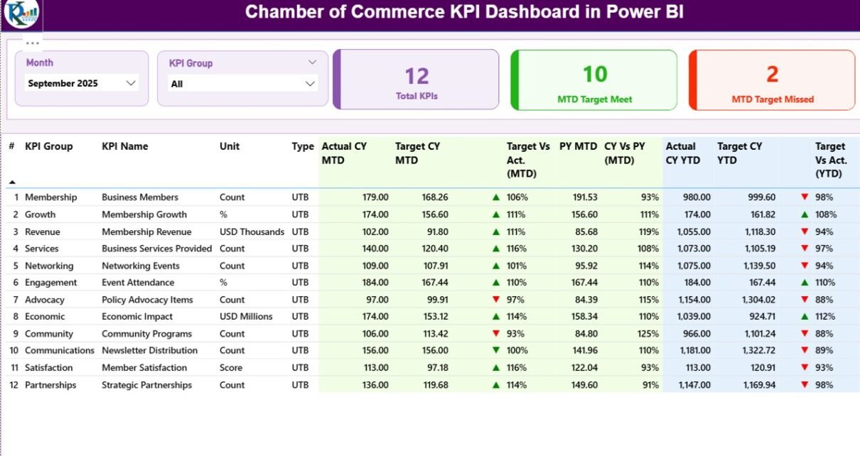
1. Summary Page – The Main Performance Overview
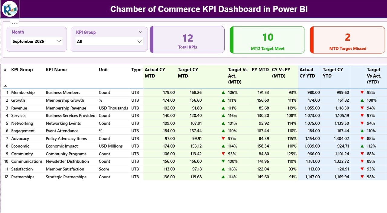
The Summary Page acts as the main control center of the dashboard. It displays key performance indicators in an organized and interactive format.
At the top of the dashboard, users will find two slicers:
-
Month slicer
-
KPI Group slicer
These slicers allow users to filter the dashboard instantly.
For example, leaders can view performance for a specific month or KPI category.
Click to Purchases Chamber of Commerce KPI Dashboard in Power BI
KPI Performance Cards
The summary page displays three key performance cards:
-
Total KPIs Count – Total number of KPIs being tracked.
-
MTD Target Meet Count – Number of KPIs that achieved targets in the current month.
-
MTD Target Missed Count – Number of KPIs that failed to meet targets.
These cards immediately highlight organizational performance.
Detailed KPI Table
Below the cards, the dashboard shows a detailed KPI performance table.
This table contains multiple important metrics.
KPI Number
This field represents the sequence number of each KPI.
KPI Group
This column categorizes KPIs into different groups such as:
-
Membership
-
Finance
-
Operations
-
Events
-
Engagement
Grouping KPIs helps organizations analyze performance by department.
KPI Name
This field displays the specific name of the KPI.
For example:
-
Member Growth Rate
-
Event Participation Rate
-
Sponsorship Revenue
Unit
This column shows the unit of measurement used for the KPI.
Examples include:
-
Percentage (%)
-
Number of members
-
Revenue value
KPI Type
The dashboard includes two KPI types:
LTB – Lower the Better
Examples include:
-
Operational costs
-
Complaint rate
-
Event cancellations
UTB – Upper the Better
Examples include:
-
Membership growth
-
Revenue
-
Event participation
This classification helps determine KPI success automatically.
Current Year MTD Actual
Actual CY MTD shows the actual value of the KPI for the current month-to-date period.
For example, if the KPI tracks event registrations, this field shows the total registrations recorded so far.
Current Year MTD Target
Target CY MTD displays the expected performance target for the current month.
Comparing this with actual numbers helps determine whether the organization performs well.
Click to Purchases Chamber of Commerce KPI Dashboard in Power BI
MTD Status Icon
The dashboard visually indicates KPI performance using icons.
-
▲ Green arrow → Target achieved
-
▼ Red arrow → Target missed
Because of these indicators, managers can quickly identify performance issues.
Target vs Actual (MTD)
This column calculates the percentage comparison between target and actual values.
Formula used:
Actual MTD ÷ Target MTD
This metric shows how close the organization is to meeting targets.
Previous Year MTD
The PY MTD field displays the KPI value from the same period in the previous year.
Comparing historical performance helps identify growth trends.
Current Year vs Previous Year (MTD)
This metric compares:
Current Year MTD ÷ Previous Year MTD
It helps determine whether the organization improves compared to last year.
Current Year YTD Actual
The Actual CY YTD field shows the year-to-date performance of each KPI.
This allows leaders to track progress throughout the year.
Current Year YTD Target
The Target CY YTD field displays the expected target for the year-to-date period.
This enables long-term performance monitoring.
YTD Status Icon
Just like the MTD indicator, the dashboard uses visual icons for YTD performance:
-
Green arrow for success
-
Red arrow for missed targets
Therefore, managers can quickly assess performance.
Target vs Actual (YTD)
Formula used:
Actual YTD ÷ Target YTD
This percentage indicates the overall progress toward annual targets.
Previous Year YTD
This metric shows YTD performance for the previous year.
Historical comparisons help evaluate growth trends.
Current Year vs Previous Year (YTD)
Formula used:
Current Year YTD ÷ Previous Year YTD
This comparison shows whether the organization improves year over year.
2. KPI Trend Page – Performance Trend Analysis
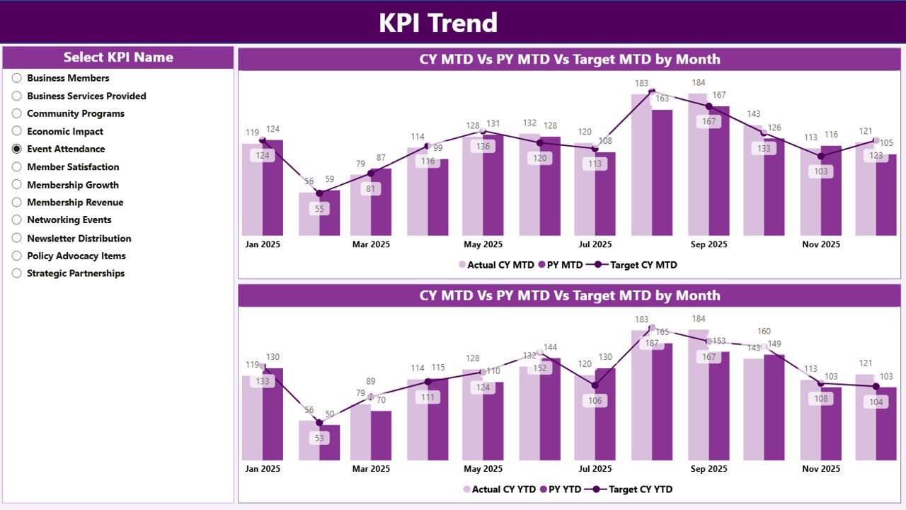
The KPI Trend Page focuses on trend analysis.
Instead of viewing static numbers, users can observe performance changes over time.
The page contains two combo charts:
-
MTD Performance Trend
-
YTD Performance Trend
These charts display:
-
Current year actual values
-
Previous year performance
-
Target values
Therefore, leaders can easily identify patterns.
KPI Selection Slicer
The page also includes a KPI Name slicer.
Users can select a specific KPI to view its trend.
For example:
-
Membership Growth KPI
-
Event Revenue KPI
-
Member Satisfaction KPI
This interactive feature allows detailed performance analysis.
Click to Purchases Chamber of Commerce KPI Dashboard in Power BI
3. KPI Definition Page – Drill-Through KPI Details
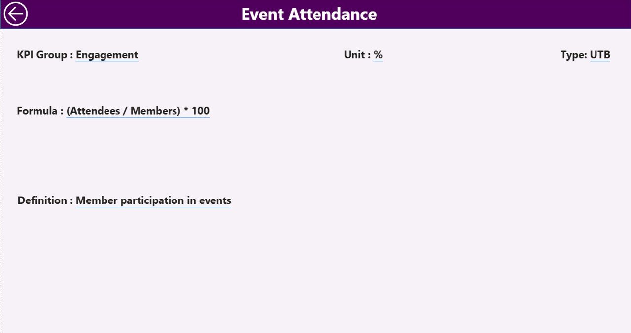
The KPI Definition Page serves as a hidden drill-through page.
Users can access it directly from the summary page.
When a user drills through a KPI, the dashboard displays detailed information such as:
-
KPI formula
-
KPI definition
-
KPI measurement unit
-
KPI category
This page helps users understand how each KPI is calculated.
Additionally, a Back Button allows users to return to the main dashboard quickly.
Excel Data Source Structure
The Power BI dashboard uses an Excel file as its data source.
This Excel file contains three worksheets that store all required data.
1. Input Actual Sheet
This sheet stores actual KPI values.
Users must enter the following information:
-
KPI Name
-
Month (first date of the month)
-
MTD values
-
YTD values
Once the data updates, Power BI refreshes the dashboard automatically.
2. Input Target Sheet
This sheet stores target KPI values.
Users must enter:
-
KPI Name
-
Month
-
MTD target
-
YTD target
Targets help evaluate performance against goals.
3. KPI Definition Sheet
This sheet contains detailed KPI information.
Fields include:
-
KPI Number
-
KPI Group
-
KPI Name
-
Unit
-
Formula
-
Definition
-
KPI Type (LTB or UTB)
This information helps maintain KPI consistency across the organization.
Advantages of Chamber of Commerce KPI Dashboard in Power BI
Using this dashboard offers multiple benefits.
1. Centralized KPI Monitoring
All performance metrics appear in one location.
2. Real-Time Insights
Power BI updates visuals instantly after data refresh.
3. Improved Decision-Making
Leadership teams can identify performance issues quickly.
4. Interactive Analysis
Users can filter data by month or KPI category.
5. Visual Performance Indicators
Icons and charts simplify complex data interpretation.
6. Historical Performance Comparison
The dashboard compares current performance with previous year metrics.
7. Better Accountability
Departments can track their KPIs more effectively.
Opportunities for Improvement in KPI Dashboards
Although KPI dashboards offer many advantages, organizations can still improve their analytics.
Add Predictive Analytics
Using AI-based forecasting can improve strategic planning.
Integrate Multiple Data Sources
Connecting CRM, accounting, and event management systems improves insights.
Automate Data Updates
Automated data pipelines reduce manual entry errors.
Implement Role-Based Dashboards
Different departments may require customized dashboards.
Best Practices for the Chamber of Commerce KPI Dashboard
To maximize the value of this dashboard, organizations should follow these best practices.
Define Clear KPIs
Choose KPIs that align with organizational goals.
Maintain Data Accuracy
Regularly update the Excel data source.
Use Consistent KPI Definitions
Ensure all departments follow the same KPI definitions.
Review Dashboard Regularly
Leadership teams should review KPIs monthly.
Train Staff on Dashboard Usage
Users should understand how to interpret metrics.
Monitor Both MTD and YTD Metrics
Short-term and long-term analysis ensures balanced performance tracking.
How Does Power BI Improve KPI Reporting?
Click to Purchases Chamber of Commerce KPI Dashboard in Power BI
Power BI provides several advantages compared to traditional reporting methods.
Interactive Visualizations
Users can explore data dynamically.
Fast Data Processing
Power BI handles large datasets efficiently.
Automated Reporting
Reports update automatically after data refresh.
Easy Data Integration
Power BI connects with Excel, databases, and cloud systems.
Conclusion
The Chamber of Commerce KPI Dashboard in Power BI provides a powerful solution for tracking organizational performance.
Instead of relying on static reports, chambers can monitor KPIs through interactive visuals, trend analysis, and performance indicators.
Because the dashboard combines MTD, YTD, target comparisons, and historical analysis, leaders gain deeper insights into performance trends.
Moreover, the Excel-based data source makes updates simple and efficient.
When organizations implement this dashboard properly, they improve decision-making, transparency, and strategic planning.
Therefore, adopting a KPI dashboard in Power BI becomes an essential step toward modern, data-driven chamber management.
Frequently Asked Questions (FAQs)
What is a KPI dashboard in Power BI?
A KPI dashboard in Power BI is an interactive reporting tool that tracks key performance indicators using visual charts, metrics, and comparisons.
Why should a Chamber of Commerce use a KPI dashboard?
A KPI dashboard helps chambers monitor performance, track membership growth, analyze financial metrics, and improve decision-making.
What data source does the dashboard use?
This dashboard uses an Excel file containing three worksheets: Actual data, Target data, and KPI definitions.
What is the difference between MTD and YTD?
-
MTD (Month-to-Date) shows performance for the current month.
-
YTD (Year-to-Date) shows performance from the beginning of the year until the current date.
What are LTB and UTB KPIs?
-
LTB (Lower the Better) means lower values indicate better performance.
-
UTB (Upper the Better) means higher values indicate better performance.
Can organizations customize this dashboard?
Yes. Organizations can add additional KPIs, modify visuals, and connect new data sources.
Visit our YouTube channel to learn step-by-step video tutorials