Modern manufacturing facilities rely heavily on automation units, robotic systems, and smart machinery to improve productivity, efficiency, and operational accuracy. However, managing these automation systems requires continuous monitoring of maintenance activities, operational efficiency, downtime, and energy consumption.
Many companies still track automation performance through manual spreadsheets and scattered reports. As a result, managers struggle to identify equipment failures, analyze maintenance costs, or monitor machine efficiency across departments. Consequently, operational inefficiencies increase and maintenance costs rise.
Click to Purchases Automation Units Dashboard in Excel
Therefore, organizations increasingly use data-driven dashboards to monitor automation systems. One powerful solution is the Automation Units Dashboard in Excel.
The Automation Units Dashboard in Excel provides a centralized analytical platform where managers can monitor automation performance, maintenance trends, operational efficiency, downtime hours, and energy consumption. Because Excel offers flexibility, automation managers can easily customize and analyze automation data through interactive charts and filters.
In this article, you will learn everything about the Automation Units Dashboard in Excel, including its features, benefits, components, best practices, and frequently asked questions.
What is an Automation Units Dashboard in Excel?
An Automation Units Dashboard in Excel is an interactive reporting tool that helps organizations track the performance of automated equipment and machines across departments, vendors, and operational units.
The dashboard consolidates data related to:
-
Maintenance activities
-
Equipment efficiency
-
Downtime hours
-
Defect rates
-
Vendor performance
-
Energy consumption
-
Maintenance costs
Instead of reviewing multiple reports, managers can quickly analyze automation performance through interactive charts, KPI cards, and analytical reports.
Because Excel supports formulas, pivot tables, slicers, and charts, the dashboard provides real-time insights into automation systems.
Why Do Companies Need an Automation Units Dashboard?
Automation systems generate a large amount of operational data. However, without a structured reporting system, analyzing that data becomes difficult.
Companies need an Automation Units Dashboard for several reasons.
1. Monitor Machine Performance
Managers can easily track the efficiency and performance of automation units across different departments.
2. Track Maintenance Costs
Maintenance costs can quickly increase in industrial environments. Therefore, the dashboard helps organizations analyze maintenance expenses by:
-
Department
-
Vendor
-
Unit type
-
Location
3. Reduce Equipment Downtime
Downtime directly impacts productivity. The dashboard highlights downtime trends and helps managers identify problem areas quickly.
4. Improve Operational Efficiency
When organizations monitor efficiency scores and defect rates regularly, they can improve production performance.
5. Support Data-Driven Decisions
Because the dashboard provides visual insights, decision-makers can easily identify issues and implement improvements.
Key Features of the Automation Units Dashboard in Excel
The Automation Units Dashboard in Excel includes several powerful features that help organizations analyze automation performance effectively.
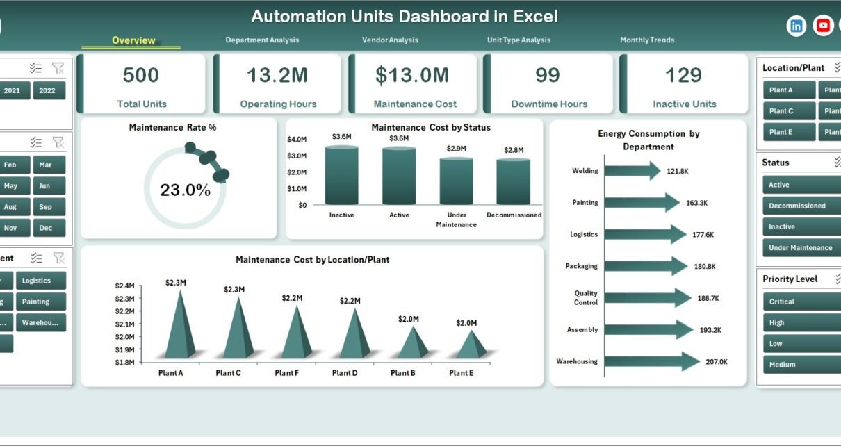
Page Navigator
The dashboard includes a Page Navigator located on the left side of the screen.
This feature allows users to quickly switch between different analytical pages, such as:
-
Overview Page
-
Department Analysis
-
Vendor Analysis
-
Unit Type Analysis
-
Month Analysis
Therefore, users can easily explore different aspects of automation performance without scrolling through multiple sheets.
Click to Purchases Automation Units Dashboard in Excel
How Many Pages Are Available in the Dashboard?
The dashboard contains five analytical pages inside the Excel application. Each page focuses on a different type of analysis.
Let’s explore each page in detail.
1. Overview Page – What Insights Does It Provide?
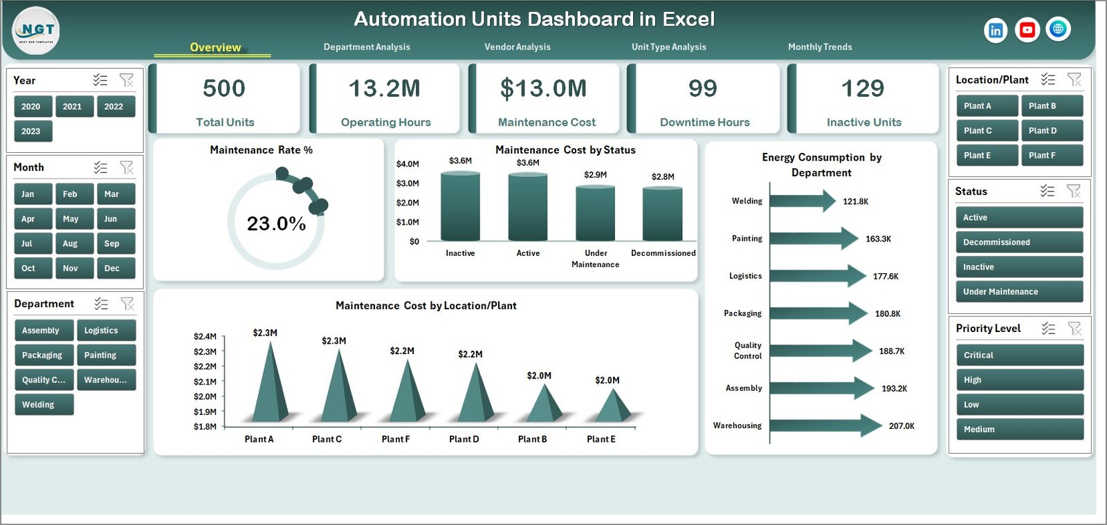
The Overview Page acts as the main summary page of the dashboard.
This page provides a high-level view of automation system performance. Managers can quickly understand operational conditions without opening multiple reports.
Key Components of the Overview Page
The page contains:
-
Interactive slicers on the right side
-
KPI cards displaying key automation metrics
-
Multiple analytical charts
KPI Cards Display Key Performance Indicators
The dashboard includes four KPI cards that highlight important automation metrics.
These KPI cards help managers track performance quickly.
Charts Available on the Overview Page
The overview page contains the following charts:
-
Maintenance Rate (%)
-
Maintenance Cost by Status
-
Energy Consumption by Department
-
Maintenance Cost by Location or Plant
These visualizations help managers monitor the overall condition of automation systems across locations and departments.
2. Department Analysis – How Does It Improve Operational Visibility?
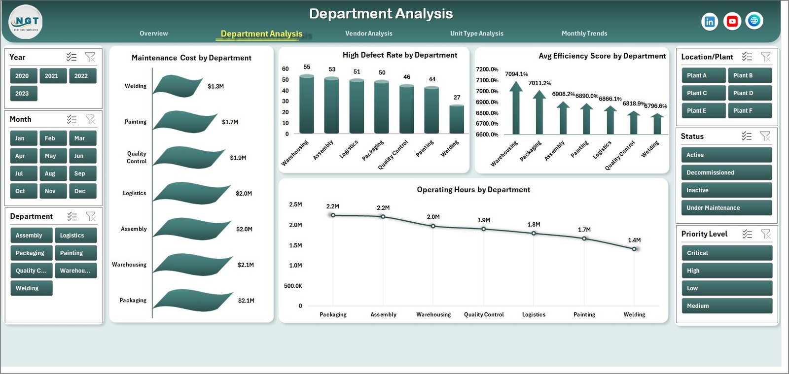
The Department Analysis Page provides insights into automation performance across different departments.
Because each department operates different automation equipment, performance levels often vary.
Therefore, this page helps managers identify departments that require maintenance improvements.
Charts Available in Department Analysis
The page includes four analytical charts:
-
Maintenance Cost by Department
-
High Defect Rate by Department
-
Average Efficiency Score by Department
-
Operating Hours by Department
These charts allow organizations to compare automation performance across departments.
As a result, managers can identify which department requires operational improvements.
3. Vendor Analysis – Why Is Vendor Performance Important?
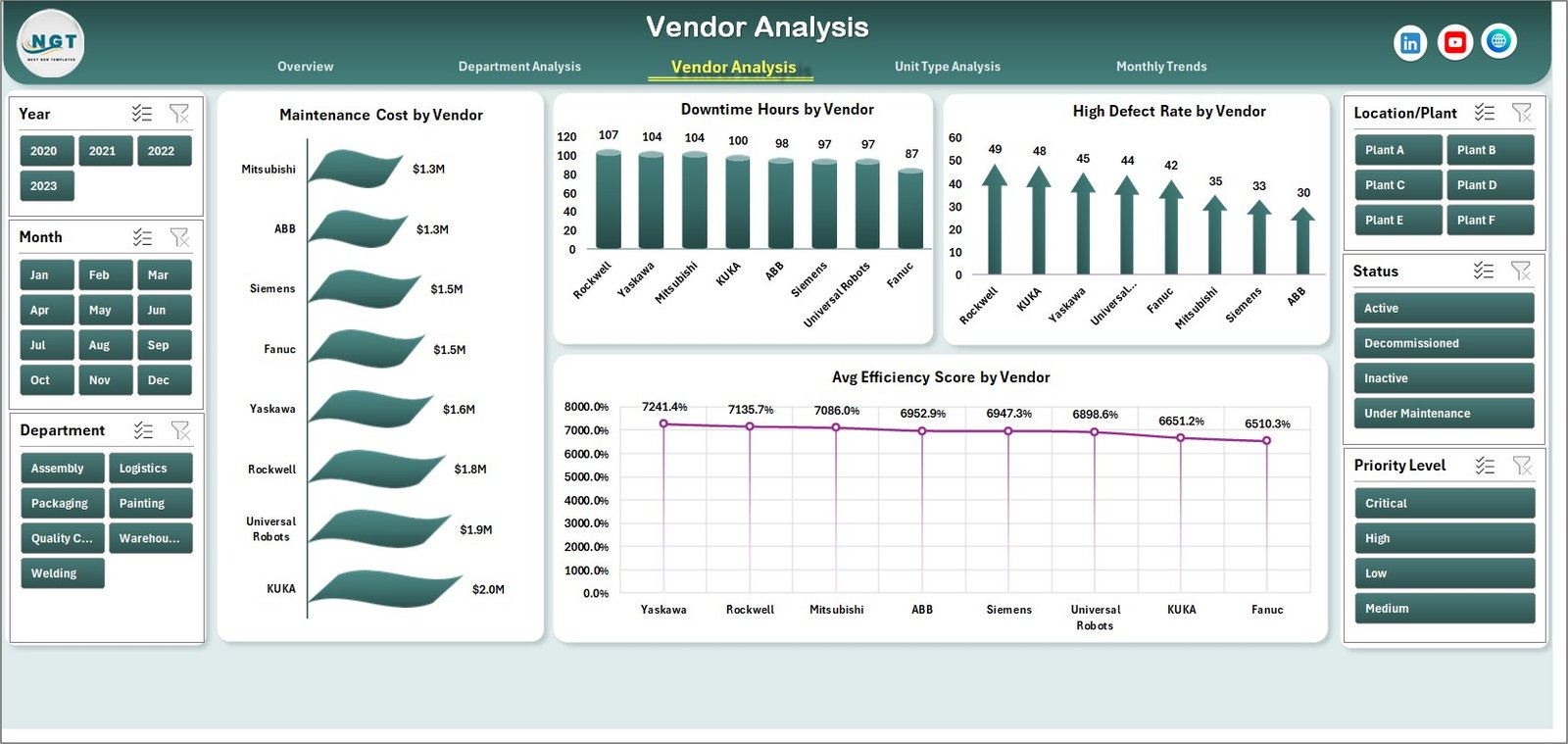
Automation units often rely on external vendors for maintenance services, spare parts, and system upgrades.
Therefore, organizations must monitor vendor performance regularly.
The Vendor Analysis Page helps managers evaluate vendor contributions and service quality.
Charts Available in Vendor Analysis
The vendor analysis page includes the following charts:
-
Maintenance Cost by Vendor
-
Downtime Hours by Vendor
-
High Defect Rate by Vendor
-
Average Efficiency Score by Vendor
These insights help organizations choose reliable vendors and improve vendor contracts.
4. Unit Type Analysis – How Can It Improve Equipment Planning?
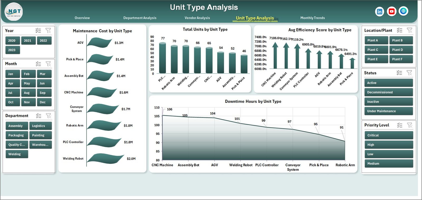
Automation systems include different types of machines, such as:
-
Robotic arms
-
CNC machines
-
Packaging automation units
-
Assembly line robots
Each type of equipment behaves differently in terms of maintenance and efficiency.
The Unit Type Analysis Page helps managers analyze performance based on machine type.
Charts Available in Unit Type Analysis
This page includes four charts:
-
Maintenance Cost by Unit Type
-
Total Units by Unit Type
-
Average Efficiency Score by Unit Type
-
Downtime Hours by Unit Type
These insights help organizations plan equipment upgrades and optimize machine utilization.
Click to Purchases Automation Units Dashboard in Excel
5. Month Analysis – How Does Monthly Monitoring Help?
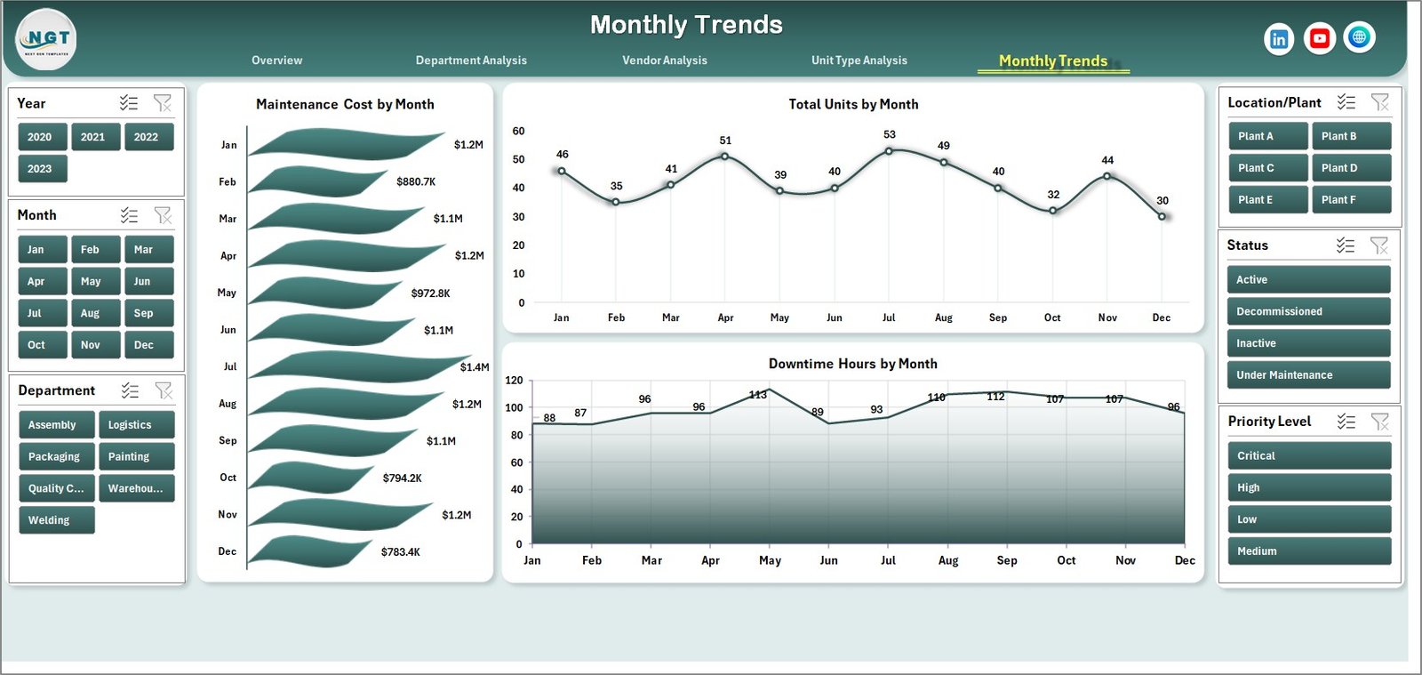
The Month Analysis Page allows organizations to track automation performance over time.
Because automation performance fluctuates due to maintenance schedules and production demands, monthly monitoring becomes essential.
Charts Available in Month Analysis
The page includes the following charts:
-
Maintenance Cost by Month
-
Total Units by Month
-
Downtime Hours by Month
These charts help organizations identify trends in automation performance and maintenance costs.
Support Sheet – Why Is It Important?
The Support Sheet stores reference information used by the dashboard.
This sheet may include:
-
Department lists
-
Vendor names
-
Unit types
-
Location data
-
Status categories
Because the support sheet standardizes data, it helps maintain data consistency across the dashboard.
Data Sheet – What Data Does It Contain?
The Data Sheet contains the raw operational data used in the dashboard.
This sheet usually includes fields such as:
-
Unit ID
-
Department
-
Unit Type
-
Vendor
-
Location
-
Maintenance Cost
-
Operating Hours
-
Downtime Hours
-
Efficiency Score
-
Energy Consumption
-
Maintenance Status
-
Defect Rate
-
Month
Once users update this sheet, the dashboard automatically refreshes all charts and analysis.
Advantages of the Automation Units Dashboard in Excel
Click to Purchases Automation Units Dashboard in Excel
Organizations gain several benefits when they use this dashboard.
1. Centralized Performance Monitoring
The dashboard consolidates all automation data into one system.
2. Improved Maintenance Planning
Managers can analyze maintenance costs and plan preventive maintenance schedules.
3. Faster Decision-Making
Interactive charts allow managers to quickly identify operational issues.
4. Reduced Equipment Downtime
The dashboard highlights downtime patterns, which helps reduce machine failures.
5. Better Vendor Management
Organizations can evaluate vendor performance based on maintenance quality.
6. Higher Operational Efficiency
When companies monitor automation metrics regularly, they improve productivity.
7. Easy Customization
Because the dashboard uses Excel, organizations can modify it according to their operational needs.
Best Practices for the Automation Units Dashboard in Excel
Organizations should follow certain best practices to maximize the value of the dashboard.
Maintain Accurate Data
Always update the data sheet regularly. Accurate data ensures reliable analysis.
Use Consistent Data Formats
Standardize formats for dates, departments, and vendors.
Monitor KPIs Regularly
Managers should review automation KPIs weekly or monthly.
Implement Preventive Maintenance
Use dashboard insights to schedule preventive maintenance activities.
Track Vendor Performance
Regularly evaluate vendors based on maintenance efficiency and downtime impact.
Train Staff on Dashboard Usage
Ensure that operations teams understand how to interpret dashboard metrics.
How Does This Dashboard Help Industrial Automation Teams?
Automation teams rely on continuous monitoring to maintain machine efficiency.
This dashboard helps them:
-
Track equipment health
-
Monitor maintenance activities
-
Identify high-defect machines
-
Reduce downtime
-
Improve vendor collaboration
Consequently, organizations can maintain smooth production operations.
Conclusion
Industrial automation systems play a critical role in modern manufacturing and operational environments. However, organizations must monitor automation performance continuously to maintain productivity, reduce downtime, and control maintenance costs.
The Automation Units Dashboard in Excel provides a powerful and easy-to-use solution for tracking automation performance. Because the dashboard consolidates data into interactive charts and reports, managers can easily analyze operational efficiency, vendor performance, maintenance costs, and downtime trends.
Moreover, Excel makes the dashboard flexible and customizable for different industries.
Therefore, organizations that implement this dashboard can improve operational transparency, reduce equipment failures, and make better data-driven decisions.
Frequently Asked Questions (FAQs)
What is an Automation Units Dashboard in Excel?
An Automation Units Dashboard in Excel is an analytical tool that helps organizations monitor automation equipment performance, maintenance costs, downtime hours, and efficiency metrics.
Who can use this dashboard?
Many professionals can use this dashboard, including:
-
Manufacturing managers
-
Automation engineers
-
Maintenance teams
-
Plant supervisors
-
Operations managers
Can this dashboard be customized?
Yes. Because the dashboard is built in Excel, users can easily customize charts, formulas, and data fields.
What type of data does the dashboard require?
The dashboard requires automation-related data such as:
-
Maintenance cost
-
Operating hours
-
Downtime hours
-
Efficiency scores
-
Vendor information
-
Department data
-
Unit type
How often should the dashboard be updated?
Organizations should update the dashboard regularly, preferably weekly or monthly, to maintain accurate insights.
Visit our YouTube channel to learn step-by-step video tutorials