Ceramic manufacturing involves many moving parts every single day. You need to monitor production volume, raw material cost, energy usage, quality levels, defective units, operator performance, plant efficiency, and monthly trends. When all this information sits in different sheets and reports, the work becomes slow, confusing, and stressful.
Click to Purchases Ceramic Manufacturing Dashboard in Power BI
So, how can you manage ceramic production data in a faster and smarter way?
The answer is simple: Ceramic Manufacturing Dashboard in Power BI.
This dashboard helps ceramic manufacturers bring important business data into one interactive place. As a result, plant managers, production heads, quality teams, and business owners can quickly understand what is happening across the production floor. Instead of checking reports manually, they can use visual charts, KPI cards, and slicers to make better decisions in less time.
In this article, you will learn what a Ceramic Manufacturing Dashboard in Power BI is, why it matters, what pages it includes, how each chart helps, and how your business can benefit from it.
What Is a Ceramic Manufacturing Dashboard in Power BI?
A Ceramic Manufacturing Dashboard in Power BI is an interactive business intelligence report designed to track and analyze ceramic production data. It collects data from your manufacturing process and turns it into easy-to-read visuals, cards, and charts.
Because of this, users can quickly monitor production output, quality score, energy cost, raw material cost, and plant-wise performance without going through raw data.
Moreover, Power BI gives you dynamic filtering options. Therefore, you can use slicers to focus on a specific plant, operator, shift, month, product type, or production line. This makes reporting more useful and more practical.
Why Is a Ceramic Manufacturing Dashboard Important?
Ceramic manufacturing requires close control over cost, production, and quality. If you miss even one important metric, profits may drop, waste may increase, and performance may suffer.
That is why this dashboard becomes so valuable.
It helps you:
- Track total production in one view
- Monitor raw material and energy expenses
- Compare plant and operator performance
- Identify defective production areas quickly
- Analyze production patterns across months
- Improve quality control decisions
- Reduce time spent on manual reporting
In addition, the dashboard helps management react faster. Instead of waiting for long reports, decision-makers can view real-time insights and take action quickly.
Who Can Use the Ceramic Manufacturing Dashboard in Power BI?
This dashboard is useful for many professionals in the ceramic manufacturing industry. For example:
- Plant Managers
- Production Supervisors
- Factory Owners
- Quality Control Teams
- Cost Analysts
- Operations Managers
- Supply Chain Teams
- Business Analysts
Since the dashboard presents data in a visual and structured format, both technical and non-technical users can understand it easily.
What Makes Power BI a Great Choice for Ceramic Manufacturing Reporting?
Power BI is one of the best tools for reporting and analytics. It is powerful, interactive, and user-friendly. More importantly, it turns raw manufacturing data into meaningful business insights.
Here is why Power BI works so well for ceramic manufacturing dashboards:
1. It creates interactive dashboards
Users can click filters, slicers, and visuals to explore the data instantly. Because of that, analysis becomes fast and flexible.
2. It handles large data easily
Ceramic manufacturing often produces a lot of records. Power BI manages large datasets efficiently, so performance stays smooth.
3. It improves decision-making
Visual reports help users identify trends, problems, and opportunities faster. Therefore, management can act without delay.
4. It supports real-time refresh
When you update the source data, the dashboard can refresh quickly. As a result, the latest information becomes available without creating new reports from scratch.
What Does the Ceramic Manufacturing Dashboard in Power BI Include?
This dashboard contains five powerful pages, and each page focuses on a different part of the manufacturing process:
- Overview Page
- Production Analysis
- Quality Control
- Cost Analysis
- Plant Performance
Each page gives useful insights through charts, cards, and slicers. Let us understand them one by one.
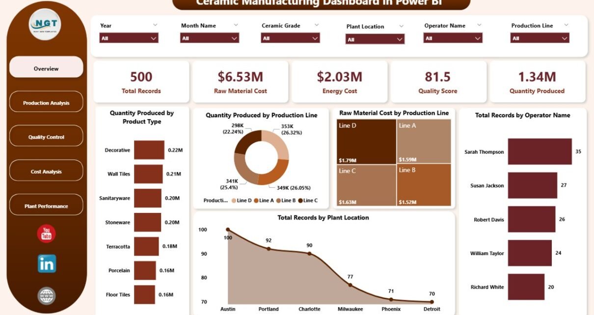
What Can You See on the Overview Page?
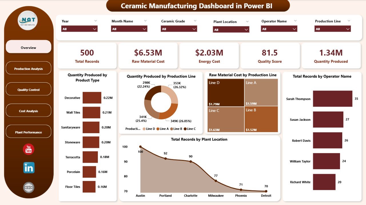
The Overview Page gives you a complete summary of your ceramic manufacturing operations. It shows high-level metrics at the top, and it also includes charts that help users understand the business quickly.
KPI Cards on the Overview Page
The top section includes these important cards:
- Total Records – Shows the total number of data entries available in the report.
- Raw Material Cost – Displays the total cost spent on raw materials.
- Energy Cost – Shows how much energy cost the production process consumed.
- Quality Score – Highlights the overall quality performance.
- Quantity Produced – Displays the total number of ceramic units produced.
These cards help users understand the overall business condition at a glance. Because they appear at the top, users can start their analysis immediately.
Charts Used on the Overview Page
1. Quantity Produced by Product Type
This chart shows which ceramic product types contribute the most to total production. Therefore, users can quickly understand product-wise production distribution.
It also helps management identify top-performing products and weaker product categories. As a result, planning becomes more focused.
2. Quantity Produced by Production
This chart shows how production output spreads across production categories or production lines. Because of that, managers can compare output levels quickly.
In addition, it helps identify which production area performs better and which one may need attention.
3. Raw Material Cost by Production
This chart compares raw material spending across production segments. Therefore, users can see where material cost is high.
It also supports cost control decisions because it highlights production areas that consume more resources.
4. Total Records by Plant Location
This chart shows how many records belong to each plant location. As a result, users can understand location-wise activity and reporting volume.
Moreover, it helps compare data distribution between different manufacturing plants.
5. Total Records by Operator Name
This chart displays record count by operator name. Therefore, managers can track operator-level involvement and contribution.
It also gives a quick view of workforce activity across the production process.
How Does the Production Analysis Page Help?
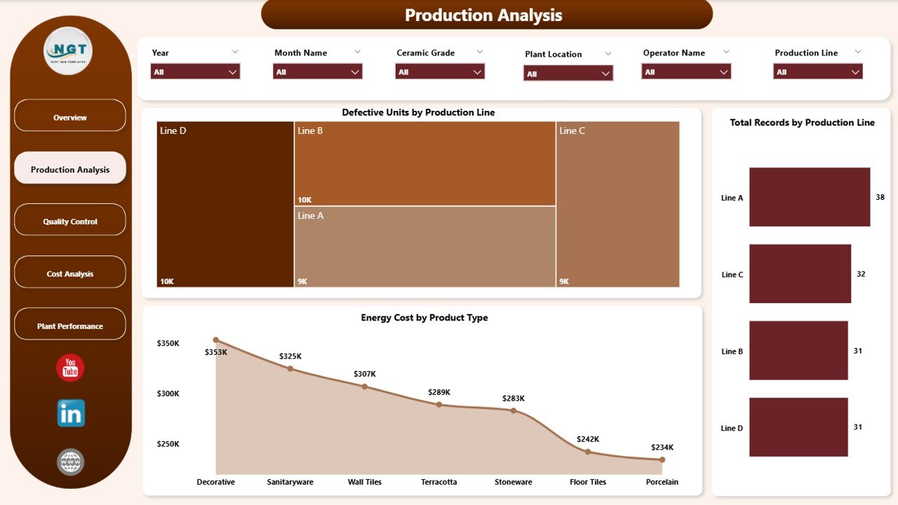
The Production Analysis page focuses on production performance and defects. This page is useful for production teams because it helps them understand where output is strong and where issues appear.
Charts Used on the Production Analysis Page
1. Defective Units by Production
This chart shows the number of defective units across different production areas. Therefore, teams can quickly identify where rejection levels are higher.
It also helps reduce waste because managers can focus improvement efforts on the weak production area.
2. Total Records by Production
This chart displays how many records belong to each production category. As a result, users can understand the activity volume in each section.
In addition, it helps compare data flow and operational presence across production groups.
3. Energy Cost by Product Type
This chart shows how much energy cost each product type consumes. Therefore, users can identify which products are more expensive to produce in terms of power usage.
This becomes very helpful when companies want to improve energy efficiency and reduce operational costs.
Why Is the Quality Control Page So Useful?
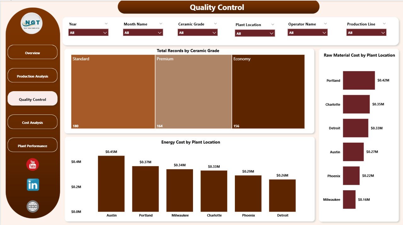
Quality is one of the most important parts of ceramic manufacturing. Even if production is high, poor quality can lead to customer complaints, returns, and profit loss.
That is why the Quality Control page plays a very important role.
Charts Used on the Quality Control Page
1. Total Records by Ceramic Grade
This chart shows record count by ceramic grade. Therefore, users can understand how data spreads across different quality grades.
It also helps quality teams study the volume and performance of each ceramic grade more clearly.
2. Raw Material Cost by Plant Location
This chart compares raw material spending across plant locations. As a result, plant-wise cost differences become easy to identify.
Moreover, it helps managers investigate whether certain plants use materials less efficiently than others.
3. Energy Cost by Plant Location
This chart shows energy usage cost for each plant location. Therefore, businesses can compare plant efficiency more effectively.
It also supports cost optimization because energy-heavy plants can be reviewed for process improvement.
What Insights Can You Get from the Cost Analysis Page?
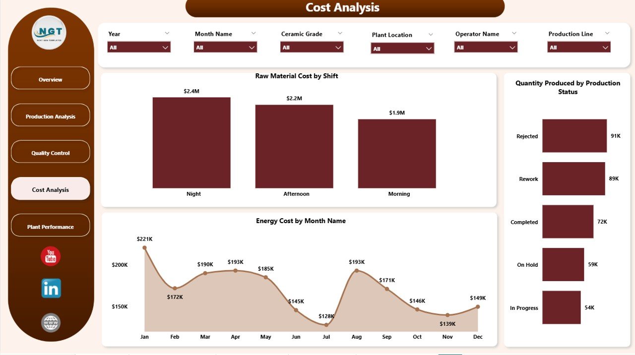
Cost control is essential in every manufacturing business. Raw materials and energy often take a large share of total expenses. So, if you do not track cost carefully, profitability can drop quickly.
The Cost Analysis page helps solve that issue.
Charts Used on the Cost Analysis Page
1. Raw Material Cost by Shift
Click to Purchases Ceramic Manufacturing Dashboard in Power BI
This chart shows raw material cost across different shifts. Therefore, managers can compare which shift uses materials more heavily.
It also helps detect process inconsistency between shifts, which can improve planning and training.
2. Quantity Produced by Production Status
This chart displays production quantity based on production status. As a result, users can understand output at different stages or statuses.
This chart is useful because it shows whether production moves smoothly or whether bottlenecks affect output.
3. Energy Cost by Month Name
This chart tracks monthly energy cost trends. Therefore, users can see which months have higher energy expenses.
It also helps businesses plan seasonal budgets and understand long-term energy consumption patterns.
How Does the Plant Performance Page Improve Decision-Making?
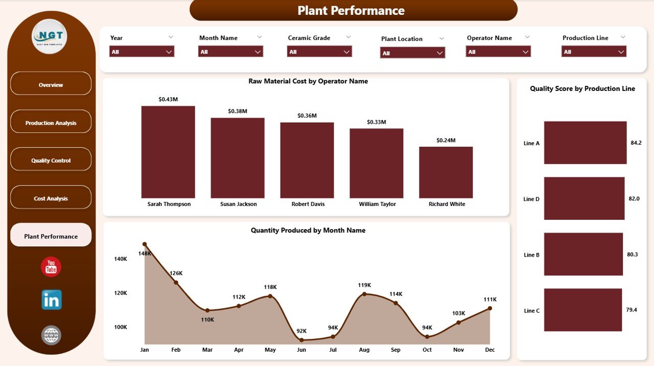
The Plant Performance page focuses on the contribution of operators, production lines, and time trends. This page is useful because it connects operational activity with performance outcomes.
Charts Used on the Plant Performance Page
1. Raw Material Cost by Operator Name
This chart shows raw material cost associated with different operators. Therefore, managers can study operator-linked material usage patterns.
It also helps identify whether training or process control is needed for better material efficiency.
2. Quality Score by Production Line
This chart compares quality scores across production lines. As a result, users can easily find the strongest and weakest production lines.
This insight helps improve product consistency and supports better quality planning.
3. Quantity Produced by Month Name
This chart tracks monthly production quantity trends. Therefore, managers can see which months perform better or worse.
It also supports forecasting because seasonal production patterns become easier to understand.
What Are the Advantages of Ceramic Manufacturing Dashboard in Power BI?
A well-designed dashboard does much more than show charts. It improves reporting, speeds up analysis, and supports better decisions across the business.
Advantages of Ceramic Manufacturing Dashboard in Power BI
- Centralized reporting
It brings production, cost, and quality data into one place. Therefore, users no longer need to open multiple files. - Faster decision-making
Since important metrics appear instantly, managers can respond to problems much faster. - Improved cost control
The dashboard tracks raw material and energy cost clearly. As a result, waste and overspending become easier to identify. - Better production monitoring
It helps users track quantity produced, production status, and defects. Therefore, performance analysis becomes smoother. - Stronger quality management
Quality score, ceramic grade, and defective unit analysis support better quality control. - Easy plant comparison
Since the dashboard includes plant location analysis, managers can compare performance between plants quickly. - Operator-level insights
Users can study records and cost by operator name, which helps improve accountability and training. - Interactive filtering
Slicers allow quick filtering by different categories. Therefore, users can focus on the exact data they need.
What Are the Best Practices for the Ceramic Manufacturing Dashboard in Power BI?
Even the best dashboard works better when users follow the right approach. Good practices improve both dashboard quality and business results.
Best Practices for the Ceramic Manufacturing Dashboard in Power BI
- Keep source data clean
Always use well-structured and accurate data. Otherwise, the dashboard may show misleading results. - Update data regularly
Refresh the dashboard on time so that users can work with the latest production information. - Use slicers wisely
Apply filters carefully when reviewing plant, operator, product type, or month-wise data. - Review KPI cards first
Start with Total Records, Raw Material Cost, Energy Cost, Quality Score, and Quantity Produced. Then move deeper into chart analysis. - Track defects frequently
Review defective units often because quality problems can grow quickly if ignored. - Compare plants and shifts
Plant-wise and shift-wise comparisons often reveal hidden cost or performance gaps. - Monitor monthly trends
Monthly production and energy cost charts help businesses plan future targets more accurately. - Share dashboards with decision-makers
Make sure plant heads, quality teams, and analysts use the same dashboard so everyone works with the same insights.
How Does This Dashboard Help Reduce Manufacturing Problems?
Ceramic businesses often face common problems such as high material cost, high energy consumption, inconsistent quality, low plant efficiency, and delayed reporting. Fortunately, this dashboard helps tackle all of them.
For example, if raw material cost suddenly rises in one production area, the related chart can reveal it quickly. Similarly, if one plant shows lower quality score than another, management can take action at once.
Because the dashboard presents data visually, users do not need to search through long reports. Instead, they can identify issues, compare categories, and act faster.
That is exactly why dashboards like this are so useful in modern manufacturing.
Click to Purchases Ceramic Manufacturing Dashboard in Power BI
Why Should Ceramic Manufacturers Use This Dashboard Instead of Manual Reports?
Manual reports take time. They also increase the chance of mistakes. In addition, static reports do not allow deep filtering and quick comparisons.
On the other hand, this Ceramic Manufacturing Dashboard in Power BI gives you:
- Interactive reporting
- Faster data analysis
- Better visibility
- Easier cost tracking
- More accurate quality monitoring
- Improved monthly trend analysis
So, rather than depending on old-style spreadsheets alone, ceramic manufacturers can use Power BI to build a smarter reporting system.
Conclusion
The Ceramic Manufacturing Dashboard in Power BI is a practical and powerful solution for modern ceramic businesses. It helps you track production, monitor cost, control quality, compare plant performance, and understand business trends in one place.
With five well-designed pages — Overview, Production Analysis, Quality Control, Cost Analysis, and Plant Performance — this dashboard gives a complete picture of manufacturing operations. Moreover, interactive charts, KPI cards, and slicers make analysis fast and simple.
If you want to improve reporting, reduce manual work, and make smarter production decisions, this dashboard can become a very valuable tool for your business.
In short, it does not just show data — it helps you understand the story behind the data and act with confidence.
Frequently Asked Questions with Answers
1. What is a Ceramic Manufacturing Dashboard in Power BI?
A Ceramic Manufacturing Dashboard in Power BI is an interactive report that helps track production, quality, raw material cost, energy cost, and plant performance in one place.
2. Who should use this dashboard?
Plant managers, production supervisors, quality control teams, business owners, and analysts can use this dashboard to monitor ceramic manufacturing performance.
3. What KPIs are included in this dashboard?
The dashboard includes important KPIs such as Total Records, Raw Material Cost, Energy Cost, Quality Score, and Quantity Produced.
4. How does this dashboard help in cost control?
It tracks raw material cost and energy cost through charts and filters. Therefore, businesses can identify expensive areas and take corrective action quickly.
5. Can this dashboard help improve quality?
Yes, it can. The dashboard includes quality-related analysis such as ceramic grade, quality score, and defective units, which help teams improve product quality.
6. Why is Power BI better than manual reporting?
Power BI offers interactive visuals, quick filters, real-time insights, and easier data analysis. As a result, it saves time and improves decision-making.
7. Can I analyze plant-wise performance in this dashboard?
Yes. The dashboard includes charts based on plant location, which makes plant-wise comparison easy and useful.
8. Does this dashboard support monthly trend analysis?
Yes, it does. Charts like Energy Cost by Month Name and Quantity Produced by Month Name help users understand monthly trends clearly.
9. How do slicers help in this dashboard?
Slicers let users filter data quickly by category, which makes the dashboard more interactive and more focused.
10. Is this dashboard useful for large ceramic manufacturing businesses?
Yes, absolutely. It works very well for businesses that want to track multiple plants, production lines, operators, and cost areas in one professional dashboard.
Visit our YouTube channel to learn step-by-step video tutorials
Click to Purchases Ceramic Manufacturing Dashboard in Power BI