Introduction
Blood Banks Dashboard in Power BI is a professionally designed, ready-to-use analytics solution built to help healthcare professionals, blood bank managers, and data analysts monitor and manage blood bank operations efficiently. With five powerful analytical pages, this Power BI dashboard transforms complex datasets into clear, actionable insights that drive smarter decisions.
Whether you are tracking blood inventory across multiple locations, analyzing revenue trends by hospital partner, or monitoring processing costs by region — this dashboard delivers all the intelligence you need on a single interactive platform. By leveraging Power BI’s dynamic visuals and slicers, blood bank administrators can quickly filter, drill down, and explore data without writing a single line of code.
Click here to Purchase Blood Banks Dashboard in Power BI
Key Features of Blood Banks Dashboard in Power BI
- Dynamic KPI Cards: Track Total Records, Revenue per Unit, Processing Cost per Unit, Medium Level, and High Level metrics at the top of the overview page for instant awareness.
- 5 Comprehensive Report Pages: The dashboard includes Overview, Inventory & Stock Analysis, Blood Bank Name Analysis, Region Analysis, and Monthly Trends — each offering unique analytical perspectives.
- Interactive Slicers and Filters: Filter data instantly by region, blood bank name, screening status, city, hospital partner, and time period to uncover targeted insights.
- Multi-Dimensional Chart Analysis: Explore revenue, cost, storage duration, shelf life, and urgency levels across blood banks, regions, cities, and months with visually compelling charts.
- Seamless Data Connectivity: Connect to Excel, CSV, SQL databases, or cloud sources — Power BI refreshes all visuals automatically with a single click.
- Fully Customizable: Modify colors, chart types, KPI thresholds, and data connections to match your organization’s unique reporting requirements.
- Hospital Partner Tracking: Analyze revenue per unit by hospital collaborations to optimize partnerships and improve financial outcomes.
- Screening Status Insights: Break down storage duration by screening outcomes to improve quality control and regulatory compliance.
Dashboard Pages Explanation
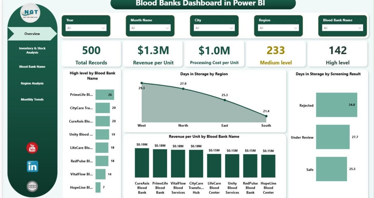
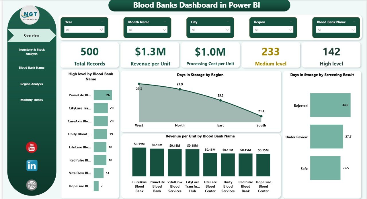
1. Overview Page
The Overview Page serves as the central command center of the Blood Banks Dashboard in Power BI. At the top, intuitive KPI cards display the most critical high-level metrics at a glance:
- Total Records: The total number of blood units recorded across all locations.
- Revenue per Unit: Average revenue generated per blood unit across all blood banks.
- Processing Cost per Unit: Average processing cost incurred per blood unit.
- Medium Level: Count of blood units at medium urgency or quality level.
- High Level: Count of blood units flagged at high urgency or quality level.
Below the cards, multiple interactive charts provide deeper analytical insights:
- Revenue per Unit by Blood Bank Name: Compares revenue performance across individual blood banks.
- Days in Storage by Region: Tracks average storage duration across different geographic regions.
- Days in Storage by Screening Status: Analyzes how storage duration varies based on screening outcomes.
- Revenue per Unit by Hospital Partner: Highlights revenue contribution from each hospital collaboration.
Overview PageClick here to Purchase Blood Banks Dashboard in Power BI
2. Inventory & Stock Analysis
This page delivers detailed inventory insights that help blood bank managers optimize storage operations and reduce waste. The analysis focuses on shelf life monitoring, city-level storage tracking, and regional cost comparisons:
- Shelf Life (Days) by Blood Bank Name: Measures the remaining shelf life of blood units stored at each individual blood bank location.
- Days in Storage by City: Tracks how long blood units have been stored across different cities, helping identify locations with potential overstocking issues.
- Processing Cost per Unit by Region: Compares the processing cost efficiency across different regions to help identify cost optimization opportunities.
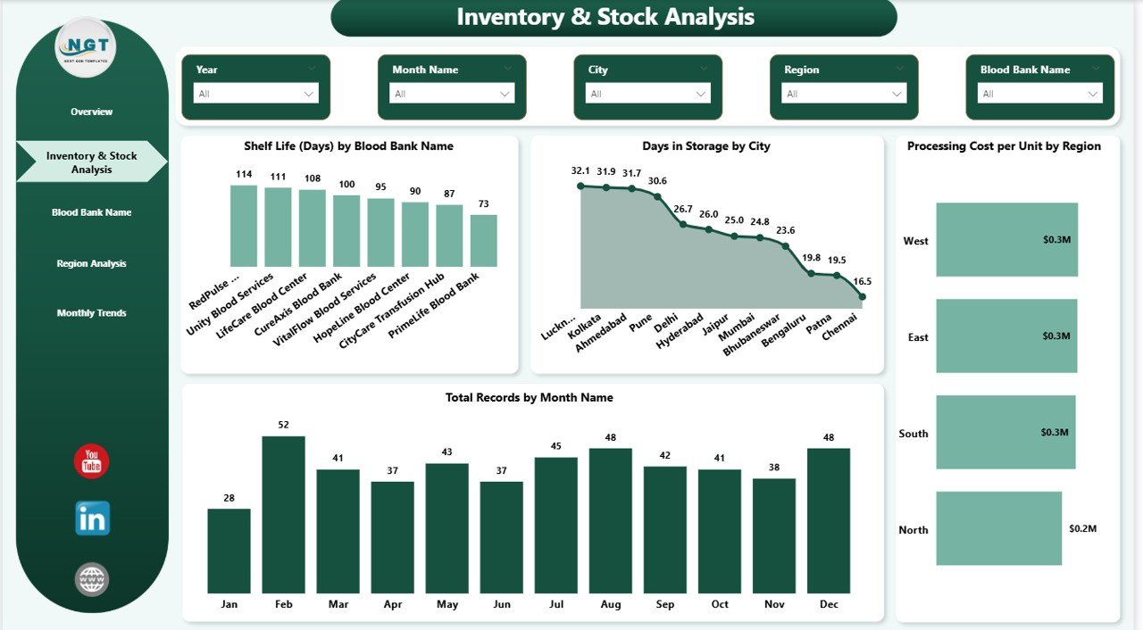 Inventory & Stock Analysis
3. Blood Bank Name Analysis
This page zooms into performance metrics at the individual blood bank level, providing granular insights that help administrators compare and benchmark blood bank operations:
- Days in Storage by Blood Bank Name: Detailed storage duration analysis for each blood bank.
- Processing Cost per Unit by Blood Bank Name: Cost efficiency comparison at the blood bank level.
- Total Records by Blood Bank Name: Volume of blood units managed per blood bank location.
- Medium Level by Blood Bank Name: Distribution of medium urgency indicators across individual blood banks.
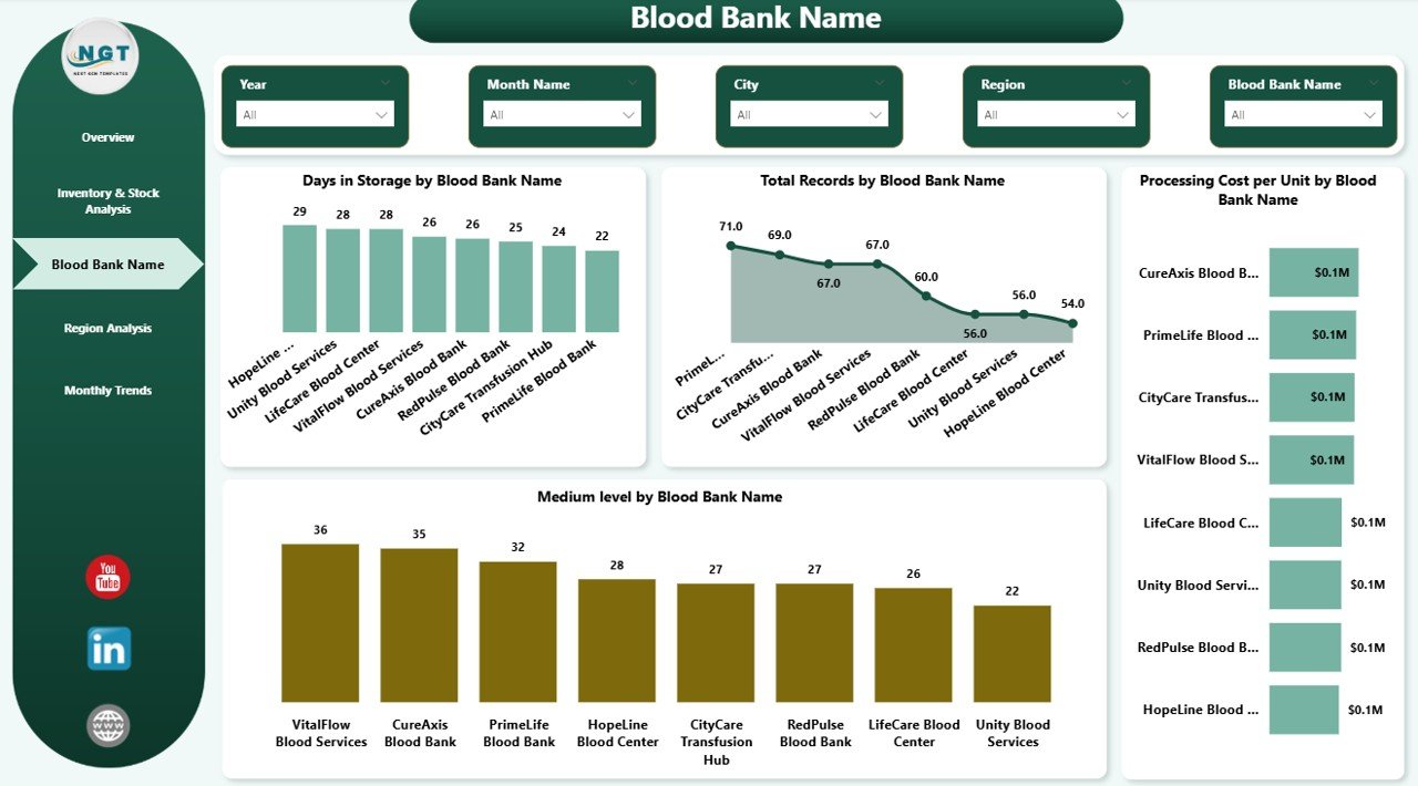 Blood Bank Name Analysis
Click here to Purchase Blood Banks Dashboard in Power BI
4. Region Analysis
The Region Analysis page breaks down performance by geographic region, helping administrators identify regional strengths, weaknesses, and optimization opportunities:
- Revenue per Unit by Region: Compares revenue generation across regions to identify the most profitable areas.
- Medium Level % by Region: Shows the percentage of medium urgency blood units per region for quality monitoring.
- Critical Level % by Region: Highlights regions with the highest percentage of critical-level blood units requiring immediate attention.
- Shelf Life (Days) by Region: Compares shelf life performance across regions to optimize distribution and reduce expired inventory.
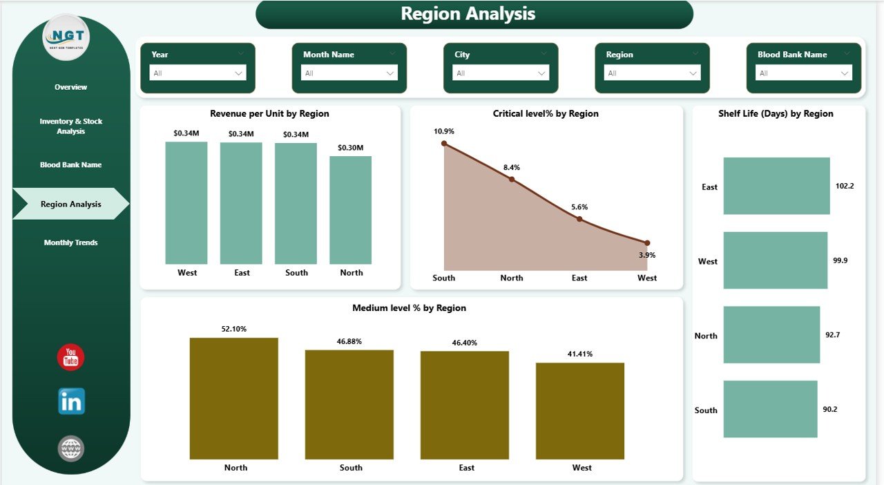 Region Analysis
5. Monthly Trends
The Monthly Trends page reveals temporal patterns that help administrators understand seasonal variations, detect anomalies, and forecast future demand:
- Total Records by Month: Tracks the volume of blood units processed each month to identify demand cycles.
- High Level by Month: Monitors the monthly count of high urgency blood units for proactive planning.
- Critical Level by Month: Tracks critical-level occurrences monthly to spot concerning trends early.
- Revenue per Unit by Month: Analyzes revenue performance month over month to understand financial trends.
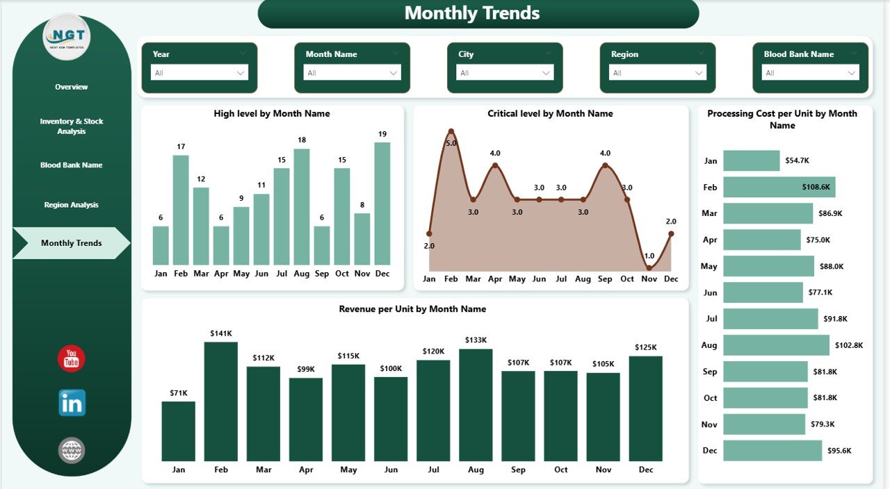 Monthly Trends
Click here to Purchase Blood Banks Dashboard in Power BI
Advantages of Blood Banks Dashboard in Power BI
- Centralized Monitoring: All blood bank data is consolidated into one interactive dashboard, eliminating the need for multiple disconnected reports.
- Real-Time Decision Making: Dynamic visuals update instantly, enabling administrators to make data-driven decisions without delays.
- Multi-Level Analysis: From high-level KPI overviews to granular blood bank and region analysis — the dashboard supports decision-making at every organizational level.
- Cost Optimization: Processing cost analysis by region and blood bank helps identify cost-saving opportunities across the supply chain.
- Improved Compliance: Screening status and shelf life monitoring support regulatory compliance and quality assurance requirements.
- Scalable Solution: Whether managing one blood bank or hundreds across regions, this Power BI dashboard scales effortlessly.
Opportunities for Improvement
- Integrate real-time data connections from hospital management systems for automatic updates without manual data entry.
- Add automated Power Automate alerts for critical shelf life breaches, inventory shortages, or unusual cost spikes.
- Incorporate predictive analytics using Power BI’s AI capabilities to forecast blood demand and optimize inventory planning.
- Implement row-level security (RLS) to control data access based on user roles and regional responsibilities.
- Add donor demographic analysis to understand donation patterns and improve recruitment campaigns.
Best Practices
- Always ensure your data source (Excel or database) follows the required format before connecting to the dashboard.
- Schedule automatic data refresh in Power BI Service to keep all dashboard visuals current without manual intervention.
- Use slicers strategically to drill down into specific regions, blood banks, or time periods for focused analysis.
- Regularly review KPI thresholds and update them based on evolving operational goals and industry benchmarks.
- Share the dashboard with stakeholders using Power BI Service for collaborative decision-making across departments.
- Combine this dashboard with the Blood Banks Dashboard in Excel for comprehensive offline and online reporting capabilities.
Explore Relevant Templates
If you found this Blood Banks Dashboard in Power BI helpful, you may also be interested in these related templates from NextGenTemplates:
- Blood Banks Dashboard in Excel — The Excel version of this dashboard with pivot tables and one-click refresh functionality.
- Cardiology Institutes Dashboard in Power BI — A healthcare-focused Power BI dashboard for cardiology operations analysis.
- Medical Tourism KPI Dashboard in Power BI — Track medical tourism KPIs with professional Power BI visuals.
- Bioinformatics Companies Dashboard in Power BI — Analyze bioinformatics company performance with interactive charts.
- Nursing Homes KPI Dashboard in Power BI — Monitor nursing home KPIs and operational metrics in Power BI.
FAQs
What is the Blood Banks Dashboard in Power BI?
It is a professionally designed Power BI report template that helps blood bank administrators monitor inventory, revenue, costs, and performance across multiple locations using interactive visuals and slicers.
Can I connect my own data to this dashboard?
Yes. The dashboard is designed to work with Excel, CSV, SQL, or any data source supported by Power BI. Simply connect your data and map the columns to the existing data model to start analyzing.
Do I need advanced Power BI skills to use this dashboard?
No. This blood bank dashboard is built with user-friendliness in mind. You can navigate pages, apply filters, and explore charts without any coding or advanced Power BI knowledge.
How many pages does this dashboard have?
The dashboard includes five analytical pages: Overview, Inventory & Stock Analysis, Blood Bank Name Analysis, Region Analysis, and Monthly Trends — each providing unique insights into blood bank operations.
Can I customize the dashboard design and KPIs?
Absolutely. All charts, colors, KPI cards, and data connections are fully customizable within Power BI Desktop to match your specific reporting and branding requirements.
Is this dashboard suitable for managing multiple blood bank locations?
Yes. The dashboard is designed to handle data from multiple blood banks, cities, and regions — making it ideal for organizations managing a network of blood bank facilities.
Conclusion
The Blood Banks Dashboard in Power BI is a powerful, interactive analytics solution that transforms complex blood bank data into clear, actionable insights. With five structured report pages covering everything from high-level KPIs to detailed regional and monthly trend analysis, this dashboard empowers administrators to optimize operations, reduce costs, and improve decision-making across their entire blood bank network.
Whether you are managing a single blood bank or overseeing a multi-location operation, this dashboard is your go-to tool for data-driven healthcare management. Start making smarter decisions today with the Blood Banks Dashboard in Power BI.
Click here to Purchase Blood Banks Dashboard in Power BI
For more Power BI tutorials and dashboard walkthroughs, visit our YouTube channel:
For official Power BI resources, visit Microsoft Power BI Documentation.