The Administration Report in Excel tracks 5 core KPIs across 4 structured sheets, with 5 pre-built charts and two slicers covering Completed %, Escalated % by Department, High Priority by Region, Escalated % by Request Type, and Total Request by Month. Setup takes under 10 minutes — paste your request data into the Data Sheet and every chart, KPI card, and report table refreshes automatically.
For administration and operations teams, tracking internal service requests through scattered emails, shared inboxes, or paid ticketing SaaS is costly and fragmented. This Excel-based report consolidates IT, facility, procurement, HR, and compliance request data into a single workbook with slicer-driven filters, a record-level information table, and structured data entry. If you want complete request visibility without paying $25–150 per user per month for ServiceNow or Zendesk, the Administration Report in Excel delivers exactly that.
Key Features of Administration Report in Excel
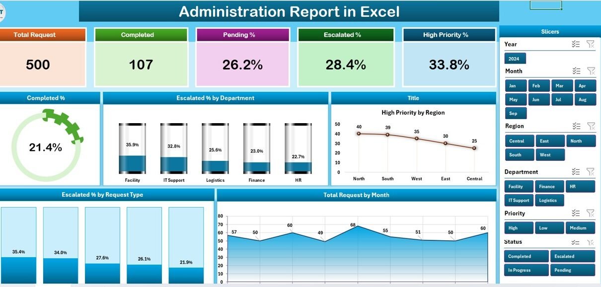
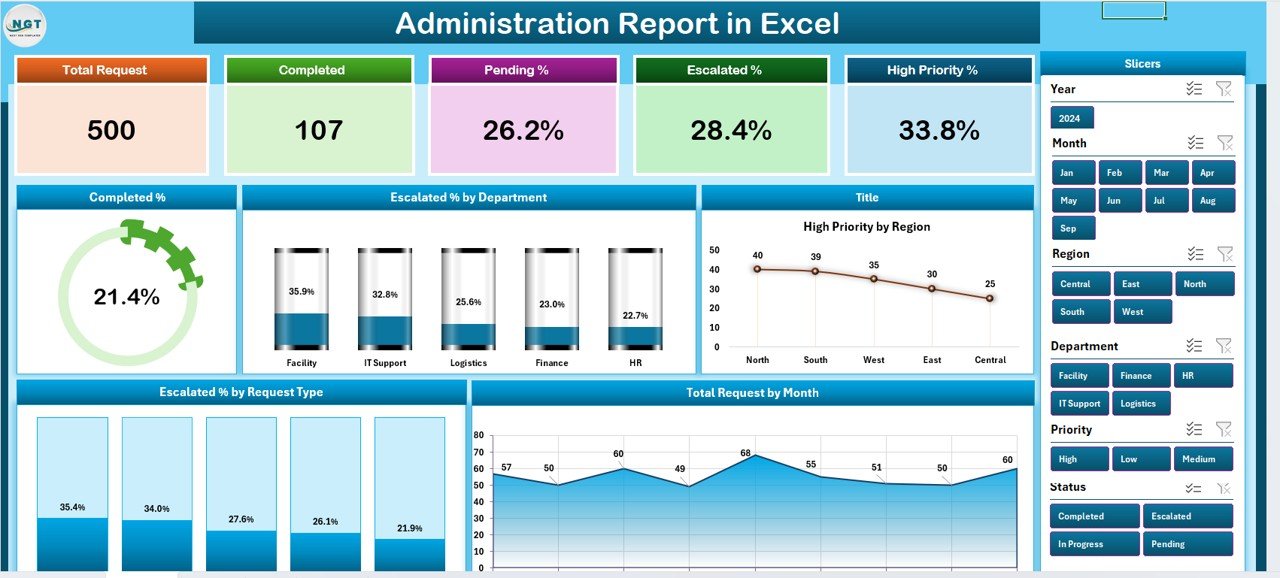
📊 5 KPI Cards on Summary Page — The top of the Summary Page displays 5 interactive KPI cards covering Total Requests, Completed Requests, Escalated Requests, High Priority Requests, and Pending Requests. Each card recalculates instantly when you filter using the slicer.
📈 5 Interactive Charts — The Summary Page visualizes Completed %, Escalated % by Department, High Priority by Region, Escalated % by Request Type, and Total Request by Month in one consolidated view. All charts connect to the right-side slicer.
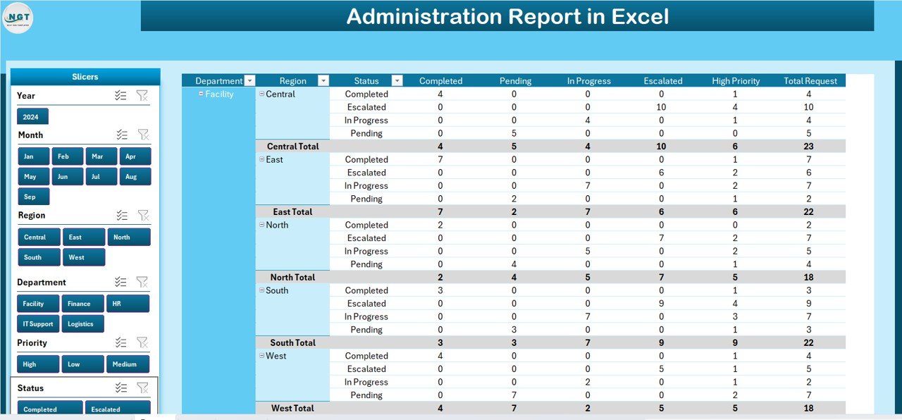
🔍 Dedicated Report Page with Information Table — A separate Report Page shows a full record-level information table with a left-side slicer for drilling into individual request records by department, region, status, priority, or request type.
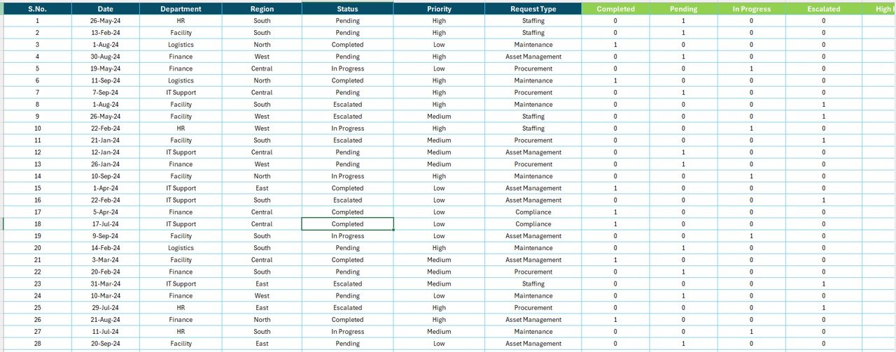
📋 Structured Data Sheet — A dedicated Data sheet stores all administration request records in a clean, repeatable format. Fields include Request ID, Department, Region, Request Type, Status, Priority, Request Date, Completion Date, and Escalation Level.
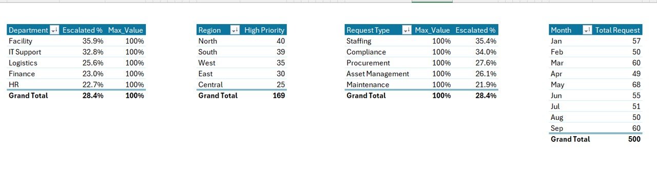
🛠️ Support Sheet for Configuration — A Support Sheet stores lookup lists, helper calculations, and dropdown values that feed the dashboard. Extend departments, regions, and request types here without touching any formulas.
☁️ Works Offline — Full Excel desktop functionality on Windows and Mac. No internet required, no subscription fees, no per-user licensing.
Dashboard Pages Explanation
1️⃣ Summary Page
The Summary Page is the main operational view of the report. It displays 5 KPI cards across the top — Total Requests, Completed Requests, Escalated Requests, High Priority Requests, and Pending Requests — followed by 5 interactive charts: Completed %, Escalated % by Department, High Priority by Region, Escalated % by Request Type, and Total Request by Month. A right-side slicer filters every KPI and chart simultaneously, giving admin managers a real-time snapshot of operational performance.
2️⃣ Report Page
The Report Page is built for record-level analysis. It features a left-side slicer and a full information table listing every request in the dataset. Admin teams use this page to filter requests by department, region, status, priority, or request type, and drill into individual records for review, escalation, and follow-up. This page complements the Summary Page by moving from aggregate KPIs to actionable request-level detail.
3️⃣ Data Sheet
The Data Sheet is the raw data entry tab where you add administration request records in the structured format used throughout the report. Fields include Request ID, Department, Region, Request Type, Status (Pending, In Progress, Completed, Escalated), Priority (Low, Medium, High), Request Date, Completion Date, and Escalation Level. Paste your own data in the same structure and every chart, KPI card, and report table updates automatically.
4️⃣ Support Sheet
The Support Sheet stores lookup lists — department names, region names, request type categories, priority levels — and any helper calculations that feed the dashboard. Edit this sheet to customize categories, add new departments or regions, or adjust priority definitions, and the entire report respects the updated configuration automatically.
Administration Report in Excel vs. Google Sheets vs. ServiceNow / Zendesk — Feature Comparison
| Feature | Administration Report in Excel | Google Sheets Equivalent | ServiceNow / Zendesk / Freshservice |
|---|---|---|---|
| Cost | $7.99 one-time | $6.99 one-time | $25–150 / user / month |
| Platform | Microsoft Excel (desktop) | Google Sheets (browser) | Web SaaS (subscription) |
| Setup Time | Under 10 minutes | Under 10 minutes | 2–6 weeks onboarding |
| Offline Access | ✅ Full offline use | Requires internet | ❌ Cloud-only |
| Slicer Filtering | ✅ Native Excel slicers | Filter views only | Built-in filters |
| Customizable Fields | ✅ Fully editable | ✅ Fully editable | Limited |
| Year-1 Cost (5 users) | $7.99 total | $6.99 total | $1,500–$9,000 / year |
| Chart Variety | ✅ 5 built-in charts | Varies by template | ✅ Configurable |
For administration teams that want a full request report without paying $25–150 per user per month for ServiceNow, Zendesk, or Freshservice, the Administration Report in Excel sits in the sweet spot.
Who Should Use This Template
Perfect for:
- Administration managers at 10–500 person companies tracking internal service requests and escalations
- Operations leads handling IT, facility, procurement, HR, and compliance requests across multiple departments and regions
- Office managers who want a single Excel file covering request intake, status tracking, and escalation reporting
- Small business owners replacing shared email inboxes with a structured request report
- Consultants preparing quarterly administration performance reports for clients
Not a fit if:
- You need ITIL-compliant ticketing with SLA automation, SSO, and SOC 2 certification
- Your workflow requires real-time two-way sync with email, Slack, or Jira (this report uses manual or paste-based data entry)
- You already live entirely in Google Workspace — consider the Administration Dashboard in Google Sheets instead
Real-World Use Cases
Anjali runs administration at a 180-person IT services firm in Pune. She uses the Administration Report in Excel to track service requests across 6 departments and 4 regions, monitor escalation percentages week over week, and present a monthly operational summary to leadership. The slicer-driven Summary Page lets her switch from company-wide view to a single department in one click — saving her roughly 4 hours per week of manual pivot-table rebuilding.
Marcus manages office operations at a 45-person marketing agency in Chicago. He replaced a shared email inbox with this report to log maintenance, procurement, and IT requests. During his Monday standup, he filters by priority using the slicer and walks his team through the Completed % KPI. The 5-chart Summary Page gave him an immediate view of which department generates the most escalations — something his previous spreadsheet couldn’t show.
Elena consults for 7 mid-size clients across Europe. She duplicates this template for each client, customizes the Support Sheet with their department, region, and request type lists, and delivers a branded administration performance report every quarter — turning a $7.99 template into a recurring consulting deliverable that previously required a $400/month Freshservice license per client.
Advantages of Administration Report in Excel
✅ One-Time Cost — $7.99 with lifetime access compared to $1,500–$9,000 per year for paid ticketing SaaS at 5 users.
✅ Slicer-Based Filtering — Two slicers (right on Summary, left on Report) filter KPIs, charts, and the information table simultaneously, reducing manual pivot-table work by several hours per week.
✅ Record-Level Drilldown — The Report Page information table lets admin teams move from aggregate escalation metrics to individual request records for follow-up within seconds.
✅ Works Offline — Full Excel desktop functionality on Windows and Mac. No internet, no subscription, no per-user fees.
✅ Fully Customizable — Edit the Support Sheet to add departments, regions, request types, or priority levels, and every other sheet respects the changes automatically.
✅ Professional Output — Copy the Summary Page as an image or export to PDF for monthly leadership reviews with zero extra formatting work.
Opportunities for Improvement
Honest limitations worth knowing before you buy:
- Manual data entry — The report does not automatically ingest data from email, Slack, Jira, or a ticketing API. You paste or type your request records into the Data Sheet.
- Single-user editing — Excel desktop handles one concurrent editor. For real-time multi-user collaboration, the Google Sheets version is a better fit.
- No automated SLA tracking — The report tracks request status and escalation level, but does not auto-calculate SLA breach windows. Enterprise ITIL teams should use a dedicated ticketing platform.
- Static data model — Adding entirely new fields (e.g., customer ID, contract ID) requires Excel editing. The template supports the 9 core fields listed in the Data Sheet out of the box.
Best Practices
🎯 Update the Data Sheet weekly — Teams that add new request records every Monday get the cleanest trend charts on the Total Request by Month visual.
🎯 Customize the Support Sheet first — Before pasting your data, edit department and region lists in the Support Sheet to match your organization. This keeps the slicer and dropdown menus clean.
🎯 Use the Report Page for standups — Filter by “High Priority” and “Pending” status during daily or weekly operational standups to focus discussion on requests needing attention.
🎯 Export Summary Page snapshots monthly — Copy the Summary Page as an image or export to PDF for monthly leadership reviews. Learn more about how Excel slicers work on Microsoft’s official documentation.
🎯 Duplicate for different scopes — Consultants and multi-entity admins can save copies per region, client, or business unit, and use the Support Sheet to swap category lists.
Explore Relevant Templates
📊 Also available as: Administration Dashboard in Google Sheets — Same KPIs and structure built for browser-based, real-time team collaboration.
📊 Equipment Borrowing Request Tracker in Excel — A focused request-tracking template for equipment loans with VBA-powered intake forms.
📊 IT Helpdesk Ticket Management System — A full VBA-based ticket management system with login, user forms, and multi-user workflows inside Excel.
📊 Compliance and Audit Dashboard in Power BI — Step up to Power BI when you need richer interactivity and cross-report drillthrough on audit data.
📊 Browse all Excel Dashboard Templates →
Frequently Asked Questions
What KPIs does the Administration Report in Excel track?
The Administration Report in Excel tracks 5 core KPIs on the Summary Page: Total Requests, Completed Requests, Escalated Requests, High Priority Requests, and Pending Requests. All metrics update automatically when you replace the sample data with your own request records in the Data Sheet.
Can I filter the report by department, region, or priority?
Yes. The Summary Page has a right-side slicer and the Report Page has a left-side slicer. Both let you filter by department, region, priority, status, or request type. All KPI cards, charts, and the information table update simultaneously when a filter is applied.
How does this compare to ServiceNow, Zendesk, or Freshservice?
The Administration Report in Excel costs $7.99 one-time versus $25–150 per user per month for ServiceNow, Zendesk, or Freshservice. It covers the same request tracking and escalation reporting without subscription costs or lengthy onboarding, and works fully offline on Windows and Mac.
How long does setup take?
Setup for the Administration Report in Excel takes under 10 minutes. Open the file, paste your request data into the Data Sheet, update the Support Sheet dropdowns if needed, and every chart, KPI card, and report table updates automatically.
Can I add more departments or regions?
Yes. The Support Sheet holds all department, region, request type, and priority lookup lists. Add rows to extend these lists and the Summary Page charts, Report Page table, and slicers respect the updated configuration immediately.
Does this template work on Mac?
Yes. The Administration Report in Excel works on both Windows and Mac versions of Microsoft Excel. Slicers, charts, and formulas all function natively without add-ins. Excel for the web also supports viewing the report.
Is there a Google Sheets version?
Yes. A Google Sheets equivalent is available as the Administration Dashboard in Google Sheets for teams that prefer browser-based, real-time collaboration over Excel’s desktop workflow.
About the Author
Built by PK — Microsoft Certified Professional with 15+ years of Excel, Google Sheets, and Power BI experience. Founder of NextGenTemplates, reaching 300K+ subscribers across YouTube channels. Every template is hand-built and tested before release.
Conclusion
The Administration Report in Excel gives administration and operations teams a complete request tracking system — 5 KPI cards, 5 charts, a record-level information table, and two slicers — in a single Excel workbook for $7.99 one-time. Replace scattered email inboxes, stop paying per-user SaaS fees, and start running your administration reporting from a single file that works offline on Windows and Mac.
📖 Click here to Purchase Administration Report in Excel
✅ Instant download · One-time payment · No subscription
🎥 Visit our YouTube channel for step-by-step video tutorials: Youtube.com/@PK-AnExcelExpert
📅 Last updated: April 2026