Introduction
The Resource Allocation KPI Dashboard in Power BI is a 3-page report that tracks resource utilization across MTD and YTD with target and prior-year comparisons — plus a drill-through KPI Definition page that shows the formula and meaning behind every metric. Setup takes under 10 minutes once your data is ready, and the entire dashboard runs in free Power BI Desktop with an Excel workbook as the data source.
If your team has been struggling with resource visibility — who is over-allocated, who is on the bench, where the staffing variances are — this template gives you a single screen to anchor those monthly conversations. Replace expensive enterprise PPM software with a one-time $11.99 purchase that works for project, IT, consulting, manufacturing, and shared-services use cases.
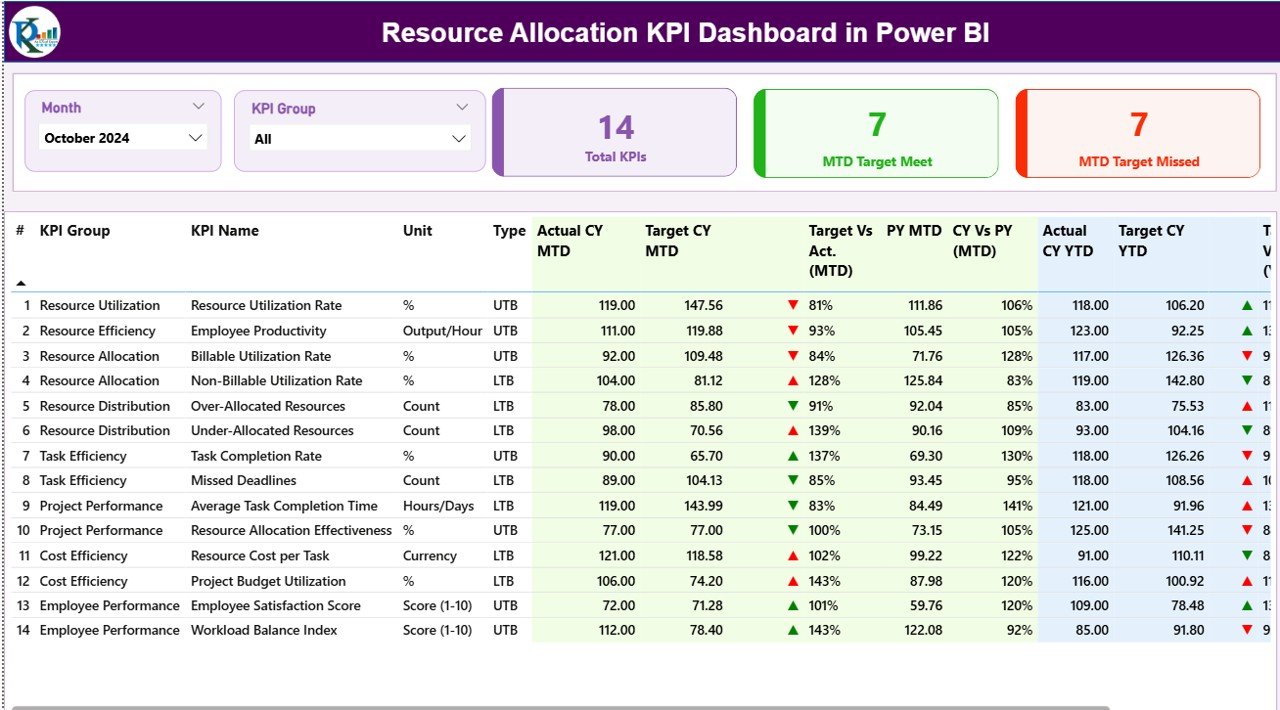
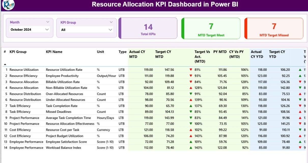
Resource Allocation KPI Dashboard — Summary Page in Power BI
Key Features of Resource Allocation KPI Dashboard in Power BI
This dashboard is built around the way real PMOs and resource managers report — not a generic BI canvas. It tracks any resource KPI you define in the Excel data file, automatically computes MTD and YTD comparisons against target and prior year, and flips the green/red status icons depending on whether the KPI is Lower-the-Better (LTB) or Upper-the-Better (UTB).
The Summary page anchors leadership conversations: 3 status cards on top tell you exactly how many KPIs hit target this month, how many missed, and how many you are tracking in total. Below that, a 16-column KPI table gives you the full numerical picture, including percentage of target met, current year vs prior year change, and color-coded direction icons.
The KPI Trend page lets you drill into any single KPI and see two combo charts side by side: one for MTD trend across 12 months (Actual CY vs Actual PY vs Target), one for YTD. The KPI Definition page is hidden by design but accessible via right-click drill-through from any KPI row, so new managers on your team can understand exactly how each metric is calculated without a separate Confluence page.
Dashboard Pages Explanation
Page 1 — Summary Page
This is the main page of the Resource Allocation KPI Dashboard in Power BI. At the top sit two slicers — Month and KPI Group — letting you cut the entire view by reporting period or KPI category in one click. Three status cards next to the slicers show the Total KPIs count, the MTD Target Met count, and the MTD Target Missed count. Numbers refresh the moment you move the slicers.
Below the cards is a 16-column detailed KPI table covering KPI Number, KPI Group, KPI Name, Unit, Type (LTB or UTB), Actual CY MTD, Target CY MTD, MTD status icon, Target vs Actual % (MTD), PY MTD, CY vs PY % (MTD), Actual CY YTD, Target CY YTD, YTD status icon, Target vs Actual % (YTD), PY YTD, and CY vs PY % (YTD). The dashboard auto-detects KPI direction so a low value can be “good” (e.g., bench rate) or “bad” (e.g., billable utilization) without you re-coding any logic.
Page 2 — KPI Trend Page
Use this page when you need to drill into the trajectory of a single KPI. A KPI Name slicer on the left lets you pick the metric, and two combo charts on the right plot Current Year Actual, Previous Year Actual, and Target across all 12 months. The first chart shows the MTD pattern — useful for spotting seasonality or one-off shocks. The second shows the YTD path — useful for explaining cumulative performance to leadership.
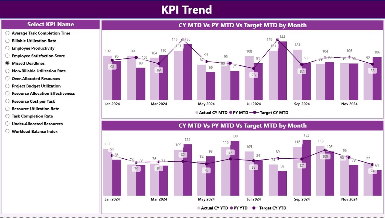
KPI Trend page — combo charts comparing CY, PY, and Target for MTD and YTD
Page 3 — KPI Definition Page (drill-through, hidden)
This is a hidden drill-through page. From any KPI row on the Summary, right-click and choose “Drill through → KPI Definition” — the report jumps to a full-screen view of that KPI’s Number, Group, Name, Unit, Type (LTB / UTB), Formula, and Definition. A back button in the top-left corner returns you to the Summary page in one click. This is the page that ends “what does this metric mean again?” conversations.
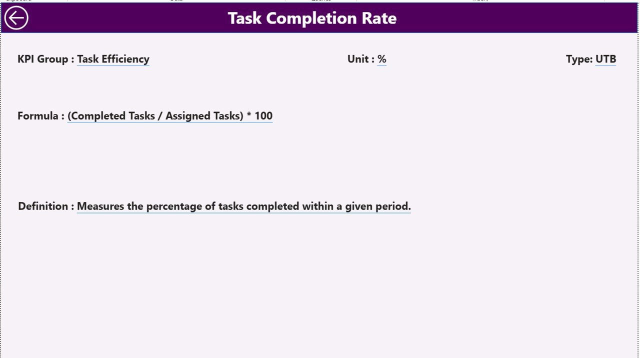
KPI Definition drill-through page — formula and meaning for every metric
Excel Data Source Workbook
The dashboard reads from a single Excel workbook with three input tabs. The Input_Actual sheet holds KPI Name, Month (first date of month), MTD value, and YTD value. The Input_Target sheet has the same structure but for target values. The KPI Definition sheet holds KPI Number, KPI Group, KPI Name, Unit, Formula, Definition, and Type (LTB or UTB). Add or rename a KPI in the Definition sheet, add matching rows in the two Input sheets, hit Refresh in Power BI Desktop, and the report updates everywhere.
Resource Allocation KPI Dashboard in Power BI vs. Tableau / Qlik vs. Asana / Monday.com / Smartsheet — Feature Comparison
| Feature | Resource Allocation KPI Dashboard in Power BI | Tableau / Qlik Sense | Asana / Monday / Smartsheet |
|---|---|---|---|
| Cost | $11.99 one-time | $15-75 / user / month | $10-25 / user / month |
| Platform | Power BI Desktop (free) | Tableau / Qlik Cloud | Web SaaS |
| Setup time | Under 10 minutes | 2-6 weeks (model + reports) | 1-2 weeks (workspace + automations) |
| MTD + YTD vs Target + PY in one view | ✅ Built in | ✅ Custom-built | ❌ Requires reporting add-on |
| Drill-through KPI definitions | ✅ Pre-configured | ✅ Custom-built | ❌ |
| Customizable KPI list | ✅ Edit Excel, refresh | ✅ Edit data model | ⚠️ Limited |
| Year-1 cost at 5 users | $11.99 total | $900-4,500 | $600-1,500 |
| Lifetime access | ✅ Yes | ❌ Subscription | ❌ Subscription |
For PMO leads, project managers, and resource managers who want enterprise-grade KPI tracking without paying $900-4,500 per year for Tableau or Qlik, the Resource Allocation KPI Dashboard in Power BI sits in the sweet spot.
Who Should Use This Template
Perfect for:
- PMO leads at 20-500 person service firms tracking billable utilization, bench time, and project staffing
- Project managers reporting monthly resource KPIs to leadership with MTD vs YTD vs target views
- Resource managers in IT, consulting, and engineering allocating talent across multiple concurrent projects
- Operations leads who already use Power BI Desktop and want a starter KPI framework instead of a blank canvas
- Freelance Power BI consultants who need a baseline KPI report to ship and customize per client
Not a fit if:
- You need real-time API connections to Jira, Asana, or Workday — this template uses an Excel data source
- You require SOC 2, SSO, or row-level security baked into the report — those need Power BI Service with paid tiers
- You only manage 1-2 projects as a solo freelancer — a simpler tracker will serve you better
Real-World Use Cases
Priya leads the PMO at a 120-person consulting firm. She uses the Resource Allocation KPI Dashboard in Power BI to track billable utilization, bench rate, and project staffing variance across 8 service lines. Her monthly leadership meeting now opens with a single screen instead of 6 separate Excel files — and she swapped her $1,800/year Smartsheet reporting add-on for this template. The drill-through KPI Definition page also cut down her onboarding time for new project managers, because they can self-serve the metric definitions instead of pinging her on Slack.
Daniel runs IT resource planning at a mid-market software company. He tracks 12 KPIs including engineer utilization, on-call coverage, ticket throughput per FTE, skills coverage, and bench rate by skill. His leadership team reviews the Summary page weekly during the operations standup, and he uses the KPI Trend page to investigate any KPI that flagged red — the YTD chart usually tells a clearer story than the MTD chart for capacity planning conversations.
Aisha is a freelance Power BI consultant. She uses this template as the baseline she ships to her construction-industry clients, then customizes the KPIs for crew utilization, equipment allocation, and overtime hours per crew. What used to take 3 days of dashboard build work now takes 4 hours of tailoring, which means she can take on more clients per quarter without dropping quality.
Advantages of Resource Allocation KPI Dashboard in Power BI
The biggest advantage is cost. Year 1 for a 5-user team is $11.99 one-time on this template versus $900-4,500 on Tableau/Qlik or $600-1,500 on Smartsheet/Monday with a reporting add-on. Multiply over 3 years and you have saved enough to fund another headcount.
The second advantage is setup speed. The data model, visuals, slicers, drill-through, and back-button navigation are all pre-wired. You spend 10 minutes pointing the report at your Excel file and refreshing — not 2-6 weeks of model and report development.
The third advantage is flexibility. Because the dashboard reads from an Excel workbook with KPI Definition driving the visuals, you can change the entire metric set without touching DAX, Power Query M, or visual properties. Add a row in Excel, refresh, done.
Opportunities for Improvement
Honest about what the template does not do: there is no live API connector to Jira, Asana, Workday, or your HRIS — you refresh from an Excel file. If you need a continuous data pipeline, you will want to build a Power Query connection or a Dataflow on top of this template. Similarly, the report does not include row-level security; if different leaders should see different KPI subsets, that needs Power BI Service with Pro/PPU licenses and RLS configuration.
The template ships with sample data and sample KPIs — not industry-specific KPI lists for, say, construction or healthcare. You will spend a little time deciding which 8-15 KPIs you actually want to track, and writing the formulas in the KPI Definition sheet, before the dashboard tells your story.
Best Practices
Start with 8-12 KPIs maximum. Resource KPI dashboards die when teams try to track 30 metrics; nobody acts on a wall of red and green. Pick the 3-4 KPIs leadership reviews monthly, the 4-6 your team manages weekly, and a 1-2 long-tail metrics for trend watching.
Standardize the LTB / UTB tagging in the KPI Definition sheet up front — it is the column that controls icon logic, so a wrong value will show a green up-arrow when the KPI is actually getting worse. Review the sheet with one teammate before going live with leadership.
Use the KPI Group field to cluster related metrics. Three or four meaningful groups (e.g., Utilization, Allocation, Skills, Capacity) make the KPI Group slicer usable. Twenty groups make it noise.
For deeper Power BI tactics, the official Microsoft Learn KPI visual guide is a good companion read for anyone planning to extend this template with native KPI visuals or scorecards.
Explore Relevant Templates
📌 Productivity Tracker KPI Dashboard in Power BI — Pair this with productivity tracking to see whether your allocated resources are actually delivering hours.
📌 Succession Planning KPI Dashboard in Power BI — Combine resource allocation with bench-strength planning for long-term workforce continuity.
📌 Employee Training KPI Dashboard in Power BI — Track training completion against the skills gaps your allocation data uncovers.
📌 Browse the full Power BI Dashboard Templates library for 200+ ready-to-use industry dashboards.
🔁 Also available as:
- Resource Allocation KPI Dashboard in Google Sheets — same KPI framework, browser-based
- Resource Allocation Report in Excel — Excel-only version with simpler structure
Frequently Asked Questions
What KPIs does the Resource Allocation KPI Dashboard in Power BI track?
The Resource Allocation KPI Dashboard in Power BI tracks any resource KPIs you define in the Excel KPI Definition sheet — typical examples include billable utilization rate, bench rate, project staffing variance, allocation accuracy, time-to-allocate, and skills coverage. Each KPI displays MTD and YTD comparisons against target and prior year automatically.
How does this compare to Tableau or Qlik for resource KPI reporting?
Tableau and Qlik are powerful but cost $15-75 per user per month and need 2-6 weeks of model and report build. The Resource Allocation KPI Dashboard in Power BI is a one-time $11.99 purchase, runs in free Power BI Desktop, and ships ready to use with MTD, YTD, target, and prior-year comparisons already wired up.
How long does setup take?
Setup takes under 10 minutes. Fill the 3 Excel input sheets (Actual, Target, KPI Definition), open the .pbix file in Power BI Desktop, point it at your Excel workbook via Transform Data, and click Refresh. The Summary, KPI Trend, and KPI Definition pages all update automatically.
Can I add my own KPIs to the dashboard?
Yes. The Resource Allocation KPI Dashboard in Power BI is data-driven — every KPI displayed comes from the KPI Definition sheet in the Excel workbook. Add a new row with the KPI Number, Group, Name, Unit, Formula, Definition, and Type (LTB or UTB), then add matching rows to Input_Actual and Input_Target, and refresh.
Do I need a Power BI Pro license?
No. The .pbix file opens and runs in free Power BI Desktop from Microsoft. A Pro license is only required if you want to publish the report to the Power BI Service and share it with other users in your organization through the cloud workspace.
What does LTB and UTB mean in the KPI Type column?
LTB stands for Lower the Better (e.g., bench rate, allocation error rate) and UTB stands for Upper the Better (e.g., billable utilization, on-time staffing). The Resource Allocation KPI Dashboard in Power BI uses this Type field to flip the green/red icon logic automatically, so a low value can be “good” or “bad” depending on the KPI direction.
Can I use this for non-project use cases like manufacturing or warehouse staffing?
Yes. The Resource Allocation KPI Dashboard in Power BI is topic-agnostic — the visuals respond to whatever KPIs you list in the KPI Definition sheet. Customers use it for crew utilization, equipment allocation, contact center staffing, healthcare bed allocation, shared services capacity, and more.
About the Author
Built by PK — Microsoft Certified Professional with 15+ years of Excel, Google Sheets, and Power BI experience. Founder of NextGenTemplates, reaching 300K+ subscribers across YouTube channels. Every template is hand-built and tested before release.
Conclusion
The Resource Allocation KPI Dashboard in Power BI gives PMO leads, project managers, and resource managers a ready-made monthly reporting framework that costs $11.99 one-time instead of $900-4,500 per year. With 3 connected pages, MTD and YTD comparisons against target and prior year, drill-through KPI definitions, and an Excel-driven data model, it ships ready to use and stays flexible enough to evolve with your KPI list.
🛍️ Click here to Purchase Resource Allocation KPI Dashboard in Power BI
✅ Instant download · One-time payment · No subscription · Lifetime access
📺 Watch step-by-step Power BI tutorials on Youtube.com/@PK-AnExcelExpert and Youtube.com/@NextGenTemplates.
📅 Last updated: May 2026