According to Gartner, companies that actively monitor supplier KPIs reduce supply chain disruptions by up to 35% compared to those relying on ad hoc reviews. Yet most procurement teams still track supplier performance in fragmented spreadsheets with no standardized MTD/YTD comparison framework, no prior-year benchmarking, and no consistent KPI classification logic. The Supplier Performance KPI Dashboard in Power BI changes that — delivering a structured, 3-page Power BI report that tracks every supplier metric from quality rates to delivery accuracy, with automatic LTB/UTB status logic and drill-through KPI definitions built in.
This ready-to-use Power BI template uses an Excel file as its data source, meaning your team fills three structured sheets — Actuals, Targets, and KPI Definitions — and the entire dashboard auto-populates across all 3 report pages. No DAX editing, no Power BI modeling work, and no per-user subscription fees. At a one-time cost of $11.99, it replaces the kind of supplier analytics that enterprise tools like SAP Ariba charge thousands per year to provide.
Key Features of the Supplier Performance KPI Dashboard in Power BI
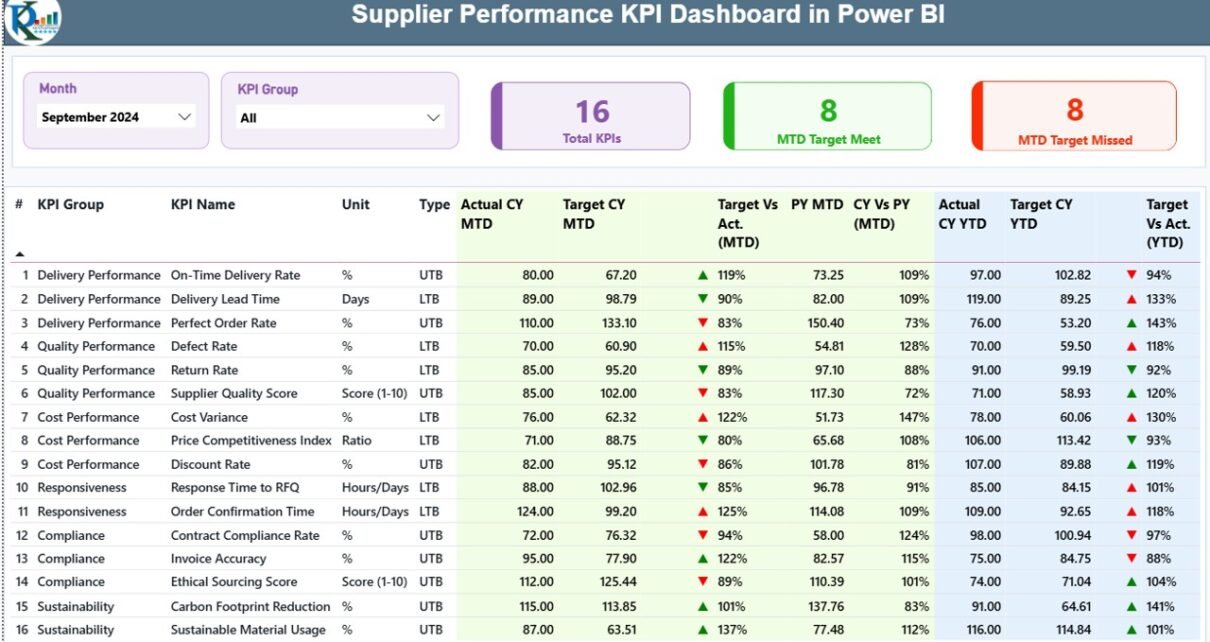
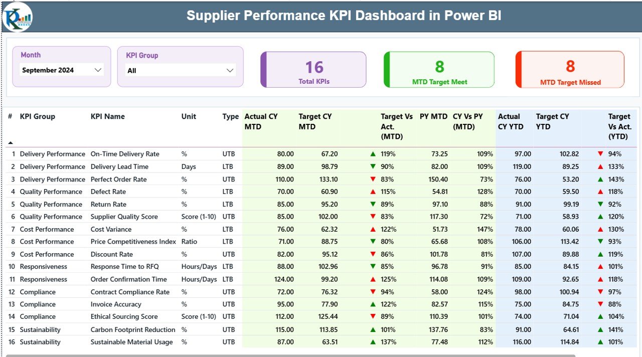
The dashboard tracks supplier metrics through three purpose-built Power BI pages, each designed for a different use case: executive summary, trend analysis, and KPI documentation. The Summary page is the operational hub — it shows a 18-column KPI table covering KPI Number, Group, Name, Unit, Type (LTB/UTB), Actual CY MTD, Target CY MTD, MTD Icon (▼▲), Target vs Actual MTD %, PY MTD, CY vs PY MTD %, Actual CY YTD, Target CY YTD, YTD Icon, Target vs Actual YTD %, PY YTD, and CY vs PY YTD %.
At the top of the Summary page, three KPI cards provide instant counts: Total KPIs tracked, MTD Target Meet count, and MTD Target Missed count. This gives procurement leaders a snapshot before they scroll into the detail. Month and KPI Group slicers let the user filter the entire table to a specific period or supplier performance category (Quality, Delivery, Cost, Responsiveness, etc.).
The LTB/UTB classification system is one of this template’s most valuable features. For Lower-the-Better KPIs — defect rate, lead time variance, return rate — the dashboard shows a green ▲ when actual is below target and a red ▼ when it exceeds it. For Upper-the-Better KPIs — on-time delivery %, fill rate, OTIF — the logic reverses automatically. All of this is driven by the Type column in the Excel KPI Definition sheet, requiring no Power BI configuration at all.
Dashboard Pages Explanation
Summary Page — 18-column KPI table with MTD/YTD actuals, targets, and LTB/UTB status icons
Page 1 — Summary: This is the main reporting view. Month and KPI Group slicers sit at the top. The three header cards (Total KPIs, MTD Met, MTD Missed) provide instant executive visibility. Below them, the full 18-column table shows both MTD and YTD performance for every supplier KPI side by side, with color-coded ▼▲ icons updating automatically based on your LTB/UTB settings.
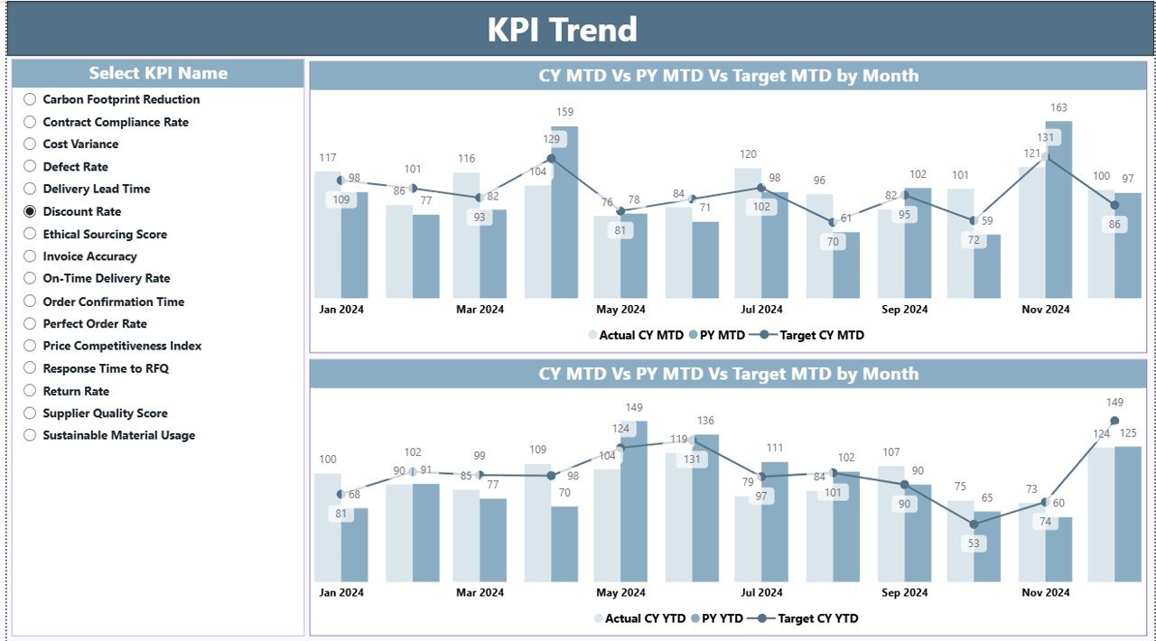
KPI Trend Page — MTD and YTD combo charts with CY Actual, PY Actual, and Target lines
Page 2 — KPI Trend: Two combo charts display monthly performance for any selected KPI — one for MTD data and one for YTD data. Each chart shows three series: Current Year Actual, Previous Year Actual, and Target. A KPI name slicer on the left side of the page lets you select any single metric to reload both charts simultaneously. This page is ideal for identifying seasonal patterns and year-over-year improvement trends in supplier performance.
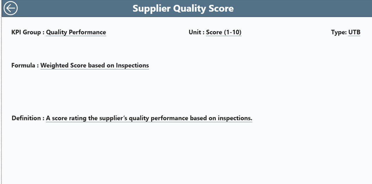
KPI Definition Drill-Through Page — formula, definition, and LTB/UTB classification for any KPI
Page 3 — KPI Definition (Hidden Drill-Through): This page is hidden in the normal report navigation to keep the interface clean. It is accessible by right-clicking any row on the Summary page and selecting Drill Through → KPI Definition. The page shows the full formula, textual definition, unit of measure, and LTB/UTB classification for the selected KPI. A back button in the top-left corner returns the user to the Summary page. This page is especially valuable during stakeholder reviews when team members question how a metric is calculated.
Excel Source File — 3 Input Sheets: The data source is a structured Excel workbook with three sheets. The Input_Actual sheet accepts KPI name, month (enter the first date of the month), MTD actual, and YTD actual per row. The Input_Target sheet uses the same column structure for target values. The KPI Definition sheet is where you define each KPI’s number, group, name, unit, formula, full definition, and LTB/UTB type. Once you fill these sheets and refresh Power BI Desktop, all three dashboard pages auto-populate. Learn more about best practices for building Power BI data models at Microsoft Learn Power BI documentation.
Supplier Performance KPI Dashboard in Power BI vs. Tableau vs. SAP Ariba — Feature Comparison
| Feature | Supplier Performance KPI Dashboard in Power BI | Tableau KPI View | SAP Ariba / Jaggaer |
|---|---|---|---|
| Cost | $11.99 one-time | $70/user/month | $5,000–$50,000/year |
| Platform | Power BI Desktop (free) | Tableau Desktop (paid) | Cloud SaaS only |
| Setup time | Under 15 minutes | Hours of data modeling | Weeks of implementation |
| MTD + YTD tracking | ✅ Built-in | Requires custom calc | ✅ Native |
| LTB/UTB auto-logic | ✅ Pre-built | Manual configuration | ✅ Native |
| Drill-through KPI detail | ✅ One right-click | ✅ Available | ✅ Available |
| Excel data entry (no editing .pbix) | ✅ | ❌ | ❌ |
| Year-1 cost at 5 users | $11.99 total | $4,200+ | $20,000+ |
| No subscription required | ✅ | ❌ | ❌ |
For procurement teams that need structured supplier KPI visibility without enterprise procurement software costs, this Power BI template delivers the core functionality at a fraction of the price.
Who Should Use This Template
Perfect for:
- Procurement managers at manufacturers, distributors, or retailers tracking 10–50 supplier KPIs monthly
- Supply chain analysts building monthly performance reports comparing current vs. prior year
- Operations teams presenting supplier scorecards to senior leadership using Power BI
- Consultants who manage supplier analytics for multiple clients and need a reusable KPI framework
- Power BI users who want a production-ready template without writing DAX measures from scratch
Not a fit if:
- You need live ERP or supplier portal data integration — this template uses Excel as its data source
- Your organization requires automated multi-tier supplier data feeds without manual data entry
- You need enterprise compliance features like SSO, role-based cloud access, or SOC 2 certification
Real-World Use Cases
Ravi manages procurement at a mid-sized auto parts manufacturer. Every month he fills the Excel input sheets with delivery accuracy, defect rates, and lead times for 24 active suppliers. The Power BI dashboard automatically flags which KPIs missed targets using red ▼ icons — saving him 4 hours of manual analysis time before the monthly operations review. His team now reviews supplier KPIs in Power BI rather than emailing spreadsheets back and forth.
Priya is a supply chain consultant supporting 3 FMCG clients. She maintains one copy of this template per client, renaming KPI groups to match each industry’s terminology. The drill-through KPI Definition page is her secret weapon during client presentations — when stakeholders question how a metric is calculated, she right-clicks and shows the formula immediately without switching tools or looking up documentation.
A logistics company’s operations team uses the dashboard to track 15 carrier KPIs monthly, including on-time delivery rate, damage claims percentage, and invoice accuracy rate. The Year-over-Year comparison columns on the Summary page let the VP of Operations see at a glance whether this year’s Q3 performance is ahead or behind the same period last year — in under 30 seconds of navigation.
Advantages of the Supplier Performance KPI Dashboard in Power BI
The most immediate benefit is time savings. Teams that previously spent hours compiling supplier performance data in Excel pivot tables can now fill three structured sheets and have a fully interactive Power BI report in under 15 minutes. The LTB/UTB logic eliminates a common source of manual errors — procurement analysts no longer need to remember which metrics should be minimized versus maximized when evaluating supplier performance.
The year-over-year comparison capability is particularly valuable for quarterly business reviews. Having CY vs PY columns for both MTD and YTD in the same table gives leadership a complete picture of supplier improvement trends without requiring separate reports or additional calculations. The drill-through KPI Definition page also serves as a living documentation layer that keeps the entire team aligned on metric definitions.
Opportunities for Improvement
The template uses Excel as its data source, which means data entry is a manual process. Teams with ERP systems (SAP, Oracle, Dynamics 365) would benefit from connecting the Power BI file directly to those data sources as a future enhancement — the Excel-based structure makes it easy to replace the source later without rebuilding the report visuals. Additionally, the template tracks KPIs at the aggregate level; teams that want supplier-level drill-down (individual vendor performance comparison) would need to extend the data model with a supplier dimension table.
Best Practices
Always use the first date of each month (e.g., 2026-01-01) in the Month column of the Input sheets to ensure Power BI date filtering works correctly. Group your KPIs into 4–6 logical categories in the KPI Group column — this makes the Summary page slicer more useful and prevents the table from becoming overwhelming. For LTB KPIs, set realistic target values that represent achievable improvement rather than theoretical minimums; overly aggressive targets will flood the dashboard with red icons and reduce the signal value of the alert system. Review and update the KPI Definition sheet quarterly to keep formula definitions current as your supplier agreements evolve.
Explore Relevant Templates
🔹 Supplier Feedback Tracker in Excel — Capture and analyze qualitative supplier feedback with structured Excel-based tracking forms.
🔹 Supply Chain Procurement Dashboard in Google Sheets — Track PO status, vendor spend, and procurement pipeline progress in Google Sheets.
🔹 Warehouse Efficiency Dashboard in Power BI — Monitor warehouse throughput, utilization rate, and accuracy KPIs in the same Power BI environment.
🔹 Read our tutorial on the Supplier Feedback Tracker in Excel for complementary supplier documentation tools.
Also explore: Warehouse Efficiency Dashboard in Power BI tutorial for operational KPI tracking in the same platform.
Frequently Asked Questions
What is the Supplier Performance KPI Dashboard in Power BI?
It is a ready-to-use Power BI .pbix template that tracks supplier metrics across 3 report pages — Summary, KPI Trend, and KPI Definition. The dashboard shows MTD and YTD actuals vs. targets with LTB/UTB status logic, year-over-year comparisons, and a drill-through page for KPI formula documentation. Data is entered via a structured Excel file.
How many KPIs can this dashboard track?
There is no hard limit — you define all KPIs in the Excel KPI Definition sheet. The dashboard is designed to handle dozens of KPIs across multiple groups. The KPI Group slicer on the Summary page lets users filter by category so the table remains manageable regardless of how many total KPIs are configured.
What does LTB and UTB mean in this dashboard?
LTB stands for Lower the Better — used for KPIs like defect rate, lead time, or return percentage where a lower value indicates better supplier performance. UTB stands for Upper the Better — used for metrics like on-time delivery %, fill rate, or OTIF where a higher value is better. The dashboard automatically applies the correct green/red ▼▲ icon based on the type assigned in the KPI Definition sheet.
Do I need a Power BI license to use this template?
No paid license is required for individual use. Power BI Desktop is a free application from Microsoft that fully supports this template. A Power BI Pro license (approximately $10/user/month) is only needed if you want to publish the report to the Power BI Service and share it with colleagues via a web link.
How does this compare to using SAP Ariba for supplier KPI tracking?
SAP Ariba is an enterprise procurement platform costing $5,000–$50,000 per year that requires IT-led implementation over weeks or months. This Power BI template costs $11.99 one-time, requires no IT resources, uses an Excel file your team already knows how to update, and can be configured and running in under 15 minutes. For teams without enterprise procurement software, it provides the core KPI visibility at a fraction of the cost.
Can I add new KPIs after initial setup?
Yes. Simply add new rows to the KPI Definition sheet and the corresponding actuals/targets to the Input_Actual and Input_Target sheets, then refresh Power BI Desktop. The dashboard automatically includes the new KPIs in the Summary table and makes them available in the KPI Trend slicer without any additional configuration.
About the Author
Built by PK — Microsoft Certified Professional with 15+ years of Excel, Google Sheets, and Power BI experience. Founder of NextGenTemplates, reaching 300K+ subscribers across YouTube channels (@PK-AnExcelExpert, @NextGenTemplates). Every template is hand-built and tested before release.
Conclusion
The Supplier Performance KPI Dashboard in Power BI gives procurement and supply chain teams a structured, ready-to-use reporting framework that replaces hours of manual spreadsheet work with a single Power BI refresh. The combination of MTD/YTD tracking, LTB/UTB logic, year-over-year comparisons, and drill-through KPI documentation makes it one of the most complete supplier analytics templates available at this price point.
Click here to Purchase the Supplier Performance KPI Dashboard in Power BI →
✅ Instant download · One-time payment · No subscription
📺 Youtube.com/@PK-AnExcelExpert — Step-by-step Power BI tutorials for every template.
📅 Last updated: May 2026