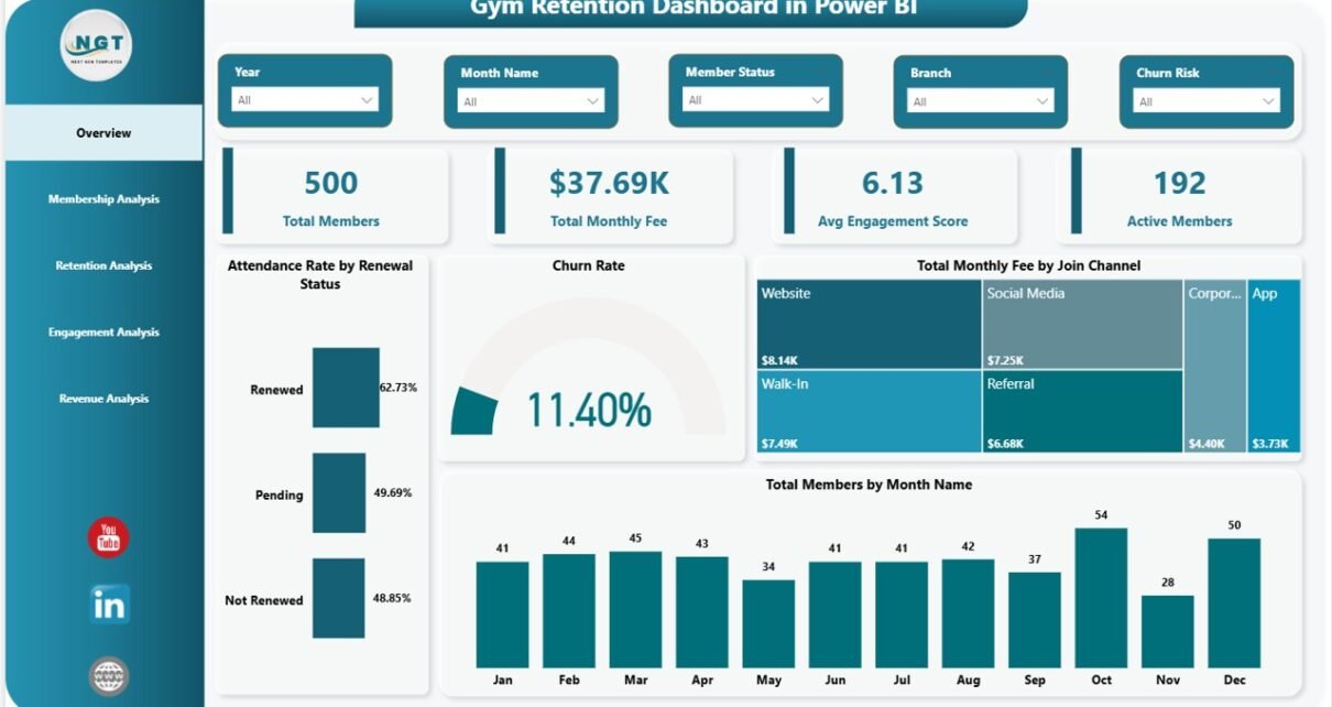
The Gym Retention Dashboard in Power BI tracks 4 headline KPIs across 5 interactive report pages, with 13 pre-built visuals and slicer-driven filters covering Membership Type, Branch, Renewal Status, Program, and Join Channel. Setup takes under 10 minutes — point Power BI Desktop at your member dataset, click Refresh, and every visual rebuilds automatically.
Gym owners and fitness chain managers face a hard problem: which members will renew next month, and which are quietly slipping away? Mindbody, ClubReady, and Glofox all answer half the question — booking is solid, but retention analytics are usually paywalled or shallow. The Gym Retention Dashboard in Power BI solves the second half. It accepts your existing member export, classifies churned vs. renewed members by branch and month, scores trainer and branch engagement, and surfaces monthly fee revenue trends — all in a fully editable .pbix file you own outright.
👉 Click here to Purchase Gym Retention Dashboard in Power BI
Key Features of Gym Retention Dashboard in Power BI
📊 4 headline KPIs on the Overview page — Total Members, Total Monthly Fee, Avg Engagement Score, and Active Members. Each KPI card recalculates instantly when any slicer is toggled, so leadership reviews take minutes rather than hours.
📈 13 pre-built Power BI visuals across 5 report pages — Overview, Membership Analysis, Retention Analysis, Engagement Analysis, and Revenue Analysis. Each page is built around a specific decision gym managers make weekly.
🎛 Multi-slicer filtering on every page — Membership Type, Branch, Renewal Status, Program, and Join Channel slicers cross-filter the entire page in real time, with no DAX writing required.
🔁 Renewal Status segmentation built in — The Retention Analysis page splits Churned Members vs. Renewed Members by Month Name and Branch, so multi-location operators can identify branch-level retention leaks before quarter close.
🧑🏫 Trainer-level engagement scoring — Avg Engagement Score by Trainer on the Engagement page links staff performance directly to member outcomes. Most gym SaaS tools either hide this behind premium tiers or skip it entirely.
💰 Monthly fee revenue analysis — Total Monthly Fee by Membership Type, Branch, and Month Name on the Revenue page tracks where recurring revenue concentrates and how it trends month-over-month.
Dashboard Pages Explanation
📊 Page 1 — Overview Page. The opening page is built for leadership-level scanning. 4 KPI cards on top — Total Members, Total Monthly Fee, Avg Engagement Score, Active Members — give an at-a-glance read on gym health. Four charts surface the patterns behind those numbers: Attendance Rate by Renewal Status (correlates engagement with renewals), Churn Rate (overall trend), Total Monthly Fee by Join Channel (which acquisition source brings highest-paying members), and Total Members by Month Name (growth and seasonality).
📊 Page 2 — Membership Analysis. Three tier-focused visuals: Avg Engagement Score by Membership Type (which tier is most engaged), Total Members by Membership Type (tier mix), and Total Monthly Fee by Renewal Status (do renewing members pay more?). Use this page when reviewing pricing or planning new tier launches.
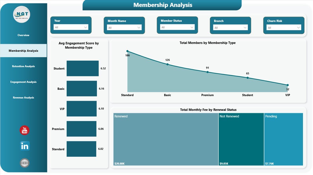
Membership Analysis Page
📊 Page 3 — Retention Analysis. The retention page is the heart of the dashboard. Three visuals: Total Members by Program (which programs retain members), Churned Members and Renewed Members by Month Name (the renewal-vs-churn trend over time), and Churned Members by Branch (location-level leak detection). The branch-level breakdown is where multi-location operators catch problems early.
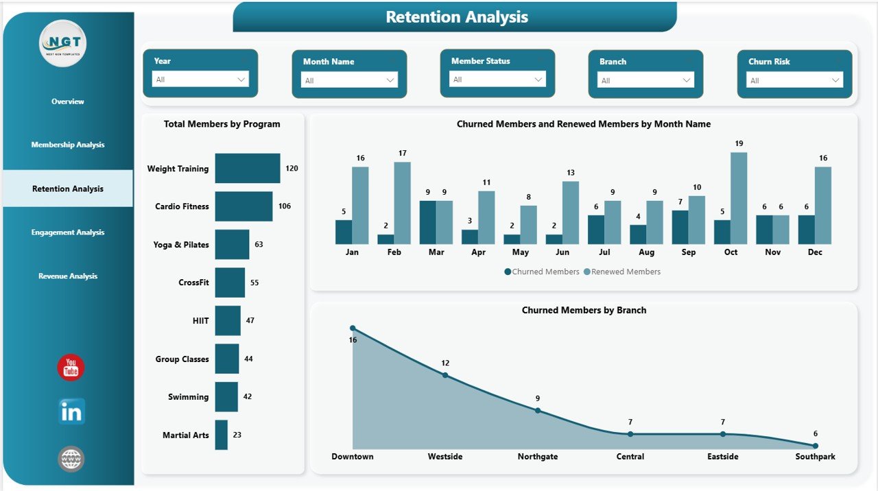
Retention Analysis Page
📊 Page 4 — Engagement Analysis. Three engagement visuals: Avg Engagement Score by Trainer (staff performance ranking), Attendance Rate by Program (which programs sustain attendance), and Avg Engagement Score by Branch (location performance). Engagement is a leading indicator of renewal — this page tells you which interventions will pay off in 60–90 days.
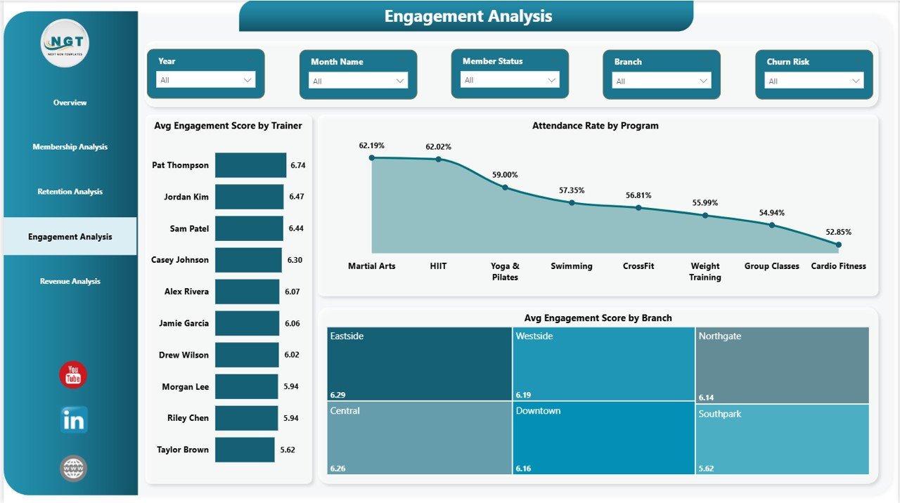
Engagement Analysis Page
📊 Page 5 — Revenue Analysis. Three revenue visuals: Total Members by Branch (size by location), Total Monthly Fee by Membership Type (where revenue concentrates by tier), and Total Monthly Fee by Month Name (seasonality and growth). Pair this with the Retention page to model whether revenue dips are a churn problem or a pricing problem.
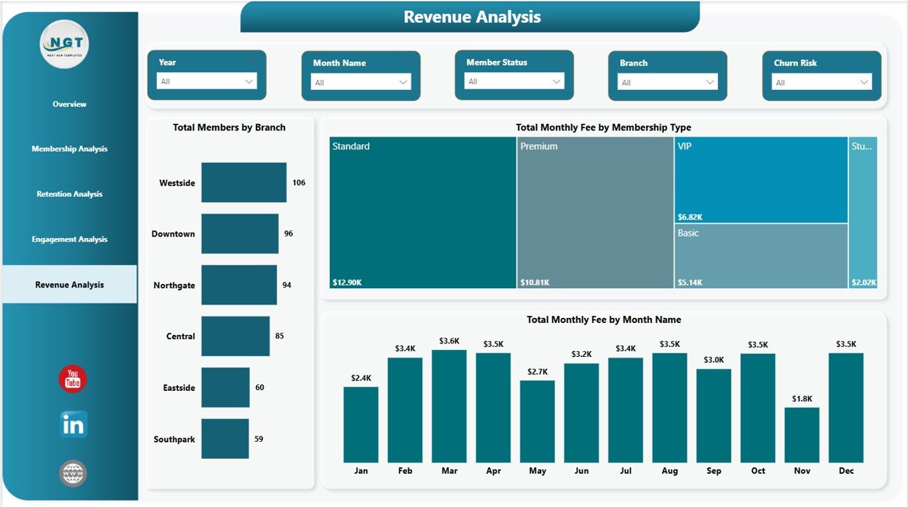
Revenue Analysis Page
Gym Retention Dashboard in Power BI vs. Tableau / Qlik vs. Mindbody / GymMaster — Feature Comparison
| Feature | Gym Retention Dashboard in Power BI | Tableau / Qlik Sense | Mindbody / GymMaster (SaaS) |
|---|---|---|---|
| Cost | $17.99 one-time ✅ | $15–$70 / user / month | $129–$349 / month |
| Platform | Power BI Desktop (free) | Tableau / Qlik Sense | Cloud SaaS |
| Setup Time | Under 10 minutes ✅ | 4–8 hours per dashboard | 1–2 weeks onboarding |
| Renewal Status Segmentation | ✅ Built in | Custom build required | Premium tier only |
| Trainer Engagement Scoring | ✅ Avg score per trainer | Custom DAX / formulas | Premium add-on |
| Multi-Branch Comparison | ✅ Branch slicer | ✅ Available | ✅ Available |
| Customizable Visuals | ✅ Fully editable | ✅ Fully editable | ⚠️ Locked templates |
| No Per-User Fees | ✅ Unlimited Desktop users | ❌ Per-seat pricing | ❌ Per-location pricing |
| Year-1 Cost (5 users) | $17.99 ✅ | $900–$4,200 | $1,548–$4,188 |
For gym operators who want renewal-status segmentation, trainer engagement scoring, and branch-level revenue visibility without paying $1,500+ per year for Mindbody, the Gym Retention Dashboard in Power BI sits in the sweet spot.
Who Should Use This Template
✅ Perfect for:
- Gym owners and fitness chain operators (1–10 branches) who already use Power BI Desktop for analytics
- Retention managers who need visibility into churned vs. renewed members by month, branch, and program
- Boutique fitness operators tracking 100–10,000 member records and exporting from Mindbody, ClubReady, or GymMaster
- Fitness business analysts presenting monthly retention and revenue reports to franchise leadership
❌ Not a fit if:
- You operate enterprise-scale gym chains needing live API integrations and real-time member-facing portals
- You don’t have a Windows machine — Power BI Desktop is Windows-only
- You need built-in payment processing, class booking, or member self-service check-in
- You prefer a spreadsheet-only workflow — see the Excel or Google Sheets versions instead
Real-World Use Cases
Marcus runs a 4-location fitness chain in Manchester. Each Monday morning he refreshes the Gym Retention Dashboard in Power BI against his ClubReady CSV export. The Retention Analysis page surfaces which branches lost the most members the previous week — and Avg Engagement Score by Branch on the Engagement page tells him whether the problem is staff-driven (low trainer scores) or program-driven (low attendance rate by program). He used to spend four hours each Monday building these views in Excel; now it takes 12 minutes from refresh to decision.
Priya manages member experience at a 6-studio boutique fitness brand. She uses the Engagement Analysis page to identify trainers consistently scoring above 4.0 in average engagement, then pairs her highest-churn-risk members (flagged on the Retention page) with those trainers in personalised re-engagement sessions. Renewals improved 14% in her first quarter using the dashboard, replacing a $189/month Glofox analytics add-on her brand had carried for two years.
David is operations lead for a 3-location CrossFit network. He uses Total Monthly Fee by Membership Type on the Revenue Analysis page to model price increases on premium tiers without losing low-engagement members. The Branch slicer lets him pressure-test pricing changes per location before rolling out network-wide. The dashboard replaced a $139/month Mindbody Insights subscription, freeing roughly $1,668/year that funded an additional weekend trainer slot.
Advantages of Gym Retention Dashboard in Power BI
The most practical advantage is cost displacement. Mindbody Insights, Glofox Reports Premium, and GymMaster Analytics range from $129 to $349 per month. A 12-month subscription at the entry tier costs $1,548. The Gym Retention Dashboard in Power BI is $17.99 once. The savings fund a trainer hire, equipment refresh, or marketing test — line items that actually grow the business.
The second advantage is data ownership. The .pbix file lives on your machine. There is no vendor lock-in, no data egress fees, no deprecated reports when the SaaS provider changes plans. If you switch booking platforms, the dashboard keeps working — the data source is just an Excel/CSV path you control.
The third advantage is analytical depth. SaaS gym tools rarely expose trainer-level engagement scoring or renewal status segmentation by branch in their entry tiers. This dashboard makes both first-class visuals.
Opportunities for Improvement
Honest assessment: the Gym Retention Dashboard in Power BI is a Power BI Desktop file. It does not handle live data syncs from Mindbody or ClubReady out of the box — you refresh manually after pasting an export. For continuous live data, you’d add a Power BI Service Pro license and configure scheduled refreshes via a gateway, which is a one-time setup but does add complexity.
The dashboard also assumes a clean dataset with consistent column names. If your member export uses different field names, you’ll spend 5–10 minutes mapping them in Power Query before the first refresh. After that, every subsequent refresh is one click.
Finally, Power BI Desktop is Windows-only. Mac users either run a Windows VM or use the Google Sheets version instead.
Best Practices
📌 Standardise your data export — always pull the same columns in the same order from your booking platform. Save the export query as a recurring report so weekly refreshes take seconds.
📌 Refresh weekly, review monthly — refresh the Power BI model every Monday, but reserve deep analysis for the first Monday of each month when you have a full month of churn data.
📌 Pair Engagement Score with Retention — members with engagement scores below 3.0 are your at-risk segment. Cross-reference them with the Churned Members visual on the Retention page to validate your churn-prediction logic.
📌 Use the Branch slicer for franchise reviews — when reporting to leadership or franchise partners, filter to one branch at a time and present that branch’s full 5-page story.
📌 Refer to Microsoft’s Power BI Desktop documentation when modifying DAX measures or extending the data model — Microsoft Learn has authoritative guides on every Power BI feature.
Explore Relevant Templates
📌 Gym Retention Dashboard in Excel — Same retention analytics in a spreadsheet-first format with Data and Support sheets, designed for teams that prefer Excel over Power BI.
📌 Gym Retention Dashboard in Google Sheets — Browser-based version with real-time collaboration, ideal for teams using Google Workspace.
📌 Gym Fitness Business Dashboard in Power BI — Broader gym operations dashboard covering revenue, scheduling, and member demographics.
📌 Fitness Trainer Dashboard in Power BI — Trainer-focused performance analytics for fitness studios.
📌 Yoga & Wellness Studio Dashboard in Excel — Retention and revenue analytics tuned for yoga and wellness studios.
Browse more in Power BI Dashboard Templates on NextGenTemplates.
Frequently Asked Questions
What KPIs does the Gym Retention Dashboard in Power BI track?
The Gym Retention Dashboard in Power BI tracks 4 headline KPIs — Total Members, Total Monthly Fee, Avg Engagement Score, and Active Members — plus 13 visual-level metrics including Attendance Rate by Renewal Status, Churn Rate, Total Monthly Fee by Join Channel, Avg Engagement Score by Trainer, and Churned Members by Branch.
Do I need a Power BI Pro license?
No. The Gym Retention Dashboard in Power BI runs entirely in Power BI Desktop, which is free from Microsoft. A Power BI Pro license is only needed if you want to publish reports to the Power BI Service for team sharing. The .pbix file works offline on any Windows machine without any subscription.
👉 Click here to Purchase Gym Retention Dashboard in Power BI
How does this compare to Mindbody Insights or GymMaster?
Mindbody and GymMaster cost $129–$349 per month. The Gym Retention Dashboard in Power BI is $17.99 once. It does not handle bookings or payments, but if you already use a booking platform, it gives you deeper retention, engagement, and revenue analytics than those tools’ built-in reports.
How long does setup take?
Under 10 minutes. Open the .pbix file in Power BI Desktop, point the data source to your member export (Excel, CSV, or database), click Refresh, and all 5 dashboard pages rebuild automatically. No DAX writing or model editing is required for standard use.
Does this work on Mac?
Power BI Desktop is Windows-only — the Gym Retention Dashboard in Power BI runs only on Windows machines. Mac users can use a Windows VM, or switch to the Excel version or Google Sheets version, which both work on Mac.
Can I customise the visuals and DAX measures?
Yes. Every visual, slicer, KPI card, and DAX measure in the Gym Retention Dashboard in Power BI is fully editable. You can rename columns, add new measures, change colors, swap visual types, or remove pages entirely. Lifetime access means you own the .pbix file outright.
Can I add more branches or membership types?
Yes. The Gym Retention Dashboard in Power BI reads from a single dataset. Add new branches, membership types, programs, or trainers to your data source, refresh the Power BI model, and every slicer, visual, and KPI card updates automatically — no DAX edits needed.
About the Author
Built by PK — Microsoft Certified Professional with 15+ years of Excel, Google Sheets, and Power BI experience. Founder of NextGenTemplates, reaching 300K+ subscribers across YouTube channels. Every template is hand-built and tested before release.
Conclusion
If you operate a gym, fitness chain, or boutique studio and you’ve been paying $129+ per month for a SaaS analytics tool that still doesn’t show you renewal status by branch or trainer-level engagement scoring, the Gym Retention Dashboard in Power BI is the upgrade you’ve been looking for. 4 headline KPIs, 13 Power BI visuals, 5 dedicated pages, multi-slicer filtering, and full data ownership — all for $17.99 once.
👉 Click here to Purchase Gym Retention Dashboard in Power BI
✅ Instant download · One-time payment · No subscription
🎥 Visit our YouTube channel for step-by-step Power BI tutorials: YouTube.com/@PK-AnExcelExpert
📅 Last updated: May 2026