The global bakery market generates over $500 billion in annual revenue, yet most bakery owners still track sales, profits, and branch performance in fragmented spreadsheets or manual logs. The Bakery Business Dashboard in Excel solves this by consolidating 5 core KPIs and 16 pre-built charts into a single 5-page interactive workbook — driven entirely by pivot tables, so one click of Refresh All updates every metric and visual simultaneously. Setup takes under 10 minutes: replace the sample data in the Data sheet and the entire dashboard recomputes automatically.
This Excel template is built for bakery owners, F&B operations managers, and food service consultants who need branch-level performance visibility, product-category profitability analysis, and customer buying pattern insights — without paying $69–$199 per month for Toast POS Analytics or MarketMan. For a deeper look at how leading food businesses use Excel dashboards to replace SaaS analytics tools, see Microsoft’s official PivotTable documentation.
You can Click here to Purchase the Bakery Business Dashboard in Excel from NextGenTemplates. Instant download · One-time payment · No subscription.
What Is the Bakery Business Dashboard in Excel?
The Bakery Business Dashboard in Excel is a 7-sheet workbook that transforms raw bakery transaction data into a fully interactive analytics suite. It uses native Excel pivot tables and pivot charts connected to dynamic slicers — no VBA macros, no Power Query, no add-ins required. The template works offline on Excel for Windows and Excel for Mac (2016 and later).
The dashboard covers five dedicated analysis pages plus a Data sheet for input and a Support sheet for pivot tables. Every chart and KPI card pulls from the Support sheet’s pivots, which update automatically when you click Refresh All after entering new data. This architecture means zero manual formula updates — the structure scales with your data as you add more months or more branches.
Click here to Purchase Bakery Business Dashboard in Excel
Dashboard Pages Explanation
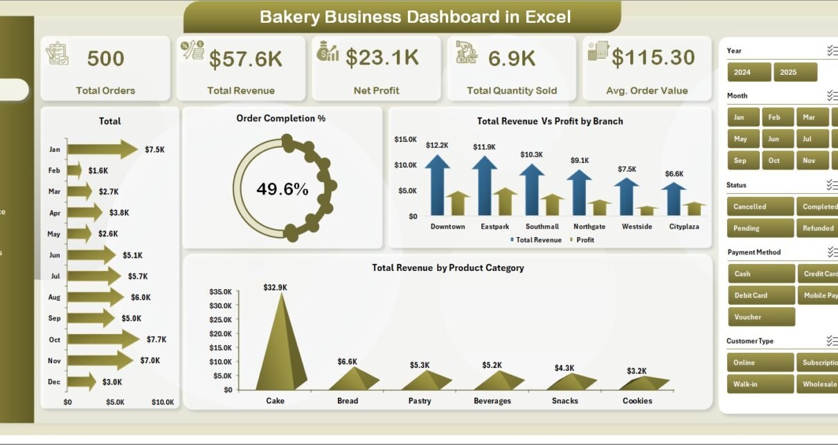
1. Overview Page
The Overview Page is the command center of the Bakery Business Dashboard in Excel. At the top, five KPI cards display the highest-priority metrics at a glance: Total Orders, Total Revenue, Net Profit, Total Quantity Sold, and Avg. Order Value. These five cards cover the full business health picture — volume, revenue, profitability, and transaction efficiency in a single screen.
Below the KPI cards, four charts provide visual breakdowns: Total Revenue by Month shows monthly revenue trends to identify peak and off-peak selling periods; Order Completion % tracks the ratio of fulfilled vs placed orders and flags fulfilment bottlenecks; Total Revenue Vs Profit by Branch compares branch-level revenue against net profit to surface which locations are most efficient; and Total Revenue by Product Category shows which product lines contribute most to total sales. Multiple slicers let you filter all charts simultaneously by date range, branch, or category.
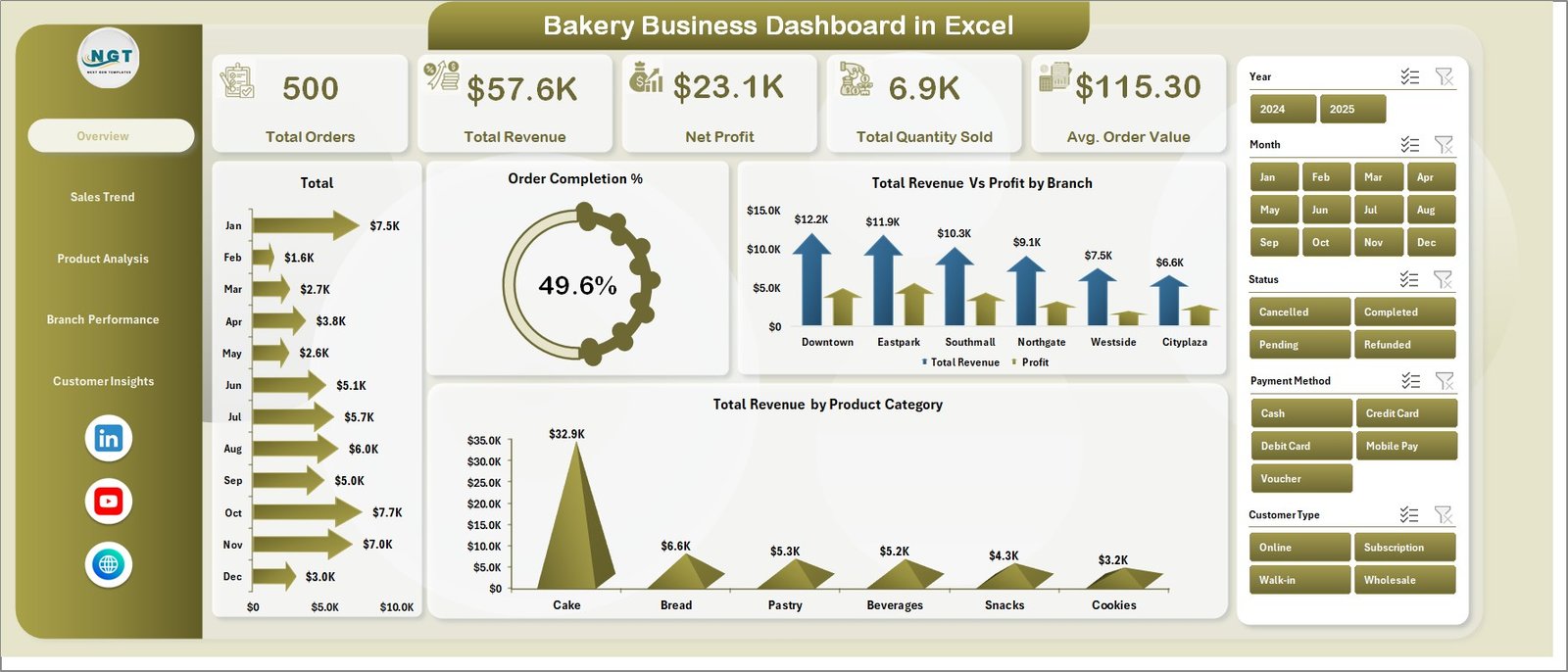
Overview Page
2. Sales Trend Page
The Sales Trend Page provides four month-by-month and segment-level views of bakery sales performance. Total Revenue Vs Profit by Month is the central chart — it reveals whether profit margin is keeping pace with revenue growth or being eroded by rising ingredient costs. Total Revenue by Customer Type separates retail walk-ins from wholesale accounts or corporate buyers, showing which segment drives more revenue. Total Orders by Month tracks order volume trends across the year and flags seasonal peaks. Avg. Order Value by Product Category highlights which product lines generate higher-value transactions per order, informing upselling and product mix decisions.
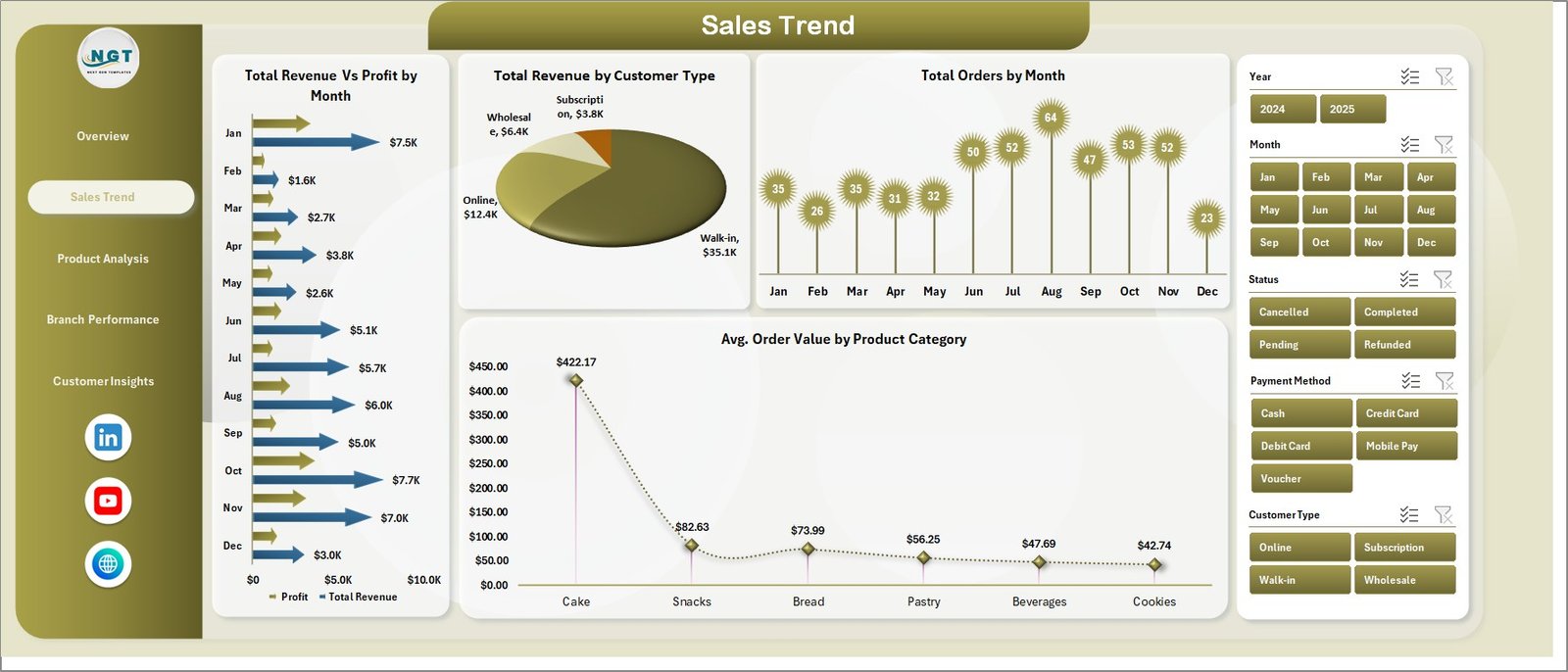
Sales Trend Page
3. Product Analysis Page
The Product Analysis Page is designed for pricing and product portfolio decisions. Four charts break down performance by product category: Total Orders by Product Category ranks product lines by order frequency; Total Cost by Product Category surfaces which categories carry the highest ingredient and production costs; Profit Margin % by Product Category is the critical page for bakery owners — it shows which product lines earn the widest margins and which are diluting overall profitability; Total Revenue Vs Total Quantity Sold by Product Category correlates revenue contribution with unit volume to identify high-revenue, high-volume winners.
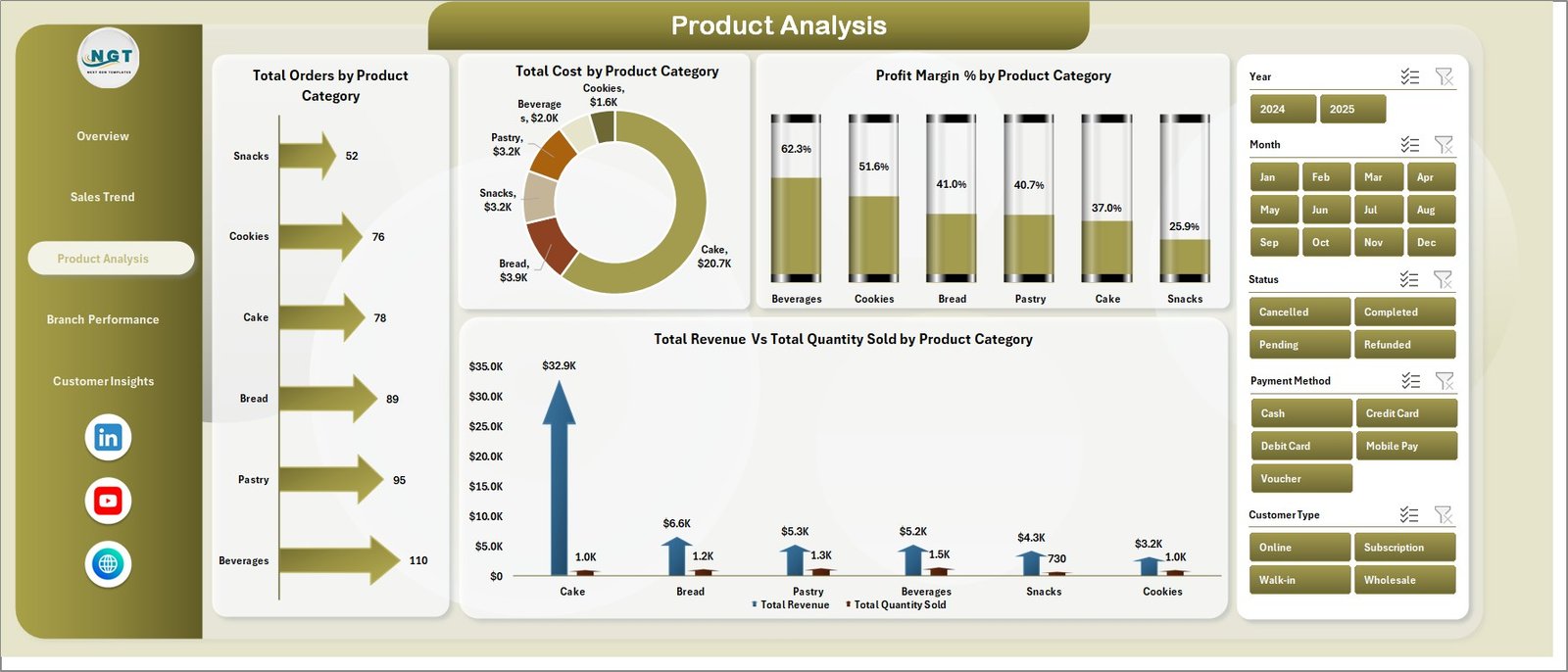
Product Analysis Page
4. Branch Performance Page
The Branch Performance Page is built for multi-location bakeries that need to compare outlet contributions side by side. Four charts cover every angle: Total Revenue Vs Total Cost by Branch shows which locations run the tightest cost margins; Net Profit by Branch is the bottom-line view of each location’s contribution to the business; Total Orders by Branch ranks outlets by transaction volume; and Total Quantity Sold by Branch shows unit-level throughput per location. Together, these four charts make it easy to identify which branches need operational attention and which are performing above the business average.
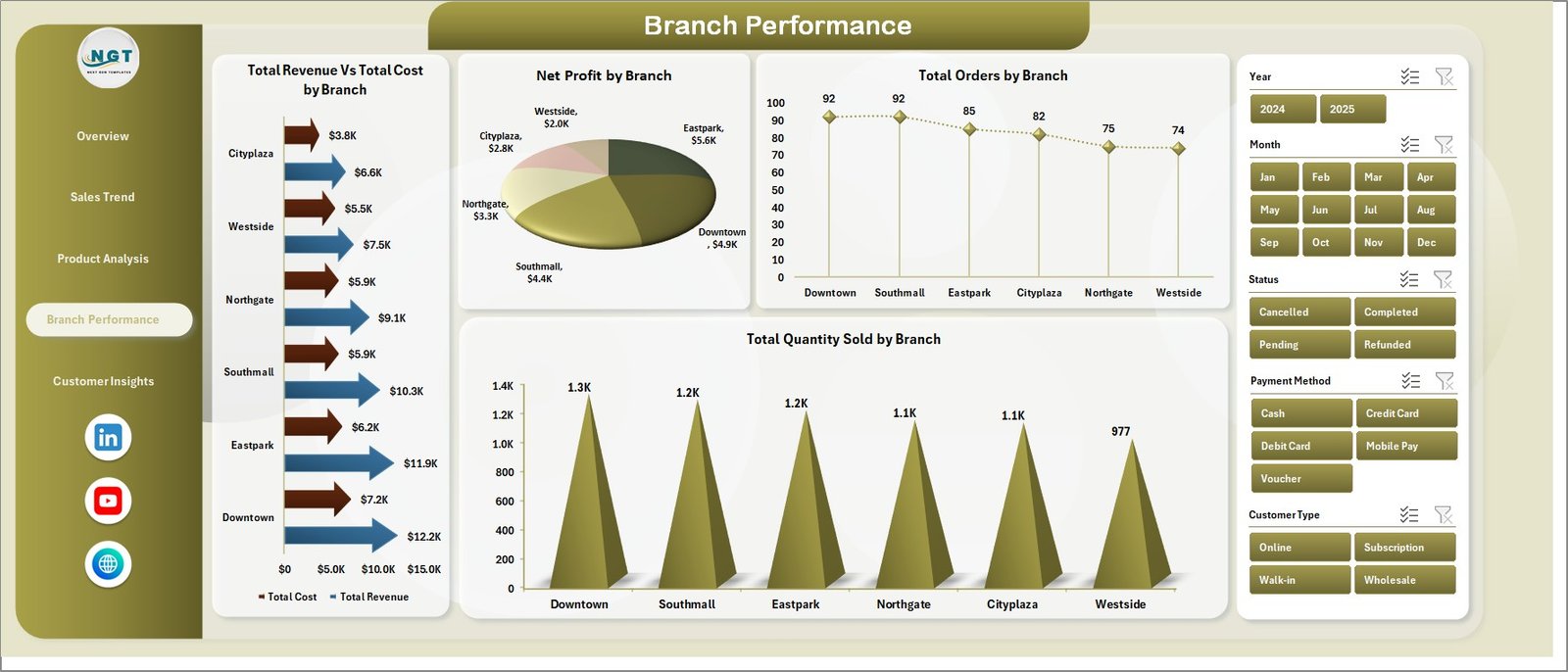
Branch Performance Page
5. Customer Insights Page
The Customer Insights Page surfaces buying pattern data that helps with pricing, channel strategy, and payment infrastructure decisions. Profit Margin % by Customer Type compares retail vs wholesale profitability to guide B2B vs B2C strategy; Total Revenue by Channel shows which sales channel — in-store, online, delivery — generates the most revenue; Total Orders by Payment Method tracks cash, card, and digital payment adoption trends; and Avg. Order Value by Customer Type reveals which customer segment spends more per visit, informing targeted promotions and loyalty programs.
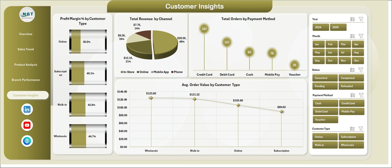
Customer Insights Page
6. Data Sheet Tab
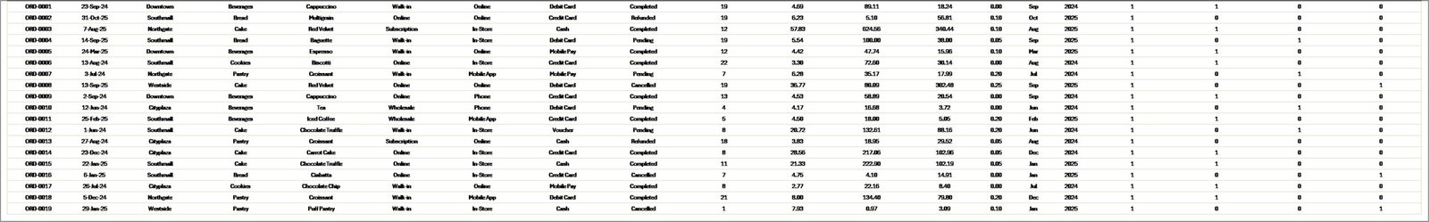
The Data sheet is where you enter all bakery transaction records. Each row represents one transaction, and the columns follow a standardized format that feeds every pivot table in the Support sheet. Add new rows at the bottom as you receive daily or weekly data — then click Refresh All to push the updates through to all five dashboard pages simultaneously. The Data sheet supports any number of rows, making the template equally effective for a single-location bakery with 500 monthly transactions or a multi-branch operation with 50,000+ annual records.
Data Sheet Tab
7. Support Sheet Tab
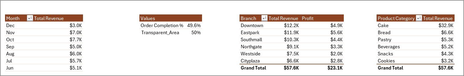
The Support sheet contains all pivot tables that power the dashboard charts and KPI cards dynamically. To update the entire dashboard after adding new data: go to the Data tab in the Excel Ribbon and click Refresh All. All pivot tables in the Support sheet recalculate, and every connected chart across the five dashboard pages updates automatically. You can keep this sheet hidden during day-to-day use for a cleaner workbook presentation.
Support Sheet Tab
Bakery Business Dashboard in Excel vs. Google Sheets Dashboard vs. Toast POS Analytics — Feature Comparison
| Feature | Bakery Business Dashboard in Excel | Google Sheets Dashboard | Toast POS Analytics |
|---|---|---|---|
| Cost | $17.99 one-time | $9–15 one-time | $69–165/month |
| Platform | Microsoft Excel | Google Sheets (browser) | Cloud SaaS |
| Setup Time | Under 10 minutes | Under 10 minutes | 2–4 weeks onboarding |
| Dashboard Pages | 5 pages (16 charts) | Varies by template | Limited pre-built views |
| Branch Comparison | ✅ Built-in | ❌ Manual setup needed | ✅ POS-integrated |
| Customer Insights | ✅ Dedicated page | ❌ Manual setup needed | ✅ Built-in |
| Offline Access | ✅ Full offline | ❌ Requires internet | ❌ Cloud only |
| Customizable Fields | ✅ Fully editable | ✅ Editable | ⚠️ Limited |
| Year-1 Cost at 5 Users | $17.99 total | $9–15 total | $4,140–9,900 |
For bakery owners who want five pages of analytics without monthly SaaS fees, the Bakery Business Dashboard in Excel sits in the sweet spot.
Who Should Use This Template
Perfect for:
- Bakery owners and managers at single-location or multi-branch bakeries who want structured performance visibility
- F&B operations teams tracking product-category profitability, branch contribution, and customer buying patterns
- F&B consultants delivering professional analytics reports to bakery and café clients
- Small-to-mid-size bakeries (1–20 employees) that need 5-page analytics without SaaS platform costs
Not a fit if:
- You operate 50+ bakery locations and need real-time POS API integration and live cloud sync
- Your team requires automated daily data feeds from IoT production line equipment
- You don’t have access to Microsoft Excel — check our Google Sheets Dashboard Templates instead
Real-World Use Cases
Ananya owns a 4-branch artisan bakery chain in Bengaluru. She uses the Bakery Business Dashboard in Excel to compare Net Profit by Branch every Monday morning. Before this template, she spent 3 hours manually consolidating branch data. Now she enters the week’s orders into the Data sheet, clicks Refresh All, and the Branch Performance page immediately shows which location is underperforming — saving her a full morning every week.
James manages operations for a high-volume wholesale bakery in Manchester. The Profit Margin % by Product Category chart on the Product Analysis page revealed that his specialty cakes earned 34% margins while his standard bread loaves earned only 11%. That insight led him to shift floor space toward higher-margin lines, improving overall monthly net profit by 18% in the first quarter after adopting the dashboard.
Maria is an F&B consultant in São Paulo who delivers the Bakery Business Dashboard in Excel as a branded deliverable to bakery clients. The 5-page layout lets her present a complete business review in a single file, covering revenue trends, product profitability, branch rankings, and customer insights — without paying for SaaS tools that cost more per month than her client engagement fee.
Advantages of Bakery Business Dashboard in Excel
The most significant advantage is cost: $17.99 one-time versus $69–$165 per month for Toast POS Analytics or $239+ per month for MarketMan. At 5 users over one year, this template costs 99% less. Beyond cost, the dashboard runs entirely on native Excel features — no add-ins, no licenses, no internet connection required. Every data point and chart is visible and editable by the owner, unlike SaaS black-box dashboards. The slicer-based filtering means non-technical team members can explore the data independently without breaking any formulas. And because the template uses pivot tables, it scales linearly with your data — adding 12 more months of records requires zero structural changes.
Opportunities for Improvement
This template requires manual data entry — there is no direct API connection to POS systems like Toast, Square, or Lightspeed. Bakeries processing high daily transaction volumes will need to export CSV data from their POS and paste it into the Data sheet on a weekly or monthly basis. The template also does not include inventory tracking, production scheduling, or supplier cost management — for those use cases, pair it with a dedicated inventory management tool. Finally, real-time collaboration is limited to Microsoft 365 shared workbooks (via OneDrive or SharePoint); for native real-time multi-user editing, consider our Google Sheets Dashboard Templates.
Best Practices
Update the Data sheet on a consistent schedule — weekly updates deliver the most actionable insights. Standardize your product category and branch names from day one: inconsistent naming (e.g., “Breads” vs “Bread” vs “bread”) creates separate slicer entries that fragment your analysis. Use the Support sheet’s pivot tables to verify row counts after each data entry session to catch any import errors before they propagate to charts. Keep the Support sheet hidden and share only the five dashboard pages with team members who don’t need to edit the underlying data structure. And review the Branch Performance and Product Analysis pages together each month — the combination of those two views gives the clearest picture of where to focus operational improvement effort.
Explore Relevant Templates
🔹 Bakery KPI Scorecard in Excel — Track 15+ bakery KPIs with MTD/YTD analysis, Actual vs Target comparison, and color-coded trend charts. The ideal companion for KPI monitoring alongside this dashboard.
🔹 Food Delivery Dashboard in Excel — 5-page analytics for cloud kitchen and food delivery operations including rider performance, cuisine-level revenue, and zone-wise delivery times.
🔹 Catering Business KPI Scorecard in Excel — Monitor catering-specific KPIs including food cost %, on-time delivery rate, and revenue per event.
🔹 Food and Beverage Report in Excel — F&B reporting template for restaurants, hotels, and catering businesses with cost vs sales analysis and availability tracking.
🔹 Browse all Excel Dashboard Templates on NextGenTemplates.
Frequently Asked Questions
What KPIs does the Bakery Business Dashboard in Excel track?
The Bakery Business Dashboard in Excel tracks 5 KPIs on the Overview page: Total Orders, Total Revenue, Net Profit, Total Quantity Sold, and Average Order Value. It also includes 16 analytics charts across five pages covering sales trends, product profitability, branch performance, and customer buying patterns — all updating automatically from a single Data sheet.
How long does setup take?
Setup takes under 10 minutes. Open the Excel file, replace the sample data in the Data sheet with your actual bakery transaction records using the same column format, go to the Data tab in the Excel Ribbon, click Refresh All, and the entire 5-page dashboard updates automatically.
Does this template work on Mac?
Yes. The Bakery Business Dashboard in Excel uses standard pivot tables, pivot charts, and slicers — no VBA macros required. It is fully compatible with Microsoft Excel for Mac (2016 and later) and Microsoft Excel for Windows.
Can I use this for multiple bakery branches?
Yes. The Branch Performance page is specifically designed for multi-location analysis. It shows Revenue vs Cost, Net Profit, Total Orders, and Quantity Sold side by side for every branch. Add branch names in the Data sheet column and they appear automatically in the slicer and charts after Refresh All.
How does this compare to Toast POS Analytics?
Toast POS Analytics costs $69–$165 per month per location with mandatory onboarding. The Bakery Business Dashboard in Excel is a $17.99 one-time purchase with lifetime access, works offline, requires no subscription, and provides 5 dedicated analysis pages including branch comparison and customer insights at a fraction of the annual SaaS cost.
Can I customize product categories and branch names?
Yes. Update the category and branch values in your Data sheet and click Refresh All — the pivot table slicers and chart labels automatically reflect your custom values with no formula editing required.
Is there a Power BI version?
Not for the Bakery Business Dashboard specifically. For Power BI analytics templates, explore our Power BI Dashboard Templates collection on NextGenTemplates.
About the Author
Built by PK — Microsoft Certified Professional with 15+ years of Excel, Google Sheets, and Power BI experience. Founder of NextGenTemplates, reaching 300K+ subscribers across YouTube channels. Every template is hand-built and tested before release.
Conclusion
The Bakery Business Dashboard in Excel gives bakery owners a complete 5-page analytics suite — Overview, Sales Trend, Product Analysis, Branch Performance, and Customer Insights — without paying monthly SaaS fees. At $17.99 one-time, it covers everything from KPI monitoring to product margin analysis to branch benchmarking in a single offline-capable Excel file.
Click here to Purchase Bakery Business Dashboard in Excel
Instant download · One-time payment · No subscription · Lifetime access
For step-by-step video tutorials, visit Youtube.com/@PK-AnExcelExpert