The global solar energy market installed over 230 GW of new capacity in 2024 alone — and every EPC company, developer, and regional operator managing that growth needs one thing: a reporting layer that turns raw installation records into clear decisions. The Solar Energy Dashboard in Power BI tracks 4 headline KPIs across 5 interactive pages, covering system type performance, client segment profitability, panel brand benchmarking, and multi-region portfolio analysis. Setup takes under 10 minutes — open the .pbix file in Power BI Desktop, replace the sample data, and every card, chart, and slicer updates automatically.
🌍 Join 8,400+ teams in 40+ countries using NextGenTemplates to replace paid SaaS tools with one-time-purchase Power BI, Excel, Google Sheets, and HTML templates.
✅ Instant download · One-time payment of $17.99 · No subscription · No per-user fees · Lifetime access
Key Features of Solar Energy Dashboard in Power BI
4 KPI cards on the Overview page — Total Revenue, Net Profit, Total Capacity, and Total Annual Energy Output — give solar EPC managers and project finance teams instant visibility into portfolio-level performance. According to the International Energy Agency’s Solar PV reports, solar project financiers increasingly require standardized KPI reporting across revenue, margin, and installed capacity metrics. This dashboard delivers all four in a single, refreshable Power BI file.
5 dedicated analysis pages covering Overview, System Insights, Client Segment, Brand Analysis, and Regional Performance. Each page uses Power BI’s native cross-filtering, so every slicer click instantly updates all visuals on that page — no manual chart rebuilds, no pivot refresh buttons required.
Multi-dimensional slicer filtering lets you drill from a company-wide view down to a single system type, client segment, panel brand, or region in two clicks. Built for project managers, brand managers, and finance controllers who need fast, filtered answers from the same dataset without leaving the dashboard.
Brand and client profitability analysis built in — the Brand Analysis page benchmarks panel brands on revenue, capacity, and profit margin, while Client Segment breaks performance across residential, commercial, industrial, and utility clients. These are exactly the insights solar channel managers use to negotiate supplier partnerships and reallocate pipeline toward higher-margin segments.
Dashboard Pages Explanation
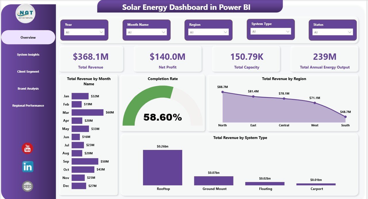
1. Overview Page
The Overview page presents 4 headline KPI cards — Total Revenue, Net Profit, Total Capacity, and Total Annual Energy Output — paired with four supporting charts: Total Revenue by Month Name (shows seasonal revenue distribution), Completion Rate (tracks project delivery against targets), Total Revenue by Region (highlights geographic revenue concentration), and Total Revenue by System Type (breaks revenue by rooftop, ground mount, carport, and utility-scale systems). Multiple slicers let you filter the entire page by system type, client segment, panel brand, or region in two clicks.
Overview Page — Solar Energy Dashboard in Power BI
2. System Insights
The System Insights page compares solar system types across three key dimensions: Total Capacity by System Type (shows which system category has the most installed kW), Total Annual Energy Output by System Type (reveals which configuration generates the most energy), and Total Projects by System Type (tracks volume by category). This page is the go-to view for operations teams deciding where to focus installation capacity and for executives weighing which system type mix produces the best energy yield.
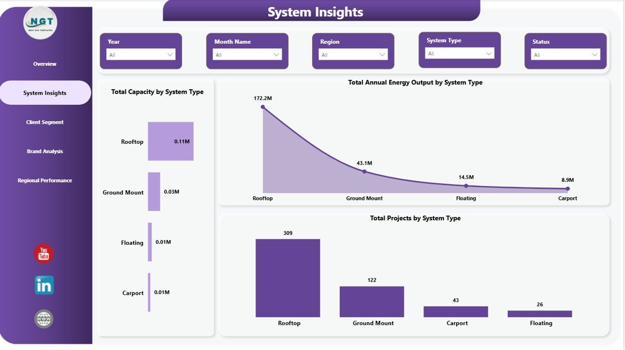
System Insights
3. Client Segment
The Client Segment page breaks portfolio performance across customer categories: Total Revenue by Client Segment (shows which customer type drives the most revenue), Total Capacity by Client Segment (reveals where installed kW is concentrated), and Profit Margin by Client Segment (the most important view — which segment is most profitable). Sales and account management teams use this page to identify whether to double down on commercial clients, renegotiate residential pricing, or adjust industrial project terms.
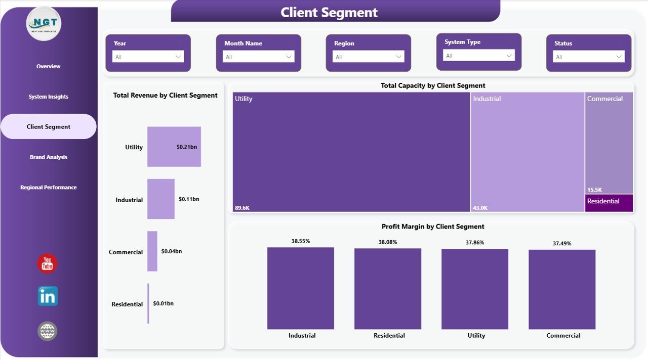
Client Segment
4. Brand Analysis
The Brand Analysis page benchmarks panel suppliers across three performance metrics: Total Revenue by Panel Brand (shows which brand drives the most business), Total Capacity by Panel Brand (reveals installed kW by supplier), and Profit Margin by Panel Brand (the critical metric for procurement — which brands are most margin-accretive). Procurement and channel managers use this page to negotiate volume discounts with top-performing brands and phase out relationships with low-margin suppliers.
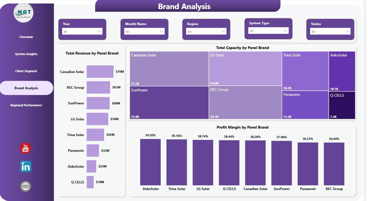
Brand Analysis
5. Regional Performance
The Regional Performance page provides a geographic view of the portfolio: Profit Margin by Region (the most actionable metric for regional sales heads — which territory is most profitable), Total Capacity by Region (shows installed kW concentration by geography), and Total Revenue and Net Profit by Region (the dual-axis view CFOs rely on to compare revenue generation vs margin delivery across territories). This is the executive-level page for monthly business reviews.
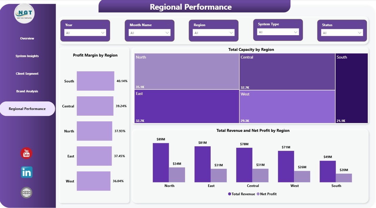
Regional Performance
Solar Energy Dashboard in Power BI vs. Excel vs. Paid Solar SaaS — Feature Comparison
| Feature | Solar Energy Dashboard in Power BI | Solar Energy Dashboard in Excel | Paid Solar SaaS (Aurora / OpenSolar Pro / Scoop) |
|---|---|---|---|
| Cost | $17.99 one-time ✅ | $17.99 one-time | $49–$199 / user / month |
| Platform | Power BI Desktop + Service ✅ | Microsoft Excel (desktop + web) | Cloud SaaS only |
| Setup time | Under 10 minutes ✅ | Under 10 minutes | 2–6 weeks onboarding |
| Interactive cross-filtering | ✅ Native Power BI | ⚠️ Slicer-only | ✅ Yes |
| Publish to Power BI Service | ✅ Share via link | ❌ Not applicable | ✅ Paid seat per viewer |
| Brand + region analysis | ✅ Out of the box | ✅ | ⚠️ Higher tier only |
| Year-1 cost at 5 users | $17.99 total ✅ | $17.99 total | $2,940–$11,940 |
For solar EPC teams already using Power BI who want installation-level analytics without $3K–$12K per year in SaaS fees, the Solar Energy Dashboard in Power BI sits in the sweet spot.
Who Should Use This Template
Perfect for:
- Solar EPC and installation companies with 50–2,000 installations per year already running Power BI for reporting
- Solar finance and operations managers presenting monthly portfolio decks in Power BI Service
- Channel managers who need brand-by-brand margin comparisons across panel suppliers
- Regional solar sales heads tracking revenue and capacity across multiple geographies
- Solar consultants replicating a portable Power BI template across multiple installer clients
Not a fit if:
- You need SCADA-level live telemetry or real-time inverter data feeds — this is a reporting dashboard, not an IoT monitoring platform
- Your team needs PV system sizing, string layouts, or shading simulations — use Aurora or PVsyst for design
- You require SOC 2-audited, SSO-gated cloud platforms with automated utility bill parsing
Real-World Use Cases
Priya leads operations at a 60-person solar EPC company in California. Her team installs 400+ rooftop and commercial systems per year across three regions. Every Monday she opens the Regional Performance page in Power BI Service, filters by the Southwest, and flags any territory where profit margin has slipped more than 3 points month-over-month — then pivots to Client Segment to identify whether the erosion is coming from residential or commercial projects. The Solar Energy Dashboard in Power BI replaced a $120/month Power BI add-on her team had been paying for since 2022.
Marco is a finance controller at a European solar developer with ground-mount and carport installations across Germany, Italy, and Spain. His CFO sends a standing request every month-end: Total Revenue vs Net Profit by Region, broken down by system type. Marco publishes the Power BI dashboard to Service, shares a read-only link with the executive team, and never opens PowerPoint.
Ananya is an independent solar consultant who delivers monthly performance reports to five installer clients across Asia. She duplicates the .pbix file for each client, connects it to their project data, and walks through the Overview and Brand Analysis pages during quarterly reviews. She replaced an $89/user/month reporting SaaS with a one-time $17.99 purchase and now bills for the insights, not the software.
Advantages of Solar Energy Dashboard in Power BI
Power BI’s native cross-filtering means analysts spend zero time rebuilding charts for different filter combinations — every slicer selection propagates instantly across all visuals on the page. This alone saves solar operations teams 2–3 hours per monthly reporting cycle compared to Excel-based pivot refreshes.
Publishing to Power BI Service converts a local .pbix file into a live, shareable dashboard that stakeholders can access from any browser — with no per-viewer license required beyond the author’s existing Power BI Pro or Premium seat. For smaller solar companies, this is a cost-effective alternative to enterprise SaaS platforms that charge per seat for read-only access.
The Brand Analysis and Client Segment pages surface the profitability insights that most solar reporting tools bury in raw data exports. Knowing that Tier 1 commercial clients deliver 22% margins while residential clients average 14% gives sales leadership a clear pipeline prioritization signal without a data analyst in the loop.
Opportunities for Improvement
The current template uses static Excel-based sample data. Teams wanting live data connectivity will need to replace the data source with a SQL Server, SharePoint list, or Power BI Dataflow connection — a 15–30 minute one-time setup in Power Query. The template does not include a custom DAX-driven rolling 12-month trend or YoY comparison measure out of the box, though both can be added by any intermediate Power BI user. Organizations managing 5,000+ installation records monthly may also want to consider switching to a DirectQuery connection for performance optimization.
Best Practices
Keep the data model clean: one flat fact table with installation records and consistent column naming. Power BI’s cross-filtering performs best when relationships are simple and star-schema-style. Before publishing to Service, set up Row-Level Security if multiple regional managers need to see only their own territory data. Use the Regional Performance page as your weekly executive summary — it’s the fastest way to surface territory-level profit margin signals before they compound into larger portfolio problems.
Explore Relevant Templates
☀️ Solar Energy Dashboard in Excel — the same 5 analysis pages built in native Excel with pivot tables and slicers for teams on the Microsoft stack.
🌿 ESG Environmental Dashboard in Power BI — pair your solar numbers with full carbon emissions, water usage, and regulatory compliance tracking.
🔋 Energy Consumption Analysis Dashboard in Google Sheets — track kWh, cost, and rate across energy sources and buildings.
Browse the full Power BI Dashboard Templates collection for 200+ industry-specific dashboards.
Frequently Asked Questions
What KPIs does the Solar Energy Dashboard in Power BI track?
The Solar Energy Dashboard in Power BI tracks 4 headline KPIs — Total Revenue, Net Profit, Total Capacity, and Total Annual Energy Output — plus chart-level metrics spanning system type, client segment, panel brand, and region across 5 interactive pages.
How long does setup take?
Setup takes under 10 minutes. Open the .pbix file in Power BI Desktop (free from Microsoft), replace the sample data with your own solar installation records, and every KPI card, chart, and slicer updates automatically.
Which version of Power BI do I need?
The Solar Energy Dashboard in Power BI works with Power BI Desktop (free from Microsoft) on Windows. Sharing via Power BI Service requires a Power BI Pro or Premium Per User license. No third-party add-ins, DAX customization, or Power Query scripting is needed to use the template out of the box.
How does this compare to paid solar reporting SaaS like Aurora or OpenSolar?
Aurora and OpenSolar Pro cost $49–$199 per user per month — $2,940–$11,940 per year for a 5-person team. The Solar Energy Dashboard in Power BI is $17.99 one-time and covers the performance-reporting layer most solar EPC teams actually need: revenue, margin, capacity, and regional portfolio tracking.
Can I customize the KPIs, charts, and slicers?
Yes. Every visual in the Solar Energy Dashboard in Power BI is fully editable in Power BI Desktop. Add new DAX measures, create additional report pages, change the color theme, or connect your own Excel, SQL, or SharePoint data source without any restrictions.
Is there an Excel version available?
Yes. The Solar Energy Dashboard in Excel covers the same 5 analysis pages with pivot tables and slicers for teams on the Microsoft Excel stack. Both versions use the same underlying data structure.
About the Author
Built by PK — Microsoft Certified Professional with 15+ years of Excel, Google Sheets, and Power BI experience. Founder of NextGenTemplates, reaching 300K+ subscribers across YouTube channels (@PK-AnExcelExpert, @NextGenTemplates, @NeoTechNavigators). Every template is hand-built and tested before release.
Conclusion
The Solar Energy Dashboard in Power BI gives solar EPC teams, regional operators, and consultants a production-ready reporting layer covering revenue, capacity, energy output, client profitability, brand benchmarking, and regional performance — all in a single Power BI file that sets up in under 10 minutes.
Click here to Purchase the Solar Energy Dashboard in Power BI
✅ Instant download · One-time payment of $17.99 · No subscription · Lifetime access
Visit our YouTube channel for step-by-step Power BI tutorials: Youtube.com/@PK-AnExcelExpert
📅 Last updated: May 2026