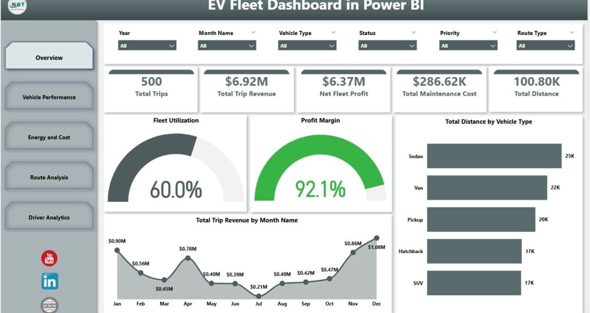
Electric fleet operators spend the largest share of their operating cost on charging — and most teams still rely on a spreadsheet for board reporting. The EV Fleet Dashboard in Power BI tracks 22 fleet KPIs across 5 interactive pages, including trips, revenue, energy consumption, charging cost by depot, CO2 saved by route type, and the top-five driver analytics — all in a single editable .pbix file priced at a one-time $17.99.
This post walks through every page of the EV Fleet Dashboard in Power BI, compares it against Tableau, Qlik, and the leading telematics SaaS platforms (Verizon Connect, Geotab, Samsara), and shows how a 10-vehicle fleet saves $3,000+ in year one by replacing per-vehicle SaaS billing with a one-time Power BI template.
👉 Click here to Purchase the EV Fleet Dashboard in Power BI
Key Features of the EV Fleet Dashboard in Power BI
- 22 fleet KPIs across 5 Power BI pages — every visual is native Power BI Desktop with DAX measures and slicer-driven filtering. No third-party visuals required.
- Executive cards on the Overview page — Total Trips, Trip Revenue, Net Fleet Profit, Maintenance Cost, and Total Distance render the full operating picture in a single screen.
- Dedicated Energy and Cost page tracking Total Energy Consumed by Route Type, Total Charging Cost by Depot, and Total Charging Cost by Vehicle Type — the three numbers that decide whether the EV business case beats diesel.
- CO2 saved by route type — auditable emissions numbers ready for ESG reports and investor decks, computed directly inside the model via DAX.
- Top-five Driver Analytics — Total Distance, Avg Driver Rating, and Total Trips by driver to support coaching, bonuses, and customer-feedback triage.
- Native slicers cascade across every page — filter by depot, vehicle type, route priority, and date range with one click.
- Fully editable
.pbixfile — every DAX measure, visual, slicer, page background, and colour theme is customisable inside Power BI Desktop.
Dashboard Pages Explanation
The EV Fleet Dashboard in Power BI ships as a single .pbix file with five linked report pages. Open it in Power BI Desktop (free Microsoft download), point the data model at your own fleet records, refresh, and every visual on every page updates.
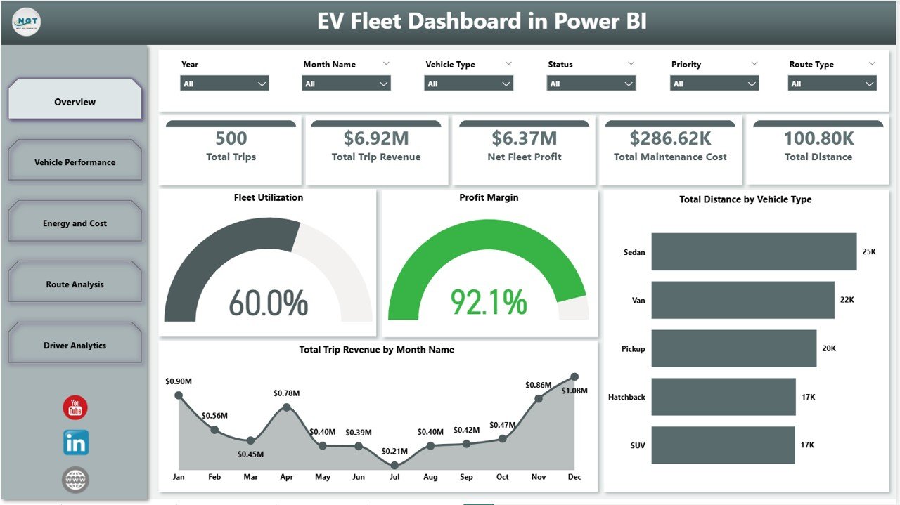
Page 1: Overview
The Overview page presents five high-level cards — Total Trips, Total Trip Revenue, Net Fleet Profit, Total Maintenance Cost, and Total Distance — plus four charts: Fleet Utilization, Profit Margin, Total Distance by Vehicle Type, and Total Trip Revenue by Month Name. Top slicers filter every visual by depot, vehicle type, and date range.
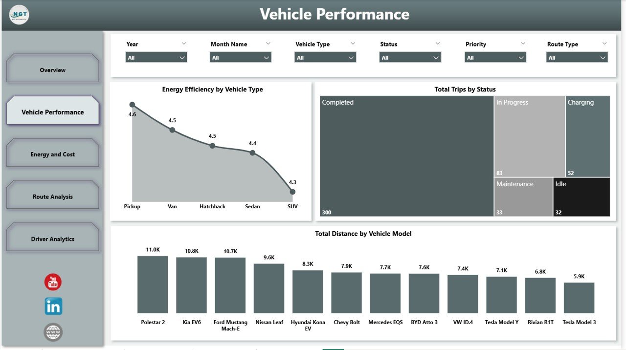
Page 2: Vehicle Performance
The Vehicle Performance page shows Energy Efficiency by Vehicle Type, Total Trips by Status, and Total Distance by Vehicle Model. Use it to spot under-utilised vehicles and identify which electric models are over-running planned trip counts.
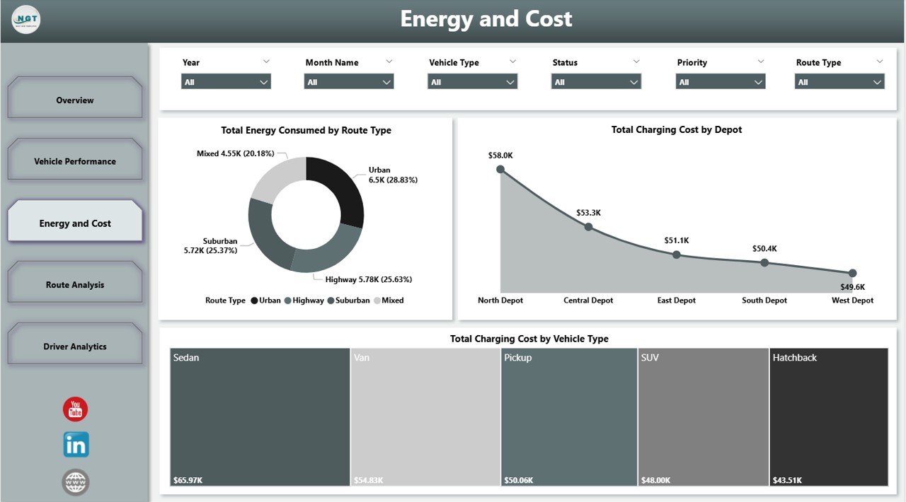
Page 3: Energy and Cost
The Energy and Cost page controls the largest EV operating expense — charging. Charts include Total Energy Consumed by Route Type, Total Charging Cost by Depot, and Total Charging Cost by Vehicle Type. Compare depot-level kWh usage and benchmark cost-per-kWh across vehicle classes.
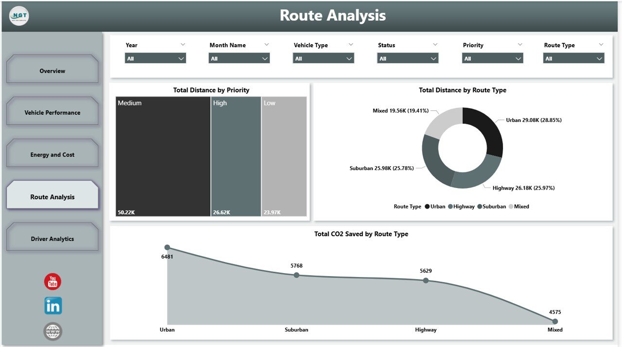
Page 4: Route Analysis
The Route Analysis page links operations to ESG. Charts include Total Distance by Priority, Total Distance by Route Type, and Total CO2 Saved by Route Type — the page you bring to board meetings to prove how many kilograms of CO2 your fleet has avoided.
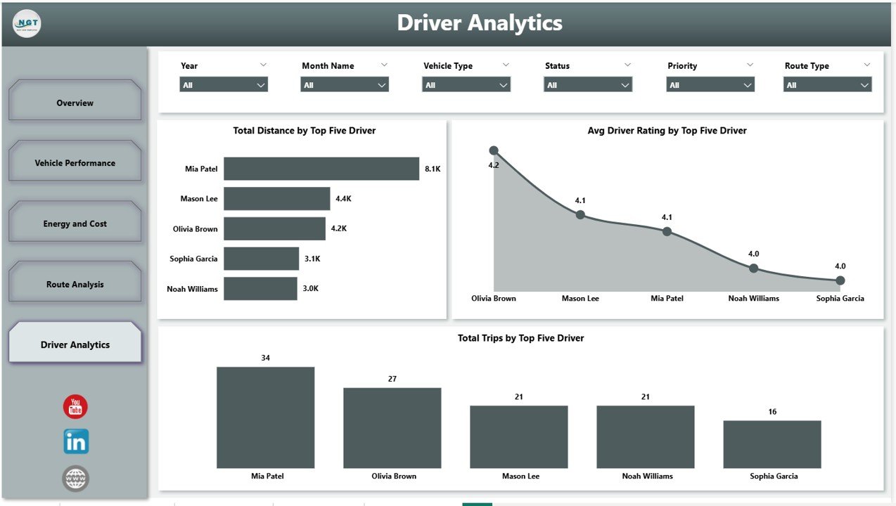
Page 5: Driver Analytics
The Driver Analytics page surfaces the top-five drivers on Total Distance, Avg Driver Rating, and Total Trips. Use it to reward consistent performers and identify drivers who pair high distance with low ratings for coaching.
EV Fleet Dashboard in Power BI vs. Tableau / Qlik vs. Verizon Connect / Geotab / Samsara — Feature Comparison
| Feature | EV Fleet Dashboard in Power BI | Tableau / Qlik EV dashboard | Verizon Connect / Geotab / Samsara |
|---|---|---|---|
| Cost | $17.99 one-time ✅ | $70-$150 / user / month | $25-$60 / vehicle / month |
| Platform | Power BI Desktop (free) ✅ | Tableau / Qlik Sense | Vendor-hosted SaaS |
| Setup time | Under 10 minutes ✅ | 2-4 weeks consultant project | 2-6 weeks onboarding + hardware install |
| Data ownership | Your file, your model ✅ | Your file, vendor licence | Vendor cloud, contractual access |
| EV-specific KPIs (kWh, CO2) | Built-in ✅ | Build yourself | Yes, vendor-defined |
| Customisable visuals | Full DAX + visual edits ✅ | Yes | Limited to vendor UI |
| Share with link | Power BI Service / OneDrive | Tableau Server | Built-in ✅ |
| Year-1 cost (10-vehicle fleet) | $17.99 total ✅ | $840+ | $3,000-$7,200+ |
For fleet managers who want depot-level, vehicle-type-level, and driver-level visibility without paying $3,000+ per year per fleet to a telematics SaaS vendor, the EV Fleet Dashboard in Power BI sits in the sweet spot — board-ready visuals at a one-time price.
Who Should Use This Template
Perfect for:
- Fleet managers operating 5-250 electric vehicles who want a single Power BI source of truth for trips, revenue, energy, and emissions.
- Last-mile delivery operators (e-grocery, parcel, food, pharma) running mixed depots and needing route-type CO2 reporting.
- Logistics analysts who already use Power BI and want a ready-made model to connect to telematics exports.
- ESG and sustainability teams needing auditable CO2-saved numbers for annual reports.
- Fleet consultants who deliver client reports and want a polished, editable starting point.
Not a fit if:
- You operate above 1,000 vehicles and need real-time GPS telematics with live driver coaching alerts.
- You require SOC 2-hosted vendor infrastructure with managed uptime SLAs.
- You prefer spreadsheets — the matching EV Fleet Dashboard in Excel is the right pick.
Real-World Use Cases
Priya runs operations for an 80-vehicle electric delivery fleet across three Manchester depots. Every Monday morning she opens the Energy and Cost page, compares charging cost per kWh across depots, and flags the depot running 18% above benchmark for a tariff review. She estimates the dashboard has saved her team roughly £1,400 every quarter — without paying a recurring telematics fee.
Marcus is a sustainability analyst at a national logistics group. He sources the CO2-saved-by-route-type numbers for his ESG annual report directly from the Route Analysis page. The Power BI file lives on the corporate OneDrive, which means the audit team can re-open the same model and trace every figure back to its source rows during the year-end review.
Aisha is an EV-transition consultant working with mid-market last-mile carriers. She uses the Driver Analytics page in pitch meetings to show prospective clients how easily they can move from spreadsheets to a Power BI-based fleet review process. The template doubled as her demo asset and helped win two retainer contracts in her first quarter.
Advantages of the EV Fleet Dashboard in Power BI
- One-time cost replaces recurring SaaS — at $17.99 versus $25-$60 per vehicle per month, a 10-vehicle fleet recovers the cost in roughly four days of telematics billing.
- Native Power BI means your IT team already supports it, your data lake already connects to it, and your security team has already reviewed it.
- Editable DAX measures — every formula is visible and changeable, unlike a black-box SaaS dashboard whose definitions you have to trust.
- ESG-ready CO2 reporting baked in — a critical signal as global EV adoption grows and disclosure rules tighten.
- Slicer-driven filtering means non-analysts can self-serve answers without writing a single DAX formula.
Opportunities for Improvement
- The dashboard does not include live GPS telemetry — it is a periodic reporting layer, not a real-time tracking tool. Pair it with a telematics provider’s data export if you need live location.
- Driver Analytics surfaces only the top five drivers per metric by design (for board readability). Analysts who need a full driver league table can duplicate the visual and remove the Top N filter.
- The default model uses kilometres and CO2 in kilograms. Teams reporting in miles or pounds will need to adjust the conversion factor inside one DAX measure.
Best Practices
- Refresh the data model at a fixed weekly cadence (Monday mornings work well) so the entire team sees the same numbers all week.
- Lock the slicer state on the Overview page before sharing the file with non-analysts — this prevents accidental filter changes.
- Publish to Power BI Service if you need scheduled refresh, row-level security, or email subscriptions.
- Save a versioned copy of the
.pbixeach quarter — it becomes your audit trail for ESG reporting.
Explore Relevant Templates
- Also available as: EV Fleet Dashboard in Excel — the same KPI set on Microsoft Excel for spreadsheet-first teams.
- Auto Repair Dashboard in Power BI — pair with the EV Fleet dashboard for workshop and maintenance visibility.
- Driving School Dashboard in Power BI — adjacent driver-training analytics in the same Power BI style.
- Supplier Performance KPI Dashboard in Power BI — track the suppliers behind your charging, maintenance, and parts spend.
- Warehouse Efficiency Dashboard in Google Sheets — complete the upstream logistics view.
- Browse the full Power BI Dashboards collection on NextGenTemplates.
Related reading on this blog: EV Fleet Dashboard in Excel, Driving School Dashboard in Power BI, and Food Delivery Dashboard in Power BI — all built with the same KPI-card-plus-slicer methodology.
Frequently Asked Questions
What KPIs does the EV Fleet Dashboard in Power BI track?
The EV Fleet Dashboard in Power BI tracks 22 fleet KPIs across five pages — Total Trips, Trip Revenue, Net Fleet Profit, Maintenance Cost, Total Distance, Fleet Utilization, Profit Margin, Energy Efficiency by Vehicle Type, Total Charging Cost by Depot, Total CO2 Saved by Route Type, and the top-five Driver Analytics metrics.
Do I need a paid Power BI licence?
No. The EV Fleet Dashboard in Power BI opens and renders fully in Power BI Desktop, which Microsoft offers as a free download. A Power BI Pro licence is only needed if you want to publish to Power BI Service for cloud-based sharing.
How long does setup take?
Under 10 minutes. Download the .pbix file, paste your fleet records into the data table while keeping column headers identical, click Refresh, and all five pages of the EV Fleet Dashboard in Power BI re-render with your numbers.
How does this compare to Verizon Connect, Geotab, or Samsara?
Those telematics SaaS platforms cost $25-$60 per vehicle per month and include hardware. The EV Fleet Dashboard in Power BI is a one-time $17.99 reporting layer — ideal if you already have data exports and just need board-ready visuals without recurring SaaS billing.
Is there an Excel version?
Yes — the matching EV Fleet Dashboard in Excel covers the same KPI set in Microsoft Excel. Many customers buy both so finance and operations each get their preferred tool with a single shared KPI definition.
Can I modify the DAX and visuals?
Yes. The EV Fleet Dashboard in Power BI ships as an editable .pbix file — every visual, DAX measure, slicer, page background, and colour theme is fully customisable inside Power BI Desktop. There are no locked elements.
Will it work with my telematics data export?
Yes — as long as your export contains trip date, vehicle, depot, route type, distance, energy consumed, charging cost, revenue, and driver columns. Most Geotab, Verizon Connect, Samsara, and FleetComplete exports include these fields and paste directly into the EV Fleet Dashboard in Power BI data table.
About the Author
Built by PK — Microsoft Certified Professional with 15+ years of Excel, Google Sheets, and Power BI experience. Founder of NextGenTemplates, reaching 300K+ subscribers across YouTube channels (@PK-AnExcelExpert, @NextGenTemplates, @NeoTechNavigators). Every template is hand-built and tested before release.
Conclusion
The EV Fleet Dashboard in Power BI is the fastest way for an electric fleet operator to move from spreadsheet reporting to board-ready Power BI visuals — without paying a recurring per-vehicle SaaS fee. Five linked report pages, 22 KPIs, native slicers, editable DAX, and CO2-saved reporting baked in.
👉 Click here to Purchase the EV Fleet Dashboard in Power BI
✅ Instant download · One-time payment · No subscription · Lifetime access
🎥 For step-by-step video tutorials, visit YouTube.com/@PK-AnExcelExpert.
📅 Last updated: May 2026