Digital Twin Services Dashboard in Excel is built for teams that need a practical way to monitor digital twin service revenue, project delivery, operations, quality, and customer satisfaction without paying for a heavy reporting platform. Digital twin programs often combine engineering work, sensors, simulation hours, service categories, deployment models, and client-facing project delivery. When that data sits in separate trackers, leaders lose time preparing reports and comparing performance. This Excel dashboard gives you a structured, visual reporting layer with KPI cards, slicers, charts, a Data Sheet, and a pivot-driven Support Sheet.
You can get the template here: Digital Twin Services Dashboard in Excel.
Key Features of Digital Twin Services Dashboard in Excel
- Five main dashboard pages: Overview, Service Insights, Regional Analysis, Operations, and Quality & CSAT.
- Executive KPI cards: Total Revenue, Total Projects, Total Profit, Total Sensors, and Profit Margin %.
- Twenty ready-made charts: Analyze project status, revenue, cost, profit, sensors, deployment model, region, complexity, engineer performance, accuracy, uptime, and CSAT.
- Interactive slicers: Filter the dashboard quickly by your business dimensions and review focused dashboard views.
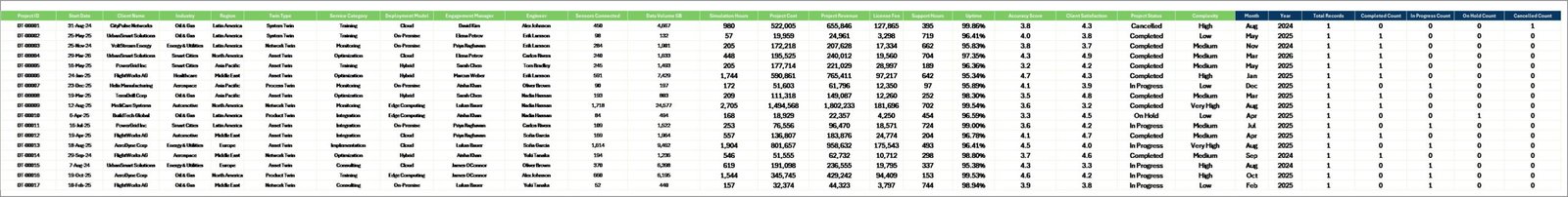
- Data Sheet tab: Add your data in the same structured format and refresh the workbook.
- Support Sheet tab: Pivot tables power the entire dashboard dynamically and can be kept hidden.
- Excel workflow: Uses familiar Excel features, including pivots, charts, slicers, and Refresh All.
Dashboard Pages Explanation
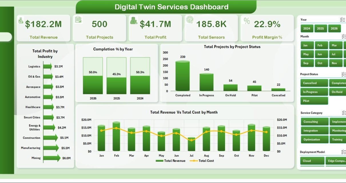
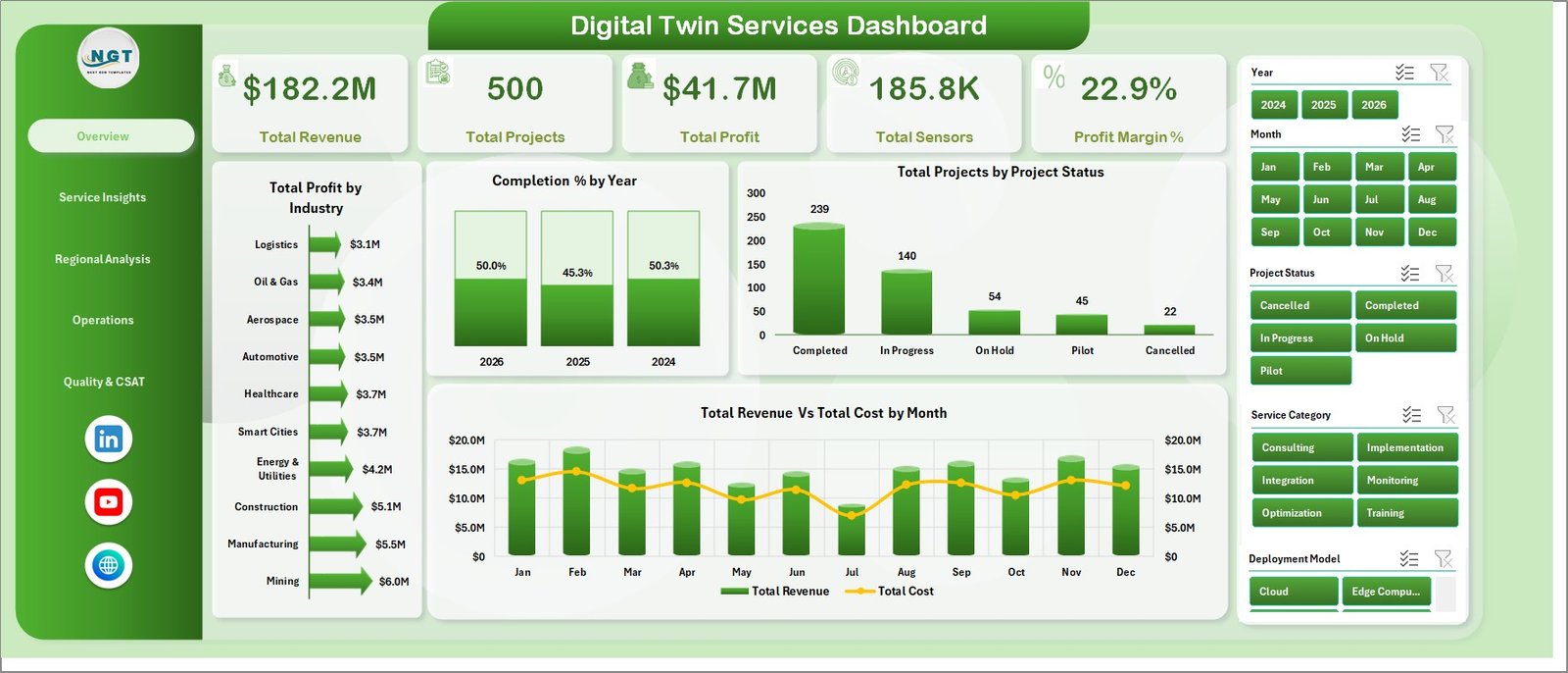
1. Overview Page
The Overview Page gives a high-level performance view for digital twin service leaders. The KPI cards summarize Total Revenue, Total Projects, Total Profit, Total Sensors, and Profit Margin %, so users can quickly understand commercial performance and delivery scale.
Total Profit by Industry compares profit contribution across industries. It helps leaders identify which sectors are producing the best return from digital twin work.
Completion % by Year tracks delivery completion by year. This chart is useful for reviewing whether project execution is improving over time.
Total Projects by Project Status shows how many projects sit in each status group. It helps project teams see active, completed, delayed, or planned work in one view.
Total Revenue Vs Total Cost by Month compares monthly revenue and cost. It helps users spot margin pressure, cost spikes, and revenue seasonality.
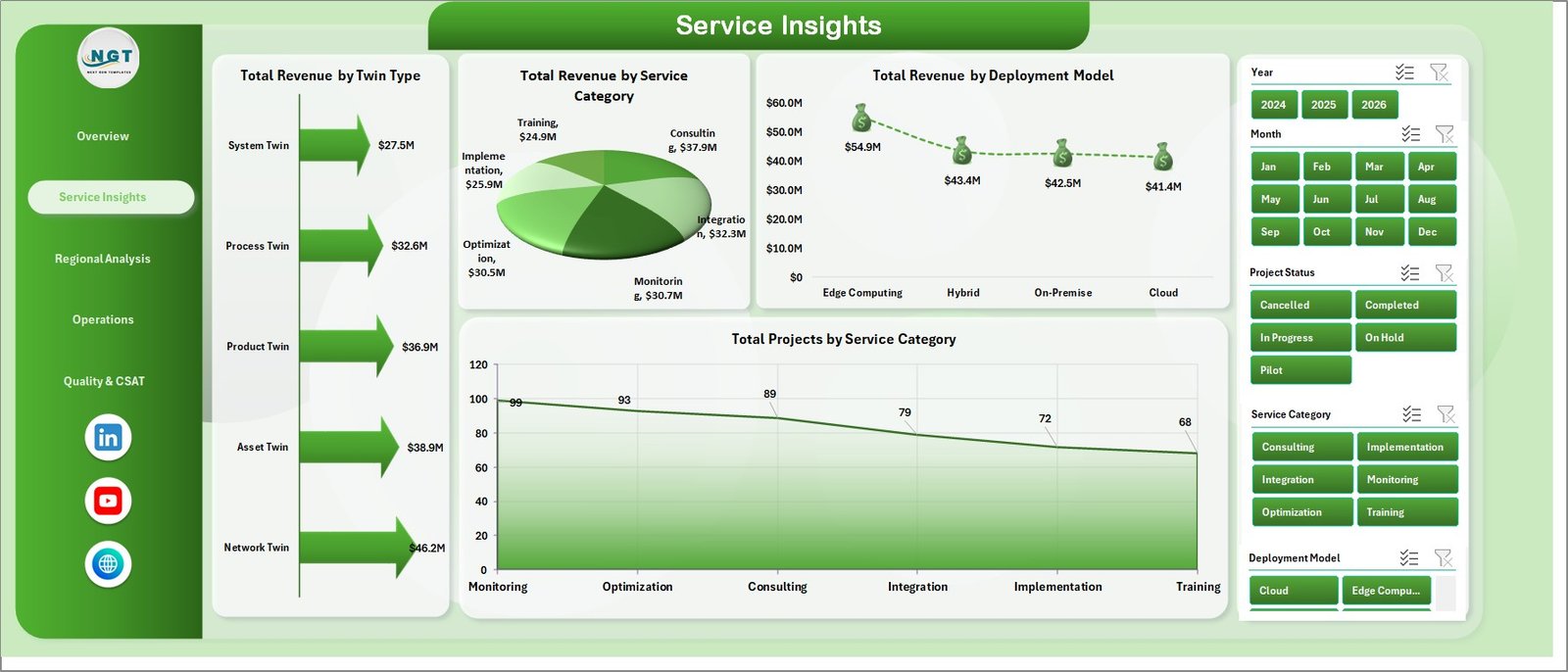
2. Service Insights
The Service Insights page explains which services, twin types, and deployment models generate revenue and project volume.
Total Revenue by Twin Type shows the highest-value twin categories. It helps sales and delivery teams prioritize offerings that contribute more revenue.
Total Revenue by Service Category compares revenue across different service categories. It is useful for understanding whether consulting, implementation, support, monitoring, or simulation services are driving growth.
Total Revenue by Deployment Model breaks revenue by deployment model. Leaders can compare cloud, on-premise, hybrid, or other deployment approaches.
Total Projects by Service Category shows delivery volume by category. It helps teams separate high-volume services from high-revenue services.
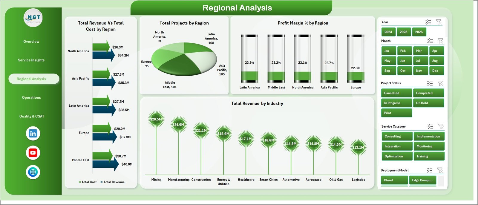
3. Regional Analysis
The Regional Analysis page compares revenue, cost, project count, margin, and industry revenue across regions.
Total Revenue Vs Total Cost by Region shows which regions are profitable and which need cost review. It is ideal for regional business reviews.
Total Projects by Region displays workload distribution by geography. Managers can use it for capacity planning and territory review.
Profit Margin % by Region compares margin performance across regions. It helps leaders identify where pricing, staffing, or delivery strategy needs attention.
Total Revenue by Industry shows industry revenue in the regional view. This helps teams understand where regional demand is strongest.
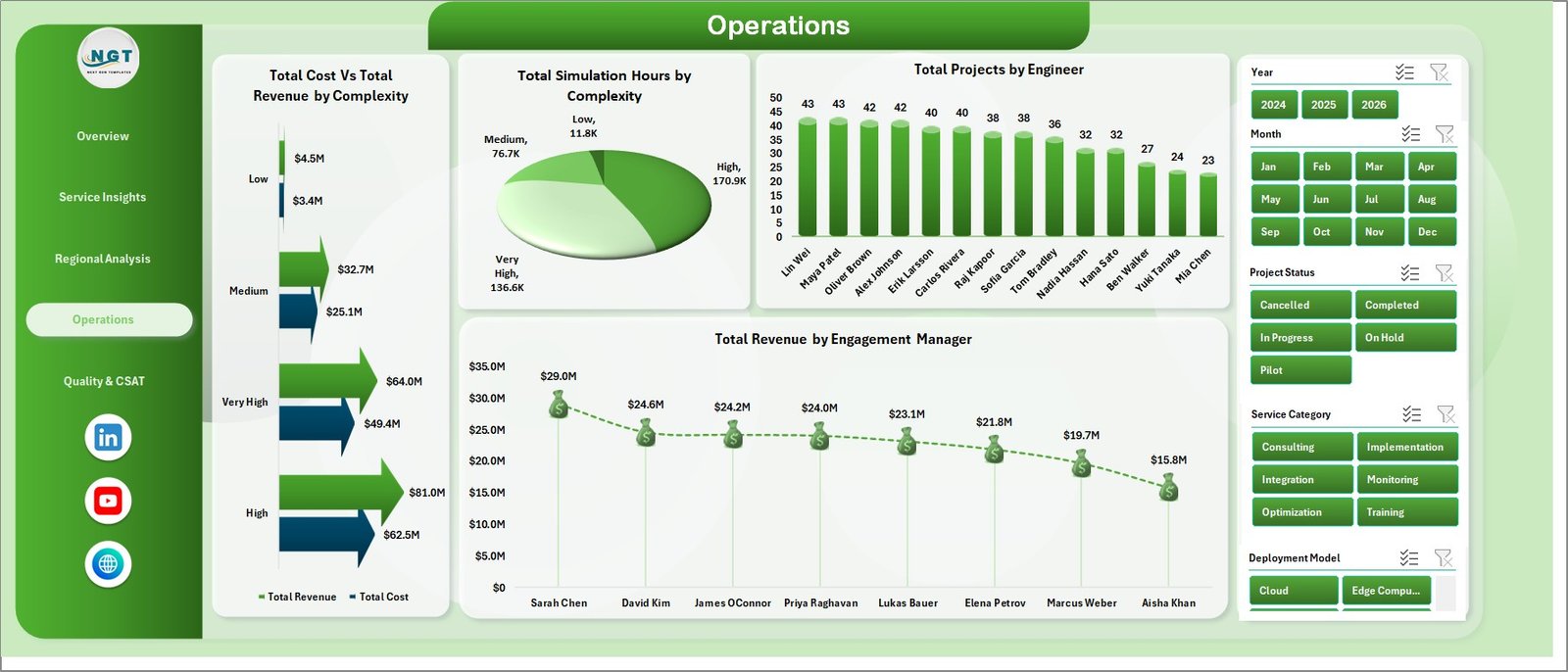
4. Operations
The Operations page focuses on complexity, simulation hours, engineer workload, and engagement manager revenue.
Total Cost Vs Total Revenue by Complexity compares cost and revenue across complexity levels. This helps teams check if complex projects are priced and staffed correctly.
Total Simulation Hours by Complexity shows simulation workload by complexity. It supports technical resource planning and compute capacity review.
Total Projects by Engineer compares project volume by engineer. Managers can use it to balance work and spot overload.
Total Revenue by Engagement Manager shows revenue ownership by engagement manager. It helps leadership review commercial responsibility and account contribution.
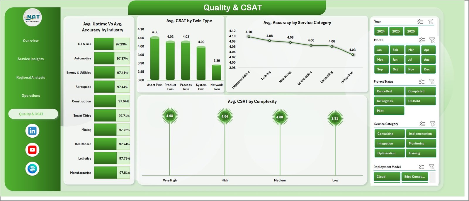
5. Quality & CSAT
The Quality & CSAT page connects technical quality with customer experience.
Avg. Uptime Vs Avg. Accuracy by Industry compares reliability and accuracy by industry. It helps teams see where digital twin outcomes are strongest.
Avg. CSAT by Twin Type shows customer satisfaction by twin type. This is useful for identifying which offerings create the best client experience.
Avg. Accuracy by Service Category compares accuracy across service categories. It helps teams identify delivery quality improvement areas.
Avg. CSAT by Complexity shows satisfaction by project complexity. It helps managers plan additional communication and support for complex work.
6. Data Sheet Tab
The Data Sheet tab is where users add digital twin service data in the same format as the template. Once the data is updated, users can refresh all pivots and charts.
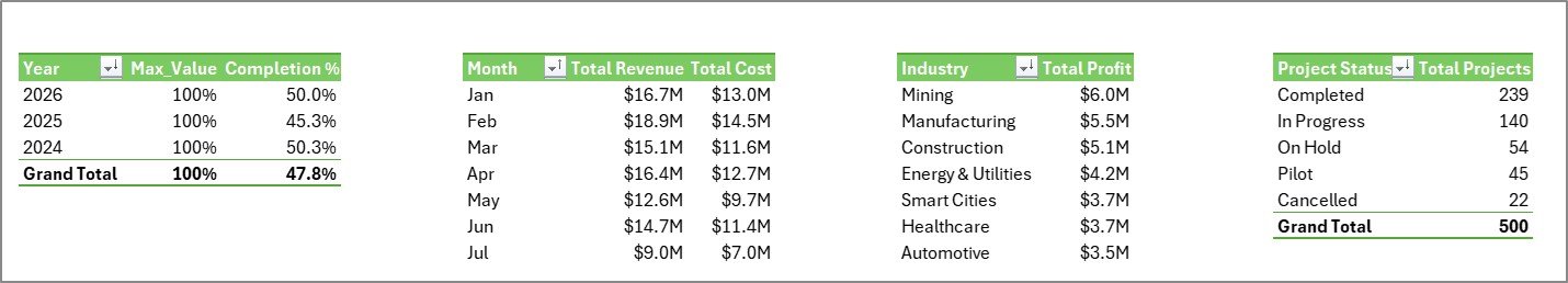
7. Support Sheet Tab
The Support Sheet contains the pivot tables used to create the dashboard dynamically. After updating the Data Sheet, go to Data > Refresh All in Excel. You can keep this sheet hidden for normal users.
Digital Twin Services Dashboard in Excel vs. Google Sheets vs. Paid SaaS – Feature Comparison
| Feature | Excel dashboard template | Google Sheets alternative | Paid digital twin SaaS |
|---|---|---|---|
| Cost | $17.99 one-time | Low cost, but manual build required | Subscription pricing |
| Platform | Microsoft Excel | Google Sheets | Vendor web platform |
| Setup time | Replace data and refresh pivots | Build formulas, pivots, and visuals | Implementation and onboarding |
| Real-time collaboration | Possible through OneDrive or SharePoint | Native collaboration | Usually included |
| Mobile access | Excel app support | Google Sheets app support | Vendor dependent |
| Customizable fields | Fully editable workbook | Editable sheet | Limited by vendor settings |
| Digital twin service analytics | Built-in pages and charts | Must be created | Often included, less flexible |
| Year-1 cost at 5 users | $17.99 total | Usually low plus build time | Often hundreds or thousands |
Who Should Use This Template
This template is useful for digital twin service providers, IoT consultants, engineering managers, smart manufacturing teams, simulation service teams, operations analysts, project managers, and engagement managers. It is especially helpful when the team already works in Microsoft Excel and wants reporting clarity without adding a new SaaS platform.
Real-World Use Cases
Digital transformation consulting: A consulting leader uses the Overview and Service Insights pages to review project revenue, profit, and service mix before client portfolio meetings.
Engineering operations: An operations manager reviews complexity, simulation hours, and engineer workload to plan staffing for upcoming digital twin projects.
Regional delivery review: A regional director uses the Regional Analysis page to compare revenue, cost, project count, and margins across territories.
Advantages of Digital Twin Services Dashboard in Excel
- It gives a complete reporting view using a tool most business teams already know.
- It separates raw data, pivot support logic, and dashboard visuals cleanly.
- It is easier to customize than many fixed SaaS reports.
- It supports fast management reviews with slicers and page-specific analysis.
- It keeps template cost predictable with a one-time purchase model.
Opportunities for Improvement
This template is intentionally built as an Excel reporting workbook. It does not include automated IoT ingestion, live sensor streaming, simulation model execution, or API connections to industrial platforms. Teams that need live telemetry should connect their operational systems separately and then use the dashboard for structured reporting after preparing the data.
Best Practices
- Keep the Data Sheet structure consistent when adding new records.
- Refresh all pivot tables after every data update.
- Review KPI totals before sharing reports with leadership.
- Keep the Support Sheet hidden if end users do not need to edit pivots.
- Use the official Microsoft guidance for refreshing PivotTable data when training new users: Microsoft Support – Refresh PivotTable data.
Explore Relevant Templates
For related IT and analytics workflows, explore IT and Cybersecurity Operations Bundle, IT Support Ticket Dashboard in Excel, IT Asset Management Dashboard in Power BI, and Cloud Hosting Services Dashboard in Excel.
Frequently Asked Questions
What is the Digital Twin Services Dashboard in Excel?
It is an Excel dashboard template for tracking digital twin service revenue, projects, profit, sensors, regional performance, operations, quality, and CSAT.
Can I update the dashboard with my own data?
Yes. Add your records to the Data Sheet in the same format, then refresh the workbook from the Excel Data ribbon.
Does this dashboard use pivot tables?
Yes. The Support Sheet contains pivot tables that power the dashboard charts dynamically.
Can I hide the Support Sheet?
Yes. The Support Sheet can stay hidden during normal dashboard use.
Is this a live IoT monitoring system?
No. It is an Excel reporting template, not a sensor streaming platform or simulation engine.
Who is this best for?
It is best for digital twin service providers, engineering teams, IoT consultants, and managers who want editable Excel reporting for project and service performance.
About the Author
Built by PK – Microsoft Certified Professional with 15+ years of Excel, Google Sheets, and Power BI experience. Founder of NextGenTemplates, reaching 300K+ subscribers across YouTube channels. Every template is hand-built and tested before release.
Conclusion
The Digital Twin Services Dashboard in Excel gives digital twin service teams a clean way to review revenue, cost, project status, regional performance, operational workload, uptime, accuracy, and CSAT. It is a practical fit for teams that want Excel-based reporting with slicers, pivot tables, and dashboard pages ready to use. For step-by-step Excel tutorials, visit Youtube.com/@PKAnExcelExpert.