Electric Utility Maintenance Dashboard in Power BI gives electric utility maintenance teams a practical way to monitor work orders, total spend, maintenance cost, parts cost, downtime hours, asset performance, regional impact, and customers affected in one interactive report. Utility maintenance teams often work with hundreds or thousands of work order records across substations, feeders, meters, transformers, and field assets. If those records stay in separate spreadsheets or monthly reports, leaders can miss cost spikes, downtime patterns, open work order pressure, and regional service issues.
This ready-to-use Power BI dashboard turns structured maintenance data into KPI cards, slicers, trend charts, asset analysis, regional reporting, and maintenance type views. Users can open the .pbix file in Power BI Desktop, replace the sample data, refresh the report, and start reviewing maintenance performance. You can get the template here: Electric Utility Maintenance Dashboard in Power BI.
Electric Utility Maintenance Dashboard in Power BI
Key Features of Electric Utility Maintenance Dashboard in Power BI
- 5 Power BI pages covering Overview, Monthly Trend, Asset Analysis, Regional Analysis, and Maintenance Type.
- High-level KPI cards for Total Work Orders, Total Spend, Total Maintenance Cost, Total Parts Cost, and Total Customers Affected.
- Multiple slicers that let users apply filters and review filtered maintenance data quickly.
- Work order status analysis to compare completion rate and operational close-out performance.
- Downtime and customer impact analysis by month and region for reliability review.
- Asset and voltage-level reporting for cost, spend, and downtime analysis.
- Editable Power BI file for teams that want to adapt visuals, fields, measures, and colors in Power BI Desktop.
Dashboard Pages Explanation
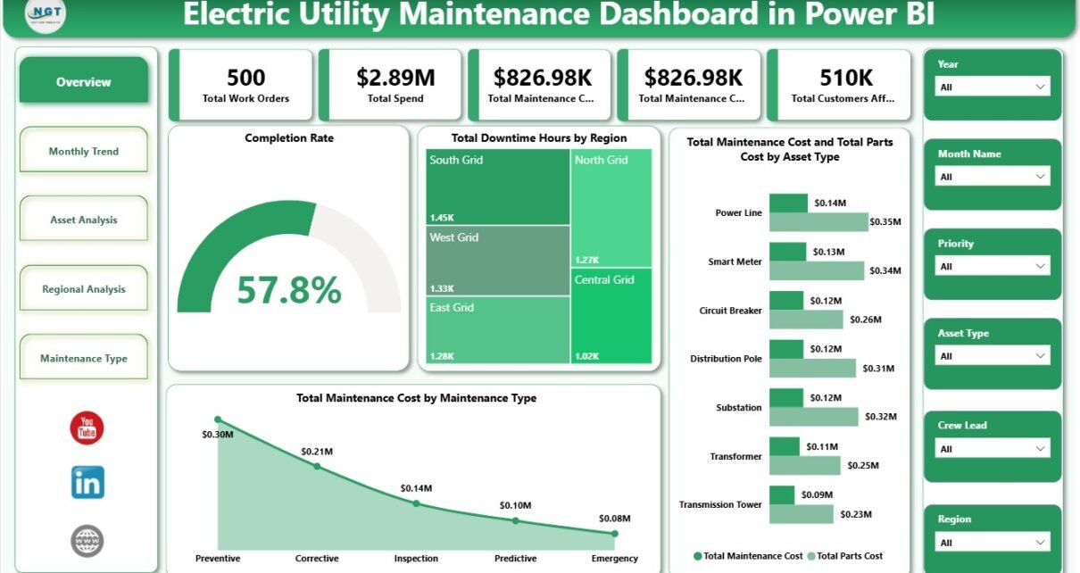
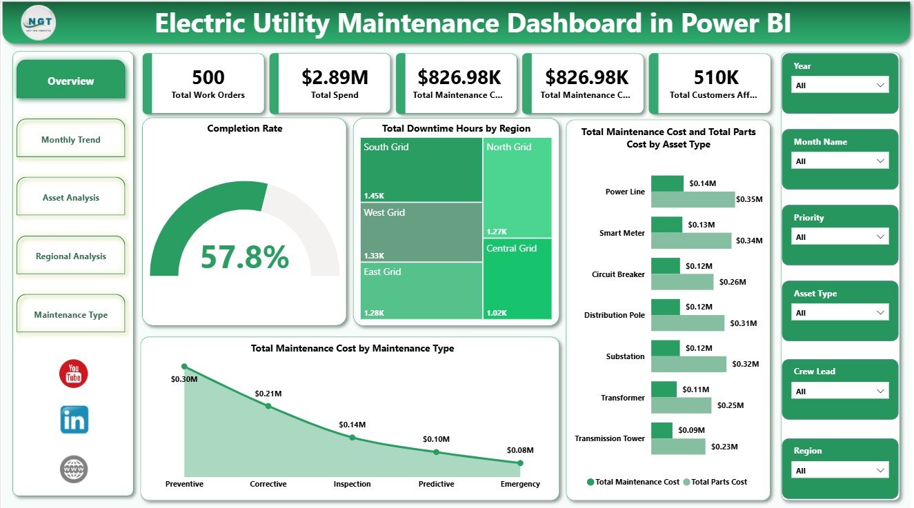
1. Overview Page
The Overview Page is the main executive screen of the report. At the top, it shows Total Work Orders, Total Spend, Total Maintenance Cost, Total Parts Cost, and Total Customers Affected. These cards help maintenance leaders understand workload, financial impact, spare-parts pressure, and customer impact before they move into deeper analysis.
Completion Rate by Work Order Status: This chart explains how work orders are distributed by completion status. It helps supervisors see whether maintenance jobs are being closed properly or whether open and delayed work requires follow-up.
Total Downtime Hours by Region: This visual compares downtime across service regions. It helps operations teams find regions where asset issues, delayed maintenance, or outage patterns may be affecting reliability.
Total Maintenance Cost by Maintenance Type: This chart breaks total maintenance cost into categories such as preventive, corrective, planned, or emergency work. It helps managers understand which maintenance approach is consuming the most budget.
Total Maintenance Cost by Asset Type: This chart shows which asset categories create the highest maintenance cost. It supports replacement planning, preventive maintenance prioritization, and vendor or asset review.
Total Parts Cost by Asset Type: This visual isolates parts cost by asset category. It helps procurement and maintenance teams identify high-consumption assets and potential spare-part planning issues.
Overview Page
2. Monthly Trend
The Monthly Trend page helps users understand how maintenance performance changes over time. It includes Total Downtime Hours by Month Name, Total Customers Affected by Month Name, Total Maintenance Cost by Month Name, and Total Parts Cost by Month Name. This page is useful for spotting seasonal downtime, cost spikes, parts-cost movement, and months where customers were affected more heavily.
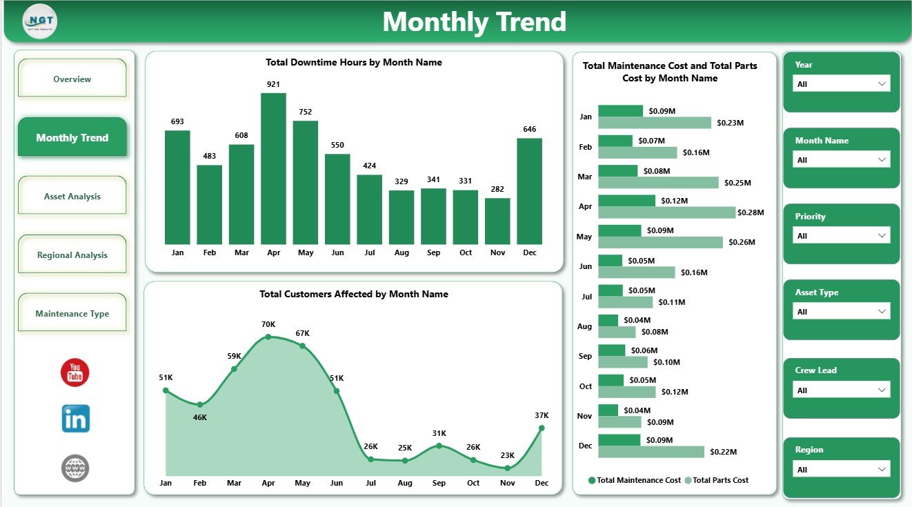
Monthly Trend
3. Asset Analysis
The Asset Analysis page focuses on equipment-level maintenance behavior. Total Maintenance Cost by Voltage Level helps teams understand whether specific voltage groups carry more maintenance cost. Total Spend by Asset Type compares overall spend by asset category, while Total Downtime Hours by Asset Type highlights assets that may need reliability review, inspection planning, or replacement consideration.
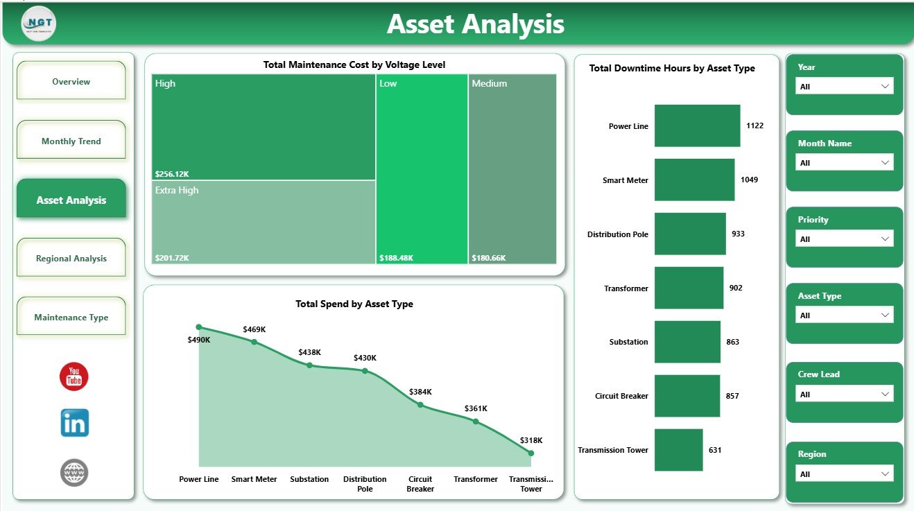
Asset Analysis
4. Regional Analysis
The Regional Analysis page compares maintenance performance across service territories. Total Customers Affected by Region shows where maintenance or outages create the largest customer impact. Total Maintenance Cost by Region highlights cost concentration, and Avg Downtime Per Order by Region helps leaders compare response quality and outage duration by area.
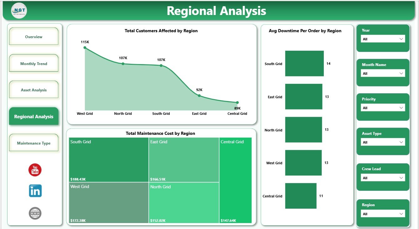
Regional Analysis
5. Maintenance Type
The Maintenance Type page helps users understand the cost and completion profile of different maintenance categories. Total Maintenance Cost by Priority shows how urgent or high-priority work affects the budget. Total Maintenance Cost by Maintenance Type explains the cost mix, while Completion Rate by Maintenance Type helps managers compare close-out performance across work categories.
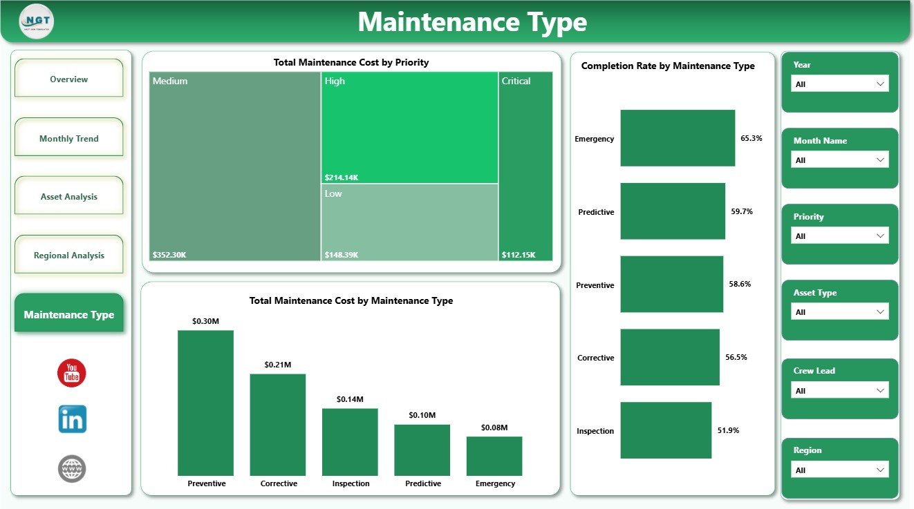
Maintenance Type
Electric Utility Maintenance Dashboard in Power BI vs. Tableau vs. Paid CRM/SaaS – Feature Comparison
| Feature | This Power BI Template | Tableau Alternative | Paid SaaS Alternative |
|---|---|---|---|
| Cost | $17.99 one-time | License plus dashboard build time | Monthly or annual subscription |
| Platform | Power BI Desktop | Tableau Desktop or Cloud | Vendor-hosted platform |
| Setup time | Open .pbix, replace data, refresh | Build data model and visuals | Requires onboarding and configuration |
| Real-time team collaboration | Available through Power BI Service | Available through Tableau Cloud | Usually included by plan |
| Mobile access | Available after publishing to Power BI Service | Available through Tableau mobile options | Usually included |
| Customizable fields | Editable visuals, fields, model, and measures | Editable if built manually | Limited by vendor settings |
| Share with link | Possible through Microsoft sharing | Possible through Tableau sharing | Usually login based |
| Year-1 cost at 5 users | $17.99 plus any Microsoft licensing | Usually much higher | Often hundreds or thousands |
| Utility maintenance analysis | Pre-built across 5 report pages | Must be designed | Depends on reporting module |
Who Should Use This Template
This dashboard is useful for electric utility maintenance managers, operations leaders, reliability engineers, asset management teams, regional service managers, substation supervisors, and Power BI analysts who report on work orders, maintenance cost, parts cost, spend, downtime, assets, regions, priority, and customer impact.
It is not a SCADA system, outage management system, field dispatch tool, GIS platform, or enterprise asset management application. It is best used as a reporting layer when your maintenance records already exist in a structured data table.
Real-World Use Cases
Meera, maintenance manager: Meera uses the Overview page every week to review work orders, spend, maintenance cost, parts cost, and customers affected before assigning follow-up actions.
Daniel, reliability engineer: Daniel uses Asset Analysis to find voltage levels and asset types with higher cost or downtime, then recommends preventive maintenance or replacement review.
Asha, regional operations analyst: Asha uses Monthly Trend and Regional Analysis to prepare leadership summaries on downtime, customer impact, and regional cost movement.
Advantages of Electric Utility Maintenance Dashboard in Power BI
- It saves time compared with building Power BI visuals from scratch.
- It keeps work order, cost, downtime, customer, asset, region, and maintenance type views in one report.
- It lets users filter quickly with slicers during review meetings.
- It supports monthly reliability and maintenance performance reviews.
- It can be customized in Power BI Desktop as your reporting process grows.
- It avoids the recurring cost of a separate dashboard SaaS product.
Opportunities for Improvement
Because this is a Power BI template, it depends on clean source data and a refresh process. Teams needing live outage alerts, automated field dispatch, role-based work order workflows, GIS mapping, or API-driven asset records may need additional Power BI setup or a full utility operations platform. The template is strongest when you want a ready reporting foundation that can be edited and extended.
Best Practices
- Keep source data columns consistent before refreshing the report.
- Use consistent names for regions, asset types, voltage levels, priority, maintenance type, and status values.
- Review maintenance cost and parts cost together to understand the full service burden.
- Use downtime and customers affected together when evaluating regional reliability.
- Open and refresh the report in Power BI Desktop after data changes.
- Use Microsoft guidance to install or update Power BI Desktop: Microsoft Learn: Get Power BI Desktop.
Explore Relevant Templates
- Electric Utility Maintenance Dashboard in Power BI
- Electric Utility Maintenance Dashboard in Excel
- Electric Utility Maintenance KPI Dashboard in Power BI
- Browse Power BI Dashboard Templates
Frequently Asked Questions
What is the Electric Utility Maintenance Dashboard in Power BI?
It is a Power BI dashboard template for tracking electric utility maintenance work orders, spend, maintenance cost, parts cost, downtime, assets, regions, priority, maintenance type, and customers affected.
Can I use my own maintenance data?
Yes. Replace the sample records with your own structured maintenance data, then refresh the report in Power BI Desktop.
Do I need Power BI Desktop?
Yes. Power BI Desktop is used to open, edit, and refresh the .pbix file. Publishing to Power BI Service may require Microsoft licensing.
Can I customize the dashboard?
Yes. You can edit visuals, fields, measures, slicers, colors, labels, and data source connections in Power BI Desktop.
Does this dashboard replace maintenance management software?
No. It is an analytics dashboard, not a work order, dispatch, outage management, GIS, or enterprise asset management platform.
Who is this dashboard best for?
It is best for electric utility maintenance managers, reliability engineers, operations analysts, asset teams, and Power BI users who need structured maintenance reporting.
About the Author
Built by PK – Microsoft Certified Professional with 15+ years of Excel, Google Sheets, and Power BI experience. Founder of NextGenTemplates, reaching 300K+ subscribers across YouTube channels. Every template is hand-built and tested before release.
Conclusion
The Electric Utility Maintenance Dashboard in Power BI gives utility teams a clear way to review work orders, maintenance cost, parts cost, downtime, asset performance, regional impact, and customers affected. Instead of rebuilding reports every month, teams can use a ready Power BI structure, refresh their data, and focus on decisions that improve reliability, cost control, and maintenance planning.
For more tutorials and template walkthroughs, visit PK An Excel Expert on YouTube.