Fan community platforms generate useful data every day: revenue, ad income, creator payouts, platform costs, active communities, acquisition channels, content categories, moderators, and report resolution results. The Fan Communities Platforms Dashboard in Power BI turns that data into a ready reporting experience with 4 Power BI pages, 5 executive KPI cards, 12 analytical visuals, and slicer-based filtering.
This dashboard is designed for creator economy teams, media businesses, membership operators, platform analysts, community managers, and moderation leads who want a cleaner way to review fan community performance without building every Power BI page from scratch.
Click here to purchase Fan Communities Platforms Dashboard in Power BI
Key Features of Fan Communities Platforms Dashboard in Power BI
- 4 Power BI report pages: Overview, Platform Mix, Community Growth, and Engagement.
- 5 KPI cards: Total Revenue, Total Platform Cost, Total Ad Revenue, Total Creator Payout, and Active Communities.
- Multiple slicers: Filter pages quickly by the available platform, time, acquisition, community, category, and moderator fields.
- Financial analysis: Review revenue, ad revenue, platform cost, creator payout, and net platform income.
- Growth analysis: Compare revenue by quarter, active community rate by community type, and income by content category.
- Engagement analysis: Review ad revenue by moderator, communities by acquisition channel, and report resolution rate by community type.
- Editable .pbix file: Adjust visuals, fields, colors, slicers, and page layouts as your reporting process evolves.
For users new to Power BI, Microsoft’s official Power BI overview explains how Power BI helps connect, model, visualize, and share business data.
Dashboard Pages Explanation
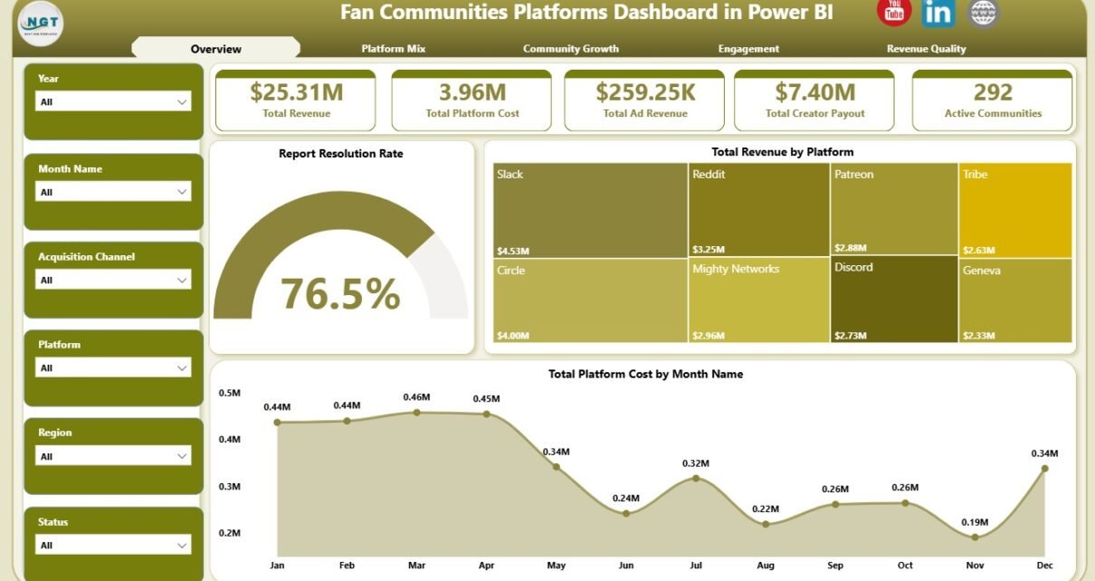
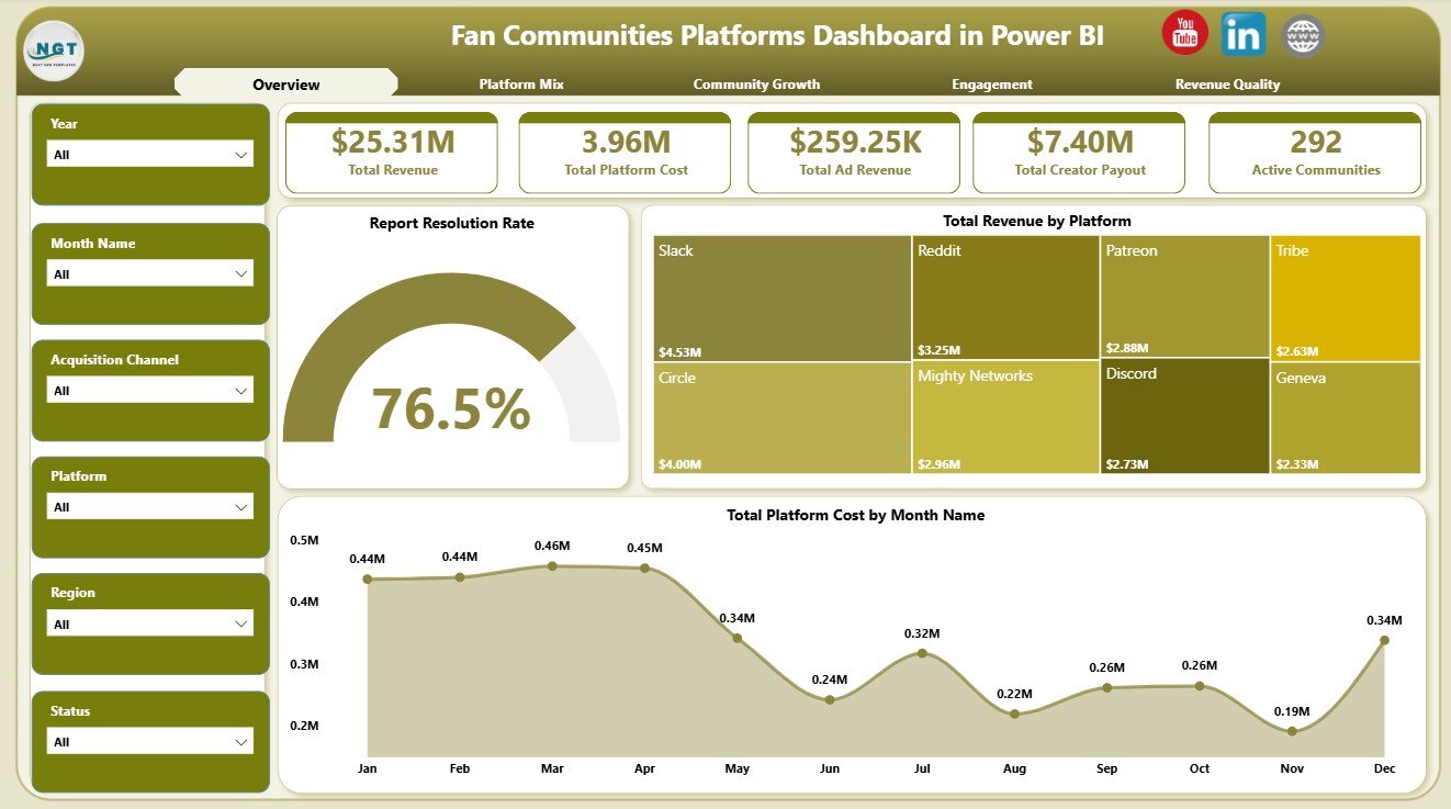
1. Overview Page
The Overview Page is the executive landing page of the report. At the top, it shows Total Revenue, Total Platform Cost, Total Ad Revenue, Total Creator Payout, and Active Communities. These cards give leadership a fast view of monetization, platform spending, creator economics, and community scale.
Report Resolution Rate: This chart shows how effectively community reports are resolved. It helps moderation and operations teams monitor trust, safety, and support responsiveness.
Total Revenue by Platform: This visual compares revenue contribution across platforms. It helps identify which fan community platforms are producing stronger commercial results.
Total Platform Cost by Month Name: This trend shows monthly platform cost movement. It supports budget reviews and highlights months where spending changes need deeper analysis.
2. Platform Mix
The Platform Mix page focuses on how acquisition channels, platforms, and monthly revenue interact. Net Platform Income by Acquisition Channel shows which acquisition sources create better income after platform economics are considered. Active Communities by Platform highlights where the active community base is concentrated. Total Revenue by Month Name helps teams review month-to-month revenue movement.

3. Community Growth
The Community Growth page gives a structured view of quarter-level revenue, community type activity, and content category income. Total Revenue by Quarter helps teams compare performance across quarters and spot seasonal patterns. Active Community Rate by Community Type shows which community models remain more active. Net Platform Income by Content Category identifies categories that contribute stronger income.

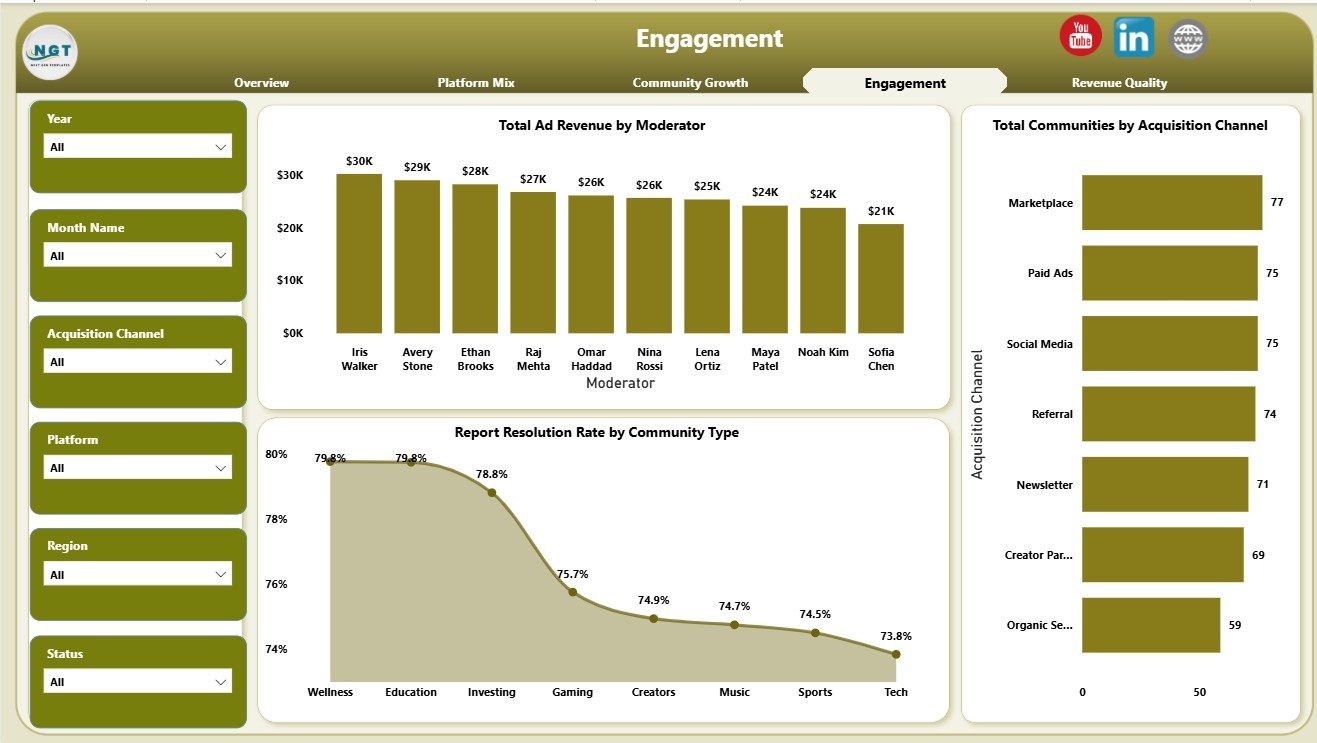
4. Engagement
The Engagement page connects moderators, acquisition channels, communities, and report resolution. Total Ad Revenue by Moderator helps compare monetization linked to moderator ownership. Total Communities by Acquisition Channel shows which channels are bringing communities into the platform. Report Resolution Rate by Community Type helps identify community types that may need stronger support workflows.
Fan Communities Platforms Dashboard in Power BI vs. Tableau vs. Paid CRM/SaaS – Feature Comparison
| Feature | This Power BI Dashboard | Tableau Alternative | Paid Community SaaS |
|---|---|---|---|
| Cost | $17.99 one-time | Requires Tableau license or build effort | Monthly or annual subscription |
| Platform | Power BI Desktop | Tableau Desktop or Cloud | Vendor cloud platform |
| Setup time | Replace data source and refresh | Build or adapt workbook | Onboarding and configuration |
| Real-time collaboration | Available through Power BI Service setup | Available through Tableau Cloud | Usually included by license |
| Mobile access | Available after publishing | Available after publishing | Usually included |
| Customizable fields | Editable Power BI model and visuals | Editable if you own the workbook | Limited by vendor settings |
| Share with link | Available through Power BI Service | Available through Tableau Cloud | Login controlled |
| Year-1 cost at 5 users | $17.99 plus any Microsoft licensing | License and development cost | Often hundreds or thousands |
| Fan community analytics | 4 ready report pages | Requires custom build | Depends on plan and export access |
Who Should Use This Template
This Power BI dashboard is useful for community managers, creator economy operators, membership platform teams, fan engagement analysts, media companies, finance teams, and moderation leads. It is especially useful when the team already exports clean records from a community platform, membership tool, creator program, content database, or support workflow.
It is not meant to replace a live community platform, payment processor, CRM, data warehouse, moderation queue, or automated connector. It works best as a reporting layer for structured fan community data.
Real-World Use Cases
Aditi, community operations manager: Aditi opens the Overview page before monthly performance calls to explain revenue, ad revenue, creator payout, platform cost, and active communities.
Rahul, creator economy analyst: Rahul uses Platform Mix and Community Growth to compare acquisition channels, platforms, quarters, content categories, and community types.
Meera, moderation lead: Meera reviews Engagement to compare moderators, acquisition channels, and report resolution rate by community type.
Advantages of Fan Communities Platforms Dashboard in Power BI
- It saves build time compared with creating every Power BI page from a blank file.
- It keeps revenue, cost, payout, growth, acquisition, and engagement views in one report.
- It supports slicer-based analysis during monthly or quarterly review meetings.
- It uses Power BI visuals that can be customized by advanced users.
- It is a one-time template purchase instead of a recurring dashboard SaaS subscription.
Opportunities for Improvement
Larger teams can extend the report by adding Power Query data connectors, calculated measures for churn and retention, cohort views, member lifetime value, creator-level payout detail, automated refresh through Power BI Service, and row-level security for separate teams or clients.
Best Practices
- Keep platform, acquisition channel, community type, content category, moderator, month, and quarter names consistent.
- Validate KPI cards after each refresh.
- Keep a backup copy before editing measures, model relationships, or report pages.
- Use slicers during review meetings instead of creating multiple static files.
- Document any source data changes so future refreshes remain predictable.
Explore Relevant Templates
You can download the product from Fan Communities Platforms Dashboard in Power BI. You may also want to compare it with Fan Communities Platforms Dashboard in Excel and browse more Power BI Dashboard Templates on NextGenTemplates.
Frequently Asked Questions
What KPI cards are included?
The Overview page includes Total Revenue, Total Platform Cost, Total Ad Revenue, Total Creator Payout, and Active Communities.
How many Power BI pages are included?
The report includes four pages: Overview, Platform Mix, Community Growth, and Engagement.
Can I use my own fan community data?
Yes. Replace or connect the source data in Power BI Desktop while keeping the same field logic where possible, then refresh the report.
Do I need advanced Power BI skills?
No advanced skills are required for normal use. Advanced users can customize the model, visuals, measures, and page layouts.
Can the dashboard be published online?
Yes. You can publish it to Power BI Service if your Microsoft account and licensing support publishing and sharing.
Does this replace a community platform?
No. It is a reporting dashboard, not a live fan community portal, payment system, CRM, or moderation tool.
About the Author
Built by PK – Microsoft Certified Professional with 15+ years of Excel, Google Sheets, and Power BI experience. Founder of NextGenTemplates, reaching 300K+ subscribers across YouTube channels. Every template is hand-built and tested before release.
Conclusion
The Fan Communities Platforms Dashboard in Power BI gives teams a practical way to review revenue, costs, creator payout, active communities, acquisition channels, community growth, engagement, moderation, and report resolution in one editable Power BI file. It is a strong fit for teams that want clearer reporting without starting every dashboard page from scratch.
Visit YouTube.com/@PKAnExcelExpert for more Excel, Power BI, and dashboard tutorials.