Manufacturing teams often review production, quality, downtime, and cost in separate files, which makes weekly performance meetings slower than they need to be. The Manufacturing Efficiency Dashboard in Excel solves that problem with 7 worksheet tabs, 5 executive KPI cards, 19 analysis charts, and slicers for Year, Month, Region, Production Line, Shift, Product Category, and Status. It is designed for users who want a ready Excel dashboard rather than a subscription-based manufacturing system.
This template helps plant managers, supervisors, quality teams, and cost analysts review Total Quantity Produced, Total Target Quantity, Total Defects, Total Downtime Hours, and Total Manufacturing Cost from one workbook. After replacing the sample data, users can click Refresh All in Excel and let the pivot tables update the dashboard pages automatically.
Click here to purchase Manufacturing Efficiency Dashboard in Excel
Manufacturing Efficiency Dashboard in Excel
Key Features of Manufacturing Efficiency Dashboard in Excel
This Excel dashboard is structured around the real questions manufacturing leaders ask in review meetings: How much did we produce? Did we meet the target? Where are defects rising? Which shifts or machines are creating downtime? Where is manufacturing cost increasing?
- 7 worksheet tabs: Overview, Production, Quality, Downtime, Cost, Data, and Support.
- 5 KPI cards: Total Quantity Produced, Total Target Quantity, Total Defects, Total Downtime Hours, and Total Manufacturing Cost.
- 19 analysis charts: Production, defects, downtime, energy cost, material cost, labor cost, and manufacturing cost views.
- Multiple slicers: Filter by Year, Month, Region, Production Line, Shift, Product Category, and Status.
- Refreshable pivot tables: Update the Data sheet and use Excel’s Refresh All command to update the dashboard.
- Editable Excel structure: Modify fields, colors, charts, and formulas according to your reporting process.
Dashboard Pages Explanation
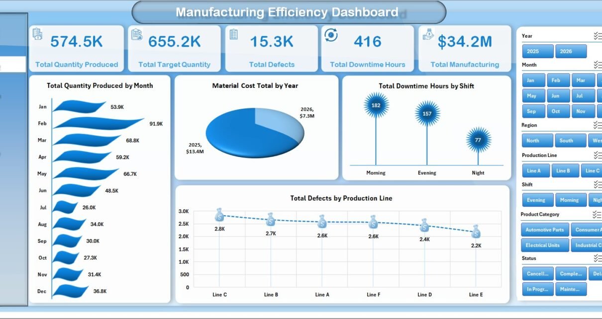
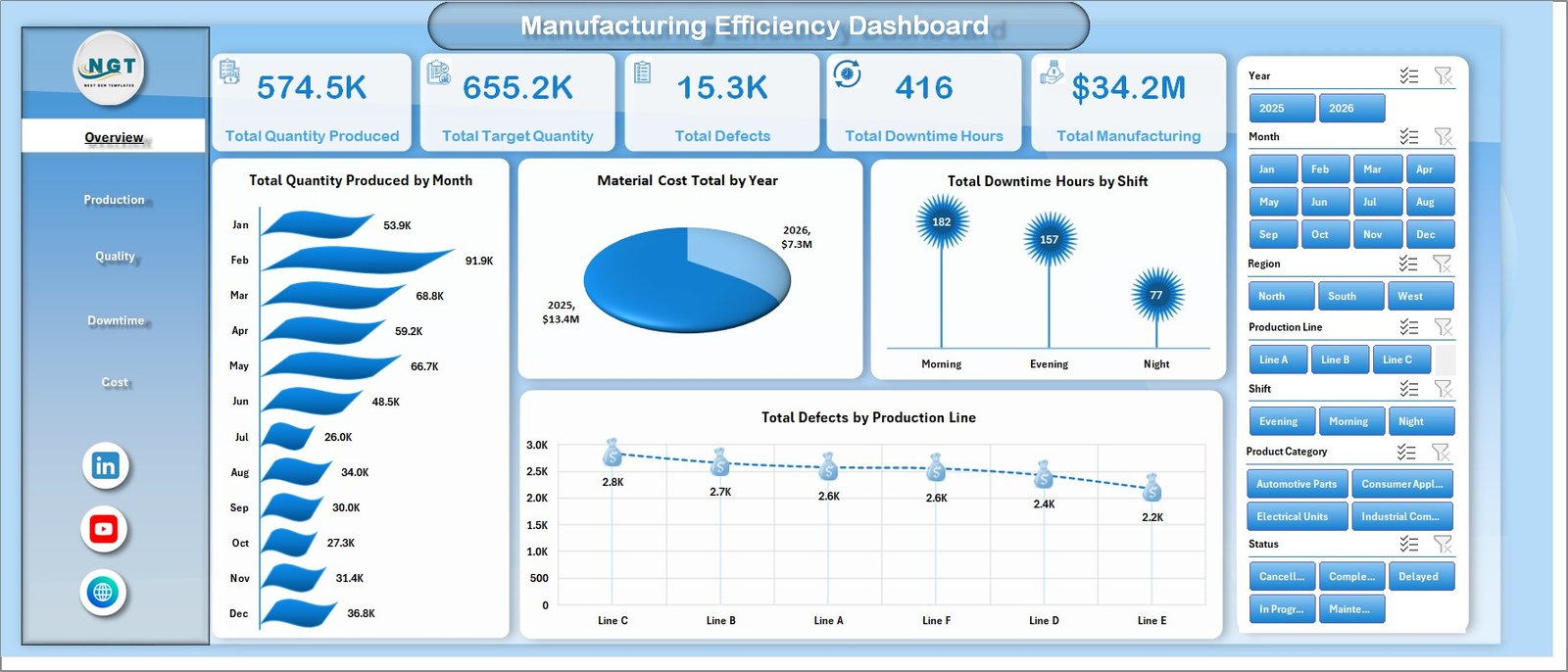
1. Overview Page
The Overview page provides the high-level manufacturing performance view. At the top, KPI cards summarize Total Quantity Produced, Total Target Quantity, Total Defects, Total Downtime Hours, and Total Manufacturing Cost so managers can understand the main numbers before reviewing detailed sheets.
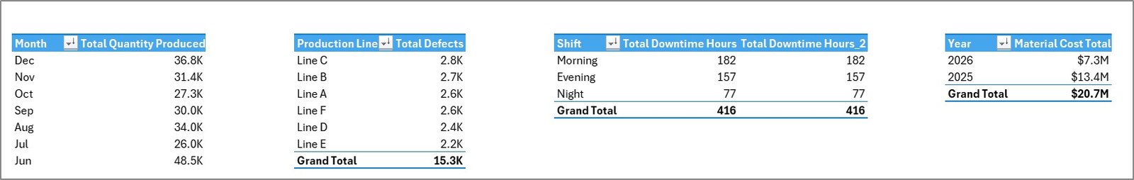
Total Quantity Produced by Month: This chart shows month-by-month production output. It helps users identify seasonality, output drops, and stronger production months.
Material Cost Total by Year: This chart compares yearly material cost. It supports procurement, cost-control, and budget review conversations.
Total Downtime Hours by Shift: This view compares downtime across shifts. It helps supervisors identify whether one shift needs maintenance, staffing, process, or scheduling review.
Total Defects by Production Line: This chart compares defect volume by line. It helps quality teams find production lines that may need training, root-cause analysis, or process checks.
2. Production Sheet
The Production sheet gives a focused view of output and product-level performance. It includes Total Quantity Produced by Quarter, Energy Cost Total by Plant, Total Quantity Produced by Product Category, and Total Defects by Product.
Total Quantity Produced by Quarter: This chart shows quarterly production movement. It helps leaders compare output across planning periods and spot changes in demand or capacity.
Energy Cost Total by Plant: This chart compares plant-level energy cost. It is useful for reviewing utility spend and identifying locations with higher operational cost.
Total Quantity Produced by Product Category: This view compares output across product categories. It helps teams understand which categories contribute the most volume.
Total Defects by Product: This chart shows product-level defect totals. It supports product quality review and corrective action planning.
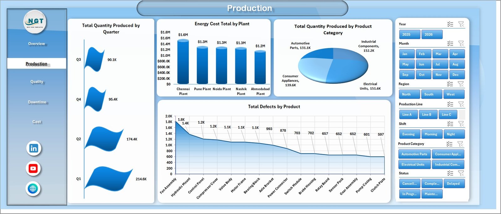
Production sheet tab
3. Quality Sheet
The Quality sheet connects quality outcomes with cost, machines, operators, production lines, and labor. It includes Total Manufacturing Cost by Machine, Total Defects by Operator, Total Downtime Hours by Production Line, and Labor Cost Total by Month.
Total Manufacturing Cost by Machine: This chart compares cost across machines. It helps identify equipment that may be associated with higher operating cost.
Total Defects by Operator: This view shows defect counts by operator. It can support coaching, process review, and training decisions when used fairly and with proper context.
Total Downtime Hours by Production Line: This chart compares downtime by line. It helps users identify bottlenecks that may affect production and quality.
Labor Cost Total by Month: This chart tracks monthly labor cost. It helps finance and operations teams connect staffing cost with production performance.
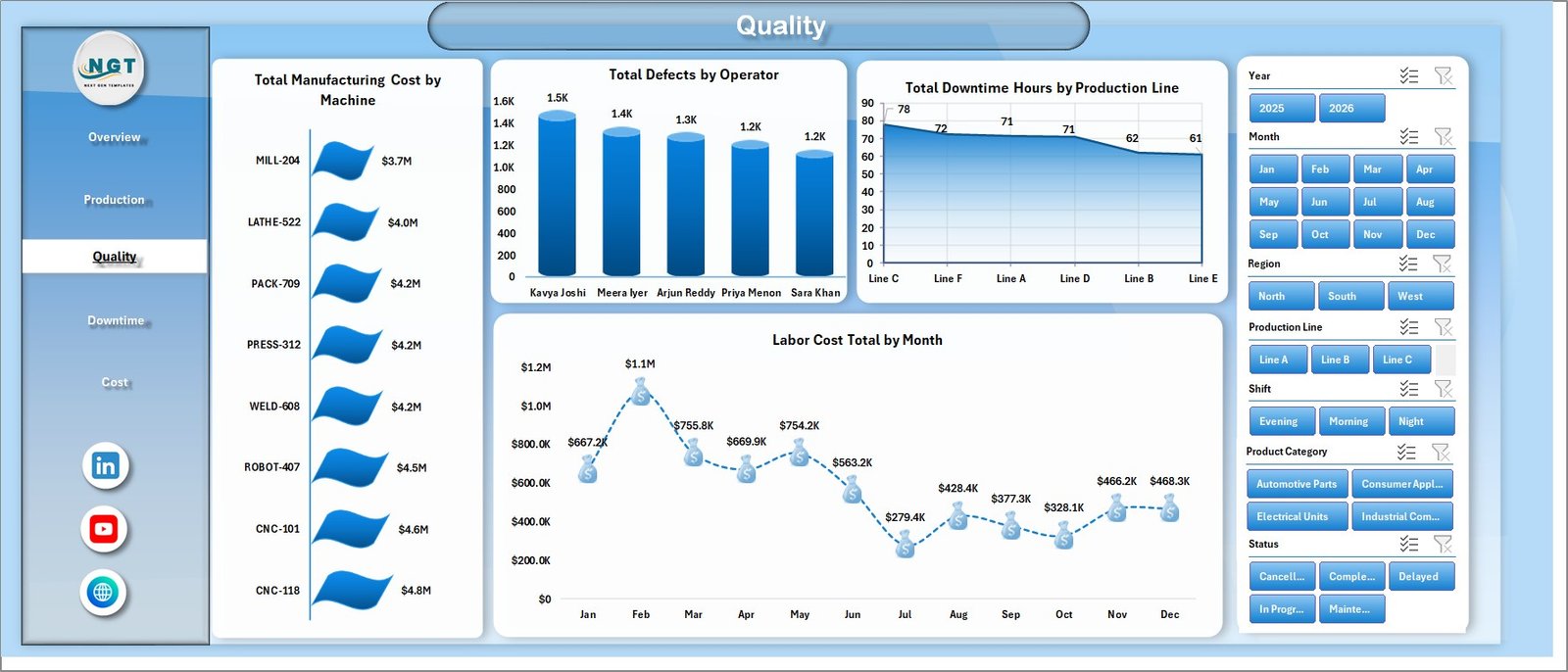
Quality sheet tab
4. Downtime Sheet
The Downtime sheet focuses on machine downtime, shift cost, plant downtime, and material cost. It includes Total Downtime Hours by Machine, Total Manufacturing Cost by Shift, Total Downtime Hours by Plant, and Material Cost Total by Product Category.
Total Downtime Hours by Machine: This chart identifies machines with higher downtime. Maintenance teams can use it to prioritize inspections and preventive maintenance.
Total Manufacturing Cost by Shift: This view compares cost across shifts. It helps leaders see whether shift scheduling, labor mix, or downtime is affecting cost.
Total Downtime Hours by Plant: This chart compares downtime across plants. It supports plant-level performance review and escalation.
Material Cost Total by Product Category: This view shows material cost by category. It helps teams connect product mix with material spend.
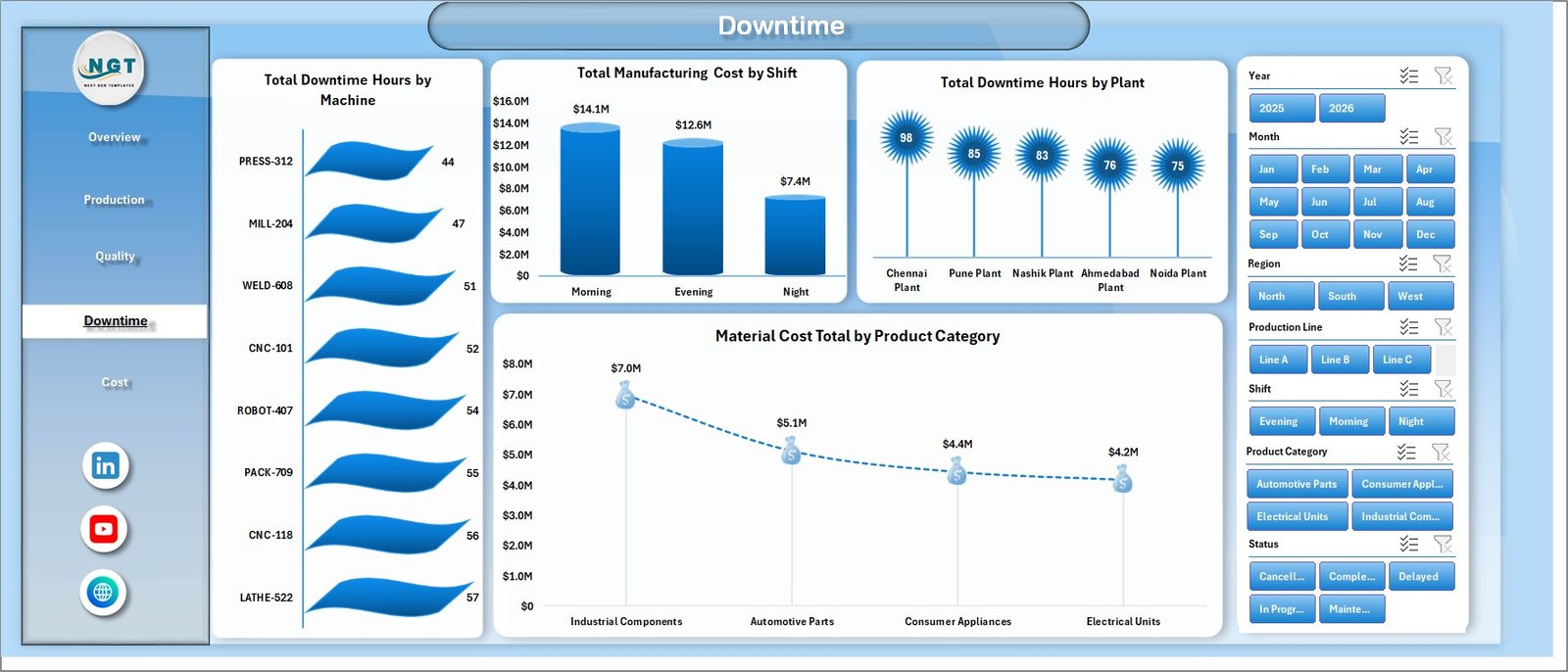
Downtime sheet tab
5. Cost Sheet
The Cost sheet is built for manufacturing cost review. It includes Total Manufacturing Cost by Plant, Total Manufacturing Cost by Month, and Labor Cost Total by Region.
Total Manufacturing Cost by Plant: This chart compares plant-level manufacturing cost. It helps identify locations that may need a deeper review of materials, labor, energy, downtime, or output mix.
Total Manufacturing Cost by Month: This chart shows monthly cost movement. It helps teams spot cost spikes and connect them with production changes.
Labor Cost Total by Region: This view compares labor cost across regions. It supports regional cost analysis and operating review discussions.
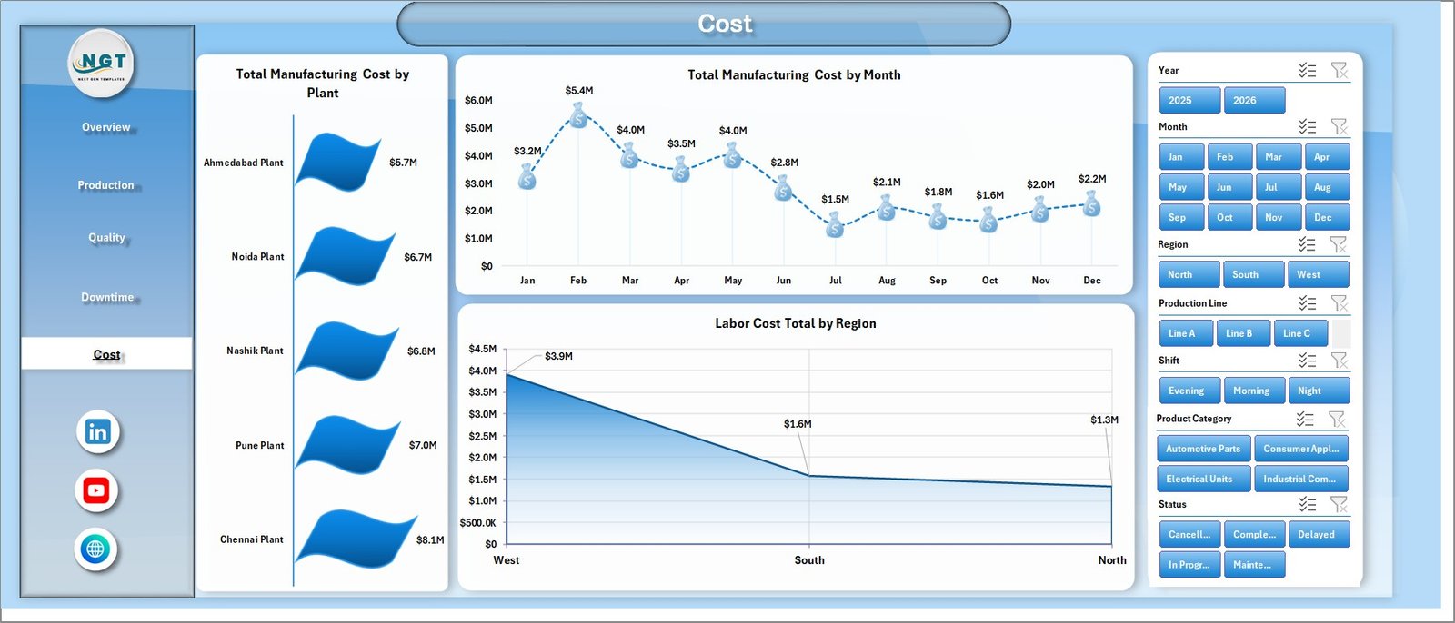
Cost sheet tab
6. Data Sheet Tab
The Data sheet is where you enter or paste the manufacturing data in the same format. Once the data is updated, go to the Data tab in the Excel Ribbon and click Refresh All.
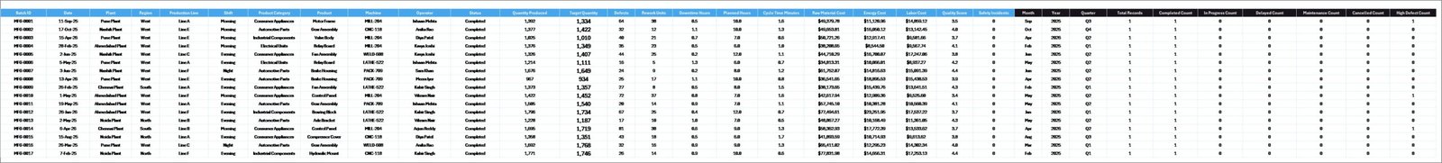
Data Sheet tab
7. Support Sheet
The Support sheet contains multiple pivot tables used to create the dashboard dynamically. You can keep this sheet hidden after setup. When the Data sheet is updated and Refresh All is clicked, the pivots and charts refresh.
Support sheet tab
Manufacturing Efficiency Dashboard in Excel vs. Google Sheets vs. Paid Manufacturing SaaS – Feature Comparison
| Feature | This Excel Dashboard | Google Sheets Alternative | Paid Manufacturing SaaS |
|---|---|---|---|
| Cost | $17.99 one-time purchase | Low if built internally | Monthly or annual subscription |
| Platform | Microsoft Excel | Google Sheets | Vendor cloud platform |
| Setup time | Replace data and refresh | Requires custom design | Implementation and onboarding |
| Real-time team collaboration | Possible through Microsoft 365 sharing | Native Google collaboration | Usually available by role |
| Mobile access | Excel mobile app with limitations | Google Sheets mobile app | Vendor app or browser |
| Customizable fields | Editable workbook, pivots, and charts | Editable but may need rebuilding | Often limited by permissions |
| Share with link | Available through OneDrive or SharePoint | Available through Google Drive | Login controlled |
| Year-1 cost at 5 users | $17.99 plus existing Microsoft licensing | Usually low if Workspace is already used | Often hundreds or thousands of dollars |
| Manufacturing analytics | Production, quality, downtime, and cost pages included | Requires equivalent setup | Depends on purchased modules |
Who Should Use This Template
This dashboard is useful for plant managers, manufacturing supervisors, production planners, quality control teams, operations analysts, finance teams, and Excel consultants who prepare manufacturing reports for clients. It is especially useful when a team has structured manufacturing data but does not want to build every pivot table, slicer, and chart from scratch.
It is not a replacement for ERP, MRP, MES, shop-floor automation, inventory control, barcode scanning, payroll, or live machine monitoring. It is an Excel reporting layer that helps users analyze existing data more clearly.
Real-World Use Cases
Plant manager weekly review: A plant manager can open the Overview page before a meeting and quickly compare quantity produced, target quantity, defects, downtime, and manufacturing cost.
Quality action meeting: A quality lead can use the Quality sheet to review defects by operator, product, and production line before assigning corrective actions.
Cost-control discussion: A finance analyst can use the Cost and Downtime pages to explain manufacturing cost by plant, shift, month, region, and product category.
Advantages of Manufacturing Efficiency Dashboard in Excel
- Faster reporting: Ready dashboard pages reduce manual chart creation time.
- Better visibility: Production, quality, downtime, and cost metrics are available in one workbook.
- Flexible filtering: Slicers make it easy to review different periods, regions, shifts, lines, and categories.
- Excel familiarity: Most operations and finance teams already know how to work with Excel files.
- One-time purchase: No subscription or per-user fee is required for the template itself.
Opportunities for Improvement
Because this is an Excel dashboard, it depends on clean and consistent data entry. Teams that need automatic machine data capture, user permissions, audit workflows, or real-time production execution should use this dashboard alongside their operational systems rather than as a replacement.
For teams that want web-based collaboration, Power BI or a manufacturing SaaS tool may be a better long-term option. Excel is strongest here as a flexible, low-cost analysis layer.
Best Practices
- Keep the Data sheet structure consistent so pivots continue to refresh correctly.
- Refresh the workbook after every data update.
- Review defects and downtime with operational context before taking action.
- Use the same product, plant, shift, and production line naming rules each month.
- Keep a backup copy before making structural changes to the workbook.
For Excel refresh and data connection concepts, you can also review Microsoft’s official guidance on refreshing data connections in Excel.
Explore Relevant Templates
You may also like the Manufacturing Excellence Bundle, Manufacturing Efficiency Dashboard in Power BI, Manufacturing Cost Efficiency KPI Dashboard in Excel, and Quality Assurance Dashboard in Excel.
Frequently Asked Questions
What is the Manufacturing Efficiency Dashboard in Excel?
It is an Excel dashboard template for tracking production quantity, target quantity, defects, downtime hours, and manufacturing cost.
How many sheets are included?
The workbook includes Overview, Production, Quality, Downtime, Cost, Data, and Support sheets.
What slicers are available?
Slicers are available for Year, Month, Region, Production Line, Shift, Product Category, and Status.
Can I update the dashboard with my own data?
Yes. Replace the sample data in the Data sheet using the same format, then click Refresh All in Excel.
Can I hide the Support sheet?
Yes. The Support sheet contains pivot tables and can be hidden after setup.
Is this dashboard a full manufacturing software system?
No. It is an Excel analytics dashboard, not an ERP, MRP, MES, or shop-floor automation system.
About the Author
Built by PK – Microsoft Certified Professional with 15+ years of Excel, Google Sheets, and Power BI experience. Founder of NextGenTemplates, reaching 300K+ subscribers across YouTube channels. Every template is hand-built and tested before release.
Conclusion
The Manufacturing Efficiency Dashboard in Excel is a practical reporting template for teams that want quick visibility into production, quality, downtime, and cost performance. With 7 sheets, 5 KPI cards, 19 charts, and multiple slicers, it gives manufacturing teams a clear starting point for recurring operational review.
Download the Manufacturing Efficiency Dashboard in Excel from NextGenTemplates
Visit our YouTube channel to learn step-by-step video tutorials: Youtube.com/@PKAnExcelExpert