Logistics teams lose time when shipment data, carrier reports, exception logs, and cost files sit in separate spreadsheets. A weekly review can easily involve hundreds or thousands of rows across freight cost, logistics cost, service level, shipment type, region, priority, automation system, origin hub, destination hub, and exception type. The Logistics Automation Dashboard in Excel gives teams a clean reporting layer with 5 dashboard pages, 5 executive KPI cards, 20 charts, slicers, a Data Sheet, and a Support Sheet powered by pivot tables.
This template is built for logistics managers, carrier operations teams, supply chain analysts, 3PL reporting teams, warehouse leaders, and consultants who want Excel-based logistics automation reporting without building every chart from scratch.
Click here to purchase the Logistics Automation Dashboard in Excel
Logistics Automation Dashboard in Excel
Key Features of Logistics Automation Dashboard in Excel
- 5 dashboard pages: Overview, Automation, Carrier Ops, Transit, and Cost.
- 5 KPI cards: Total Freight Cost, Total Logistics Cost, Total Shipments, Delivered Shipments, and Avg. Customer Rating.
- 20 pre-built charts: Review logistics cost, freight cost, automation percentage, transit hours, shipments, exceptions, regions, priorities, hubs, and service levels.
- Slicer-based filtering: Filter the dashboard quickly by the fields in your logistics dataset.
- Data Sheet tab: Add your own records in the same format as the sample data.
- Support Sheet tab: Pivot tables drive the dashboard dynamically and can be hidden after setup.
- Editable Excel workbook: Adjust formulas, labels, chart titles, slicers, colors, and layout directly in Microsoft Excel.
Dashboard Pages Explanation
The workbook includes five dashboard pages plus a Data Sheet and Support Sheet. Each dashboard page answers a different logistics question: What is happening overall? Where is automation improving or lagging? Which carriers and service levels drive cost and transit time? Where are shipments late or exception-heavy? Which hubs and periods create the highest cost?
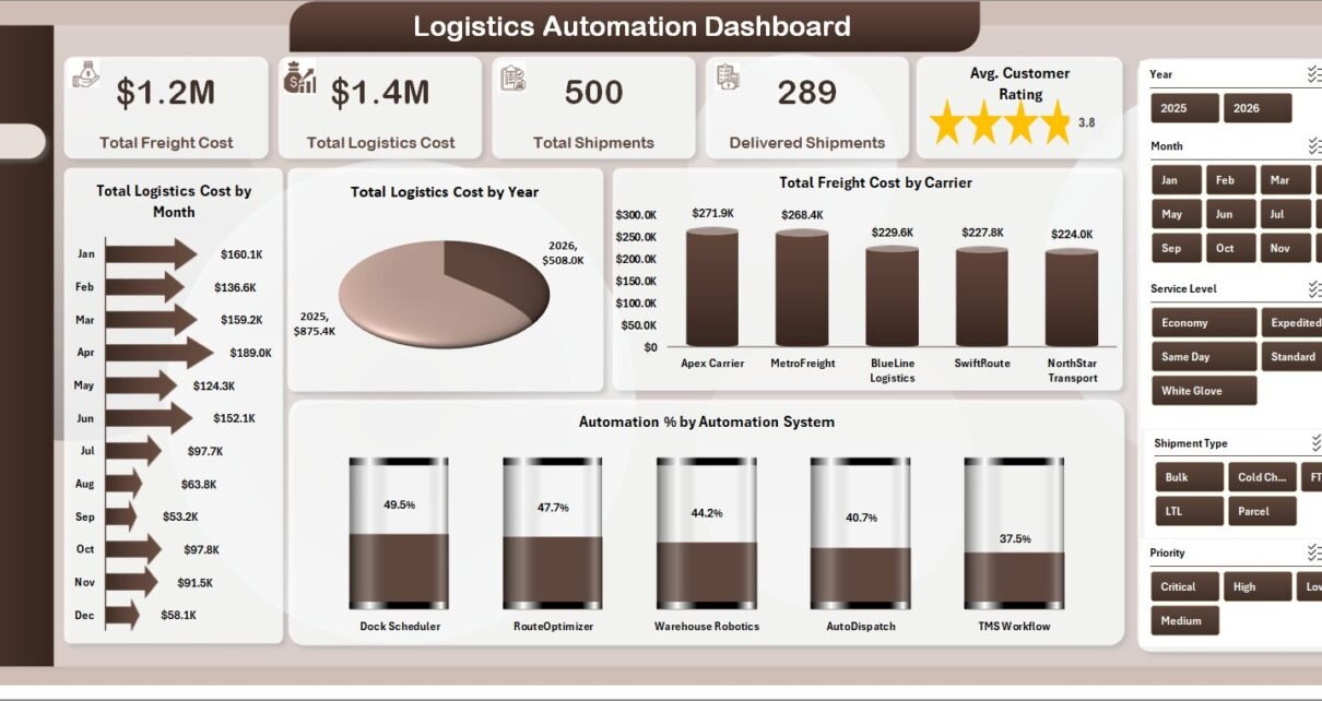
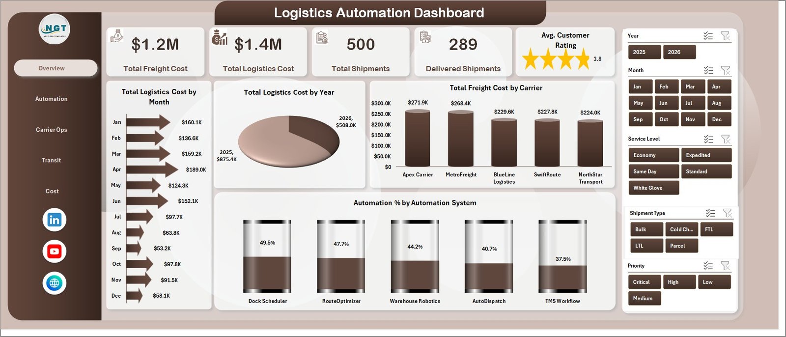
1 – Overview Page
The Overview Page starts with Total Freight Cost, Total Logistics Cost, Total Shipments, Delivered Shipments, and Avg. Customer Rating. These cards give leaders a fast read on cost, volume, completed shipment output, and customer experience before they move into detailed analysis.
Total Logistics Cost by Month: This chart shows monthly logistics cost movement. It helps teams catch seasonal spikes, automation-related changes, and month-over-month cost pressure.
Total Logistics Cost by Year: This annual view supports leadership reporting and budget discussions. It helps users compare logistics spend across years without rebuilding a separate report.
Total Freight Cost by Carrier: This chart compares carrier-level freight spending. It is useful for carrier negotiation, vendor review, and identifying dependency on expensive carriers.
Automation % by Automation System: This view shows how automation adoption differs across systems. It helps managers identify where shipment processing still depends on manual work.
Overview Page
2 – Automation
The Automation page is designed to review automation across service level, region, carrier, and handling cost. Automation % by Service Level shows whether premium, standard, express, same-day, or scheduled services are being processed through automation consistently. Automation % by Region reveals which territories are ahead or behind in automation usage.
Total Logistics Cost by Carrier connects automation review with cost performance, making it easier to see whether carrier mix and automation adoption are moving in the right direction. Total Handling Cost by Month shows handling cost movement over time, which is useful when automation is expected to reduce manual handling effort.
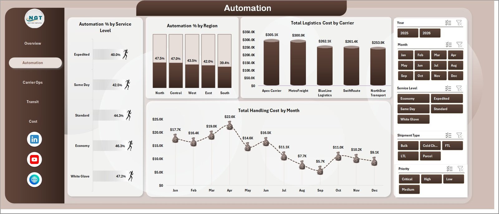
Automation
3 – Carrier Ops
The Carrier Ops page helps teams compare carrier and shipment performance. Avg. Transit Hours by Carrier highlights which carriers are faster or slower. This is useful for weekly carrier review meetings and SLA discussions.
Total Freight Cost by Service Level explains how freight cost changes across service tiers. Total Shipments by Shipment Type shows the shipment mix, while Avg. Transit Hours by Month reveals whether transit time is improving or getting worse over the reporting period.
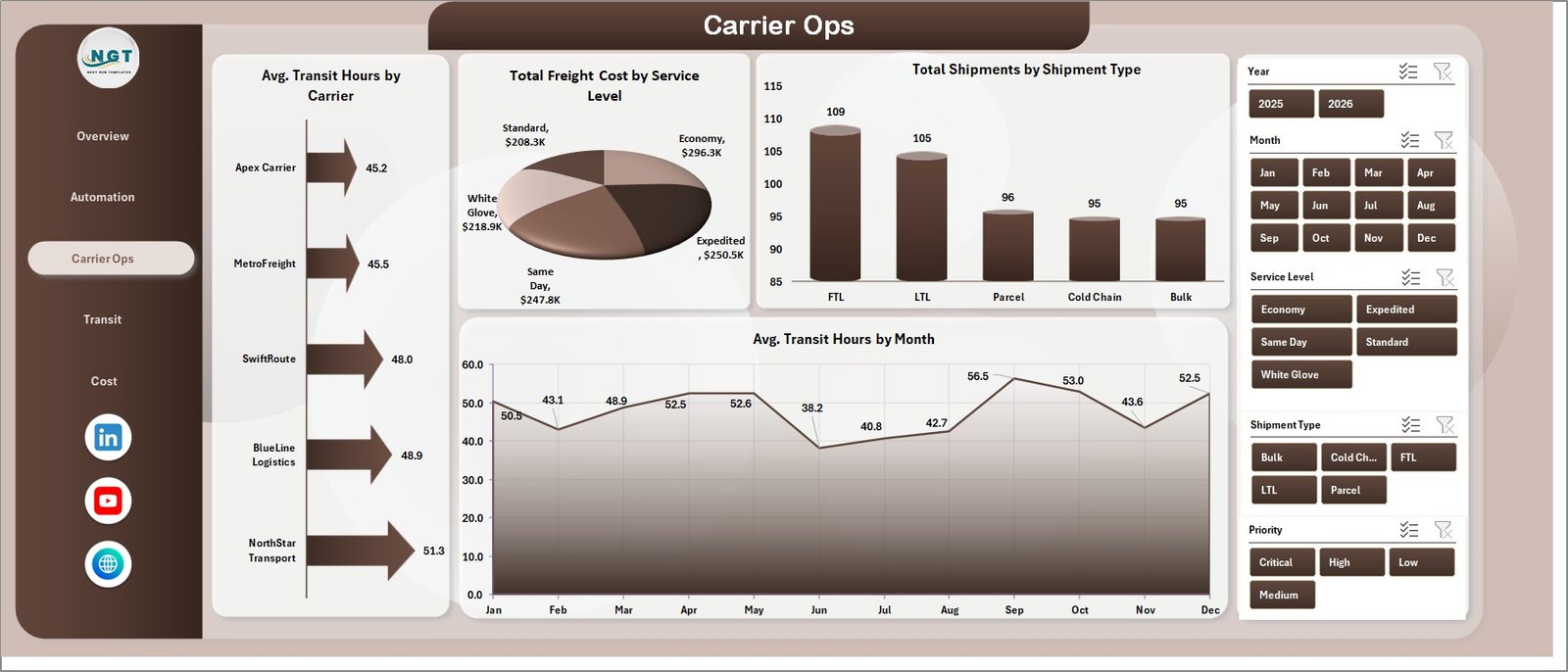
Carrier Ops
4 – Transit
The Transit page focuses on reliability and exceptions. On Time Shipments by Region shows where delivery reliability is strong and where teams may need to investigate route, carrier, or hub issues. Total Shipments by Priority helps managers see how urgent, high, medium, or standard shipments shape workload.
Total Shipments by Exception Type highlights the most common operational issue categories. Total Freight Cost by Region connects transit performance with cost by territory, helping teams avoid looking at service quality and freight spend separately.
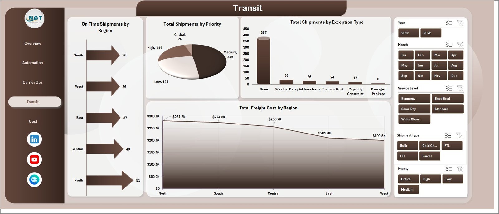
Transit
5 – Cost
The Cost page is built for cost ownership and hub review. Total Logistics Cost by Origin Hub identifies the starting hubs responsible for the highest spend. Total Logistics Cost by Quarter supports quarterly operations and finance reviews.
Total Shipments by Destination Hub shows where shipments are going most often, which helps with capacity planning and network analysis. Total Freight Cost by Month gives a focused trend for freight spend, separate from the broader logistics cost view.
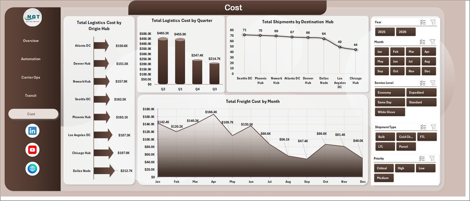
Cost
6 – Data Sheet Tab
The Data Sheet tab is the input sheet. Add or paste your logistics records in the same format as the sample data so the dashboard, slicers, pivots, and charts continue to work correctly.
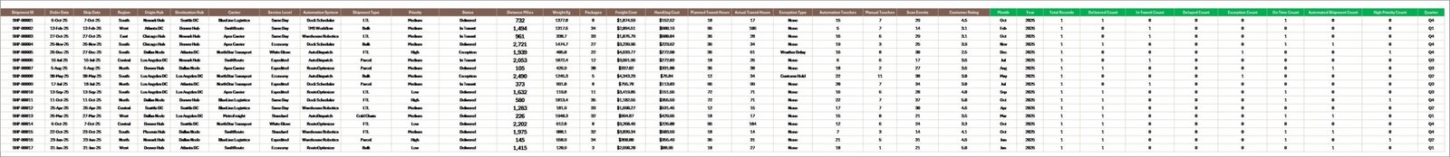
Data Sheet tab
7 – Support Sheet Tab
The Support Sheet contains multiple pivot tables used to create the entire dashboard dynamically. After updating the Data Sheet, go to the Data tab in the Excel Ribbon and click Refresh All. All pivot tables and charts will refresh. You can keep this sheet hidden for everyday users.
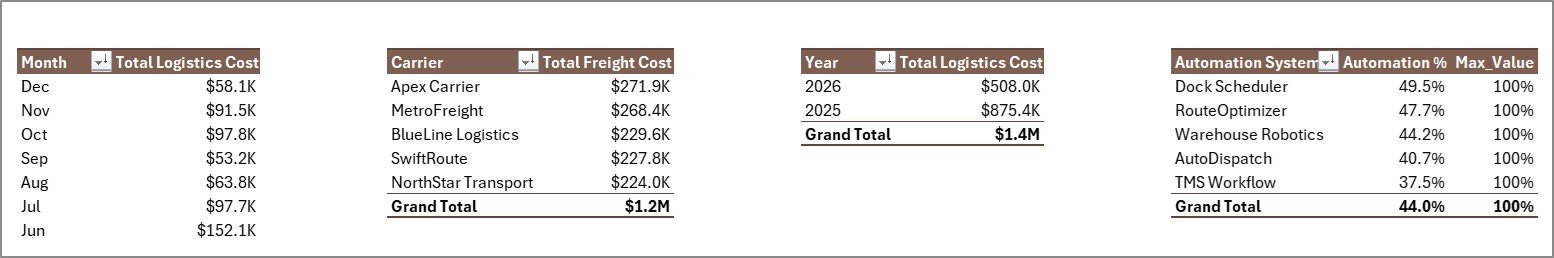
Support Sheet tab
Logistics Automation Dashboard in Excel vs. Google Sheets vs. Paid CRM/SaaS – Feature Comparison
| Feature | Logistics Automation Dashboard in Excel | Google Sheets alternative | Paid logistics SaaS |
|---|---|---|---|
| Cost | $17.99 one-time | Template or custom build | Monthly or annual subscription |
| Platform | Microsoft Excel | Google Sheets | Vendor-hosted platform |
| Setup time | Replace data and refresh pivots | Import data and adjust formulas | Implementation and onboarding |
| Real-time team collaboration | Possible with OneDrive or SharePoint | Native collaboration | Usually included |
| Mobile access | Excel mobile with limitations | Google Sheets mobile | Usually included |
| Customizable fields | Fully editable workbook | Editable sheet | Plan dependent |
| Share with link | Possible through Microsoft 365 | Yes | Login controlled |
| Year-1 cost at 5 users | $17.99 plus Microsoft licensing | Template cost plus maintenance | Often hundreds or thousands |
| Logistics automation reporting | Built across 5 pages | Must be built or adapted | Depends on vendor module |
This workbook fits teams that already use Excel and want a clean reporting layer. It does not replace a full transport management system, but it makes recurring logistics performance reviews faster and more consistent.
Who Should Use This Template
- Logistics managers reviewing cost, shipment volume, delivered shipments, and customer rating.
- Carrier operations teams comparing transit hours, carrier freight cost, and service levels.
- Supply chain analysts tracking automation percentage by system, region, and service level.
- 3PL reporting teams preparing client-facing weekly or monthly logistics reports.
- Operations consultants building a practical Excel dashboard for logistics automation reviews.
Real-World Use Cases
Ravi manages logistics operations. He opens the Overview and Carrier Ops pages before weekly carrier meetings to review freight cost, transit hours, shipments, and service-level cost.
Meera is a supply chain analyst. She uses the Automation page to compare automation by region and service level, then reviews handling cost by month to see whether process changes are reducing manual work.
Daniel is a 3PL reporting consultant. He updates the Data Sheet with client shipment records, clicks Refresh All, and uses the Transit and Cost pages for exception and hub performance review.
Advantages of Logistics Automation Dashboard in Excel
- Fast setup: Replace the sample data and refresh instead of building reports from a blank workbook.
- Clear page structure: Each page focuses on a different logistics management question.
- No subscription: The workbook is a one-time purchase and runs in Microsoft Excel.
- Editable design: You can adjust charts, pivot tables, formulas, slicers, colors, and labels.
- Excel ecosystem: The workbook uses familiar Excel features. Microsoft also provides guidance for creating PivotTables if you want to extend the file.
Opportunities for Improvement
This is a reporting dashboard, not an execution platform. It does not include live GPS tracking, driver mobile apps, barcode scanning, warehouse task assignment, automated routing, carrier API connections, or real-time dispatch workflow. Teams with advanced system requirements can use this Excel dashboard after exporting data from their TMS, ERP, WMS, or carrier portal.
Best Practices
- Keep carrier, region, service level, shipment type, priority, hub, and exception names consistent.
- Refresh all pivots after every Data Sheet update.
- Review cost and transit performance together so lower cost does not hide slower delivery.
- Use automation percentage with handling cost to understand whether automation is reducing manual effort.
- Keep a backup copy before changing pivot tables, source columns, or formulas.
Explore Relevant Templates
- Logistics Automation Dashboard in Excel
- Last-mile Delivery Dashboard in Excel
- Freight Insurance Providers Dashboard in Excel
- Freight Cost KPI Dashboard in Excel
- Last-Mile Delivery KPI Dashboard in Excel
Frequently Asked Questions
What is the Logistics Automation Dashboard in Excel?
It is an editable Excel dashboard template for reviewing logistics cost, freight cost, shipments, delivered shipments, automation percentage, carrier operations, transit reliability, exceptions, hubs, regions, and service levels.
How do I update the dashboard?
Add or paste your logistics records into the Data Sheet in the same format, then click Refresh All from the Excel Data tab.
How many dashboard pages are included?
The workbook includes 5 dashboard pages: Overview, Automation, Carrier Ops, Transit, and Cost, plus Data Sheet and Support Sheet tabs.
Can I customize the workbook?
Yes. You can edit formulas, charts, pivot tables, slicers, colors, labels, and page layouts directly in Excel.
Does this replace logistics management software?
No. It is a reporting dashboard, not a TMS, WMS, dispatch system, route optimizer, or live tracking platform.
Can I hide the Support Sheet?
Yes. The Support Sheet contains pivot tables used to drive the dashboard and can be hidden after setup.
About the Author
Built by PK – Microsoft Certified Professional with 15+ years of Excel, Google Sheets, and Power BI experience. Founder of NextGenTemplates, reaching 300K+ subscribers across YouTube channels. Every template is hand-built and tested before release.
Conclusion
The Logistics Automation Dashboard in Excel gives operations teams a practical way to review logistics cost, freight cost, shipments, automation adoption, carrier performance, transit reliability, exception patterns, and hub-level cost in one workbook. With 5 dashboard pages, 5 KPI cards, slicers, a Data Sheet, and a pivot-powered Support Sheet, it is a strong fit for teams that want better reporting without starting from a blank spreadsheet.
Click here to purchase the Logistics Automation Dashboard in Excel
For step-by-step Excel tutorials, visit YouTube.com/@PKAnExcelExpert.
Last updated: July 4, 2026